The judging process for Architizer's 14th A+Awards is now underway. Subscribe to our Awards Newsletter to receive updates about Public Voting, and stay tuned — winners will be announced later this spring.
Windows are fun because they enliven any space with natural light and effortlessly connect us to the world outside. However, architects should be wary of adopting windows too excessively. Among the perils of too many windows include the poor thermal insulation of glass, a loss of privacy and occasionally an architectural blandness from their sheer ubiquity.
Luckily, louvers are an ideal counterpart to windows. They help control how much and in which ways natural light should enter a building, and they’re a great way to add texture and style to any façade. These seven louver designs go beyond the traditional louver, proving there are plenty of ways to keep the classic window blind architecturally exciting.
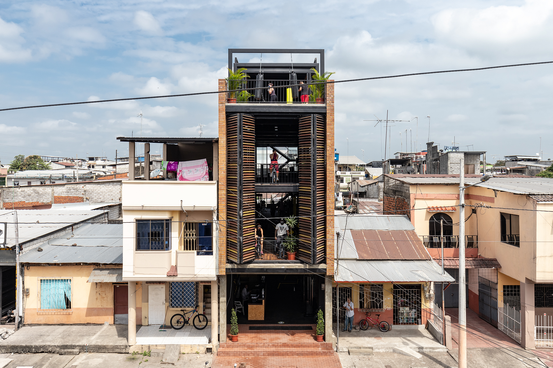
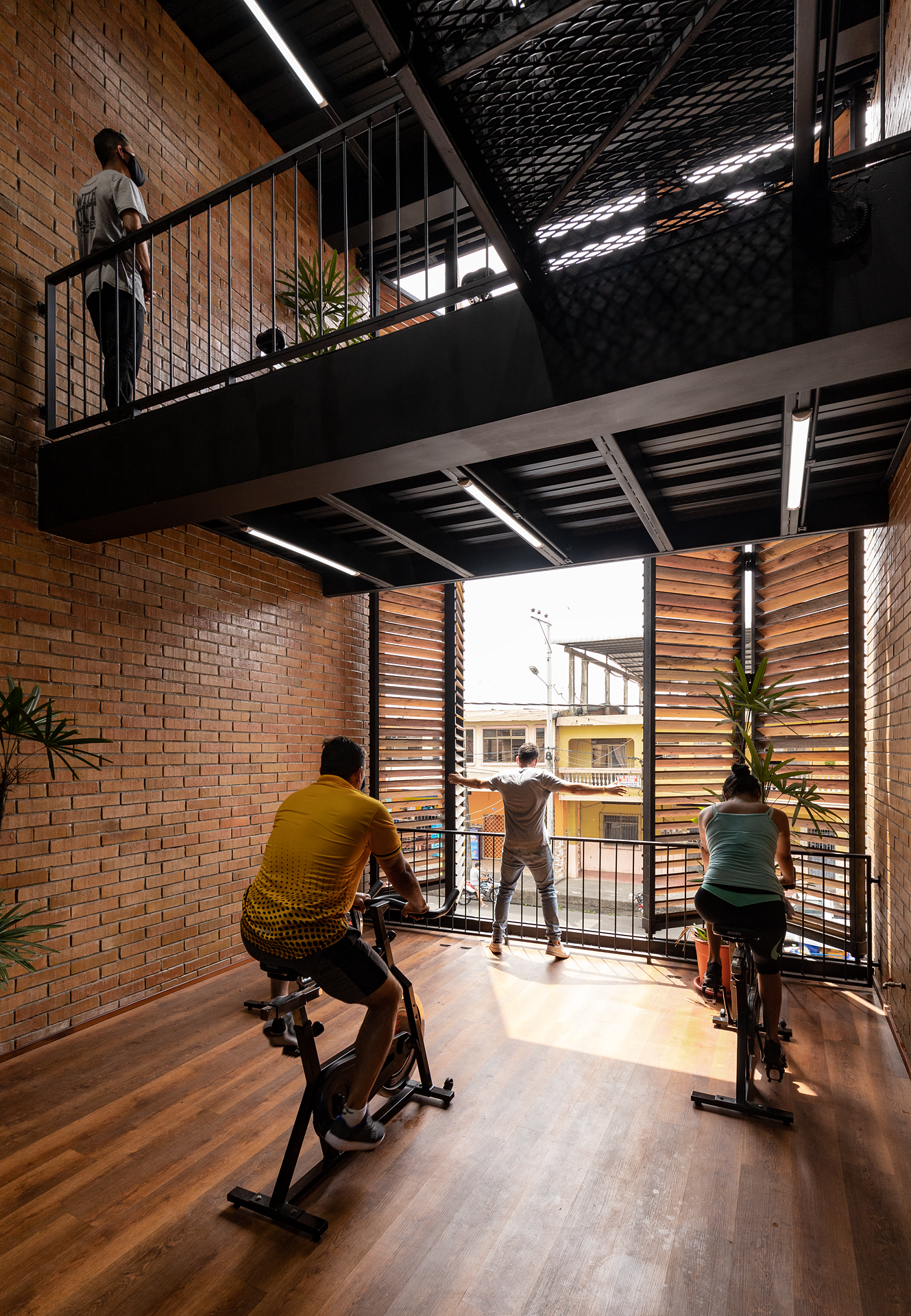
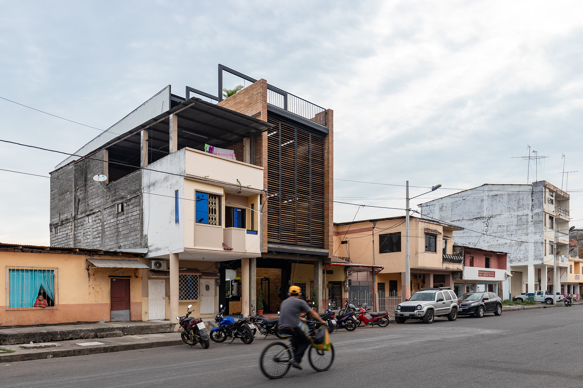
Bardales Urban Training Center
By Natura Futura Arquitectura, Babahoyo, Ecuador
Photos by JAG Studio
A couple commissioned Natura Futura Arquitectura to transform their 2-story house in Babahoyo, Ecuador into a 4-story new gym for the community. The open concept facility has both the street and backyard-facing sides left open to let generous sunlight in. But rather than add windows on those sides, the architects used pairs of 8m high retractable wooden louvers instead. The advantages of these sliding louvers are numerous: they’re relatively inexpensive, they can be adjusted to control the amount of light inside, and for the gym-goers inside, they offer ample ventilation and privacy.
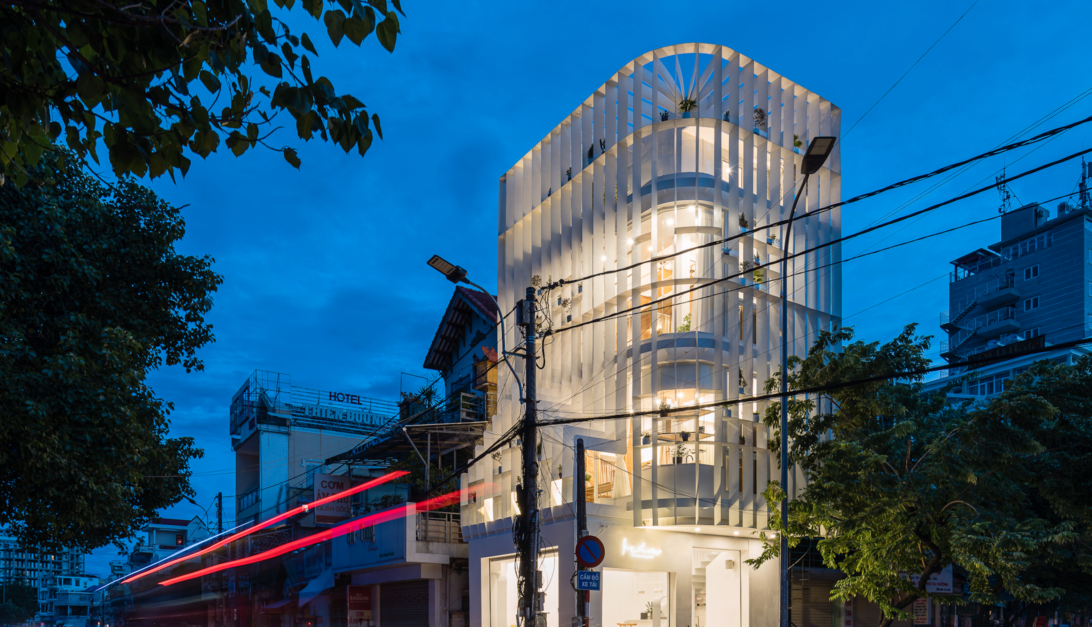
Tiam
By Nguyen Khai Architects & Associates, Hue, Vietnam
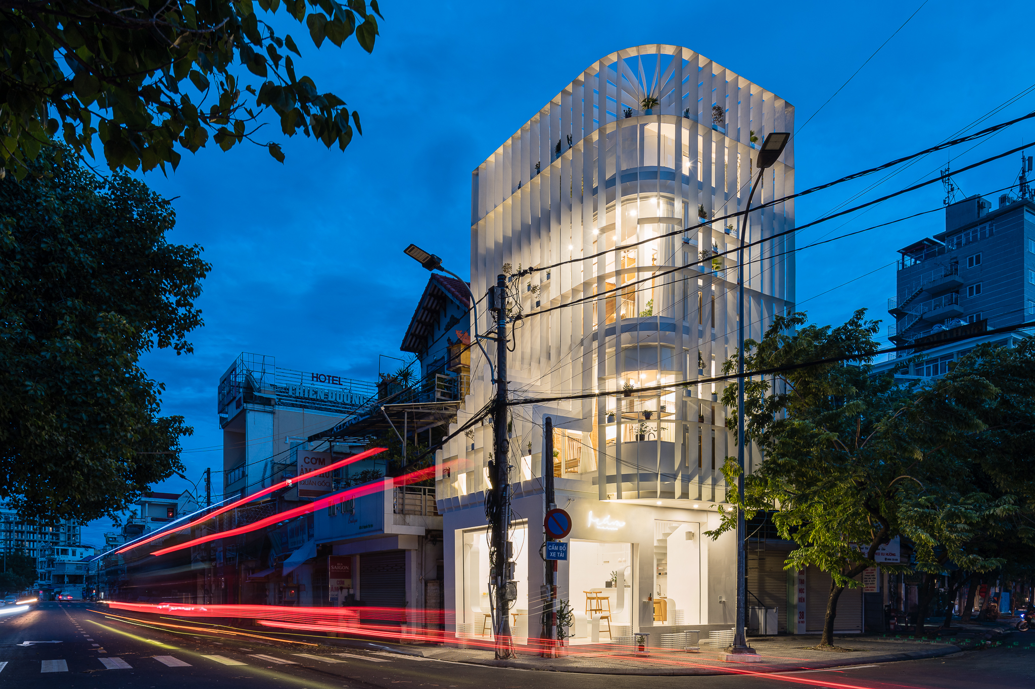
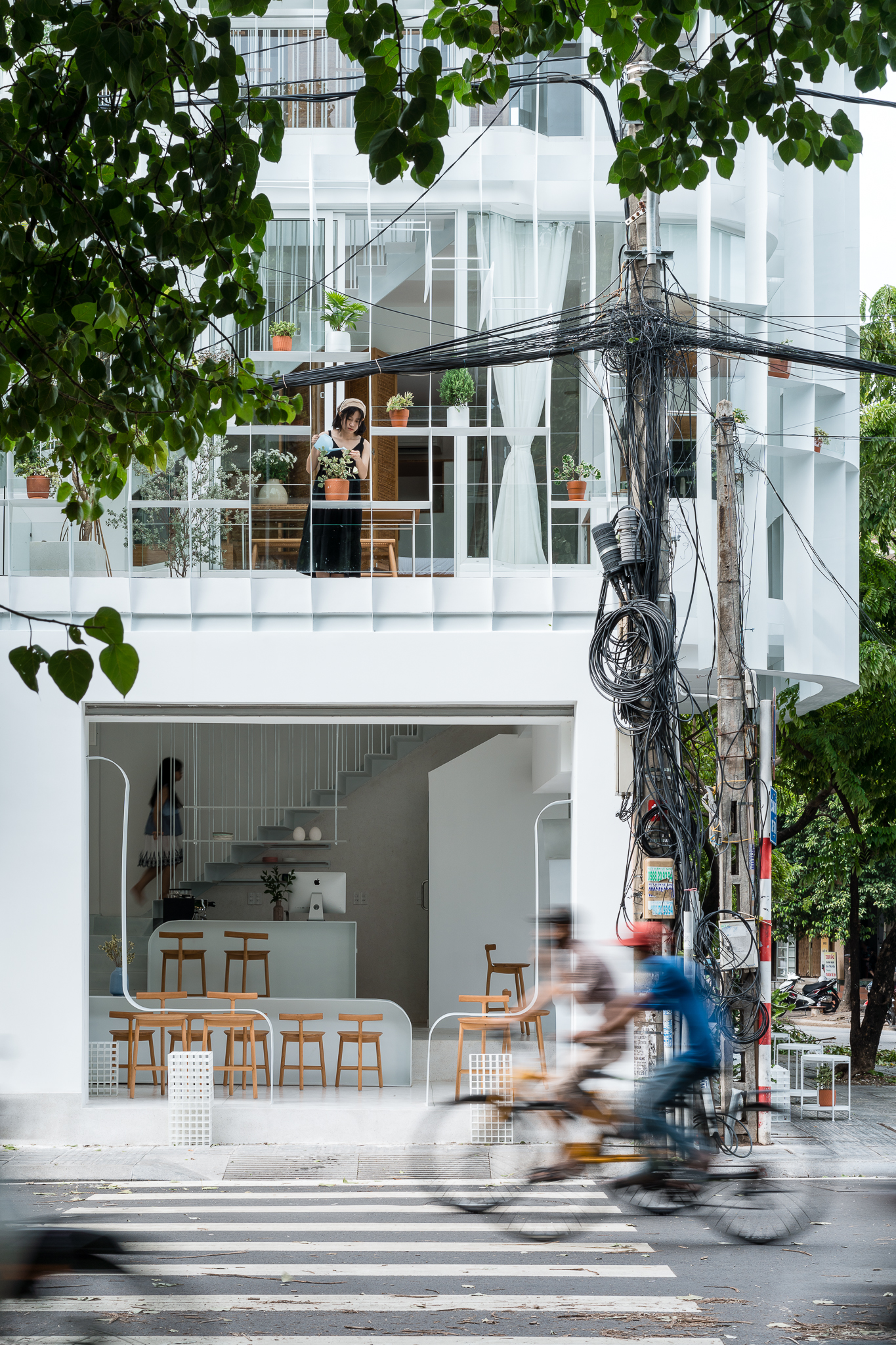
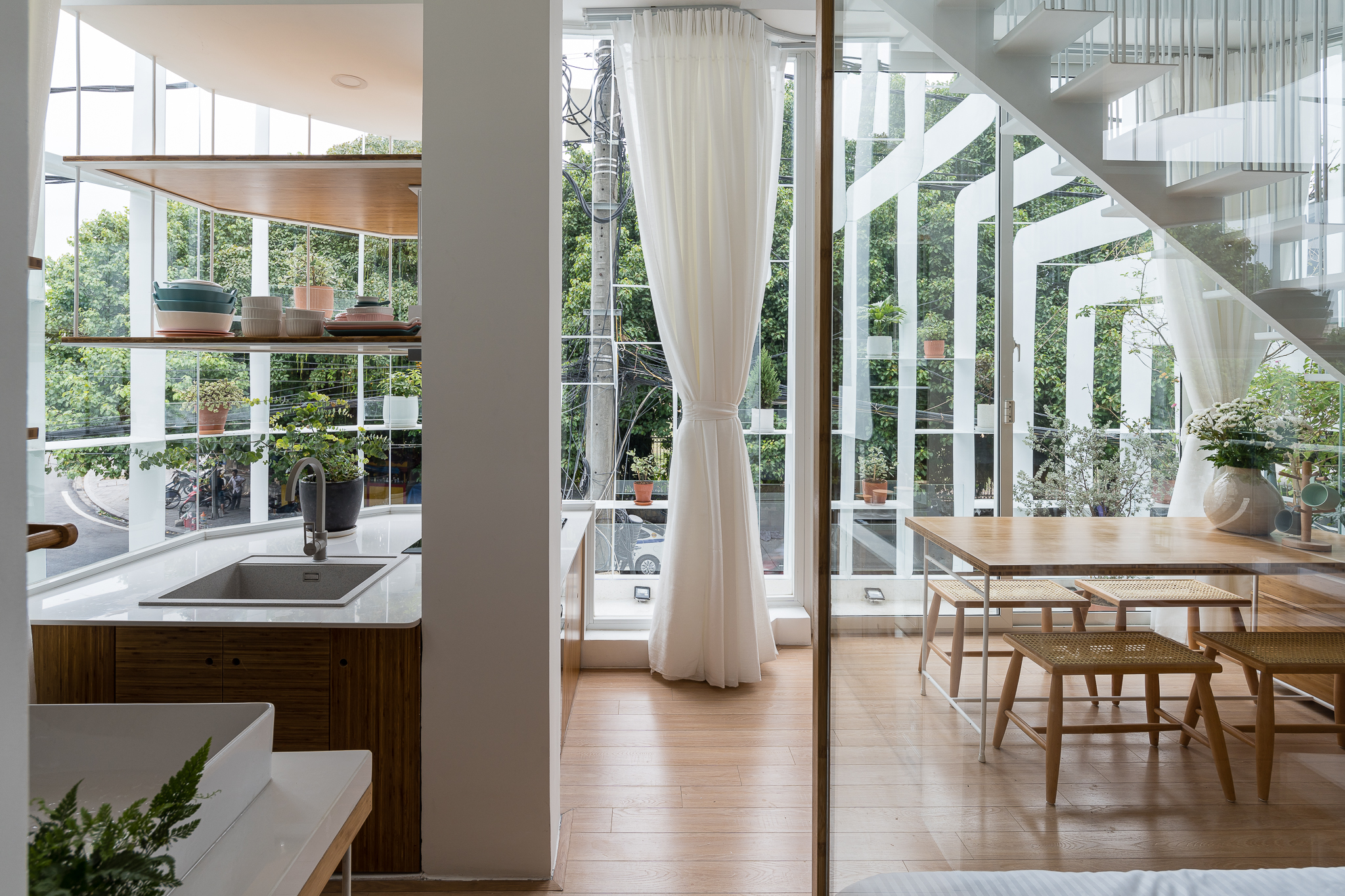 Nguyen Khai Architects & Associates renovated this 18-year-old house on a corner lot in the center of Hue, Vietnam, turning it into a bright abode for a multigenerational family with a fashionable new café on the first floor. The white vertical louvers which elegantly blanket the building from the second floor up are “like a vague partition between ‘in and out’”, the firm says, bringing closer together the people on the street and the residents inside. The louvers’ simple pattern gives the building a geometric simplicity, while occasional horizontal sections offer shelf space for small plants.
Office Complex in the heart of Athens
By A&M ARCHITECTS, Athens, Greece
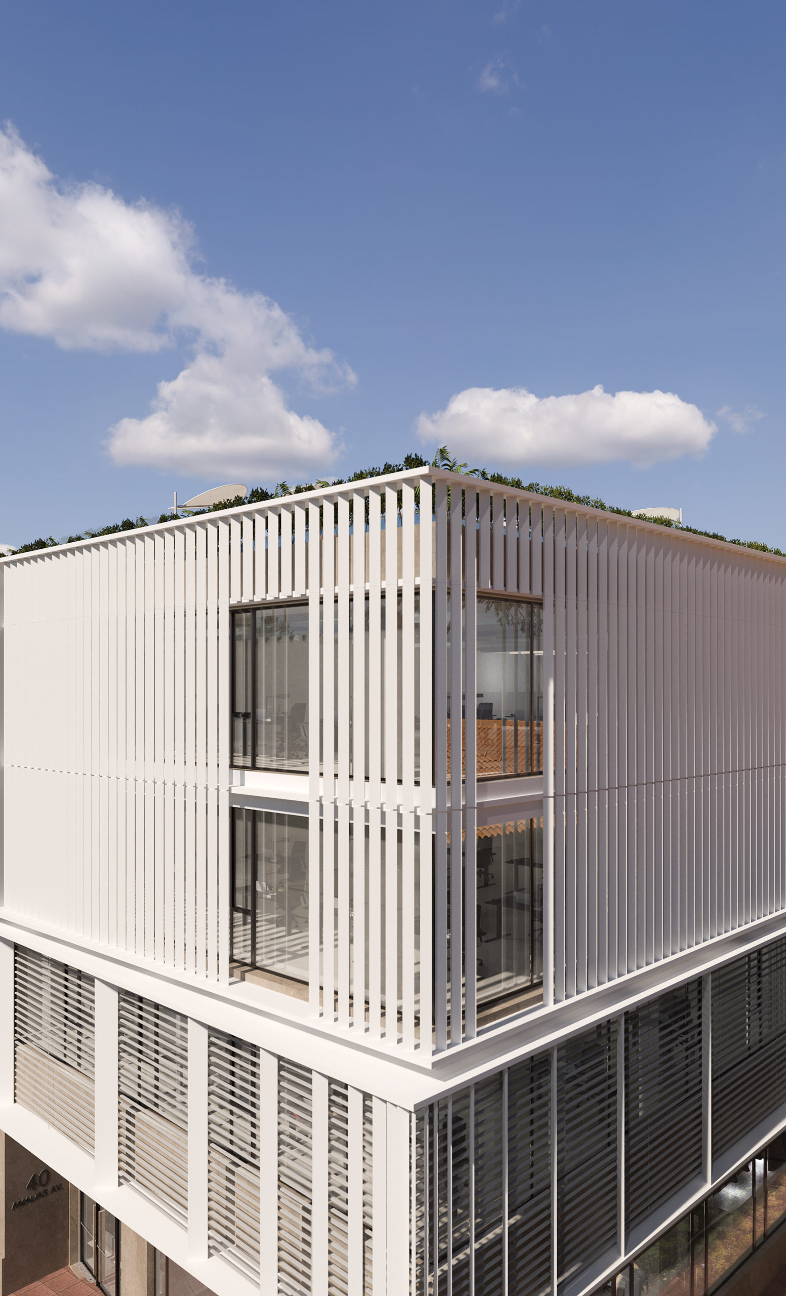
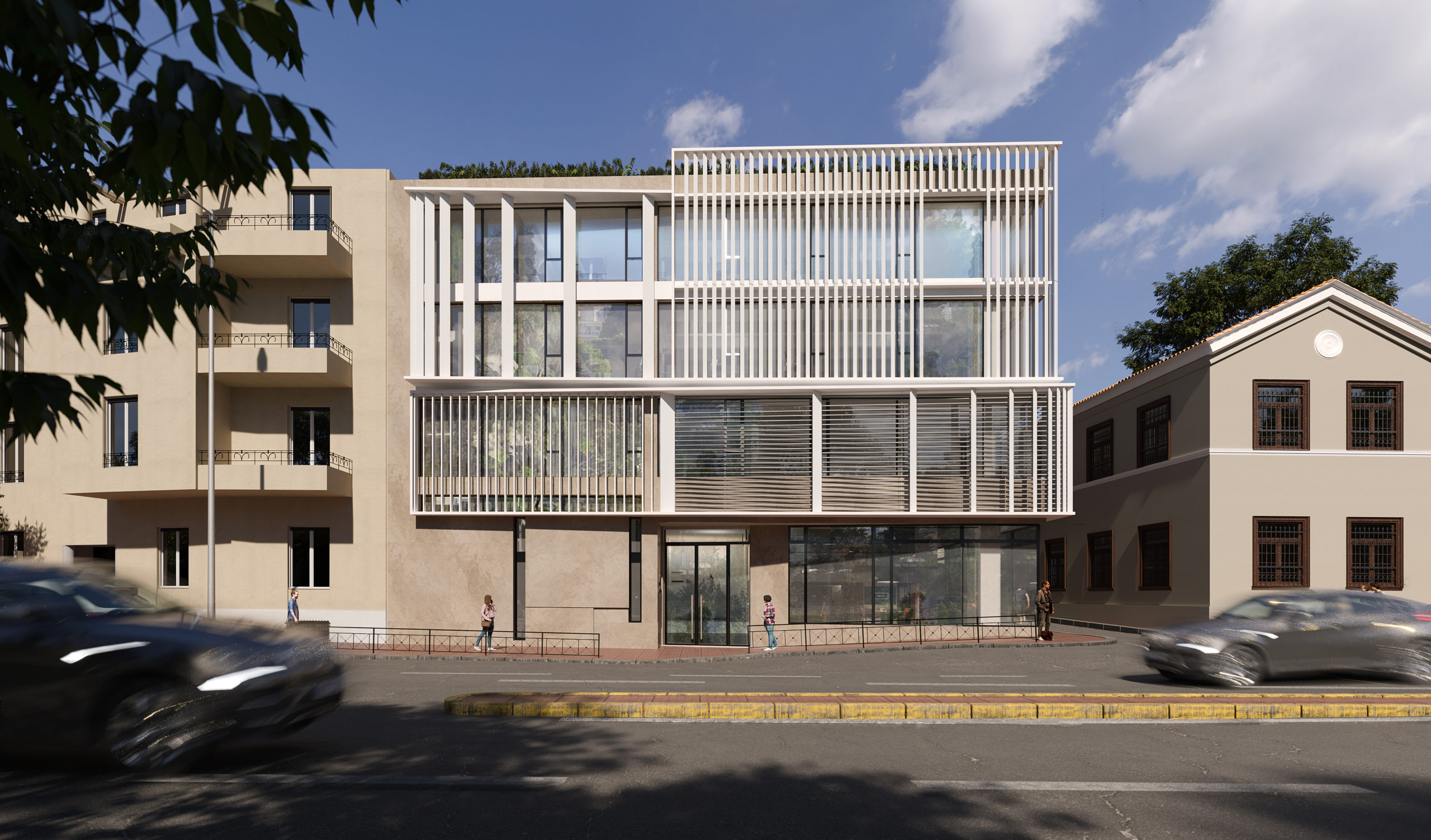 Originally built in 1977, this historical center in the heart of Athens is undergoing renovation for the addition of a contemporary façade consisting in an assortment of white louvers. Though at first glance there does not seem to be a pattern amid the horizontal and vertical louvers, they in fact follow the proportions of the golden ratio a nod to the ancient Greek monuments that first adopted it a couple millennia ago. The building nevertheless retains its modernist character from the 1970s, making the new skin an homage to the double architectural heritages of the site.
K8
By Florian Busch Architects, Kyoto, Japan
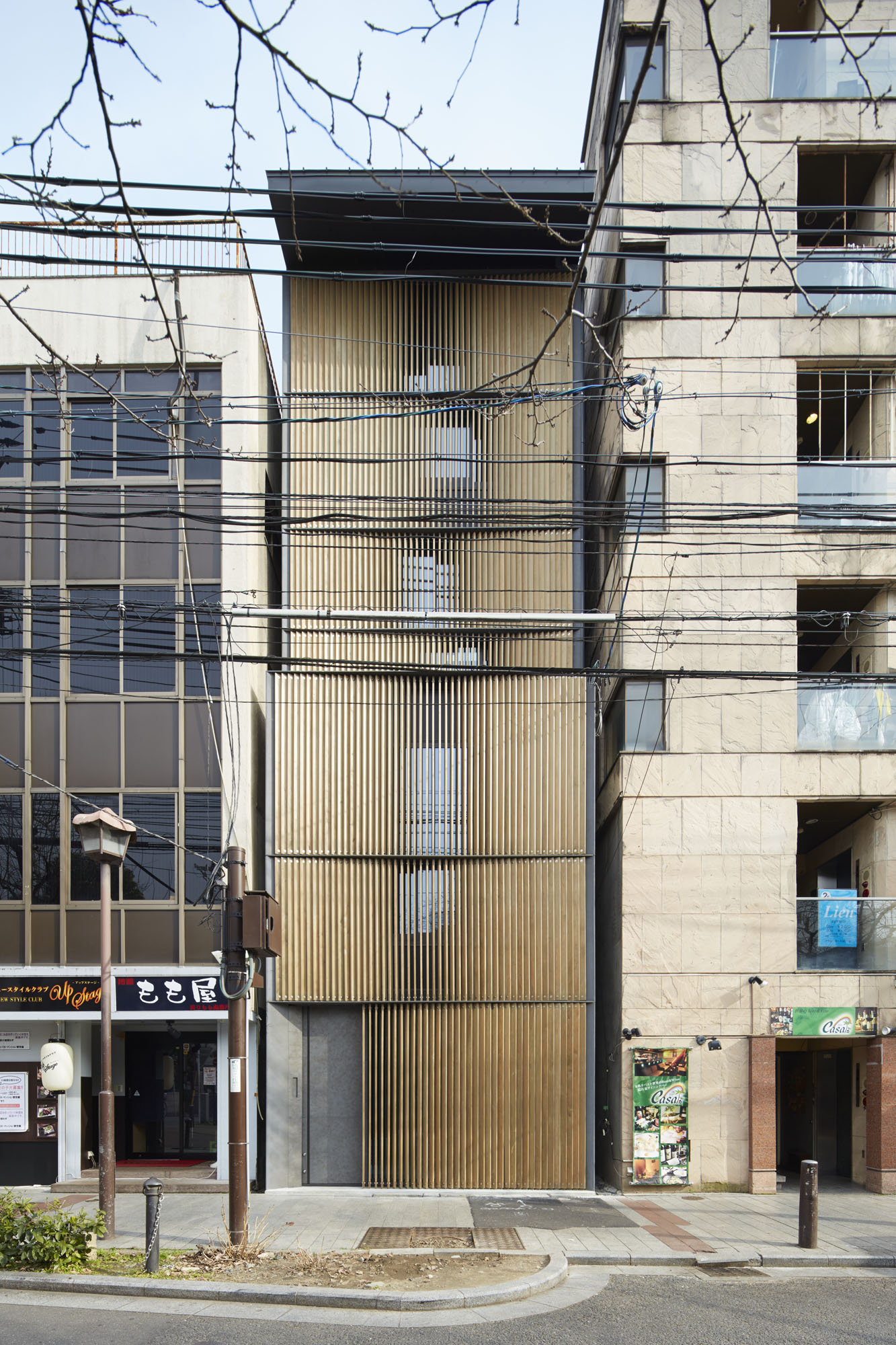
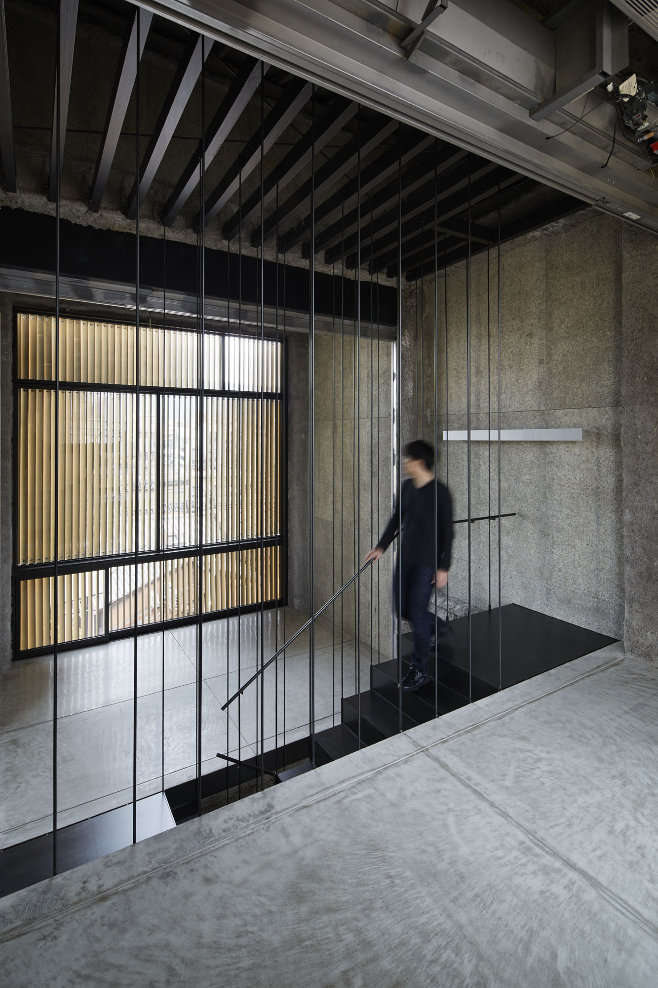 Nestled between two nondescript buildings in the heart of Kyoto’s nightlife district, this new restaurant feels mysteriously ambiguous, in no small part thanks to the wooden louvers that populate its façade. Hundreds of wood panels are gradually rotated throughout, making the façade function as what is essentially a giant louver that is opaque from some angles and nearly transparent from others. The slight variation between layers of louvers makes for a uniquely fluid interplay between shadows and transparency — a fluidity that becomes dynamic for people looking at the building as they walk past.
The linen gallery in Zhejiang
By uchida shanghai, Zhejiang, China
Photos by luz images
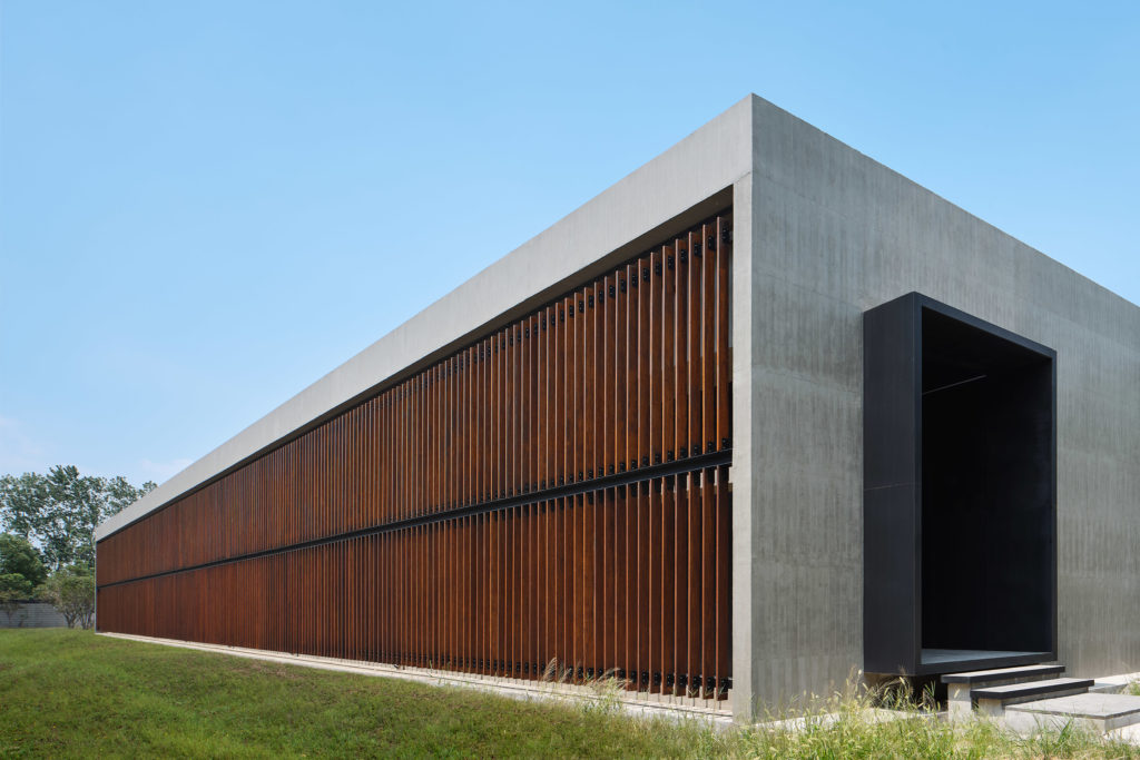
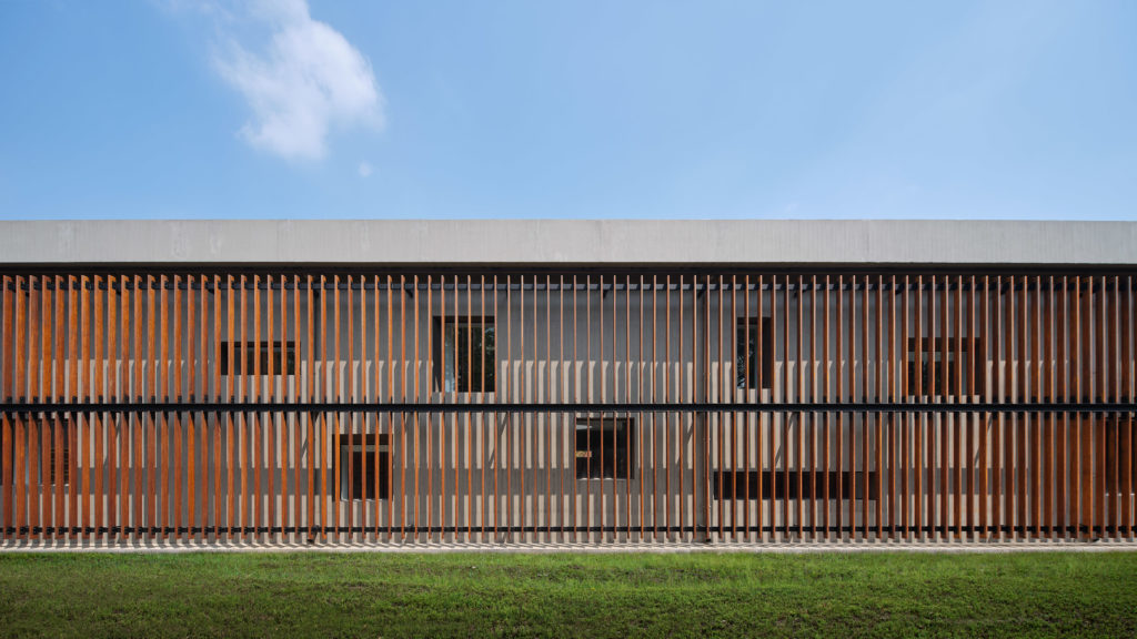
This renovated project by uchida shanghai transformed a former linen factory into a contemporary gallery exhibiting the fabric. The minimalist, rectangular design of the new gallery made in wood-cast concrete is enlivened on the rear-side by a double-skin façade made of compressed bamboo louvers. These louvers mask a series of randomly assorted windows, leading to a variety of shading and lighting combinations inside the gallery throughout the day.
Future Art Lab of the Vienna University of Music and Performing Arts
By Pichler & Traupmann Architekten ZT GmbH, Vienna, Austria
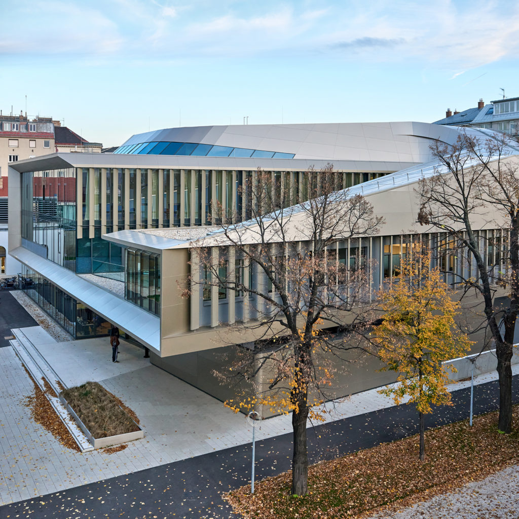
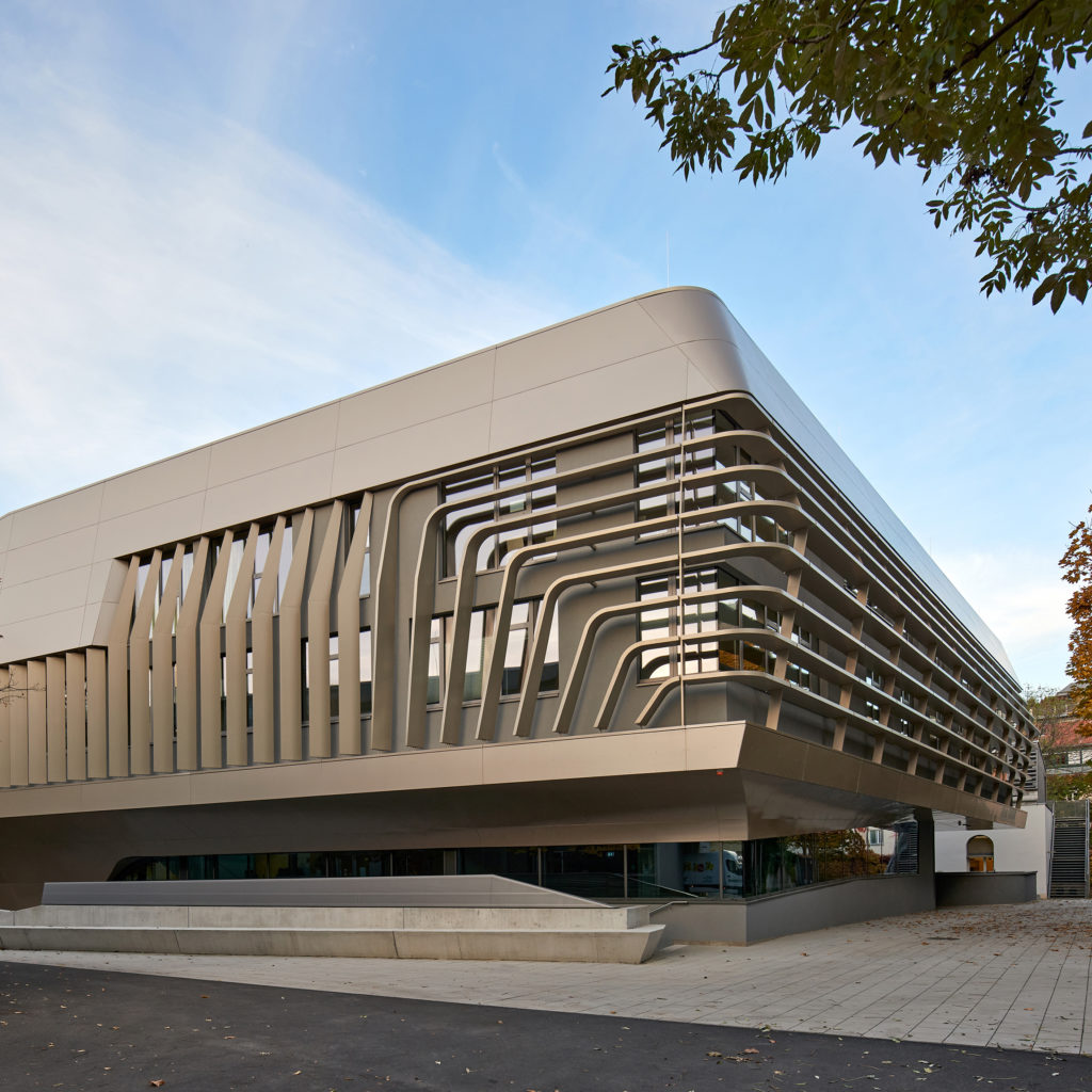 This performing arts building located in central Vienna is a grand new artistic landmark for the city. However, the building’s large size amplifies some issues, including the need to reduce sunlight entering from the large with multi-story windows. Pichler & Traupmann Architekten ZT GmbH’s solution is a collection of broad, vertical louvers that shield the large windows around the building. On some corners, the louvers twist into a horizontal orientation, providing a variety of textures for the architectural motif.
Freebooter
By GG-loop, Amsterdam, Netherlands
Photos by Francisco Nogueira / Architectural Photography and Michael Sieber
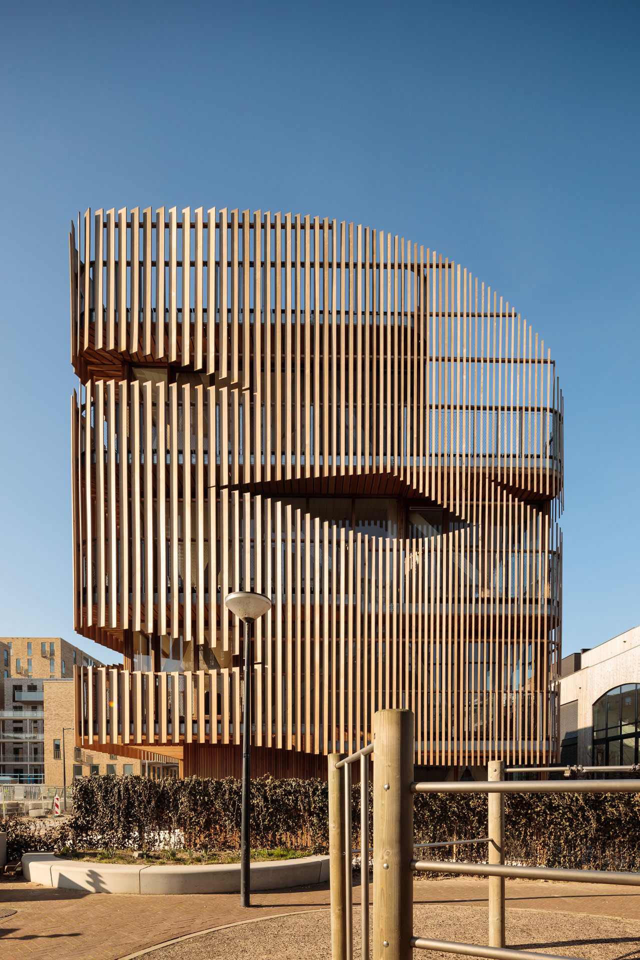
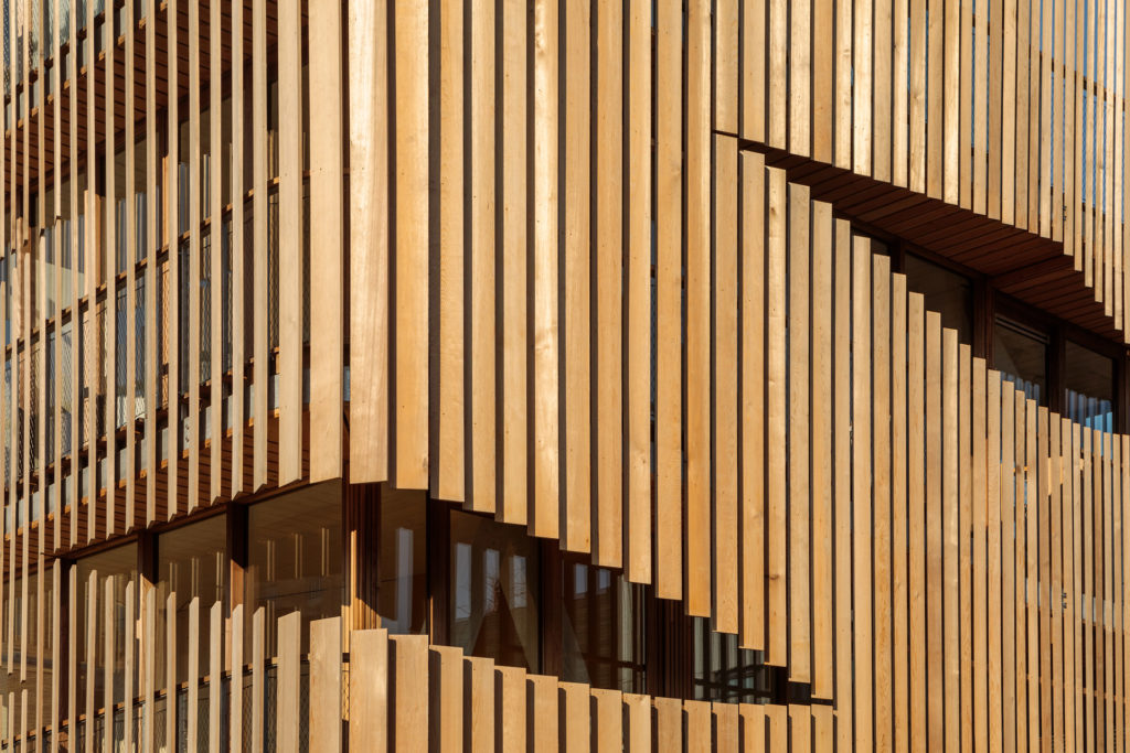
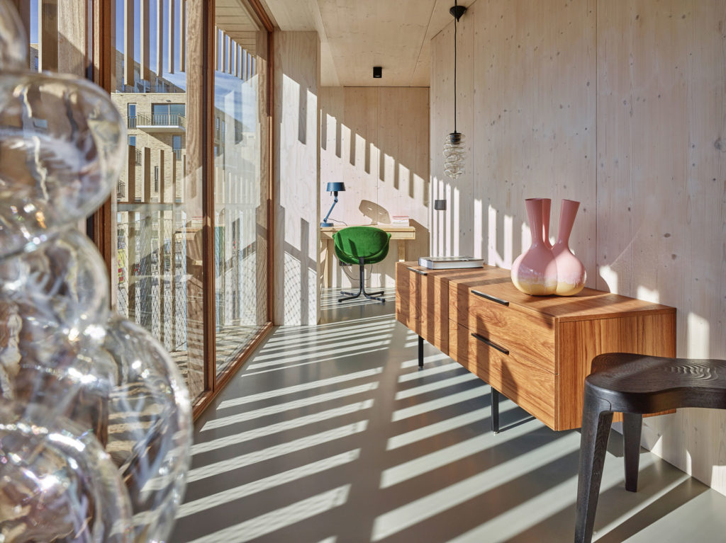
This residential complex in Amsterdam boasts an impressive louvered exterior made from hundreds of angled wooden slats. However, the gradual orientation of the louvers was not made with merely aesthetic intentions. In fact, the architects GG-loop studied the movement of the sun year-round to angle the louvers for an optimal level of sunlight and privacy inside at all times. But there’s still some degree of artistic whimsy in the façade, with occasional ruptures in the vertical pattern to keeping things interesting.
The judging process for Architizer's 14th A+Awards is now underway. Subscribe to our Awards Newsletter to receive updates about Public Voting, and stay tuned — winners will be announced later this spring.
