Architizer’s newest print publication is available for pre-order! How to Visualize Architecture is an educational guide designed to help you master the craft of architectural storytelling and visual communication. Secure your copy today.
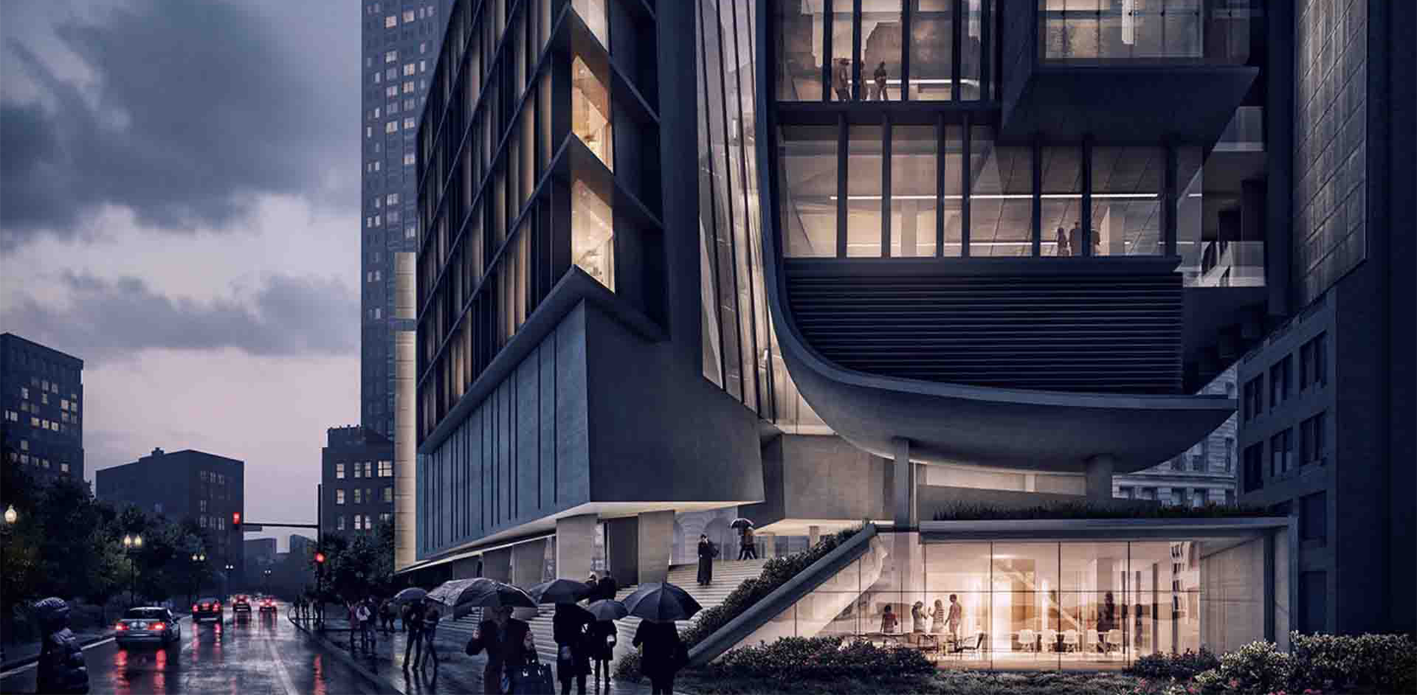
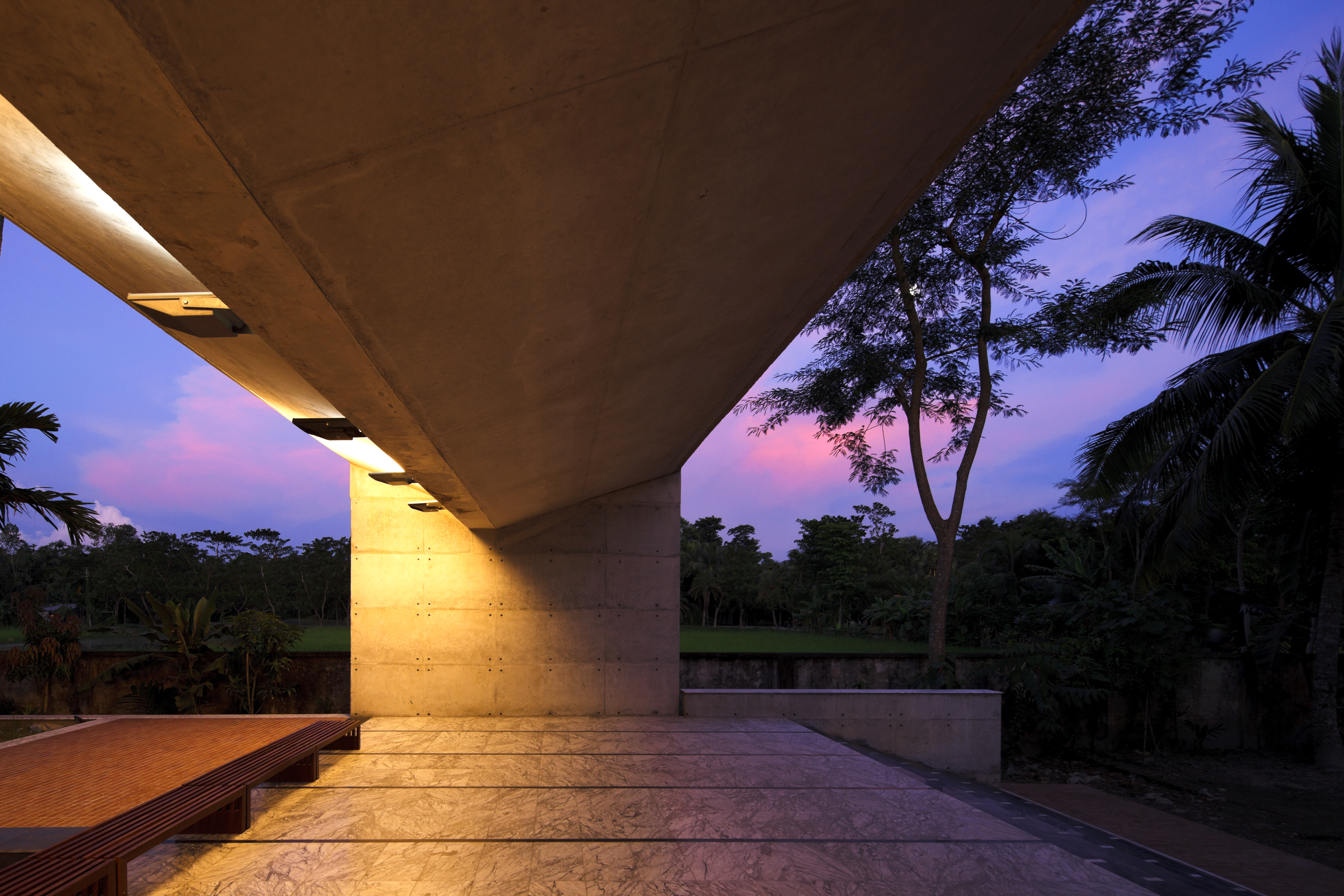
Let’s face it: Creating great renderings is hard. The process can be time consuming, tedious and expensive, and it’s easy to become overwhelmed by the countless amount of components that go into producing a quality rendering. However, they’re an essential means of communicating the fine details, ideas and qualities of an architectural project. When produced well, renderings can powerfully showcase the experience of inhabiting a certain space and convey the character of a project.
Those are the kinds of renderings we want to see from you in Architizer’s One Rendering Challenge, a global ideas competition with a simple brief: Tell a powerful story about architecture with a single rendering. For those interested in entering this year, we’ve put together some handy tips from the experts in this field. There’s no one way to craft a great rendering, so how you choose to integrate these tips into your workflow is totally up to you.
1. Master Surface Reflectivity
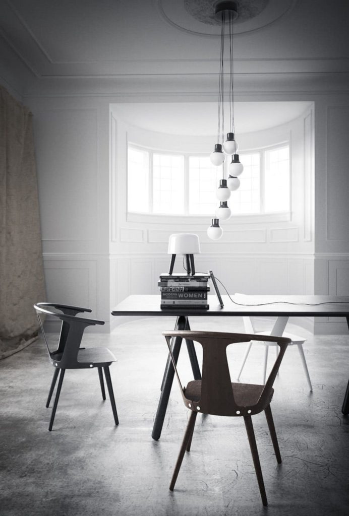
You should aim to get your models as accurate as possible, meaning a high and consistent level of fine detailing should be present throughout the rendering. A major component to this is surface reflectivity, which is crucial in developing a photorealistic model. In order to better inform yourself before tackling this element of a rendering try studying real-world materials along with researching reflection values on various rendering platforms.
As Lasse Rode of Berlin-based studio xoio explains: “The real world is a highly reflective place! Pure diffuse is pretty hard to come by actually, whereas in the CG world, it is very easy to diffuse your scenes to death. Most things reflect light in a certain way, and the biggest difference is related to the surface glossiness. Considering this — all of your materials should have some level of reflection and have maps assigned to their glossiness and reflection slots. Don’t be lazy on this one. It can have a great impact on the final look.”
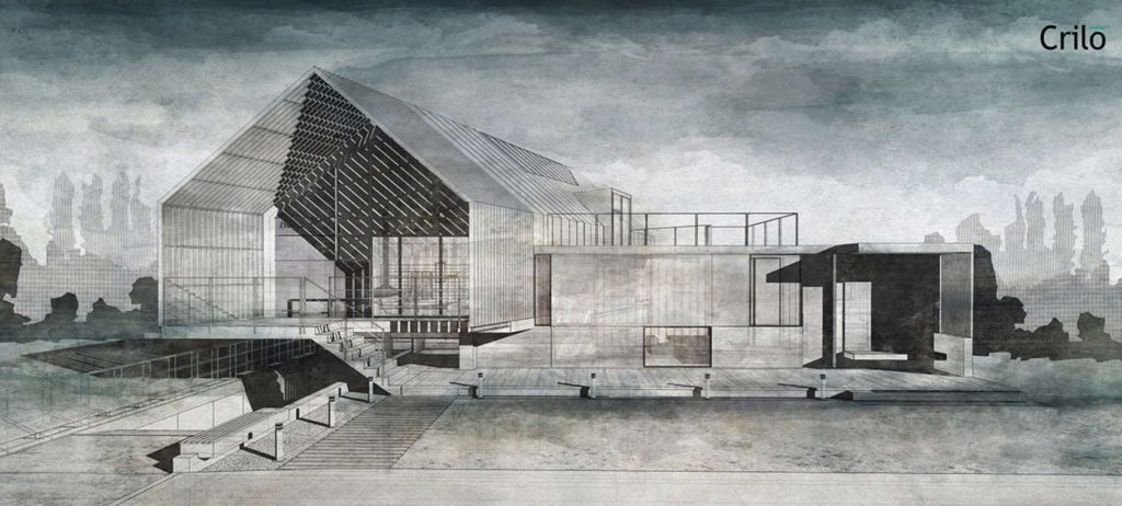
2. Explore Non-Photorealistic Styles
When it comes to architectural visualization, more stylized and illustrative approaches can also be taken, combining traditional art approaches and digital applications. Watercolor, for example, is a popular visualization technique that can compliment architectural software by yielding more expressive details and qualities of a project.
After developing a model with a sufficient level of detail, export and open in CAD in order to generate a good wireframe for use as a basic drawing. From there, utilize the application’s hatches and lines to accentuate areas of the drawing, especially strong black hatches for the landscape and shadows. This will result in a good basis for watercoloring in Photoshop.
Atelier Crilo goes into further detail in this piece on watercolor visualization: “On the drawing with the shadows, you can finally paint with watercolor brushes. You can find all kinds of brushes on the web, such as here on BrushKing, this link or in this collection, or you can even create your own from scratch.”
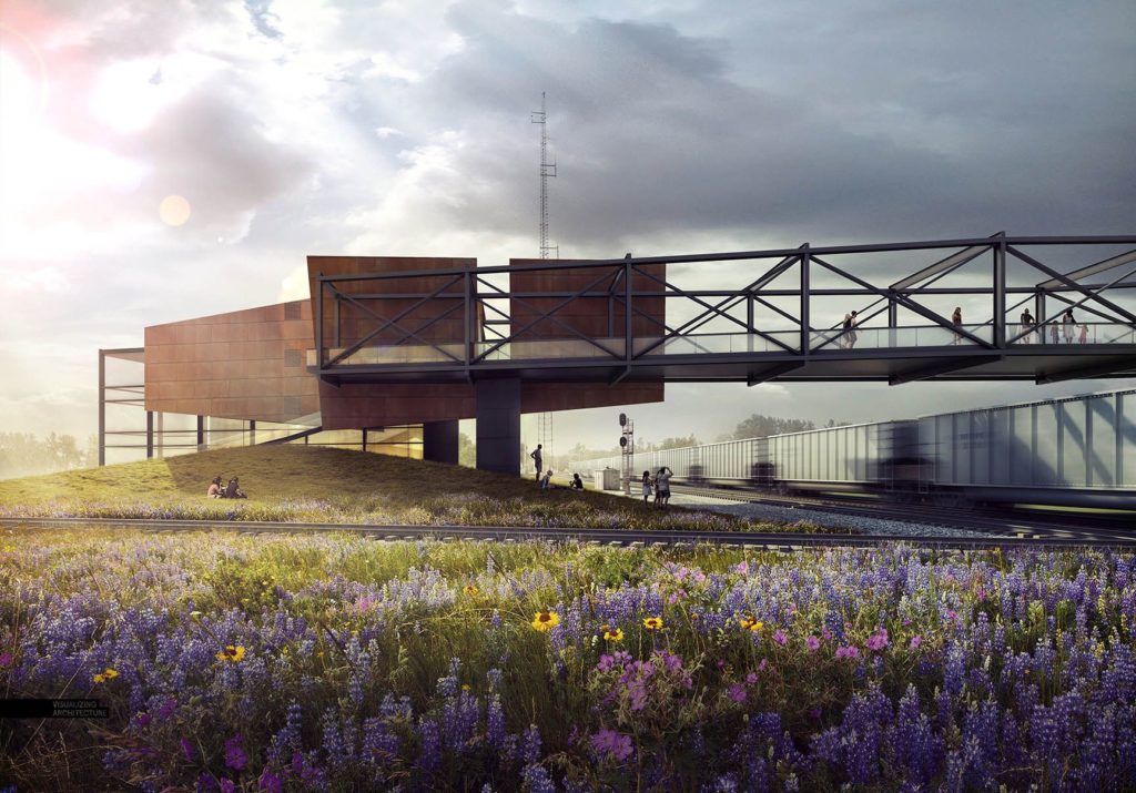
3. Make Your Backdrop Believable
A rendering’s backdrop, such as a sky, can make or break an architectural illustration. The backdrop sets the entire mood and tone of an image, which is why developing the perfect backdrop should be a top priority. Here are some guidelines to consider: avoid oversaturated color, avoid awkward or unnatural colors, minimize overly busy skies, consider sunlight direction, look for the correct perspective, and don’t be afraid to go simple.
In reference to a finalized sky illustration for an architectural rendering, Alex Hogrefe states: “I found a sky with no clouds and great color and then combined that with a cloudy sky. By adjusting the opacity of the cloudy sky, I was able to zero in on a good balance of color and softness. Once I had the sky, I amplified the warm and cool tones using color overlays and added more shadow at the base of the image.
“All these moves help to start the viewer’s eye on the left side of the image and slowly move it to the right over the bridge and to the train on the right, mimicking the path pedestrians take. In this way, I am using the light started by the sky to help tell the story of the project.”
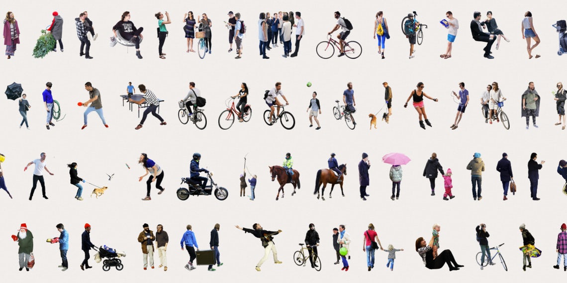
4. Save Time Searching for Textures and Cutouts
When tackling renderings it is essential to be as efficient as possible with your time. Searching the web for specific textures or cutouts can be tedious and take up a lot of time. Therefore, any way to save time at this stage is crucial to completing tasks in a timely and streamlined manner. There are many free resources online containing tons of items for renderings.
Hogrefe has compiled a list of sites that offer smart labeling and clear categorizing, making finding specific items effortless. The include libraries of high-resolution people in unique situations and positions along with comprehensive assemblages of textures.
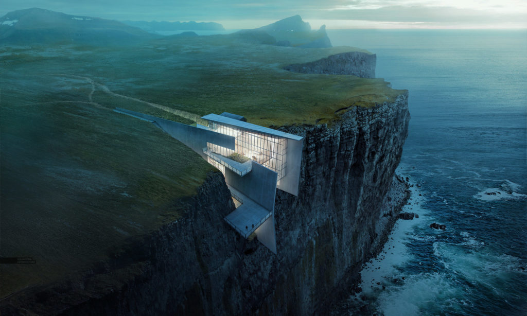
For the atmospheric Cliff Retreat, Alex Hogrefe pieced together photographs of real landscapes in Iceland.
5. Blend Visualizations With Photos
You can achieve beautiful illustrations without the use of 3D-intensive scenes and long rendering times. Blending images into simpler models, such as SketchUp, can allow for more efficient workflows. Through Photoshop you can easily tweak textures, lighting, and adjust the atmosphere and tone of your rendering.
Hogrefe, who creates breathtaking renderings by integrating real-life through Photoshop, states: “A Photoshop-heavy workflow gives us the advantage of filling in broad swaths of information quickly. It also allows us to make changes quickly since, in many cases, the projects are being developed as we create the images. Trying to keep up with these changes in 3D would be nearly impossible for us. With that said, if a project is fully developed and finalized, we will invest the time to build more detailed models.”
6. Create Realistic Textures
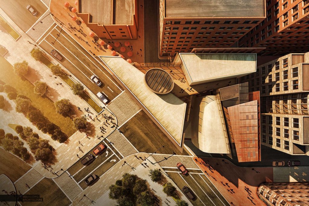
Texturing has the power of bringing more of a human touch to a model, a more realistic quality that tells more of a project’s story. For example, strong textures can display imperfections, which reflect a site’s age. When starting with a base rendering containing textures with no flaws, you can shift to 2D post processing, such as Photoshop, in order to edit faster. Then you can use real images to apply further textures to your illustration in Photoshop. Real images will have natural amounts of age and imperfections that you can easily overlay.
Hogrefe again shares his expertise here: “It’s elements like roads and rooftops — which I often see people ignoring in their illustrations — that I have come to realize make a big difference in giving an image that human touch. Building in these little imperfections start to trick the eye into thinking this is not a computer-generated image.”
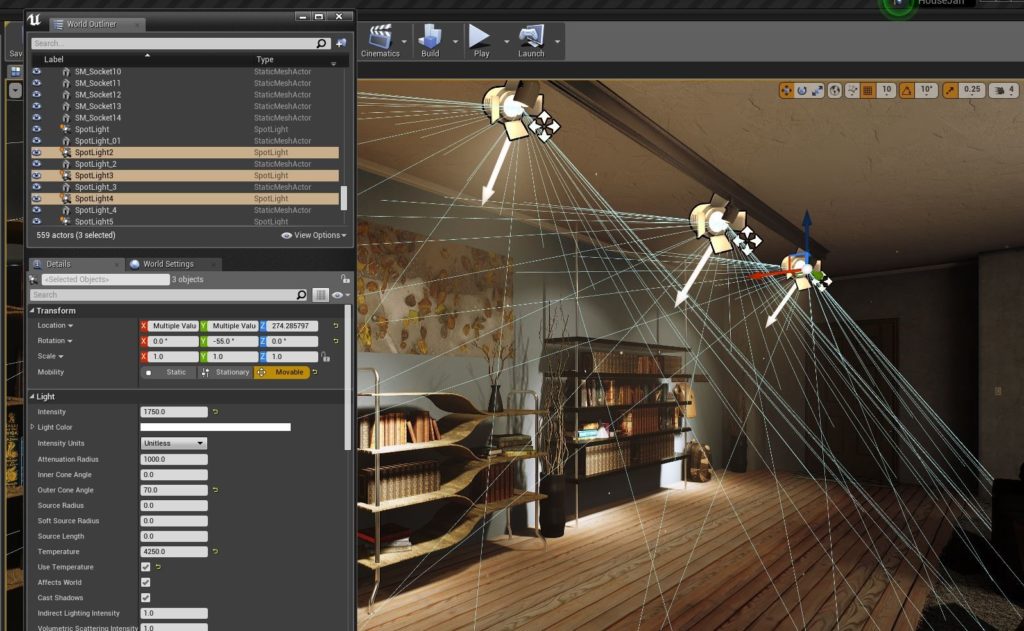
Unreal Engine’s Interface
7. Get Your Lighting Right
Light settings are difficult to perfect. They’re usually approximated to produce the best looking scene instead of accurately reflecting the true light characteristics of a space. Light settings are also process heavy, consuming a lot of graphic memory and time to render. However, software such as Unreal Engine can be used to quickly test lighting fixtures and properties in a variety of project types. It gives both designers and clients the power to visualize spaces and simulate multiple lighting options.
Here’s an excerpt from VIA Technik’s guide to creating realistic lighting in your architectural visualizations: “To bring out more of Unreal’s superpower lighting design capabilities, we import IES Light Profiles to the program, which are usually provided for free by light fixture manufacturers like Phillips, Osram, or Erco…The great thing is that with these files, you can virtually test and compare actual lighting products in ongoing projects to better understand their effects on the space.”
Architizer’s newest print publication is available for pre-order! How to Visualize Architecture is an educational guide designed to help you master the craft of architectural storytelling and visual communication. Secure your copy today.
