Architizer’s newest print publication is available for pre-order! How to Visualize Architecture is an educational guide designed to help you master the craft of architectural storytelling and visual communication. Secure your copy today.
It’s the eternal debate: open office or cubicle? As workplace trends continue to evolve, architects are designing new offices that reflect the changing conditions of labor, remote work and culture. These are underpinned by a desire to create amenity spaces and programs that blur the boundary between home and office. Companies around the world are continuously looking at how architecture shapes our work, from branded environments and social spaces to focus zones and collaborative team areas. From open floor plans to leafy lounge areas and hot desks, the following projects show the diverse ways in which designers are imagining the office of today:
 Wieden+Kennedy by WORKac, Manhattan, New York, NY, United States
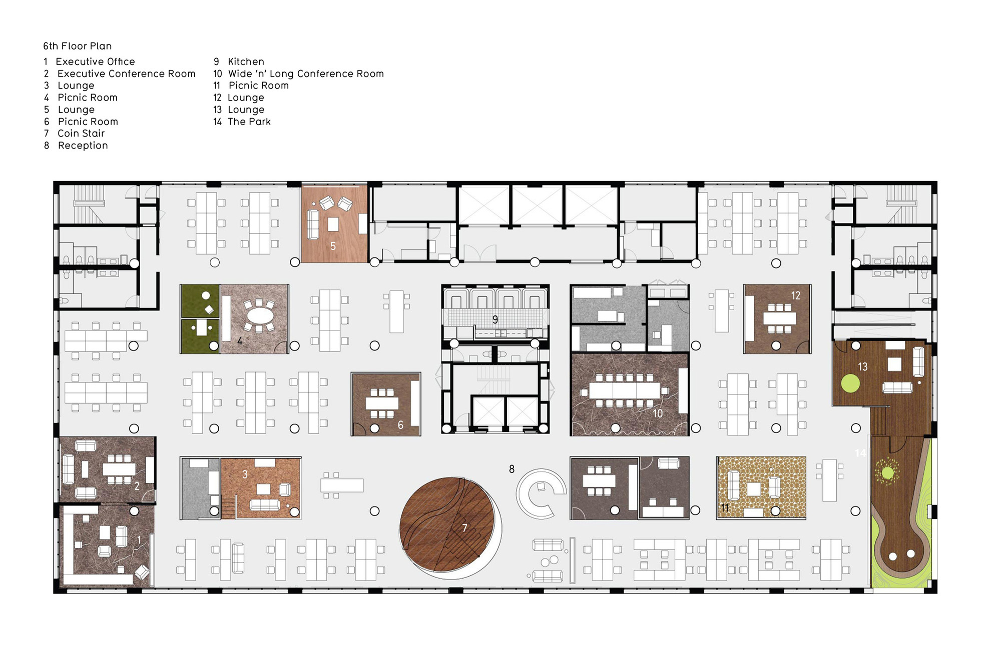
Placing “work” back at the heart of creative work, WORKac’s New York office for the advertising agency Wieden+Kennedy was designed to challenge the fad of the office-as-playground. As the team states, the company’s collaborative workflow allowed for increased density, with individual spaces shrinking in order to maximize the collective spaces. The design focused on creating a range of typologies of collaborative places for meetings of different sizes and durations, from tables for stand-up meetings to “phone booth” meeting rooms, to traditional conference rooms, to several larger collective spaces that involved carving the building in various ways.
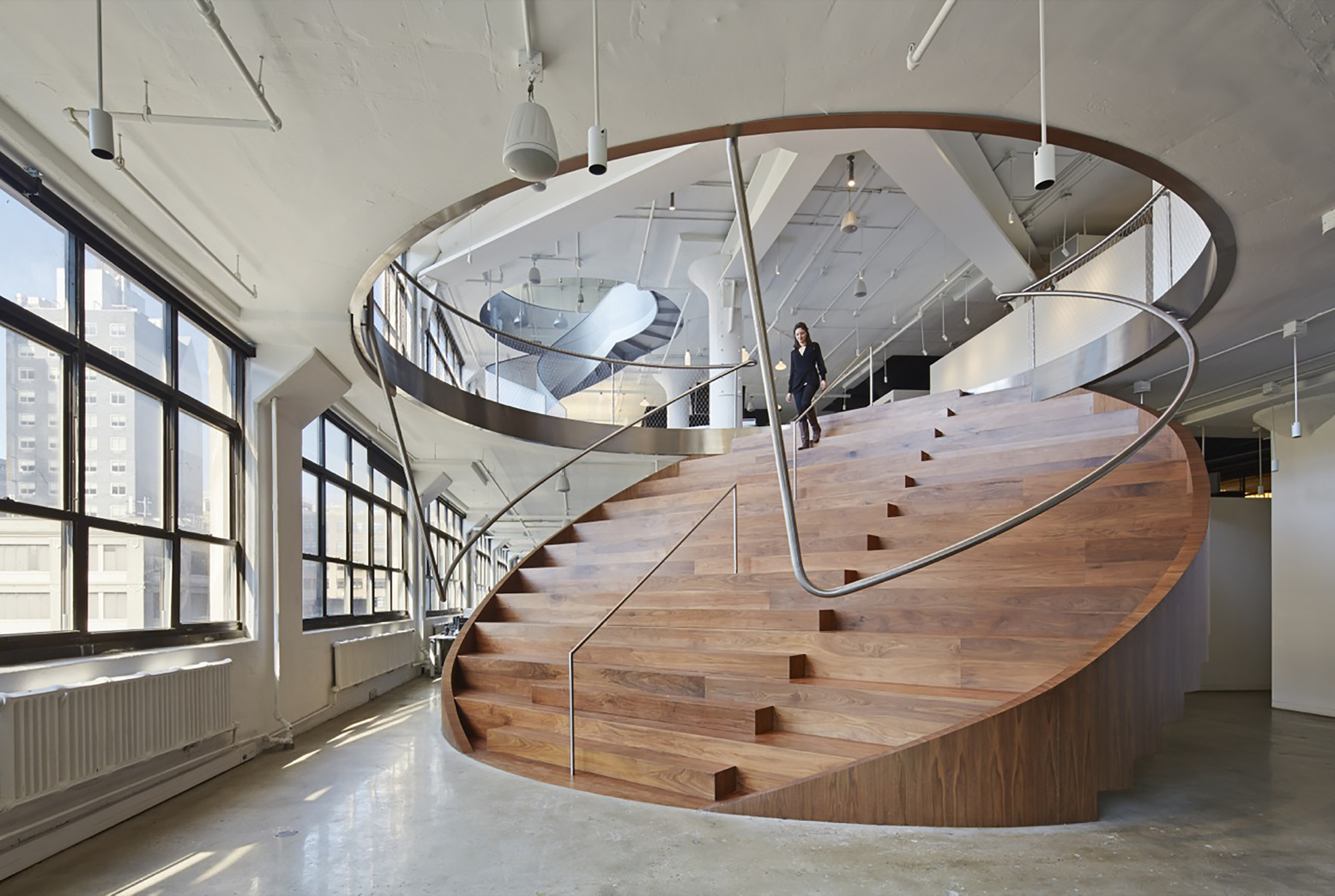
As the centerpiece of the office plan, a circular “coin stair” doubles as bleacher seating and cuts between the sixth and seventh floors. Nearby, another cut, with a perforated metal spiral staircase, connects the seventh-floor bar to the eighth-floor library. In addition, a double height courtyard creates an outdoor garden by moving the façade one bay within the building, marking the office and its program from the exterior façade.
 Hybrid Office by Edward Ogosta Architecture, Los Angeles, CA, United States
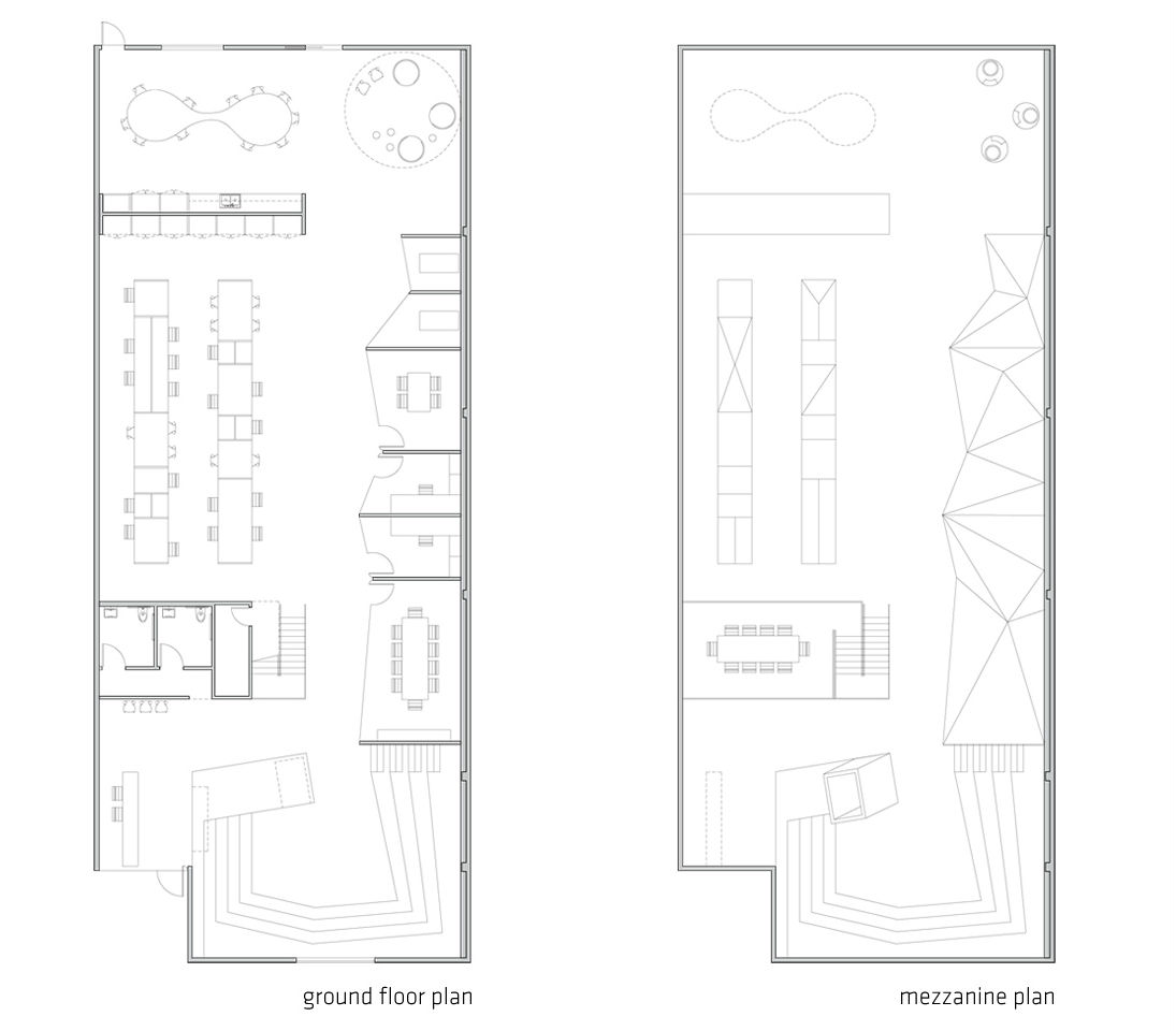
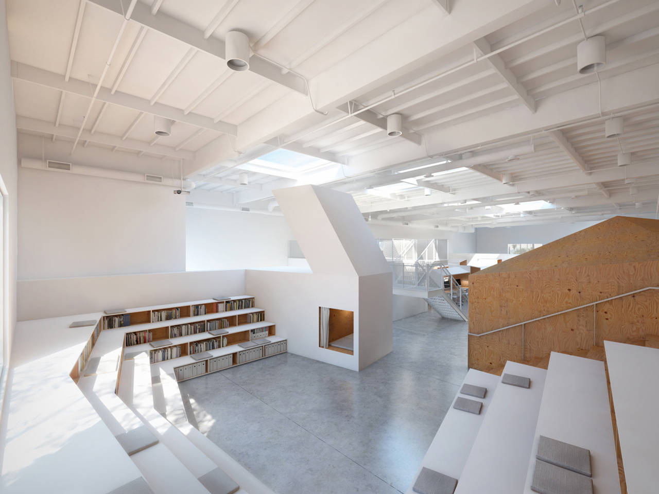
Ed Ogosta designed the Hybrid Office for a creative media agency of thirty workers. As he states, the office design contains “a menagerie of typological hybrids, which together engender a unique interior world.” Exploring the relationship between architecture and furniture, a series of hybrid-objects are designed throughout the space that reference nature and the surrounding city. Through abstraction, the objects are given a new iconographic presence, and collectively, they are made to foster a spirit of creativity.
An existing 6,000 square foot tilt-up concrete warehouse provided the container into which the hybrids were deployed. Each hybrid synthesizes essential traits from two “parents” of differing typologies; for example, a set of bookshelves combined with the stepped form of an arena results in the book-arena, which doubly functions as storage and seating for office-wide meetings. Other hybrids include the tree-chair, mountain-offices, house-table, and cave-bed. Each is constructed from simple veneered plywood and white painted fiberboard. In turn, a variety of micro-scaled individual spaces and group-sized collective spaces are available to workers throughout.
 Hechingen Studio by Whitaker Studio, Hechingen, Germany
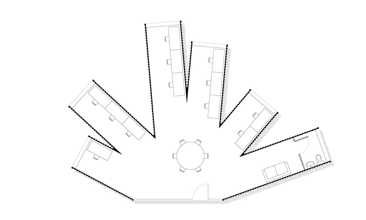
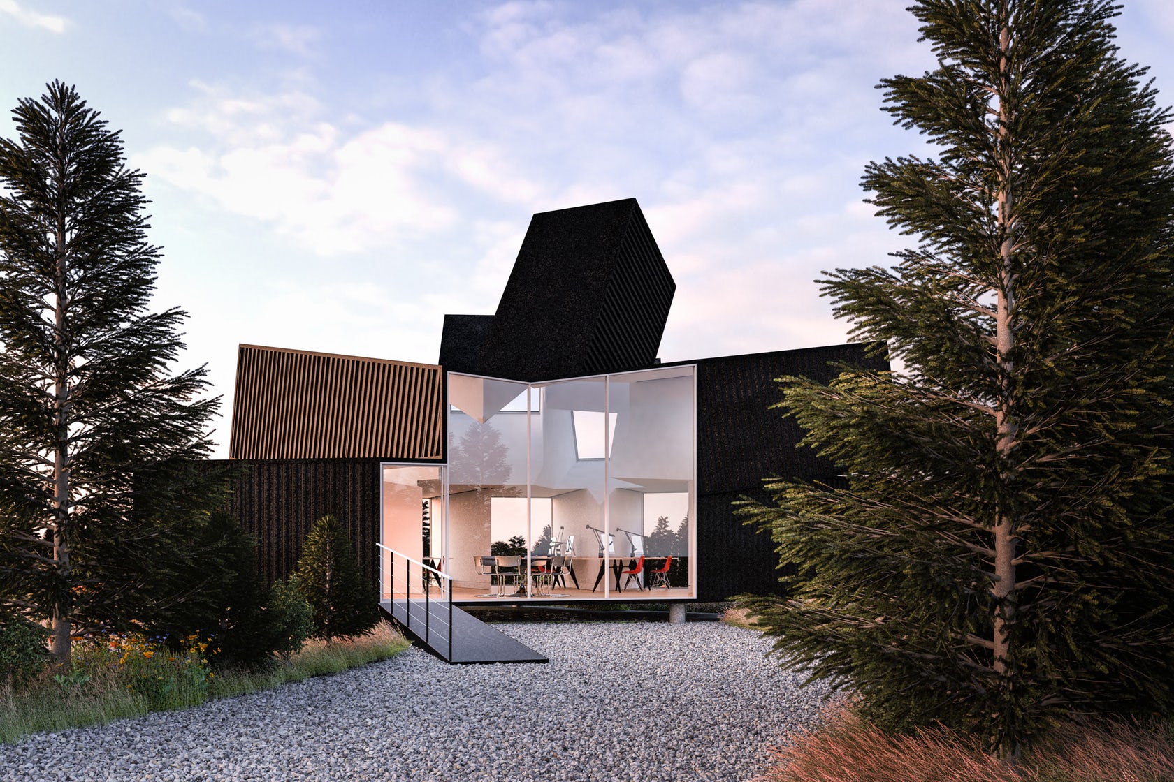
Designed for a German advertising agency, this low-cost workplace was first envisioned as a project in the Black Forest. The client was keen to use shipping containers to keep costs low and needed a small office that would encourage the growth of their company. Taking inspiration from crystal growth and the soaring towers of Hechingen Castle, 11 containers were arranged in a radial form. The upper containers trace the sun’s path through the sky while the lower containers provide an array of quiet working spaces that all open onto the central heart of the office.
As the project developed, the green field site became one of many possible location for deploying the shipping container office. Independent of the location, the design was created to reutilize existing containers already in production, and the project was made to be realized through a series of metal fabrications. After fabrication, the modules would be transported to site where they would be bolted together. The final project would sit on top of concrete columns rising from the foundations.
 Pinterest HQ by IwamotoScott Architecture, San Francisco, CA, United States
Lighting by Cooledge Lighting
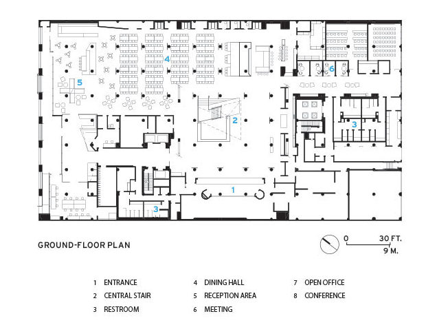
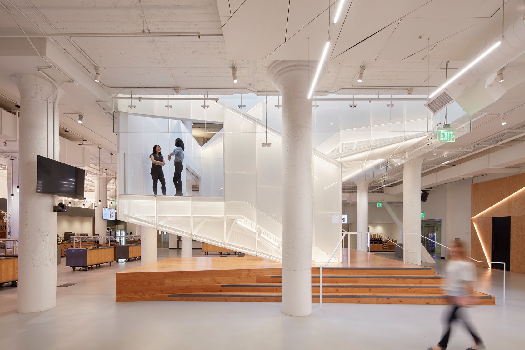
The new Pinterest headquarters in San Francisco is inspired by the redesign of the company’s web platform. The building is a four story concrete structure that previously housed a John Deere factory in San Francisco’s SOMA district. The program is organized as porous, concentric layers around a large, central interconnecting atrium and stair. The program includes: large all-hands /dining space on the ground floor, expansive open workspace on the upper three floors, and numerous meeting rooms, team rooms, lounge spaces, quiet room, maker lab, coffee bar, and design studio. A key aspect of the design involved extending the existing two story atrium to the ground floor, creating a central void at the building’s center that visually connects all four floors— into which was inserted the main communication stair.
The stair acts as the central organizing figure to the space at all levels. This central stair — referred to as the Knitting Stair in reference to the company’s collaborative ethos represented by the act and product of knitting — takes the form of a perforated steel clad volume that doubles back and intersects itself at its midpoint. The intersection allows people unexpected glimpses between two flights of people moving up and down within the stair’s interior volume. The stair’s design and materiality produces the effect of a bright, ever-changing heart at the center of the company.
 Facebook HQ, Menlo Park by Gehry Partners, Menlo Park, CA, United States
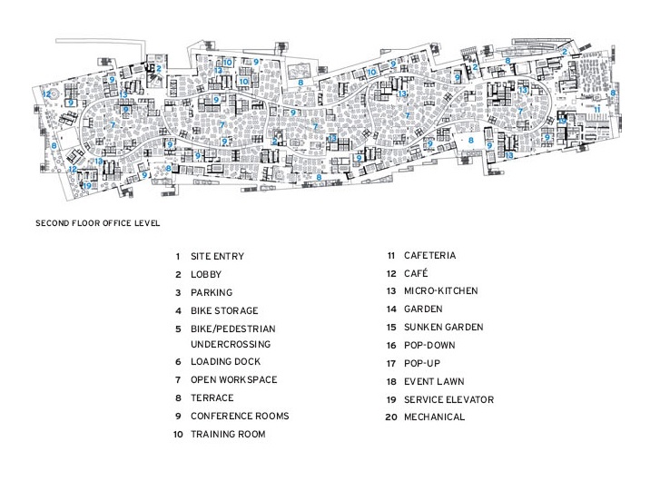
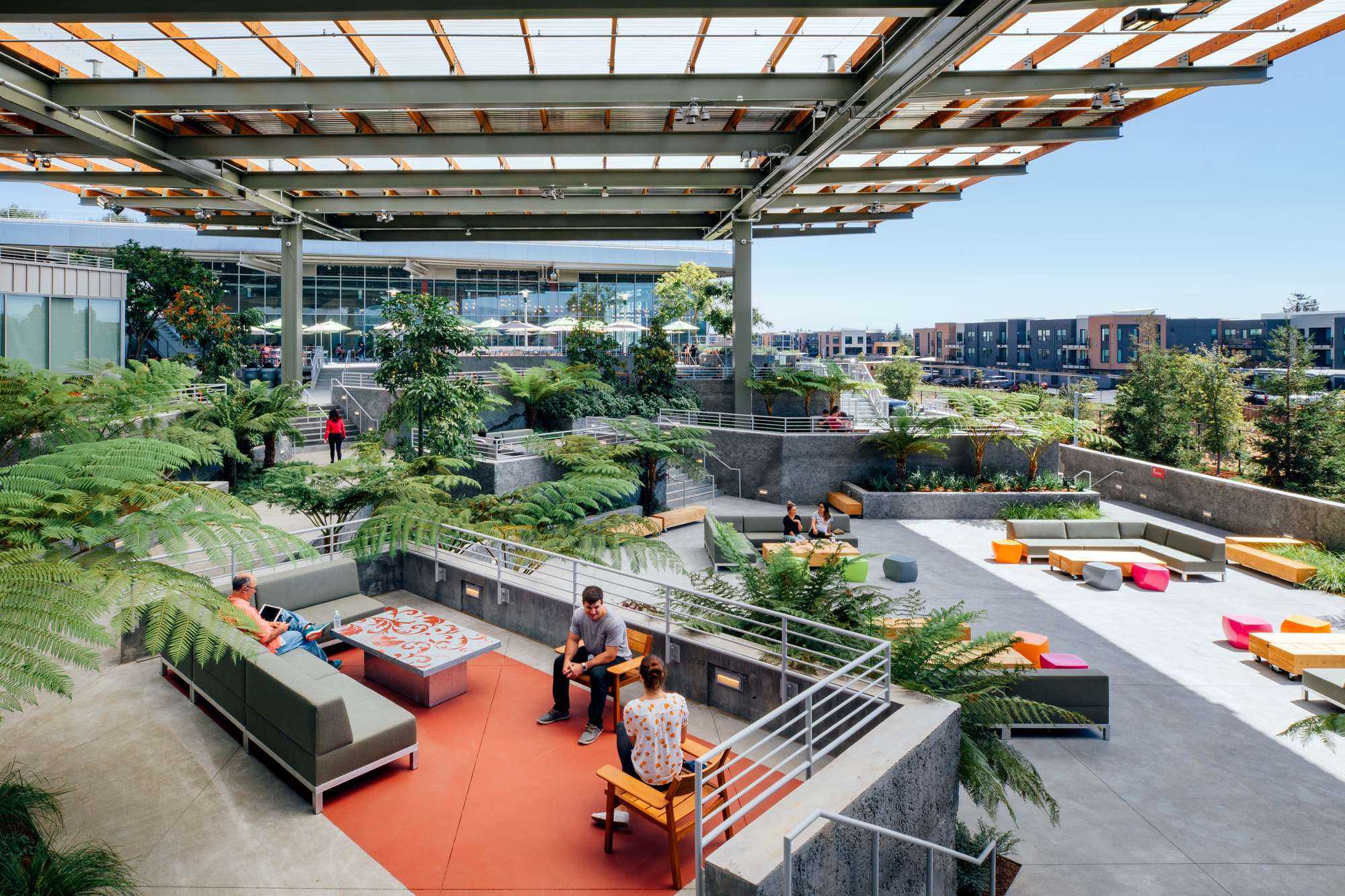
Gehry Partners recently completed Facebook’s MPK 21 building as part of its larger Menlo Park campus project. Expanding the company’s existing footprint, the design was built in less than 18 months as a highly sustainable building. Formed to bring the outdoors into the office space, the project centers on a sheltered green space with 40-foot-tall redwood trees and an amphitheater-style courtyard that connects to the original Gehry-designed MPK 20 building.
Featuring a 3.6-acre rooftop garden with over 200 trees and a half-mile meandering pathway, MPK 21 connects to the outdoors and was designed to promote teamwork. The larger development was designed to reduce impact on the environment and enhance employee well-being. Inside, an open workspace connects to a single pathway that runs the length of the building. The path features 15 art installations commissioned through an artist in residence program, five dining options, and a 2,000-person event and meeting space.
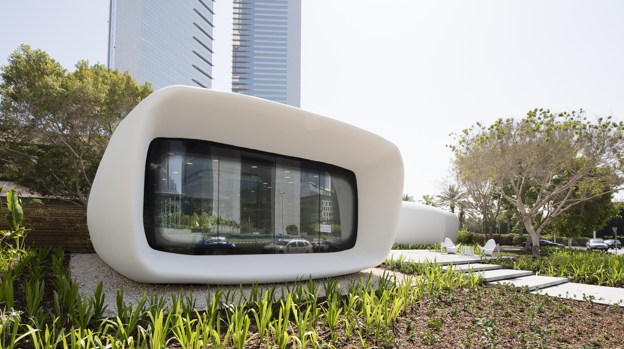 Office of the Future by Killa Architectural Design, Dubai, United Arab Emirates
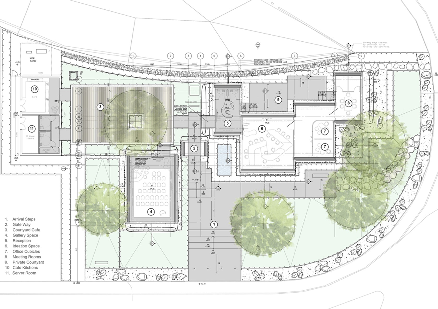
This pavilion is the world’s first fully functional and permanently occupied ‘3D printed’ building. As an ‘Office of the Future’, the building acts as temporary home for the Dubai Future Foundation as well as an exhibition space and incubator for future emerging technologies in Dubai. The entire structure was ‘printed’ in concrete using an additive manufacturing technique. It is the first fully occupied building in the world to be constructed using such techniques. A large scale 3D-printer was used to print the building in layers of reinforced concrete. The printer features a computer controlled armature to implement printing process.
The design of the building is intended to improve energy efficiency in the hot climate of the UAE, which commonly experiences temperatures that rise above 45°C (113°F) and makes use of 800mm thick insulating cladding. The pavilion has been designed to facilitate a mix of creative interactions, quiet reflective work and serendipitous meetings. This approach supports the work of flexible teams and fluid partnerships. To achieve this, the Office radiates around a tree shaded cafe courtyard.
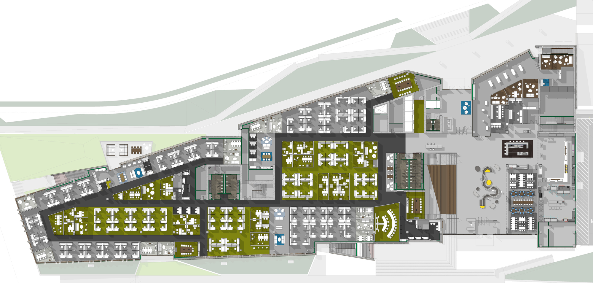
 Intuit Marine Way Building by WRNS Studio and Clive Wilkinson Architects, Mountain View, CA, United States
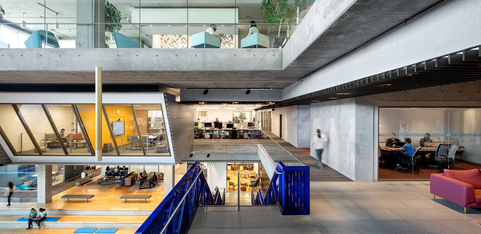
As Silicon Valley evolves to compete with growing innovation centers in walkable, networked areas, Intuit’s new Marine Way Building (MWB)—the continuation of a larger update to their Mountain View campus—models a new kind of workplace design for the region. Intuit wanted to honor their employees with new workplace environments that support their strong culture. The planning and geometry of the MWB, with 185,400 sq. ft. on four floors, can be understood as low, wide, connected, and flexible. The large floor plates, which accommodate a variety of places for people to collaborate, concentrate, socialize, and reflect, are organized into human-scaled neighborhoods and connected by clear circulation.
In addition to more intimate breakout spaces like balconies and casual soft-furniture settings, which offer a range of work opportunities to encourage users to take advantage of the whole building, full workspace neighborhoods are located at the edge of the atrium. This variety of programmatic functions along the perimeter of the atrium helps generate a consistent buzz of activity throughout the workday. Designed to embrace the mild climate of Mountain View’s North Bayshore Area, the MWB connects to both nature and the public realm. Extensive terraces with views to the bay offer an indoor/outdoor workplace experience and knit the campus together. The ground floor emerges from the landscape as a solid, textured base, and the MWB creates a dynamic new edge along the campus’s main pedestrian and vehicular spine.
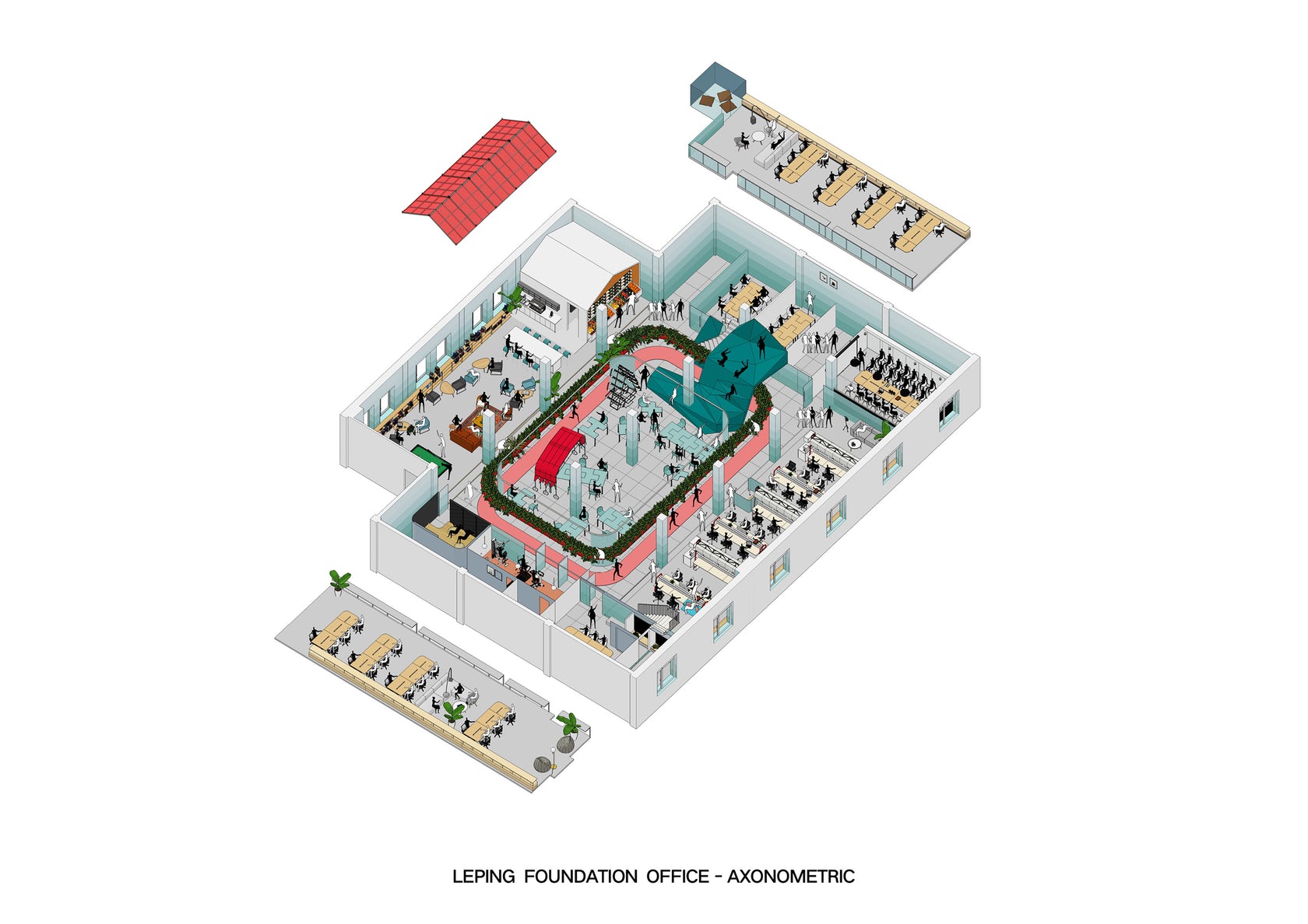
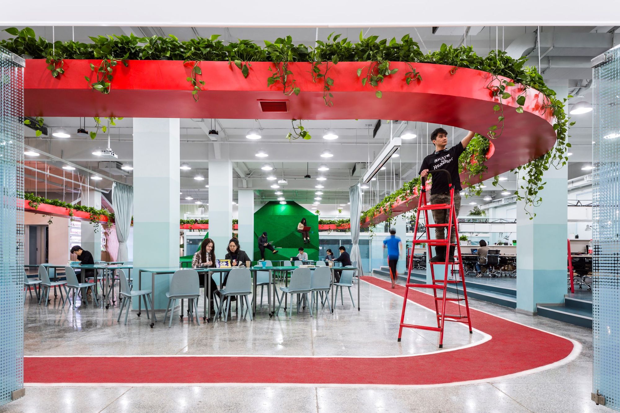 Leping Social Entrepreneur Foundation Headquarters by People’s Architecture Office, Beijing, China
Made as a 1100 sqm headquarters for the Leping Foundation, this office focuses on wellness. From job training for migrant workers and agricultural research to preschool education and microfinance, the space was made for people to come together. These distinct companies are tied together by a central activity loop of suspended vegetation mirrored by a running track underneath. The office is designed around the understanding that physical activity is good for the brain and the layout provides opportunities to move while at work, to vary modes of working, and to rest.
Leping’s work in social impact requires collaboration and interaction between team members, departments, and companies. The workstations are designed by our office and create small social spaces, including mini kitchens and lounge spaces, where spontaneous and informal conversation can take place. The furniture system uses a truss structure that allows storage to be suspended above, freeing up floor space for people to squeeze in for spontaneous discussions. In turn, the activity loop interior serves as an event space and a flexible space for incubating social enterprises. It’s populated with Tetris Tables, which can be used individually or combined into various configurations. A People’s Canopy can be moved around and expanded to create a separate meeting space within the central loop area.
 Swarovski Manufaktur by Snøhetta, Wattens, Austria
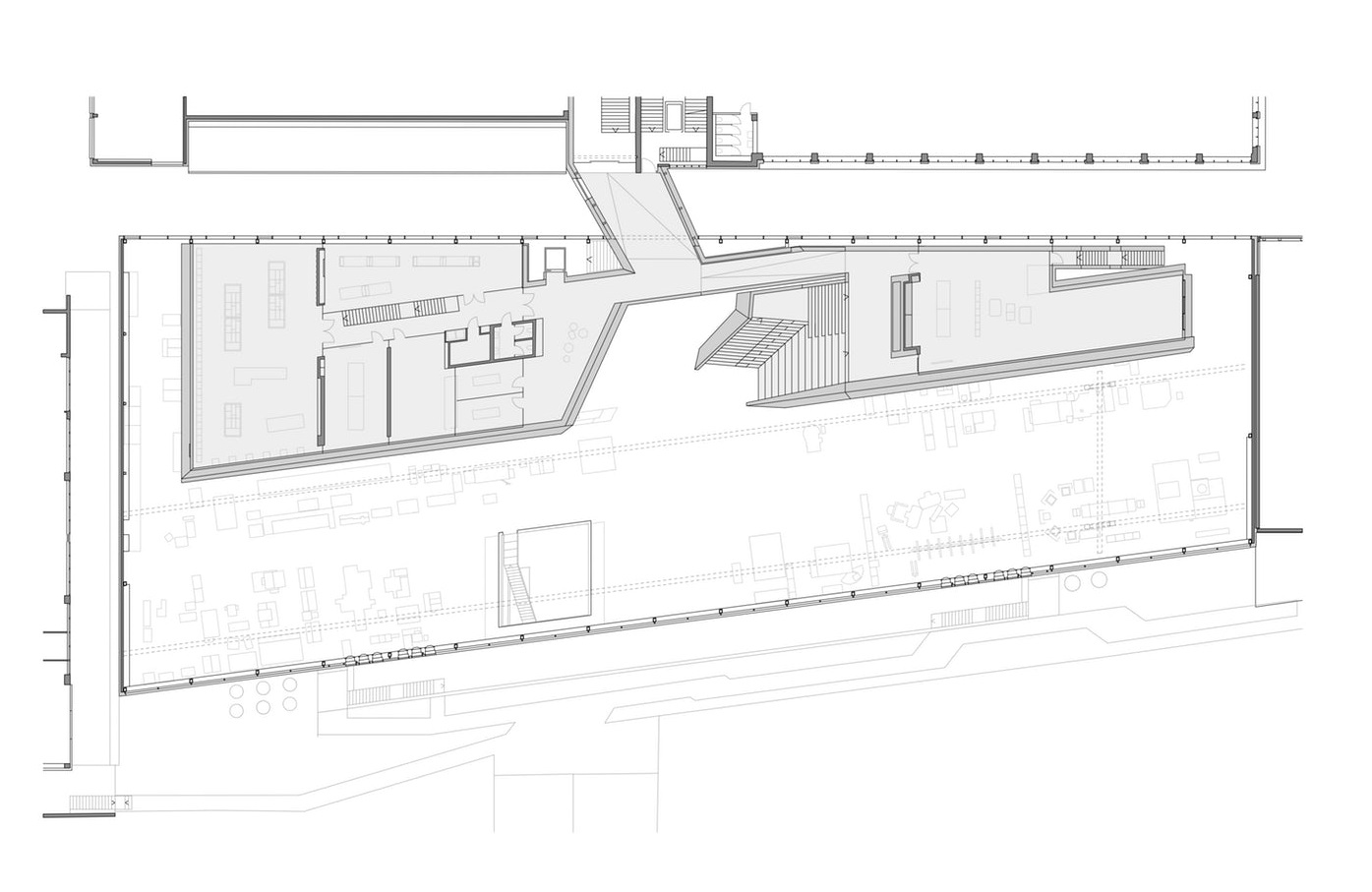
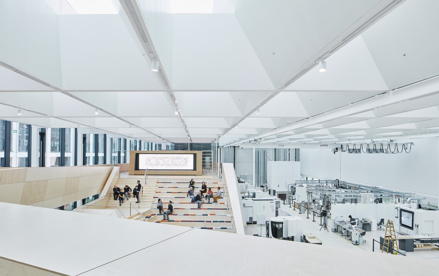
Snøhetta created a crystal workshop for the 21st century for Swarovski. Swarovski Manufaktur is designed to facilitate innovative collaborations, inventive exchange and a rapid implementation of ideas. The design primarily focuses on creating an appealing and stimulating space that encourages creativity rather than focusing on the physical production processes which are a central part of the Manufaktur. A key focus for the architects was the incorporation of daylight.
At the Manufaktur, the entire production process of the Swarovski crystal is reproduced on a small scale: the main floor contains all the machines necessary to produce prototypes or small crystal series in the shortest possible amount of time. Should technical standards or specifications change, the flexibility of the main floor provides enough space to allow for production to be rearranged to meet the latest technological requirements. Throughout the facility, a raised floor provides flexibility and space for necessary technical equipment and cables. Moreover, a “chandelier hole“– an open space plunging from the main floor and down to the basement – allows for prototypes up to 14 meters high to be assembled and tested on-site.
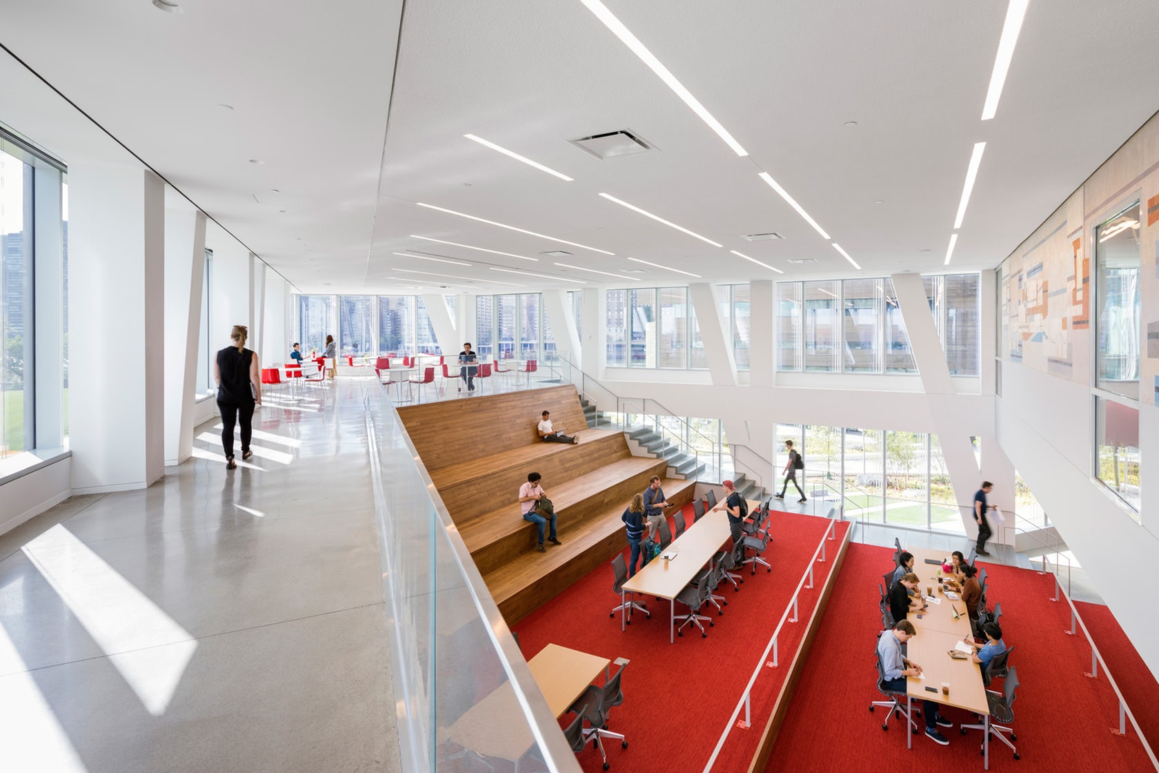 Tata Innovation Center at Cornell Tech by WEISS/MANFREDI, Manhattan, New York, NY, United States
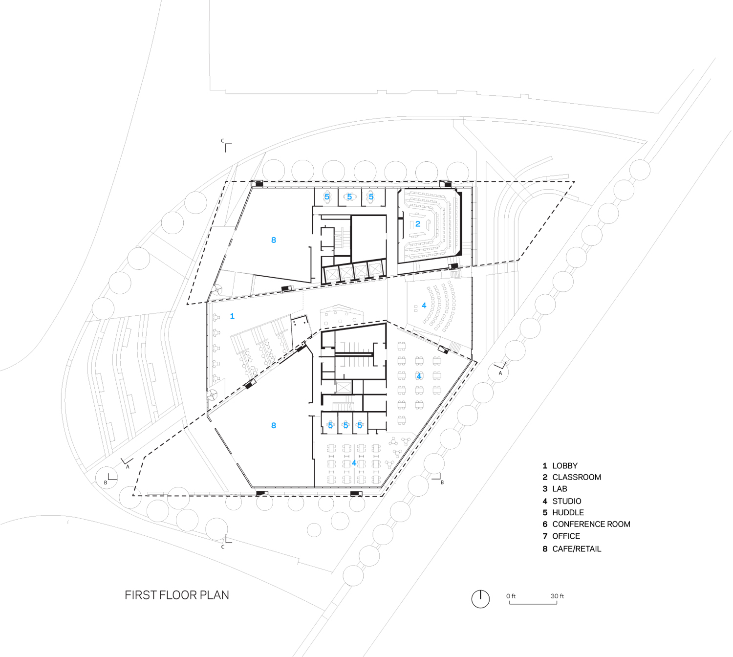
Weiss Manfredi’s Tata Center was made to bring together industry leaders and academia on Roosevelt Island. The seven-story structure was imagined as a contemporary R&D hub that’s part corporate co-location building and part innovation center. Formed with a crystalline geometry and elegant detailing, the design fosters dialogue across disciplinary hubs and tech companies alike. Sustainable design at the Tata spearheads a larger push towards becoming one of the most environmentally-friendly and energy-efficient campuses in the world.
One-third of the 235,000-square-foot building hosts Cornell Tech studios, labs, classrooms, and event spaces, while the upper levels are dedicated to a mix of technology-focused companies and start-ups. All of the occupants share central, light-filled circulation spaces with panoramic skyline views and lounges that encourage social interaction and collaboration. The building’s cantilevered southwest and northeast wings shelter outdoor social spaces that animate the ground floor retail spaces and entry terrace.
Discover More Architectural Drawings
Architizer’s newest print publication is available for pre-order! How to Visualize Architecture is an educational guide designed to help you master the craft of architectural storytelling and visual communication. Secure your copy today.
All drawings and photographs courtesy of the architects.
 Facebook HQ, Menlo Park
  Hechingen Studio
  Hybrid Office
  Pinterest HQ
  The Bridge at Cornell NYC Tech
  Wieden+Kennedy Agency World Headquarters