Showcase your visionary architectural concepts: The 2026 Vision Awards features categories that reward UNBUILT projects presenting bold ideas for the future of architecture. Take advantage of early bird pricing before April 17th.
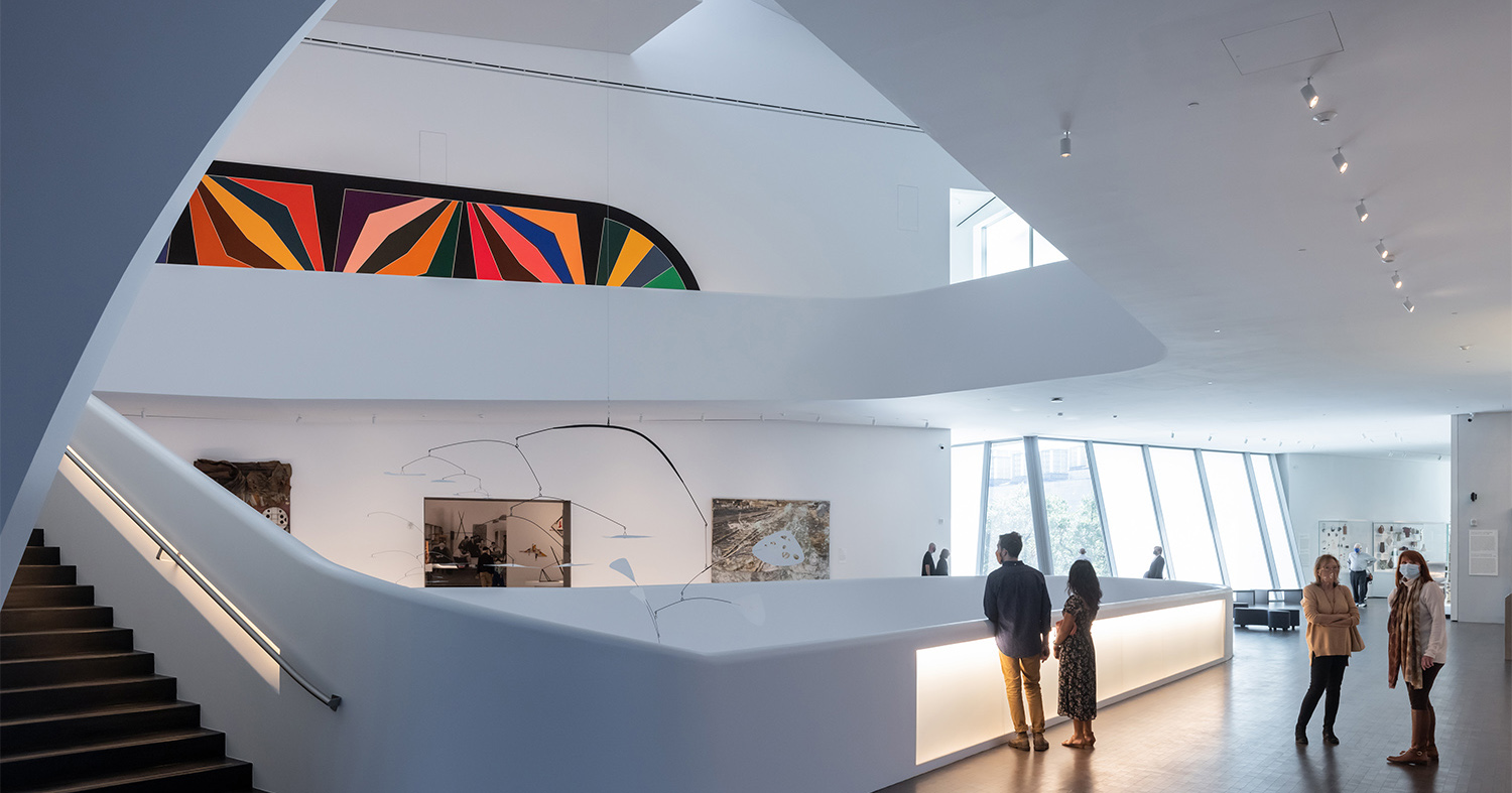
Creating architectural rendering involves more than modeling a building 3D and then polishing it. In the early days of digital architectural visualization, buildings were simply populated with human cutouts corresponding to different activities and scales. Now, with the advancement in image editing software, artists are exploring creative avenues to tell elaborate stories in a single frame.
May it be the tale of a neighborhood forgotten overtime or the experience of a person waiting for the last train on a cold night, our past One Rendering Challenge entries have shown is that anything we imagine can be portrayed in a variety of ways. With the deadline of this year’s challenge fast approaching, we have broken down the five essential characteristics of winning renderings. Using past finalists as a point of reference, this article breaks down the different techniques and components that made them stand apart from the rest.
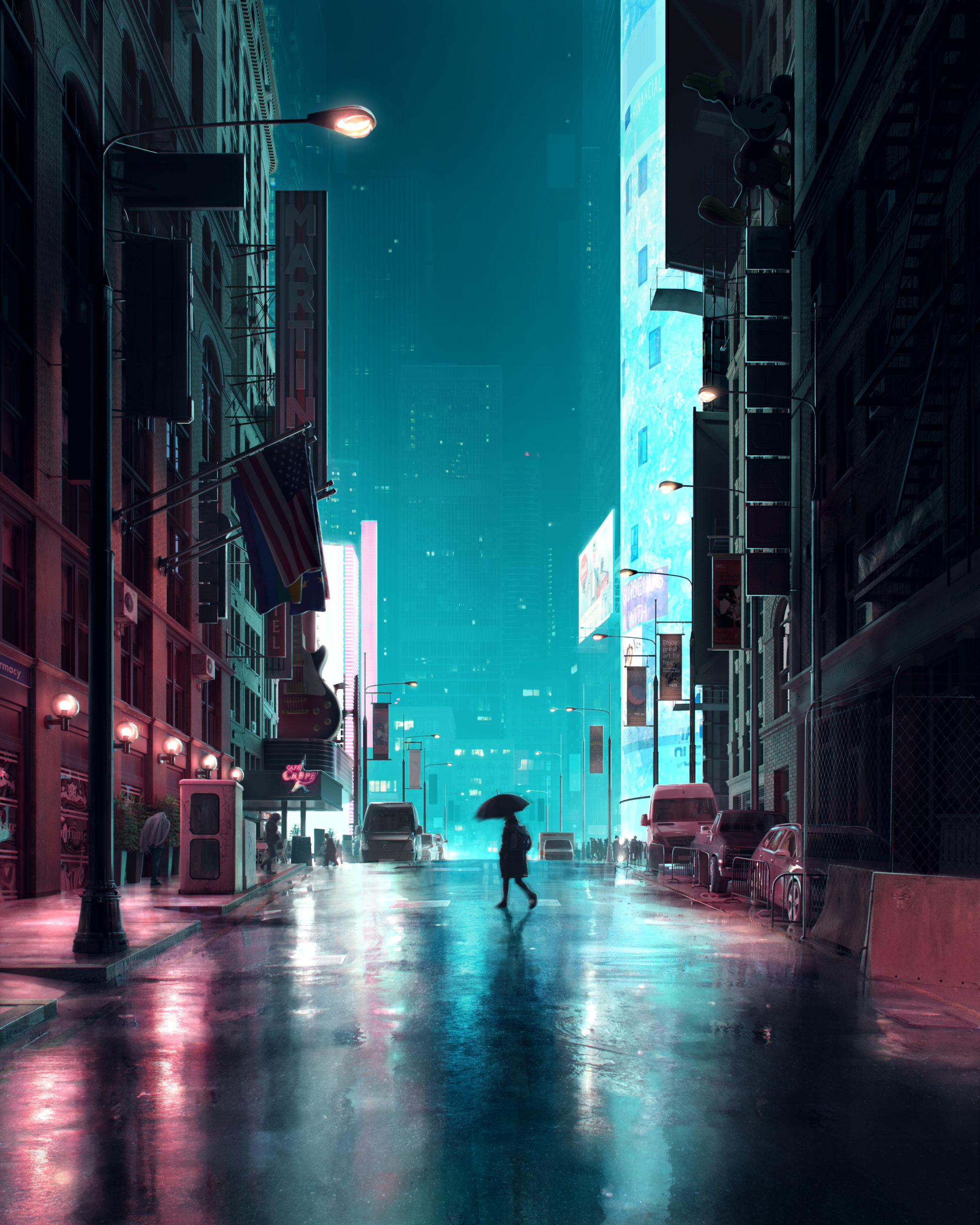
“Electric Rain” by Vittorio Bonapace
1. Create a Story
Emotional impact goes a long way from creating an impactful architectural representation. Images that tell us not only about the design details but also about the experience of walking through the architecture are often ones you would take a few more minutes to gaze at. Additionally, creating a narrative arc helps establish the context around the building and also highlights its significance in daily life. This story can be told by establishing a scene with the addition of characters, dynamic elements, picking the right time of the day or adding markers that give an indication of the weather. A story can also make the architecture the hero without having it take center stage.
In Electric Rain, creator Vittorio Bonapace takes us on a walk through a rainy city street. His image captures the loneliness and the urgency of an individual walking alone on a cold night, trying to find a warm place. This is done by animating the character and using static objects that are movable in the background. On the other hand, it also gives an idea of how chaotic and energetic this street could be at another time in the day.
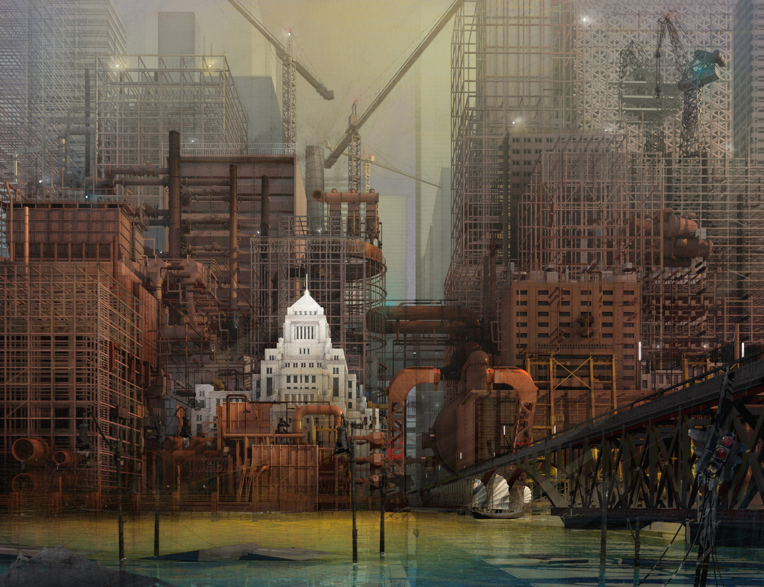
“The Vent” by dennis allain
2. Find the Perfect Color Balance
The tone of the colors used is very effective in communicating the time and place in an image. Oftentimes, images with predominantly warm tones can intuitively read as more historic or nostalgic, while more futuristic images tend to use cooler, icier tones. A successful render can lean in one direction but must also include contrasting hues to add more depth and dimension to the composition. This can be done by using a combination of cool and warm shades, dark and light tones, or muted and bright hues in varying degrees of opacity.
Dennis Allen does this very well in The Vent. The image uses a variety of reds to depict the older construction and juxtaposes this with the bluish water, newer construction elements and a bright white building that remains in focus despite not taking up a large part of the canvas. The image is a lot warmer in tone, like a sepia photograph, the color palette evokes nostalgic associations with the past. Yet, at the same time, masterful layers of grey tones, white highlights and subtle bursts of blue and purple bring the scene to life. The ivory structure in the middle also balances the darker elements in the composition.
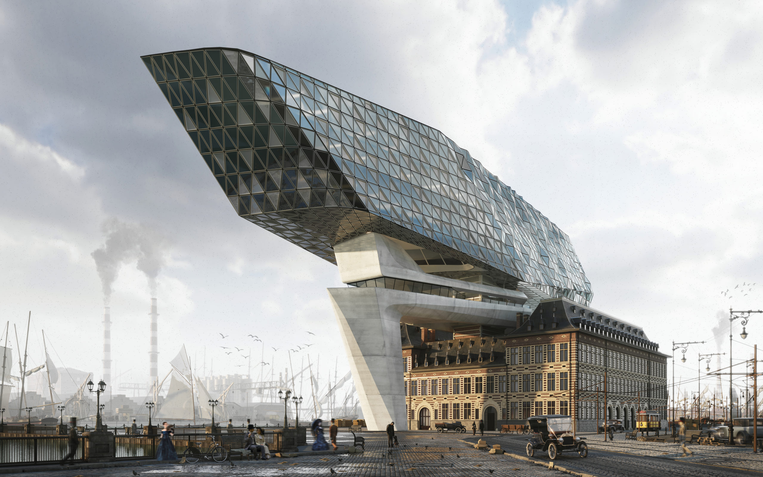
“Time Traveling” by Tigran Hakobyan
3. Play With Materials and Textures
The nature of materials in a render often depends on the project but choosing the right texture map to represent it is key. Having multiple textures in an image makes it feel a lot more tactile, making the experience of the image is richer. Even flat surfaces should have textures that show varying degrees of the same color to make them appear realistic. Furthermore, the addition of transparent or reflective surfaces can also amplify the effect of the other textures used.
This technique is evident in Tigran Hakobyan’s Time Traveling. There is an amalgamation of the past and the present with the imposing glass structure perched on a historic building. The rendering of the metal frames holding the glass triangles, the concrete support, arched fenestrations and even the cobbled sidewalk each add to the overall image. And even though the chimneys and ships in the background are covered in a layer of mist, we can see that there are not just flat color blocks; their textural quality peeks through the fog and makes the image more believable.
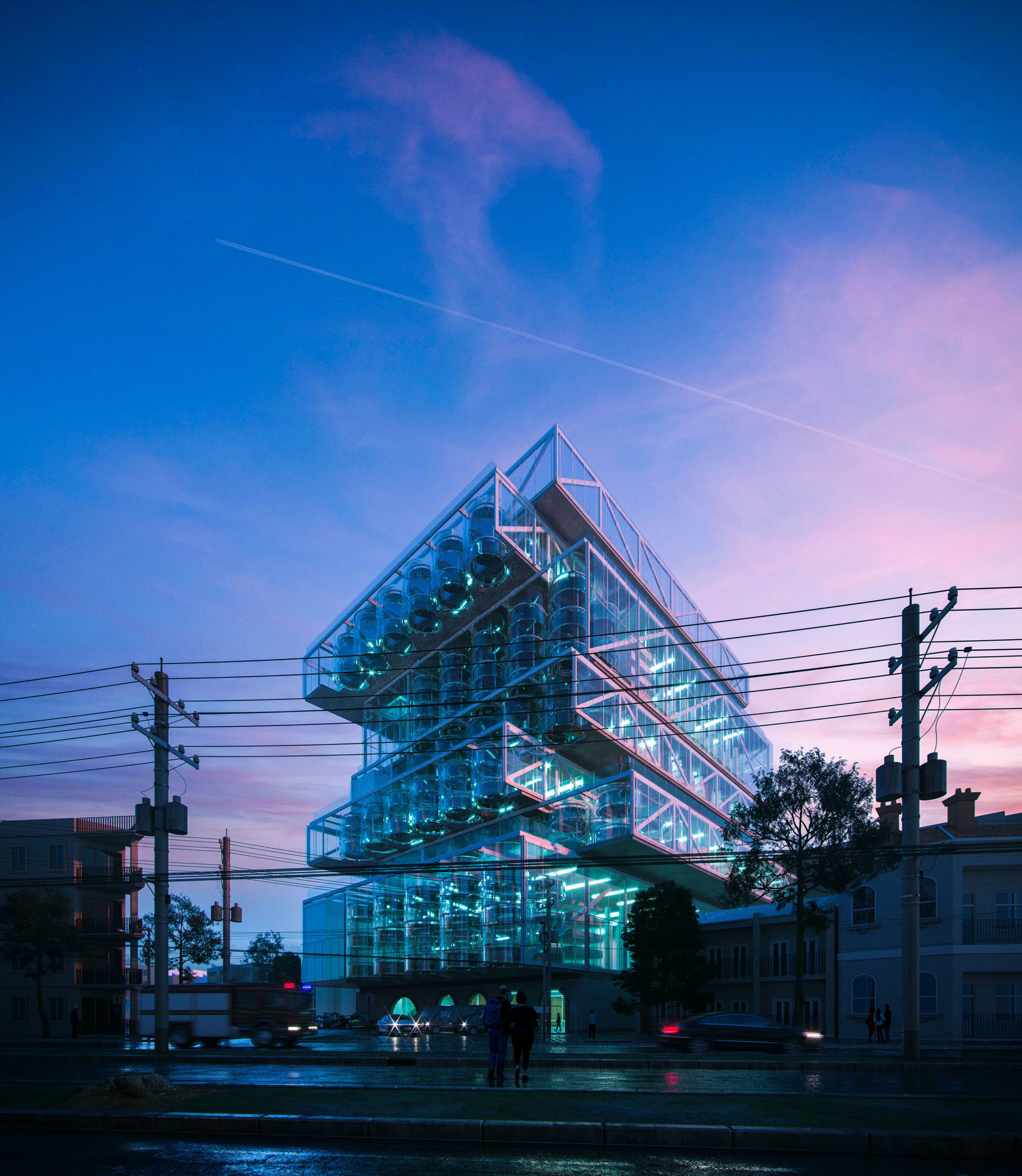
“Orchard Jenga – Start of the night shift” by Duy Phan
4. Get the Lighting Right
Lighting is key not only in architecture but also in its representation. In architectural visualization, lighting can be added in the form of environmental light, out-of-frame spotlights, incandescent fixtures, fires, reflections or a combination of all. These are especially helpful in creating a specific mood or even adding pops of color in visualizations. That said, it is important to be careful of how these different light sources react with each other as well as the materials and geometry of the elements in an image.
Orchard Jenga – Start of the night shift by Duy Phan is a excellent example of effective lighting in a render. The creator has established the time of dusk by using soft pink clouds and a slowly deepening blue. The partially lit building also does a good job of conveying the hour. We can see this not only through the reflection on the main building but also subtly in the shorter building on the left. The artist has used the lights within the main building not only to illuminate the elements inside the structure but also those in the lower half of the composition. The dark objects below are also highlighted using different vehicles with distinct headlights and taillights. Each of these light sources has a unique tone and path to keep them from overwhelming the image.
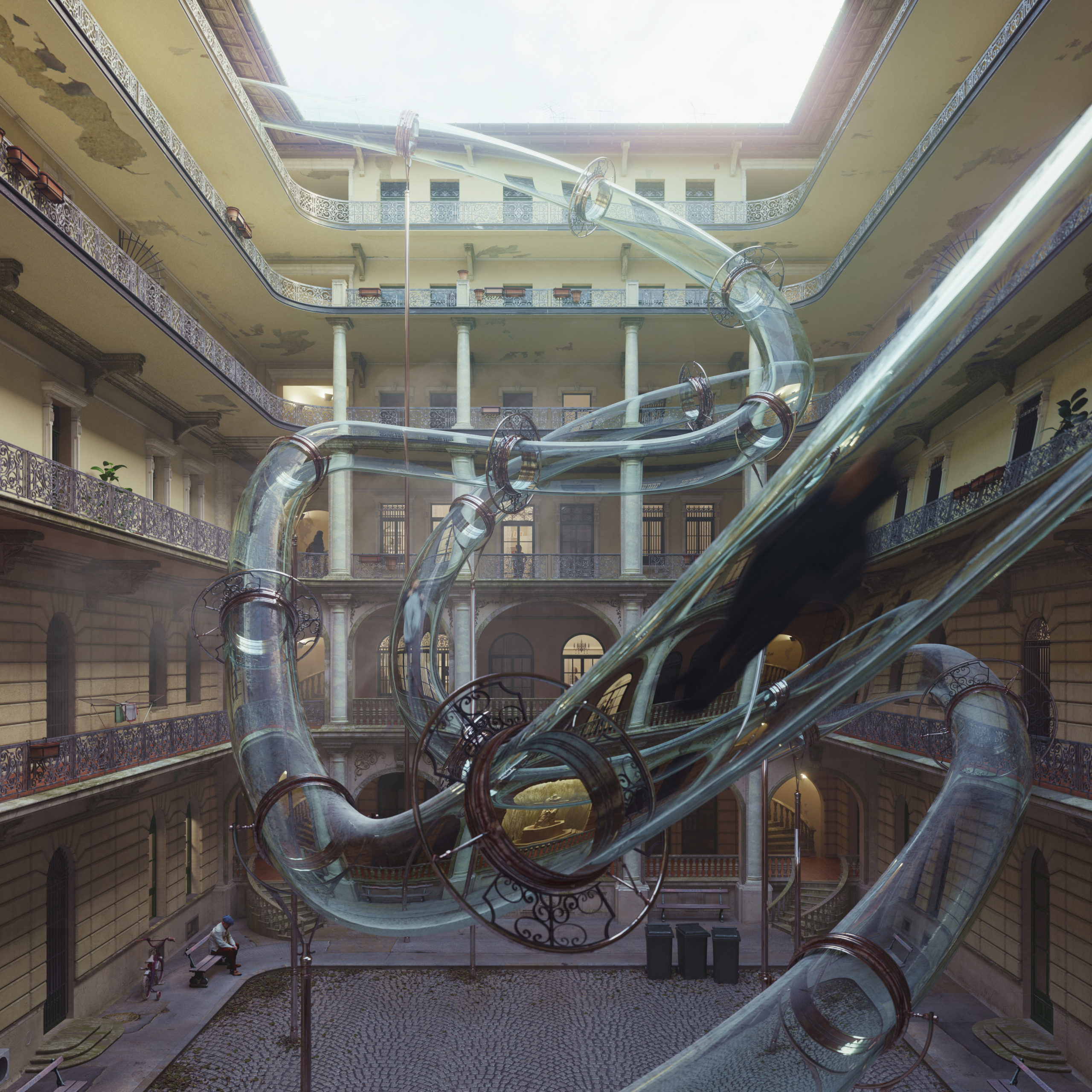
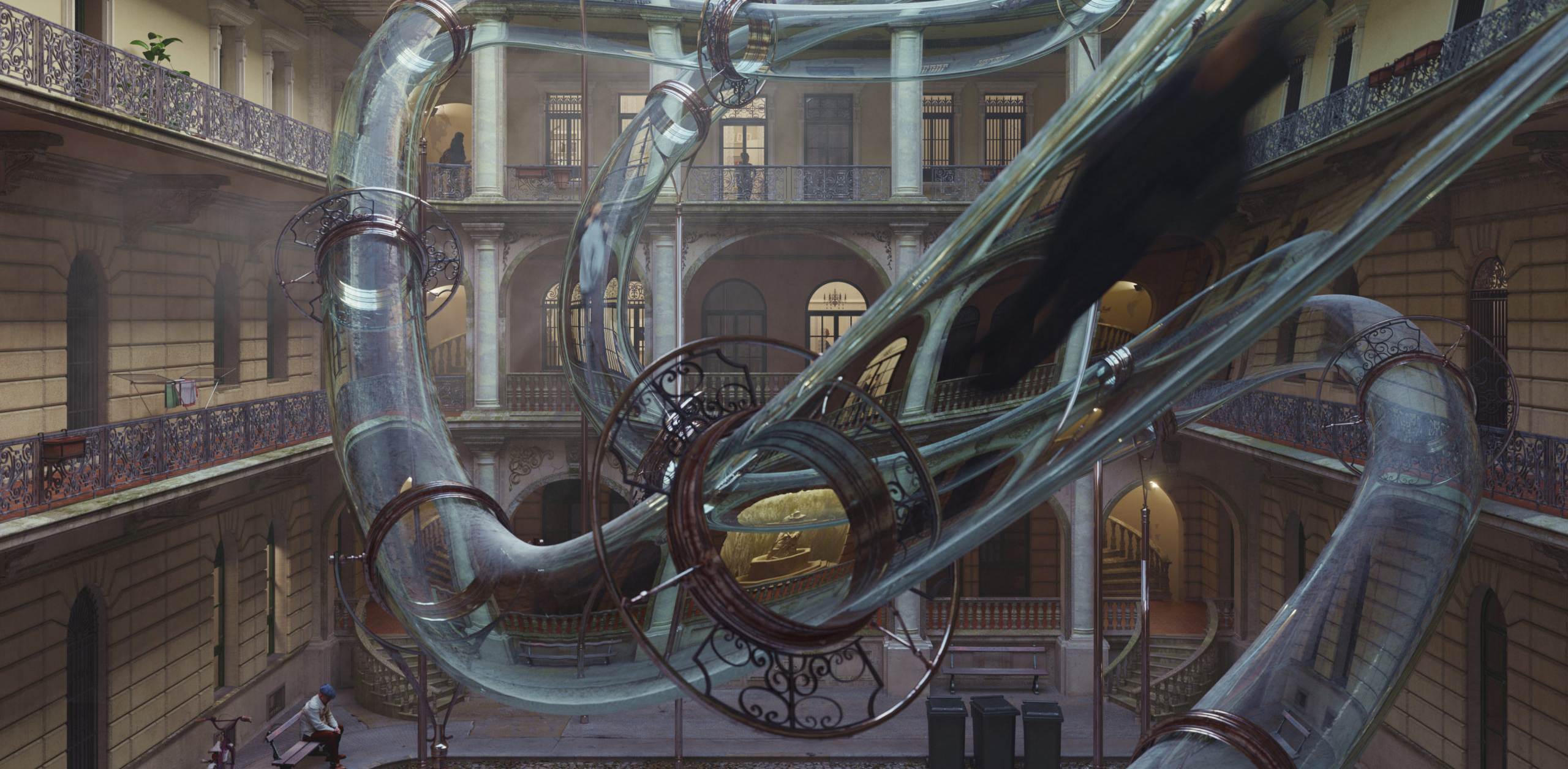
“Zoom to the future” by Carlotta Cominetti
5. Focus On Details
Most of us have heard the phrase “God is in the details.” This is also true for renderings. Even if not visible immediately, paying keen attention to the finer details can make a huge impact on how the overall render is perceived. This includes fenestration details, material reflections, smaller fixtures, vegetation, imperfections in surfaces or even the actions and attire of humans used in these images. Every item used in a render must be intentional, have a purpose and contribute to a better understanding of the image.
There is no shortage of intricate details in Carlotta Cominetti’s Zoom to the Future. Starting with the backdrop, we can see that the artist rendered the main structure to perfection and added nuances that make it more realistic and dynamic. This includes peeling wall paint, abandoned flower pots, trash cans and detailed doors and windows. Each of these additions tells us about the lives of the people inhabiting this structure. Going a step further, they have also added details like photo frames, chandeliers, books and humans within these homes in the background. When we look at the main glass tube, they have taken great care in understanding how the backdrop will warp when seen through a curved glass and have rendered these parts accordingly. They have also aligned the central statue in the building with a key segment of the tube to highlight it further.
Showcase your visionary architectural concepts: The 2026 Vision Awards features categories that reward UNBUILT projects presenting bold ideas for the future of architecture. Take advantage of early bird pricing before April 17th.