Architects: Want to have your project featured? Showcase your work by uploading projects to Architizer and sign up for our inspirational newsletters.
Buoyant with the hues of a confectioner’s dreams, with the precision of a Tenenbaum suit, there exists an architectural realm infused with a distinct eccentricity and peculiar whimsy that is unmistakably Wes Anderson’s. Exploring this terrain, we find façades of perfect symmetry, colors as vivid as Mendl’s courtesan au chocolat and detailing that would make Gaudí blush. The sartorial and cinematic savant Wes Anderson transformed the silver screen into a surrealist, pastel playground; now, reality dares to echo his vision.
Borrowing from Anderson’s cinematic anthology, these eight architectural exemplars unfold like a meticulously curated diorama, inviting you into a world where the ‘real’ and the ‘Andersonian’ converge. These buildings promise to enchant and intrigue: a journey into this realm is a Grand Tour (sans Budapest Hotel) but with all the distinctive whimsy of Wes Anderson nonetheless.
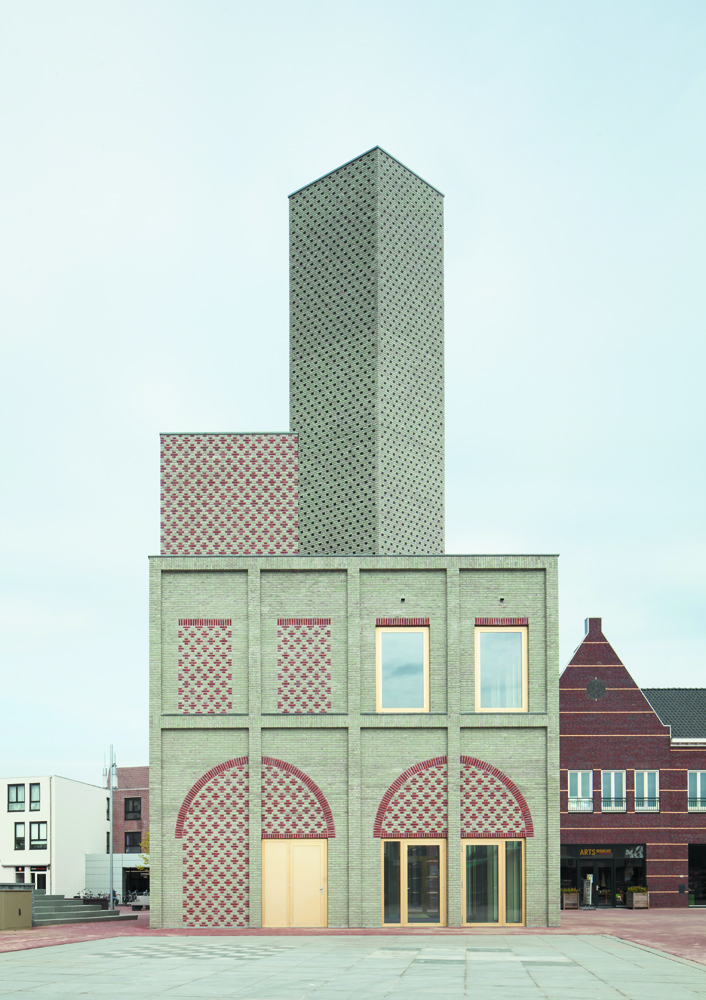
Landmark Nieuw Bergen
By Monadnock, Nieuw-Bergen, Netherlands
Photographs by Stijn Bollaert
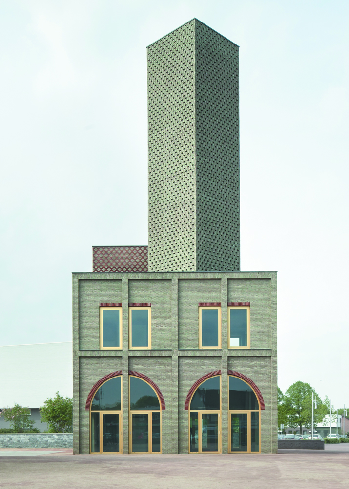
In the quaint Dutch landscape of Nieuw-Bergen, Monadnock’s ‘Landmark’ punctuates the skyline, assuming a role akin to an architectural solitaire. It serves as an avant-garde church tower of sorts, its abstract silhouette offering a distinctive identity for the village. Cloaked in an unconventional palette of green and red bricks, the tower manifests an aura of optimism and approachability.
The building’s intimate details become evident upon closer inspection, revealing patterns that animate the structure and soften its monolithic presence. Its form, an intriguing blend of a traditional house-like base and abstract volumes, becomes a novel emblem for the village, hinting at a duality that mirrors its blend of tradition and ambition. This new ‘Landmark’ is not merely a building; it is a beacon of community spirit, an inviting meeting place, and a testament to the village’s renewal.
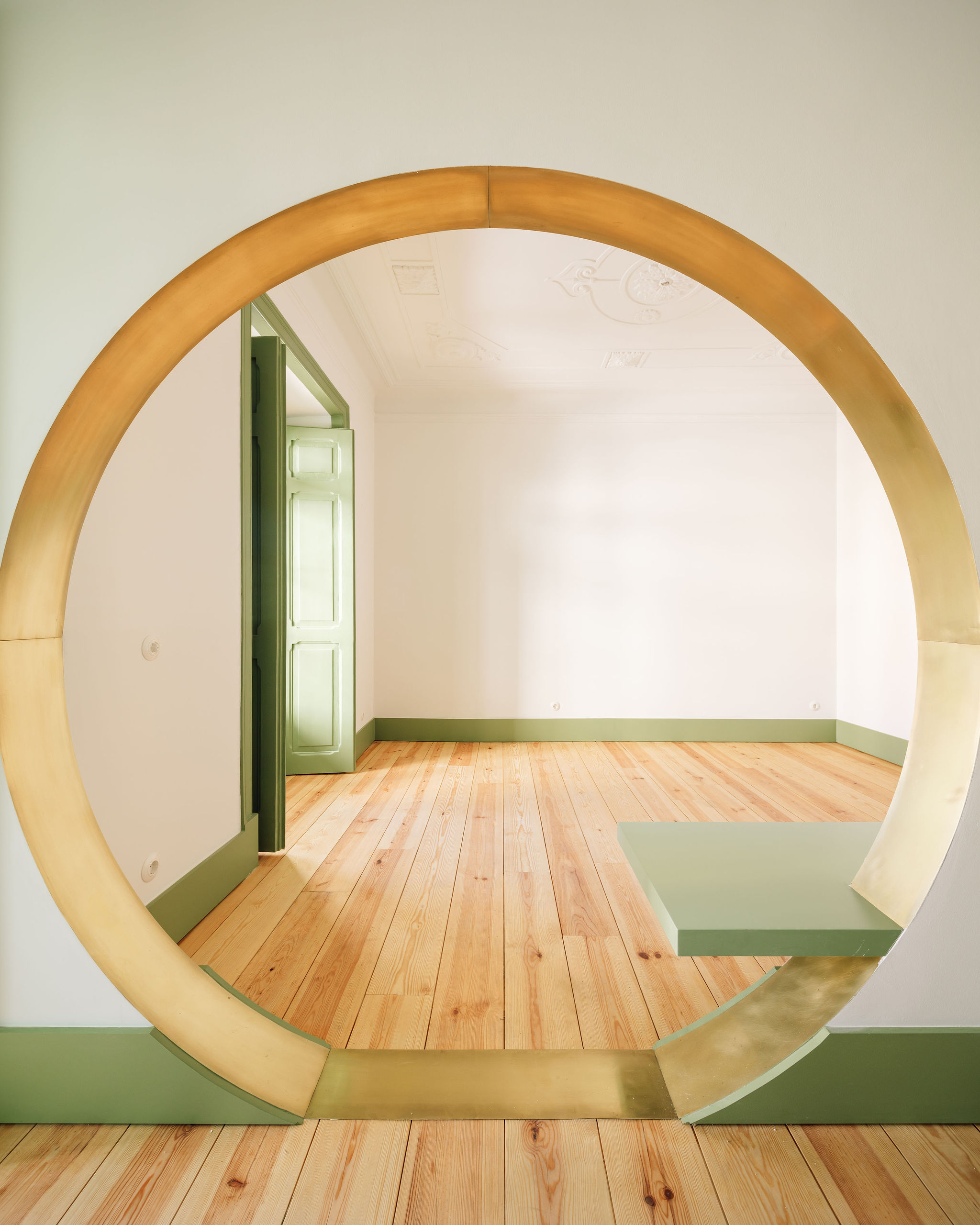
Latino Coelho Apartments
By Manuel Tojal Architects, Lisbon, Portugal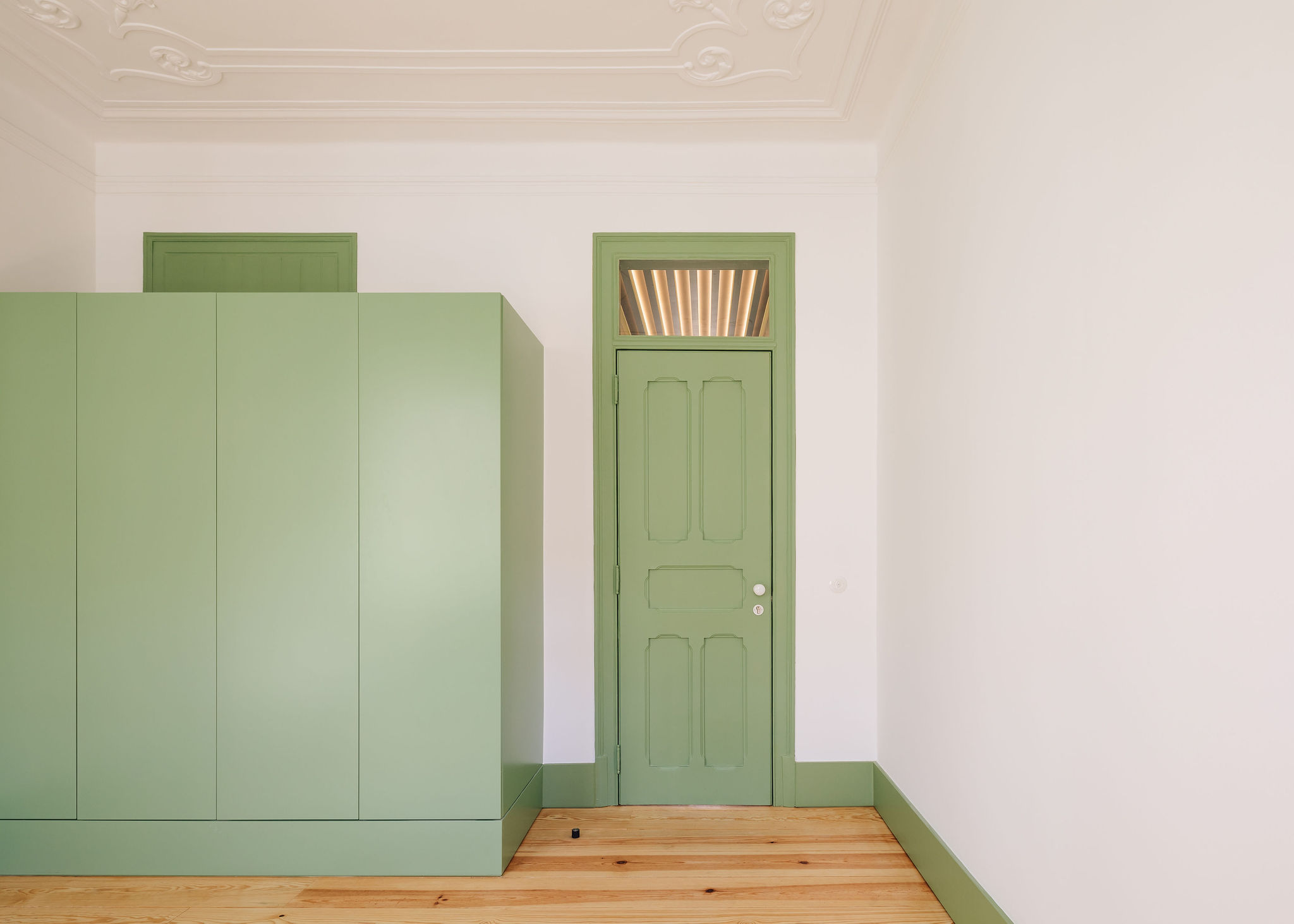
Photographs by Francisco Nogueira
In Lisbon’s Picoas neighborhood, a pair of symmetrical apartments, resplendent with early 19th-century charm, have been reimagined by Manuel Tojal Architects. The Latino Coelho Apartments echo the Wes Anderson aesthetic with their vibrant pastel tones and meticulous symmetry. The pièce de résistance, a circular aperture uniting the kitchen and living room, encapsulates the confluence of art deco grandeur and contemporary sensibility while successfully delineating the social and private spaces.
Transformation House
By Lautenbag Architectuur, Wirdum, Netherlands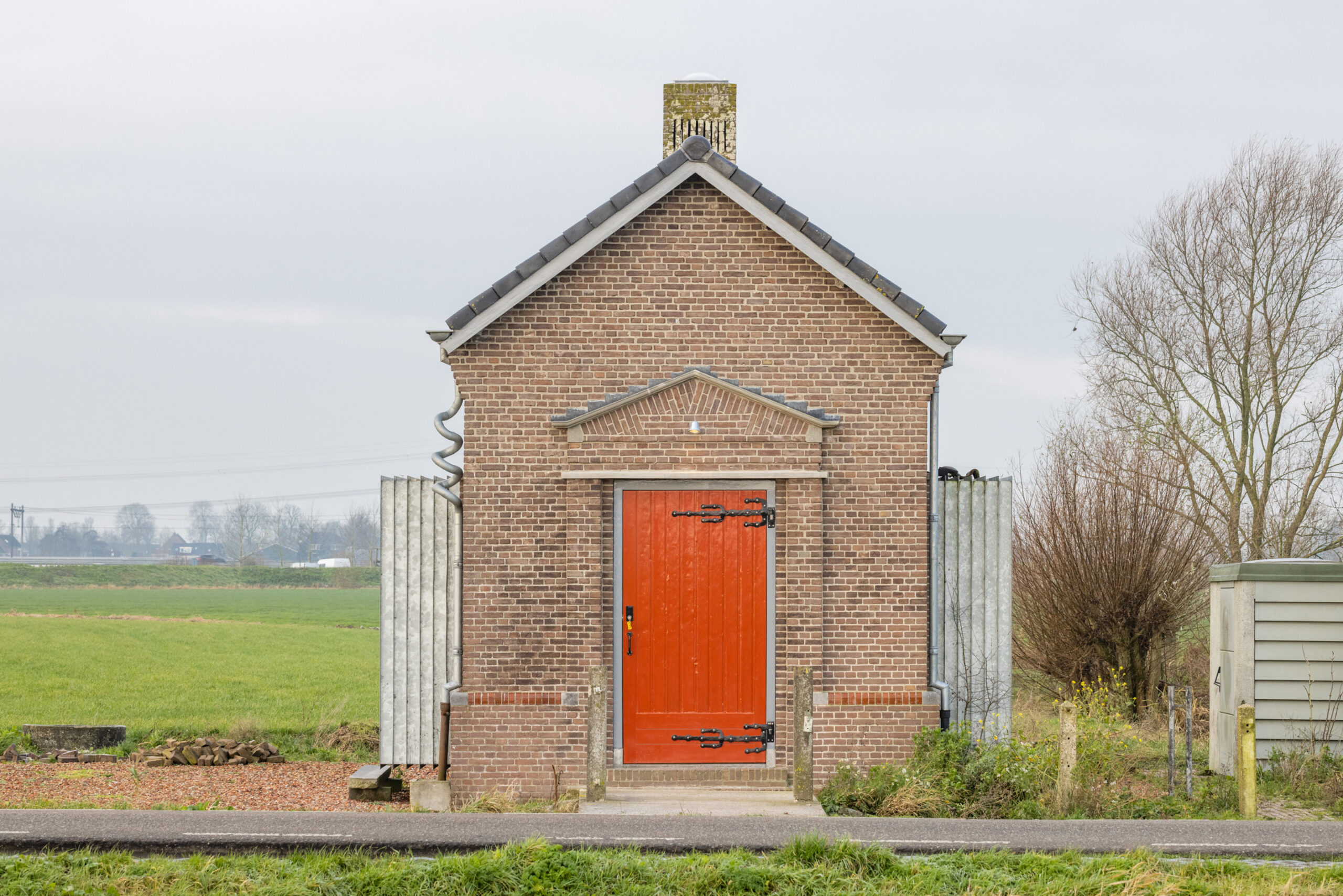
Photographs by Bas Gijselhart
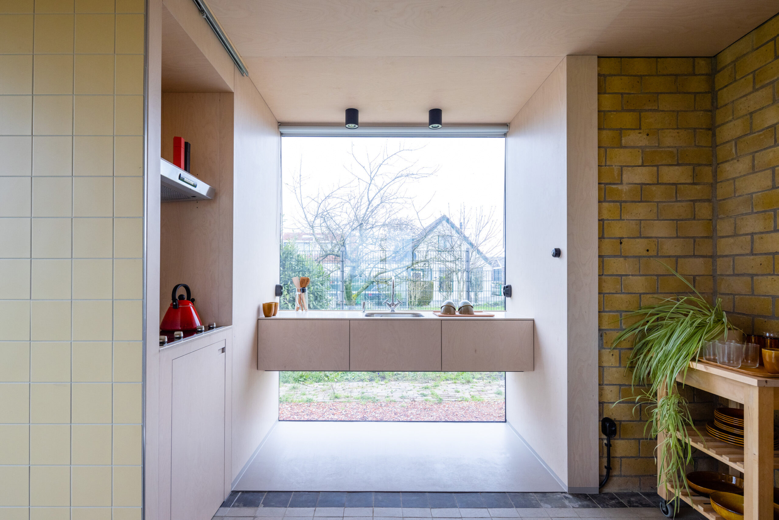
Just south of Wirdum is a distinctive transformer house from the 1920s, now whimsically repurposed into a hiker’s cabin through the creative collaboration of Ronald van der Zwaag and Diana Lautenbag. They breathed new life into the building while retaining its unique heritage by subtly expanding the structure with steel bay windows — a nod to the original transformer’s cooling fins.
This reimagining introduced light and space, transforming the building into a luminary in the landscape. The result is an exquisite fusion of heritage architecture and modern design thinking. The whole structure emerges as a modern solace, its bay windows framing the landscape like captivating stills from a film. This architectural transformation tells a captivating tale of the past repurposed for the future, exuding an enchanting, Andersonian whimsy.
Hotel Bauhofstrasse
By VON M, Ludwigsburg, Germany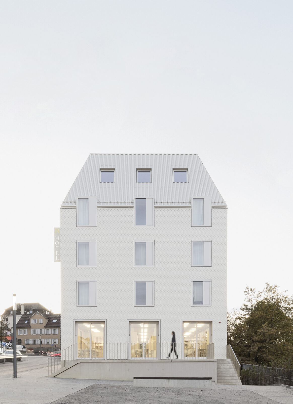
Photographs by VON M
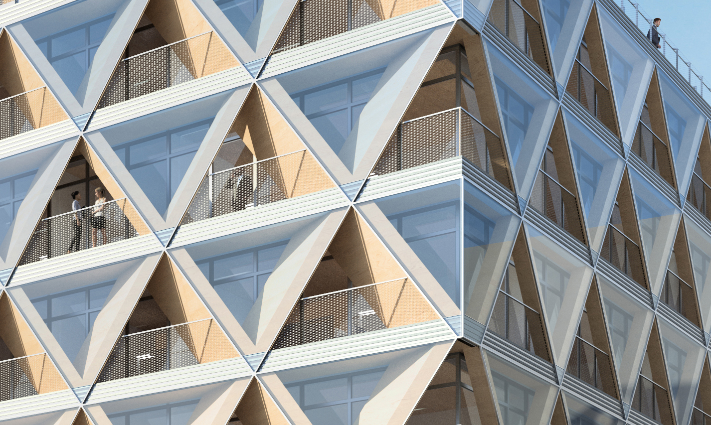
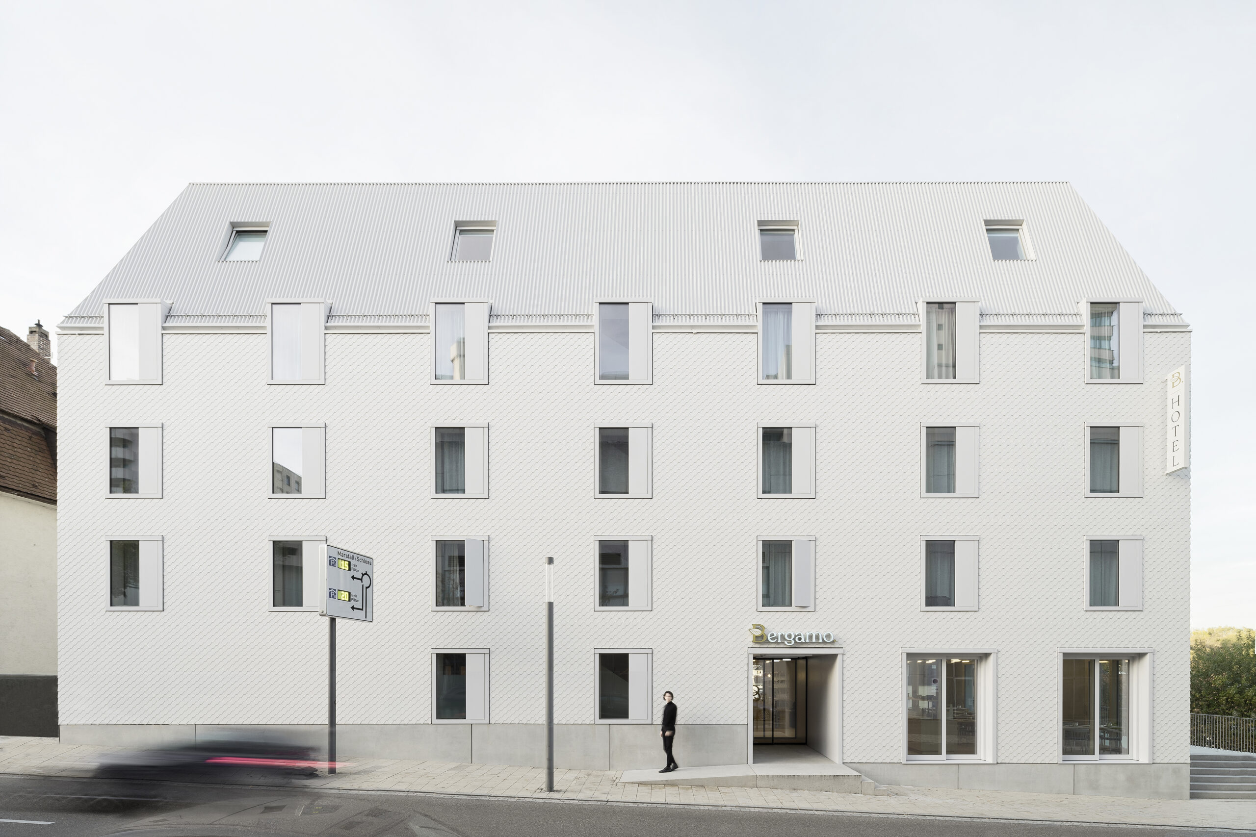
In the heart of Ludwigsburg, the Hotel Bauhofstrasse by VON M presents itself as a beacon of sustainable architecture that borrows its distinct symmetrical aesthetic from the Wes Anderson playbook. The structure, a white, eye-catching ensemble, challenges the typical hotel construct by employing a revolutionary construction principle of wooden room modules, offering an intricate balance between ecology, efficiency, and quality. Its bold symmetry, heightened by a cadre of uprightly formatted boxes serving as windows, evokes a sense of unmissable theatricality. The interior surfaces, left visible in their inherent construction, work harmoniously with the exterior, provoking a uniquely charming atmosphere.
Hotel Hércules
By GOMA Taller de Arquitectura , Santiago de Querétaro, Mexico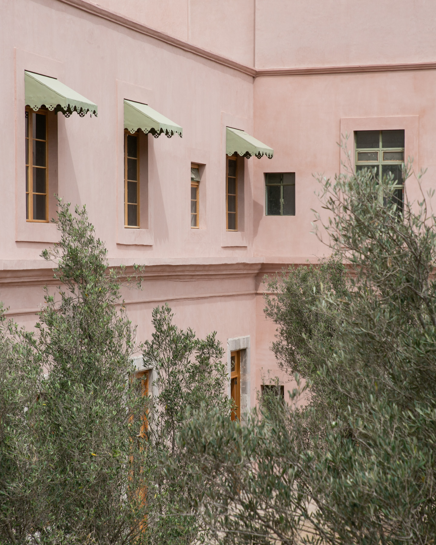
Photographs by Cesar Belio
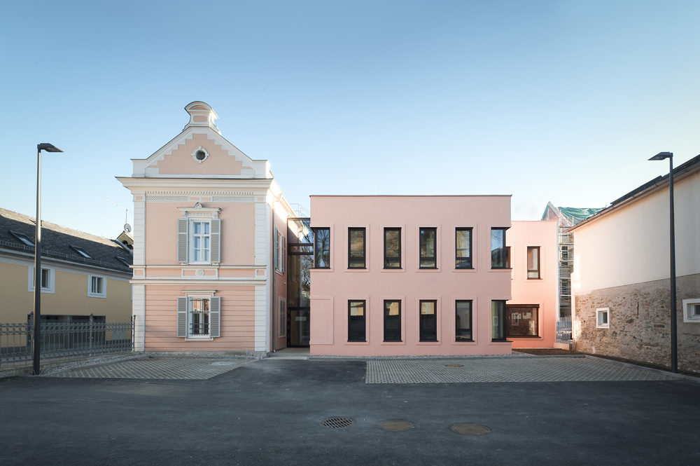
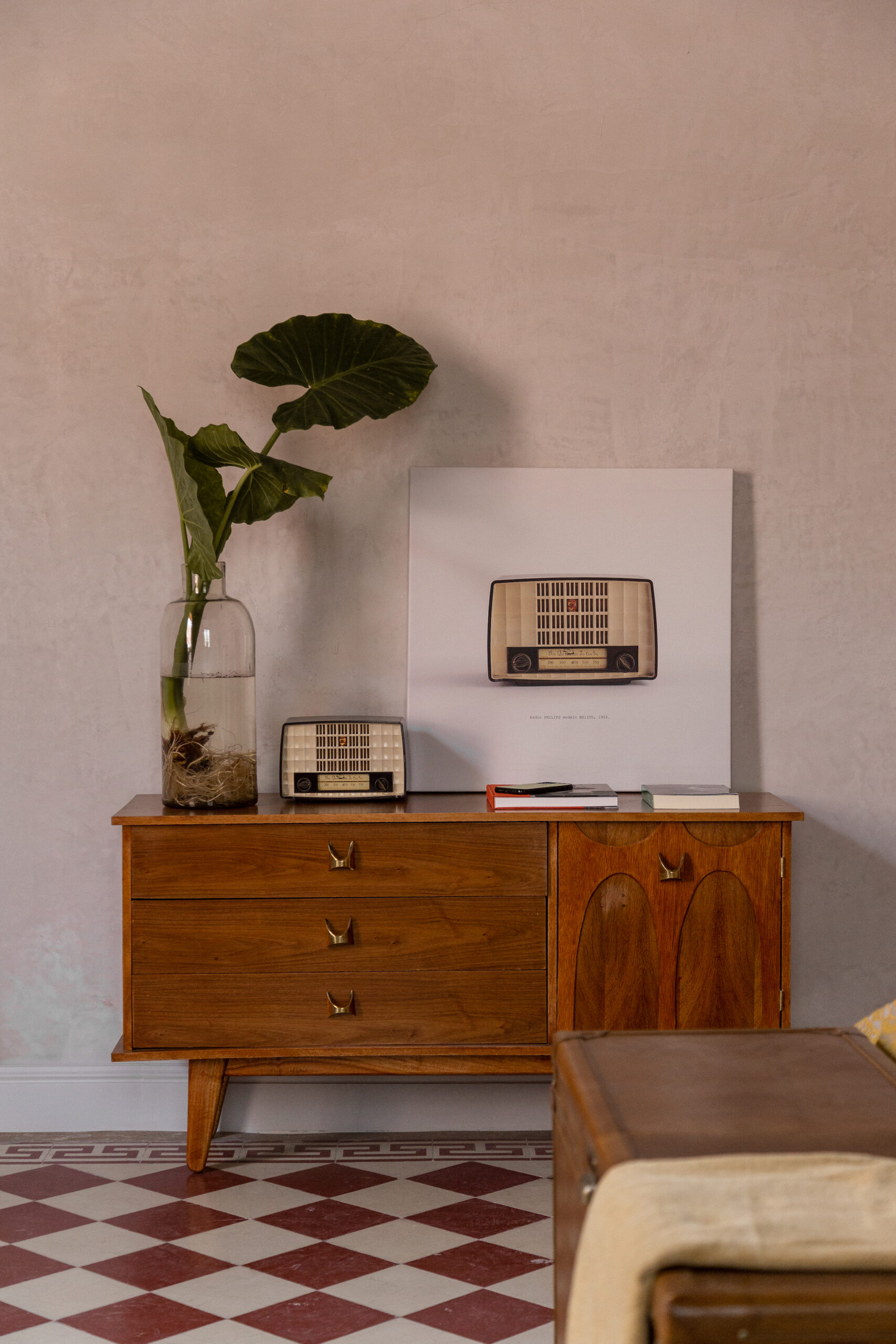
Emerging from the antiquated textiles of a bygone era, Hotel Hércules in Santiago de Querétaro, Mexico, reflects the pastel pink whimsy so recognizable as a Wes Anderson’s cinematic canvas. The vision of GOMA Taller de Arquitectura, the hotel, echoes the grand transformation seen in ‘The Grand Budapest Hotel’.
Forty rooms bloom within the former mansion, their walls whispering stories of the past industry while their pastel tones are ripe with new narratives. This hued homage to the Andersonian aesthetic extends to its cultural offerings, embracing a rich tapestry of experiences akin to the intricate universes Anderson constructs in his films.
Strasbourg Municipal Baths
By Chatillon Architectes , Strasbourg, France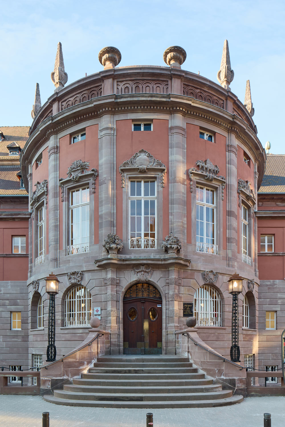
Photographs by Cyrille Weiner
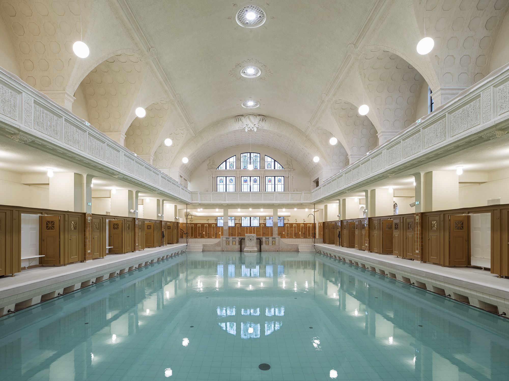
In Strasbourg, the Municipal Baths, a 1905 architectural emblem steeped in city history. Chatillon Architectes, in collaboration with TNA Architectes, Eiffage, Equalia and Quadriplus, restored and rehabilitated this cherished building with intricate detailing and a symmetry that echoes Anderson’s aesthetic throughout. The project marries antique and neo-regional styles, preserving charm while infusing it with modern functionality.
The upgraded facility now anchors itself firmly in the present, boasting a suite of contemporary amenities, from indoor pools and a sauna to a dog grooming area (dog-lover Anderson would undoubtedly approve), all while carefully preserving the historical significance of the building. A beautiful example of life — or, shall we say, architecture, imitating art.
John Anthony
By LINEHOUSE, Hong Kong, China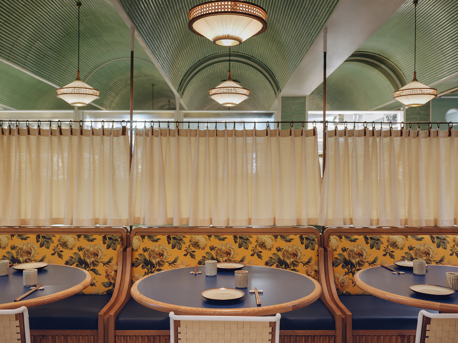
Photography by Jonathan Leijonhufvud
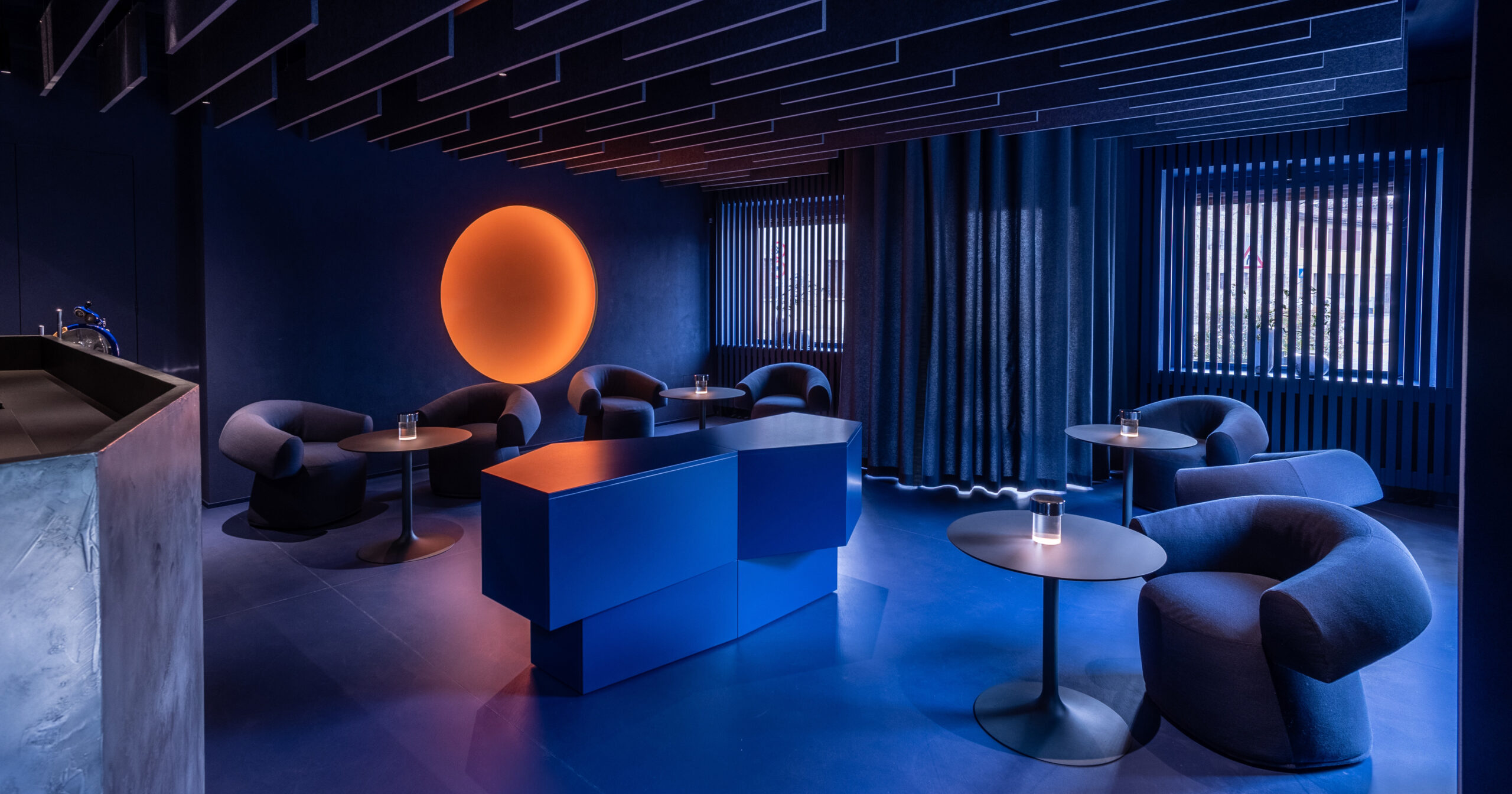
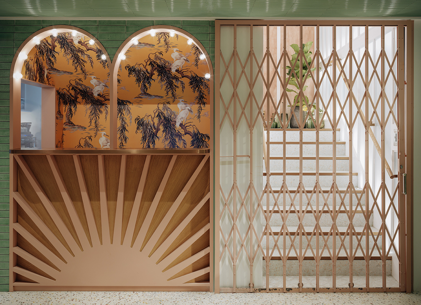
John Anthony, a dim sum restaurant by LINEHOUSE in Hong Kong, takes patrons on a charmingly maximalist journey. Channeling the story of John Anthony, the first Chinese man naturalized as a British citizen, the eatery serves as a bold fusion of East and West. The space, a mix between a British tea hall and Chinese canteen, entices with pink lacquer columns and white metal arches bathed in shifting light, an unmistakable nod to Wes Anderson’s aesthetic.
Housing Asia’s second-largest gin collection, the bar is a grand spectacle. Private rooms adorned with 18th-century trade commodity illustrations and floors of reclaimed terracotta tiles add flair, while the sustainable message of upcycling and using eco-friendly materials gives this maximalist narrative a conscientious undertone.
King Street Station
By ZGF Architects, Seattle, WA, United States
Photographs by Benjamin Benschneider
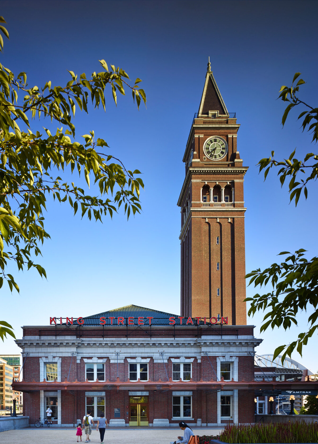
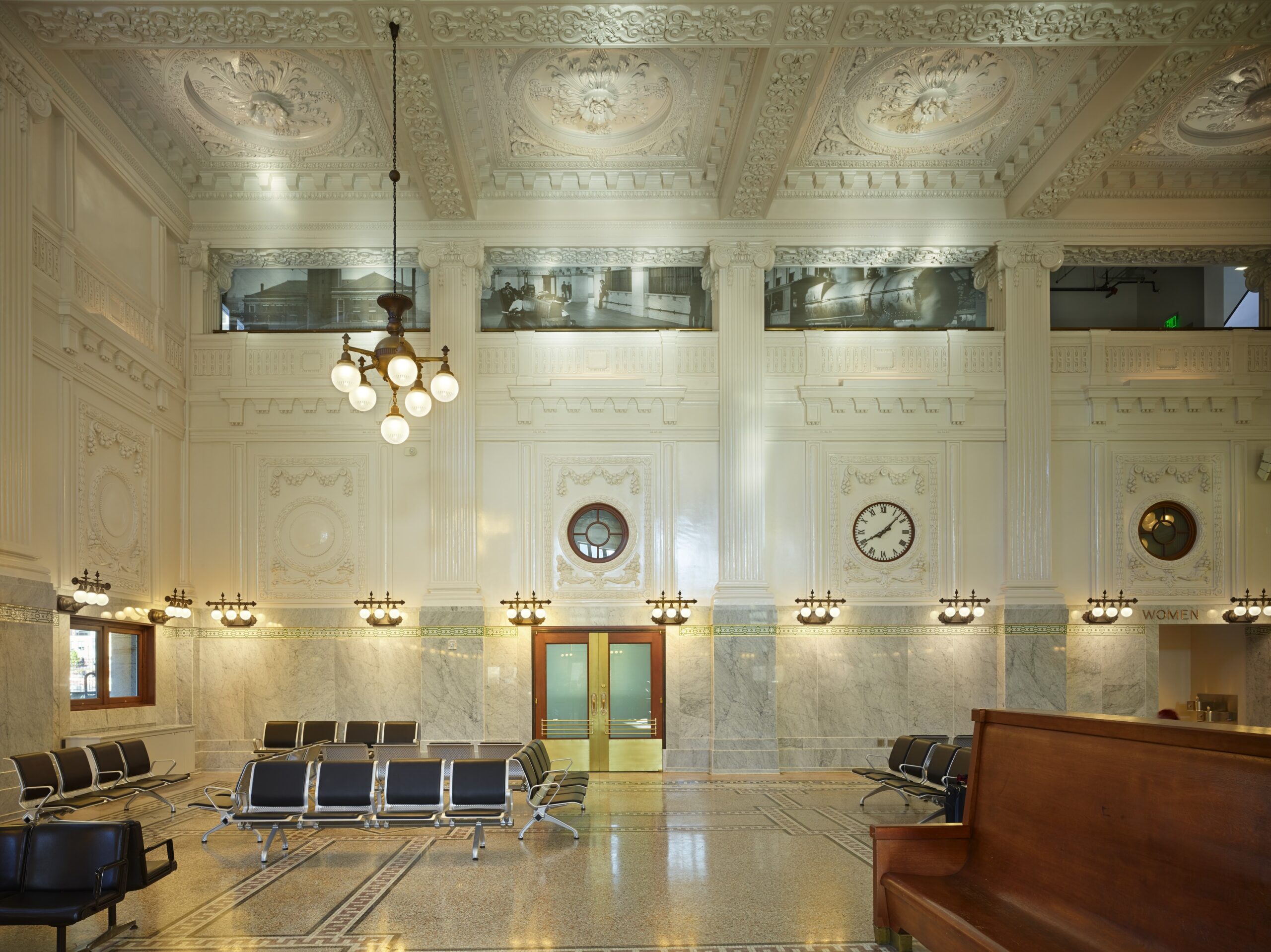
In a flourish of architectural alchemy, Seattle’s King Street Station, restored by ZGF Architects, is an enthralling blend of history and grandeur. This one-time gateway to the West, revitalized from decades of disrepair, is a tale of rejuvenation, its Venetian-inspired clock tower reclaimed as a proud civic symbol. Neon signage on the facade juxtaposes the ornate grandeur within. But this revival isn’t just aesthetic; it’s underpinned by the city’s sustainable ethos, boasting LEED Platinum certification. With a past as rich as a Wes Anderson plot, this station is more than a transportation hub—it’s an homage to the resilience of architectural charm, where bold typography and ornate detailing strike a nostalgic chord.
Architects: Want to have your project featured? Showcase your work by uploading projects to Architizer and sign up for our inspirational newsletters.
