Architects: Want to have your project featured? Showcase your work by uploading projects to Architizer and sign up for our inspirational newsletters.
As one of the three primary colors and with a long history rooted in religion and art, blue is considered majestic in many cultures. In Eastern cultures, the color blue is associated with spirituality, immortality, and divine joy and is believed to have the ability to ward off evil. In Western cultures, blue represents masculinity, authority, and loyalty and denotes safety, trust, and tranquility.
According to color theory, when used on the interior of buildings, blue is considered to be a cool color that has soothing and calming qualities, believed to have positive effects on users’ physical and mental health. In this collection, nine different shades of blue in nine different interiors are showcased to give ideas on how and when to use the color in combination with other colors, materials and finishes.
Presence in Hormuz 02
By ZAV Architects,Hormuz, Iran
Jury Winner, 9th Annual A+Awards, Architecture +Color
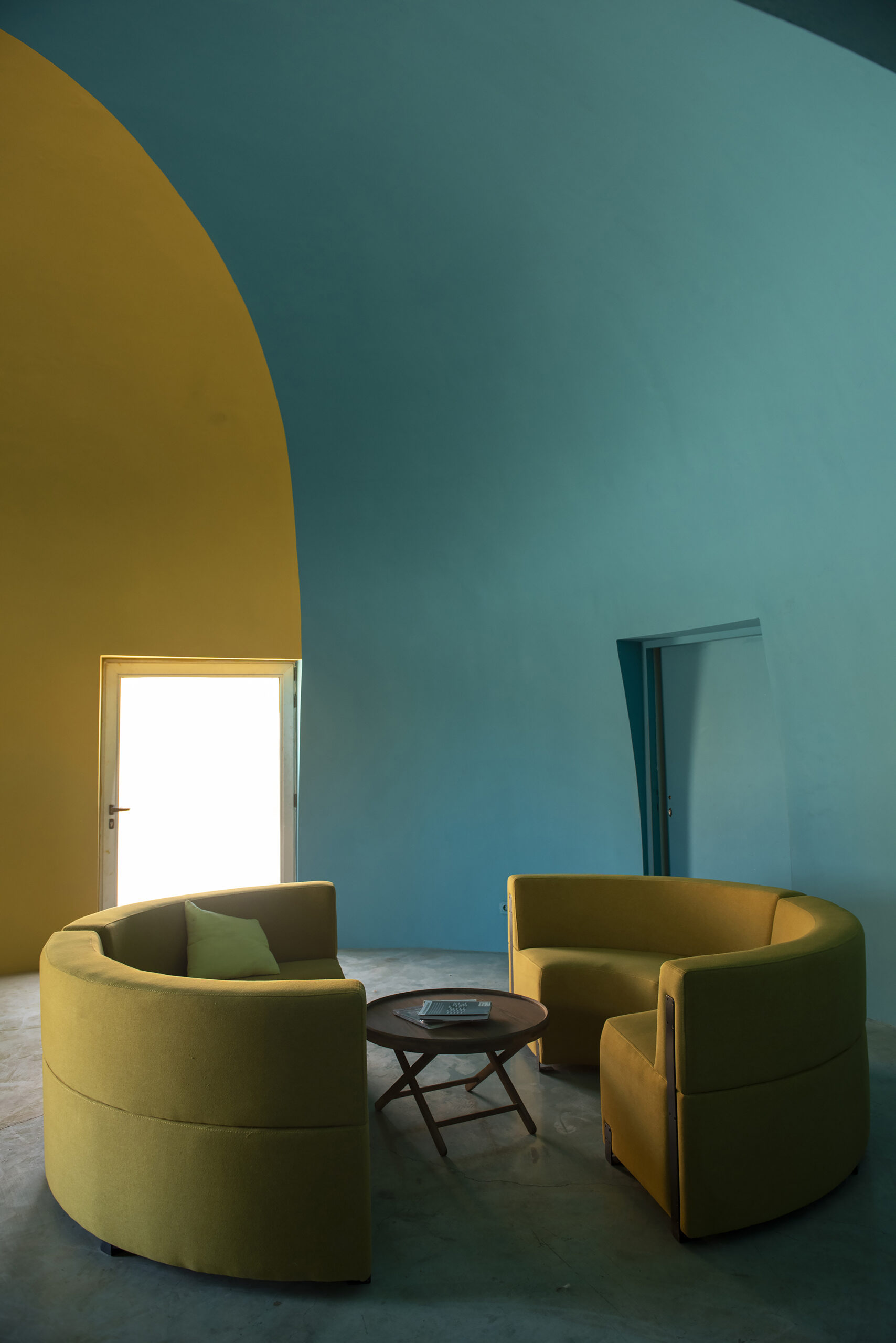
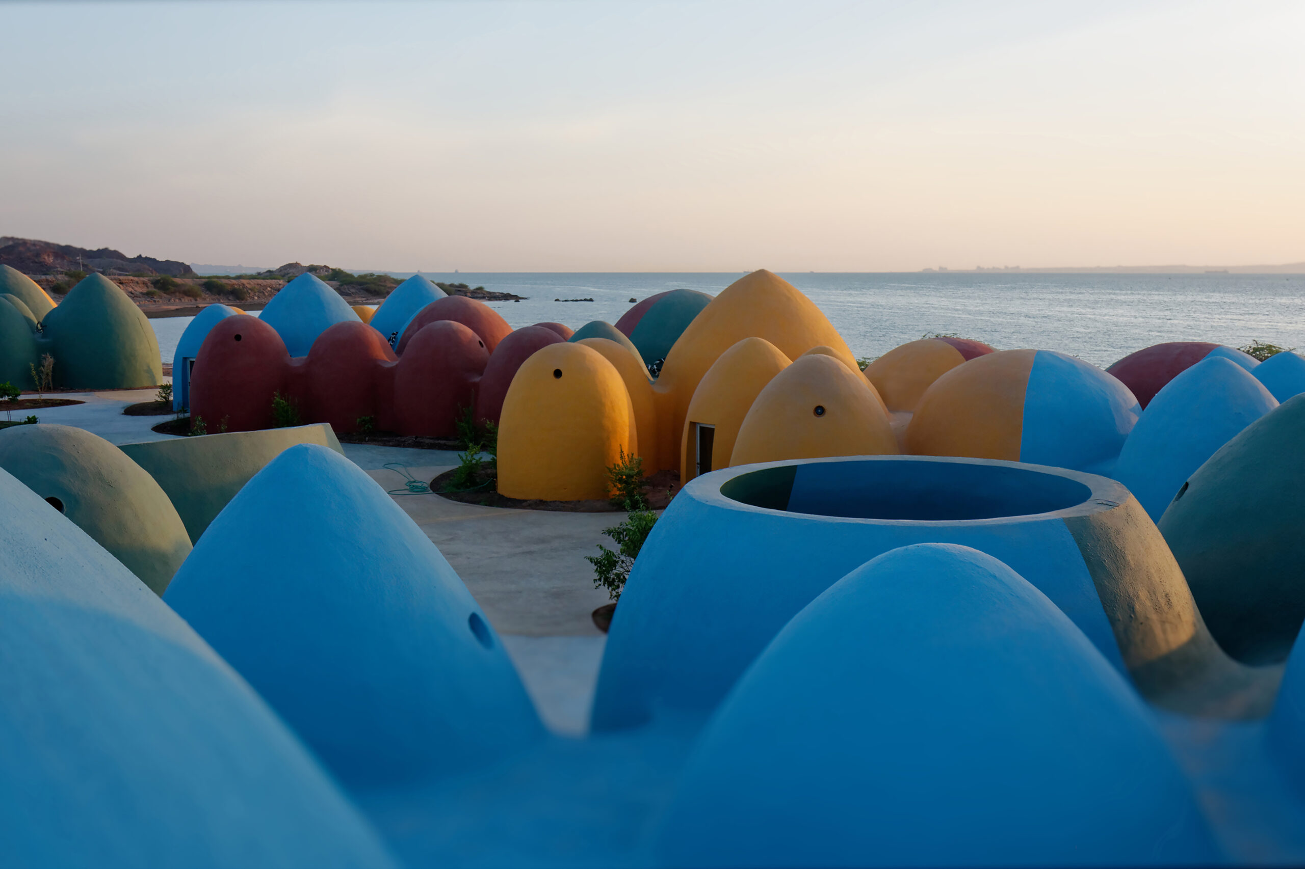 The colorful Majara residence is built as a tourist attraction that aims to celebrate the city of Hormuz and improve the economic situation of its locals by relying on local craftsmanship. The dome shaped residences aim to simulate the rainbow like topography of the area, whose wide range of colors include different shades of blue that are used to paint the exterior and the interior of the superadobe structures.
La 68 Cultural Center
By FMT Estudio , Mérida, Mexico
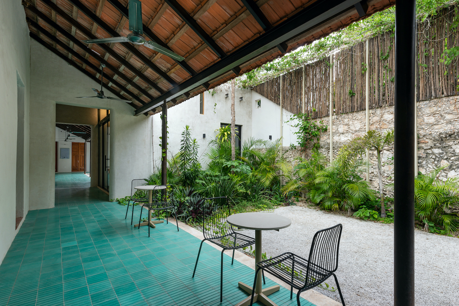
 For this project, the use of the color blue bridges the past with the present, celebrating the area’s culture and history while also making space for the current events and values. This is largely achieved through the design’s integration of the color in different elements of the center — predominantly the textured mosaic floor that almost looks like a carpet and connects the different parts of the center with each other, bridging what used to be two colonial houses that were merged together to open the new cultural center.
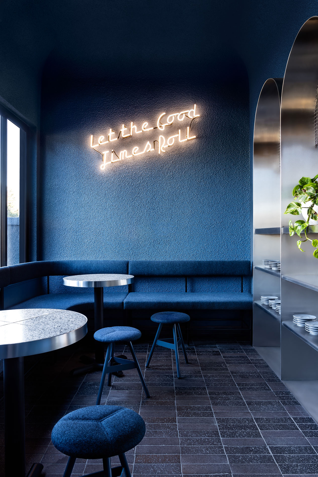
Middletown Cafe
By Studio Tate,Prahran, Australia
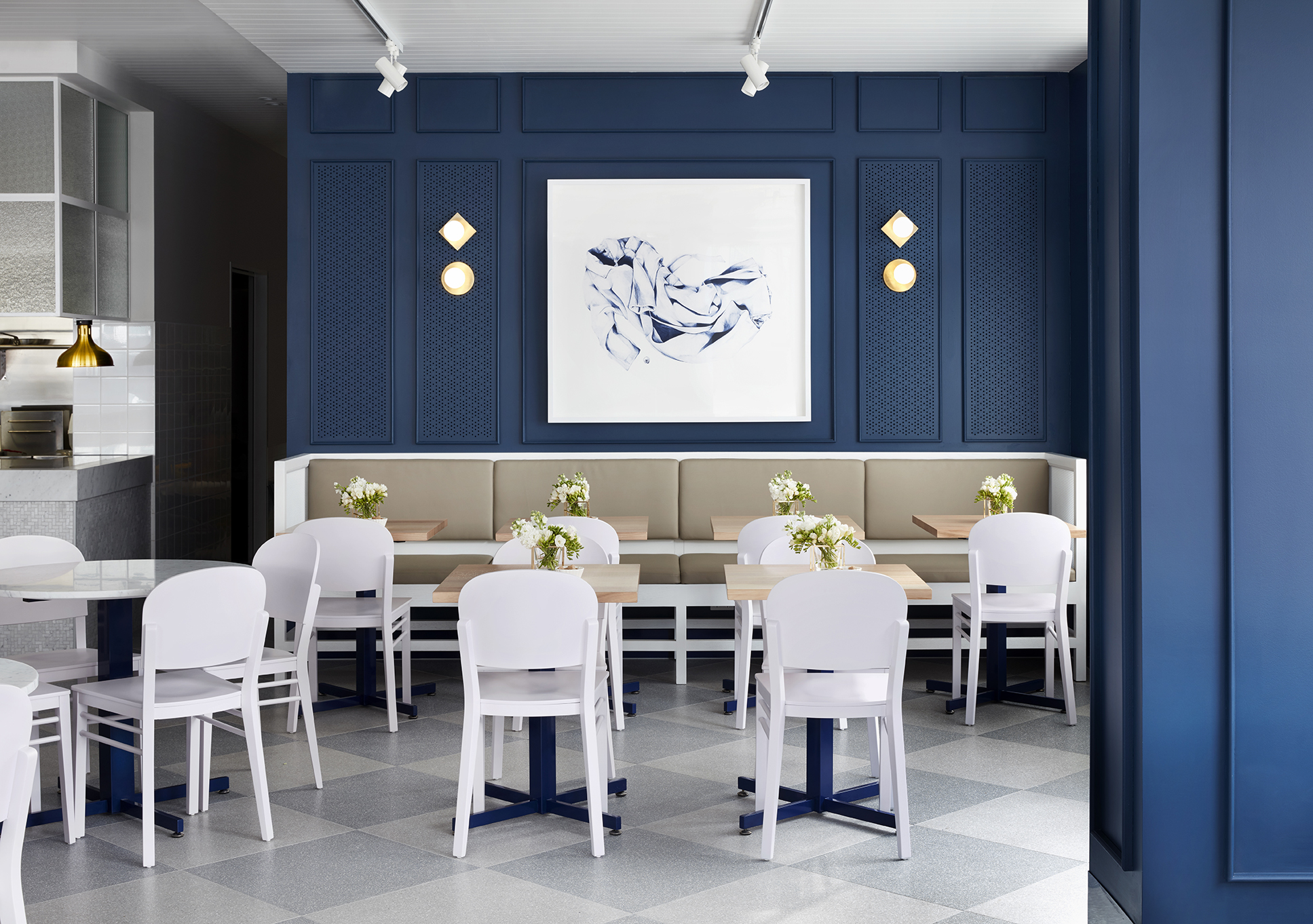
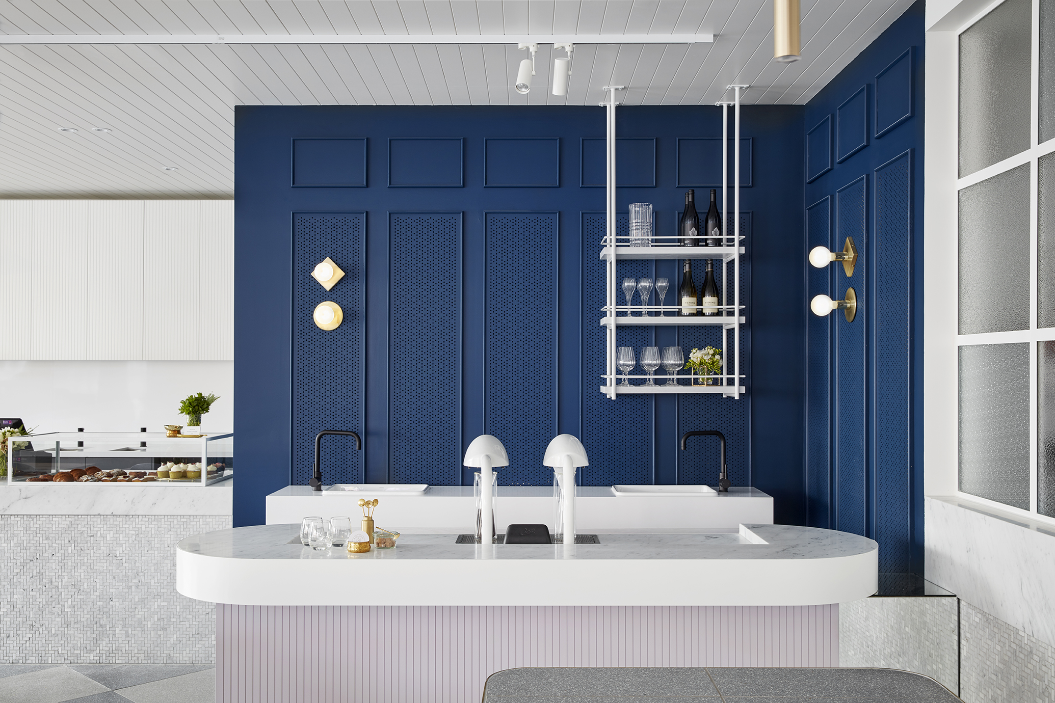 In this chic cafe in Australia, the navy blue walls serve as the background in front of which a sophisticated and elegant coffee drinking experience takes place, amidst a harmonious collection of materials such as terrazzo tiles, marble and brass trims. The blue color pallet stands in contrast with the white counter tops and chairs, giving the coffee connoisseurs the space to enjoy their coffee around a variety of seating arrangements.
Botticelli tells a story – exhibition
By NArchitekTURA I NArchitecTURE, Warsaw, Poland
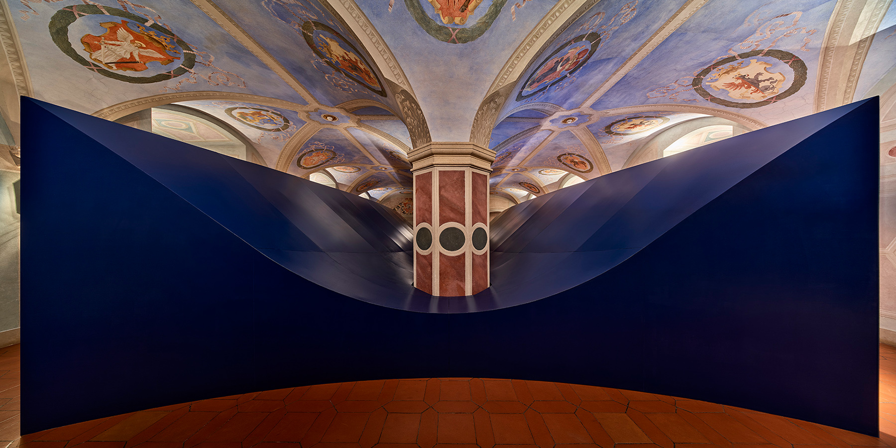
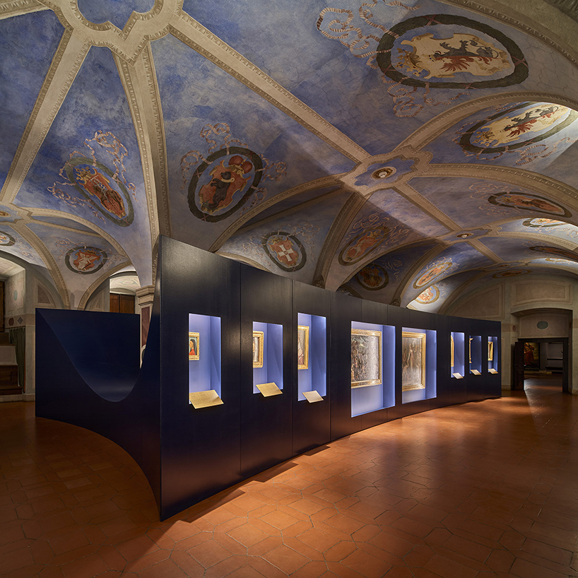
Built in one of the chambers in the historical Warsaw castle in Poland, the new exhibition display is painted with a striking and majestic blue that beautifully coats the exterior of the structure. Metaphorically, the color seemed to seep outside the frames of Botticelli’s paintings that are put at display, coloring the crown and the apse and considered a shade of of the famous lapis lazuli pigment. The color also comes as a darkened shade of that of the ceiling, complementing the design of the exhibition structure that forms a negative of the vault above.
Nabshi Gallery
By ZAV Architects,Tehran, Iran 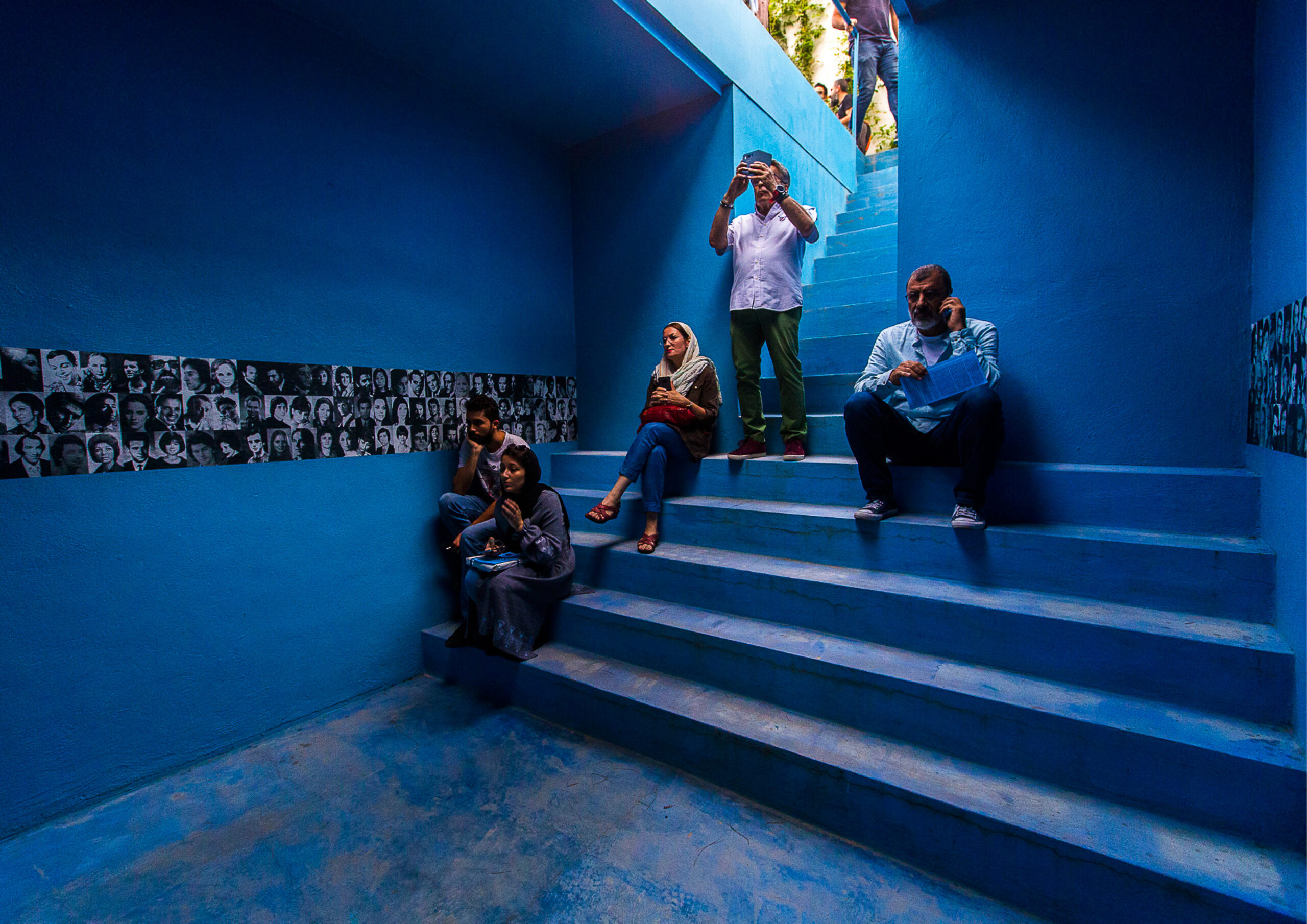
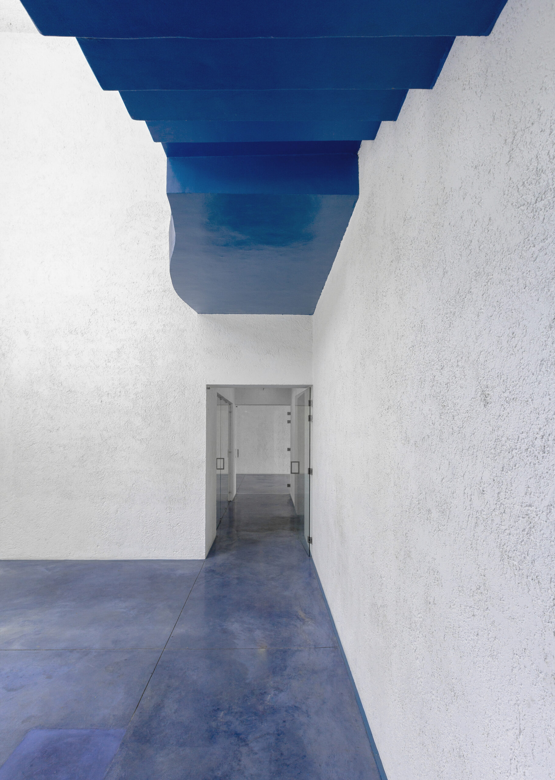 Presenting an example of intricate adaptive reuse, this gallery that used to be a house utilizes the color blue as a connecting element that weaves together different parts of the space, seen from the entrance to the rooftop. Starting at what used to be a bomb shelter and continuing into the building, for this project, blue represents continuity and transparency and stands in strong contrast to the white masonry walls of the building.
‘Blue Lounge’ Agli Amici 1887
By Visual Display – Interior / Identity / Stories, Udine, Italy
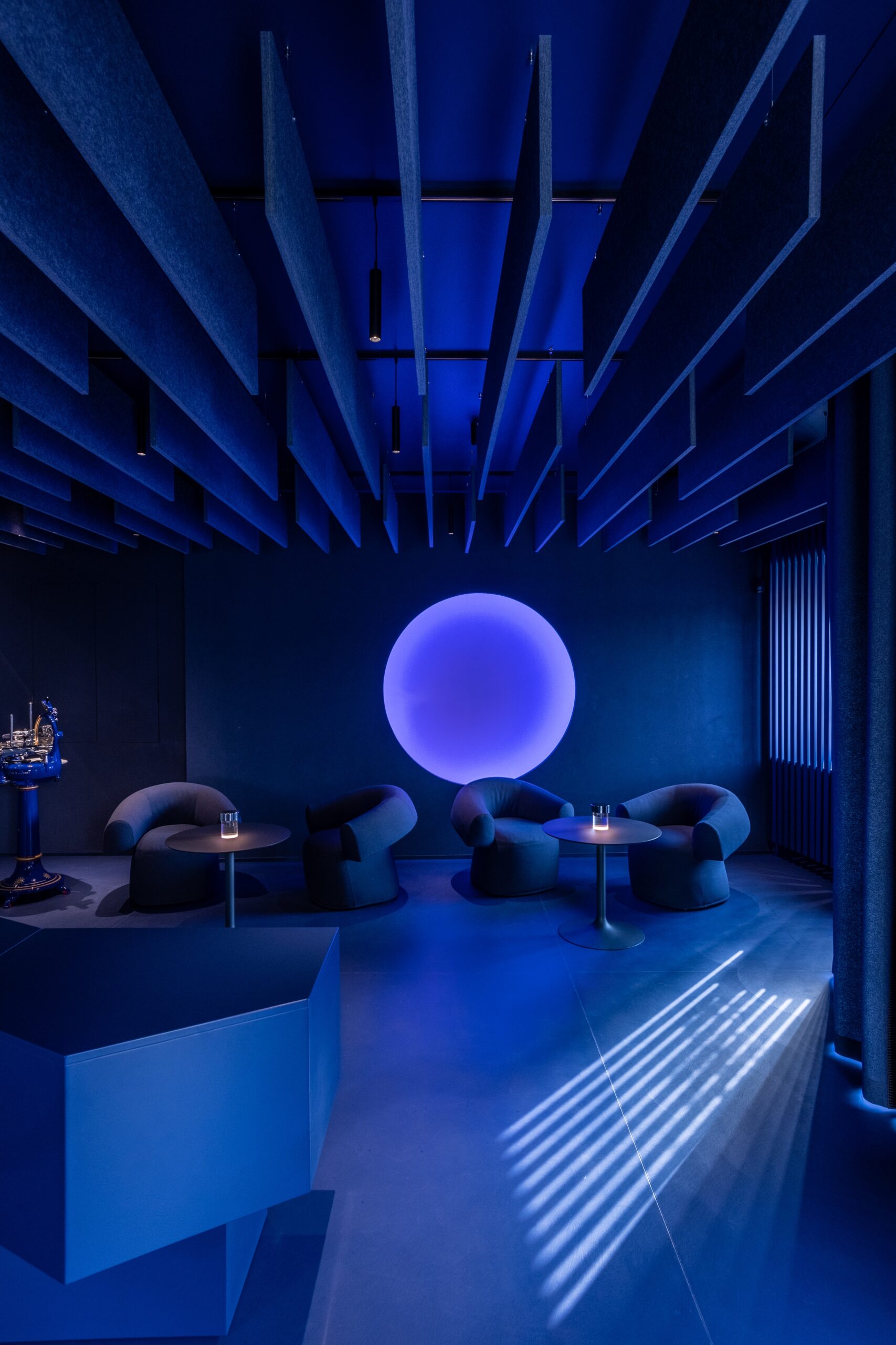
Photo by Alessandro Paderni
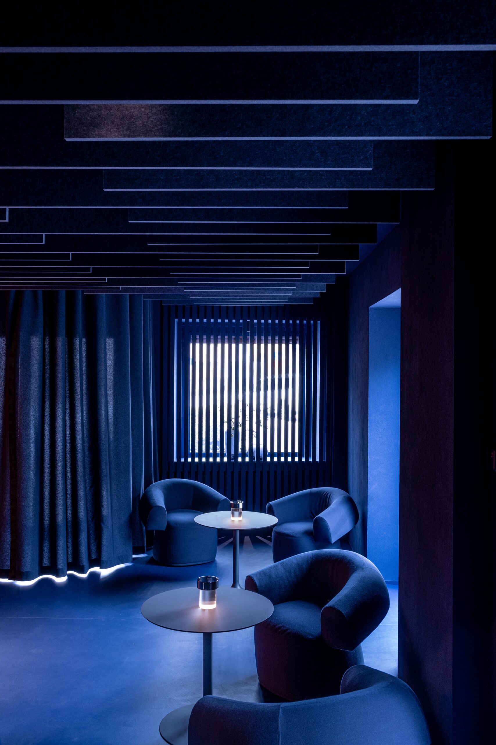
Photo by Alessandro Paderni
After passing the curtain at the entrance of this all blue lounge, one finds themselves in an alluring space that almost looks like it belongs to a retro movie, where time seems to stop. Acting as the first course of a fully rounded 2 Michelin star gastronomical experience, clients are turned into spectators that are given the opportunity to indulge in a full sensory journey as they observe the chefs cook. The lounge serves as the stage on which that experience is set to unfold, with blue painting and illuminating everything with a layer of mystery and elegance.
CRAFTON
By mode:lina™,Poznań, Poland
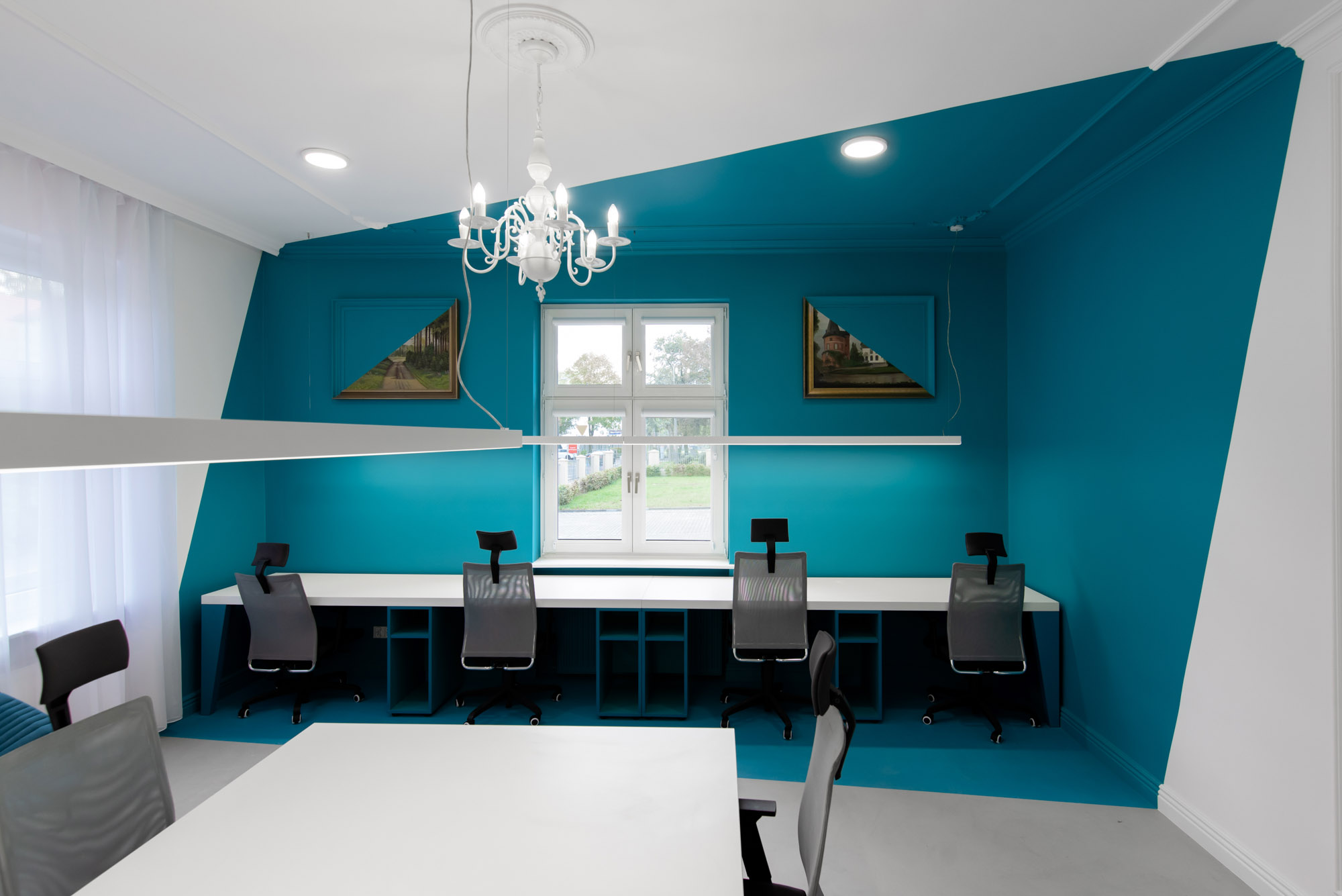
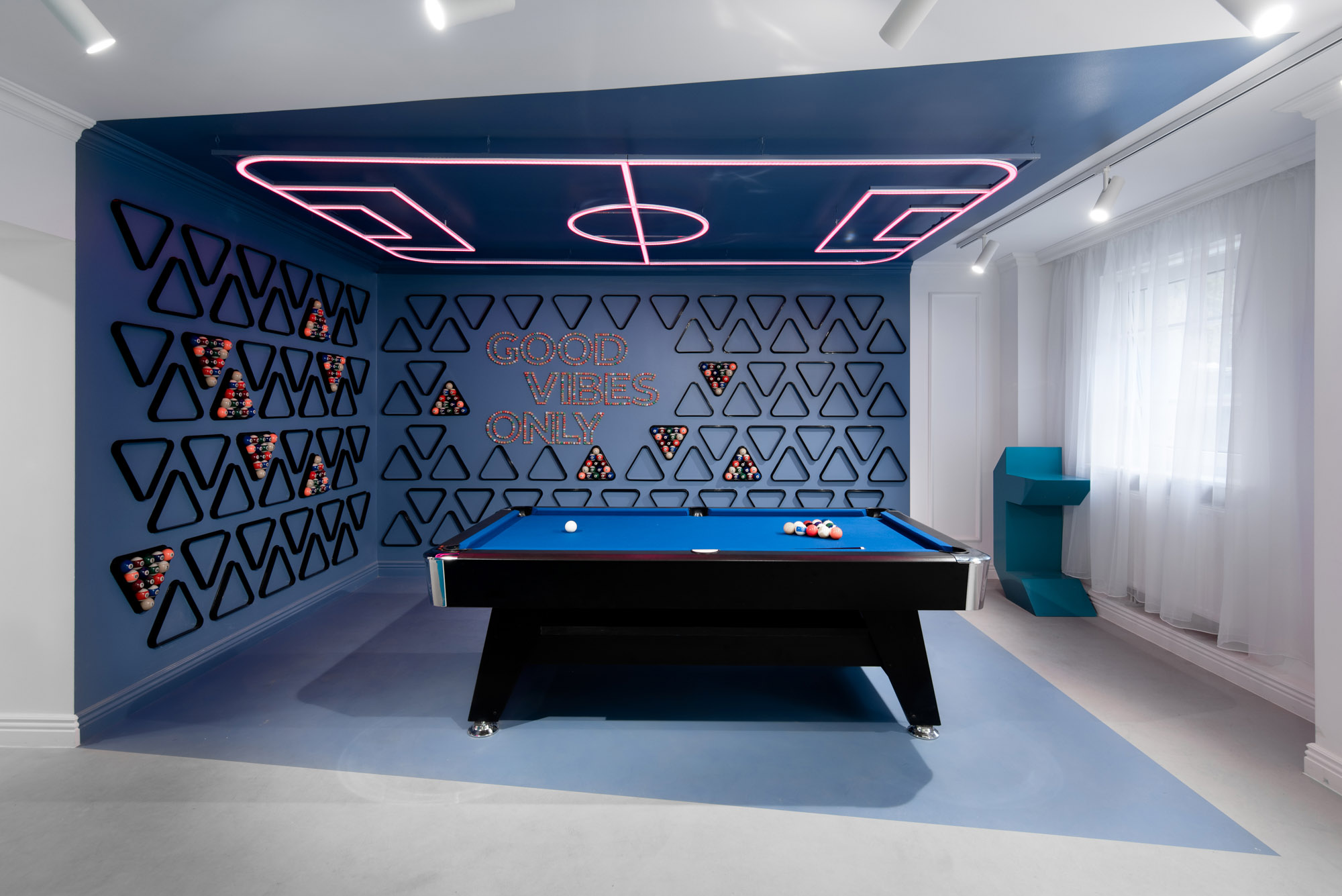
The designing team was commissioned with the task of turning a residential villa into a software house with a variety of functions and meeting spaces. To do so, the designers used a set of different colors and materials to draw the boundaries of each zone, using the space as canvas against which they stroked their brushes. Among the wide range of colors, blue was used in two shades, once for one meeting room and again for the billard corner.
Print Lounge
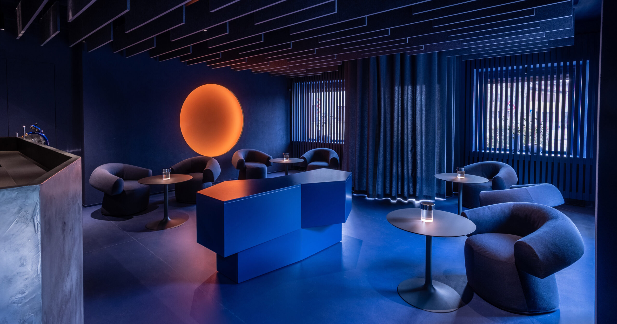
By Cass Calder Smith Architecture + Interiors, New York, United States
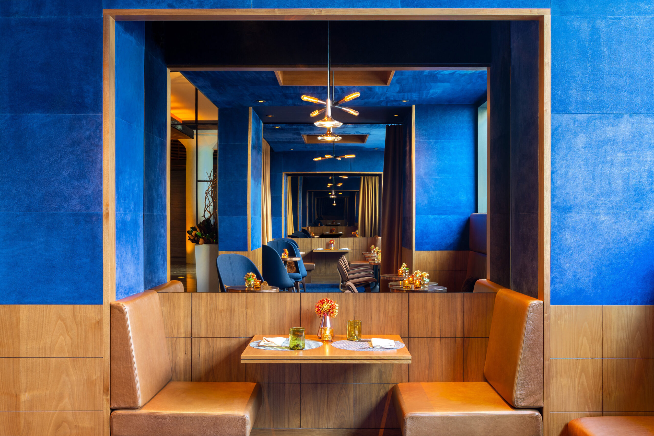
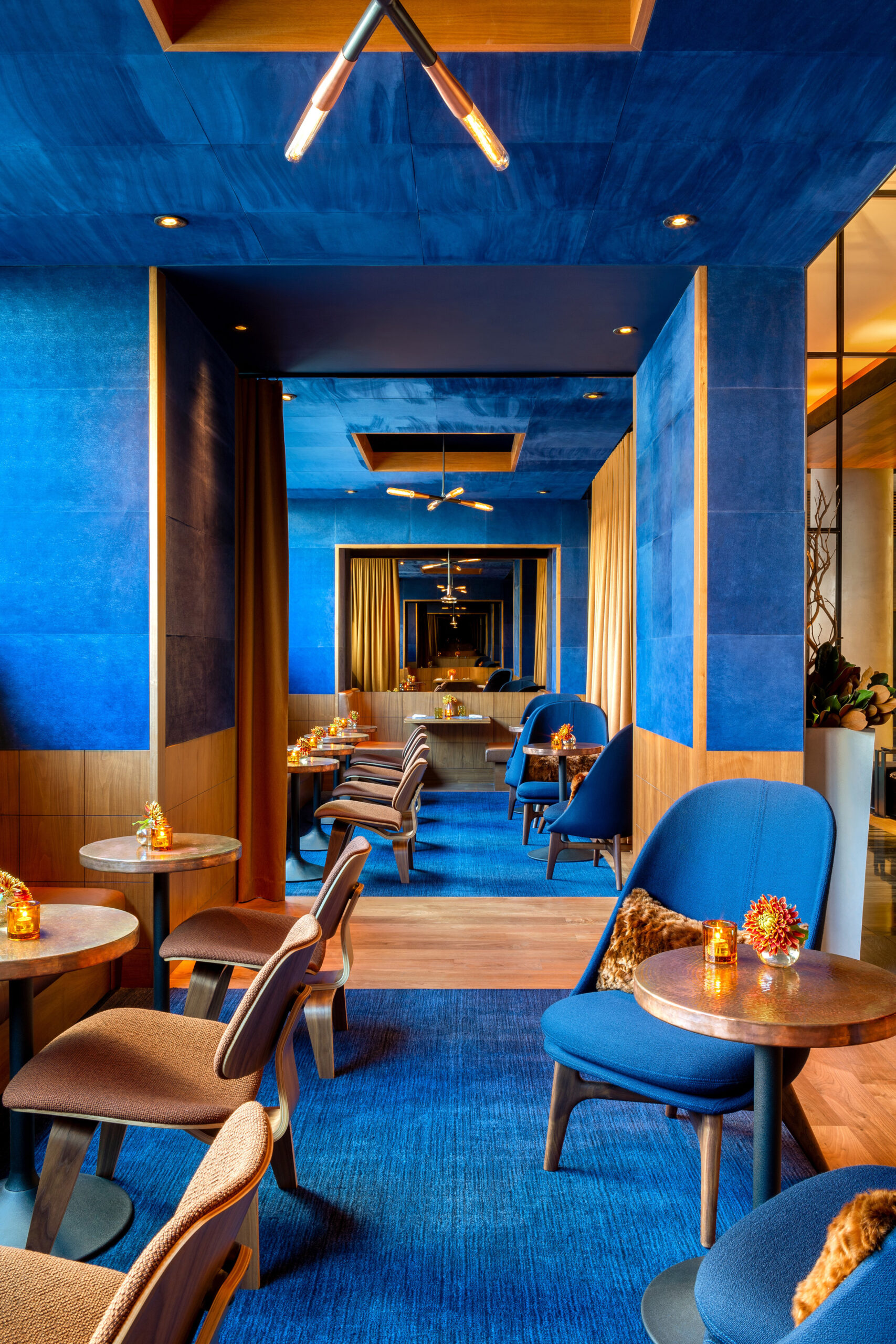 In this luxurious lounge in New York, blue is so strongly present that it almost feels like an extra diner on each table, confidently leaving its mark on the minds of everyone who visits the place. With a color combination that might have coincidentally resembled that of the ancient Ishtar Gate in historical Mesopotamia, blue seude panels cover the walls and ceiling, matched with a blue carpet and blue chairs, complemented by a number of brown chairs made out of walnut wood.
Billy Buoy
By Biasol Studio, Essendon, Australia
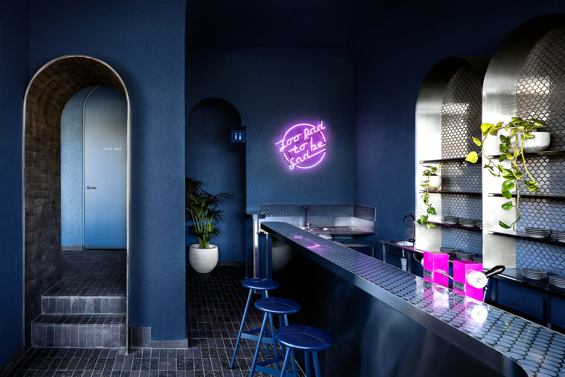
 Stepping into this diner in Essendon, Australia, one feels like they have traveled back in time to the 1980’s, with the cool and retro style of the place and the color combination of cobalt blue, hot pink, and grey. Despite its small area, the eatery was designed with a great level of sophistication that leaves a strong yet youthful impact on its visitors, complemented by its corner location and bold branding.
Architects: Want to have your project featured? Showcase your work by uploading projects to Architizer and sign up for our inspirational newsletters.
 Presence in Hormoz | Rong Cultural Center
  Print Lounge