
Architects: Want to have your project featured? Showcase your work through Architizer and sign up for our inspirational newsletters.
How do color, decoration and whimsy come together in modern design? Architect Ludwig Mies van der Rohe became known around the world for his seemingly simple buildings and the phrase “Less is More,” a mantra he adopted throughout his life. In turn, that phrase would come to define a generation of minimalist, modern design. As Pat Finn noted, more than 60 years after this famous statement, it seems that ornament still carries a hint of taboo. So what place does maximalism have in our everyday life?
Across architecture and interior design disciplines alike, maximalism is a reaction against minimalism, a move towards an aesthetic of excess. The philosophy is summarized as “more is more.” More color, more decoration, and the desire to celebrate the intricacies and complexity that come with them. Taking a dive into the Architizer library, the following projects represent how designers are creating maximalist interiors today. They represent multiple scales, material choices and wide-ranging geographies around the world. In turn, they show how interiors are becoming ever more playful, inclusive and inspiring.
BasilicÔ
By Studio CAYS, Casablanca, Morocco
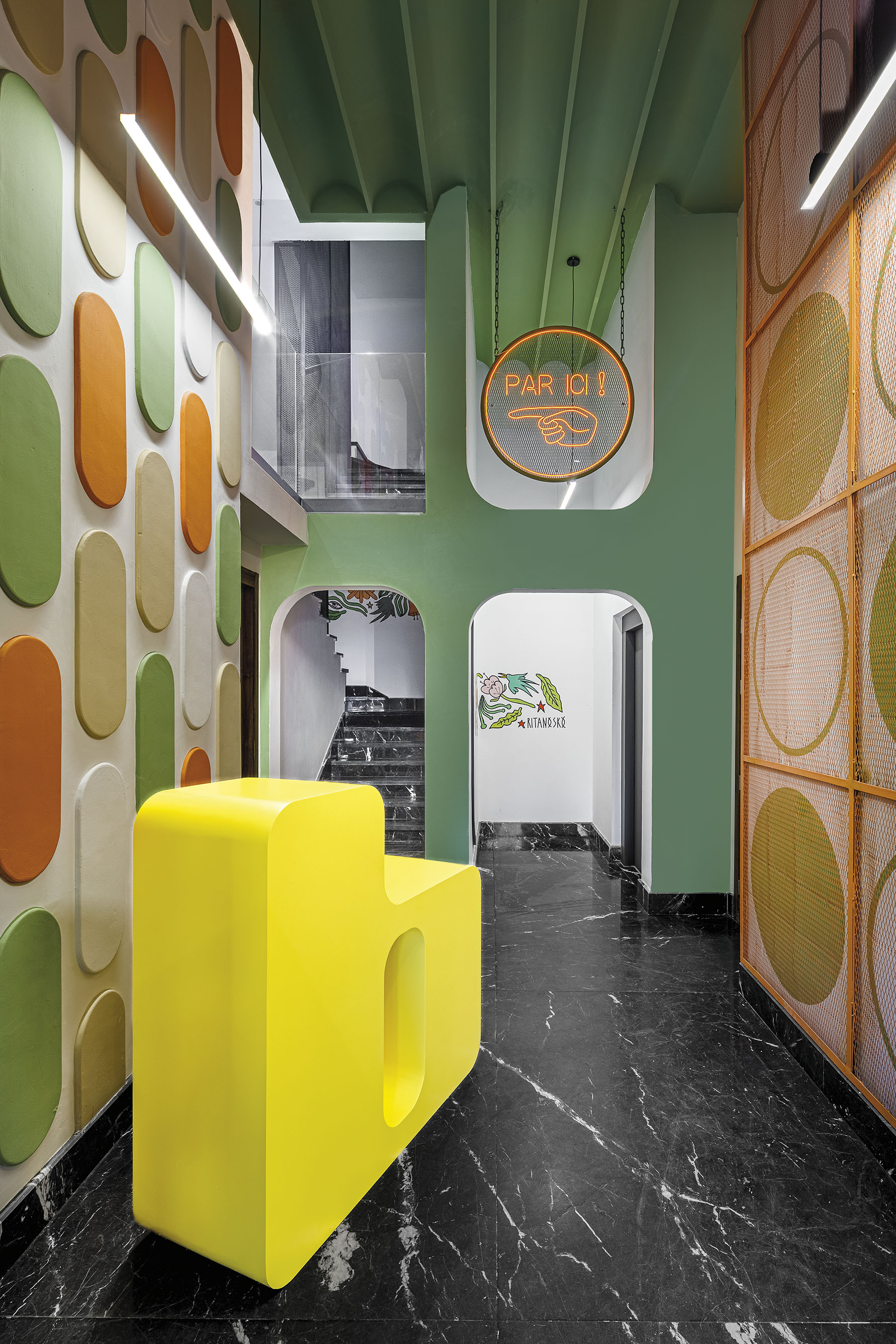 The BasilicÔ was made to create an attractive and magnetizing place to explore. The design team wanted to imagine the impact colors can have on the occupant experience, creating an environment that stimulates the senses. As they explained, polychromy and morphology combine to create a maximalist aura. The BasilicÔ project revolves around a floral theme through which several types of apartments emerge: The CoquelicÔt, the MimÔsa, the TournesÔl, the MartagÔn and the TulipÔ.
Together, the different apartments form a “bouquet” within the building to brings vitality and freshness to raw concrete walls and subdued corridors. Each of the apartment themes has its own character which stems from a common floral personality. The differences result in different shapes, colors and materials which are reflected through wall panels and furniture.
Dream La Miro
By Wutopia Lab, Jiangsu, China
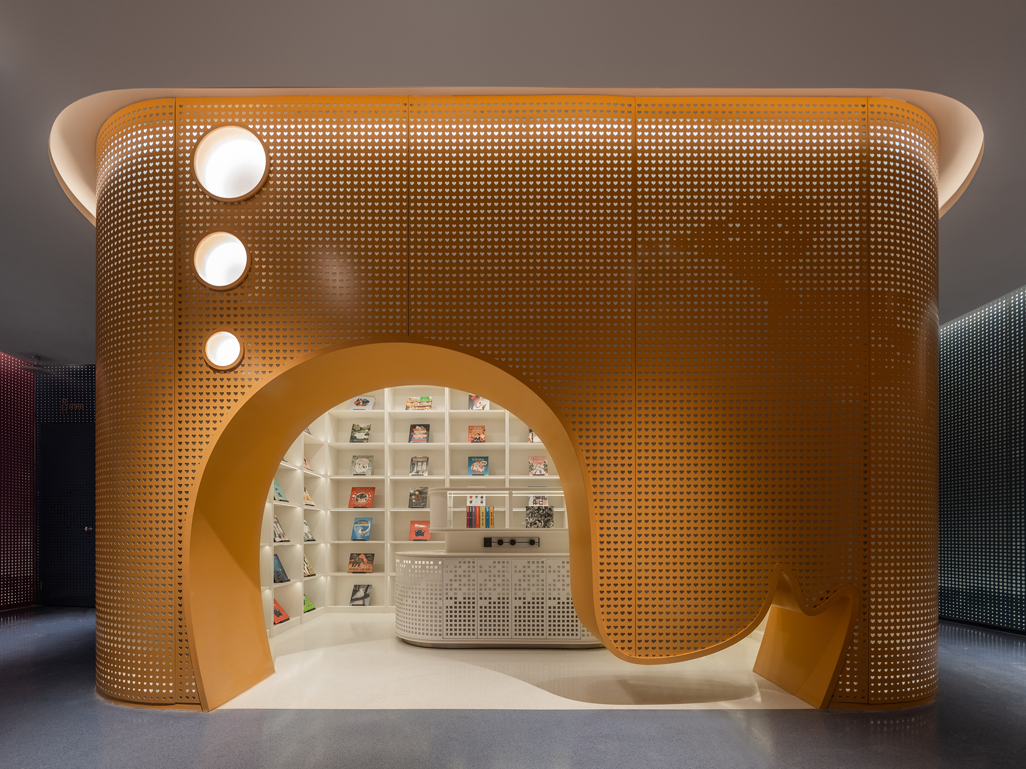 In Dream La Miro, Wutopia Lab wanted to create a place of joy for the Duoyun Bookstore. The fairytale parent-child bookstore was opened at Dream Town in Yancheng, Jiangsu. When the client showed the team the IP they had introduced, namely the three animated films created by Italian artist Cristina Làstrego: Mirò the Cat, The Circus and The Creation, they were moved by the magnificent scenes and the imagination created by the artist.
The result is a fairy tale bookstore that uses the origin of life as a base inspiration combined with elements from the other animations. Wutopia Lab chose the ark as the theme, with the yellow outside and red inside sailing ship docked in the harbor of the book sea. All the fairy tales about the Miro store of Duoyun Bookstore start from here. The team didn’t want the interior design to be boring or simple. The tent, ark, mountain and forest all became means by which they tried to break out a typical style façade.
LIÒN
By COLLIDANIELARCHITETTO, Rome, Italy
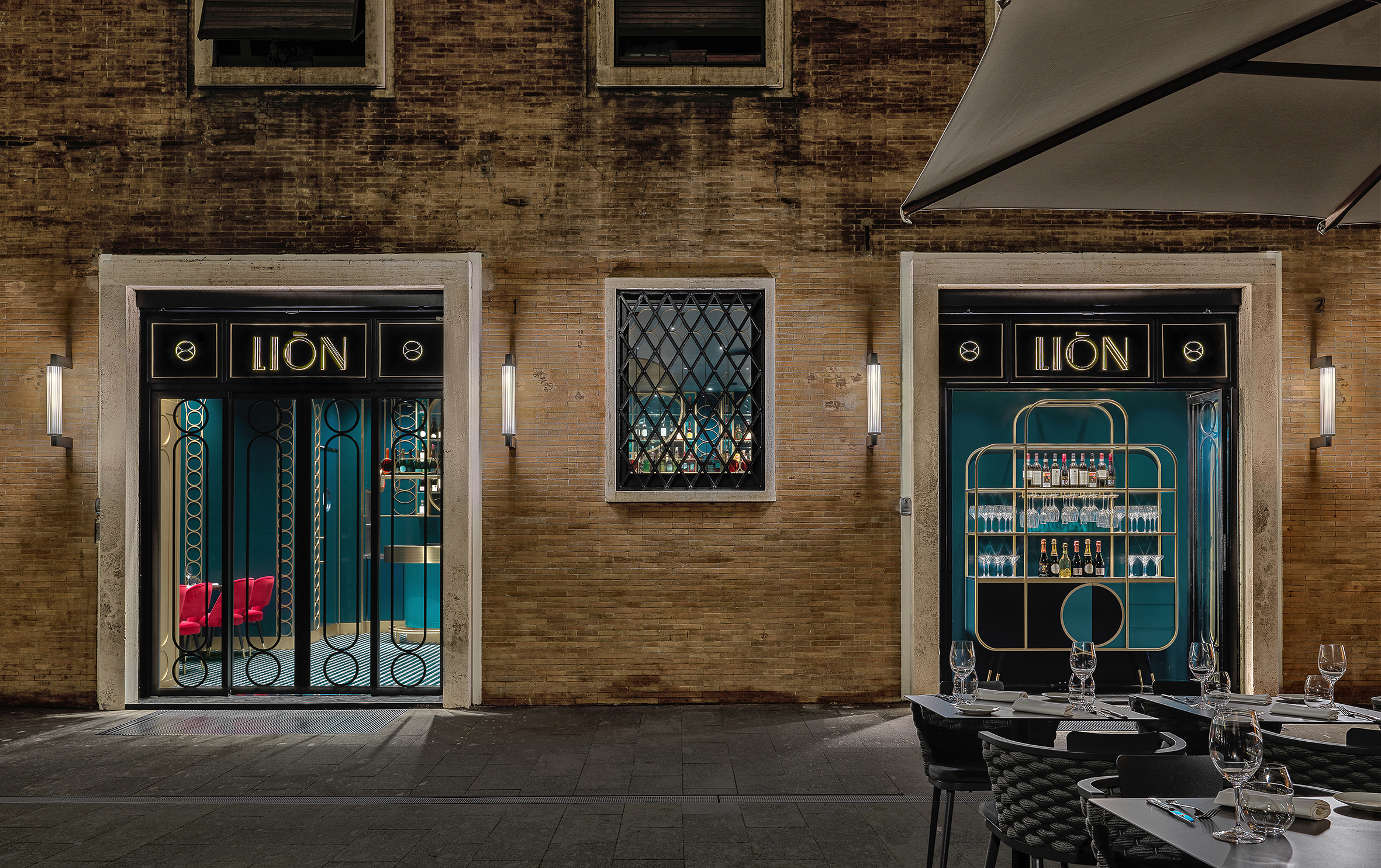
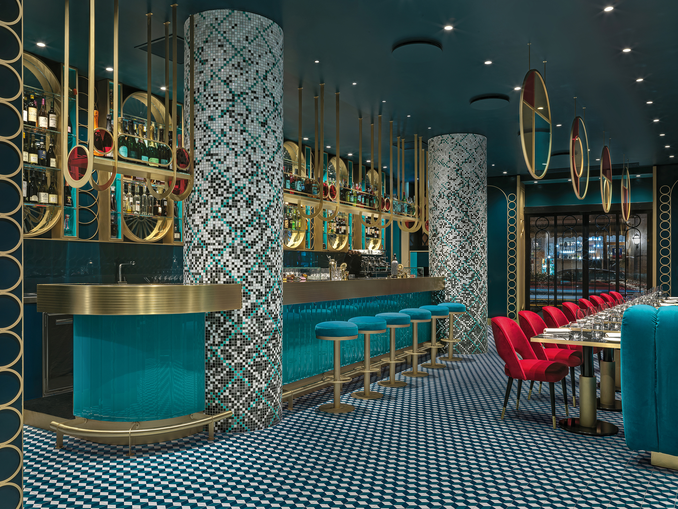 LIÒN is a restaurant and cocktail bar in the heart of Rome — halfway between the Pantheon and Piazza Navon. The project features bold lines and saturated colors in a maximalist style, contrasting with the austerity of the Palazzo that encompassed it. The idea was to give back to the city fragments of the Dolce Vita. Soft lights and mirrored surfaces envelope a sophisticated restaurant, whose terrace overlooks Largo della Sapienza.
LIÒN unfolds on two levels: the ground floor, encapsulating the restaurant, is completely projected on the outside through large windows outlined by a thick travertine frame. The basement, which is accessed via a marble staircase embellished with brass details, houses the service rooms, the kitchen and the wine cellar. The circle became the matrix of the dynamic elements, with soft and sinuous lines, which characterize the interiors, from the subtle and arched friezes that envelop the space, to the deep three-dimensional lozenge screen.
The MIXc Kunshan
By X+LIVING, China
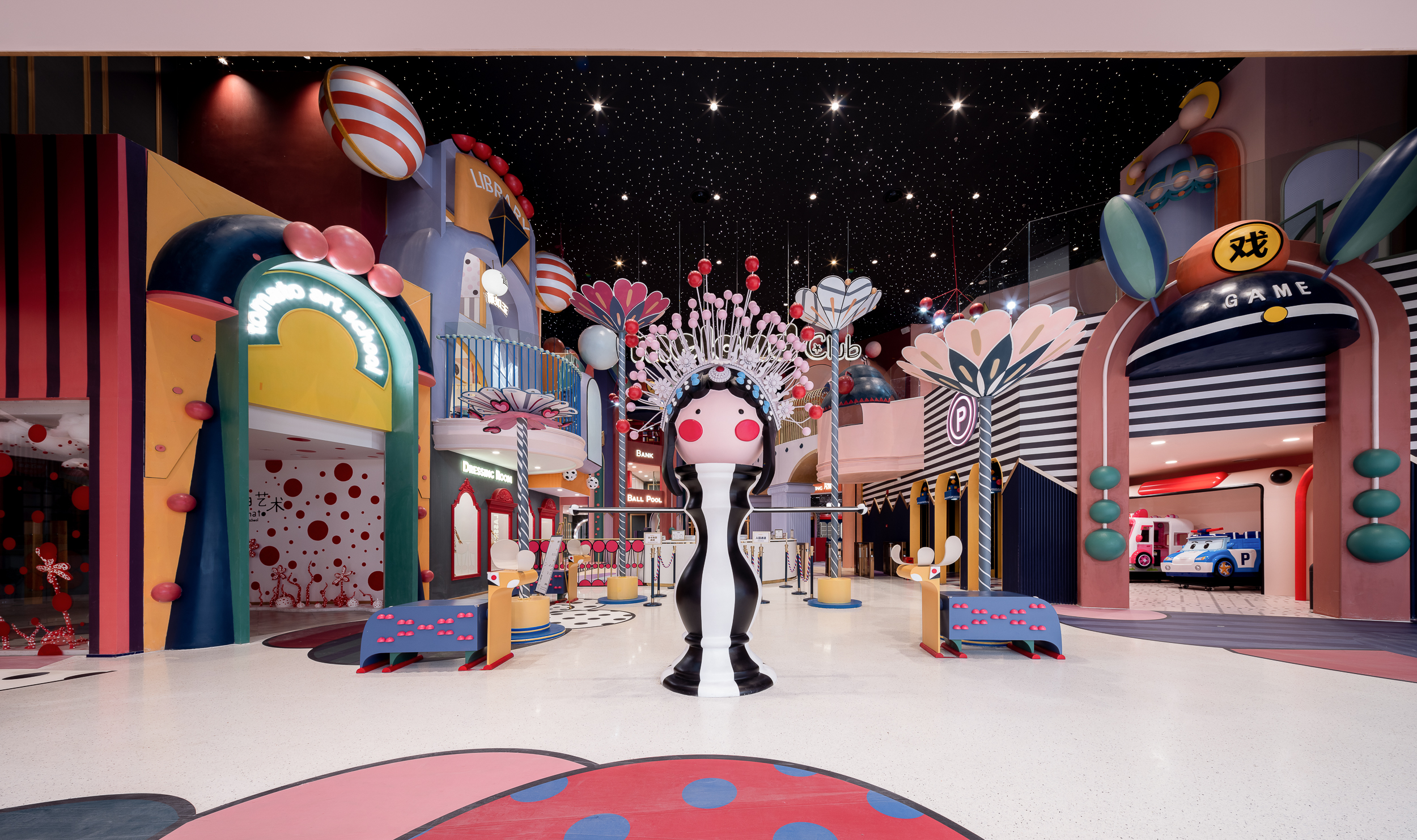
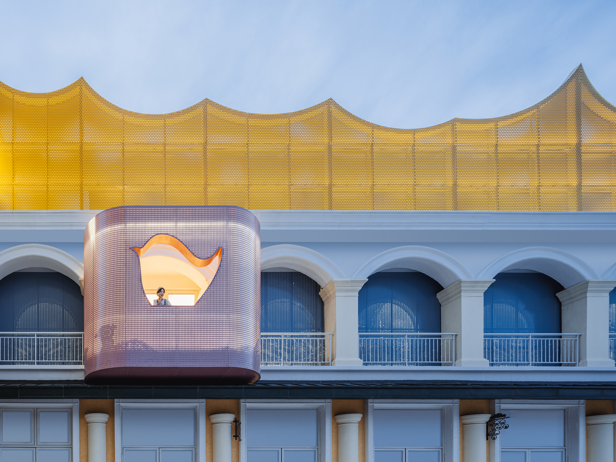
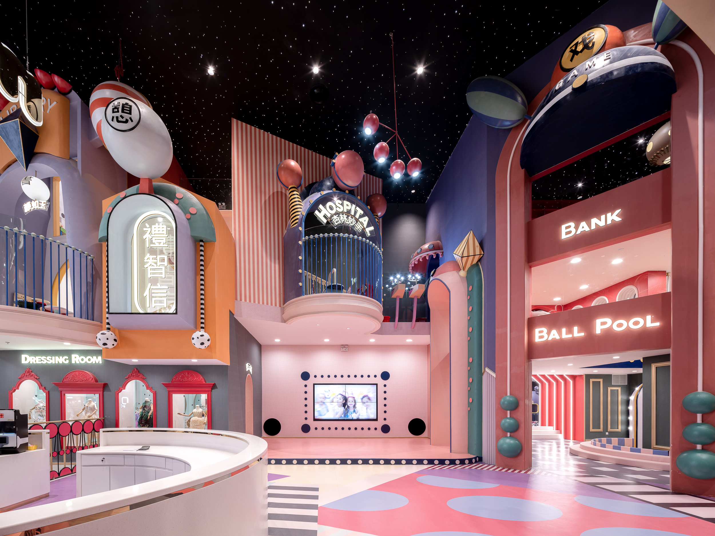 MIXc Kunshan was designed by X+LIVING to create a commercial space with an innovative strategy. The team set out to transform a public space on the third floor of a mall into a children’s section with a unity of aesthetics and theme. The result was a reimagining of public space in shopping malls. The project is located in Kunshan, Jiangsu Province, an important birthplace of Kunqu Opera. It has the nickname of “the mother of Chinese Opera”.
With the vision of creating a multifunctional experience venue that integrates parenting, leisure and education, the design team blurred the physical boundary between the public area and the retail stores through a coordinated facade design. In order to strengthen the cultural identity of the project, the team used Kunqu Opera as the origin of the design concept, and replaced the traditional aesthetic form with interesting design techniques to create a dreamlike, maximalist wonderland.
Barberia Royal
By ROW Studio, Ciudad de México, Mexico
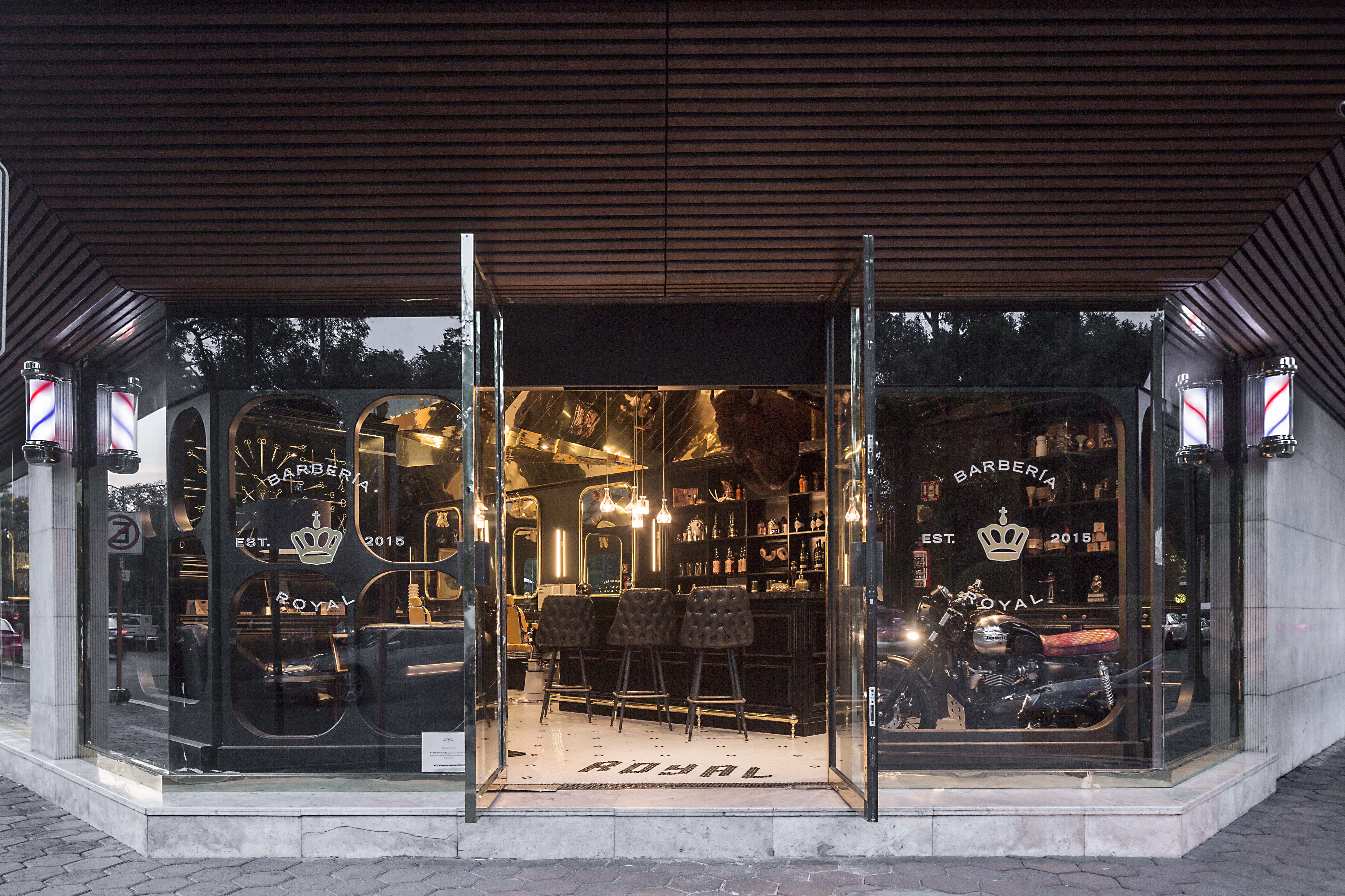
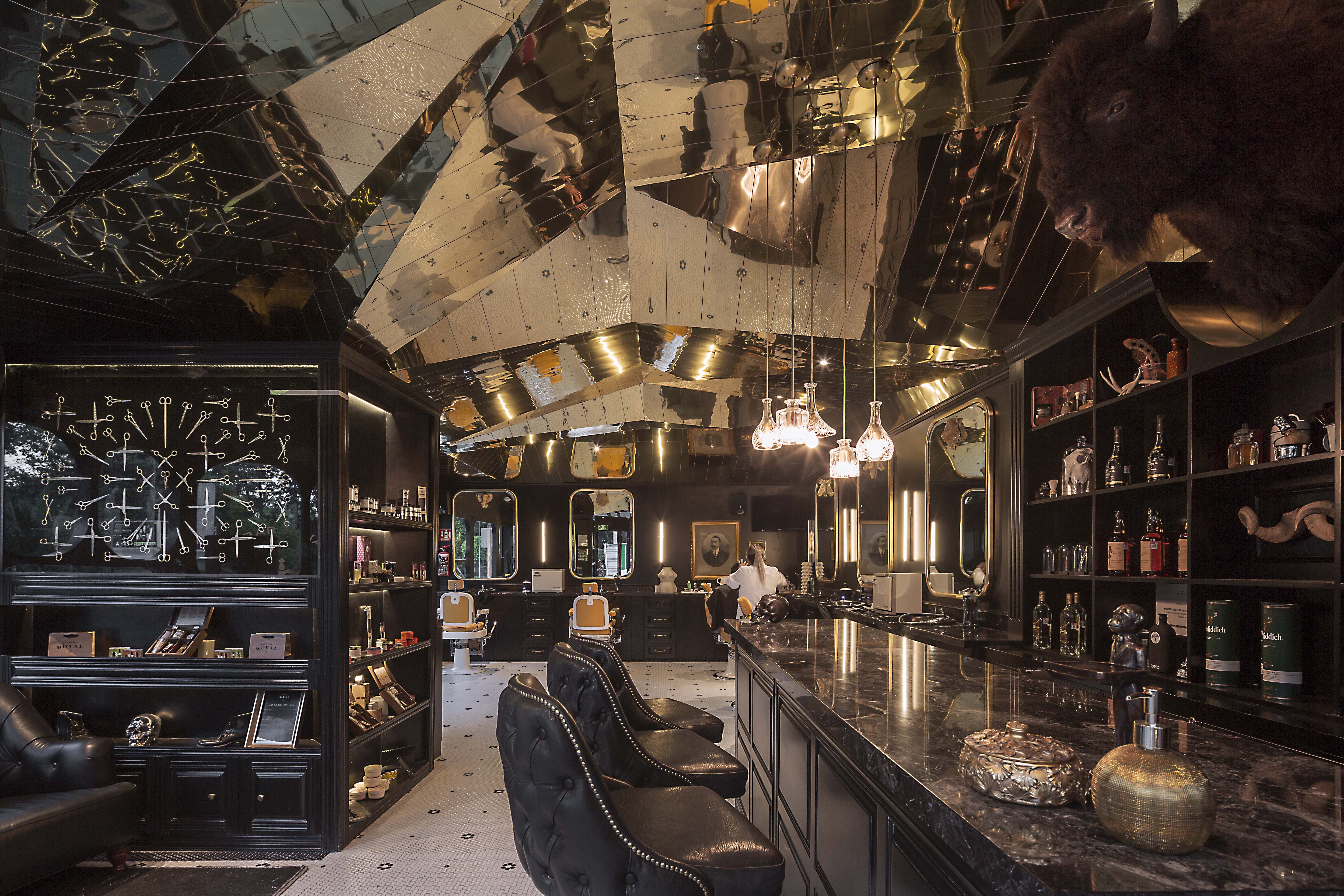 Barberia Royal is a barbershop that offers services in an incredible location of Mexico City. ROW Studio wanted to incorporate the bits and pieces of a previous proposal that was under construction on the site for a different barbershop that was never finished, recycling mismatching moldings and other wooden elements. They put the pieces together almost randomly, fitting them in a contemporary form that still references the traditional symbols of European royalty.
The lower half of the space includes colors and materials linked to the long standing heritage of traditional barbershops, including black and white hexagonal tiles floor with a flower pattern and the Royal name greeting all the patrons at the entrance. In contrast, the ceiling is shaped with an intricate faceted surface that adapts to the changing heights of the space and the structural elements of the building finished with a laser-cut golden anodized aluminum surface.
SUNDAYS
By FLAT12x, Krung Thep Maha Nakhon, Thailand
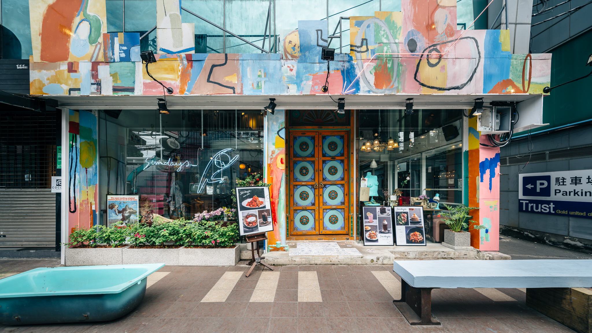
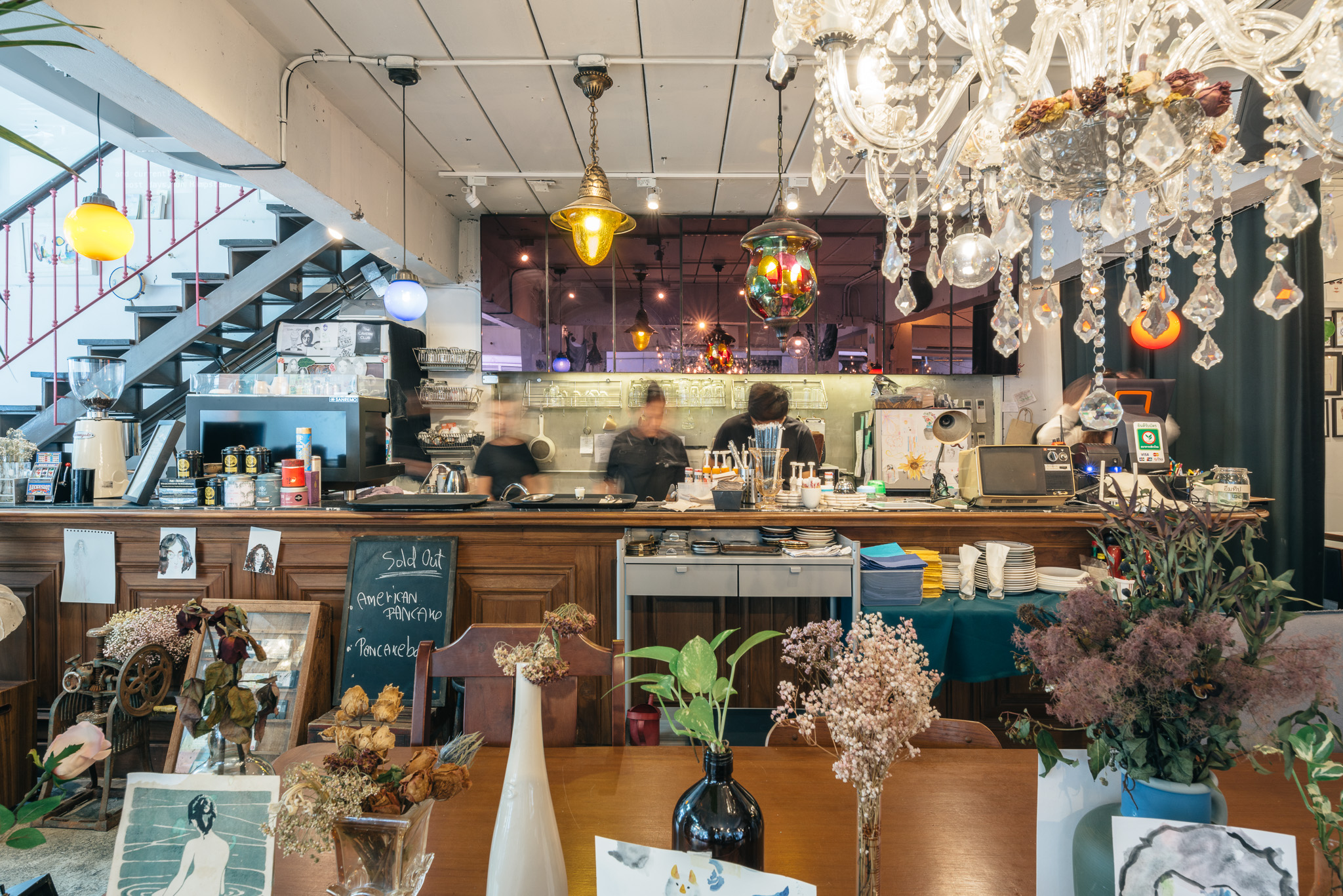 Sundays is the one-off restaurant illustrating design that is hand-crafted and built from the mindset of believing that arts can make things better. The maximalist restaurant was designed to integrate architecture, interior, graphic design and the arts in Bangkok, Thailand. Although surrounded by generic pubs and restaurants, Sundays was made to stand out. The restaurant offers customers striking experiences of what art can do to other things.
Ten pieces of drawings classically covering the unwanted old fridges or the flower bouquets that are pinned upside down to make the old structure of the building a little bit nicer. Roaming through unexpected drawings and paintings alongside with exquisite mixture of decoration styles, the restaurant expresses strong physical connection between the building to the room. Echoing this, the graphic design of the shop epitomizes the brand identity through signage and packaging of all foods and beverages.
Metal Rainbow
By Wutopia Lab, Suzhou, China
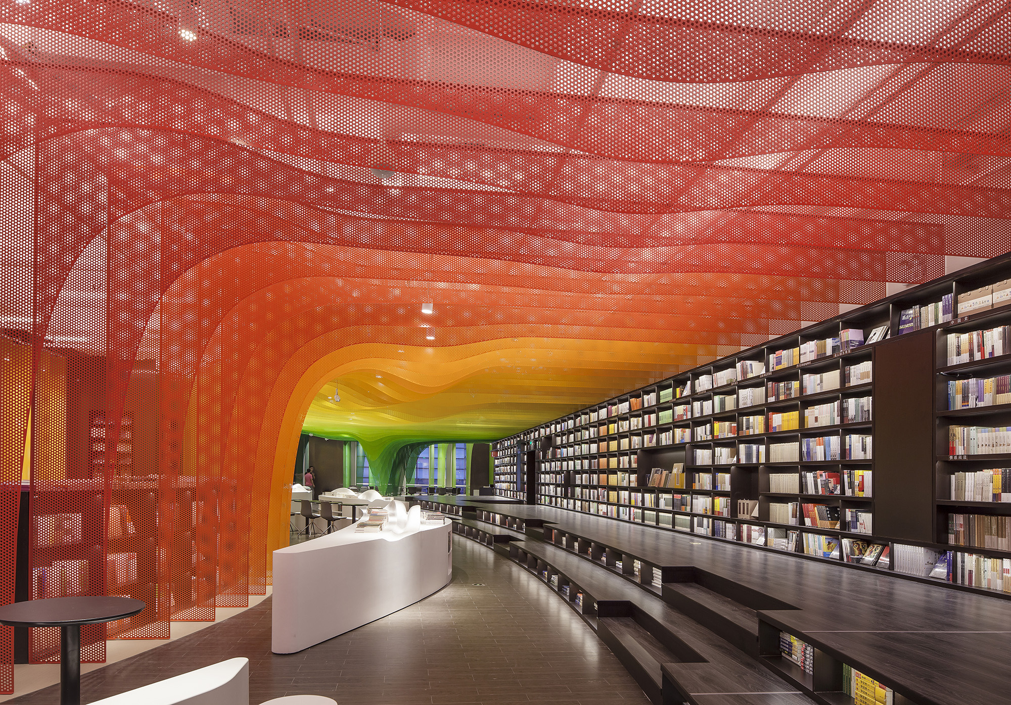
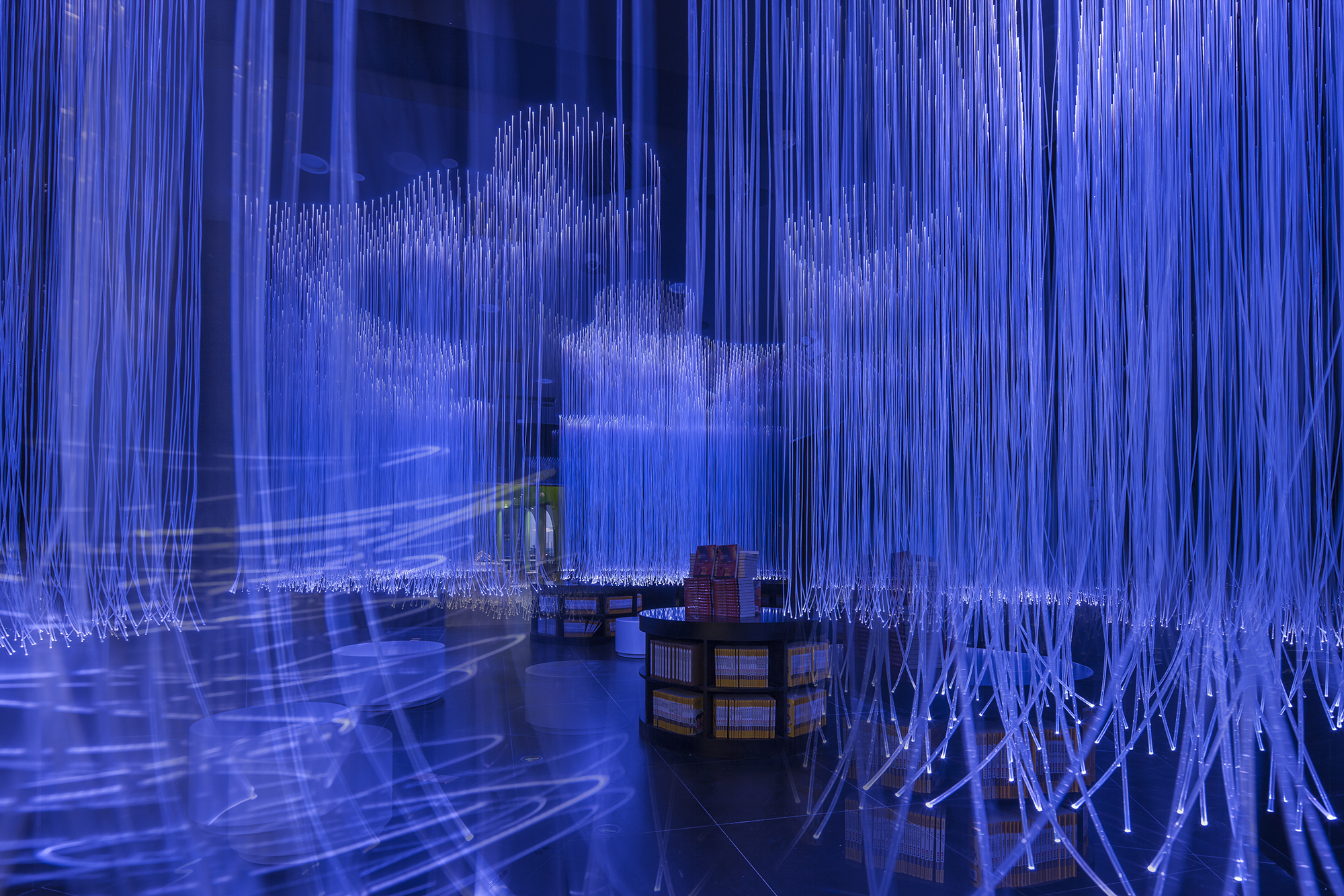
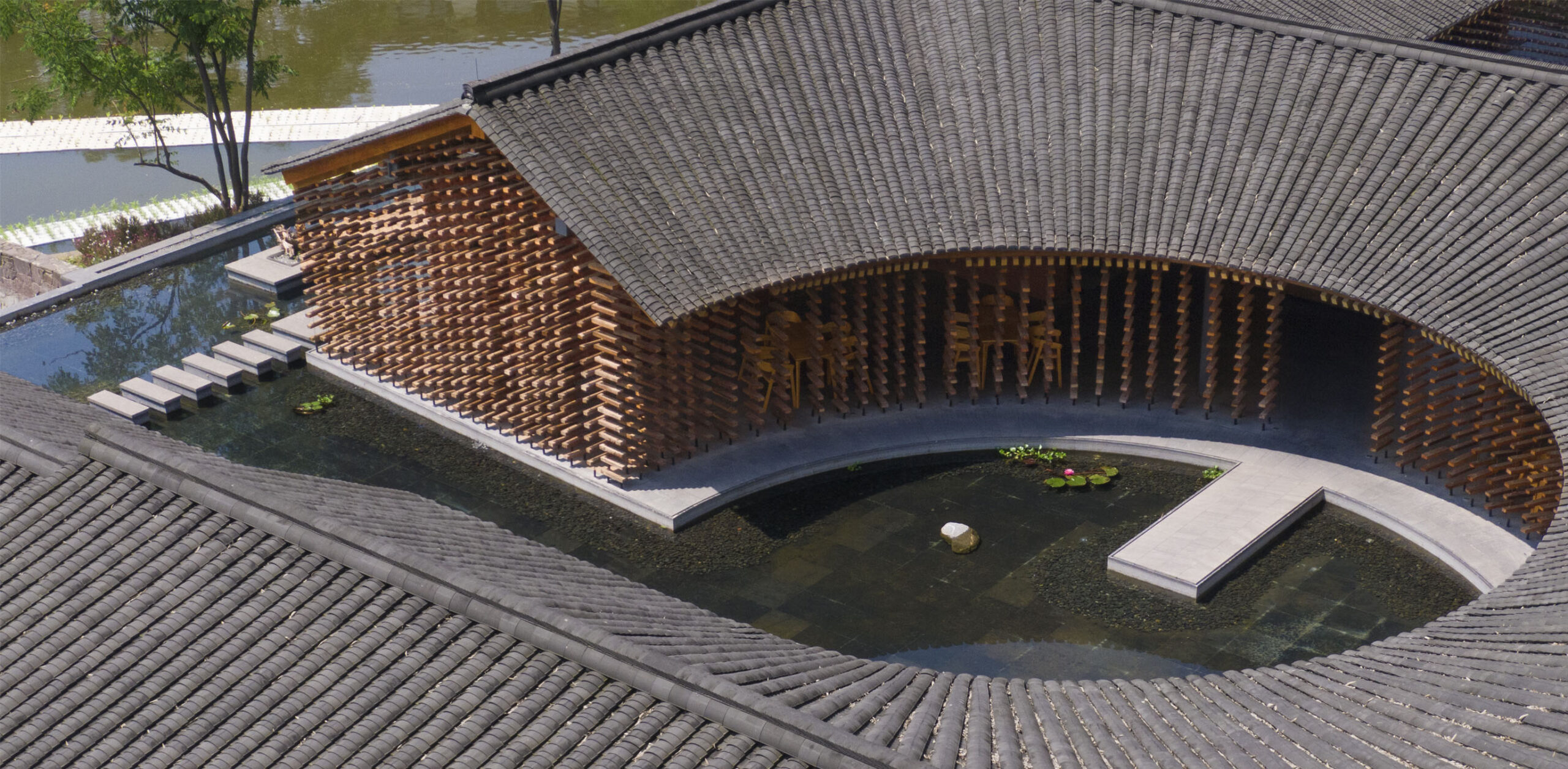
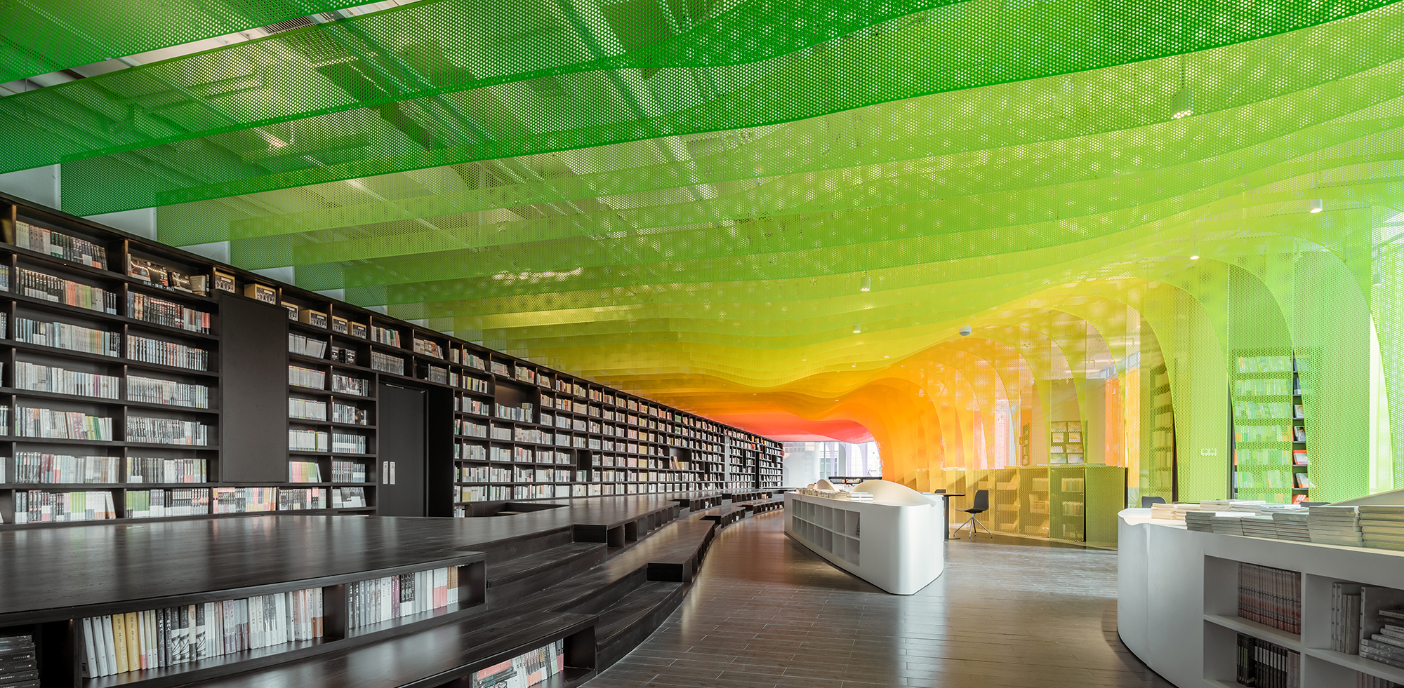
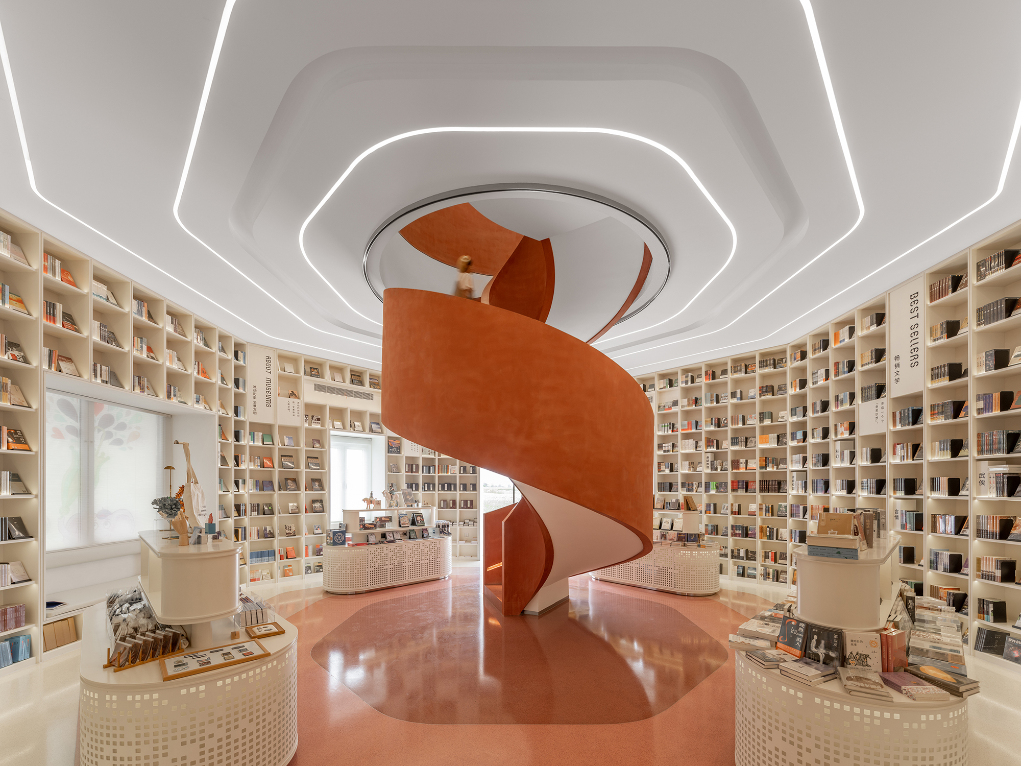
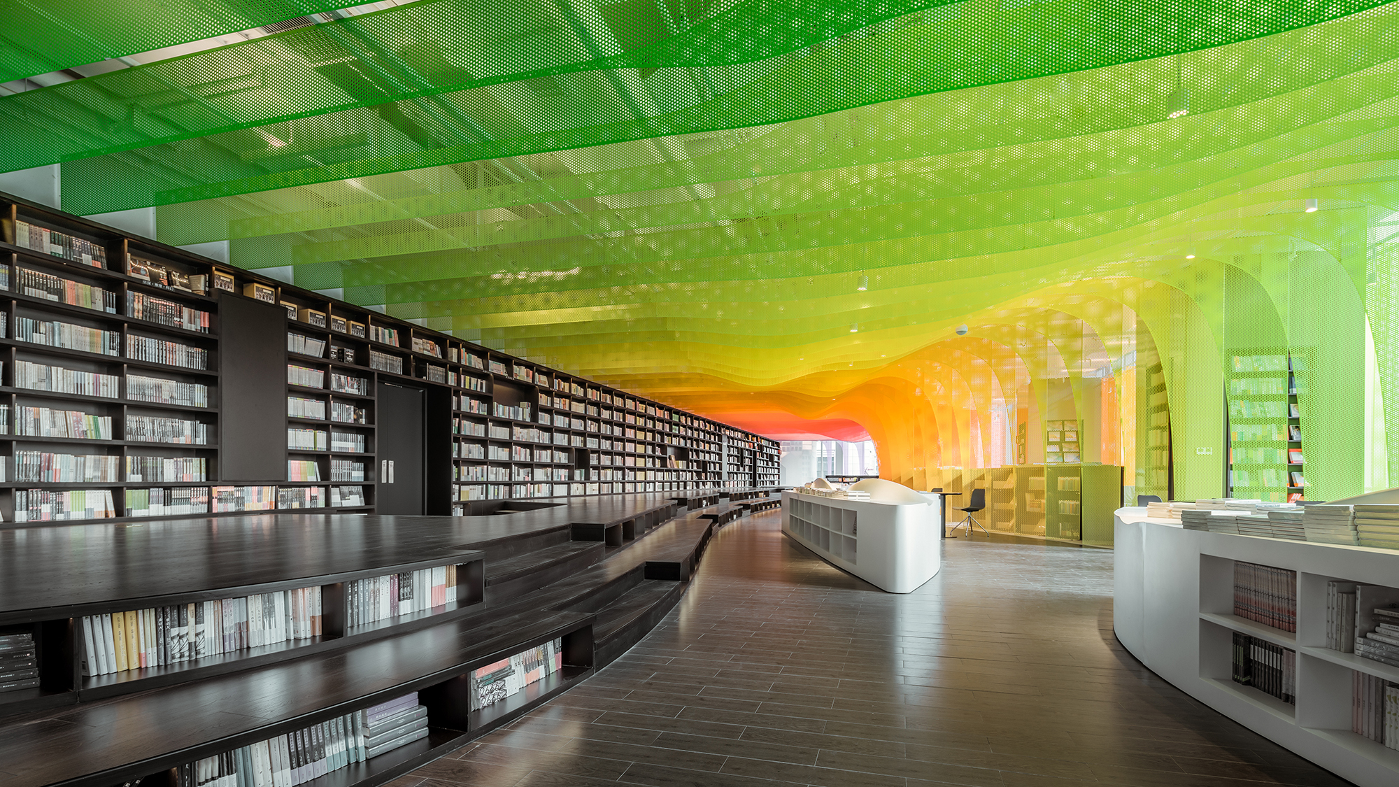 The Zhongshu Bookstore bookstore is divided into four main zones and several subdivided zones. Aiming to create a colorful new world by using symbolism, the architect gave a unique character to each zone: The Sanctuary of Crystal for new arrivals; The Cave of Fireflies for recommendations; The Xanadu of Rainbows for reading room; The Castle of Innocence for children books. As an entrance, ‘The Sanctuary of Crystal’ is a space full of books and nothing else. Using glass bricks, mirrors and acrylic, ‘The Sanctuary of Crystal’ is a shining white space, drawing customers into the heart of the store.
After a relatively narrow space, ‘The Xanadu of Rainbows’ is a large and open space. Thanks to the large windows, natural lights can pour inside. Being the most prominent space, ‘The Xanadu of Rainbows’ provides a variety of experience. Taking advantages of different heights of shelves, steps, and tables, the architect created a hyper-maximal and abstracted landscape of cliffs, valleys, islands, rapids and oases. There are also thin perforated aluminum sheets in gradient colors simulated as rainbows installed in the bookstore.
Architects: Want to have your project featured? Showcase your work through Architizer and sign up for our inspirational newsletters.


 Barberia Royal
  LIÒN
LIÒN  Metal Rainbow — Zhongshu Bookstore in Suzhou
  SUNDAYS
  The MIXc Kunshan(public area renovation design)