The judging process for Architizer's 14th A+Awards is now underway. Subscribe to our Awards Newsletter to receive updates about Public Voting, and stay tuned — winners will be announced later this spring.
As people switch from hard copies of books to digital versions, the role of a library in a community is constantly changing. Now, these institutions are more community centers than places to borrow a book from. Libraries now serve as the nexus of a variety of services such as computer access, book clubs, meeting or study spaces, children’s activities, author events, and so on. They are a refuge for those seeking to learn. In the past decades, new library designs have been approached as opportunities to create thriving social hubs in Canadian communities.
Images by Michael Grimm
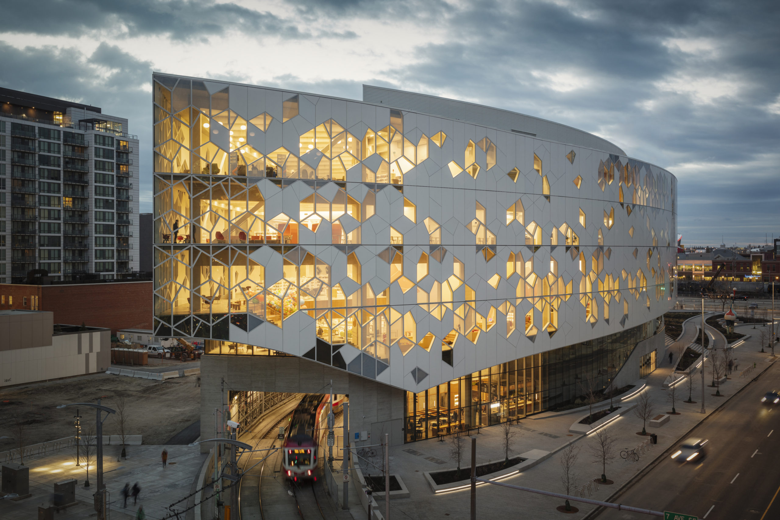
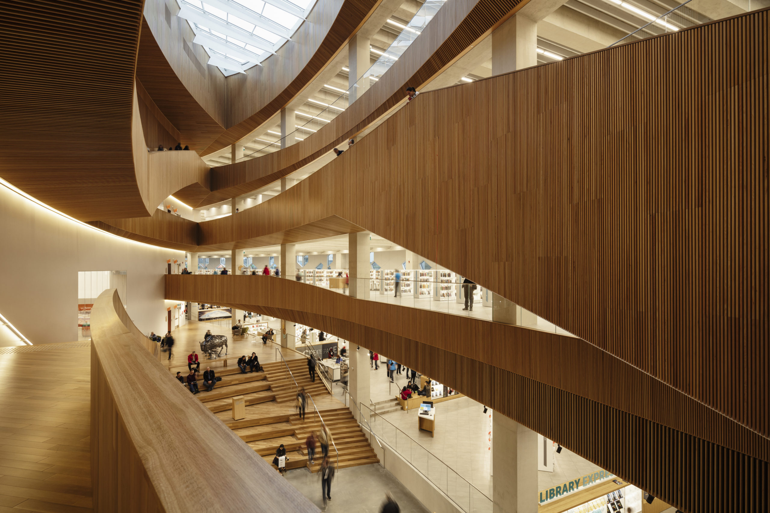
Calgary Central Library by Snøhetta, Calgary, Canada
The form of the building is governed by structures around it. The Light Rain Transit Line moves from above the ground to underground at this part of the city, so the entrance is raised over the train’s path. This raised entryway acts as a plaza that connects with the street and welcomes visitors inside. Inside, the spaces coil in a spiral that envelops the central atrium and culminate in an oculus.
The building houses reading areas, digital and group meeting rooms, study spaces and outdoor amphitheaters. A hexagonal pattern made of triple-glazed panels, fritted glass and iridescent aluminum covers the façade and controls light and visibility in different parts of the structure.
Images by Adam Mørk
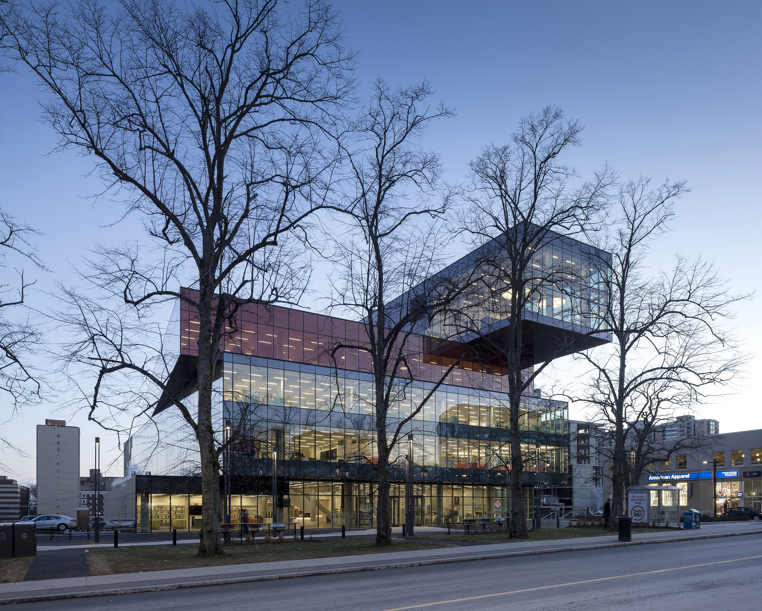
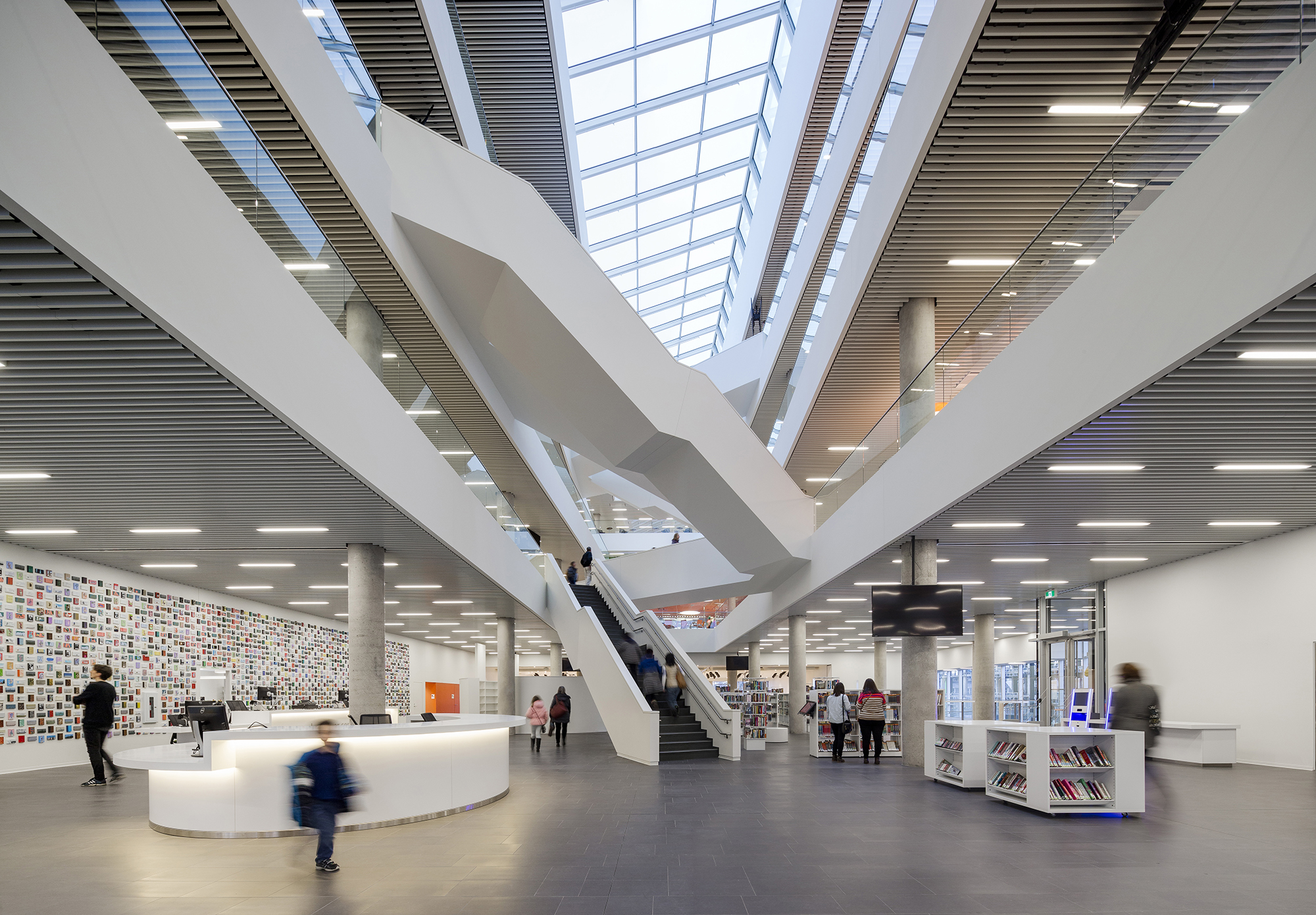
Halifax Central Library by schmidt hammer lassen architects, Halifax, Canada
Surrounded by some of the most important new and historic buildings in Halifax, the library has now become an important center for the residents. The building is planned as three volumes that are placed on top of one another in a subtle twist arrangement. An additional fourth block on the top creates a large perpendicular cantilever. The inside is broken up into different floors with a large central atrium. These levels are connected by staircases going in different directions. The library also has a green roof terrace for visitors to observe the views of the historic structures around.
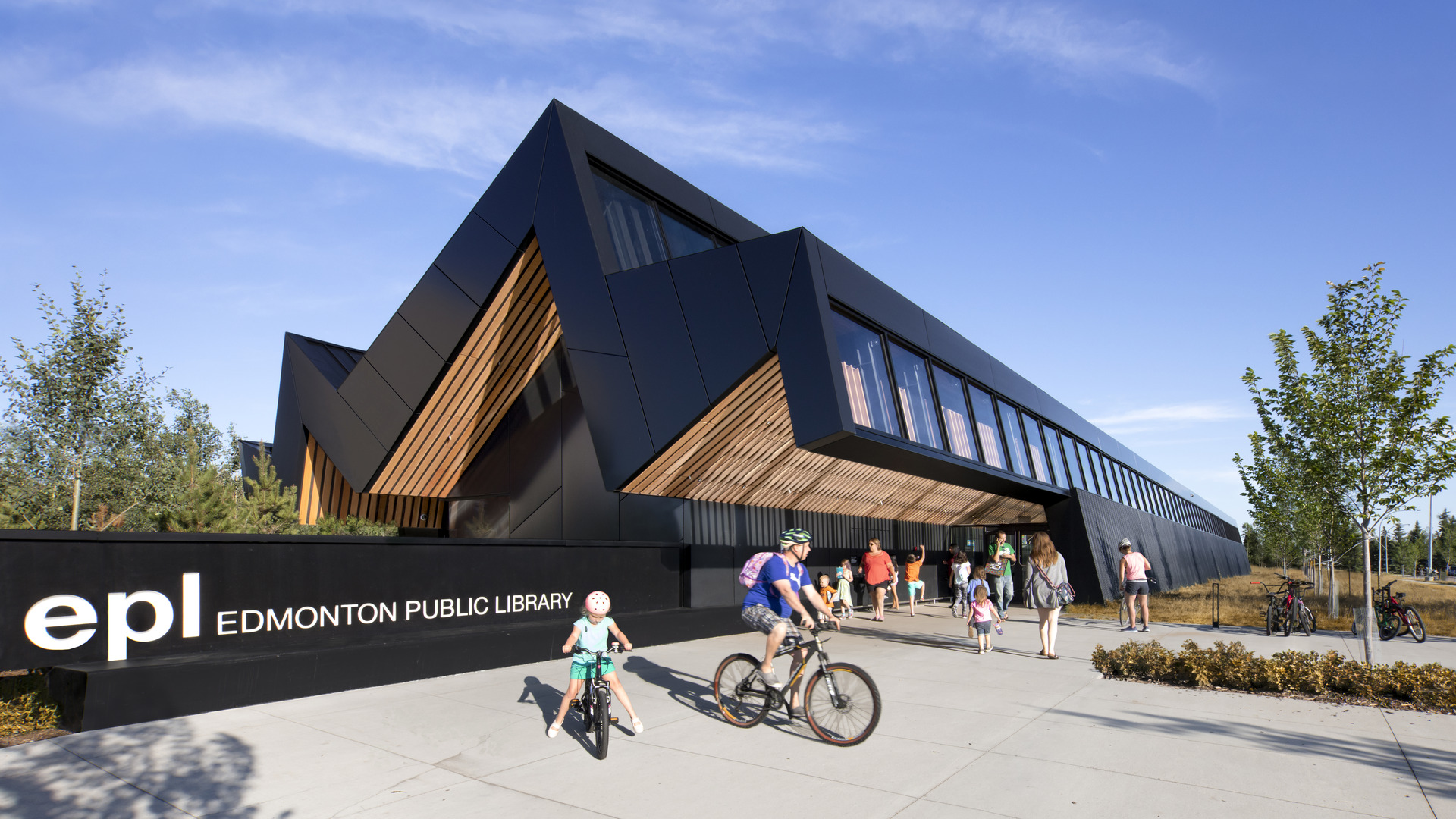
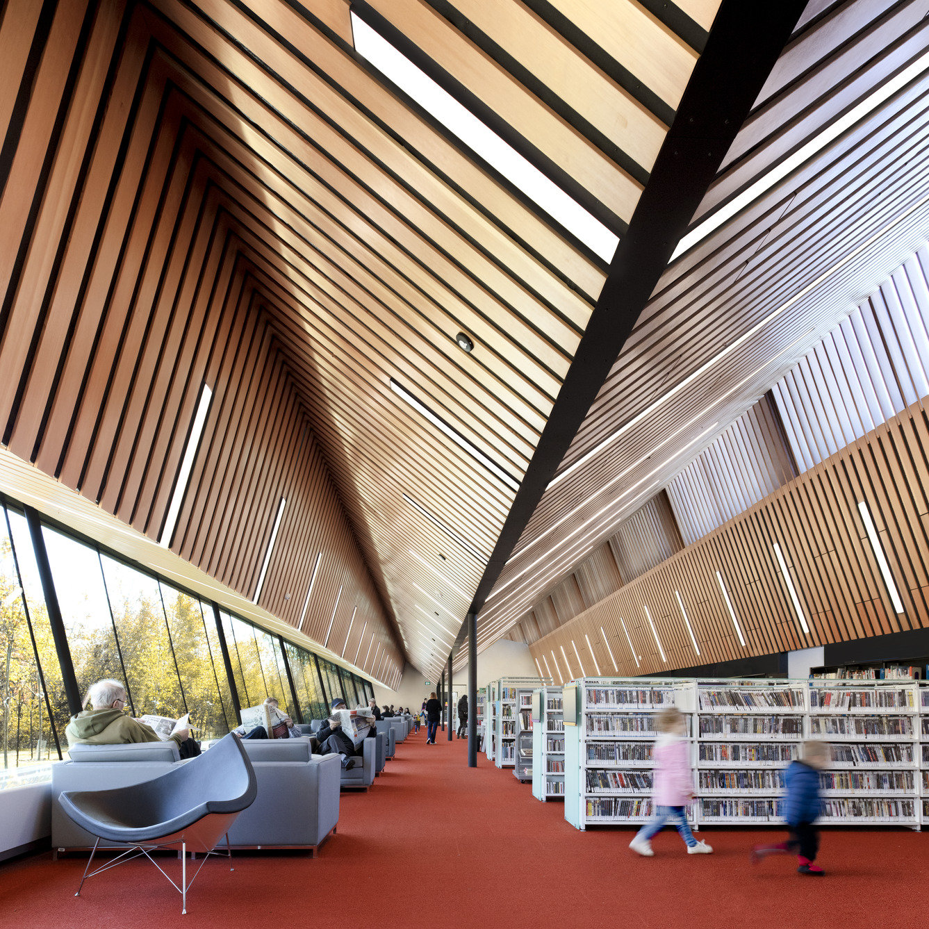 Capilano Branch Library by Patkau Architects & Group 2 Architecture+ Interior Design, Edmonton, Canada
The fan-like library makes a bold statement with its black and natural wood exterior. The fragmented roof form incorporates fenestrations at different levels to allow natural light to enter from the top. From the underside of the roof, wooden slats continue on the ceilings inside to add brightness. This pattern also provide camouflage to help integrate light fixtures and a sprinkler system. Inside, the library is divided into three zones that include both fixed and flexible space planning. There are armchairs on the longer edge of the building for visitors to take in the views outside as they read.
Images by doublespace photography inc
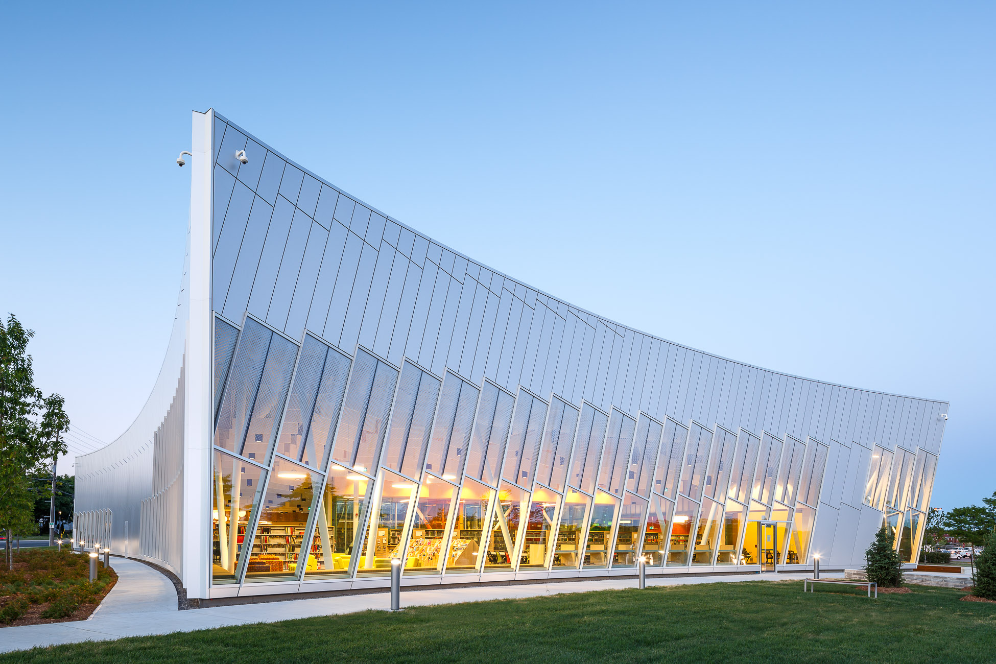
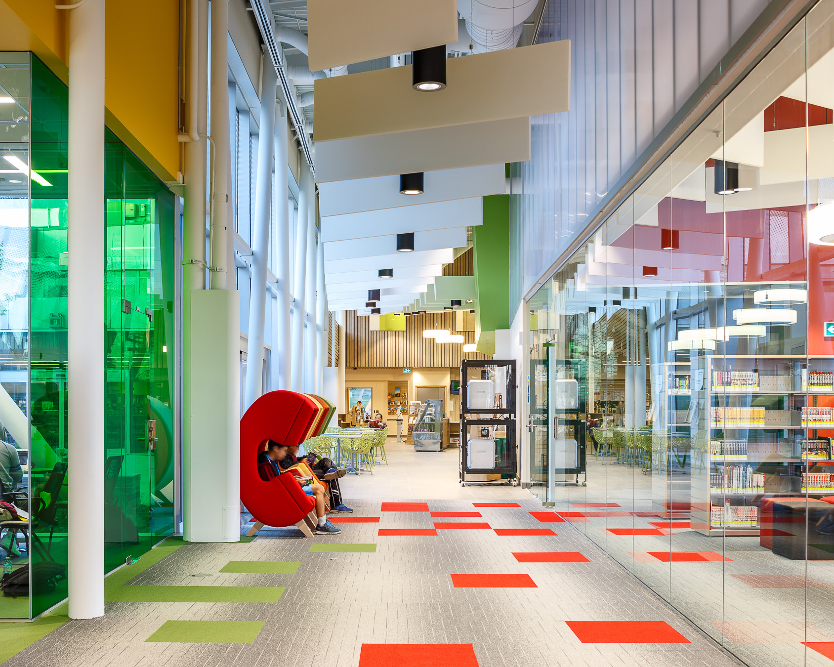
Vaughan Civic Centre Resource Library by ZAS Architects + Interiors, Vaughan, Canada
The Vaughan Civic Centre Resource Library features a swooping roof and a large central courtyard. The street-facing façades play with transparency to convey openness and prompt passersby to enter the structure. The changing patterns and shifting parts play with the sunlight and channel it indoors. Open and flexible spaces make up the inside to create more interaction among the users and also facilitate group learning. The library also houses a café, reading area, activity space, sound and video recording studios and maker spaces with equipment like 3D printers.
Images by Tom Arban and Maris Mezulis
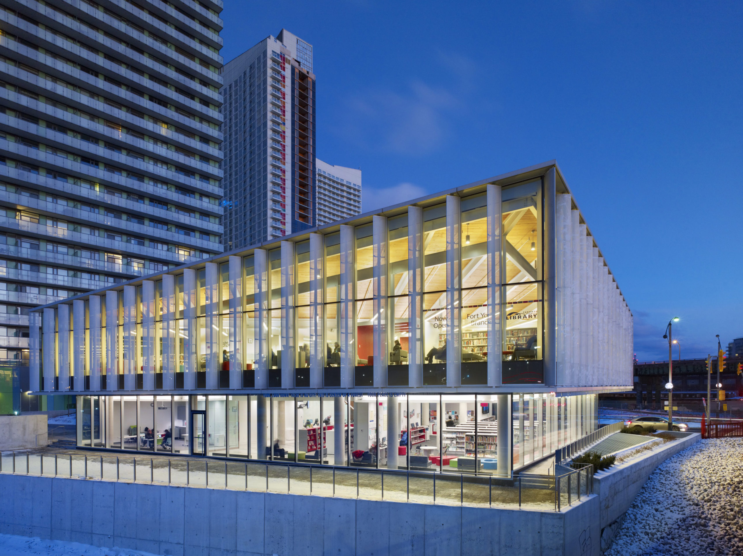
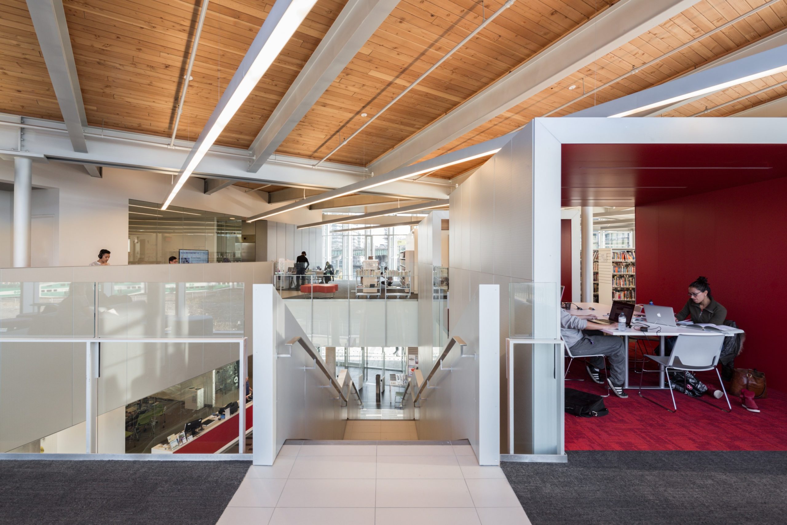
Fort York Branch Library by KPMB Architects, Toronto, Canada
The library and amenities for the surrounding condominiums were planned as pavilions in a public park. The building is made up of a base block that connects to the park with a larger volume on the top that oversees Fort York. The northern, western and southern facades are covered in metal fins for solar protection throughout the day. The large glass panels in between allow the light from within to become visible at night, making it stand out in the neighborhood. “The Planters”, a drawing by artist Charles Pachter, is recreated on the metal fins on the western side using perforations. Margaret Atwood’s poems are added to the soffit.
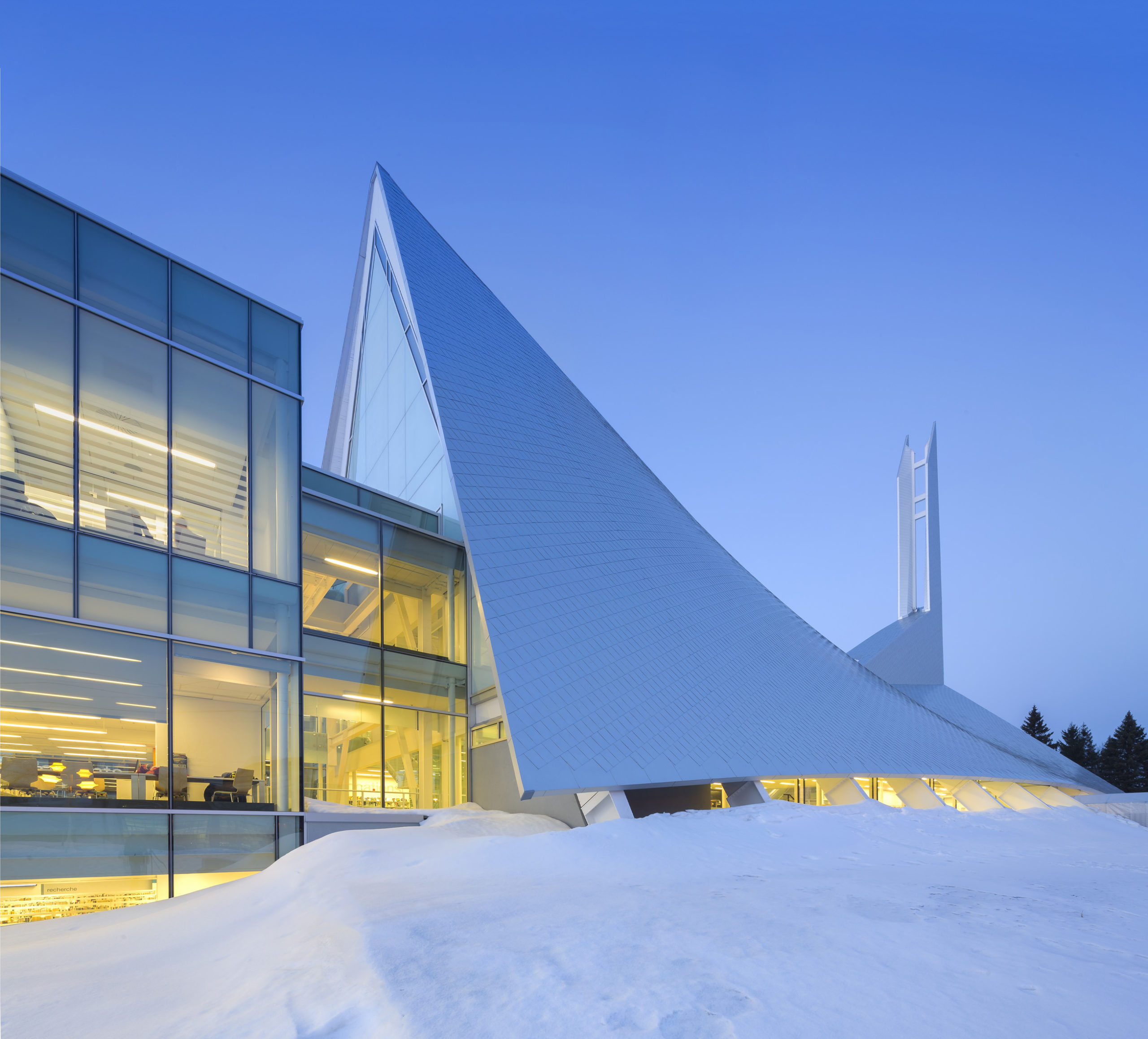
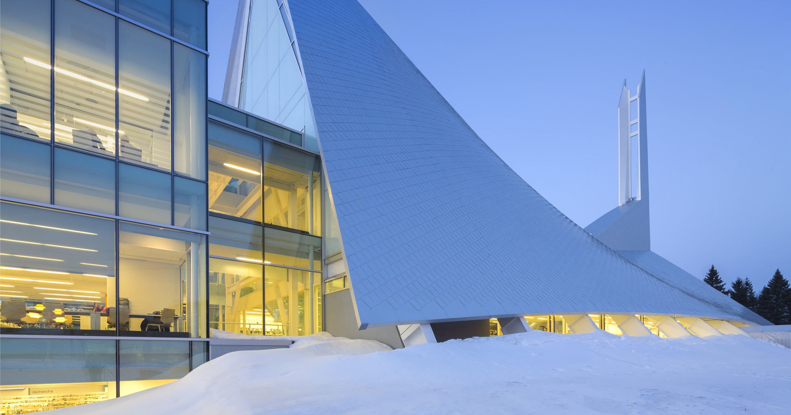
 Monique-Corriveau Library by Dan Hanganu + Côté Leahy Cardas Architects, Quebec, Canada
The Monique-Corriveau Library is built in what was once the St. Denys-du-Plateau Church designed by Jean-Marie Roy in the 1960s. The building resembles a tent with a spire on the top. The public functions of the library are situated in the nave of the plan while the community hall and administrative functions ate located in the extension. The structural framework within the building is left exposed and painted in white. This is contrasted with pops of color throughout. In addition to that, glass dividers and railings have been used for visual connectivity.
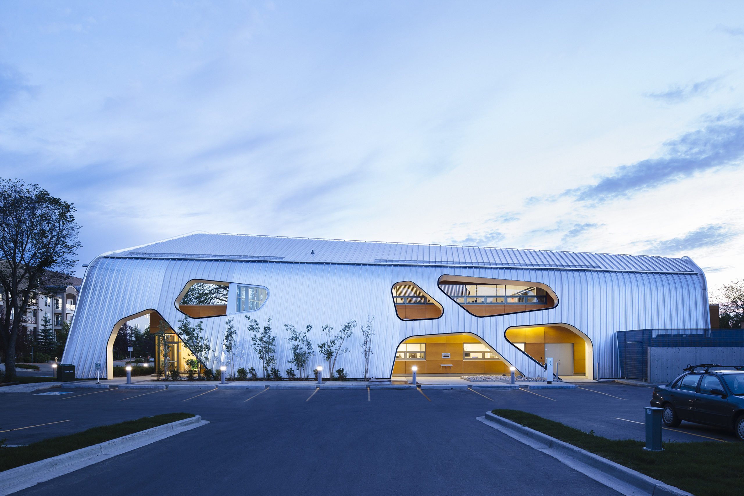
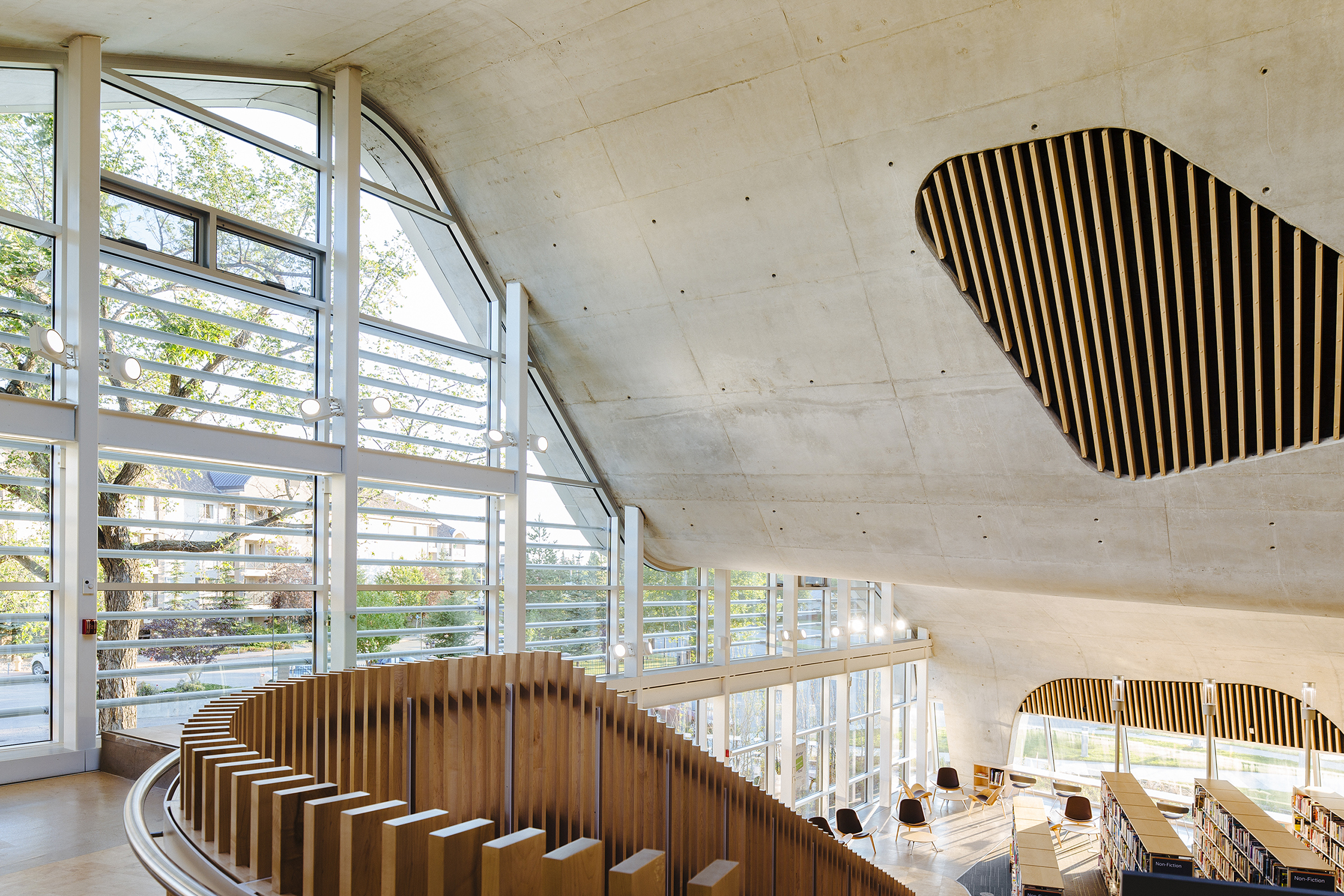 Jasper Place Branch Library by Dub Architects and HCMA Architecture + Design, Edmonton, Canada
Created with an intention to provide a social hub that goes beyond books, Jasper Place Branch Library is responsive to the changing needs of the community. It features flexible column-free spaces for ease of movement and organization. The undulating roof is a folded-plate concrete slab that includes skylights and acoustic panels and also prevents the accumulation of water or snow. It also helps defines spaces inside without requiring partitions or columns. The southern façade is glazed to capture sunlight and heat during the winter months and the covered eastern and western sides help keep the building cool in the summer.
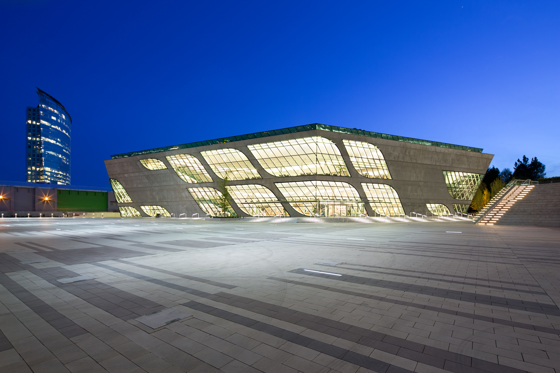
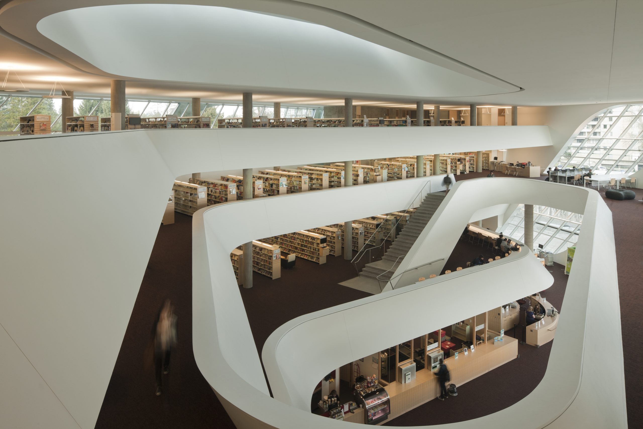 Surrey City Centre Library by Revery Architecture, Surrey, Canada
The shape of the building is driven by the curvature of the adjacent street. It is further enhanced with inclined walls and unconventional windows. In addition to creating a design language, the walls also help with solar shading and reduce energy use. The firm used a social media strategy to gain public input while designing the building. Like a few other structures in this collection, this building also features a large central atrium that guides circulation throughout the building. It comprises study areas, reading rooms, meeting spaces, computer areas, a children’s library and a coffee shop.
The judging process for Architizer's 14th A+Awards is now underway. Subscribe to our Awards Newsletter to receive updates about Public Voting, and stay tuned — winners will be announced later this spring.
 Calgary Central Library
  Capilano Branch Library
  Fort York Branch Library
  Halifax Central Library
  Jasper Place Branch Library
  Monique-Corriveau Library
  Surrey City Centre Library
  Vaughan Civic Centre Resource Library