Architects: Showcase your next project through Architizer and sign up for our inspirational newsletter.
Halloween is built around space and ritual. From processional trick-or-treating to haunted mansions and jack-o’-lanterns, the first day of Allhallowtide has strong ties to architecture and urbanism. Largely believed to have originated from Celtic harvest festivals, Halloween is now celebrated in countries around the world. The holiday is strongly associated with the colors orange and black, where orange reflected the autumn harvest and black historically symbolized death and festivals of the dead. Today, the high-contrast colors almost exclusively represent Halloween.
Taking inspiration from this iconic duo, we’ve rounded up the following collection of architecture clad in orange and black. From schools and commercial spaces in France to darkly clad residences and recreation centers, color is used to stand out from the surroundings and make a statement. Both playful and serious alike, the projects illustrate the power of contrast between architecture and nature. Together, they conjure up enchanting images of this infamous Halloween holiday.

© Jakob + MacFarlane

© Jakob + MacFarlane
The Orange Cube by Jakob + MacFarlane, Lyon, France
Developed in the old harbor zone of Lyon, the Orange Cube was made to bring together commercial and cultural program. Formally, a giant hole was carved into the brightly colored cube to respond to views, air and light.

© Jeremy Toth

© Jeremy Toth
Eyrie by Cheshire Architects, Kaiwaka, New Zealand
Eyrie was designed as two houses, each barely larger than four plywood sheets. The structures are located in an estuarine site, together created as a new vision for New Zealand’s coastal future. Made without doors, visitors must climb up boulders and drop in through the darkly clad volumes.

© Dominique Coulon & Associés

© Dominique Coulon & Associés
Josephine Baker’s Group of Schools by Dominique Coulon & Associés, La Courneuve, France
Completed in 2010, these school buildings were designed with bright forms and surfaces throughout the gymnasium and classroom spaces. The striking orange color is emblematic of Dominique Coulon, an element that flows across the trapezoid-shaped plot.

© Blouin Beauchamp Architectes

© Blouin Beauchamp Architectes
Station Blü by Blouin Tardif Architecture-Environnement, Saint-Tite-des-Caps, Canada
Located on the outskirts of the Charlevoix region, Station Blü was built with multiple programmatic spaces housed within three pavilions clad in black. Respecting its context, the architecture highlights the nearby river and landscaped area while large openings and terraces cut across the buildings.

© Peter Whyte

© Peter Whyte
Premaydena Residence by Misho + Associates, Premaydena, Australia
Designed on a low podium, the Premaydena Residence was inspired by screening, proportions and layering. As ‘a box within a box’, the project subdivides interior program by private and shared function. External orange metal panels were used to recall the lichen from local beaches.

© Atelier Carle

© Atelier Carle
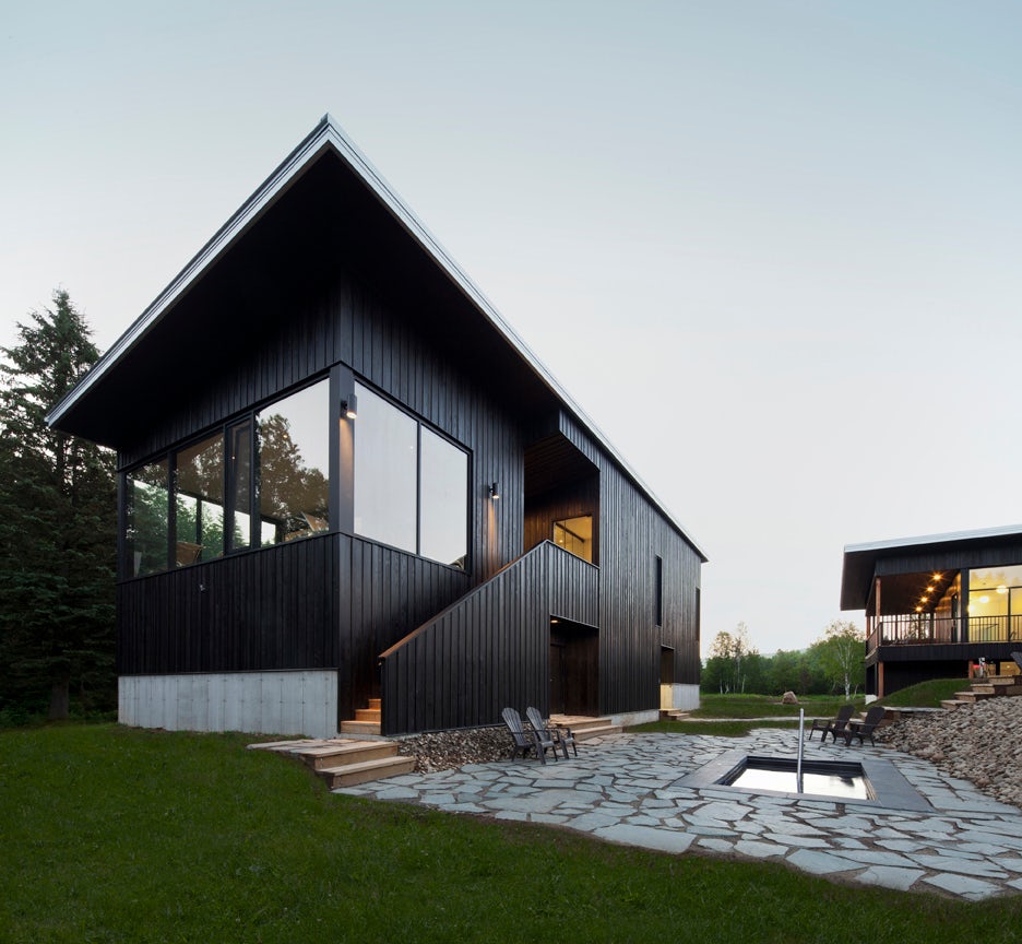
The Wetlands by Alain Carle Architecte, Wentworth-Nord, Canada
The Wetlands explores the scale of rural landscapes and settlements, including large, empty spaces and aggregated building masses. The three structures were made with black-painted wood around common outdoor spaces linked by a shared base and interconnected landscape.

© MVRDV

© MVRDV
Why Factory Tribune by MVRDV, Delft, Netherlands
Designed around a newly created interior courtyard on the Delft University campus, the Why Factory features a three-story wooden structure that accommodates diverse programs. The project centers on a distinct, bright orange auditorium stair for learning and discourse.

© MJMA Architecture & Design

© MJMA Architecture & Design
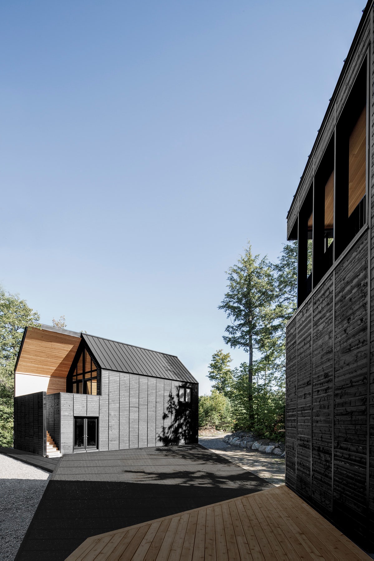
Clear Lake House by MacLennan Jaunkalns Miller Architects, Parry Sound, Canada
Designed as a contemporary and modern cottage, Clear Lake House was created with a tent-like, dark black envelope that encompasses the program. Advocating an intimate scale within its forested site, three different programmatic volumes were crafted around privacy, views and separation.

© Tham & Videgård Arkitekter

© Tham & Videgård Arkitekter
Moderna Museet Malmö by Tham & Videgård Arkitekter, Malmö, Sweden
As a new branch of the Swedish MoMA in Malmö, this design refurbishes a former electric station from 1900. A dramatic perforated orange façade was designed as a new entrance and contemporary element within the neighborhood while interior spaces were reconstructed.

© Francisco Nogueira / Architectural Photography

© Francisco Nogueira / Architectural Photography
Alvega Canoeing Center by ateliermob – arquitectura, design e urbanismo lda., Abrantes, Portugal
Sited at the river beach of Alvega in a regularly flooded area, this canoeing center was designed as three volumes raised above ground level. With an exterior made from black recycled plastic profiles, the project includes a boat storage area, cafeteria and changing cabins.
Bonus: Orange and Black!

© MAPA Architects

© MAPA Architects
MINIMOD by MAPA Architects, Porto Alegre, Brazil
The last in our feature collection, MINIMOD combines orange and black colors through a contrasting interior and exterior. The project was designed as a prefabricated modular dwelling unit with a steel frame that could be combined and customized as desired.
Architects: Showcase your next project through Architizer and sign up for our inspirational newsletter.

 Alvega Canoeing Center
  Clear Lake House
  Eyrie
Eyrie  Josephine Baker's group of schools
  Moderna Museet Malmö
  Premaydena Residence
  Station Blü
  The Orange Cube
  THE WETLANDS
  Why Factory Tribune


