Architects: Want to have your project featured? Showcase your work by uploading projects to Architizer and sign up for our inspirational newsletters.
While solid walls are one of the most efficient ways to separate rooms or divide large areas, they can make the space look cramped, or block light. There are several other types of dividers that are easier to construct, lighter in appearance, more functional and can add more personality to a space. For times when it is difficult to eliminate solid walls, covering floors and walls in different colors or playing with levels are good alternatives.
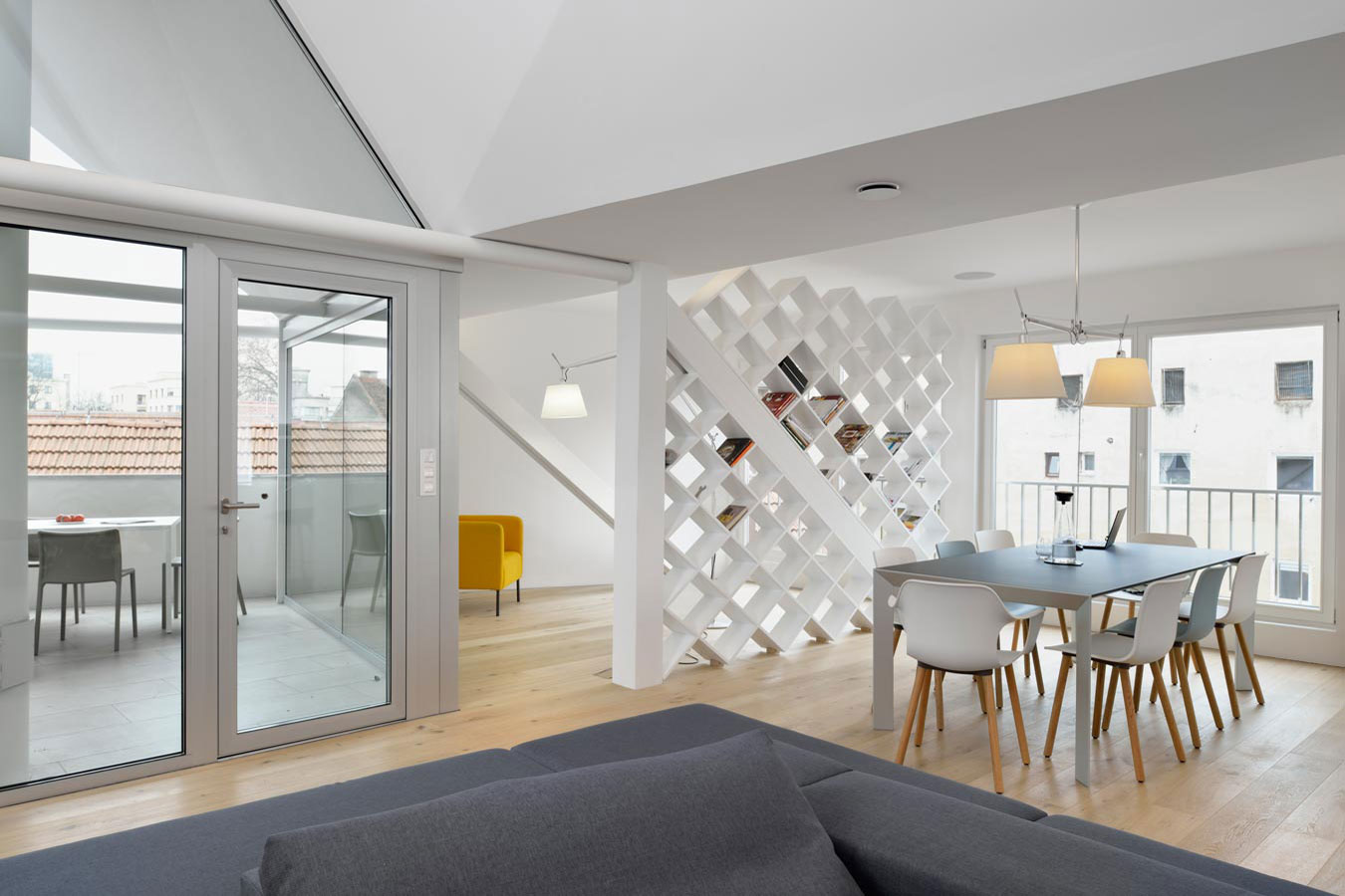
Apartment – Towards the sun by Superform, Ljubljana, Slovenia
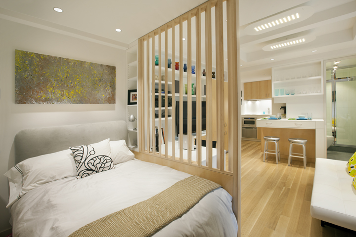
Micro Apartment by Allen + Killcoyne Architects, New York City, New York
Screens
See-through partitions are one of the most popular alternatives for walls. Screens, both static and dynamic, not only divide spaces but also add a decorative element. They can be renter-friendly, act as storage, help the flow of light and enable visual connectivity.
Micro Apartment by Allen + Killcoyne Architects uses a screen to separate the sleeping area from the living space in a small studio apartment. In Superform’s Apartment – Towards the sun, the screen isolates the sitting area while also acting as a shelf for books.
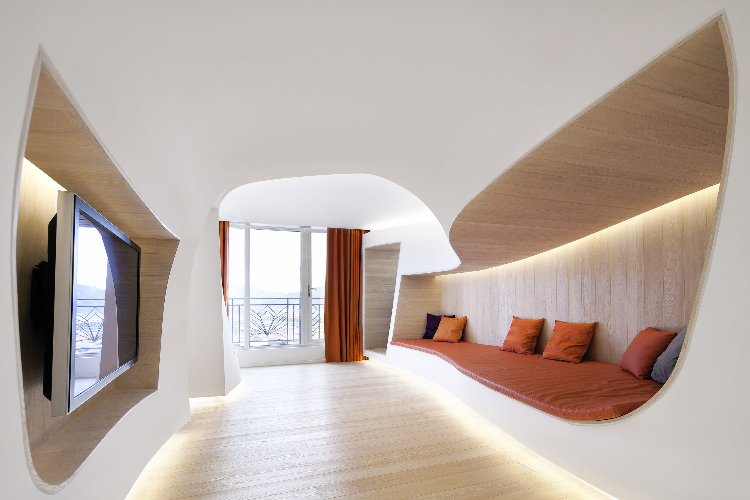
Ice & Snow Apartment by Precht, Hebei, China
False Ceilings
Subtle changes in floor height can be extremely impactful. Dropping the ceiling lower in some sections can make those spaces feel intimate and separate them from other areas. In Ice & Snow Apartment, Precht has shaped different nooks in the same space by creating organic forms in the ceiling that vary in height.
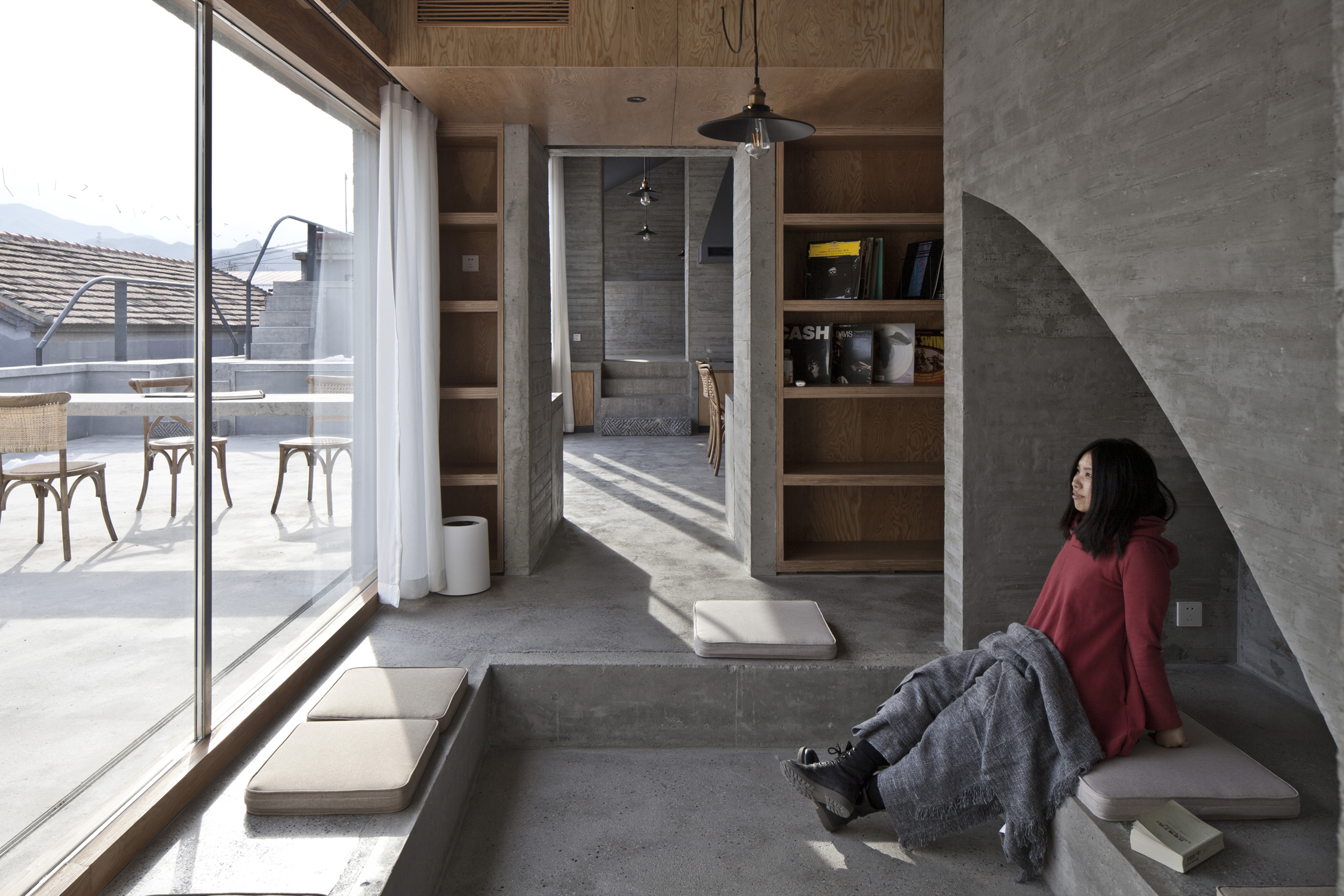
House of Steps by chaoffice, Beijing, China
Playing with Levels
Just as with ceilings, level differences in floors are also an effective way of designating functions or establishing levels of privacy in open spaces. Whether it is a single step or a raised platform, higher spaces can come across as more intimate. In House of Steps, chaoffice sinks in the floor to create a cozy nook.
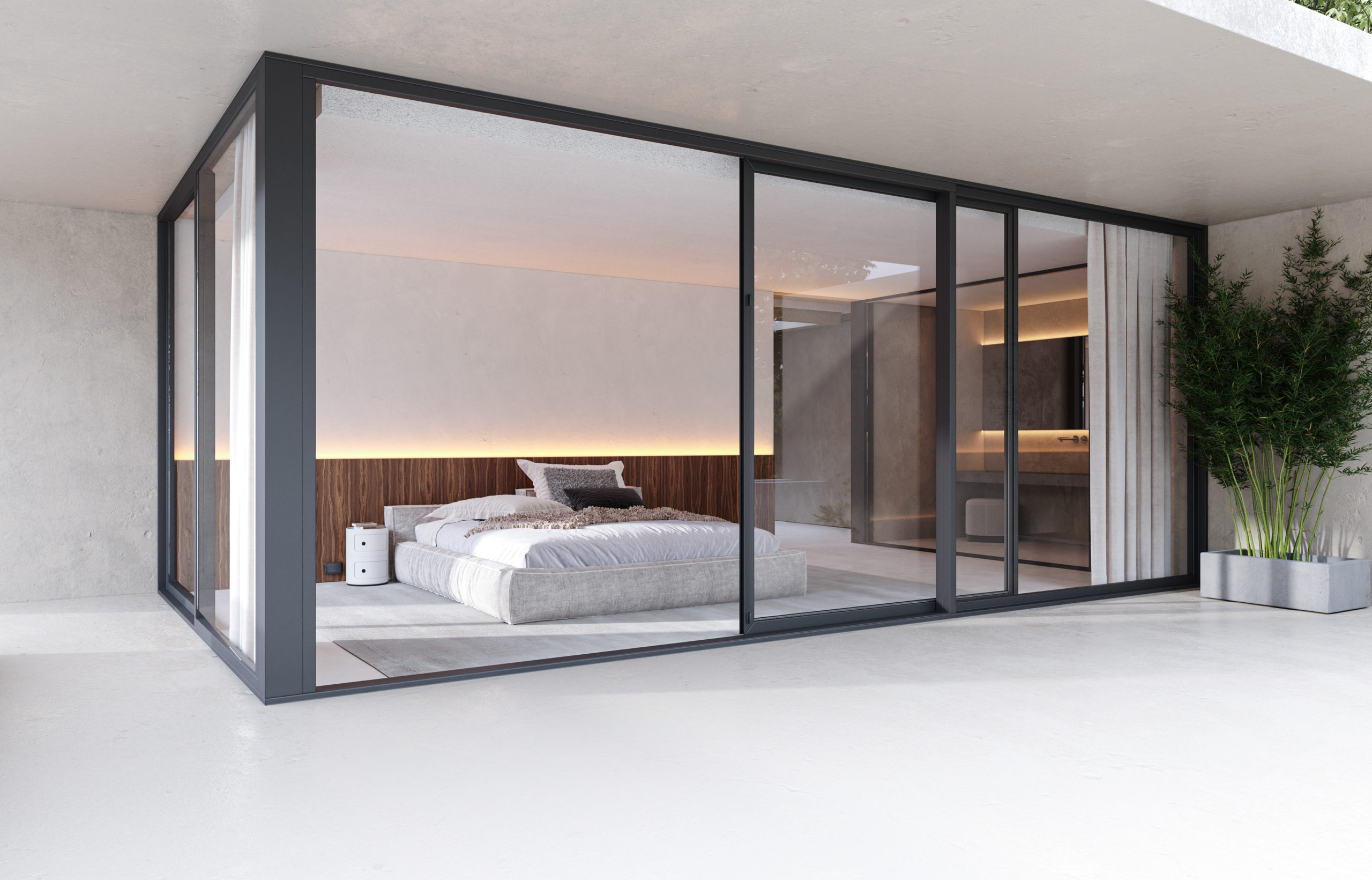
Pisco House by PAULO MARTINS ARQ&DESIGN, Agueda, Portugal
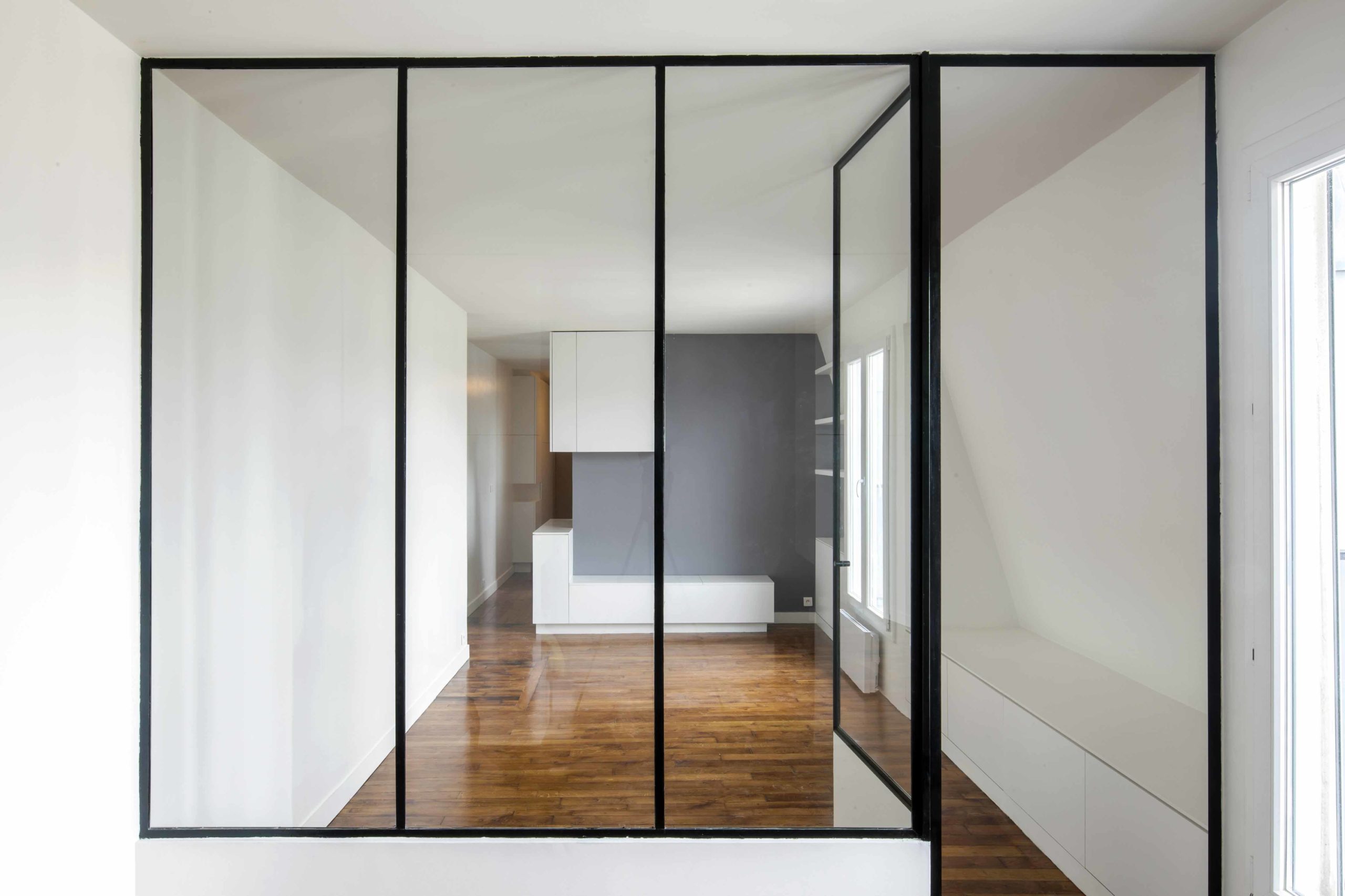
Levallois Apartment by NZI Architectes, Levallois-Perret, France
Transparent Dividers
Glass walls might not provide privacy but they efficiently break up large spaces or create pockets in homes. They can be accented with black borders to create interesting visuals. Levallois Apartment by NZI Architectes uses glass in one plane whereas Pisco House by PAULO MARTINS ARQ&DESIGN features a glass cabin.
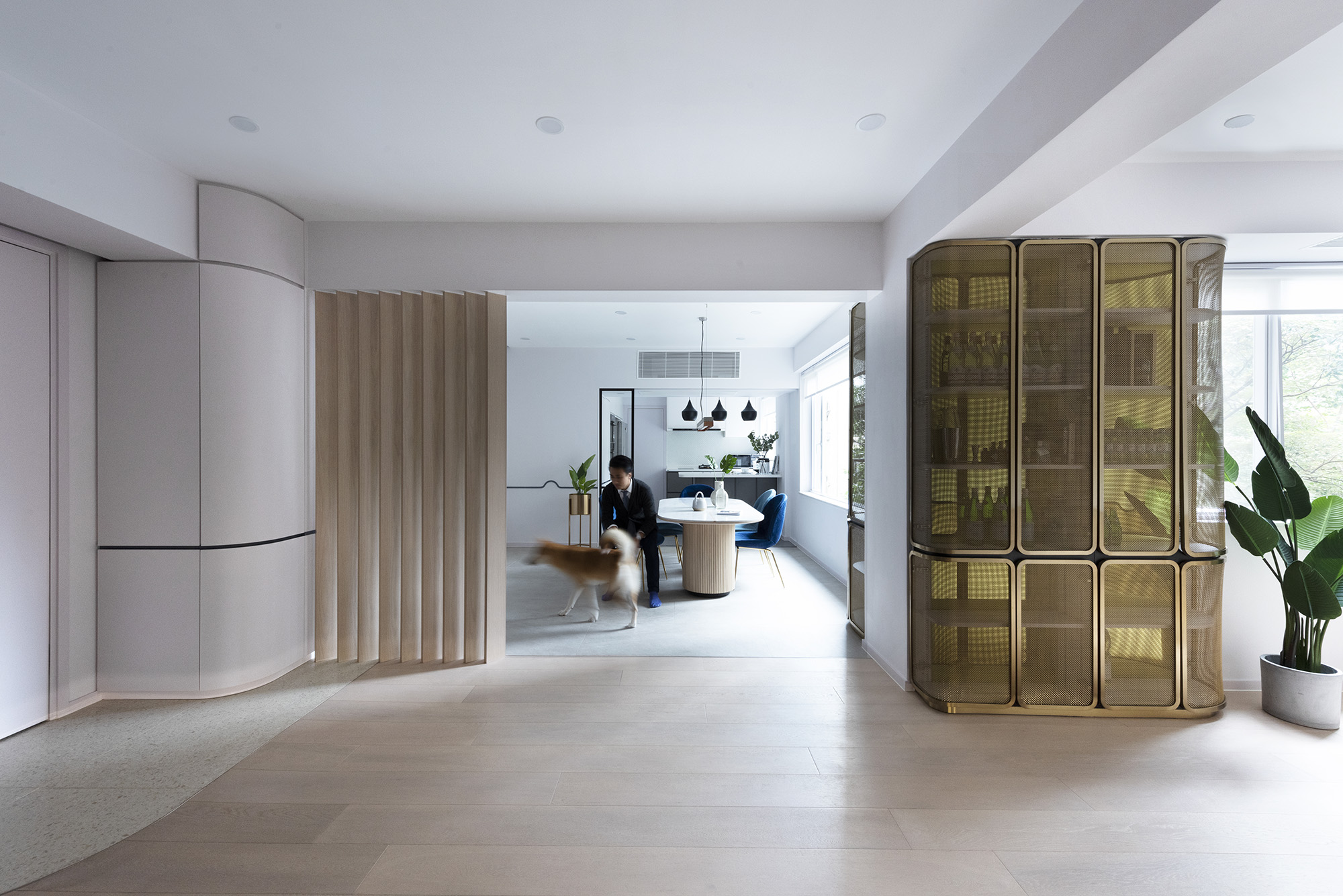
Beau Cloud Mansion / The Cascade by Bean Buro, Hong Kong Island, Hong Kong
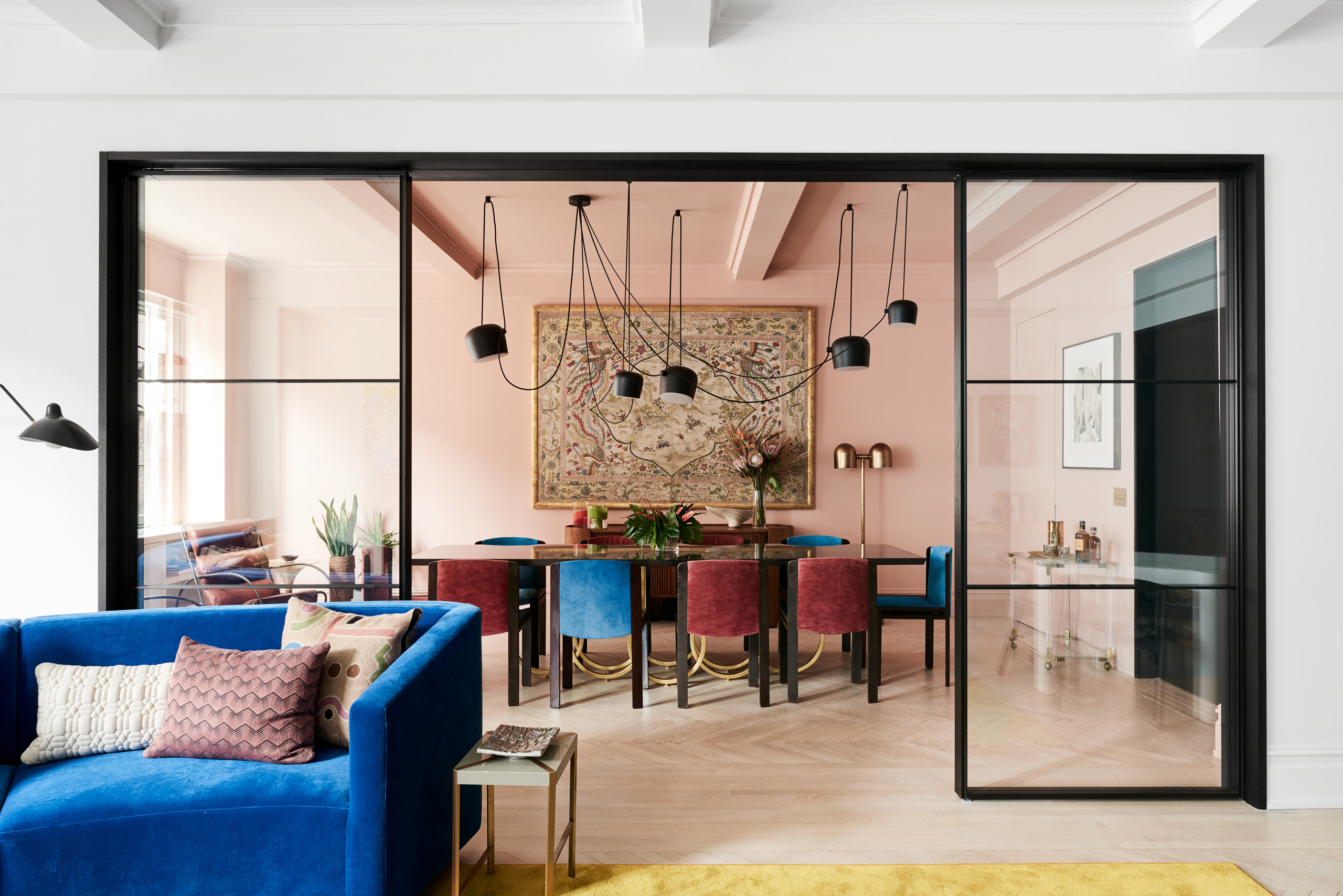
Park Avenue Prewar by Michael K Chen Architecture, New York City, New York
Partial Coverage
Even a hint of a divider can make a drastic difference. Partial screens or side panels, whether transparent or opaque, can allow for large openings and also allocate specific functions. A section of small wooden panels like in Beau Cloud Mansion / The Cascade or glass panels on two sides like Park Avenue Prewar can break up spaces without making either of the rooms look smaller.
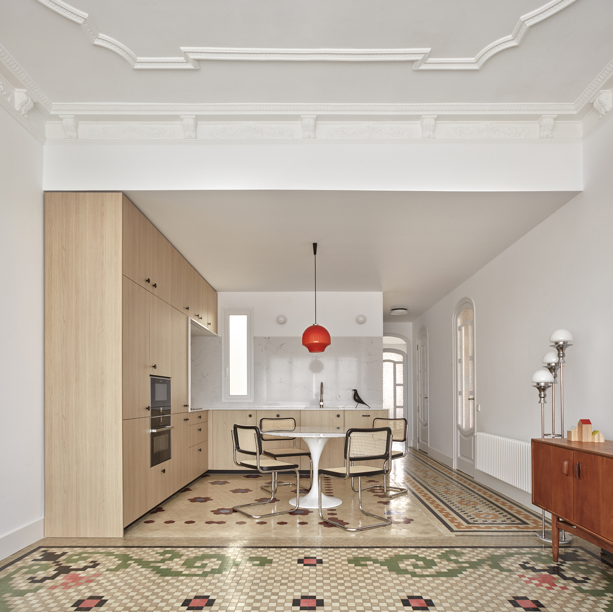
Penhouse in Ruzafa, Valencia by DG Arquitecto Valencia, Valencia, Spain
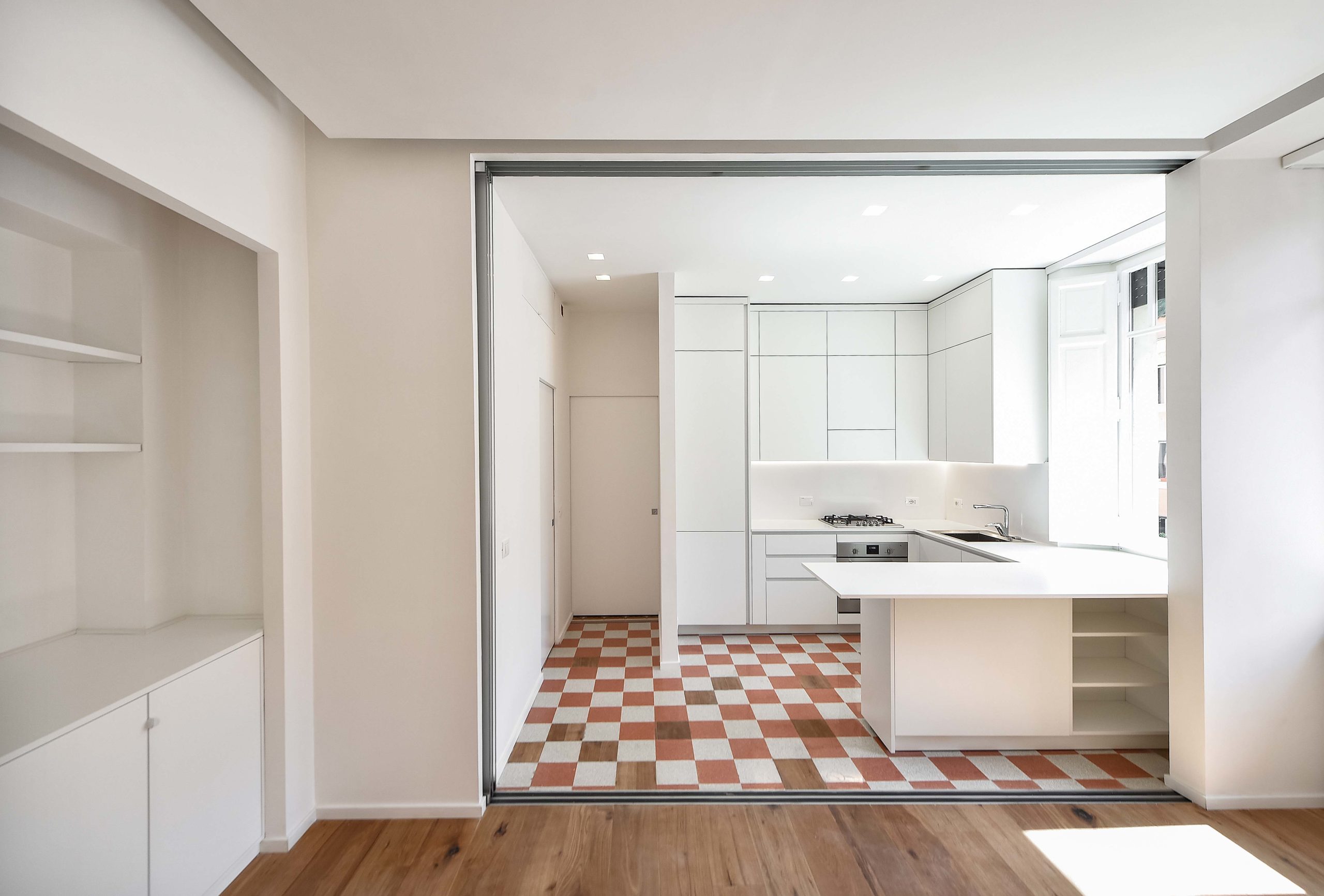
On a cruise apartment by FiumeArchitecture, Rome, Italy
Changing Floors
When space or ventilation constraints prevent the use of vertical dividers, floor treatments can be handy. Changing tile patterns or materials on floors can break up the spaces visually or allot functions to different corners in the same room.
In Penhouse in Ruzafa, Valencia, different patterned tiles distinguish the kitchen and dining area from the living room and the corridor. On a Cruise Apartment features a similar technique with changes in materials instead of tile patterns.
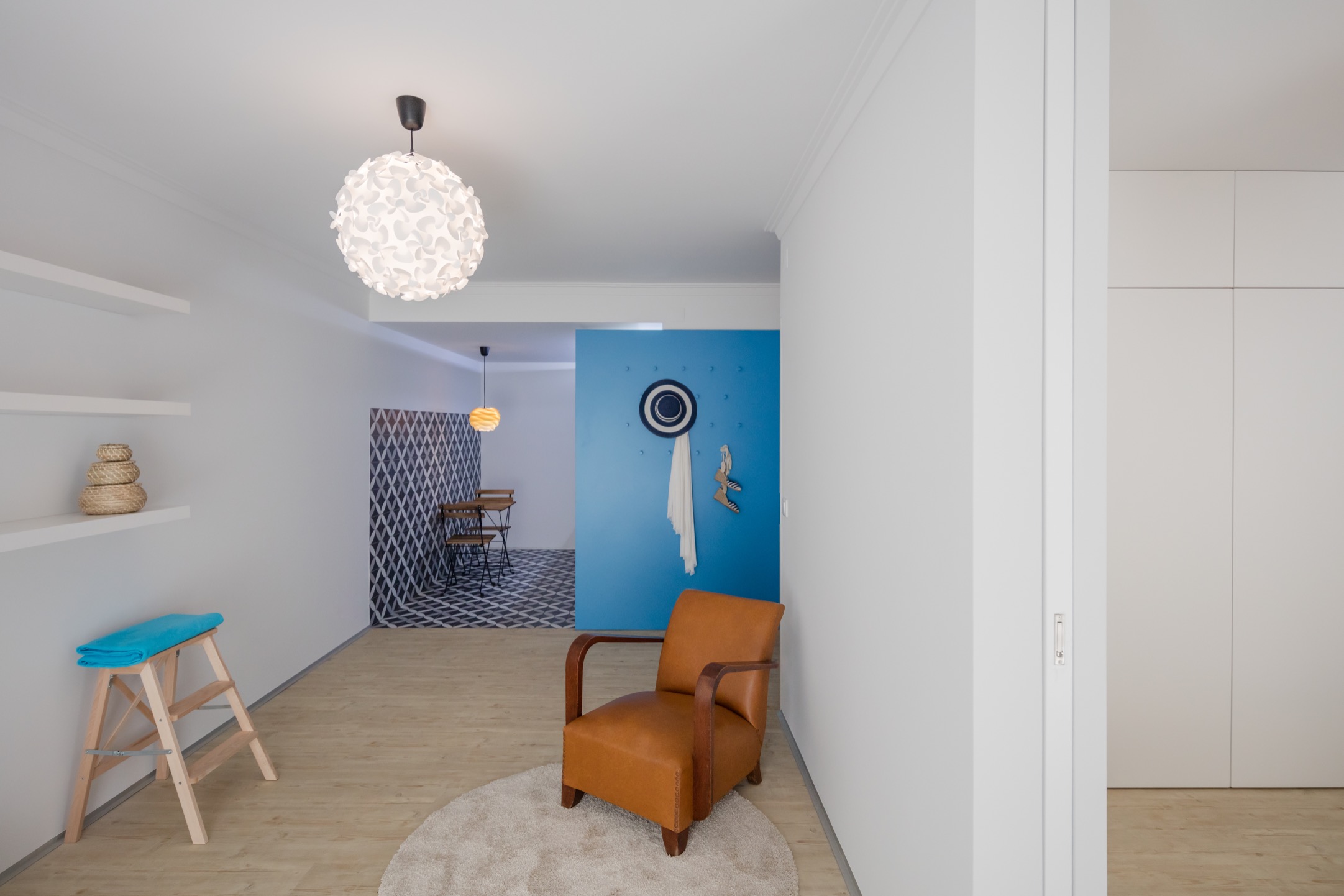
Caminha Apartment by Tiago do Vale Arquitectos, Caminha, Portugal
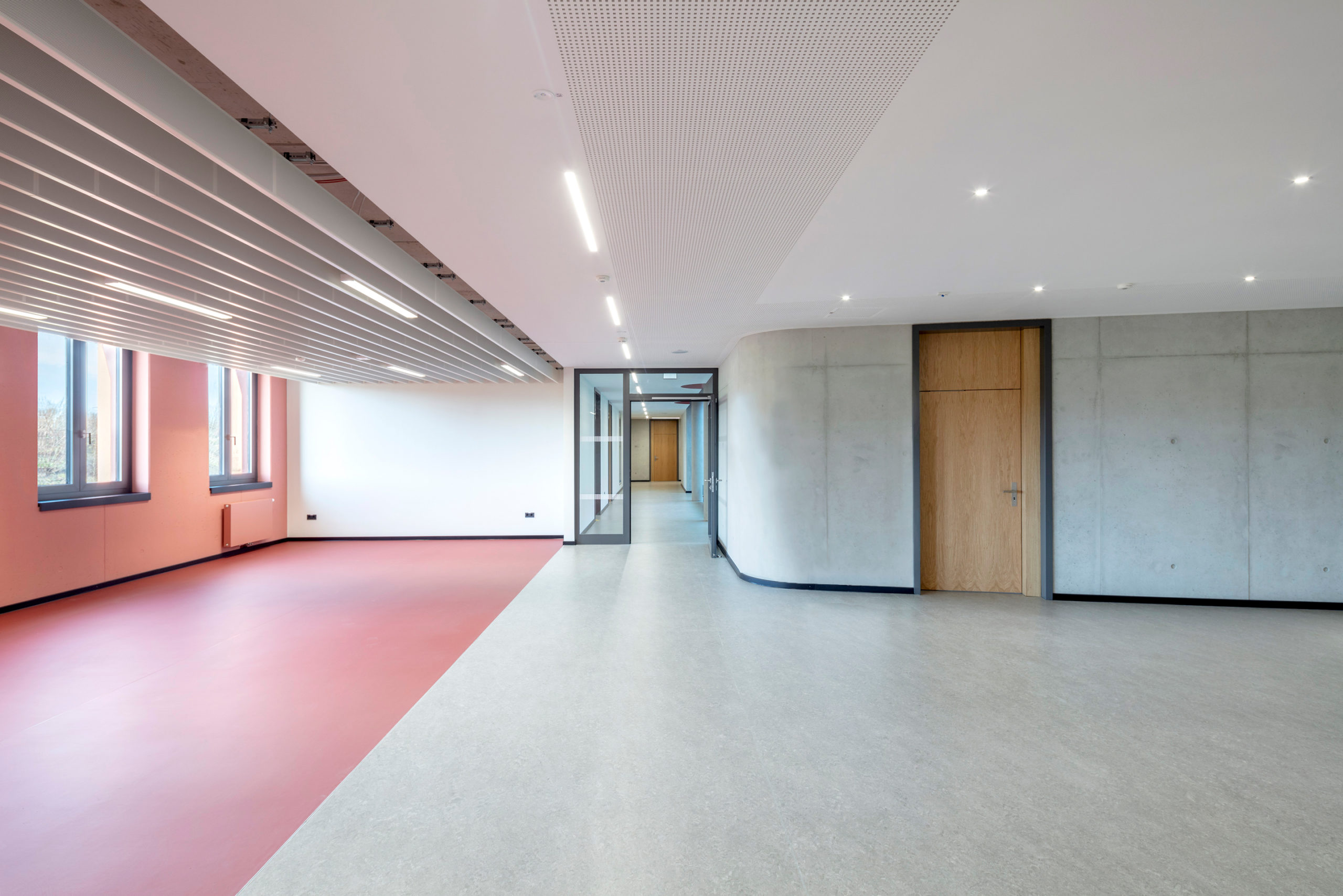
Reinoldi Secondary School by SSP AG, Mengede, Dortmund, Germany
Painted Nooks
Tiling or color shifts don’t have to be restricted to floors. Continuing the floor tiles on the walls like in Caminha Apartment by Tiago do Vale Arquitectos or painting an entire section of a room in one color like in Reinoldi Secondary School by SSP AG also creates a strong visual distinction between spaces in large areas. This is especially useful when walls cannot be moved due to structural constraints.
Change in Texture
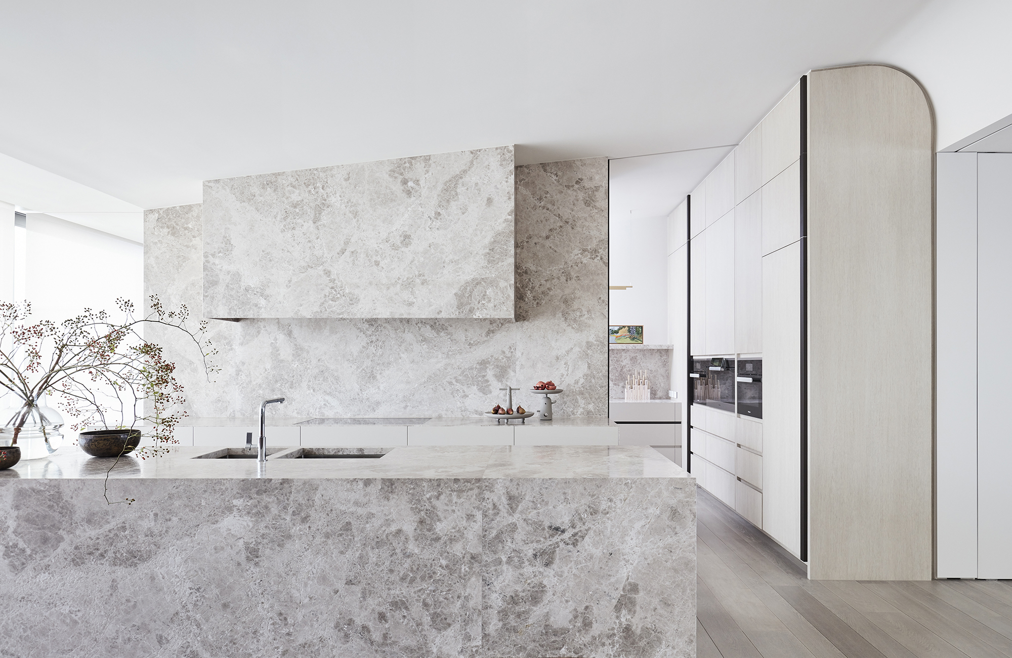
Monochrome settings are extremely popular these days. A light-toned palette is also great for smaller spaces as it makes them appear bright and airy. When adding dividers is difficult in such settings, a change in texture in the same color palette can be used to isolate functions or areas in a home. This is showcased in Arc Side by Jolson.
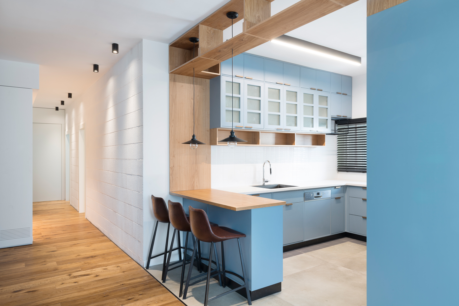
Functional Family Apartment by RUST architects – Raanan Stern, Tel Aviv-Yafo
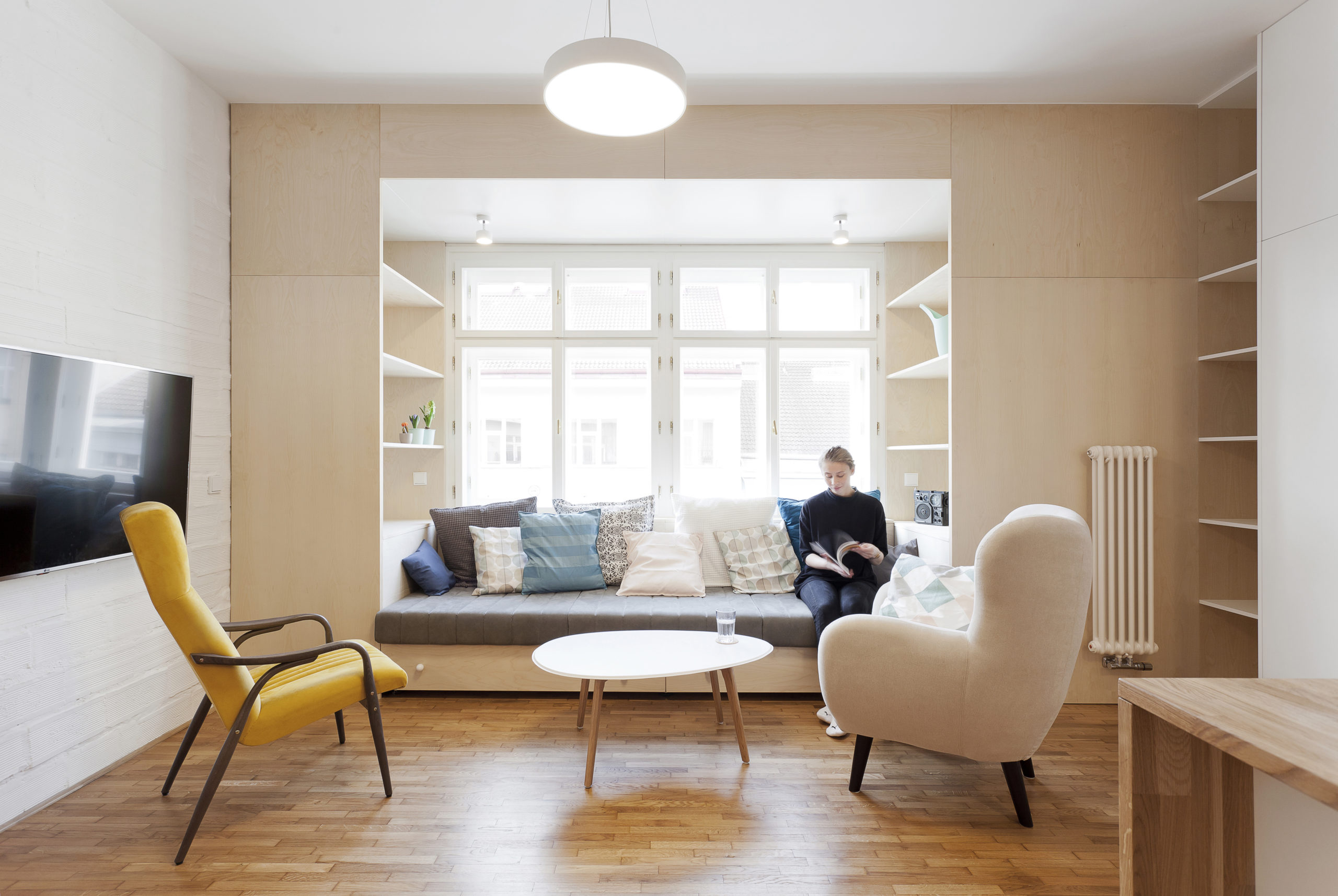
The Apartment for Přemek by ATELIER 111 architekti s.r.o., Prague, Czechia
Fixed Furniture
Framing corners with shelves or splitting up a studio space with a fixed counter or island is an extremely functional method of allocating activities and adding storage in small homes. A small breakfast bar in Functional Family Apartment clearly marks the end of the kitchen area while providing a space for meals. In The Apartment for Přemek, using shelves to make a space more narrow is a practical method of making the space cozy and intimate.
Architects: Want to have your project featured? Showcase your work by uploading projects to Architizer and sign up for our inspirational newsletters.
 Apartment - Towards the sun
  Caminha Apartment
  Functional Family Apartment
  House of Steps
  Ice & Snow Apartment
  Levallois Apartment
  Micro Apartment
  On a cruise apartment
  Park Avenue Prewar
  The Apartment for Přemek
