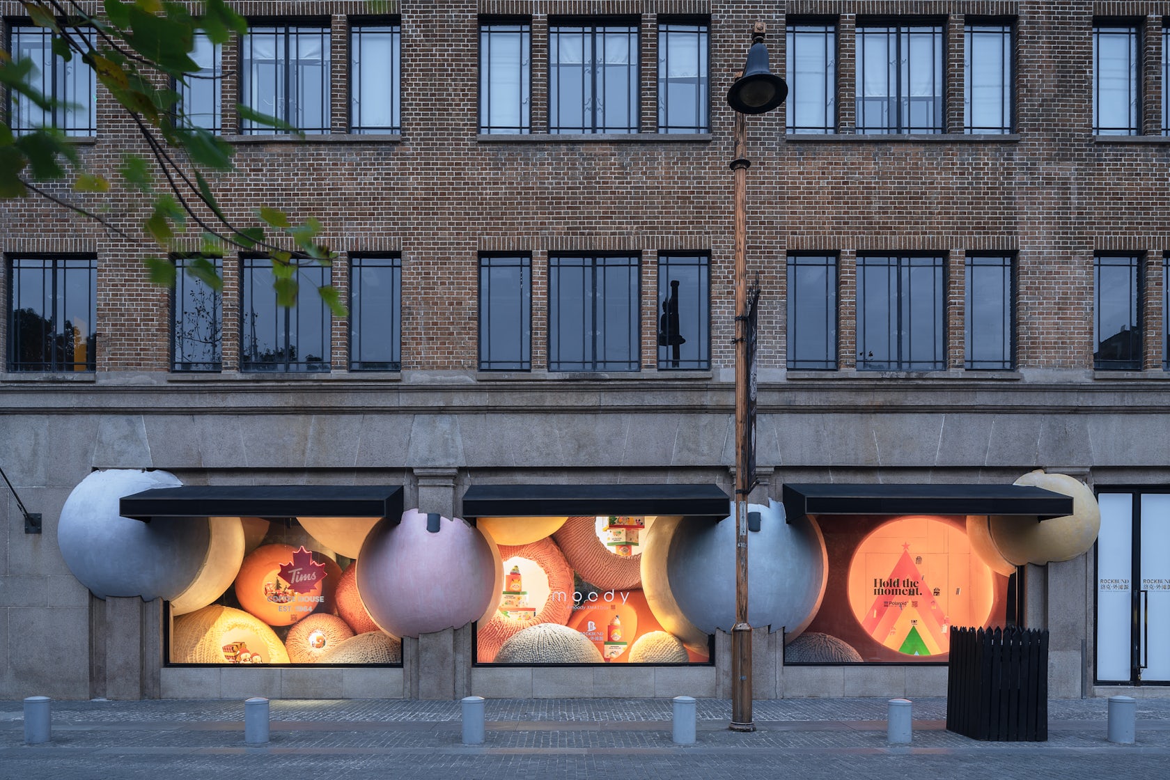
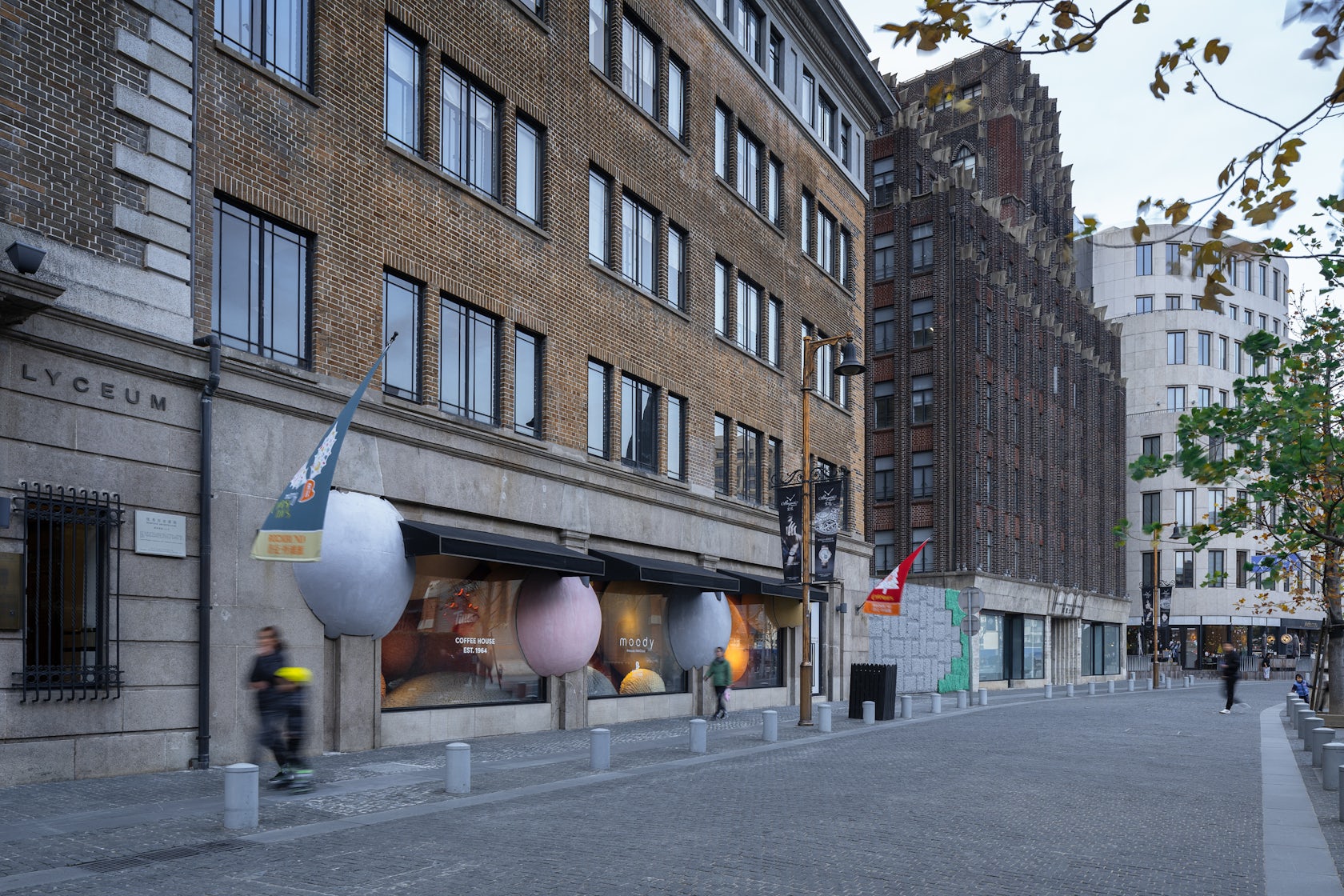
WAY-out-of-the-box – Our brief was to create an out of the ordinary festive window display for a prime location rich in historic fabric at Rockbund Shanghai, in collaboration and representing three diverse brands. Our goal was to create an installation that draws people in from afar in curiosity, almost like a street performance or a magic trick, in order to discover more, in the products displayed, in the fabrics of the historic architecture, etc.
Architizer chatted with Fernie Lai, Partner and Senior Designer at WAY Studio to learn more about this project.
Architizer: What inspired the initial concept for your design?
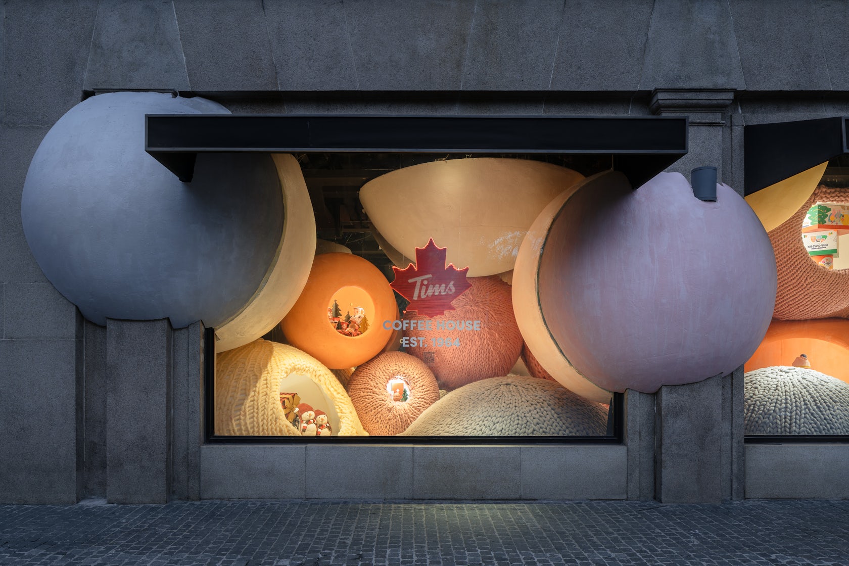
Fernie Lai: We strived to think “out side of the box” literally, to be able to interact but to break through the boundaries of the existing strict historic architecture with an exaggeration of one of the most commonly seen Christmas ornaments. We appreciate innovation. So therefore, we appreciate like-minded clients like moody who are willing to invest a little bit more in the holistic brand experience allowing us to think out side of our “architectural” box. It would be a temporary festive display, so we wanted to create something that was light, not so literal in the festive sense, and we wanted it to be something that would contrast the historic architectural fabric drastically so that it would “pop-out” in the line of windows along this stretch, quite literally in the end.
© WAY Studio
What do you believe is the most unique or ‘standout’ component of the project?
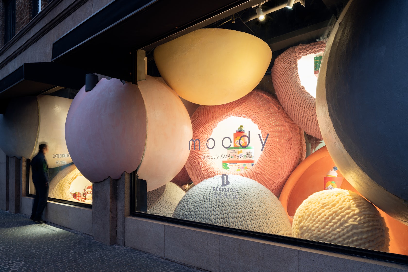
Well, I think we stood “out” quite literally! The act of (pretending to) breaking physical boundaries, we have also broken the expected scale, with that we were able to give our viewers a sneak peek into the imaginative world of what the year end festivity are all about! It’s also that change of scale in an ordinary object that creates that unexpected experience and awe that draws you close, curious to really take a good look at it.
Also it was of course also very photogenic, and instagramability is important these days…
© WAY Studio
What was the greatest design challenge you faced during the project, and how did you navigate it?
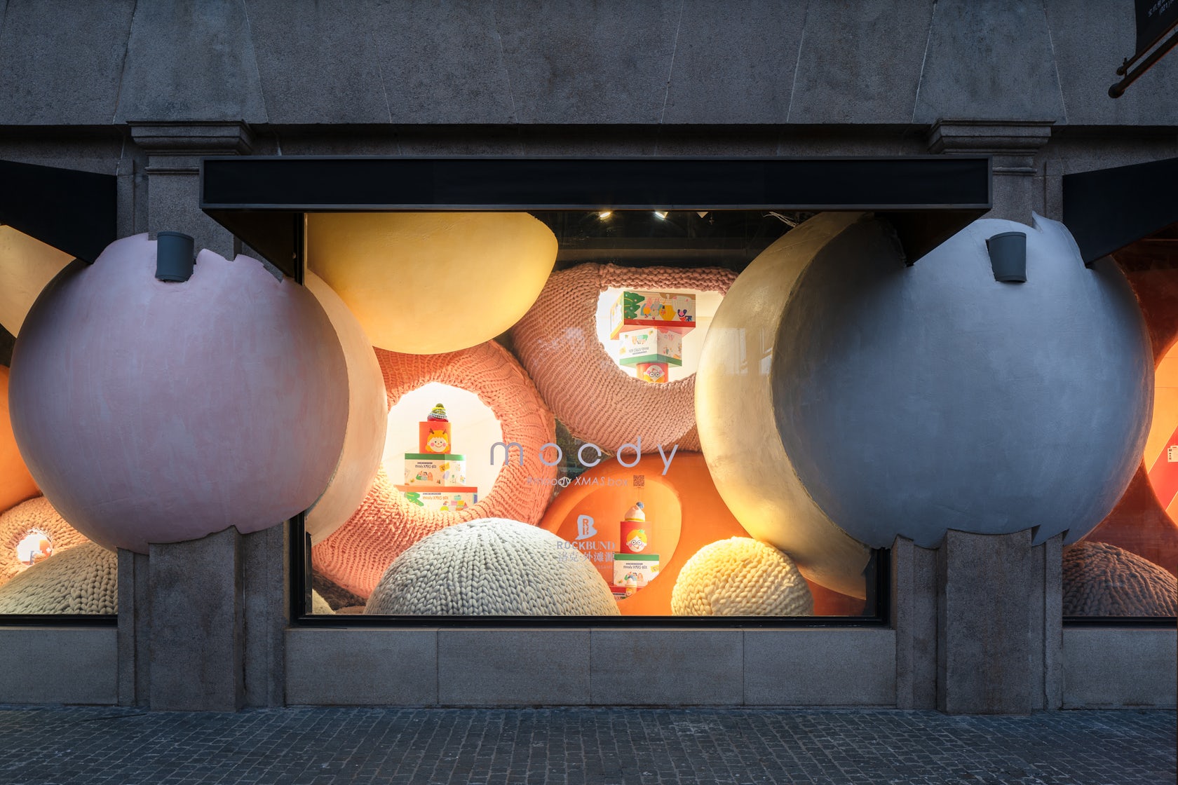
We weren’t allowed to break the facade in reality. So we had to create that illusion by creating a way to construct our spheres around the existing facade and glass. We were also not given a lot of space behind the glass display, so in order to create that sense of depth, we encased the interior portion of the installation in a mirrored box so that it felt like the spheres actually traversed deeper into the Infinity making use also of the reflection off the existing windows.
How did the context of your project — environmental, social or cultural — influence your design?
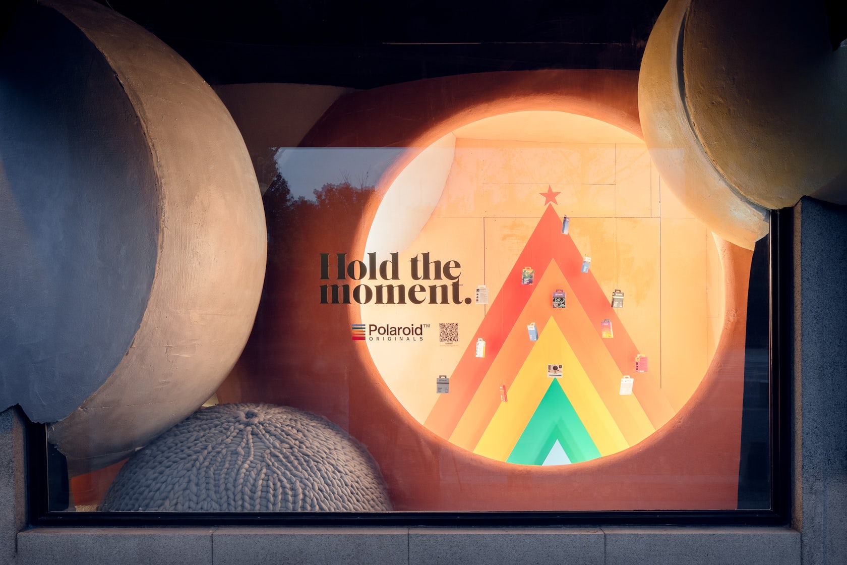
Christmas has become more of marketing strategy here in China, as in many places in the world. Co-incidentally the location of the site was within one of the more western influenced areas in Shanghai, and at the same time brings into the popular question of how we can revitalize historic city fabric, that’s why we wanted to arrive at these questions from a far, with as much exaggeration as possible. Installations really allows us to try and touch boundaries that would otherwise not be accepted because of how it is perceived, temporary and artistic.
© WAY Studio
What drove the selection of materials used in the project?
Initially we were adamant that we wanted something soft to contrast the power of the crash, and what better than a knitted surface inspired by the infamous winter sweater to clad our spheres in. We also had to find something that would be more malleable to conform to the intricate details of the existing facade, so we were lucky to have discover popular prop materials and craftsman that could sculpt perfect spheres with their bare hands!
What is your favorite detail in the project and why?
For this project, one of my favourite parts, and its something that we are constantly reminded of in the construction of all our projects, is not to forget the human-touch. For a project like this, one would think we would require high precision maybe even 3D scanning, printing, multiple molds or what not while in reality, nothing more than a few craftsman with a sharp knife was required! That’s a bit of an exaggeration, many drawings were created in the process in order to communicate and coordinate everyone, but in the end, this was a more flexible working process and allowed more leeway during onsite installation compared to something that would have been perfectly constructed!
© WAY Studio
How important was sustainability as a design criteria as you worked on this project?
With the past couple of installations that we worked on, we try to bring that element of reusability into our design as installation work really produces a lot of waste; but in reality it is still very difficult to execute as sometimes reuse also creates more waste, more cost, travel footprint, etc. The other idea that we are becoming more conscious of is to try to use materials closer and more local to the site, and so far this has been much more manageable, it also pushes us to be more creative in discovering new materials that were not previously or normally considered!
Were any parts of the project dramatically altered from conception to construction, and if so, why?
Initially the spheres notched onto the facade covered a wider facade area, but due to restrictions with the on-site construction, cobble stone pave ways and all, we had to let-go of a couple of them that would have required cranes for installation.
© WAY Studio
How have your clients responded to the finished project?
We became good friends afterwards and continue to discuss regularly, design related issues from big (our architecture) to small (her products)!
What key lesson did you learn in the process of conceiving the project?
To always think big! You never know what you can actually achieve, but of course, always have plan B, plan C, and plan D ready for action.
How do you believe this project represents you or your firm as a whole?
We are interested in abstract representation, in creating illusions, in the exploration of territories beyond even our own imagination. Therefore, working conceptually or at the installation scale gives us the opportunity to develop our minds and to try new materials.
Is there anything else important you’d like to share about this project?
In the end, we did it cause we thought it’d be cool 😉
© WAY Studio
Team Members
WAY Studio – Zheng Tao, Fernie Lai, Alan Hung, Li XuDong, He Jing Yang
Consultants
Collaborating brands in alphabetic order: moody, Polaroid Originals, Tim Horton’s; Site provided by Rockbund Shanghai; Construction – Shanghai He Cheng Contracting Ltd. Lighting consultant – J Studio; Photography – i-Joyer Photography
Products / Materials
Base Sculpture provided by HAHA Sculpture Team; Knitted surface provided by ZZHome
For more on WAY-out-of-the-box, please visit the in-depth project page on Architizer.

 WAY-out-of-the-box