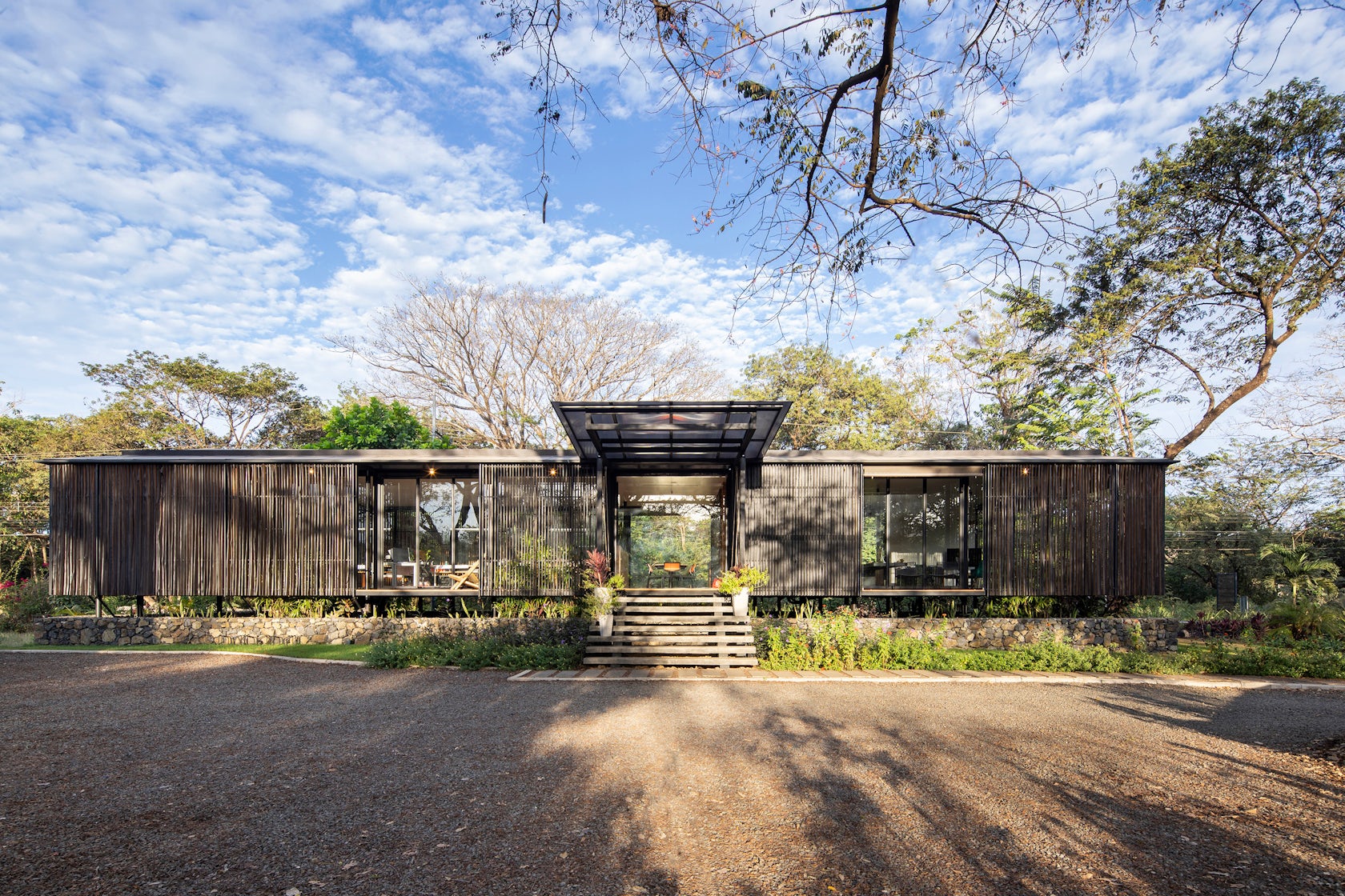
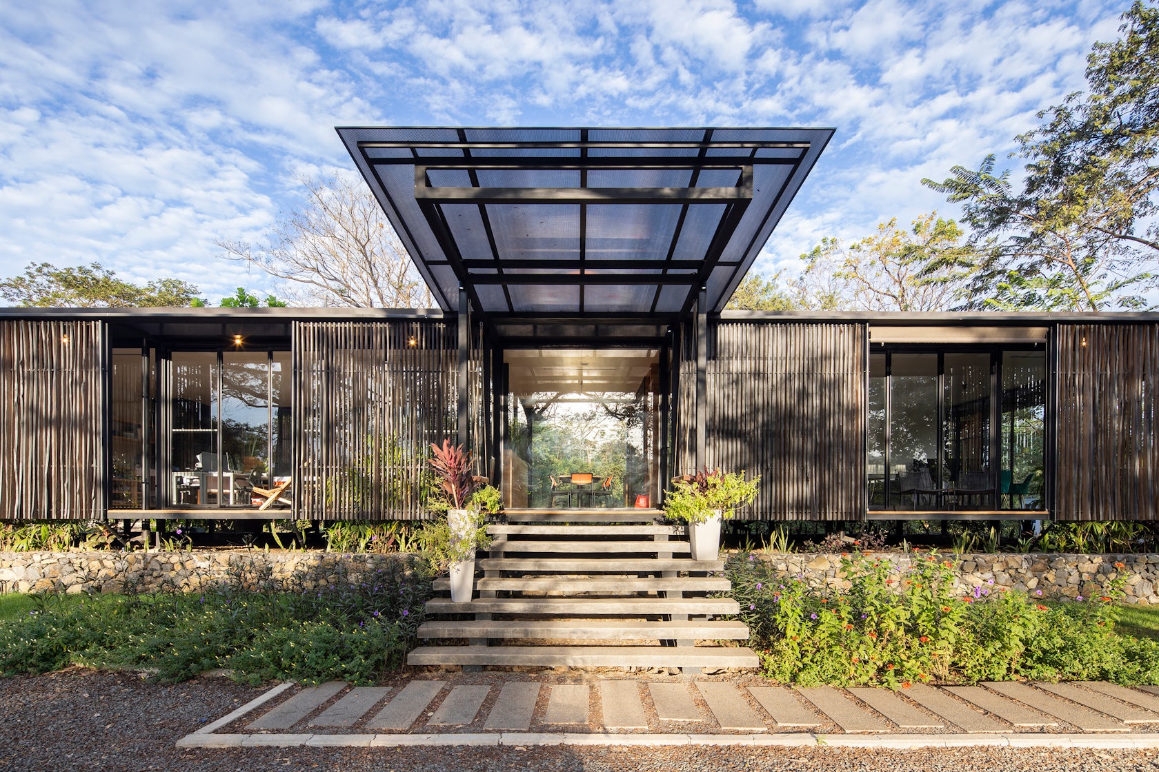
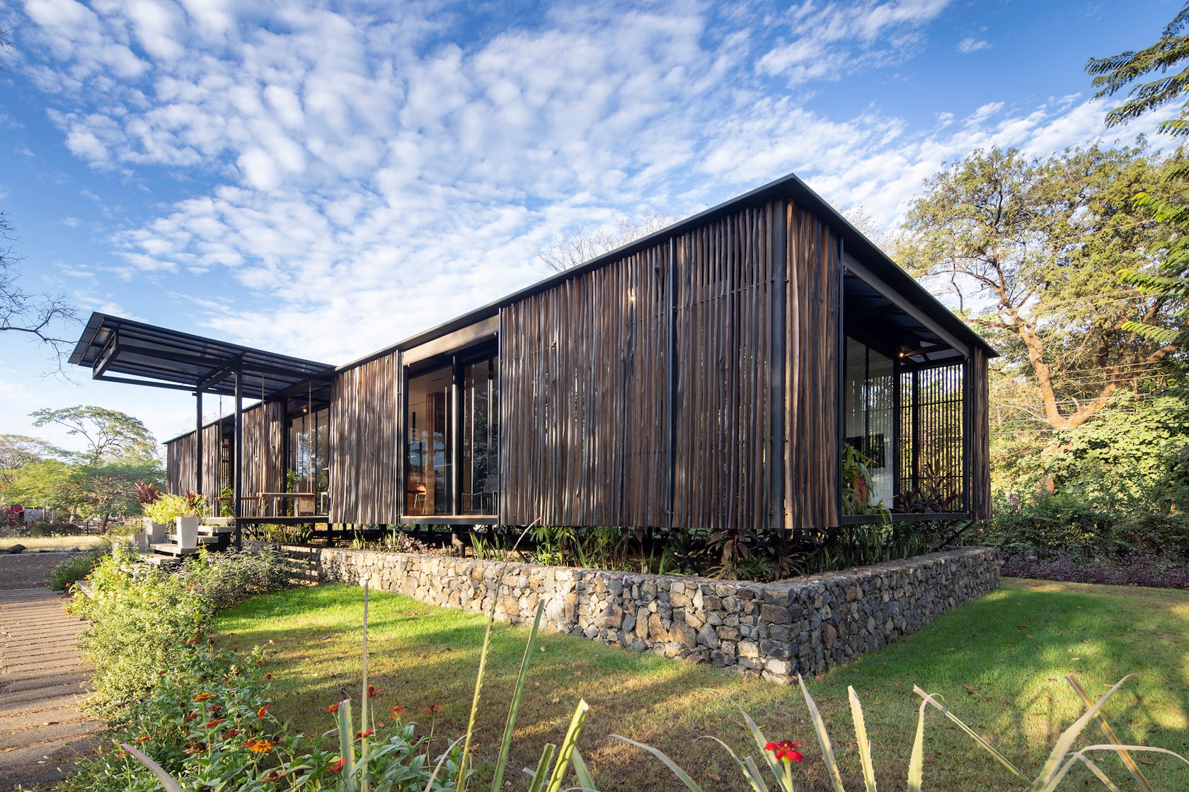
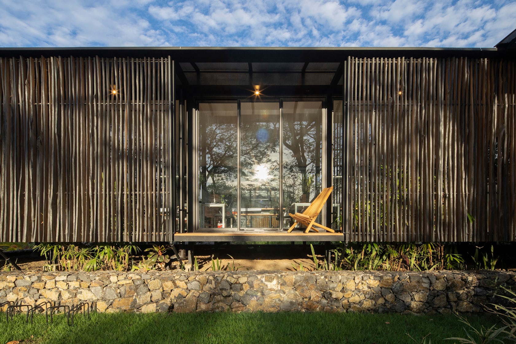
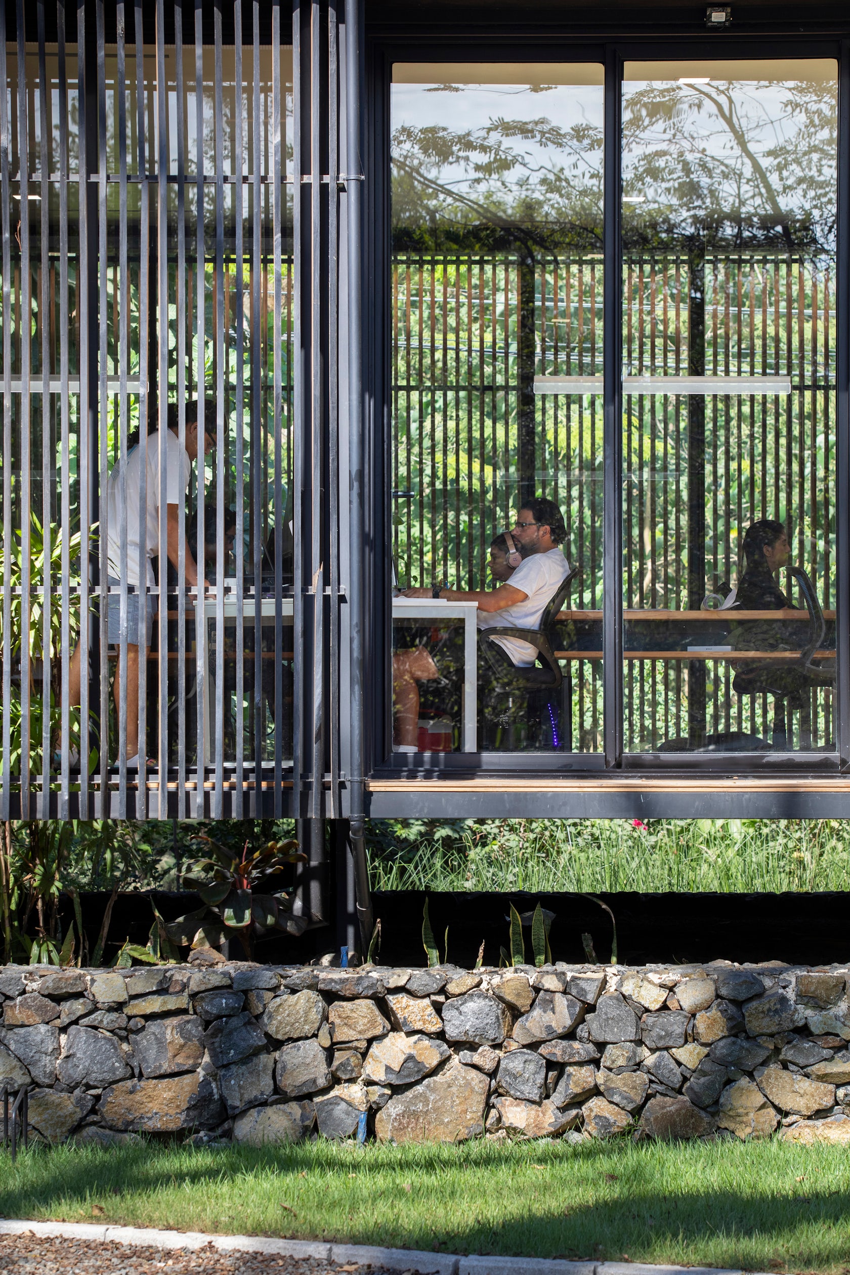
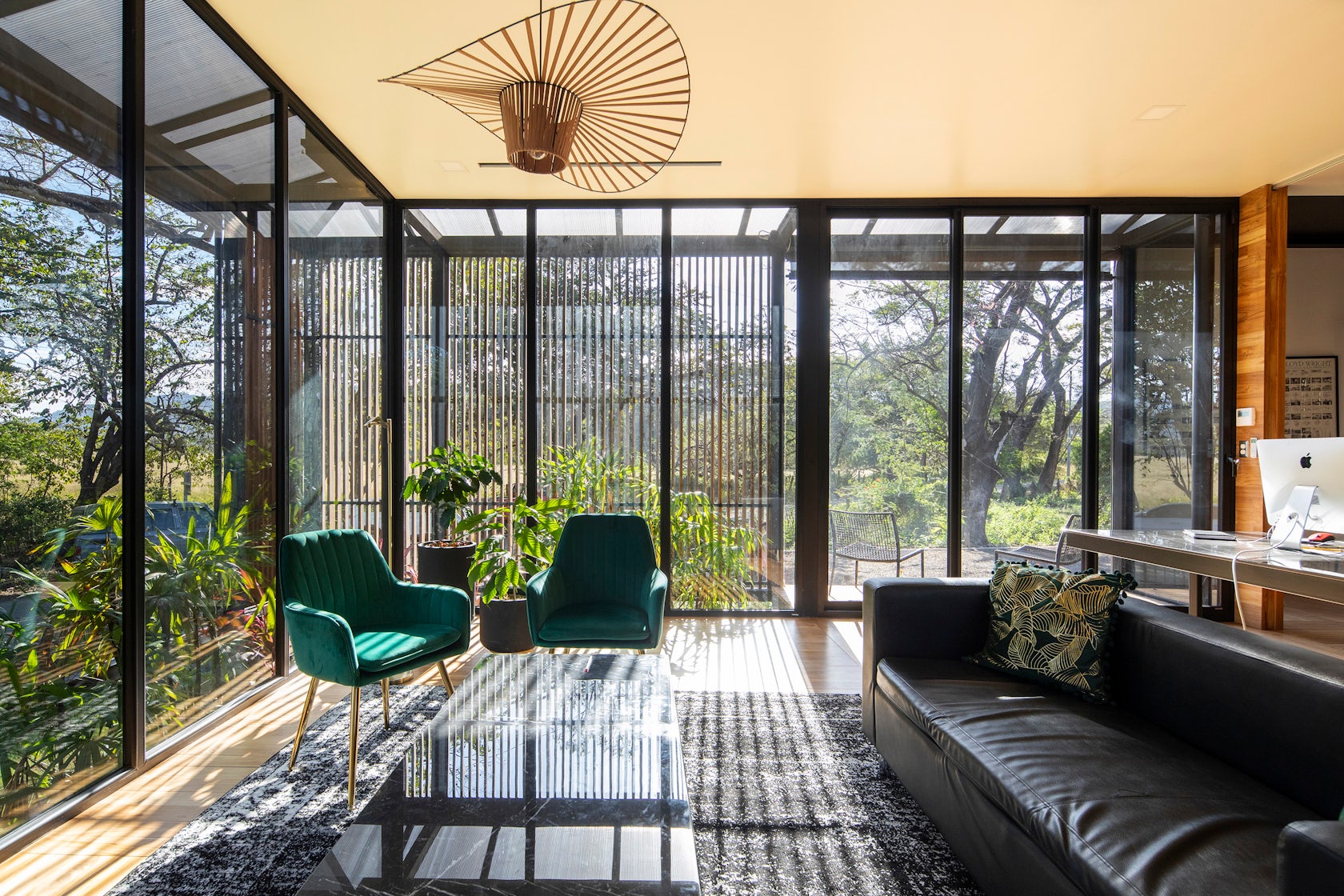
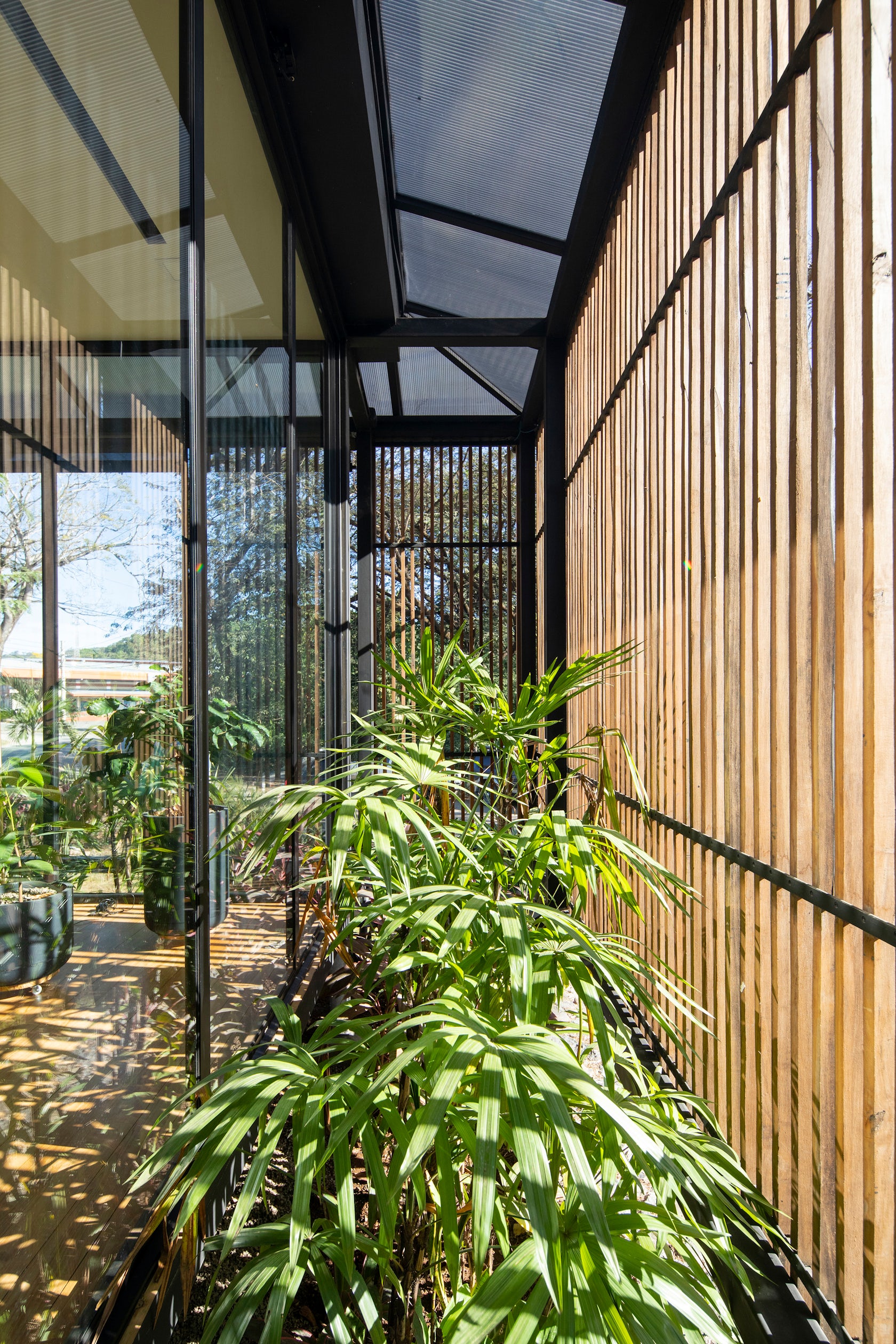
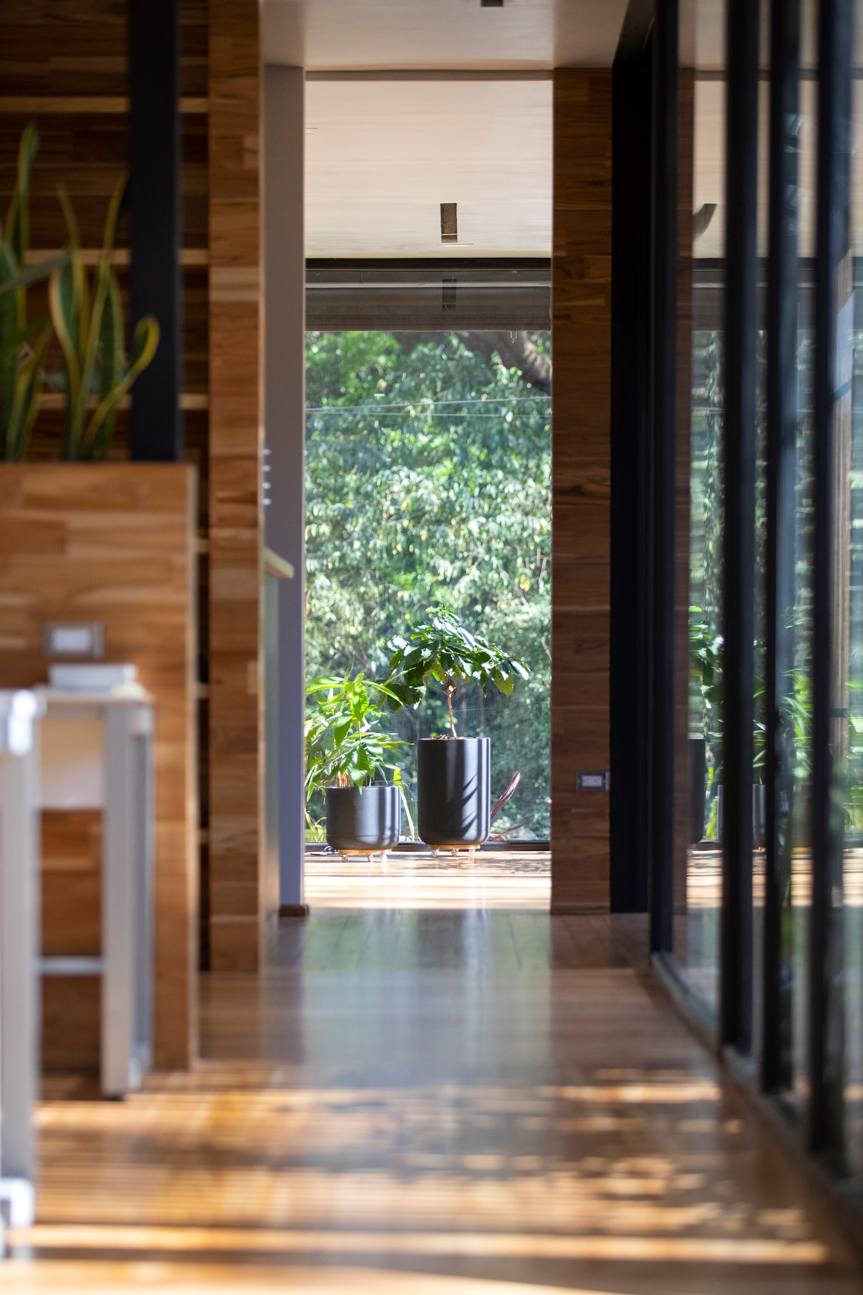
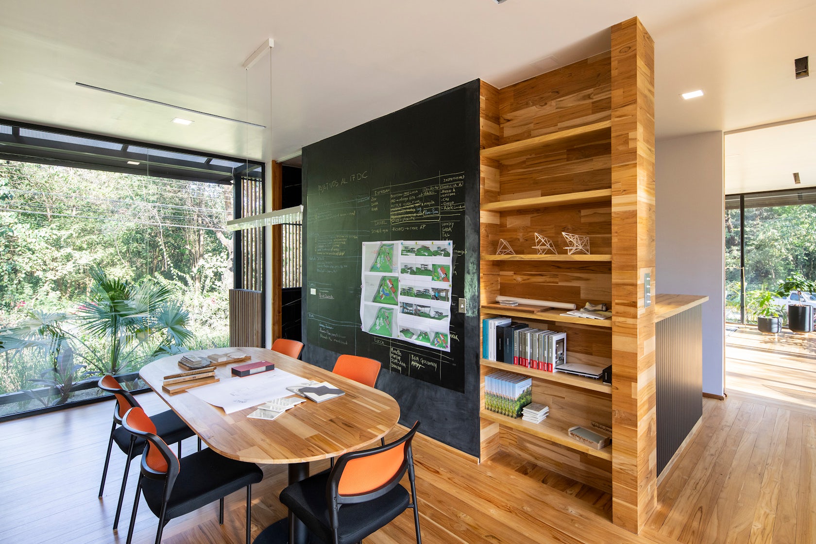
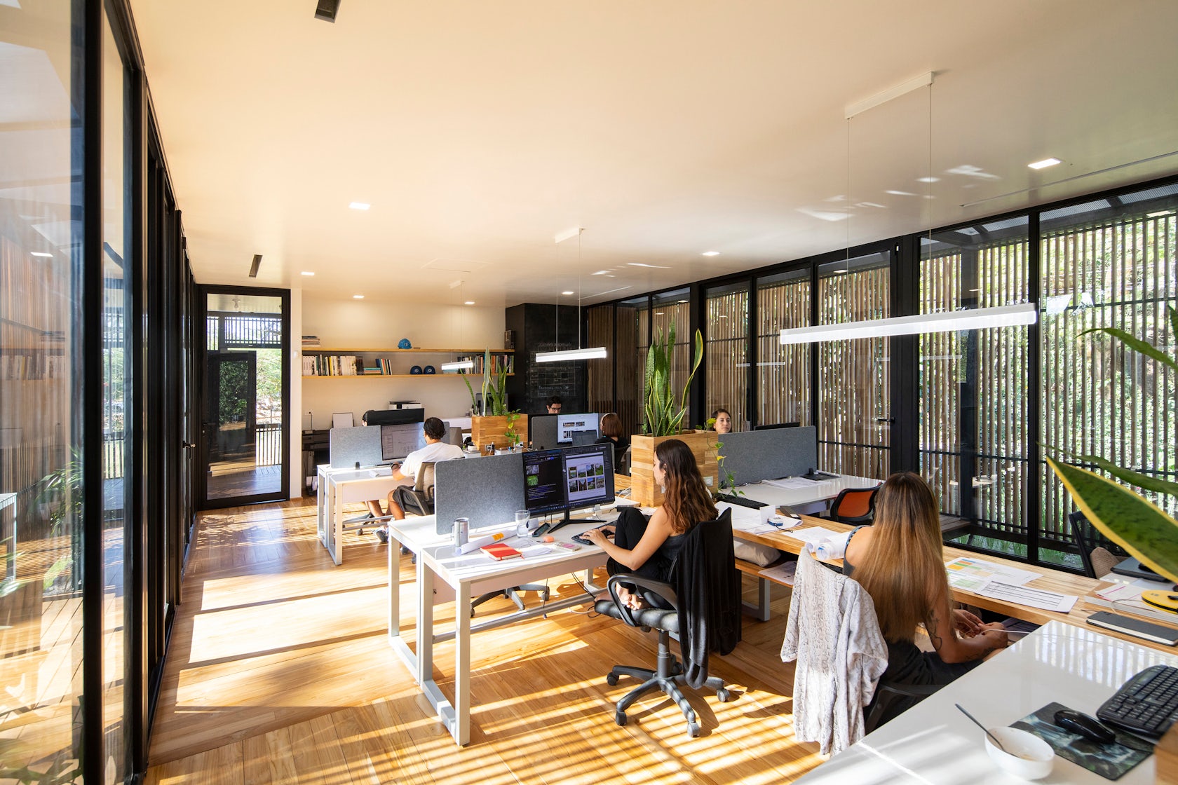
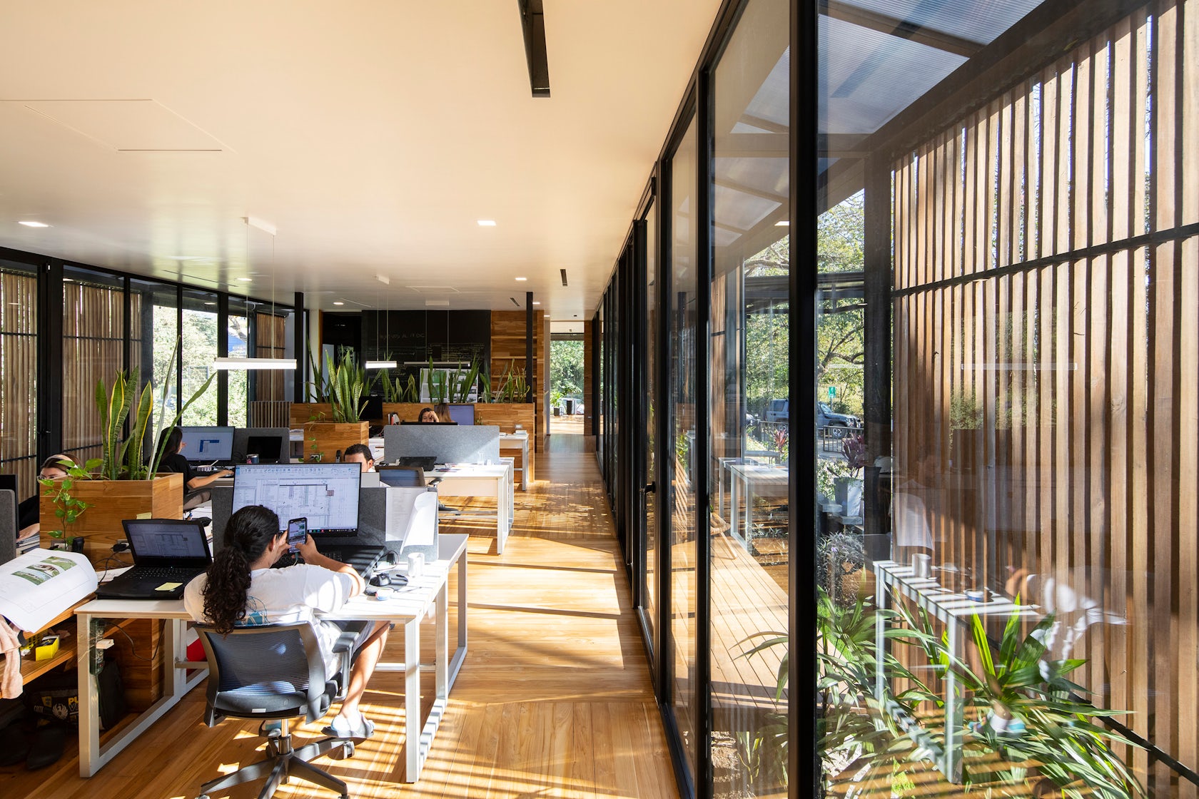
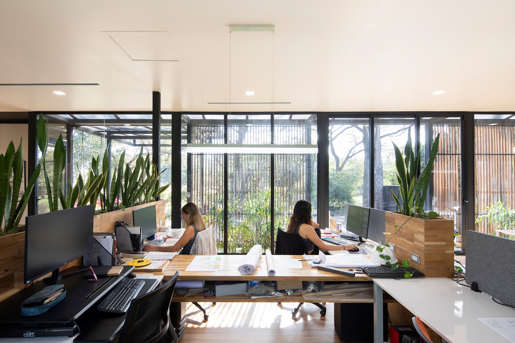
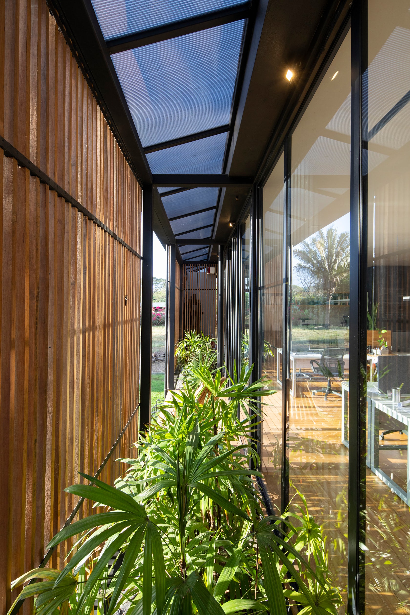
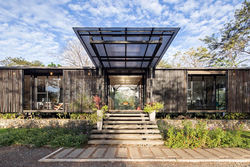
Design Studio Salagnac Arquitectos – The structure consists on a steel structural frame repeated along the building’s reticular geometry. These geometric systems provide organization and logic to the design which leads to efficiency during construction. The interior working space is hidden behind a series of timber sunshades that provide privacy without completely blocking the sun and, at the same time, ensure cross ventilation throughout the building. All the spaces have an immediate connection with the vegetation, warm materials and natural light; elements that result in a pleasant and healthy workspace that, in turn, activates all the senses and encourages creativity. We seek to establish an architectural language that applies bioclimatic strategies and energy efficient systems while offering a healthier, and more in touch with nature.
Architizer chatted with Lucca Spendlingwimmer and Evangelina Quesada at Salagnac Arquitectos to learn more about this project.
Architizer: What inspired the initial concept for your design?
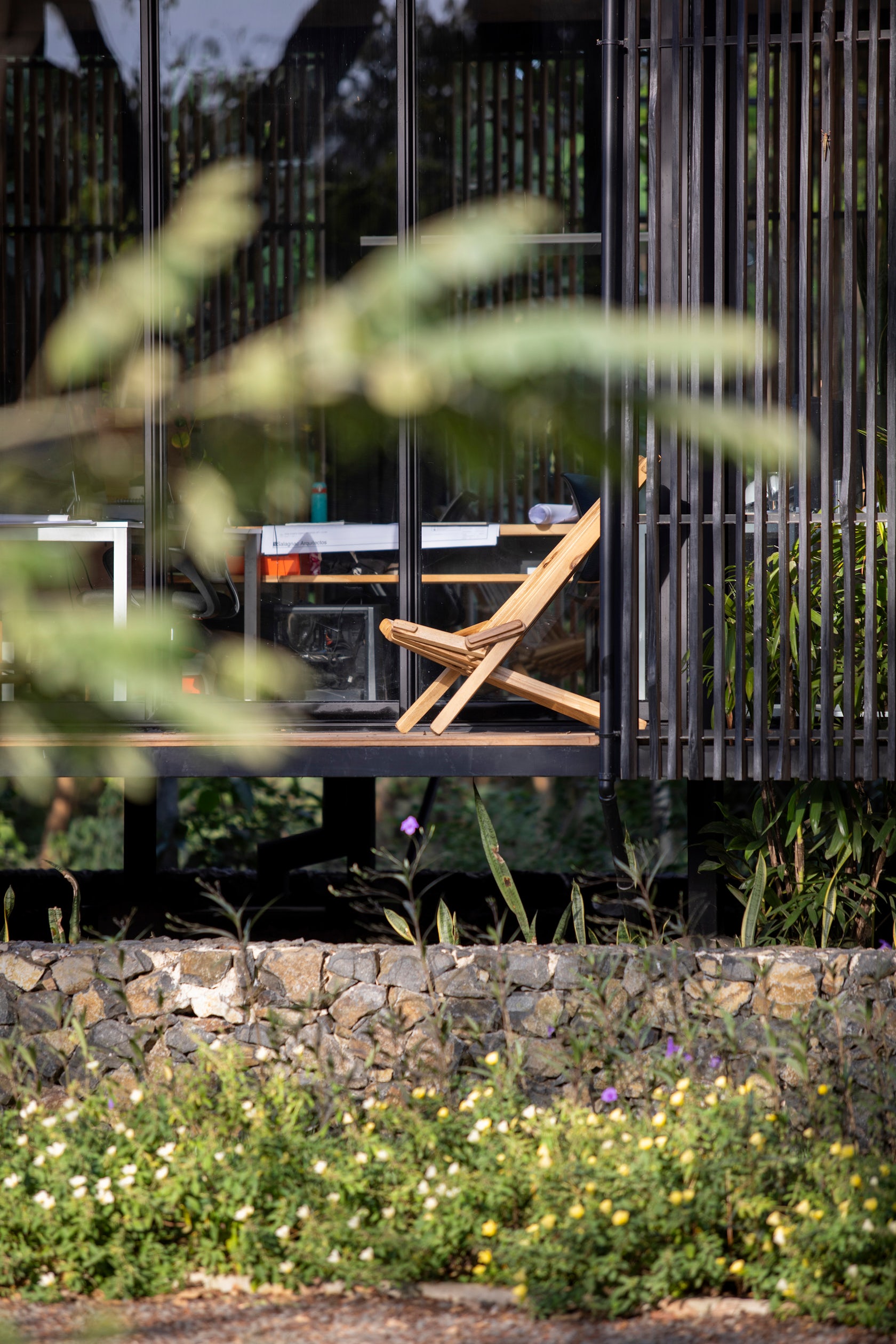
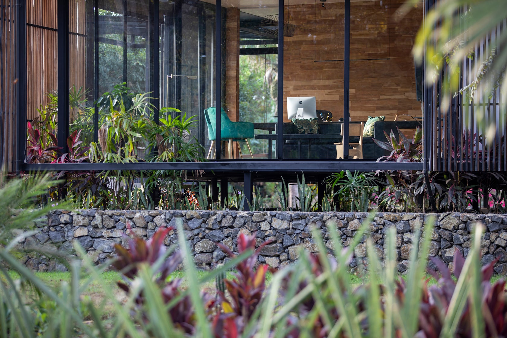
Lucca Spendlingwimmer & Evangelina Quesada: We wanted to create a building that would adapt to the conditions of the place that is prone to flooding, so we decided to build the building on a plinth and pilars. We wanted a space with lots of natural light that felt surrounded by nature and at the same time felt like a quiet space protected from solar radiation and rain. For this we created a kind of “skin” of serial wood planks that line the exterior of the building, between this “skin” and the internal work space there is an open transition space full of plants that cause the sensation of being in a building that floats on the vegetation.
© Salagnac Arquitectos
© Salagnac Arquitectos
This project won in the 10th Annual A+Awards! What do you believe are the standout components that made your project win?
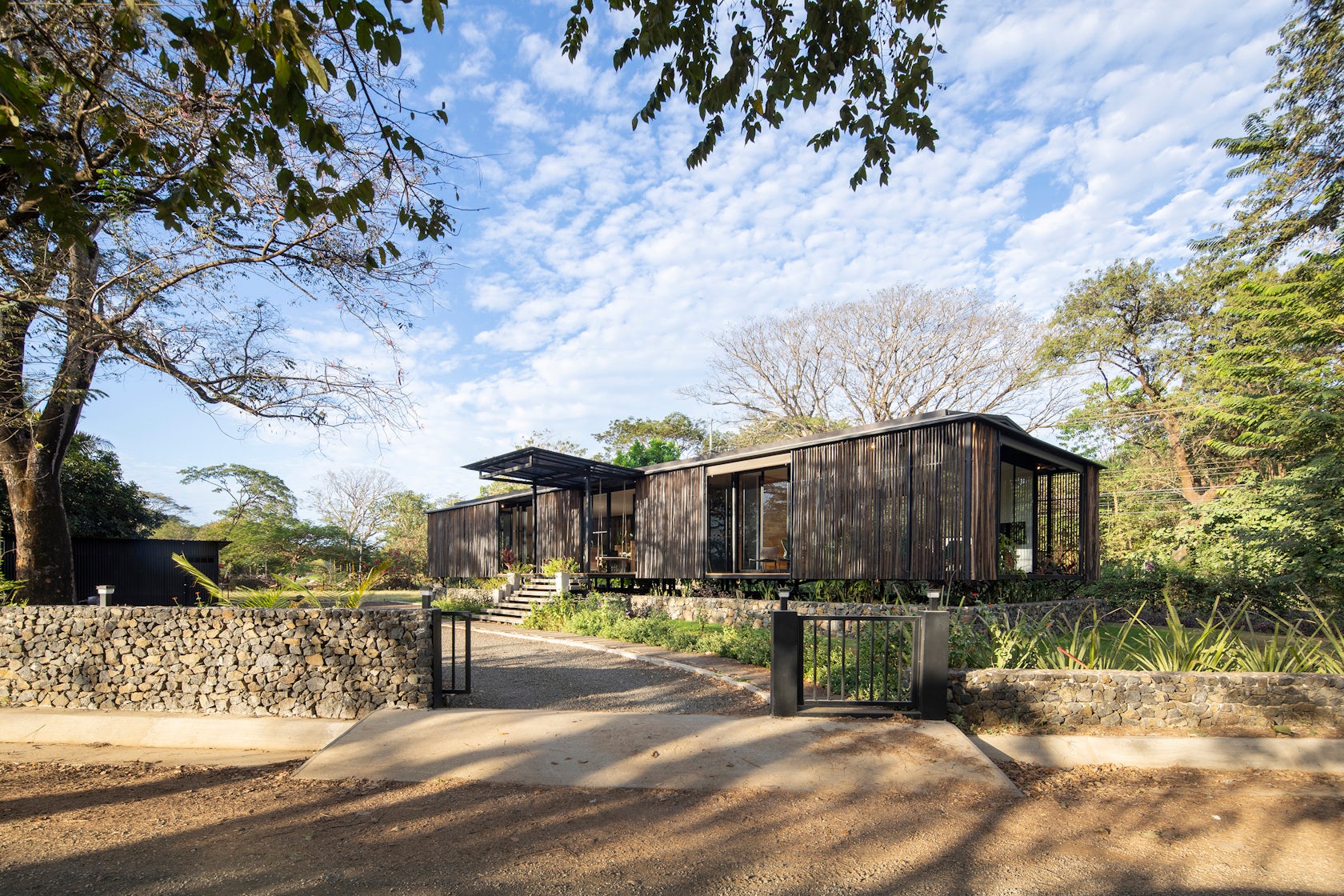
The combination of modernity in contrast with the natural and rustic. We contrasted traditional elements of stone walls and rustic wooden planks with glass and metal. In order to enhance the tradition of local materials and at the same time keep the modern design line in a clear and functional way.
© Salagnac Arquitectos
© Salagnac Arquitectos
What was the greatest design challenge you faced during the project, and how did you navigate it?
The challenge was how to build a building in an efficient and logical way in terms of cost and use of material. We achieved it by organizing the spatial distribution in a modulation that had proportions associated with the use of spaces and the proportions of the construction elements. This form of organization is called a geometric grid, which provide organization and logic to the design and leads to efficiency during construction.
© Salagnac Arquitectos
© Salagnac Arquitectos
How did the context of your project — environmental, social or cultural — influence your design?
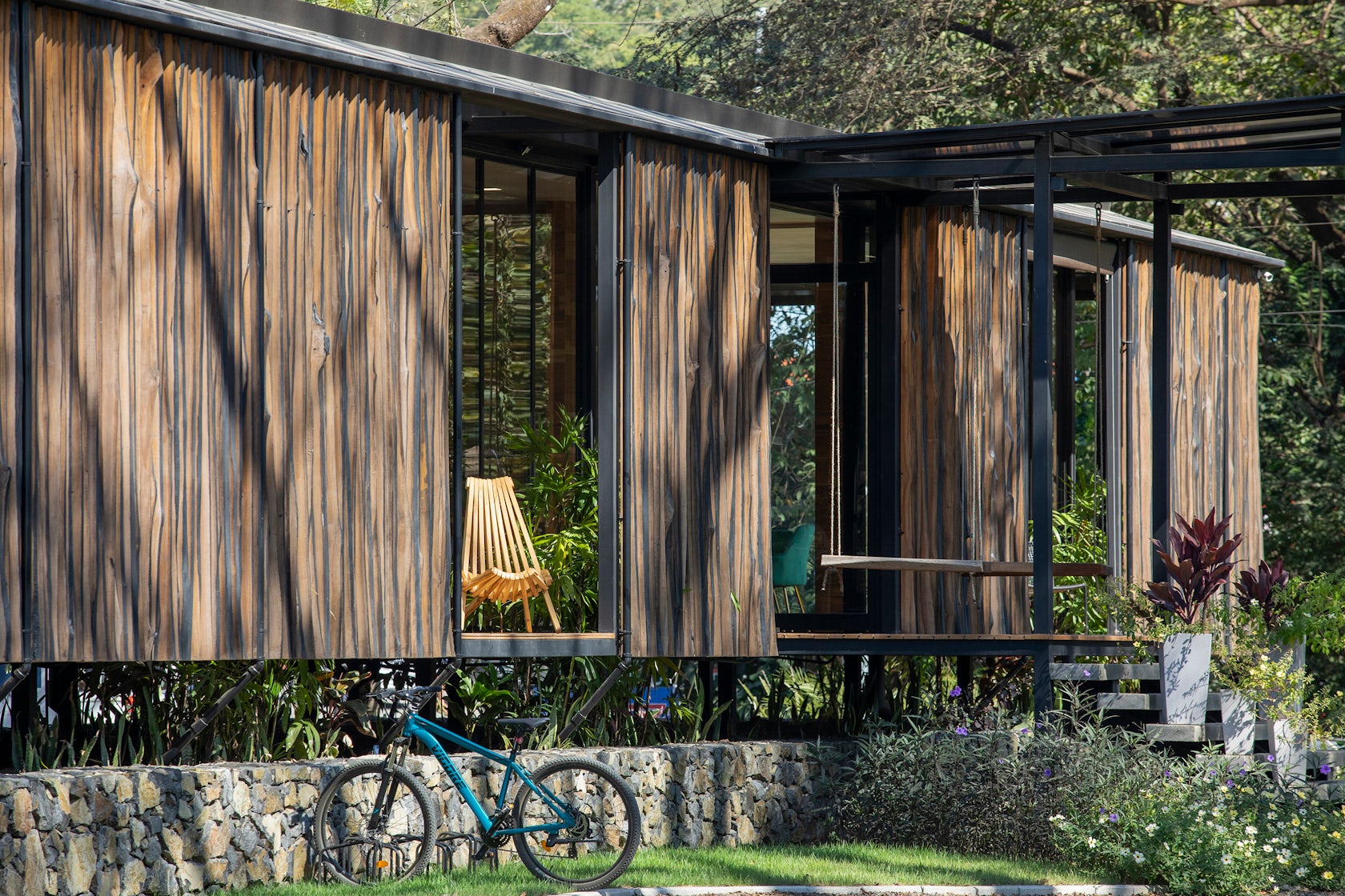
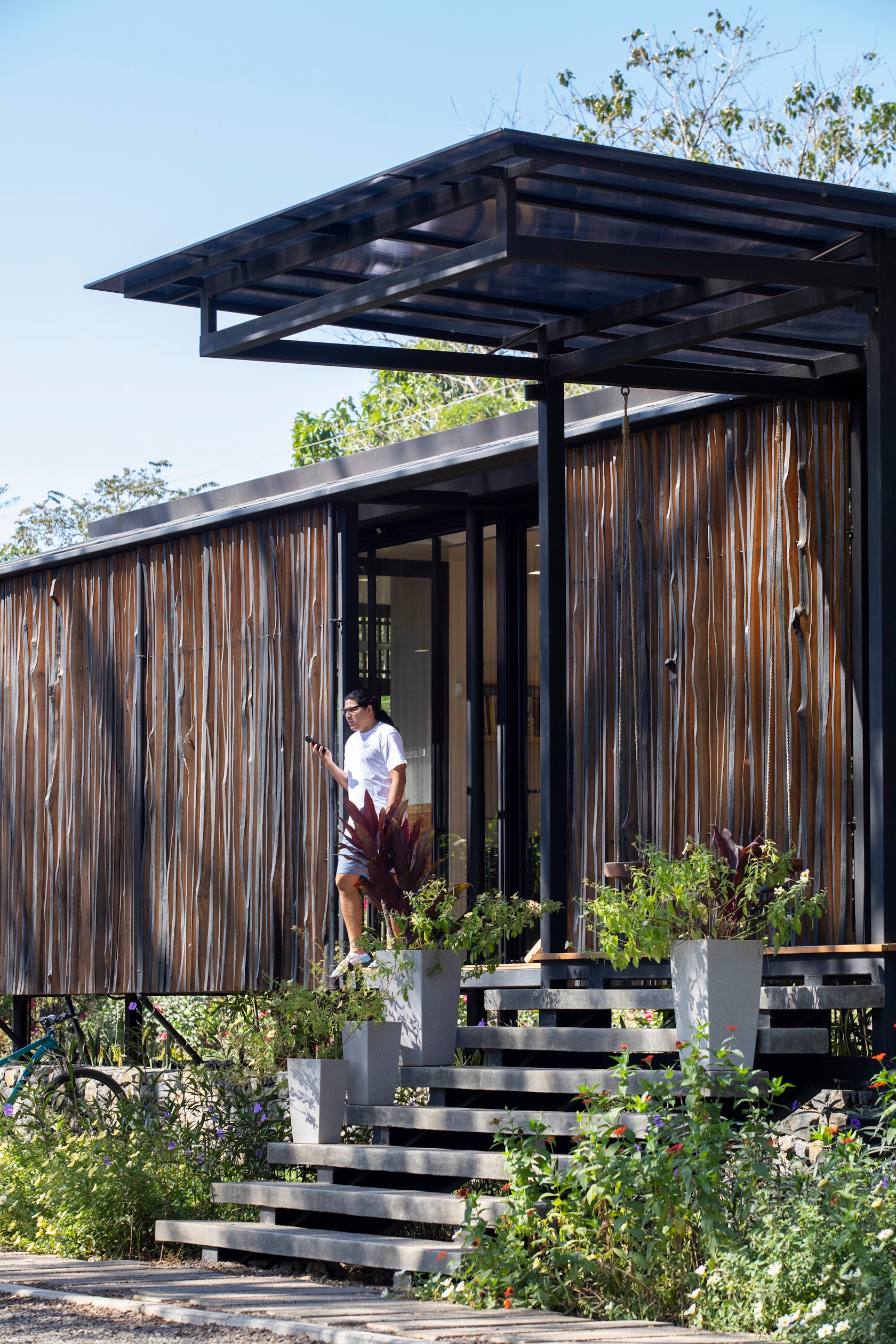
Being in an area prone to flooding, we chose to raise the building about 1.5 meters. We opted for a local stone plinth to highlight this local material and technique. For the exterior enclosure we use leftover wood from the sawmill, duly selected and made into final strips of wood. This is a way to give value to a waste resource and encourage locals to use it in the same way.
© Salagnac Arquitectos
© Salagnac Arquitectos
What drove the selection of materials used in the project?
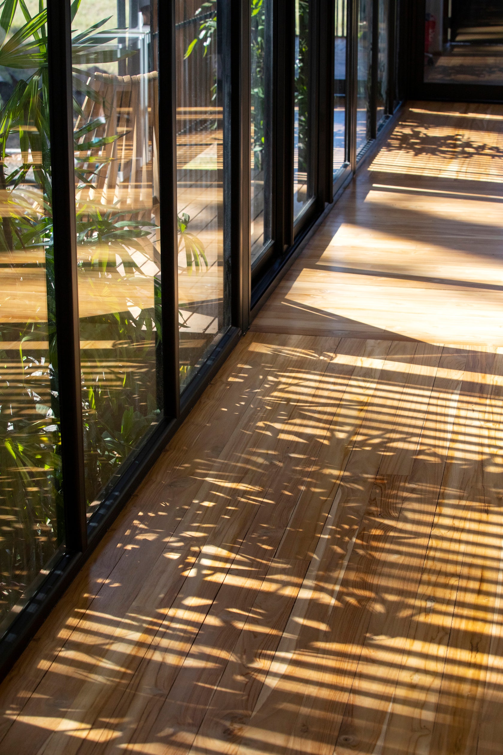
Natural and local materials on the outside that could be exposed to inclement weather and that are low-maintenance. And functional materials in the internal spaces, especially the use of glass to provide light to the spaces and protection from external elements. For the main structure we opted for a light metal structure due to its proportions to be modular and the speed of construction.
© Salagnac Arquitectos
© Salagnac Arquitectos
What is your favorite detail in the project and why?
The wooden slats of the exterior enclosure. Because we were able to use a material that sawmills normally throw away. And at the same time we managed to give a special aesthetic value to a rustic material by contrasting it with the other elements of the building of a contemporary design line.
© Salagnac Arquitectos

© Salagnac Arquitectos
How important was sustainability as a design criteria as you worked on this project?
It was very important to minimize the waste of wood in the sawmills by using the elements of the edges that they discarded. The modulation of the structure was key to making the most of the material and avoiding waste. Glass is very important to provide the internal work space with natural light and not depend on artificial light. In office spaces, sliding doors can be opened from side to side to renew the air with cross ventilation, that was something essential that we learned from the pandemic to maintain a renewed and healthy air space. And we also have a solar system that provides renewable energy for electrical equipment.
© Salagnac Arquitectos
© Salagnac Arquitectos
How have your clients responded to the finished project?
They love it!
What key lesson did you learn in the process of conceiving the project?
Simplicity on design and use of the right material makes the difference for a logical project on its conception.
© Salagnac Arquitectos
© Salagnac Arquitectos
How do you believe this project represents you or your firm as a whole?
It shows the simplicity of our design line but our commitment to the order and logic of the construction systems and the use of material to create something beautiful and functional.
© Salagnac Arquitectos
© Salagnac Arquitectos
How has being the recipient of an A+Award evoked positive responses from others?
Gives us a lot of confidence in our work.
How do you imagine this project influencing your work in the future?
There are clear elements of design, construction system and use of materials that can be imitated in other projects based on the principles that were developed in this project.
© Salagnac Arquitectos
© Salagnac Arquitectos
Is there anything else important you’d like to share about this project?
This is the first architectural design studio built in a rural area of Costa Rica.
Team Members
Architects Lucca Spendlingwimmer and Evangelina Quesada
For more on Design Studio Salagnac Arquitectos, please visit the in-depth project page on Architizer.


 Design Studio Salagnac Arquitectos
