Architects: Want to have your project featured? Showcase your work by uploading projects to Architizer and sign up for our inspirational newsletters.
Dreamy colors, curved forms and awe-inspiring details dominate most of Shanghai-based X-LIVING’s work. Founded in 2011 by architect Li Xiang, the design practice merges art and architecture to create spaces that are memorable and inspiring.
“My works always seem to present a magical, dreamy, and even surreal style is because what I want to create is not just a beautiful space, but a spatial experience for visitors,” said Xiang.
She added that touching the heartstrings of others is what drives her work. Whether it is a library or a children’s park, her projects go beyond just decorating a space by building a whole new city or world within the site. Not only are these spaces an Instablogger’s hotspot, but they also give users a new perspective, a space for their imagination to run wild.
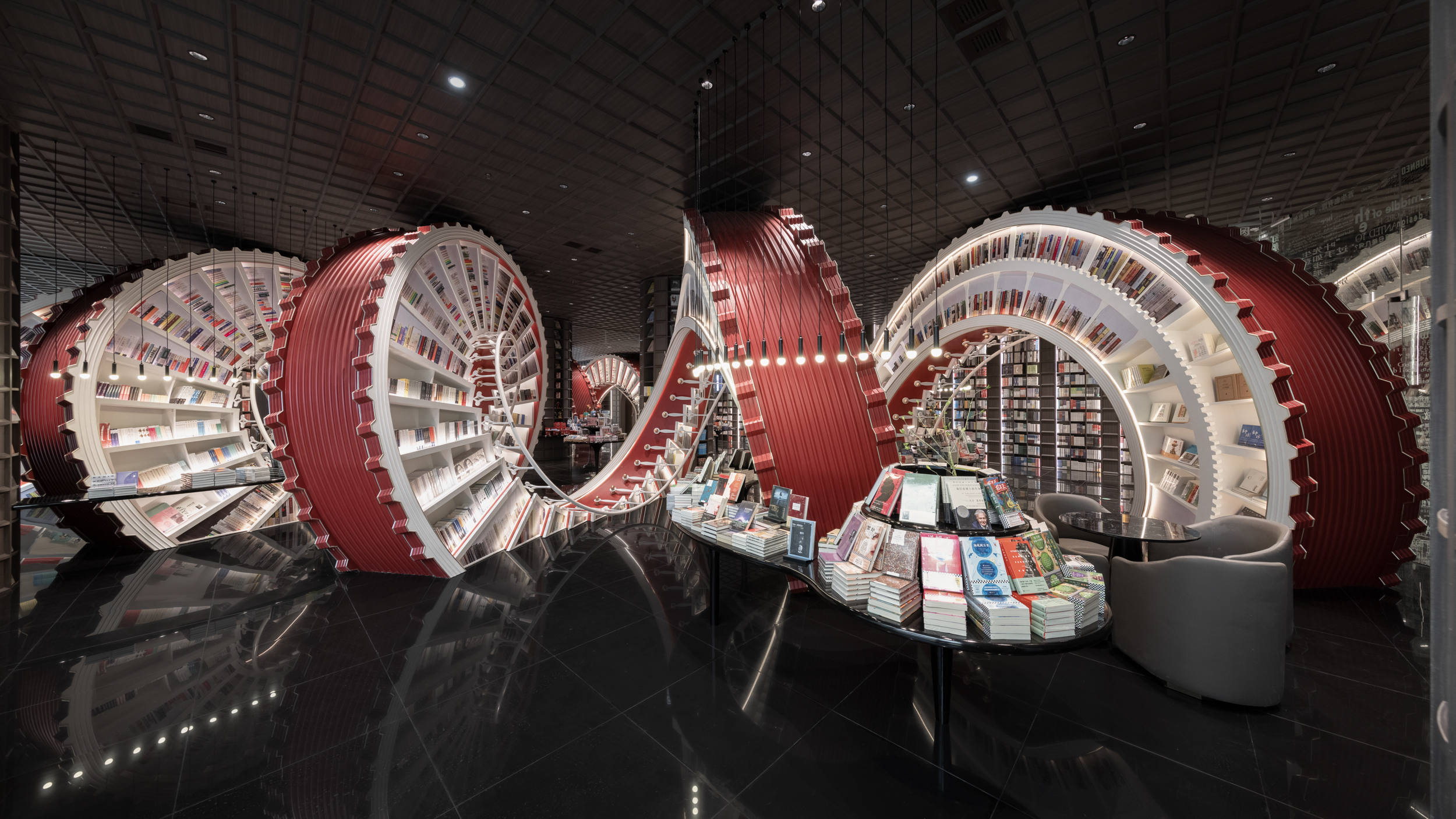
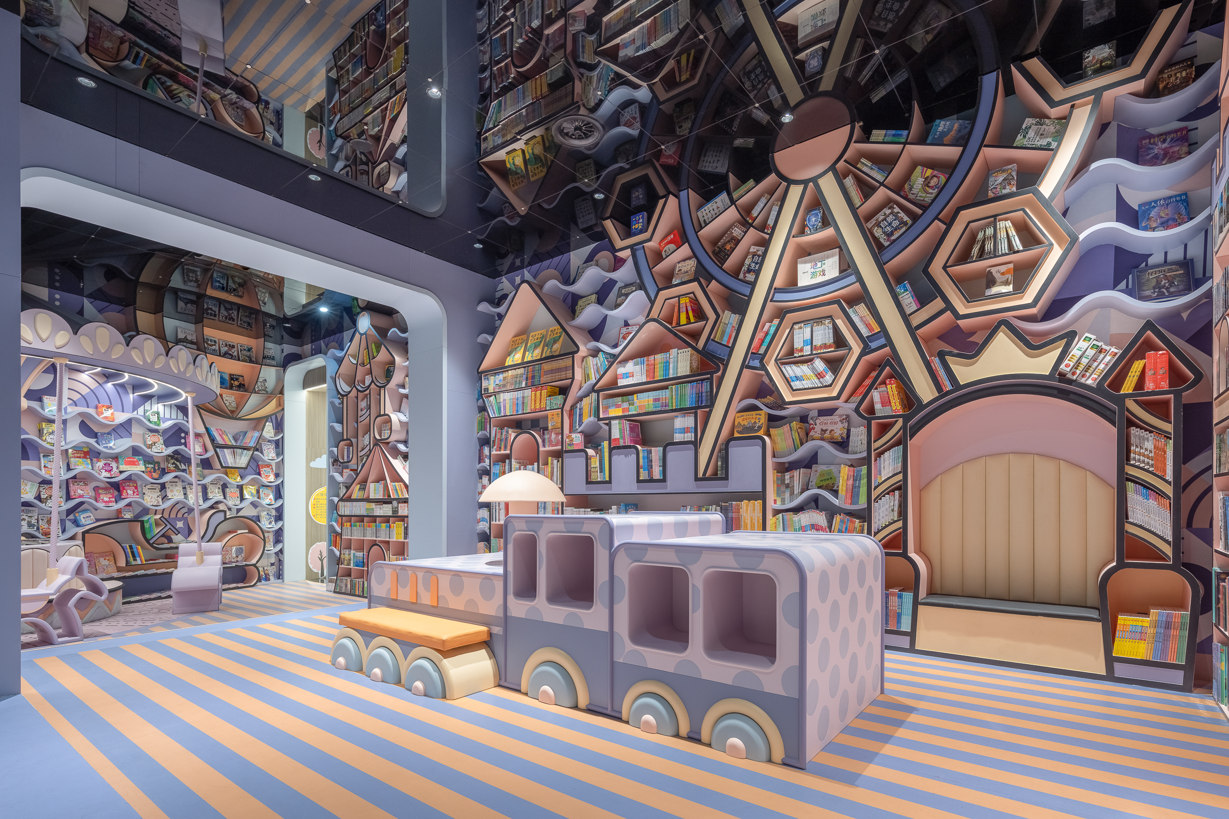
Shenzhen Zhongshuge by X+LIVING, Shenzhen, China
Bookstores and retail structures form a large portion of the firm’s work. Structures like Beijing Zhongshuge Lafayette Store, Chongqing Zhongshuge Bookstore, Yanngzhou Zhongshuge and the 2021 A+Awards winner Dujiangyan Zhongshuge are just a few examples.
One that is particularly mesmerizing is the bookstore and retail space, Shenzhen Zhongshuge, where the studio moved away from the neutral palette used in similar stores and introduced a large red and white spiral that twists its way through the middle of the space. Through the window, it appears like an art installation in a gallery. The design is a nod to all the creators and trailblazers in the Shenzhen Special Economic Zone region.
The space inside is divided into four parts: a concept area, a forum area, a children’s reading area and a conference area. The concept area features a glass façade that forms a see-through boundary between the interior and exterior. Meanwhile, the large red spiral not only acts as a bookshelf, but also visually connects the entrance to the exit. In contrast, the children’s area’s bookshelves are colored in pastel tones and arranged in the form of a Ferris wheel and a castle.
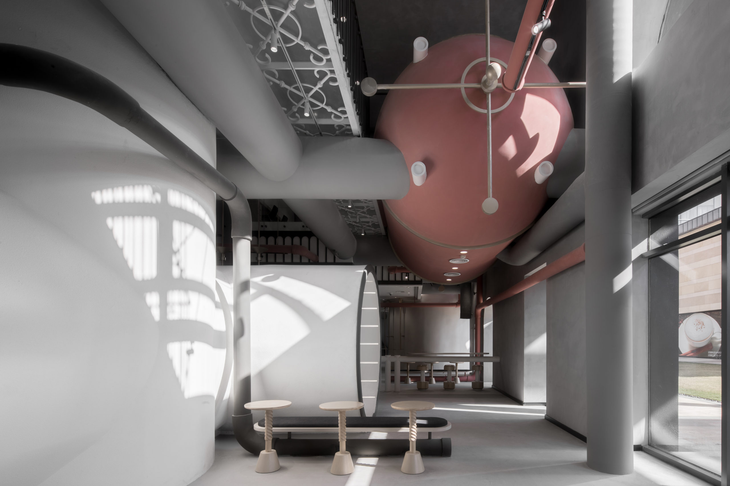
Ideas Lab by X+LIVING, Shanghai, China
Xiang says that her initial design process has two main components. The first is gathering information about the client’s functional needs, as well as background research on the site and business strategy. The second is determining a conceptual theme and narrative expressions.
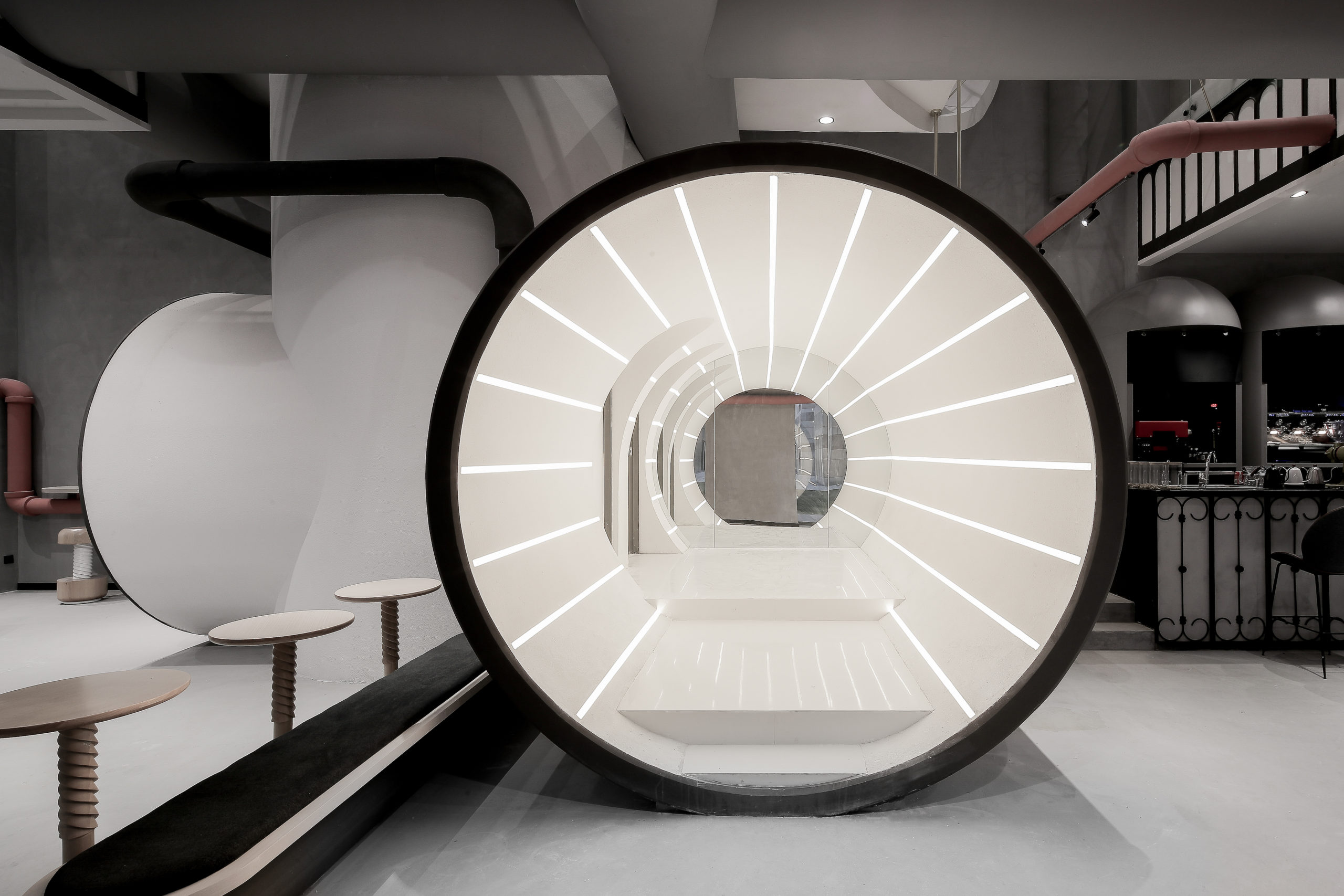
This approach is gleaned in projects that embrace different palettes and forms. For instance, in the design for an office project called Ideas Lab in Shanghai may seem muted in its color palette and details, but it is no less magical than the more flamboyant works that the firm is better known for. Inspired by the concept of “Age of Steam”, the ideas and technology hub uses components like reaction tanks, energy delivery pipes and walking platforms as design elements.
Zhuyeqing Greentea flagship store by X+LIVING, China
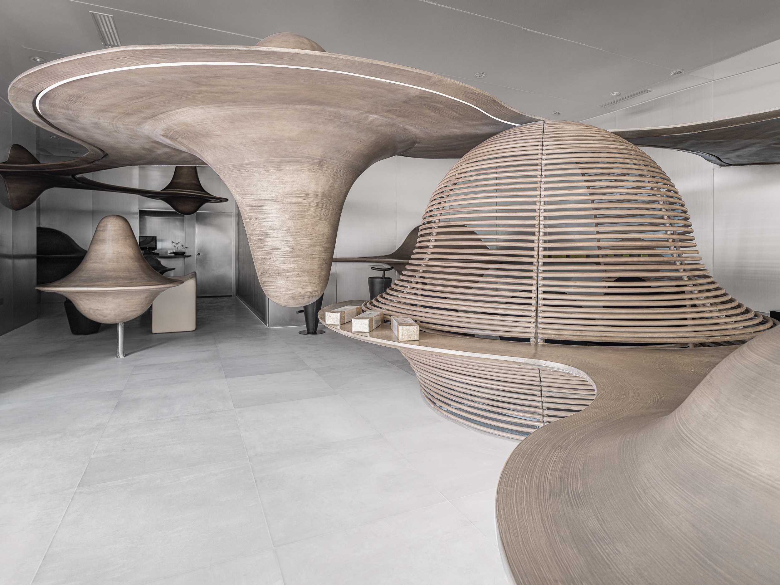
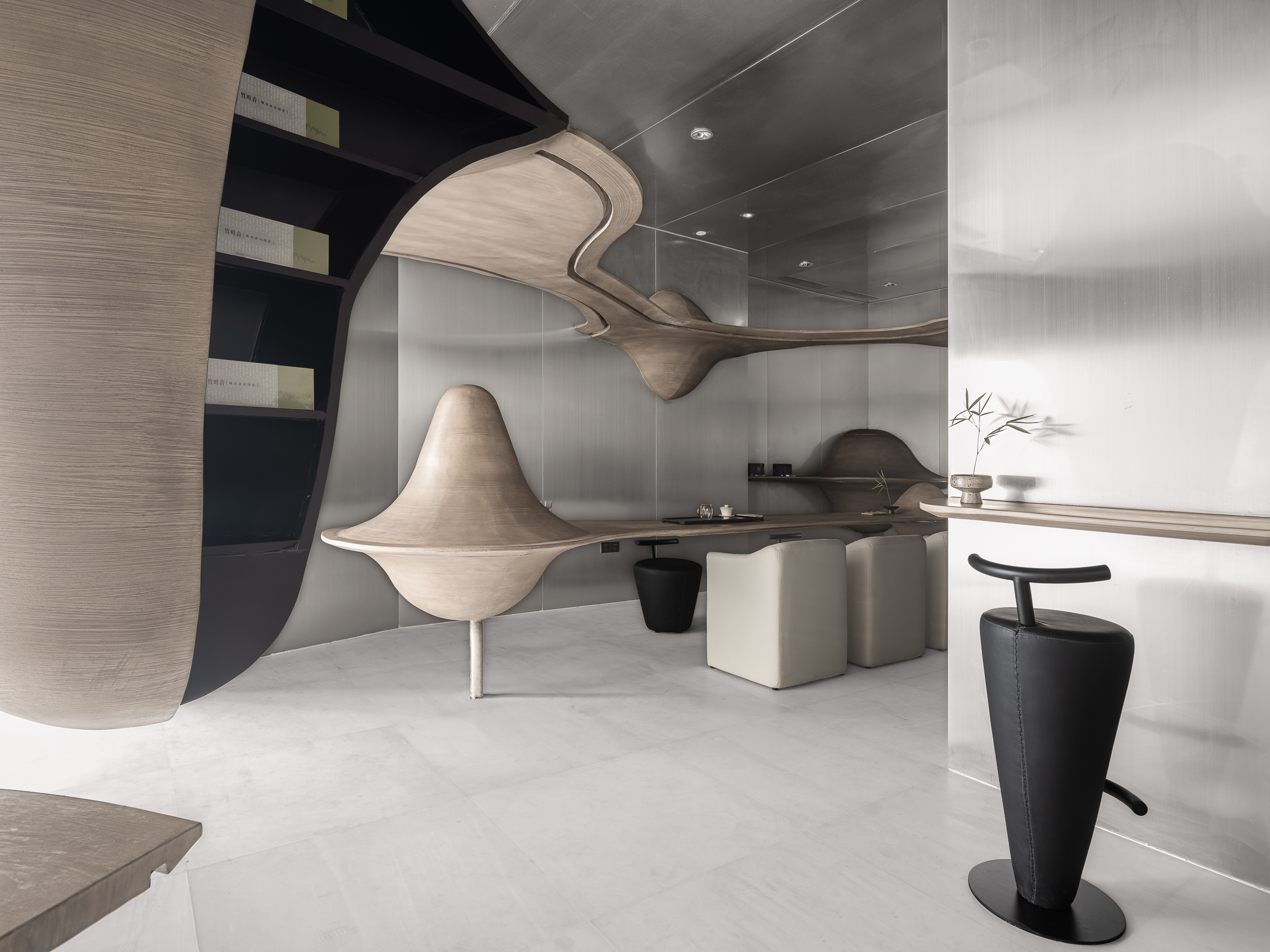
Meanwhile, the Zhuyeqing Greentea flagship store in Chengdu features an abstract landscape of mountains and clouds, referencing the topography of the tea-growing region. These paraboloids extend into horizontal planes that form counters and tables. The natural tones of these mounds are contrasted with black furniture and accents, which adds emphasis.
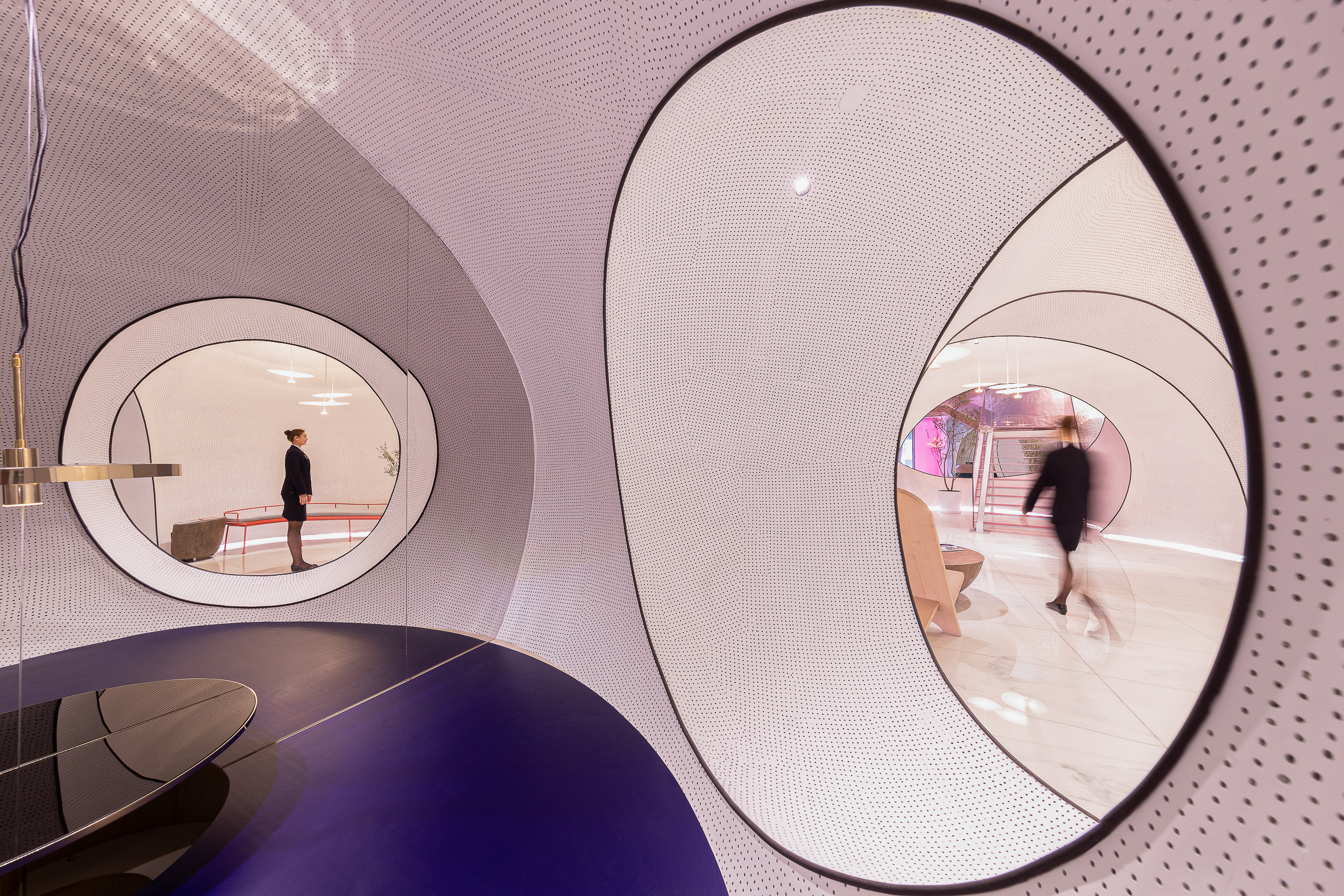
X-Living has also designed hospitality projects like Sonmei Hotel in Shenzhen and New Century Magic Hotel in Huzhou. In Sonmei Hotel, curved openings with black borders help move away from the box geometry of the space in the reception area. The dotted patterns on the partitions give it a pop art feel while still keeping the aesthetic very minimal and chic. On the other hand, the New Century Magic Hotel inspires childlike curiosity in adults with its pastel palette and patterned elements.
Sonmei Hotel by X+LIVING, Shenzhen, China
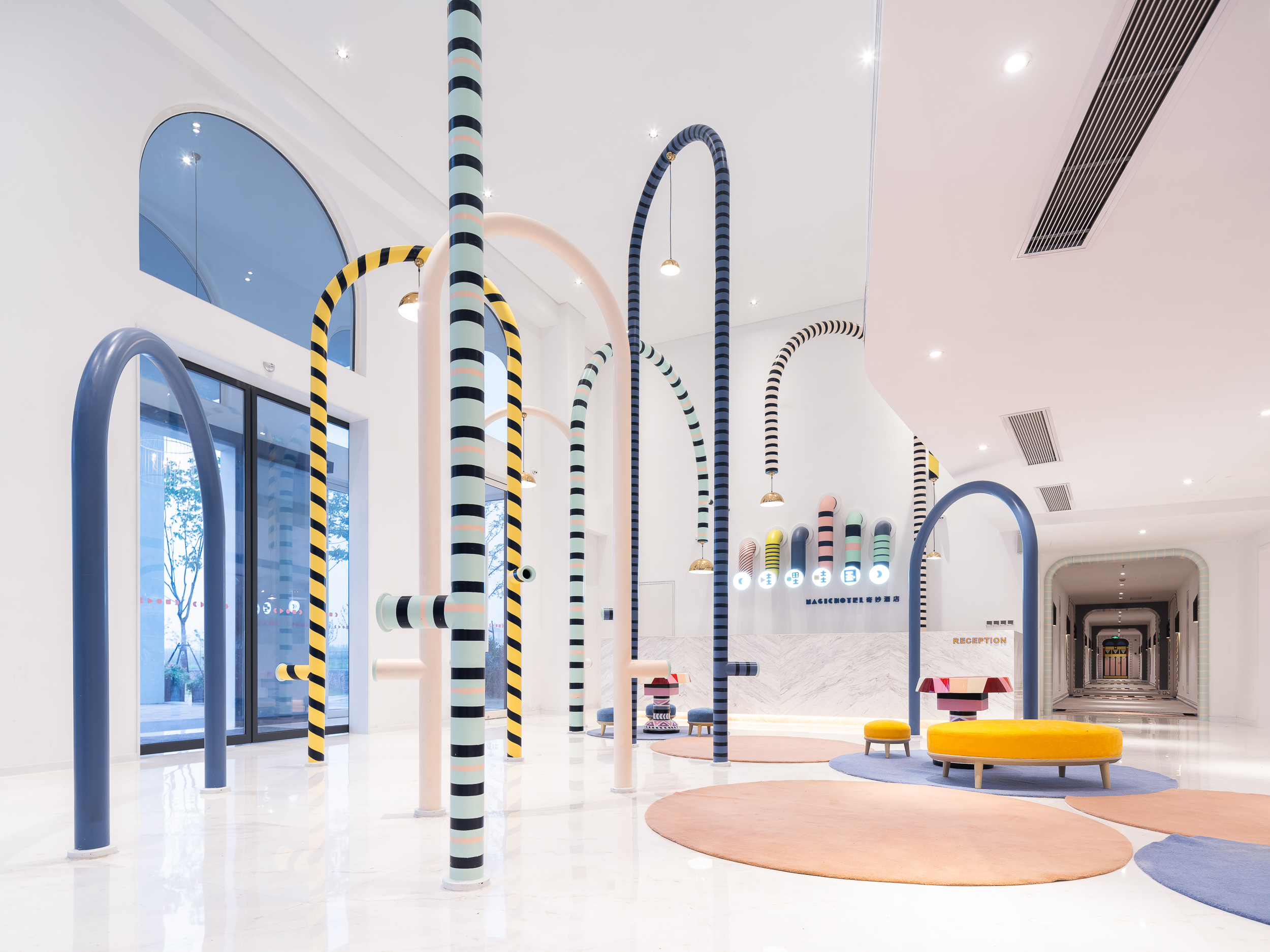
New Century Magic Hotel by X+LIVING, China
Apart from commercial projects, the firm is also well known for the creative and otherworldly spaces that it dreams up and makes reality for children. These include a variety of amusement parks, parent-children playgrounds, kindergartens and shopping mall spaces.
“After our first parent-child project opened to the public in 2017, it attracted huge attention in the market,” said Xiang. “We broke the traditional design of parent-child projects of the past two to three decades, whether it is design aesthetics or functional integration. It not only attracted a lot of consumers, but other brands in the industry as well.”
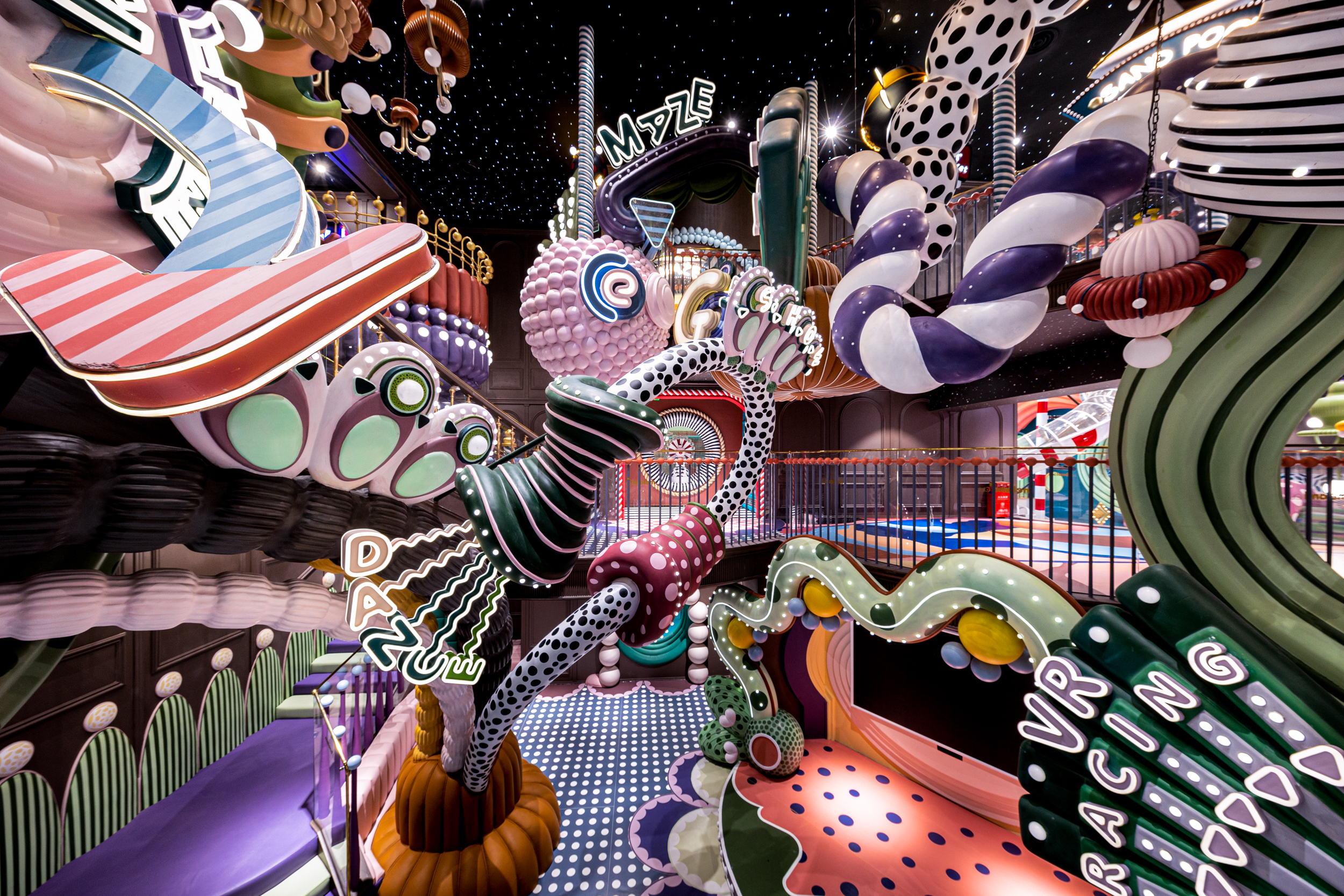
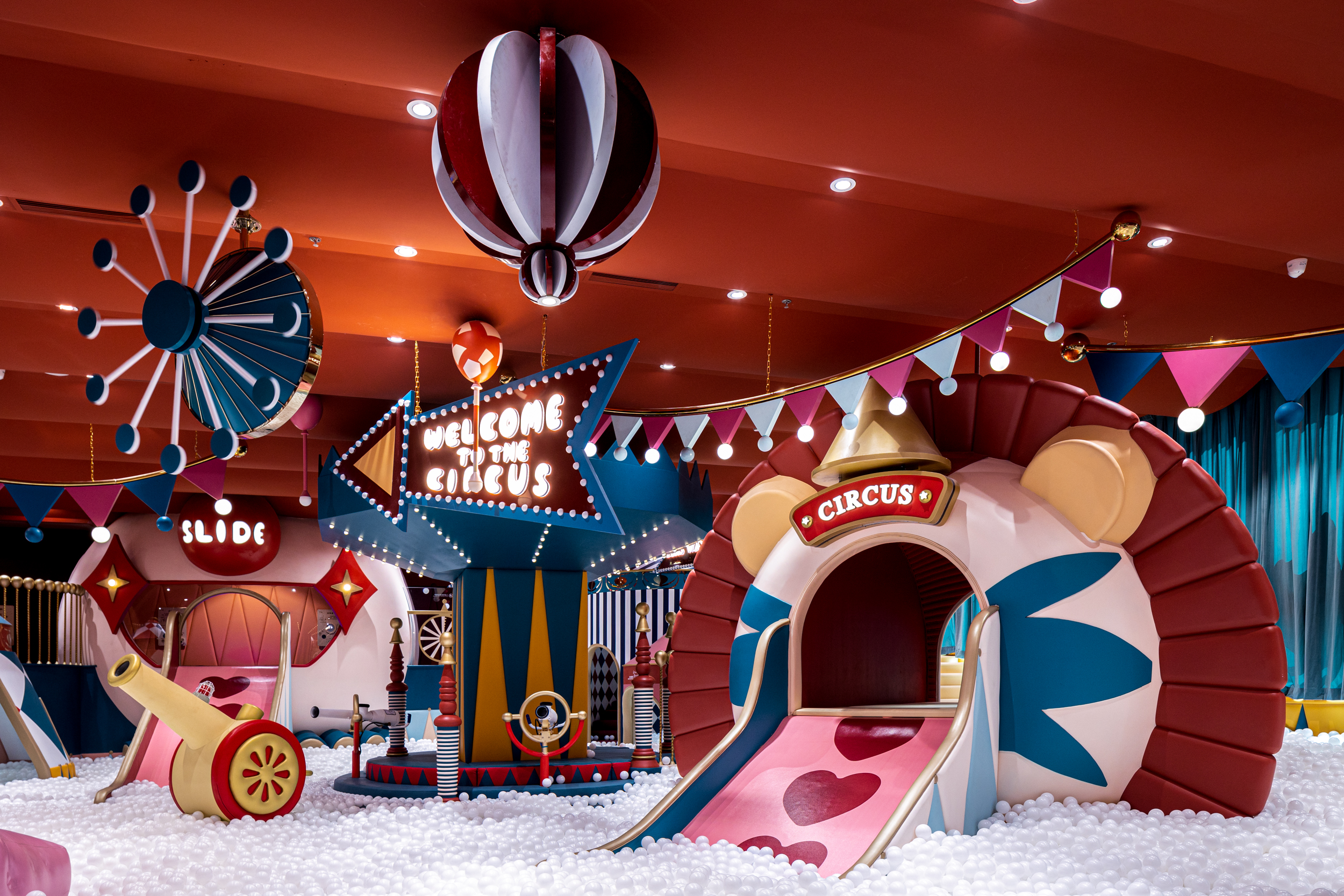
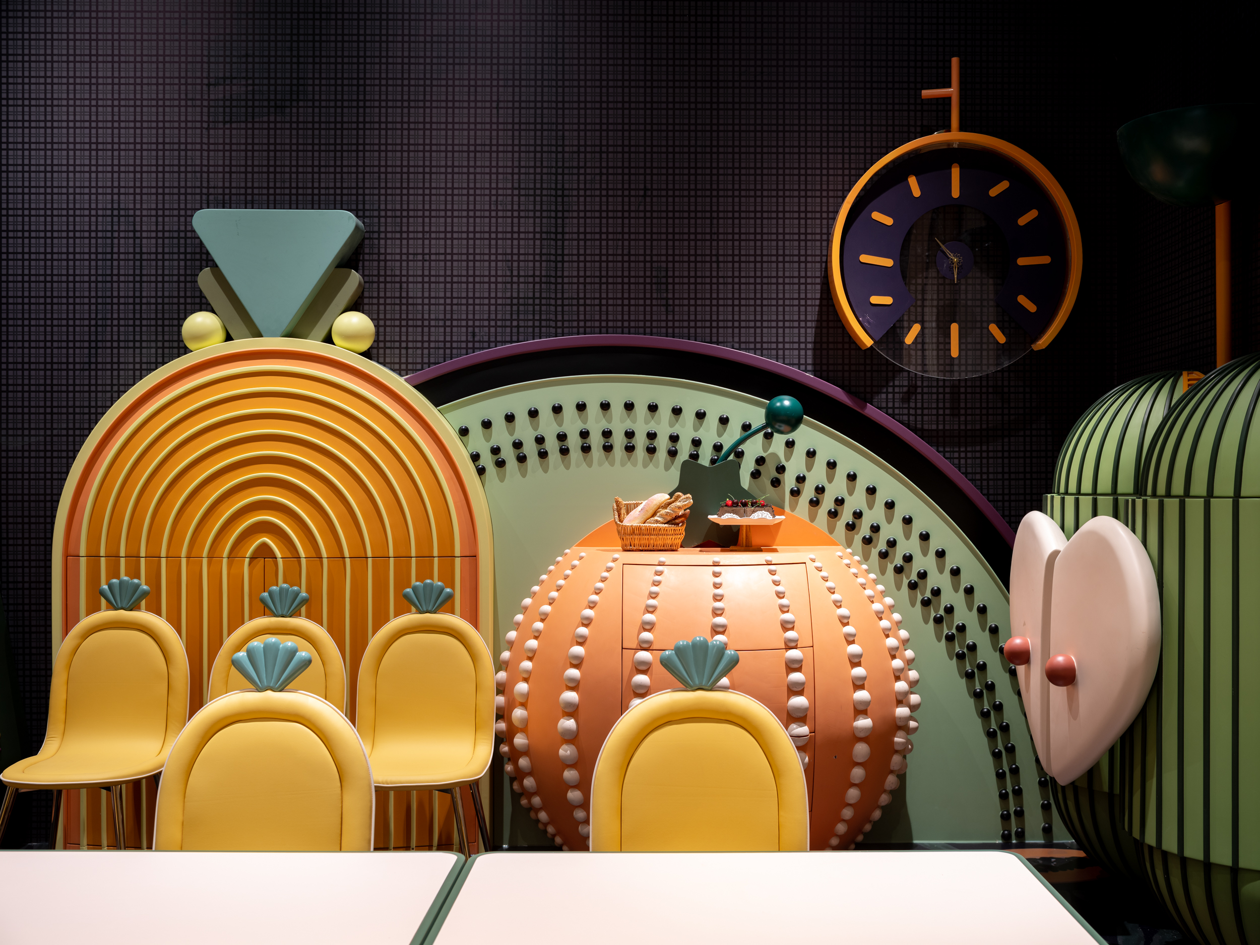
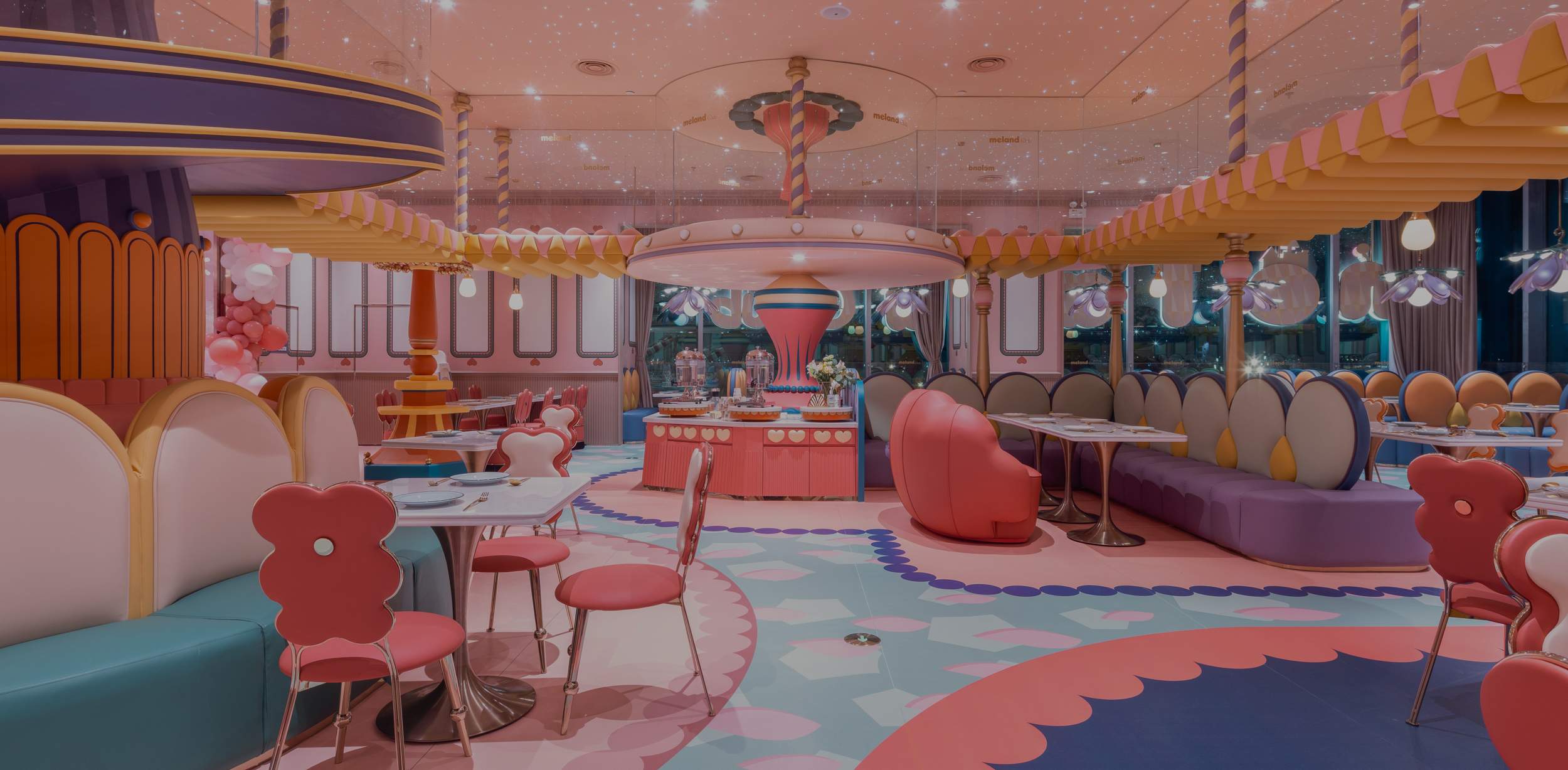
Meland Club flagship store by X+LIVING, Shenzhen, China Images by Shao Feng
For example, they present a cornucopia of color and whimsy in the maximalist design of the Meland Club flagship store. Bulbous décor elements, polka dots, oversized arches, graphic floors — no matter where you look, you will find something new. The overall design, which is located in a shopping mall, is a dreamscape inspired by the four seasons. Spring elements like flowers, bees and butterflies are deconstructed and put together in ingenious ways in the main area. It also comprises a carnival-themed ball pool, an autumnal restaurant and a cyberpunk gaming area.
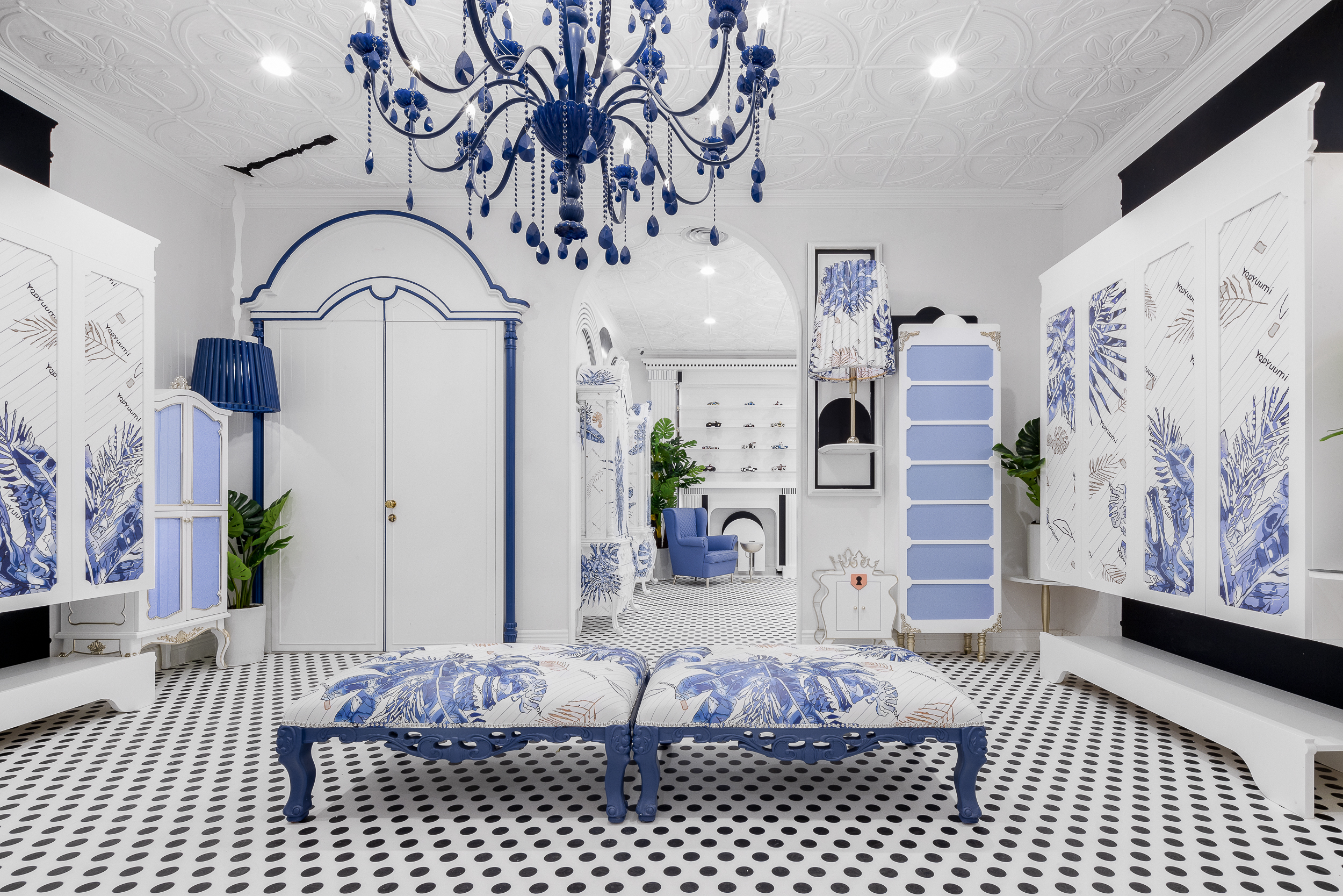
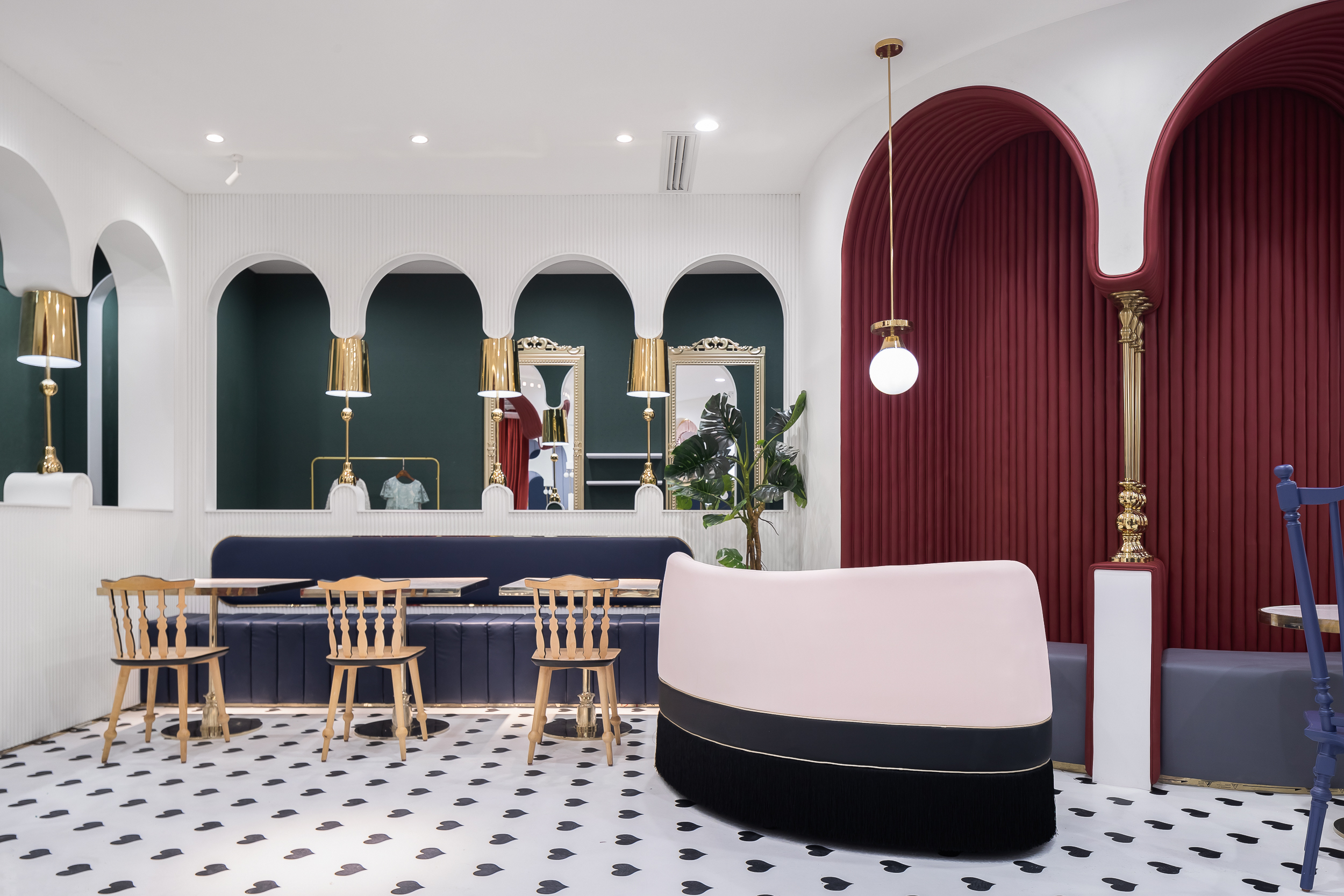
YooYuumi Kids Club by X+LIVING, China
Drawing on their expertise with child-oriented aesthetics, the studio injects a sense of playful fun into commissions for adult-centric spaces as well — and vice-versa. Indeed, their design typology for children’s projects is not limited to color-bursts and fantasy. Their theme for the YooYuumi Kids Club, a parent-child restaurant, is a lot more refined and glamorous. Wall panels and niches in deep jewel tones like burgundy, emerald and navy carve out seating spaces. The addition of gilded accents and black and white stripes gives this dining area a retro look. The seating area outside the bathroom is decorated in muted blue and white floral motifs.
Xiang urges budding designers to keep improving themselves and staying true to their original intention. She adds, “creating something innovative is hard, but it is worthwhile.”
 Beijing Zhongshuge Lafayette Store
  Chongqing Zhongshuge Bookstore
  Dujiangyan Zhongshuge
  Ideas Lab
  Meland Club flagship store
  New Century Magic hotel
  Sonmei Hotel
  Yanngzhou Zhongshuge
  YooYuumi Kids Club
  Zhuyeqing Greentea flagship store