Architects: Want to have your project featured? Showcase your work by uploading projects to Architizer and sign up for our inspirational newsletters.
At their best, blank white walls can make a room feel large and airy; on the other hand, expansive blank planes can also lend themselves to clinical or boring atmospheres. And while vibrant colors and bold patterns can inject some personality into spaces, they might not always be an option for homes and offices that are dimly light, narrow or cramped.
In such cases, where neutral tones like white and beige are preferable, adding texture to walls and ceilings can add movement and depth to a monochrome space. Subtle textural protrusions won’t take up much space yet will leave a strong impact. More and more architects are incorporating corrugations, curved profiles, shallow folds and more to add intrigue to greyscale walls and ceilings.
Images by Jonathan Leijonhufvud Architectural Photography
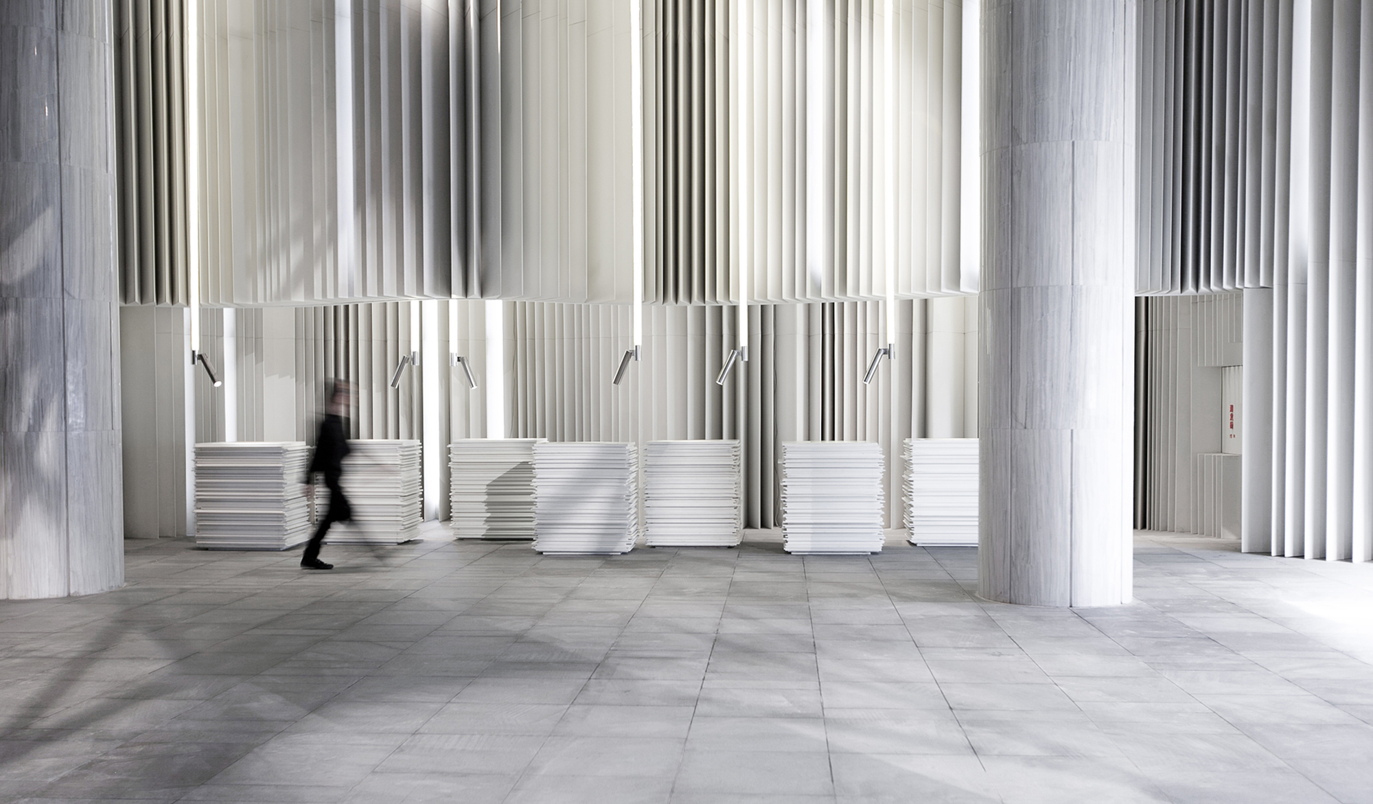
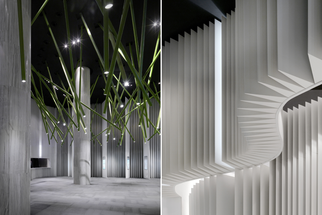
Nanchang Insun International Cinema by One Plus Partnership Ltd, Wuhan, China
Taking inspiration from the black font over white pages in books, the studio transformed the cinema into a heavily textured space. The different panels on the walls are reminiscent of the flipping of pages of masterpieces written by scriptwriters. In the lobby, visitors come across cashier tables that resemble giant stacks of paper — in reality, they are made of Corian.
Panels with slim triangular blocks are suspended from the ceiling to resemble a curtain of flipping paper. Even the columns in the space have been painted and textured to continue the black and white theme. The only thing breaking up the monotony of black and white is a series of green cylindrical spotlights that are put together in an abstract composition.
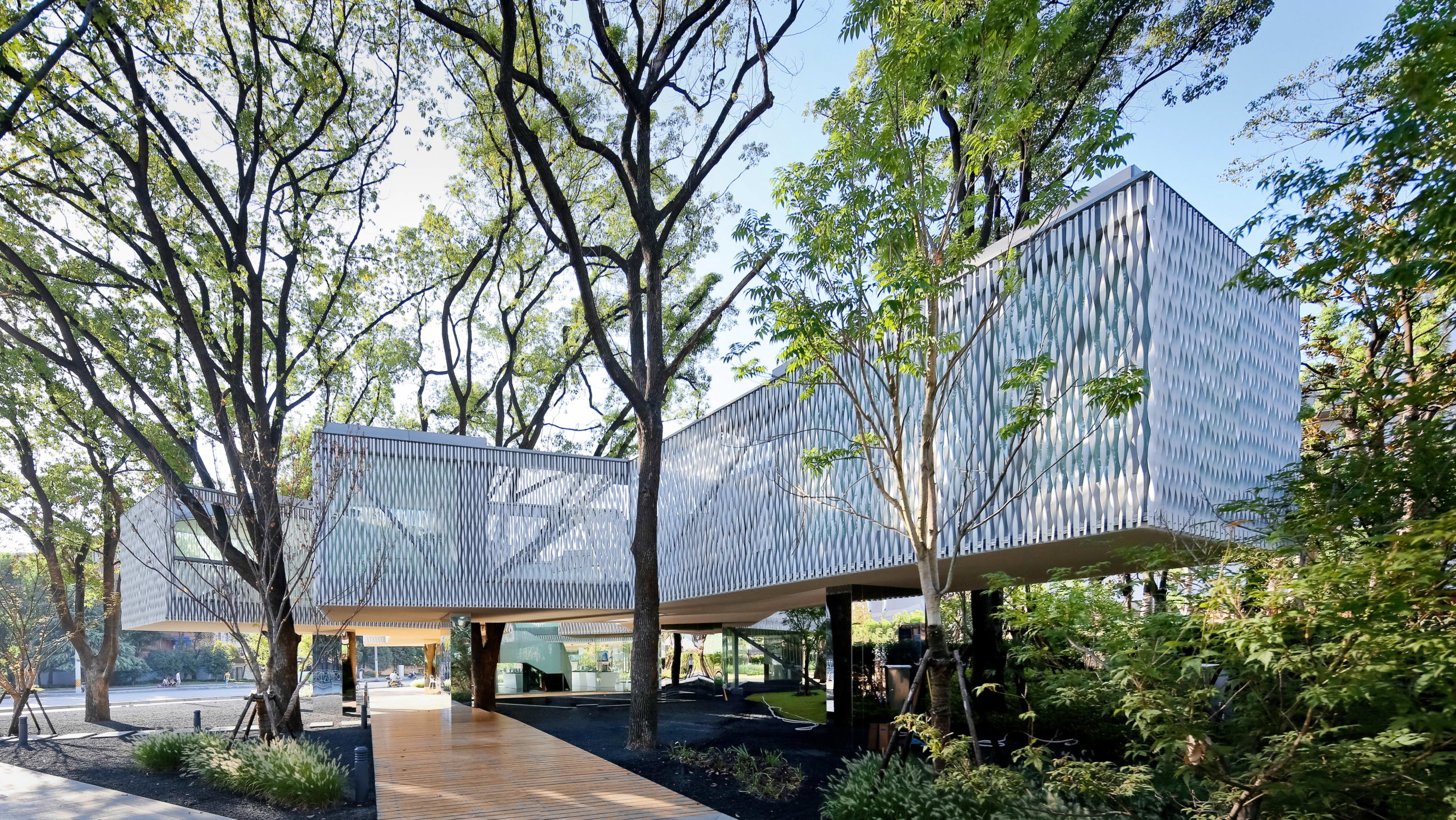
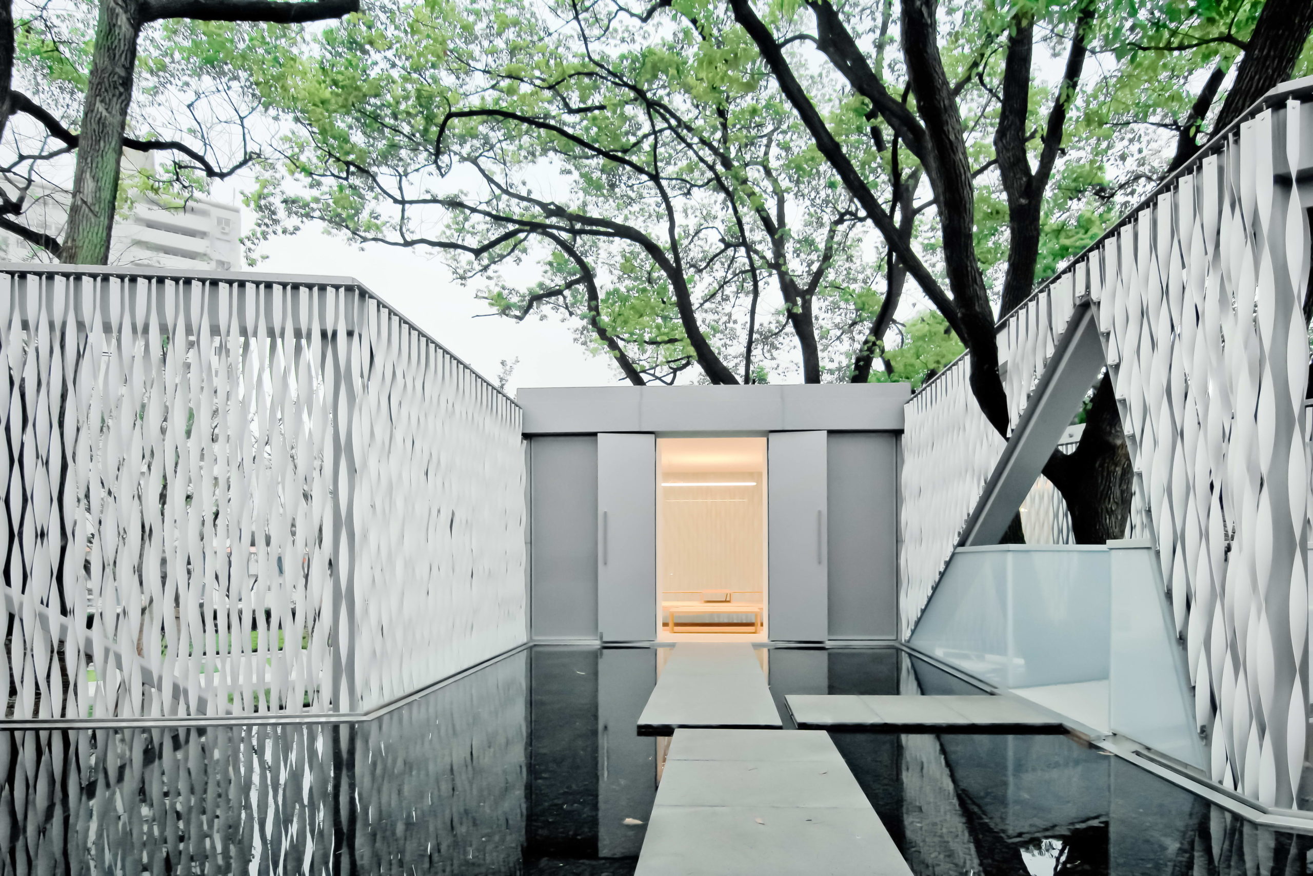 Huaxin Business Center by Scenic Architecture, Shanghai, China
Jury Winner, 2014 A+Awards, Office Building – Low Rise (1-4 Floors)
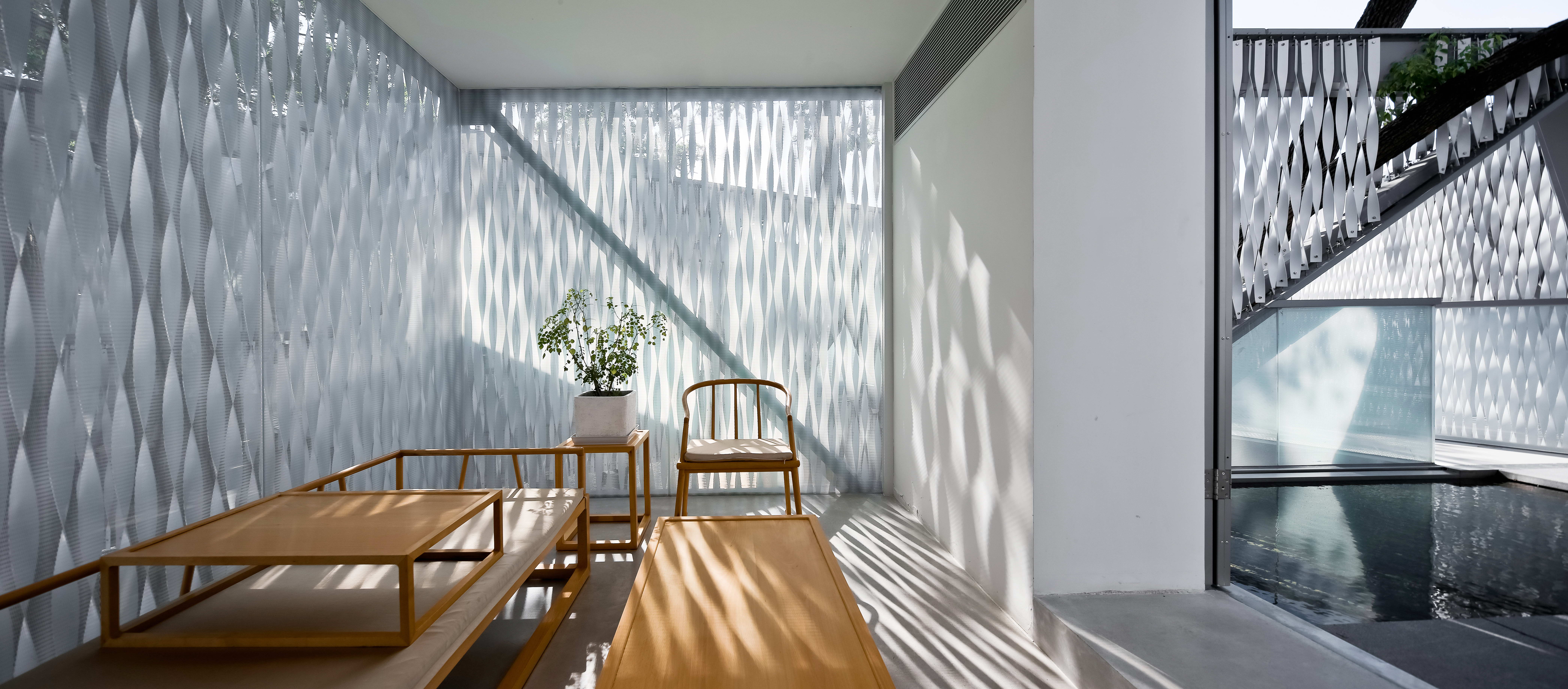
The aim of the project was to maximize green cover and protect the six trees present on site. This is achieved by elevating the main mass above the ground to leave more room for green spaces below. The four blocks of the building are connected by open bridges. On the upper level, the spaces holding important functions are covered in twisted aluminum strips on the outside. These strips add translucency to the walls and help establish connectivity with nature beyond. The thin panels, much like light strips of paper floating and twisting with the wind, give the building a very tactile quality and heighten the experience as people walk around and try to peek at the trees beyond.
Images by Sharyn Cairns
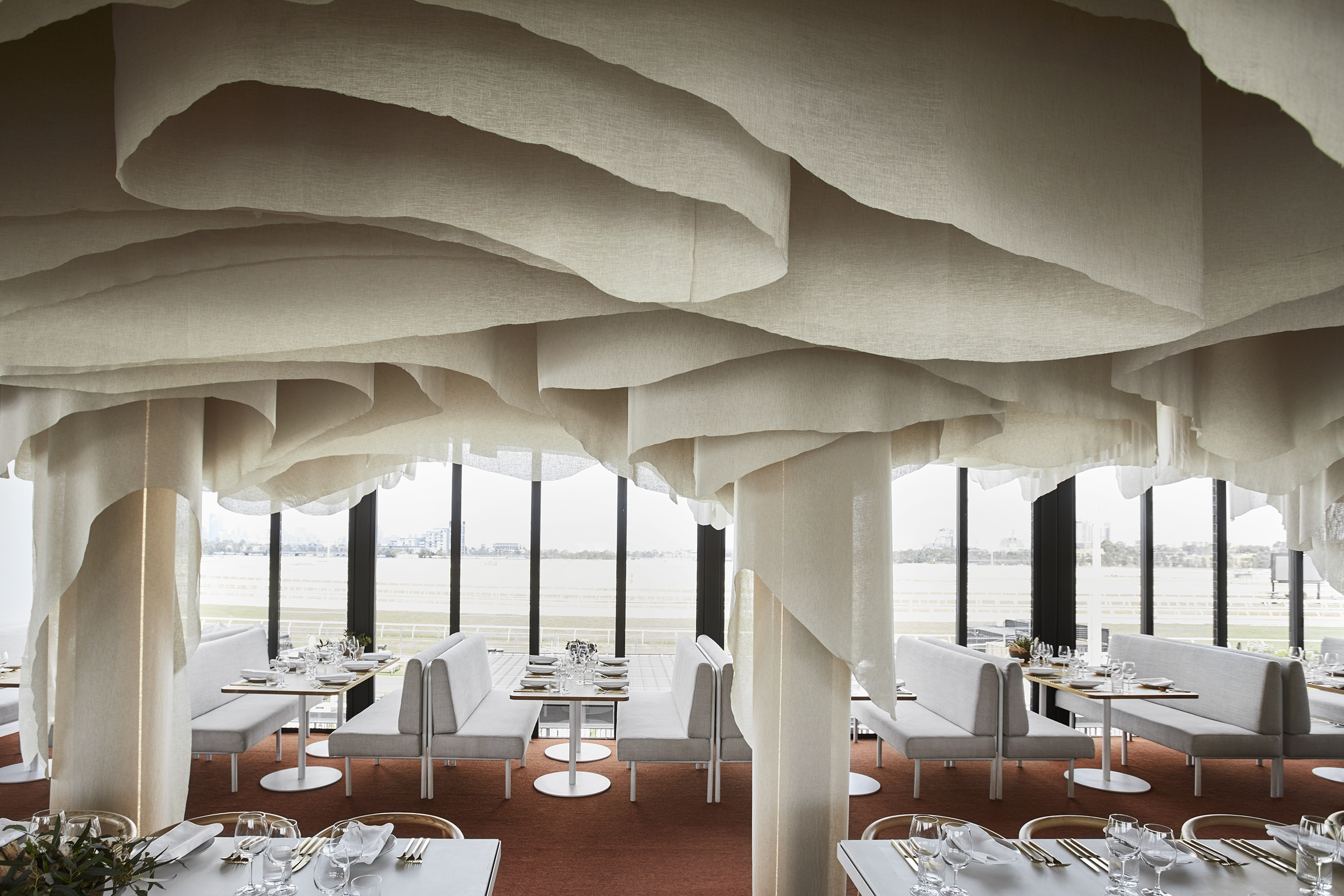
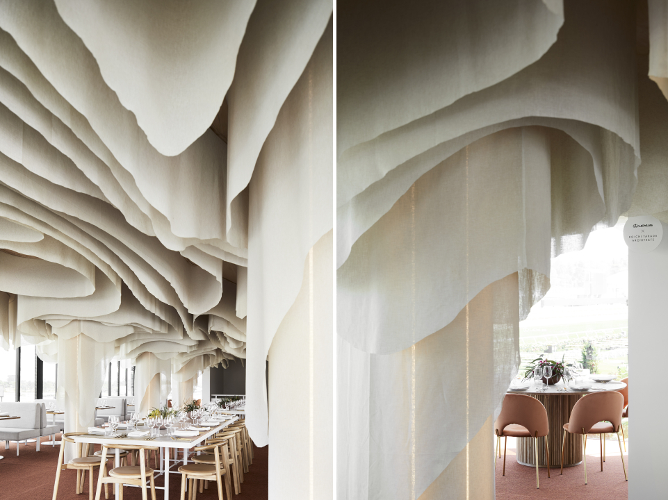
Paperbark by KOICHI TAKADA ARCHITECTS, Melbourne, Australia
The restaurant offers a zero-waste menu with locally foraged Australian produce that is designed to inspire and delight. The space reflects this awareness of nature and slow movement. It is inspired by the Victorian Dandenong Ranges and the organic lines of the native paperbark tree. Repurpose biodegradable fabric is used to create the contoured ceiling installation. The subtle tones and softness of the installation help people form an emotional connection with nature while they dine and thereby create more awareness around conservation.
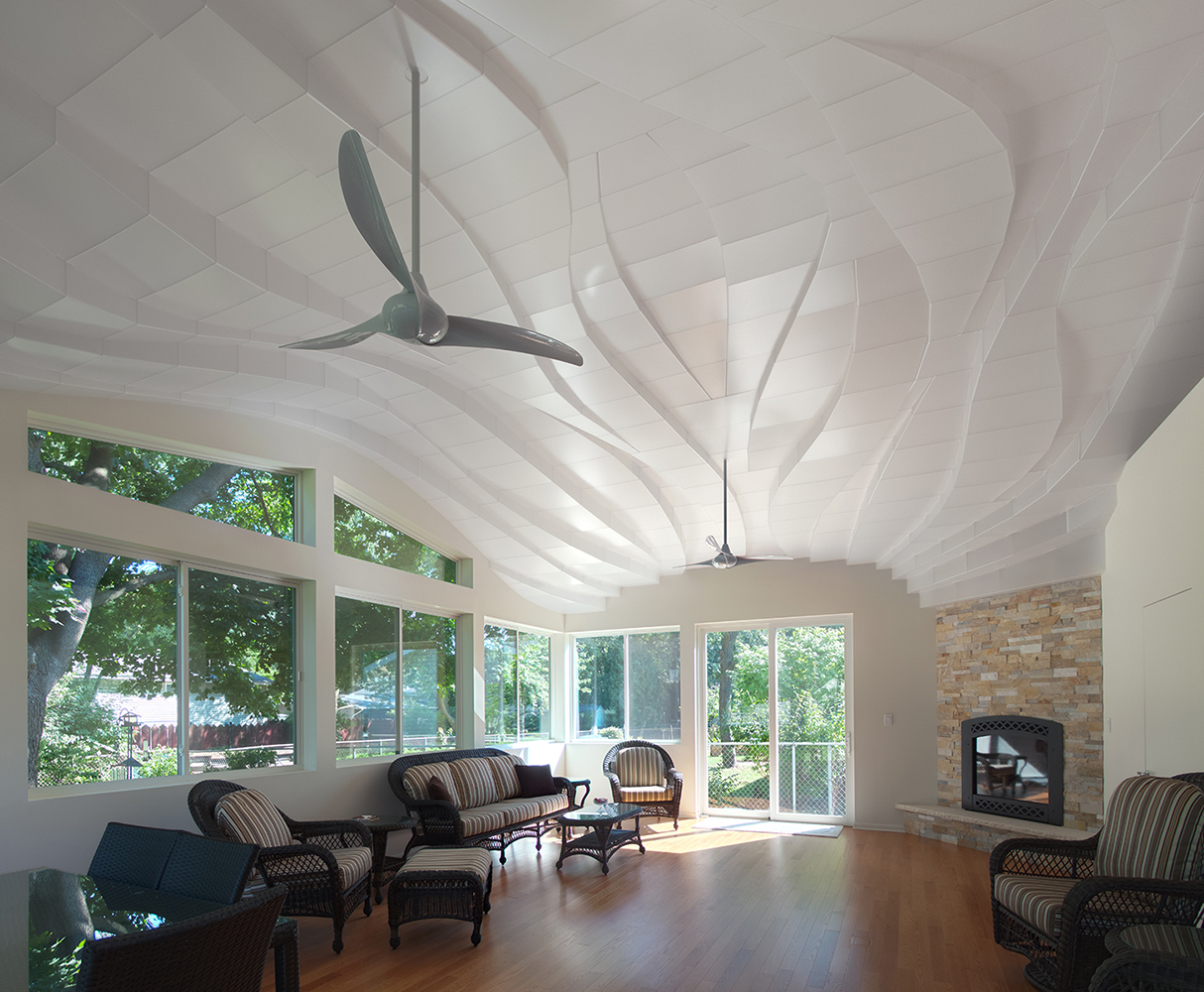
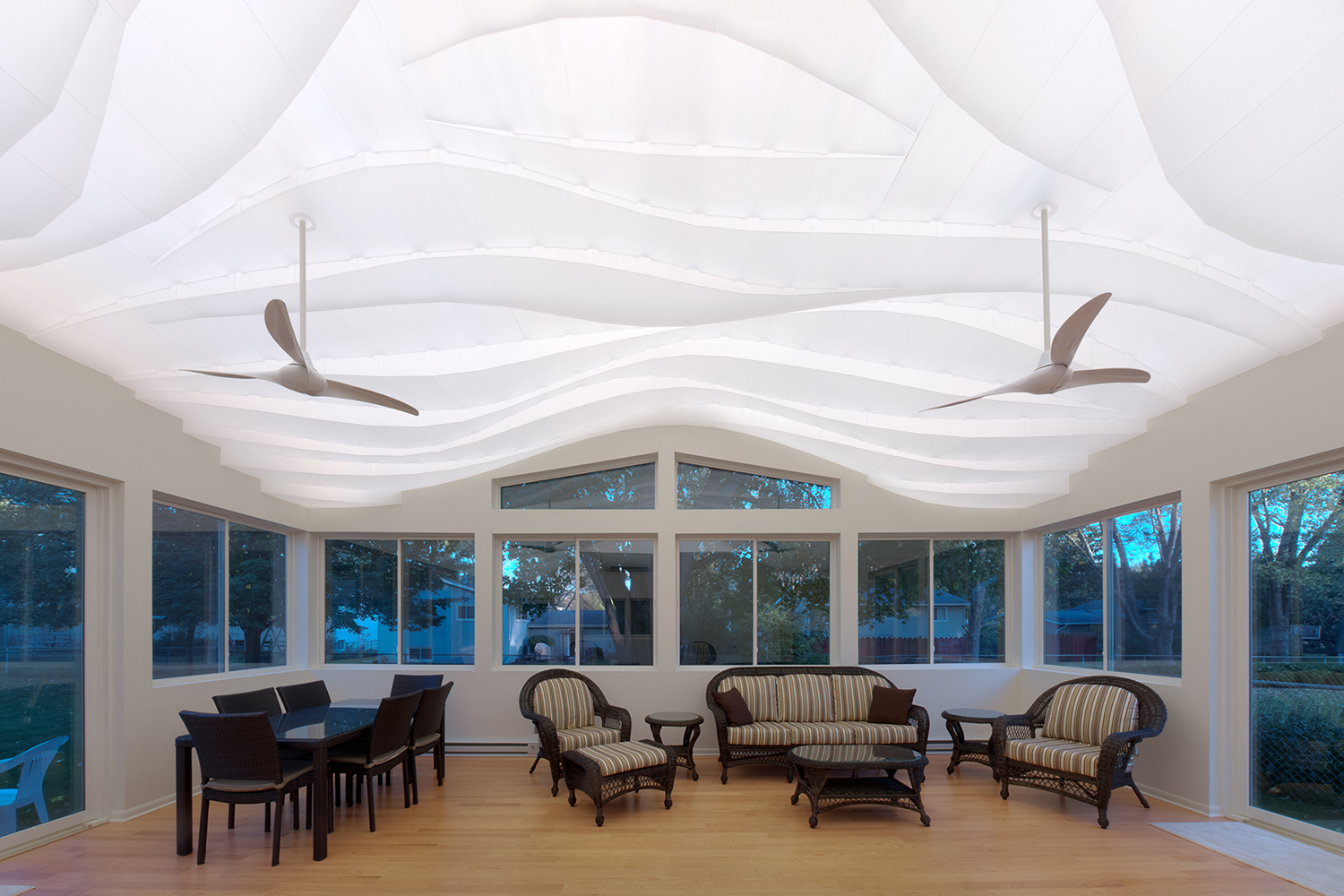 “Light Arrival” Yorkshire Ceiling by Flynn Architecture & Design, Crystal Lake, Illinois
Fluid lines on the ceiling of the sunroom help soften the rectangular edges of this space. Instead of going the digitally designed route, the ceiling is hand sculpted using translucent contoured panels that cover low-voltage LED strip lights for a diffused glow. During the day, when the lights are turned off, the shadows created by sunlight add more dimension to this three-dimensional installation. Fans suspended from this ceiling feature a similar curved profile.
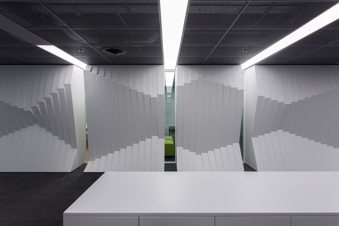
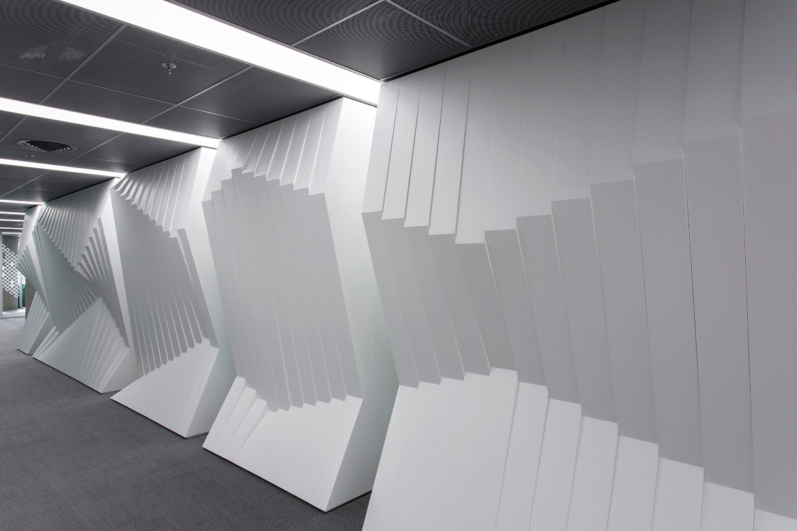 Norwegian embassy in Athens by gfra, Athens, Greece
Unlike traditional origami, the art of kirigami uses small cuts in paper along with folks to create intricate, three-dimensional patterns. The Norwegian embassy in Athens uses this technique to imitate mountains reflecting in the fjord waters. Lights placed above this wooden structure enhance the folds and make this the focal point of the overall space.
Images by Alik Usik and Serhii Nikiforov
Tween Coexistence by Dmytro Aranchii Architects, Kyiv, Ukraine
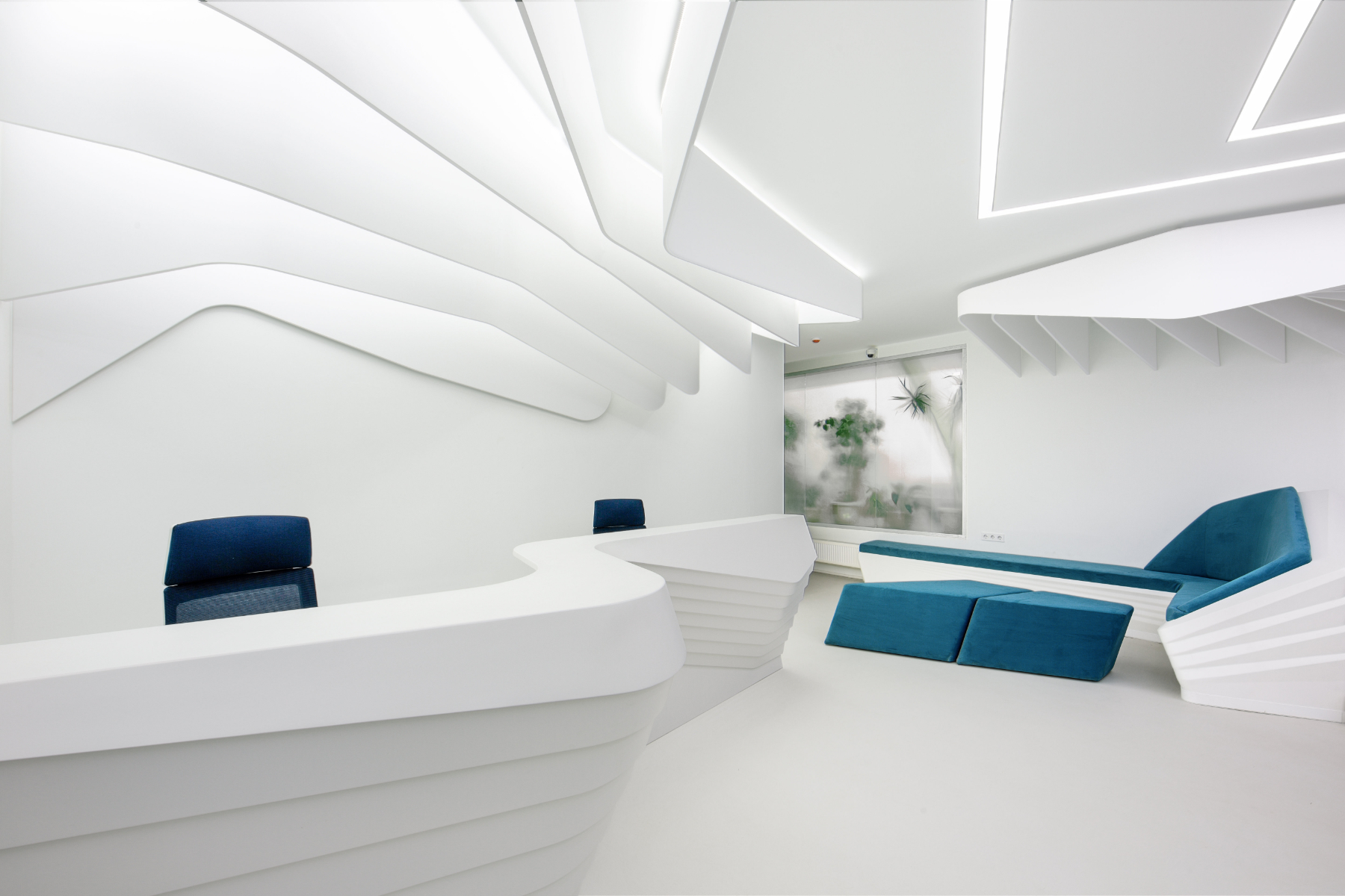
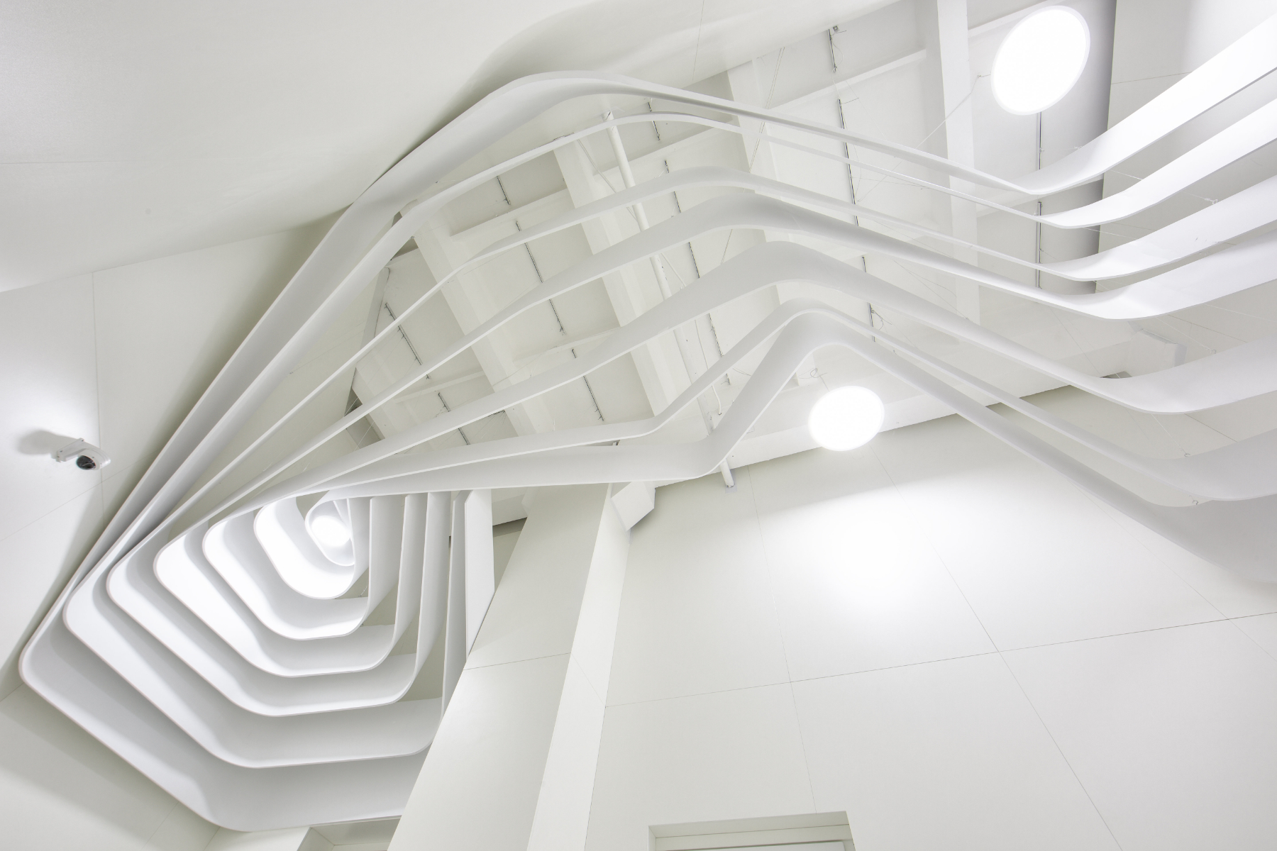
Curved and bent strips of white shape all elements of this space — right from the ceilings to the reception desk. This technique also helps the furniture to blend into the walls, visualizing fluid circulation. The waiting area contains a large reception desk and an L-shaped sofa that blends in with the stairs leading to the interior spaces. On the ceiling, one can see two distinct patterns: one that originates in the reception area and another that continues along the transition to the inner spaces.
Images by Anil Patel
1102 Penthouse by Apical Reform, Ahmedabad, India
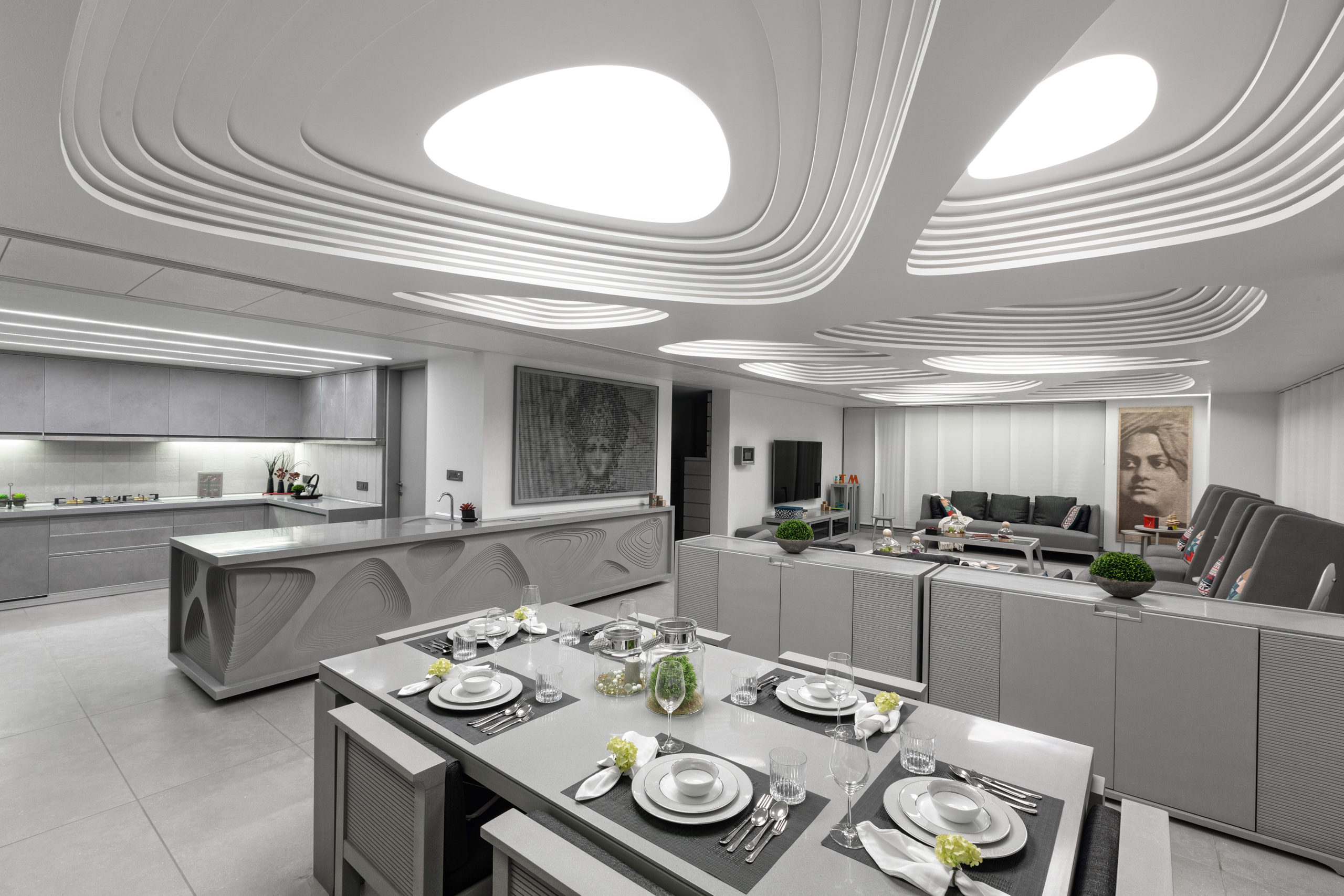
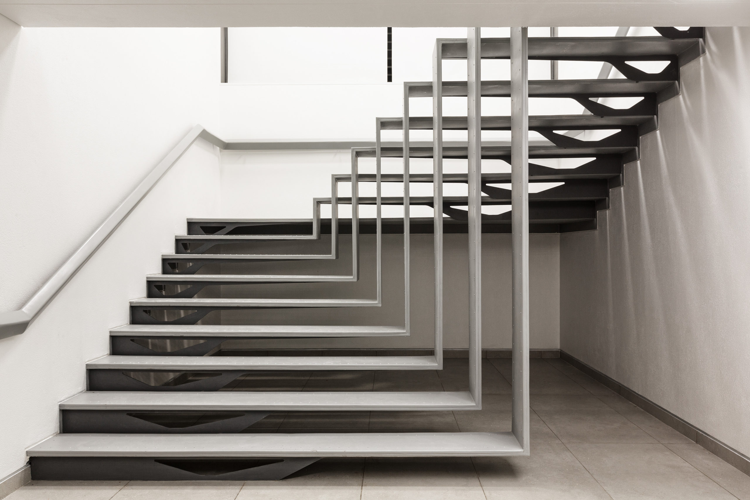
Much like a handcrafted contour model, planes with gradually decreasing cutouts are layered on top of one another to create the ceiling. Similar cutouts are used to embellish the kitchen island and console. The entire space is decorated in a neutral palette of grey and white to create a calming atmosphere. The staircase leading to the terrace is also composed using folded strips of metal similar to the forms of kirigami sculptures. Despite its lightness, it still holds a strong presence within the space.
Images by Jun Murata
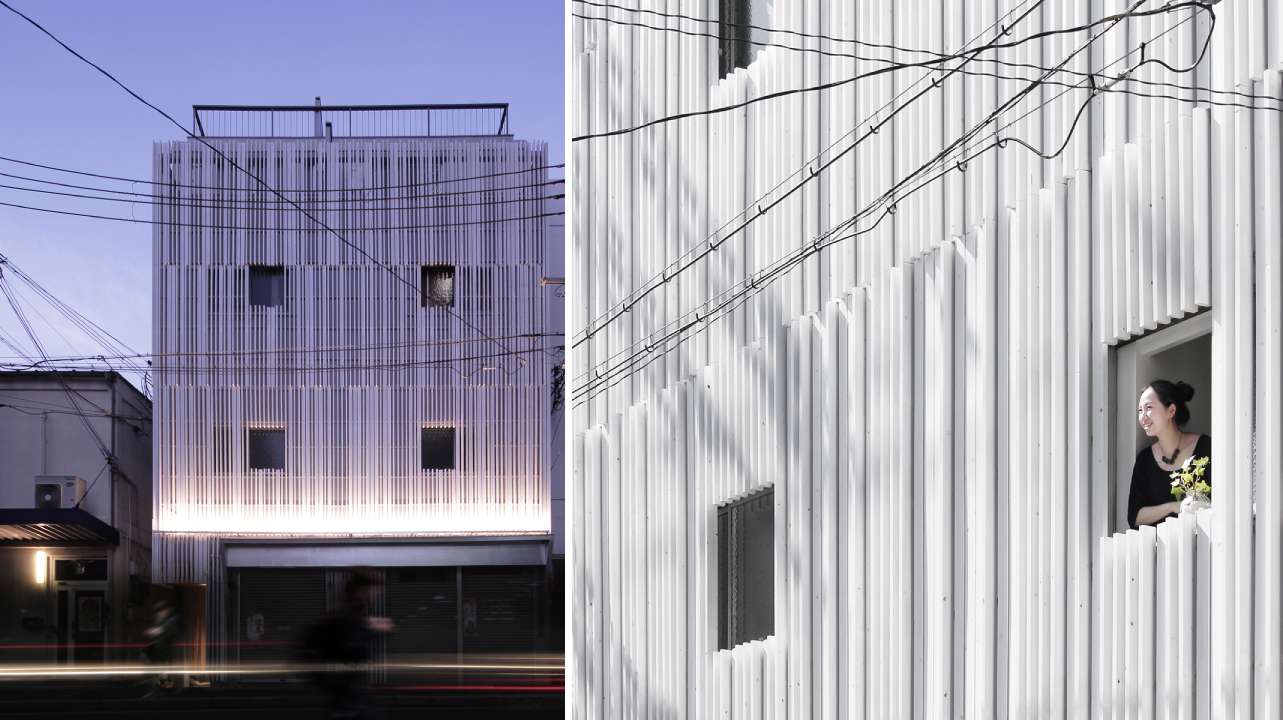
This project is a renovation of a multi-tenant building that holds living areas and office spaces. The previous blank façade of the building is transformed into an eye-catching display with the help of white fins. This was done to add more privacy as the plot across from it is meant to have an apartment building built on it in the future. Furthermore, the louvers help conceal any unevenness in the external walls as well as the new pipes installed. The extrusions also create constantly changing shadows throughout the day.
Architects: Want to have your project featured? Showcase your work by uploading projects to Architizer and sign up for our inspirational newsletters.
 "Light Arrival" Yorkshire Ceiling
  1102 Penthouse
  Huaxin Business Center
  N STRIPS
  Nanchang Insun International Cinema
  Norwegian embassy in Athens
  Paperbark
  Tween Coexistence