Architects: Want to have your project featured? Showcase your work by uploading projects to Architizer and sign up for our inspirational newsletters.
Architizer’s journal is fueled by the creative energy of the thousands of architects from around the world who upload and showcase their incredible work. From conceptual designs to projects under construction to completed buildings, we are proud to serve as a platform for showcasing global architectural talent and the brilliance of visualizers, engineers, manufacturers, and photographers who are crucial members of the industry. A stellar drawing, rendering or photo, as well as a detailed project description, can go a long way in making a project stand out, as does indicate the stellar contributors on a project.
Firms who upload to Architizer share their work with professionals and design enthusiasts through our Firm Directory and Projects database. They also gain exposure by having their projects shared on our Facebook, Instagram, and Twitter pages, as well as in our Journal feature articles. Indeed, through these various channels, hundreds of thousands of people in the global design community have come to rely on Architizer as their architectural reference and source of inspiration. In 2022, we’ll be rounding up our database’s top 10 most-viewed, user-uploaded architecture projects at the end of each month.
 10. Riverbend
By CLB Architects, Jackson, WY, United States
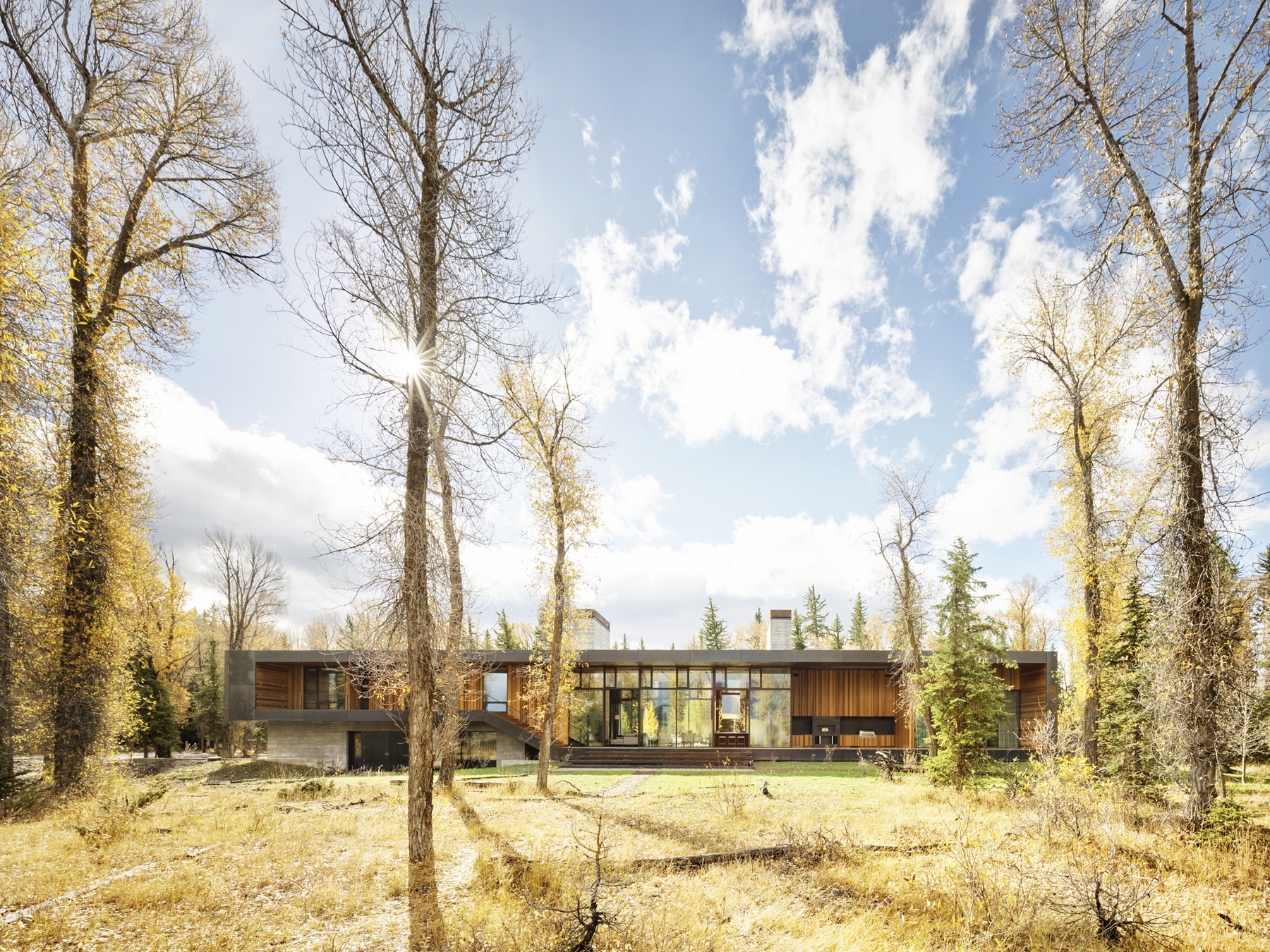
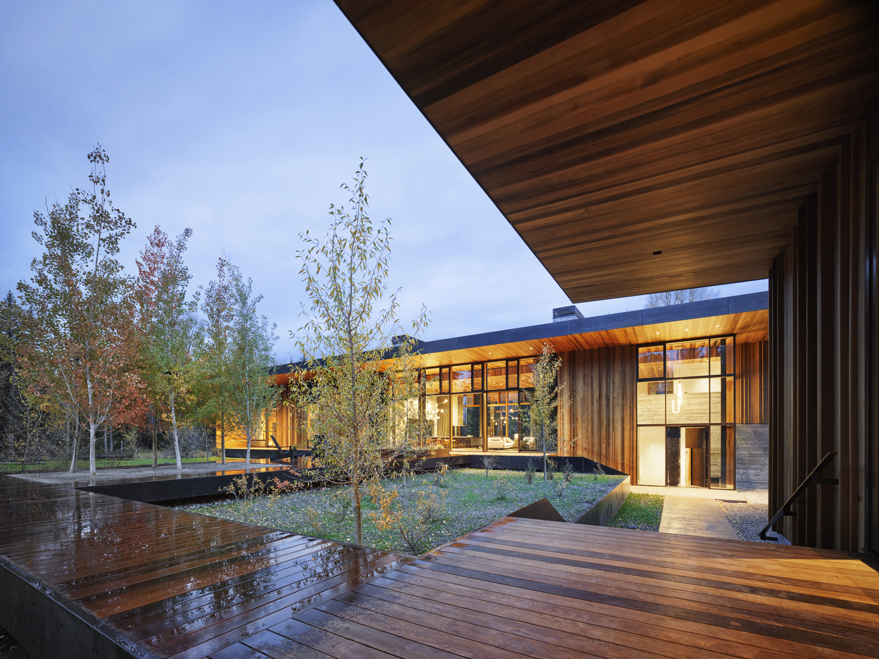
This family retreat neighbors with Grand Teton National Park and features jaw-dropping mountain views through a dappled screen of cottonwood trees. The home is nested along the Snake River, which also delimits the north and west perimeter of a wooded property. In respect to the natural beauty of the site and the distinct landscape views, house sits on a platform above the natural ground plane. Board-formed concrete serves as the foundation and low-maintenance steel plates on its façade will patina over time. Large overhangs shelter deep-set cedar niches and floor-to-ceiling windows.
 9. HH47
By JUMA architects, Sint-Martens-Latem, Belgium
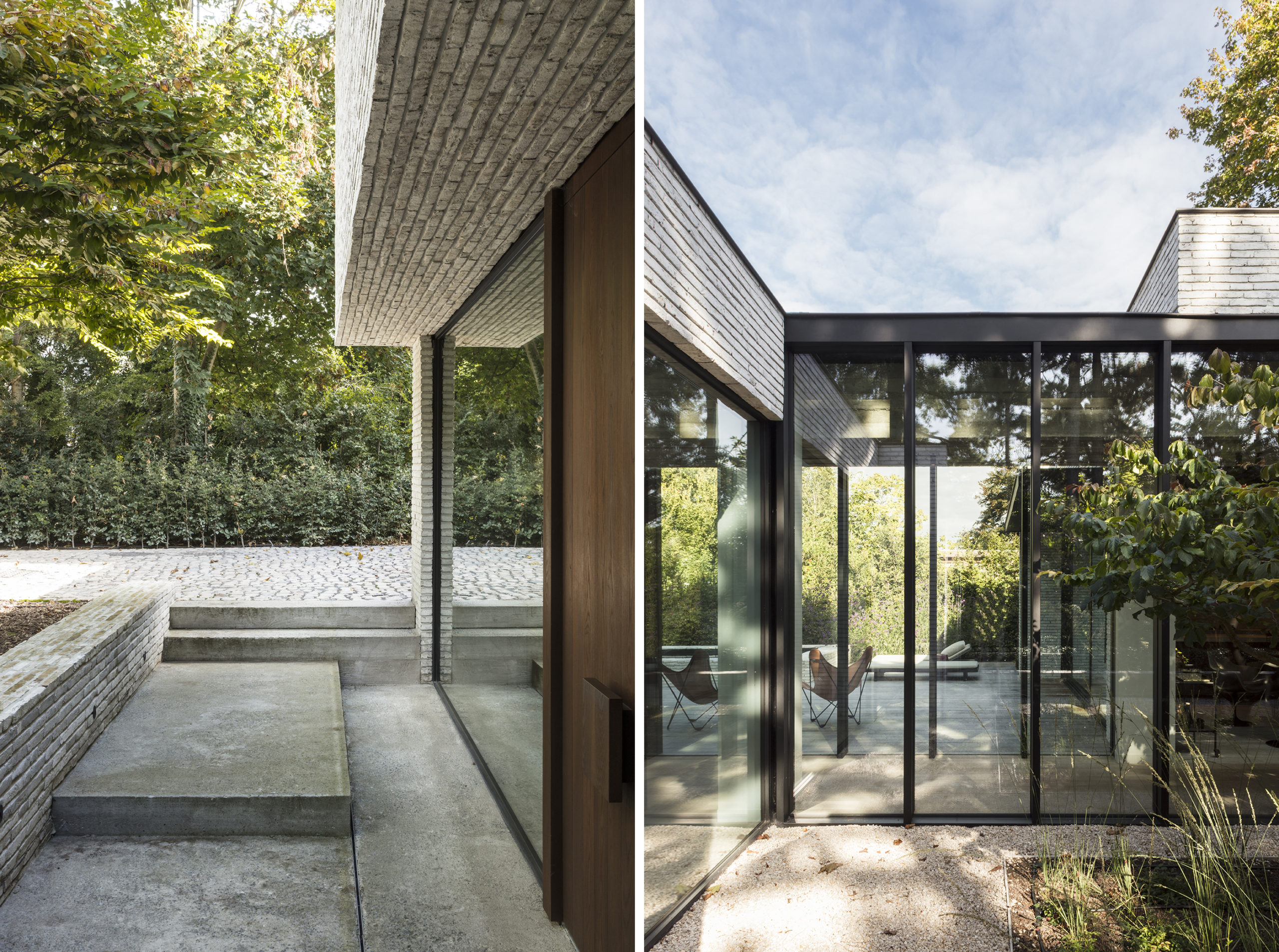
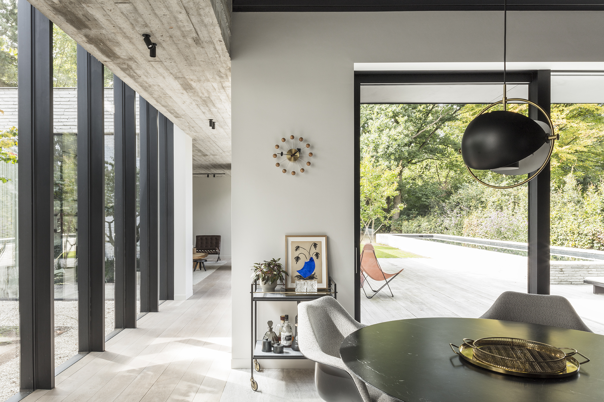
At the end of a long driveway, on a lush green plot located far from the street, sits a unique home consisting of 3 volumes of varying heights. The project held special significance to the architects: the space will serve as their own home and office. The volumes express the architectural program: one is a double garage with wood siding, the other is the architects’ office with separate access and finally the private home. The floor plan of the home is long-drawn-out, and this unique footprint, though necessary due to the unique site, inspired JUMA to include a glazed portico between the kitchen and living space — a transitional patio, of sorts. It also offers a new perspective on the garden so that the inhabitants do not only have to enjoy it from the backyard.
 8. KRM House
By Open AD architects, Gauja National Park, Latvia
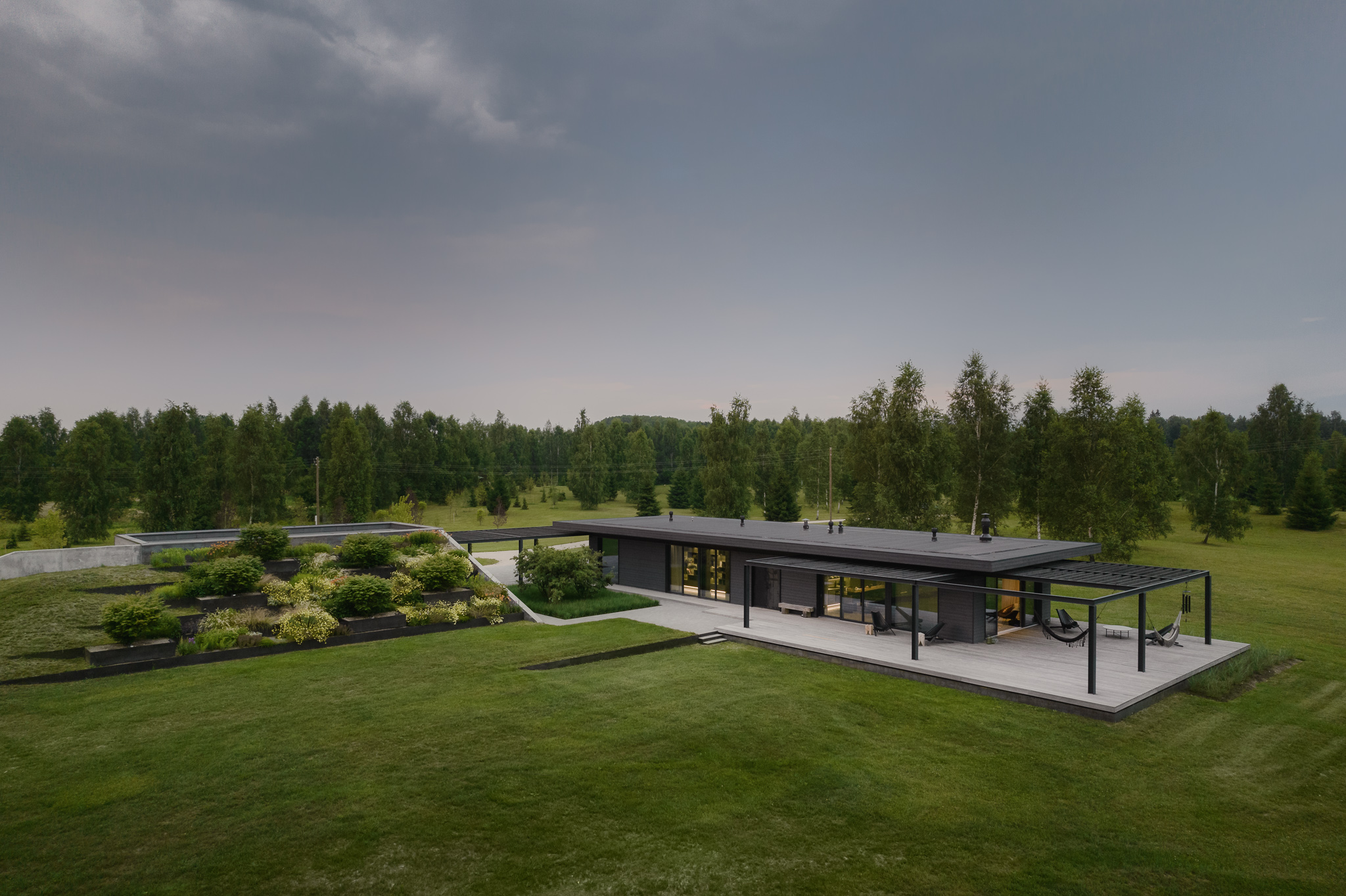
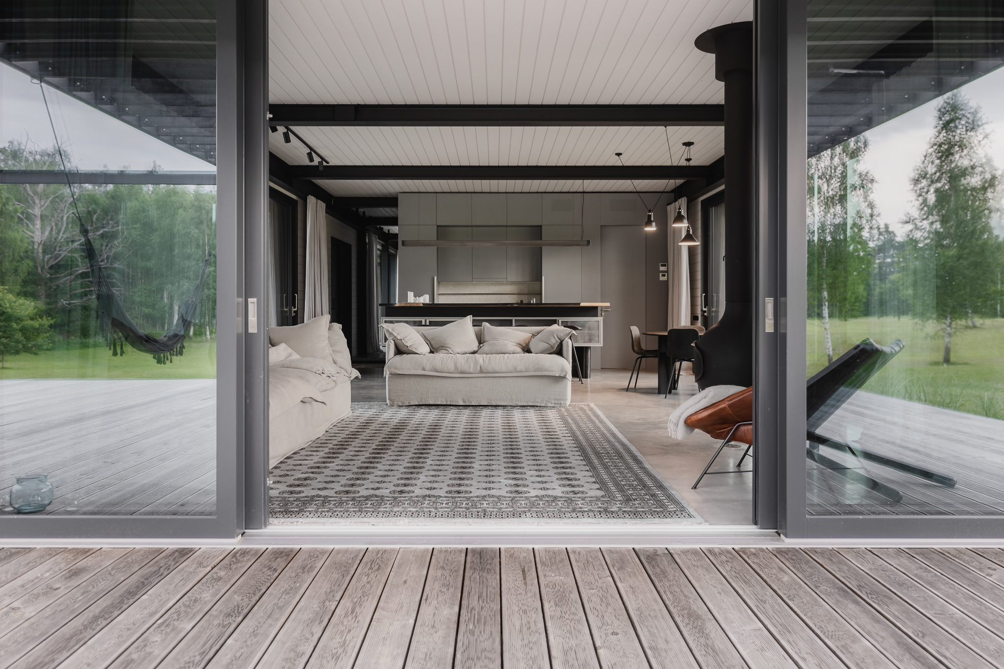
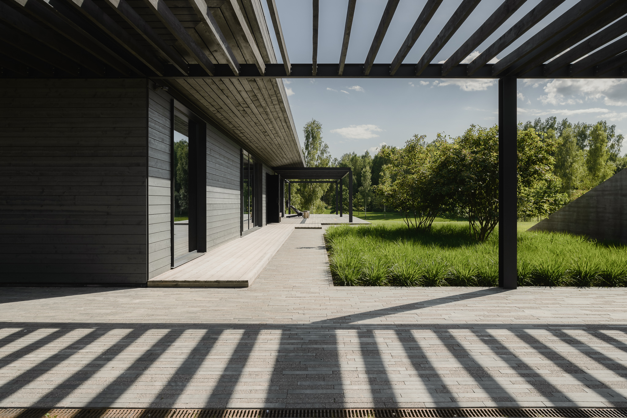
The dark, rectilinear profile of the KRM House stands out in the sparsely populated landscape of Gauja National Park, Latvia —a location where animals appear more frequently than humans. Drawing inspiration from the ancient Latvian farmstead, the viensēta, the pavilion-style holiday home connect exterior and interior spaces. In lieu of ancillary utilitarian structures, such as a barn, shed and sauna, that traditionally delineate the farmyard, a terraced garden creates yard-like area, forming a pocket of privacy within the vast landscape.
 7. KOA Apartment
By Marty Chou Architecture, Taiwan
Popular Choice, 2021 A+Awards, Apartment
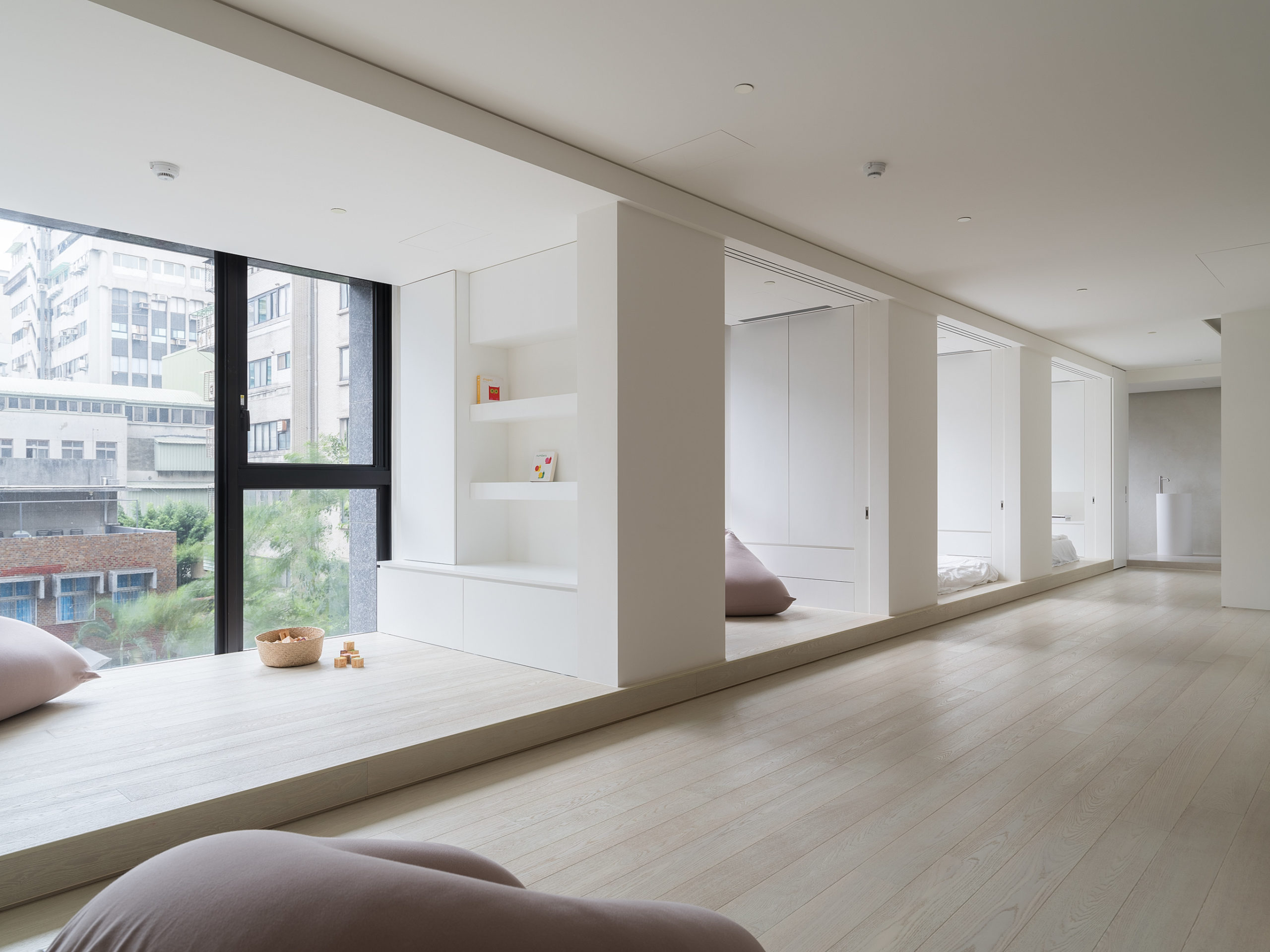
This remarkably open home was inspired by the unique life of an urban family — a couple with a daughter and another little one on the way — in Taiwan. The brief was as follows:
“At this stage of our life, the space for sleeping, seating, eating and sanitary can be stripped down to the bare essentials. We wish to have more space for our children to run freely and a big table for everyone to be around and spend time together. If possible, we wish to live in a modern gallery; simple, calm, and filled with light … in which space are left for imagination, so we can fill it with our life the years ahead.”
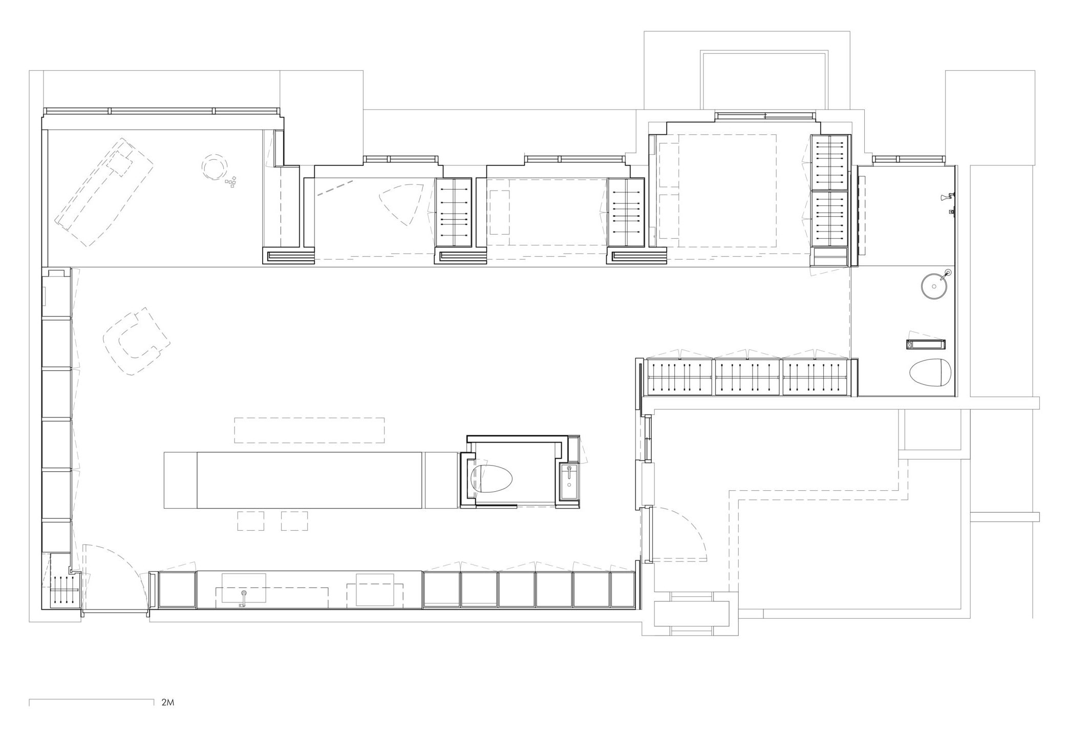
The architects responded with a space that is nearly 970 square foot (90 square meter) in a size and is completely open, surrounded on four sides by hidden cabinets. The standout feature is the statement strip of deeply recessed windows that almost serves as rooms and and of themselves. The countertop and furniture are minimal but abstract, like sculptures in the space.
 6. Zen in Zejtun [Malta]
By Daniel Scerri Periti [DSP], Żejtun, Malta
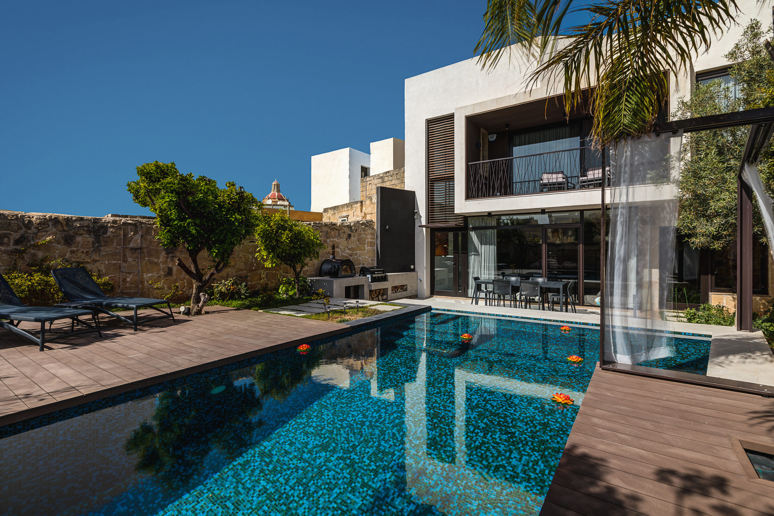
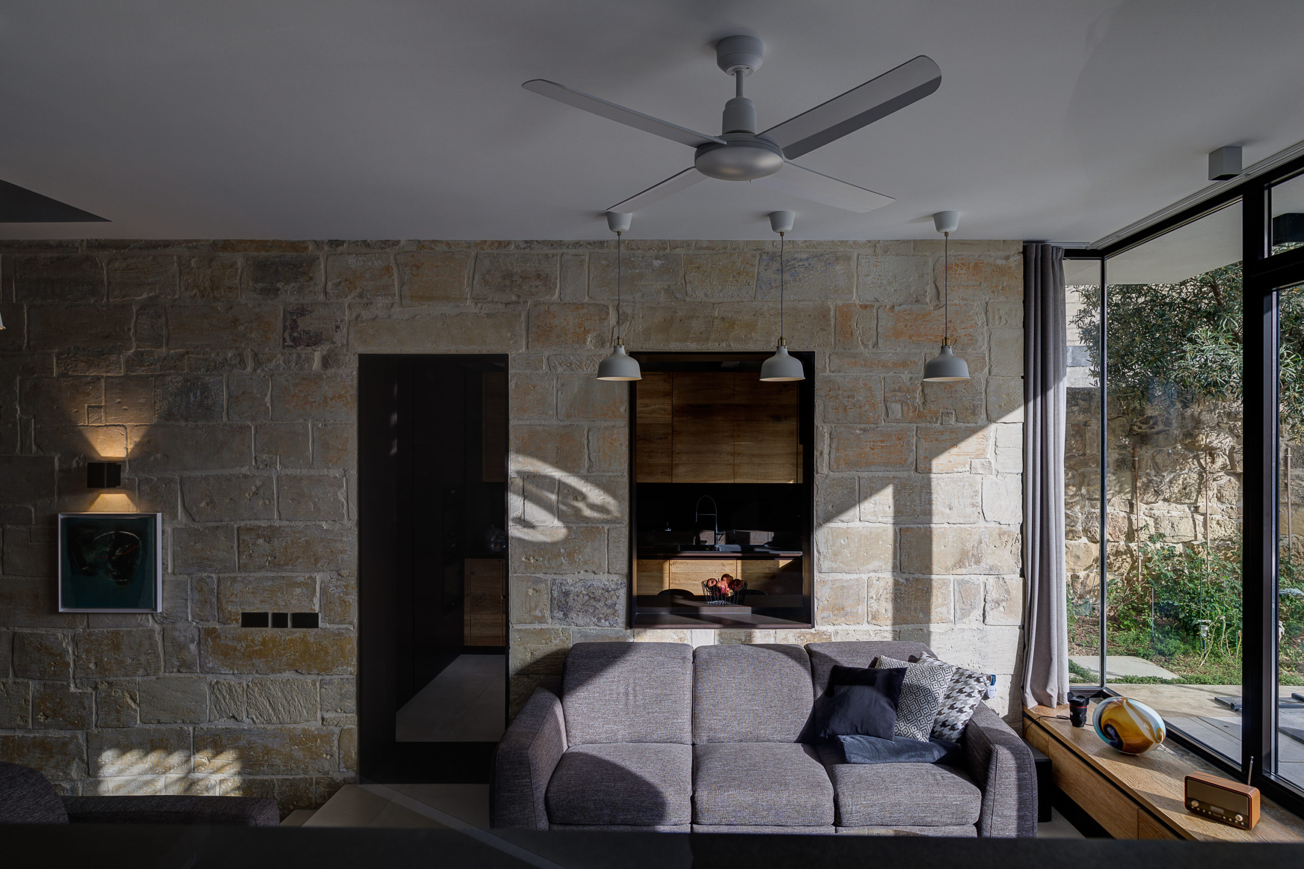
The process of converting this vernacular house was not straightforward: over the course of its 500 year lifespan, the building had accrued an array of disjointed parts. The first step was to dismantle the parts that were disrespectful to the original building (mainly from the postwar period) or were structurally unsound, while retaining the original footprint and configuration. Then, behind the unassuming facade, a new extension was added, abutting to an old wing with a long stone wall built. The tension created by contrast pulses through the entire design, juxtaposing and rhyming old and new.
 5. 2×2 House
By Mínimo Arquitetura e Design, Brasilia, DF, Brazil
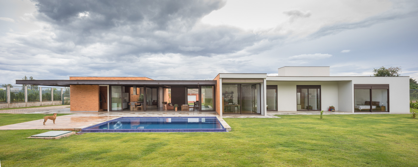
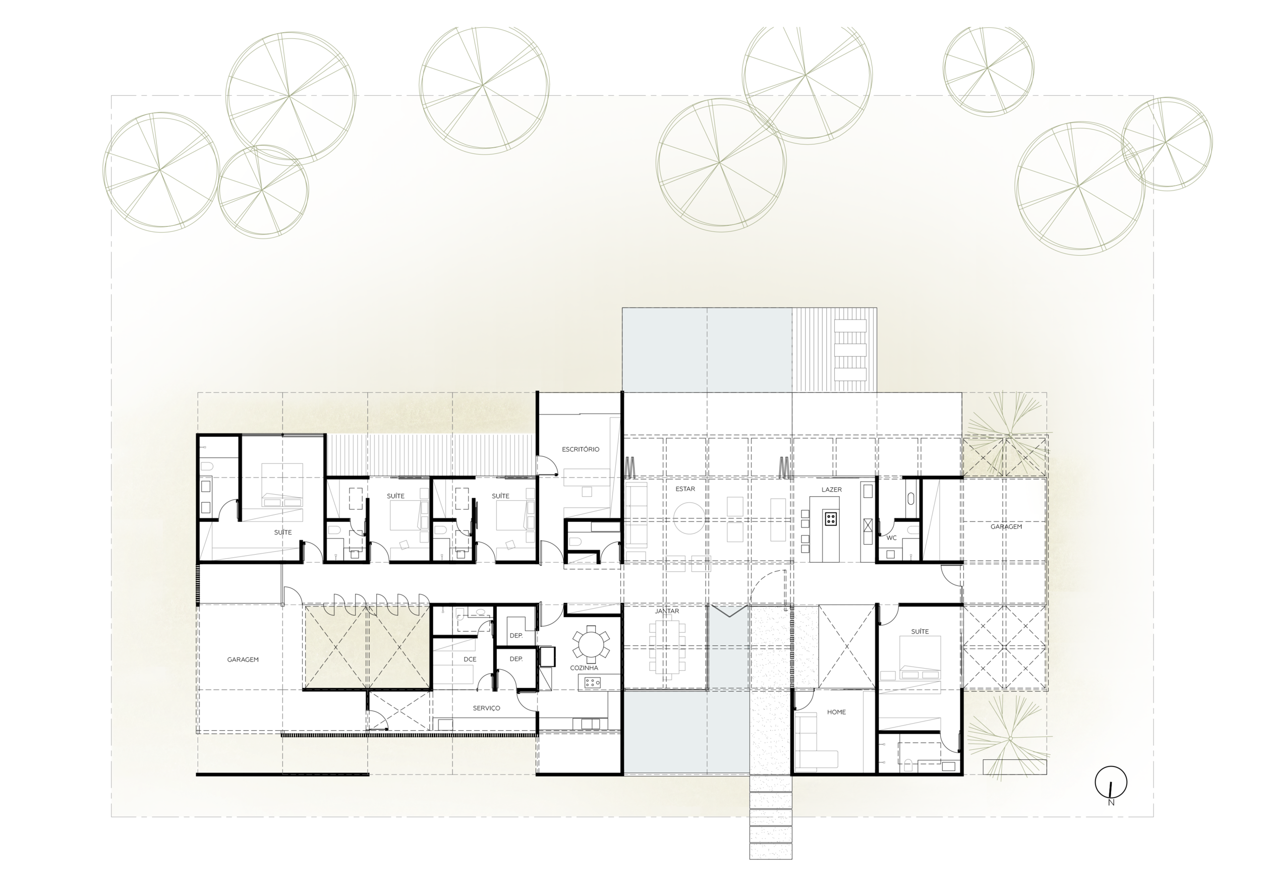
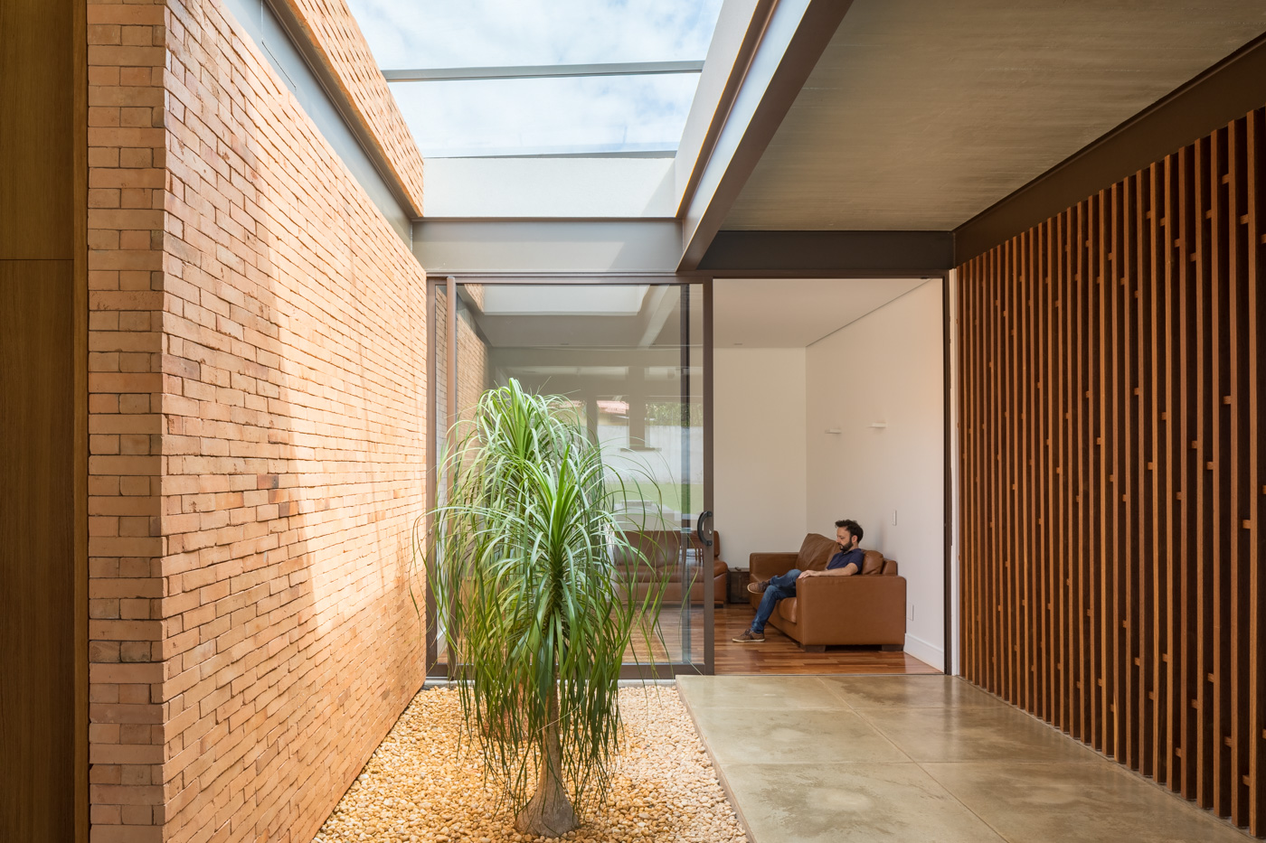
Brasília is famous for many things: its sprawling layout with ample residential plots is one of a handful of divisive design points. This wide, single storey home takes full advantage of its spacious plot, providing a space that is soaked in natural light with ample ventilation whilst remaining private. The elongated plan cleverly unfolds along two central circulation axes: one with private areas and the other with social space. The designers saw the flat topography as a benefit and harnessed it as a tool to integrate the various spaces.
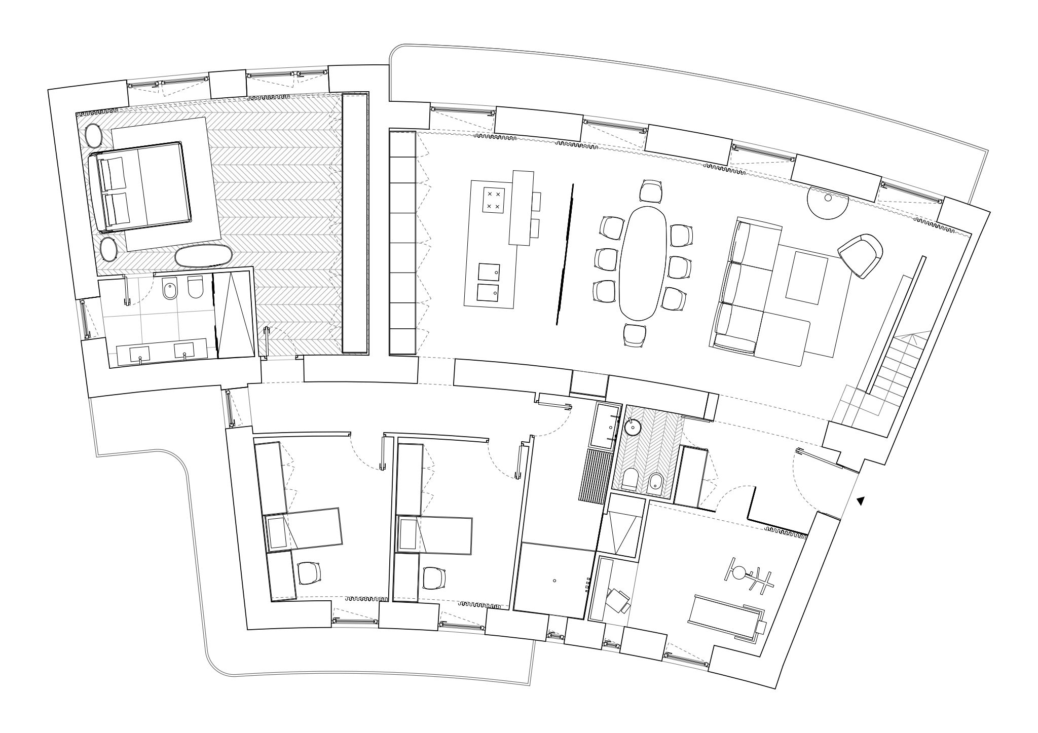 4. Panoramic Apartment O59
By FADD Architects, Naples, Campania, Italy
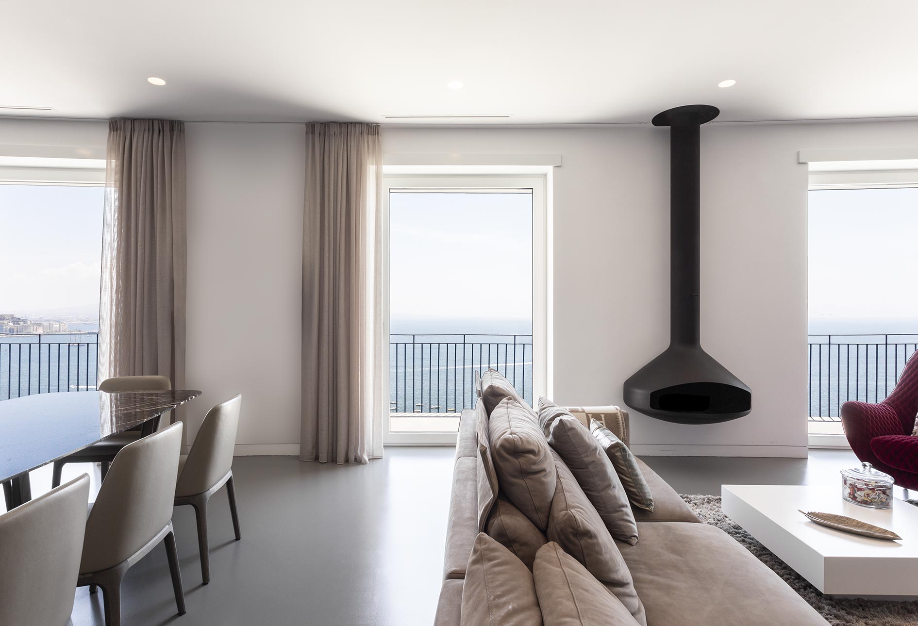
The top floor of this Neapolitan apartment building offers breathtaking views of Vesuvius, the Gulf of Naples and the island of Capri. A game of contrasts dominates the exterior decor, which includes Avola Salvatori stone cladding, white Carrara marble, warm yellow walls and ash oak accents. Natural light pours in; the architects embraced this as a central aspect for the conception of the design.
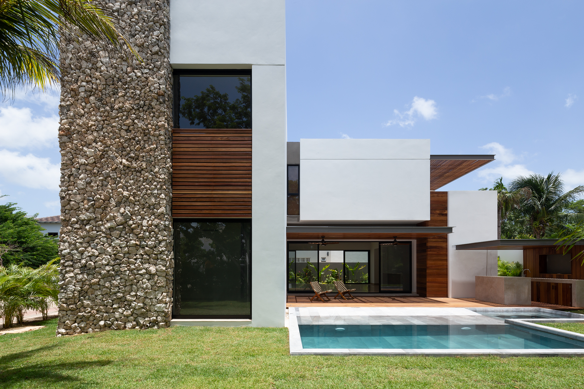
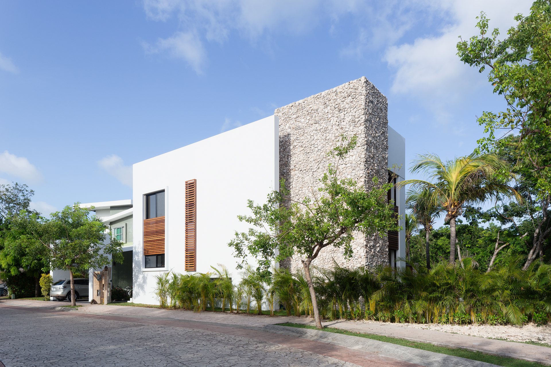 3. Delfines House
By estudio AM arquitectos, Cancún, Mexico
A corner lot is pregnant with possibility, and in this regard, the Delphines House takes full advantage of its site. The decision to use three façades served as a jumping point to create an amply ventilated home with a cumaru deck. Lush vegetation (those tzalam trees!) softens the transition between the road and the house, protecting the garden. The western is a blind façade made of natural stone that adds rich texture for a touch of drama and scale.
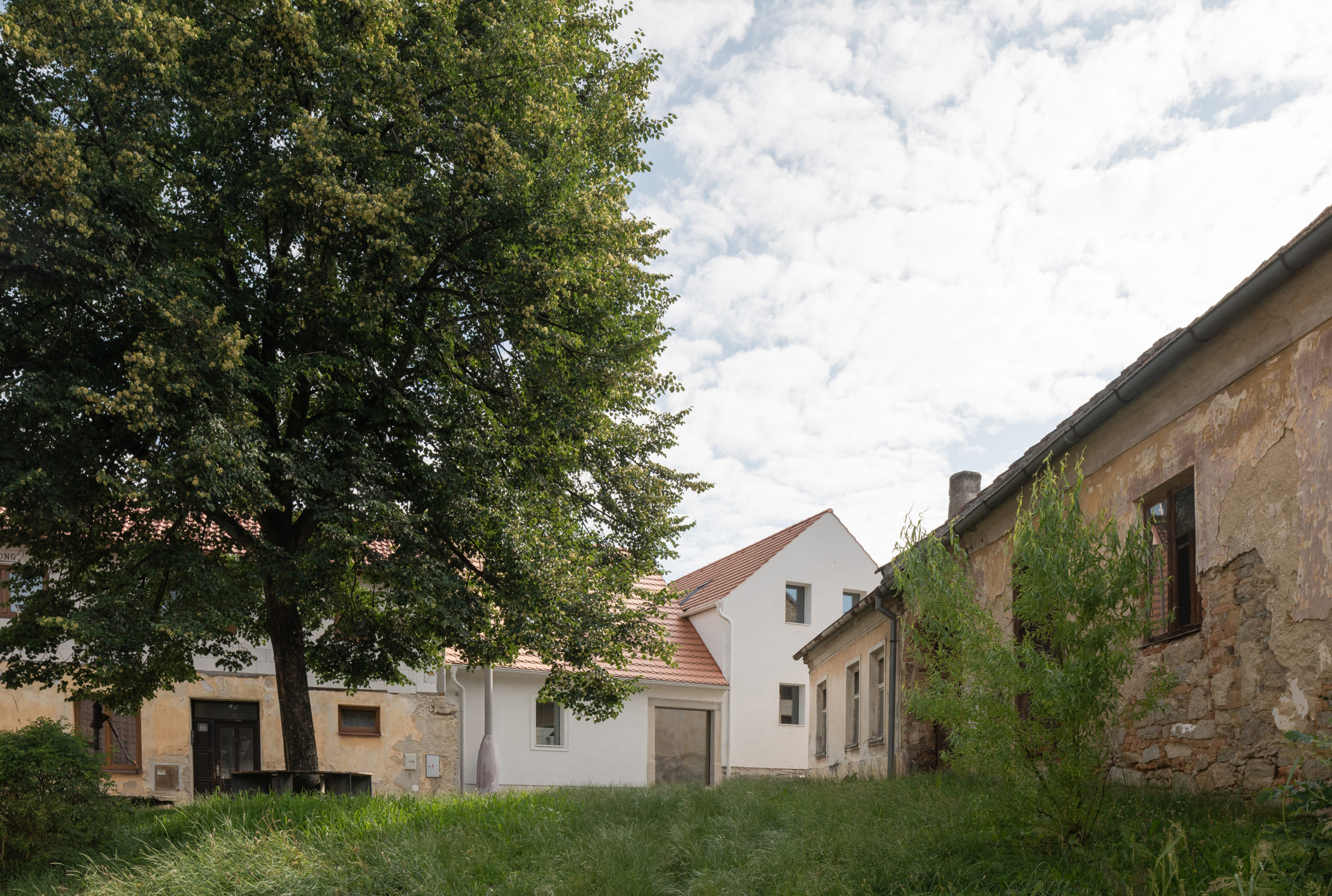
 2. Kozina House
By ATELIER 111 architekti s.r.o., Růžová, Trhové Sviny, Czechia
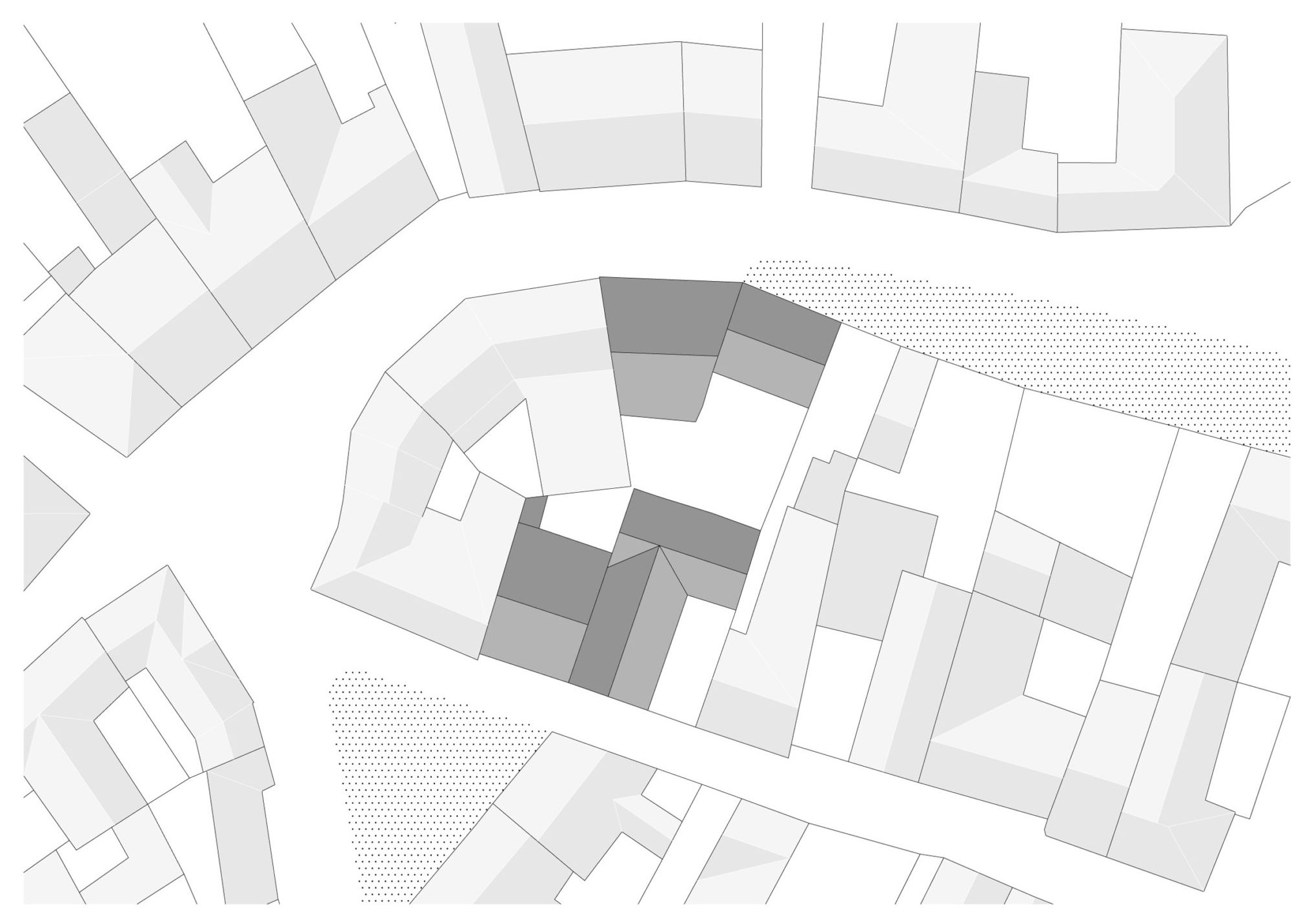
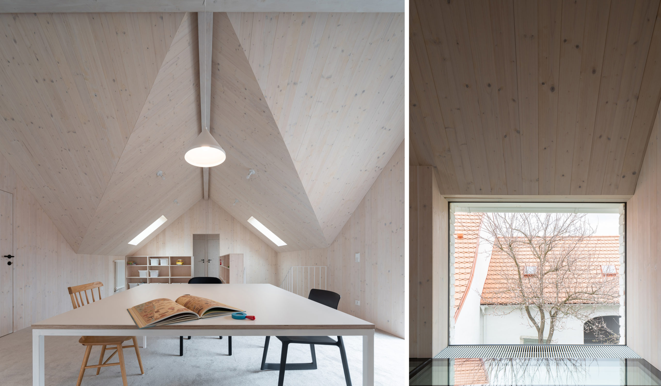
In the narrow sleepy streets of a small South Bohemian town, next to the grassy patch of the Kozina Square, ATELIER 111 architekti joined two neighboring, historic houses to create a stunning home. While one of the building underwent a significant reconstruction at the turn of the millennium, the other was in a state of disrepair. The renovation process uncovered original stone masonry and small historical fragments, which the clever conversion not only preserves, but showcases. The final result is a striking balance between an innovative and airy contemporary space with a timeless structure.
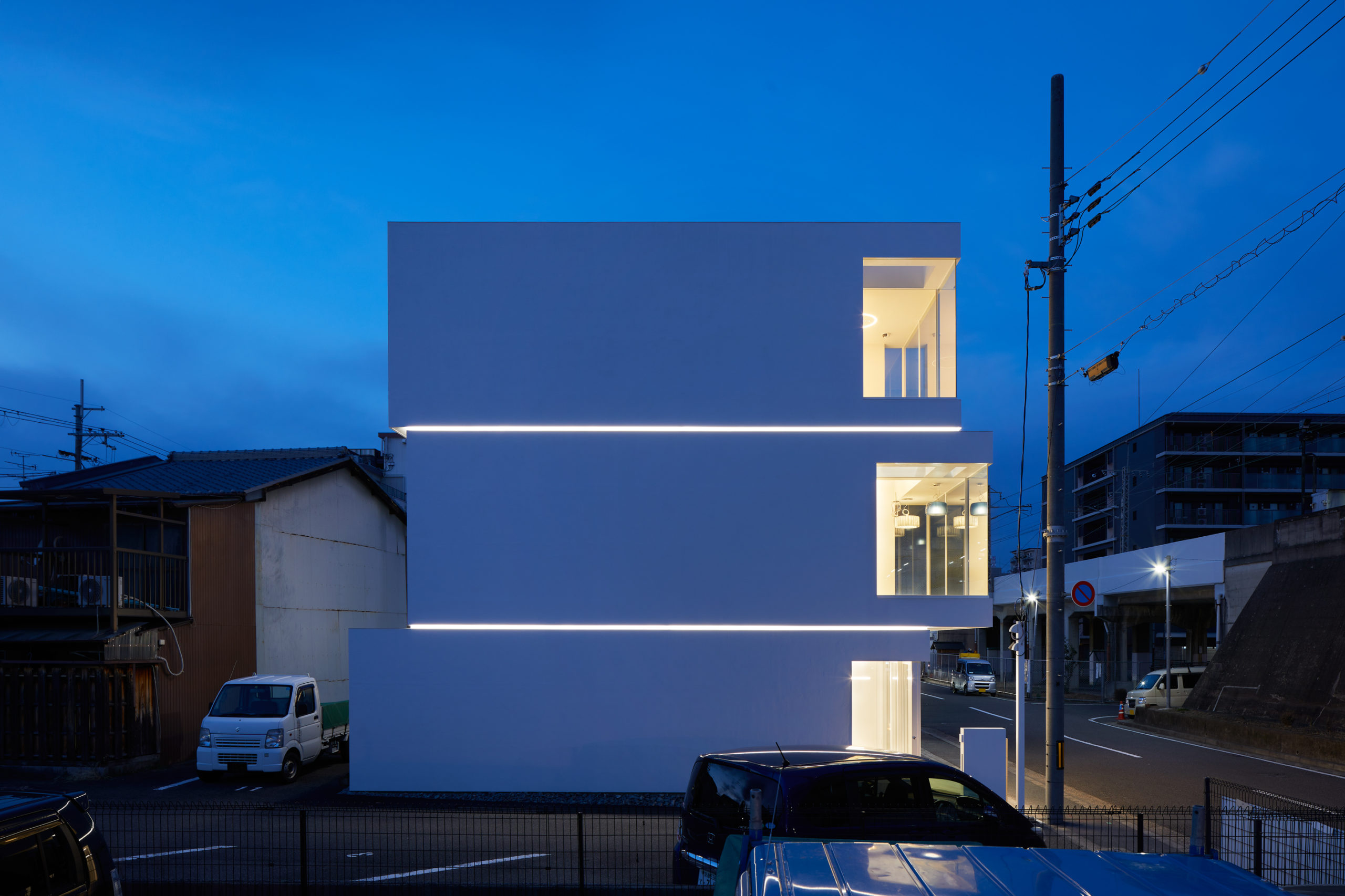 1. KKDC Japan
By Fujiwaramuro Architects, Kyoto, Japan
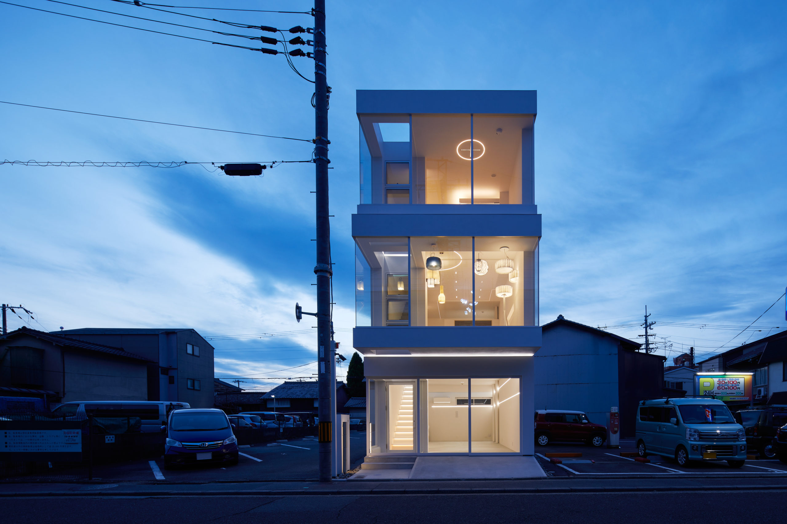
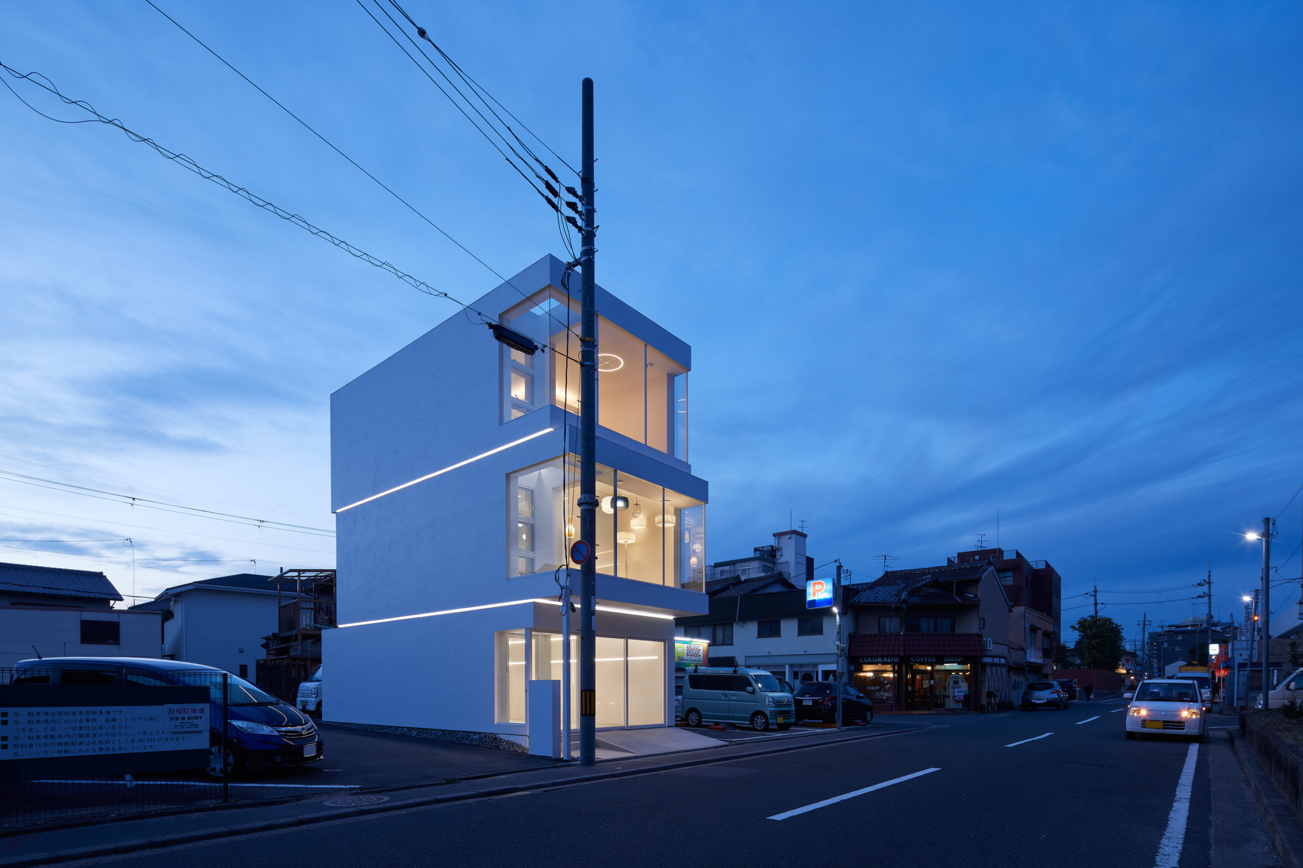
A lighting company headquartered in South Korea charged Fujiwaramuro Architects with designing a building in Japan that would express their brand identity. The architects did just that, ingeniously integrating architectural and product concepts by incorporating one of the company’s core products — linear lighting — into their design. The building volume appears like three stacked and offset cubes — a move that both disrupts the linear expectations of multi-story tower and draws attention to the product. The illumination not only calls attention to the separation between the floors, but it also dissolves the structure itself, making the blocks appear to be levitating.
Architects: Want to have your project featured? Showcase your work by uploading projects to Architizer and sign up for our inspirational newsletters.


