
Architects: Showcase your next project through Architizer and sign up for our inspirational newsletter.
Choice of color in architecture has an overwhelming effect on the way a building is perceived by those that view it, walk by it and occupy it each day. Numerous contemporary architects appear to view color as a distraction, preferring to focus on form, structure and program when conceptualizing their project. For them, the choice of exterior hue is a simple one — it is, quite literally, a black and white issue.
For others though, color is held up as a design element of incredible significance, and science indicates these architects are justified in their thinking. In-depth studies on the psychological impact of color show that people are highly sensitive to the hue and saturation of their surroundings. For example, a swathe of blue might give rise to feelings of calmness and serenity, while a misuse of red might lead to feelings of anxiety or even panic.
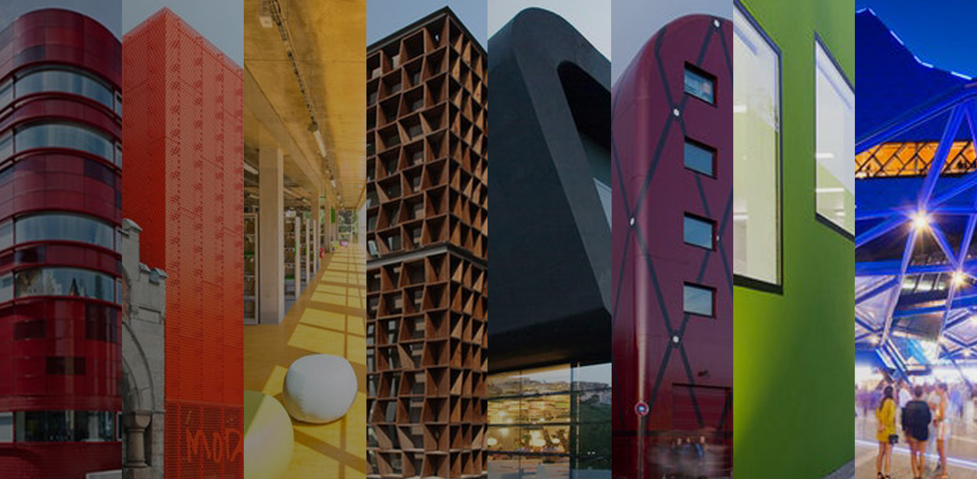
For architects, this raises the stakes: Their choice of color could make or break a project. Here, we present 72 buildings across nine color-coded collections, each of which possesses a hue or shade that impacts its occupants in a profound way. Take inspiration from this grand prismatic guide to architecture, and let us know which is your favorite over on Facebook.
Red
9 Scarlet Projects Making Us See Red
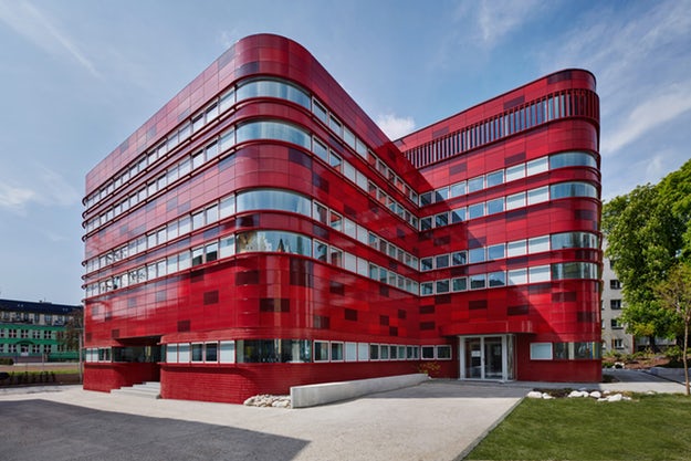
Red is a dramatic color. Always eliciting a strong visceral response, we’ve evolved to become alarmed when we see it, since its oldest association is with the natural hue of blood when it’s outside the body. As such, red has been employed over time as the color of warning signs, stoplights and emergency response, and when used in architecture, it is often in the service of one of these goals.
The importance of this association is not lost on architects who use it discriminately. As evidenced in these nine projects, it is exactly these subconscious attributes that make red a popular color to apply liberally in non-emergency settings. Whether helping a project stand out from its surroundings, or as a complement to them, it’s impossible to divorce this color from its deeply reflexive meaning. These projects exhibit a wide range of scale, program and intent, but the attention-grabbing effect is always the same: If you make something red, people will notice.
Projects in the RED collection:
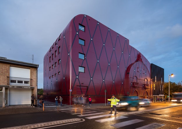
Blood Center by F A A B Architektura Adam Białobrzeski | Adam Figurski, Raciborz, Poland (pictured above)
The Couch by MVRDV, IJburg, Netherlands
Serpentine Gallery by Ateliers Jean Nouvel, London, United Kingdom
The Red House by Jarmund/Vigsnæs Architects_ JVA, Oslo, Norway
People’s Canopy by People’s Architecture Office, Lancashire, England, United Kingdom
Jean-Claude Carrière Theatre by A+Architecture, Montpellier, France
Red Wall by 3GATTI, Shanghai, China
Amphithéâtre Trois-Rivières by ATELIER PAUL LAURENDEAU, Trois-Rivières, Canada
Qinhuangdao Red Ribbon Park by Turenscape Landscape Architects, Qinhuangdao, China
See the complete collection here.
Yellow
7 Uplifting Uses of Yellow in Architecture
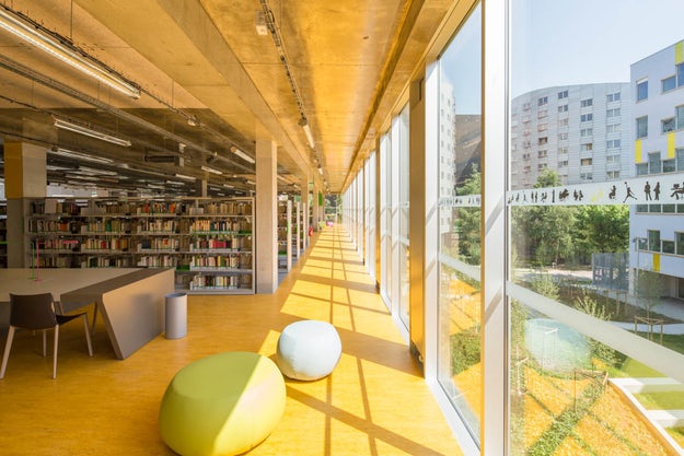
You can’t make something yellow without causing a stir. Arguably the most intense color on the spectrum, almost any expanse of it commands attention and draws the eye. So what does it mean when this color is employed in architecture? Psychologically, yellow is often characterized as making people happy or invigorated and — whether the designer intended it to or not — it can underscore such notions for inhabitants when used in a building.
These seven projects all feature noteworthy applications of yellow in their articulation. Typologies vary widely, but the effect this color choice has on a wide range of occupants illustrates striking similarities and contrasts. In all, these examples reinforce the notion that yellow exerts a powerful presence wherever it is used, and its implications should be considered carefully.
Projects in the YELLOW collection:
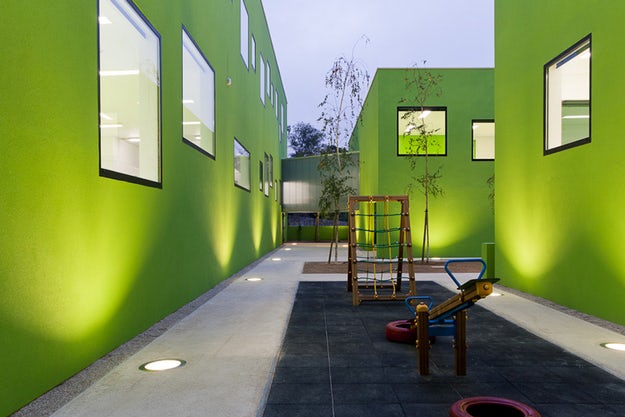
Tellus Nursery School by Tham & Videgård Arkitekter, Stockholm, Sweden
Apprentice Formation Center by AIR architectures, Saint-Maur, France
Sunray Woodcraft Construction Headquarters by DP Architects, Singapore
Inter-Generation Centre by Dominique Coulon & Associés, Venarey-les-Laumes, France
Housing for the Fishermen of Tyre by Hashim Sarkis Studios, Abbasiyeh, Lebanon
Morangis Retirement Home by Vous Êtes Ici, Morangis, France
Centre Clignancourt by GPAA Gaëlle Péneau Architecte & Associés, Paris, France (pictured above)
See the complete collection here.
Green
The Natural Inclinations of 9 Truly Green Buildings
There’s an unconscious inclination to associate the color green with balance and harmony, as well as with nature itself and, by extension, growth. As generally positive attributes, these qualities make green a popular choice in mainstream culture – a mere utterance of the word itself carries with it connotations of environmental stewardship and responsibility, a notion that greatly influences the way we react upon seeing it.
These qualities can be especially helpful in a composition, used to emphasize or even manufacture a sense of balance and harmony in a work that may otherwise be lacking it. As these nine projects demonstrate, this color is often employed to invoke nature when it isn’t there, or to tie together a disparate program or set of forms. These buildings serve as reminders that a design move as simple as color choice has fundamental implications for how a building is perceived, and should be held in equal regard to elements such as structure and form.
Projects in the GREEN collection:
123 social green housing by SOMOS.arquitectos, Madrid, Spain
Bilbao Arena and Sports Center by ACXT, Bilbao, Spain
Habitat 825 by Lorcan O’Herlihy Architects (LOHA), West Hollywood, Calif., United States
Expansion of Government Offices by CrystalZoo, Alicante, Spain
hERZberg by feld72 architekten zt gmbh, Vienna, Austria
School Center Antas by AVA ARCHITECTS Antas, Spain (pictured above)
The Kindergarten of the German School of Athens by Potiropoulos+Partners, Athens, Greece
Dream Dairy Farm Store by MORIYUKI OCHIAI ARCHITECTS, Chiba, Japan
Sports Centre Neumatt by Evolution Design, Strengelbach, Switzerland
See the complete collection here.
Brown
8 Earth-Oriented Brown Buildings
Brown is perhaps the color most taken for granted in architecture. Its use is pervasive, from the default appearance of wood to its role as an abundantly common exterior paint color in mass-produced suburban housing. We see brown everywhere, but rarely is it a feature. The projects in this collection make a prominent use of brown for an emphatic purpose, and in doing so bring the color’s associations along with them. Similar to green in its allusions to nature, brown evokes the material of the earth itself: dirt.
While a colored plant may grow from the ground, it’s easy to distinguish the difference between the two because we’re used to seeing leaves change color and die. But the brown of a hill, mountain or even a tree is clearly an extension of the ground, due to its apparent permanence. In this sense, brown is the truest earth tone of them all, gently reminding us of our inescapable relationship with the surface we live on. As a matter of color choice, these eight buildings do the same.
Projects in the BROWN collection:
Science Park by 24H-architecture, Amsterdam, The Netherlands
A House for Oiso by Dorell.Ghotmeh.Tane / Architects (DGT), Oiso, Japan
Selcuk Ecza HQ by Tabanlioglu Architects, Istanbul, Turkey
MA&MI House by 3ndy Studio, Fossò, Italy
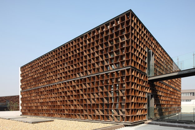
Plot 6 & Tea House in Jiangsu Software Park by Atelier Deshaus, Nanjing, China (pictured above)
Bob Champion Research and Education Building by HawkinsBrown, Norwich, United Kingdom
The Riparian House by Architecture BRIO, Karjat, India
Biomass Power Plant by Matteo Thun & Partners, Tübingen, Germany
See the complete collection here.
Black
8 Jet Black Buildings Conveying Powerful Prestige
Black is a color with a very special presence in architecture. Besides defining the stereotypical manner of dress for architects (to the extent that someone has gone so far as to write a book in an attempt to figure out why), it can have a powerful effect when used in actual architecture. The strength this effect has on building occupants cannot be understated.
Relatively rare in large expanses as part of a building’s design, black is notable for its associations with power, prestige and authority. With attendant notions of formality and respect, the subtle insinuations of black are impossible to miss when it defines a project. These eight examples typify exactly this, each of them featuring black to an overpowering degree.
Projects in the BLACK collection:
Water Bottling Plant by Panorama Arquitectos, Coihaique, Chile
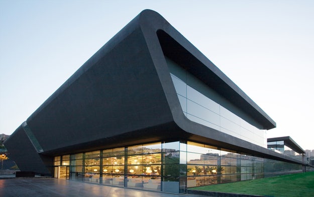
Prestige Mall by DILEKCI Architects (DDA), Istanbul, Turkey (pictured above)
No99 Straw Theater by SALTO, Tallinn, Estonia
Luxembourg Apartment by Metaform atelier d’architecture, Luxembourg City, Luxembourg
ABC Building by WISE Architecture, Seoul, South Korea
Private Clinic by Mario Mazzer Architects, Conegliano, Italy
Centre de Collaboration MiQro Innovation by Menkès Shooner Dagenais Letourneux Architectes, Bromont, Canada
MPO9 Headquarters by GSarchitects, Graz, Austria
See the complete collection here.
Purple
7 Opulent Instances of Purple Architecture
Perhaps one of the least-used colors in building design, purple’s power to influence lies in its well-known association with royalty. To the extent that it conveys notions of wealth, sophistication and privilege, it can be a powerful color choice even in small doses. With the ability to suggest a prestige in almost anything, purple, when used consciously, tends to suggest the traits it’s associated with are for sale, or at least conditionally available to those who want them, depending on what sort of circumstances they’re willing to accept.
These seven projects all showcase the color in some form or another, either subtly or front-and-center. Equally noteworthy regardless of application, the desired intent between uses is quite similar: purple is employed to communicate opulence or exclusivity, and in many cases to stir a desire for such things.
Projects in the PURPLE collection:
Comédie de Béthune – National Drama Center by MANUELLE GAUT São Paulo,RAND ARCHITECTURE, Béthune, France (pictured above)
Garware Club House by Shashi Prabhu & Associates, Mumbai, India
Boutique Almira Sadar by SADAR + VUGA, Ljubljana, Slovenia
Woo Nam Jai by IROJE KHM Architects, Seoul, South Korea
Dui Restaurant by SuperLimão Studio, São Paulo, Brazil
Sacred Heart College Performing Artsby Tridente Architects, Somerton Park, Australia
Purple Whale by IROJE KHM Architects, Seoul, South Korea
See the complete collection here.
Orange
8 Vigorous Applications of Orange in Architecture
Orange is perhaps the most underrated color. Too subtle to be associated with emergencies, too dull to make us happy, this lone remaining “warm” color’s primary renown is the eponymous fruit — elsewhere it often fails to be taken seriously. No less attention-grabbing than red or yellow, however, orange’s subconscious claims imbue it with a sense of life and vitality, and as such it can have a considerable effect in architecturally scaled applications.
The projects in this collection all telegraph a sense of life and vitality to their occupants. Regardless of the intentions of the designer, this color’s associations with life-lusting vigor are present wherever it is used. It may inspire strength or courage in the people who use these buildings — or at least get them thinking about it. In any case, the subconscious associations of color is something that building occupants pick up on, whether they realize it or not, and as evidenced here, orange is no exception.
The Orange Cube by Jakob+MacFarlane, Lyon, France
Why Factory Tribune by MVRDV, Delft, Netherlands
Cykelslangen/The Bicycle Snake by DISSING+WEITLING architecture, Copenhagen, Denmark
Afterglow by AmorphisCorvallis, Ore., United States
ArcelorMittal R&D Headquarters [insideOUT] by [baragaño], Aviles, Spain
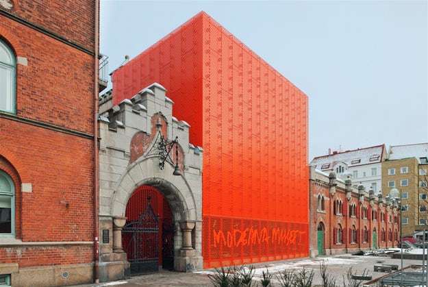
Moderna Museet Malmö by Tham & Videgård Arkitekter, Malmö, Sweden
Premaydena Residence by Misho + Associates, Premaydena, Australia
Houston Dynamo by Populous, Houston, Tex., United States
See the complete collection here.
Blue
8 Cool Blue Projects With Tranquil Undertones
When someone describes blue as a “cool” color, the term can have a wide range of meanings. With regards to literal color temperature, the inverse is actually true, as blue ranks highest on this scale relative to other colors. Most probably the association is rooted in a likeness to the color of the ocean, which may serve as a basis for how the color blue is understood in this collection: for its subconscious undertones of calmness and tranquility.
Cross-cultural understandings of blue as a subdued, passive color ensures it will have a strong effect when used in architecture. These eight projects all feature blue extensively and, for better or worse, this choice sets the predominant mood for each. These examples are powerful illustrations of how color choice can affect a broad user base in a consistent manner — a move that, no matter how it is wielded, will almost always strengthen a particular understanding of that project in the collective unconscious.
Projects in the BLUE collection:
Blue Box by Hofrichter-Ritter Architekten, Graz, Austria
La Luciole by Moussafir Architectes, Alençon, France
Stade Océane by SCAU architects, Le Havre, France
BIG by BUREAU A, Geneva, Switzerland
Swimming Pool in Bagneux by Dominique Coulon & Associés, Bagneux, France
Burgos Art School by Primitivo Gonzalez Arquitecto, Burgos, Spain
HDE 17 by POGGI Architecture + MORE Architecture, La Rochelle, France
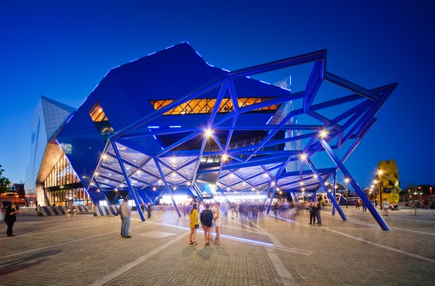
Perth Arena by ARM Architecture and Cameron Chisholm Nicol, Perth, Australia (pictured above)
See the complete collection here.
White
8 Clean and Clear Applications of White
It’s hard to think of a color (or shade) more strongly associated with cutting-edge architecture than white. A quick glance at leading design publications from the early days of Modernism up to this very moment quickly reveals the color as one of few consistent themes, so much so that a group of orthodox Modernists even named themselves after it. Architects have bathed their projects in white for decades in hopes of claiming the absolute purity it suggests for their own work — whether it be purity of form, function or ideology. As evidenced by these eight projects, this trend isn’t going away any time soon. So perhaps it’s worth taking a moment to ask: Why white?
Besides the color’s widespread associations with the concept of purity, a more practical employment of white is in service of clarity, cleanliness and simplicity. White can disguise any number of formal gesticulations, pulling an otherwise unwieldy structure back down to earth; if used as a background color, it can be both beautiful and virtually invisible. The projects in this collection demonstrate a wide range of applications under this guise, ultimately suggesting that white’s versatility may be the reason it remains a perennial favorite for architects around the world.
Projects in the WHITE collection:
Xixi Artist Clubhouse by AZL Architects, Hangzhou, China
GOLIRAN Flower Shop by Alidoost & Partners, Rasht, Iran
Apartment House “Am Heiligenstock” by CHRIST.CHRIST. associated architects, Wiesbaden, Germany
Torus by N Maeda Atelier, Saitama, Japan
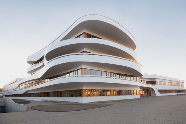
Kaffee Partner Headquarters by 3deluxe, Osnabrück, Germany (pictured above)
Vilnius University Library, by R. Paleko Arch Studija, Vilnius, Lithuania
Extension of Hamborn Abbey by ASTOC Architects and Planners, Duisburg, Germany
Living Foz by dEMM arquitectura, Porto, Portugal
See the complete collection here.
Architects: Showcase your next project through Architizer and sign up for our inspirational newsletter.