

Architects: Want to have your project featured? Showcase your work by uploading projects to Architizer and sign up for our inspirational newsletters.
It’s hard to think of a color more strongly associated with cutting-edge architecture than white. A quick glance at leading design publications from the early days of Modernism up through this very moment would quickly reveal the color as one of few consistent themes, so much so that a group of orthodox Modernists even named themselves after it. Architects have bathed their projects in white for decades in hopes of claiming the absolute purity it suggests for their own work — whether it be purity of form, function or ideology. As evidenced by the projects below, this trend isn’t going away any time soon. So perhaps it’s worth taking a moment to ask: Why white?
Besides the color’s widespread associations with the concept of purity, a more practical employment of white is in service of clarity, cleanliness and simplicity. White can disguise any number of formal gesticulations, pulling an otherwise unwieldy structure back down to earth; if used as a background color, it can be both beautiful and virtually invisible. The projects in this collection demonstrate a wide range of applications under this guise, ultimately suggesting that white’s versatility may be the reason it remains a perennial favorite for architects around the world.

© AZL Architects
© AZL Architects
Xixi Artist Clubhouse by AZL Architects, Hangzhou, China
Visibility and surface area are key design concepts in this grouping of artist’s residences. The clarity of this series of all-white structures is apparent in their juxtaposition against the surrounding earth-toned landscape, which ensures they will be seen from far away. Associations of purity with the color chosen for nearly every material used in their construction makes the buildings appear as if they are each a single, continuous surface — analogous to a painter’s blank canvas before they begin work and a nod to the type of people this project is intended to house.
© Alidoost & Partners
© Alidoost & Partners
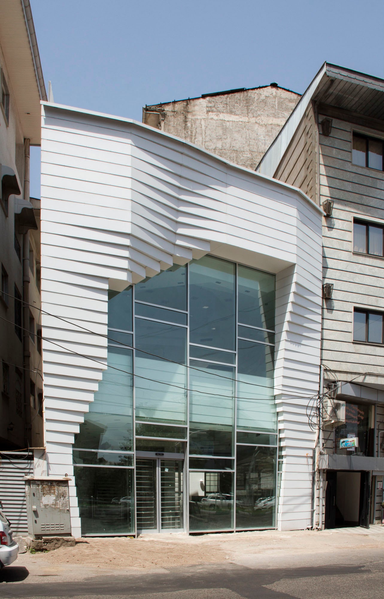
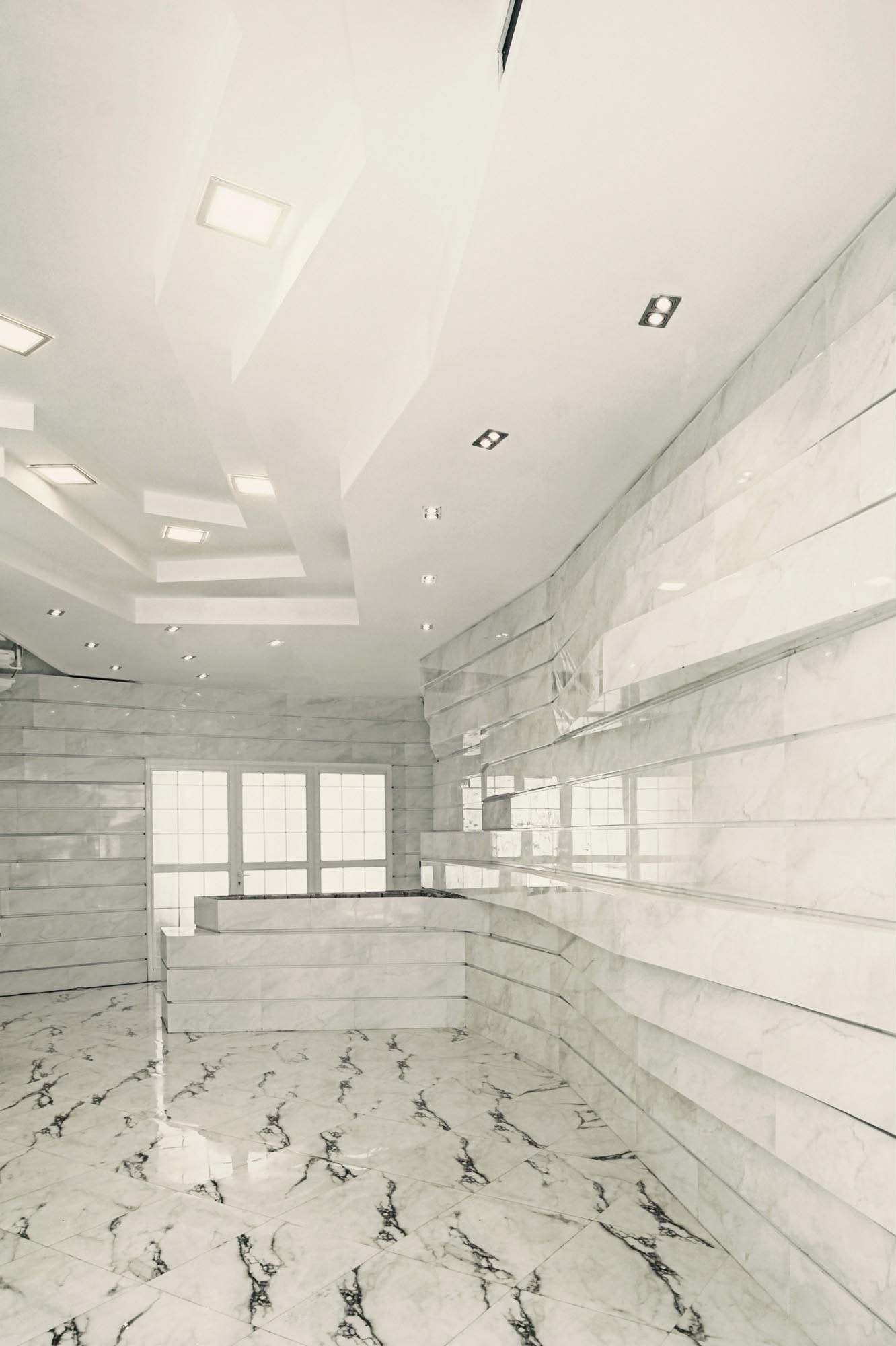
GOLIRAN Flower Shopby Alidoost & Partners, Rasht, Iran
A thorough use of bright white in this infill retail structure has a dual purpose, at once clearly differentiating the building from its darker neighbors while also providing a display surface inside that disappears behind the floral arrangements being sold. Beyond the visual ambience offered by this color choice, it also simplifies a highly textural wall surface of undulating bars, helping an otherwise complicated design achieve formal clarity.

© Thomas Herrmann
© Thomas Herrmann
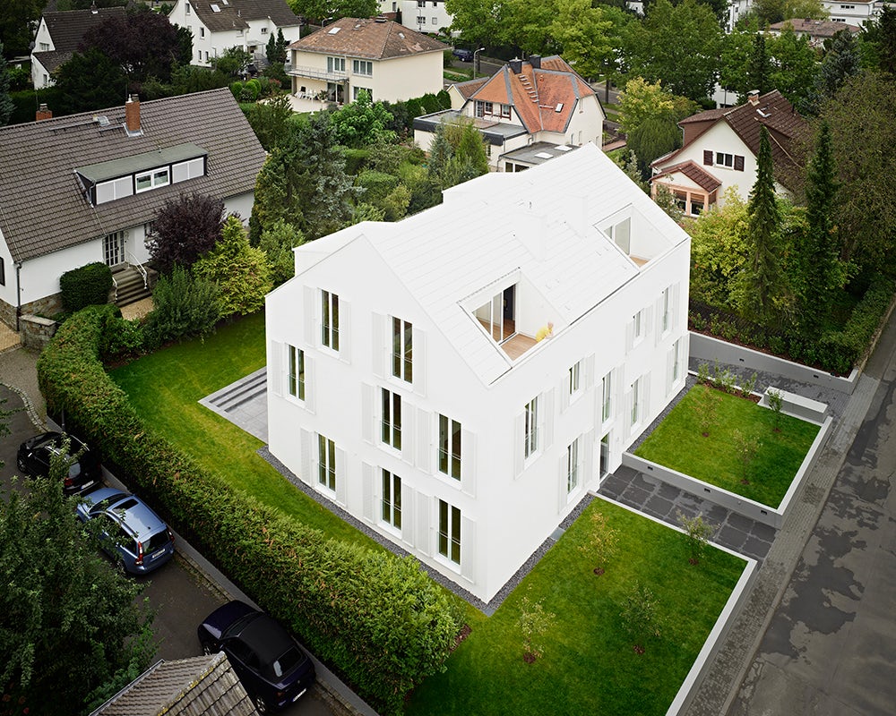
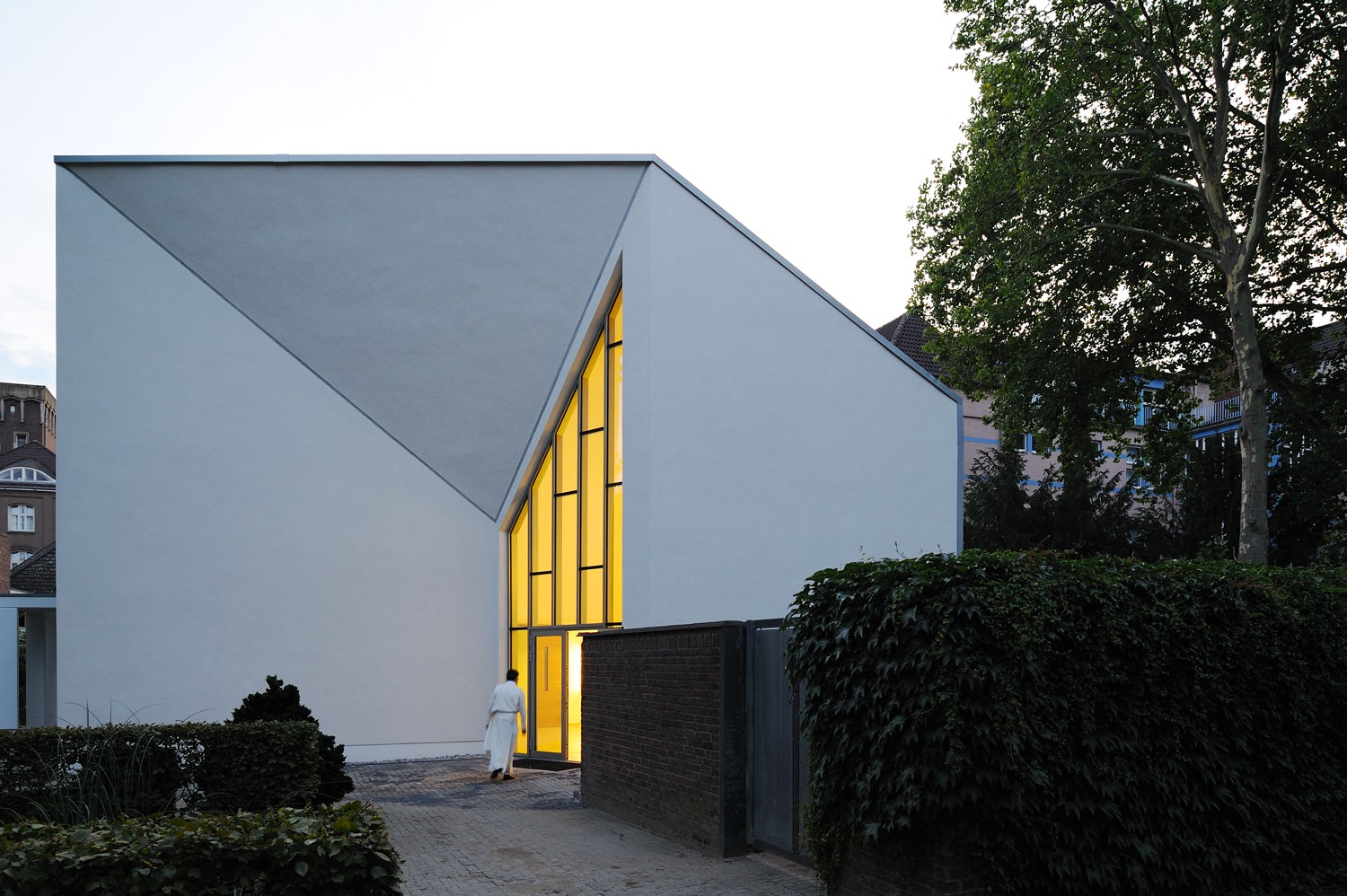
Apartment House “Am Heiligenstock” by CHRIST.CHRIST. associated architects, Wiesbaden, Germany
Sited in a conventional suburb, this apartment house sports an all-white exterior that highlights the simplicity of its form. Hewing to a traditional box-like mass with a gable roof as a reference to its context, the articulation of this form is stripped to its essence and devoid of almost any ornamentation — a move accentuated by its paint color.
© N Maeda Atelier

© N Maeda Atelier
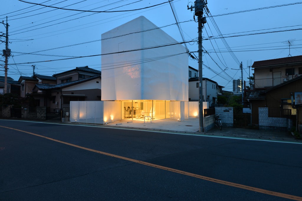
Torus by N Maeda Atelier, Saitama, Japan
The capabilities of white as an exterior color choice were utilized here once again to simplify a complex form. With retail on the ground floor and a private residence above, a perforated white scrim set against the retail portion of the building differentiates it from the near-solid white surface surrounding the residential portion above. The lower, translucent white surface is offset from the face of the retail wall to further accentuate the appearance that the scrim is floating, which was an effect desired by the designers.
© 3deluxe
© 3deluxe
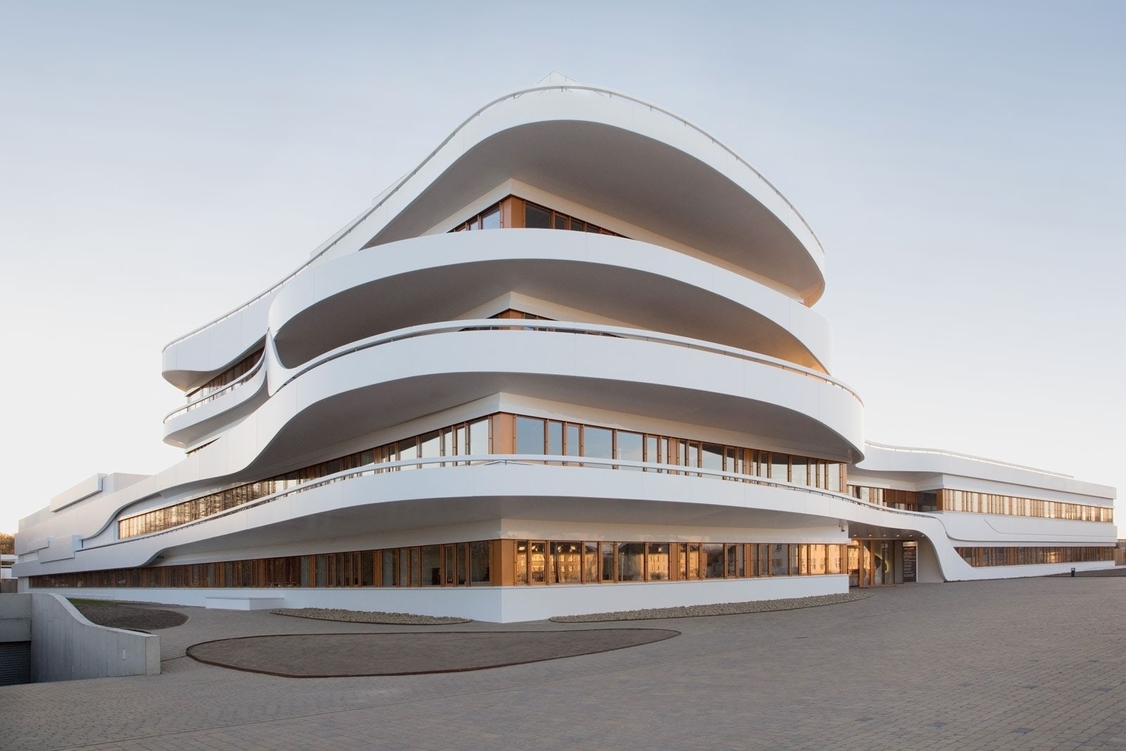
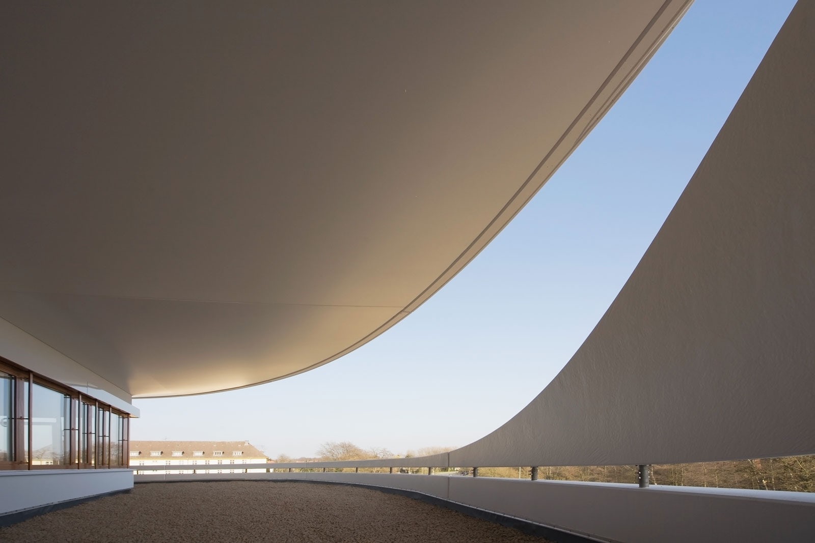
Kaffee Partner Headquarters by 3deluxe, Osnabrück, Germany
Tying together a disjointed concrete form to appear as a single, continuous mass was the motivation behind the exterior design of this architectural ensemble. Made from a series of separate concrete pieces, the simplicity of an inherent white coating enhances the perception, once connected, that they comprise a uniform surface. A further application of white along the edges of rectilinear forms in the background reinforces an orthogonal contrast to the curved pieces.
© R. Paleko Arch Studija
© R. Paleko Arch Studija
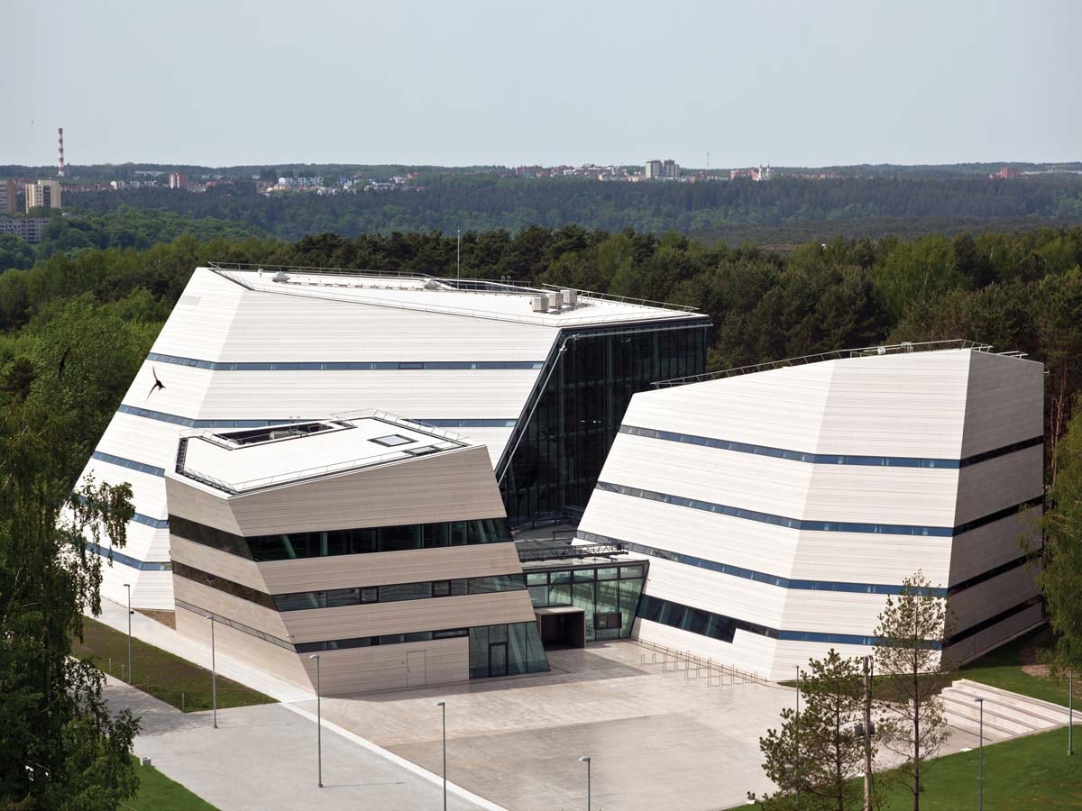
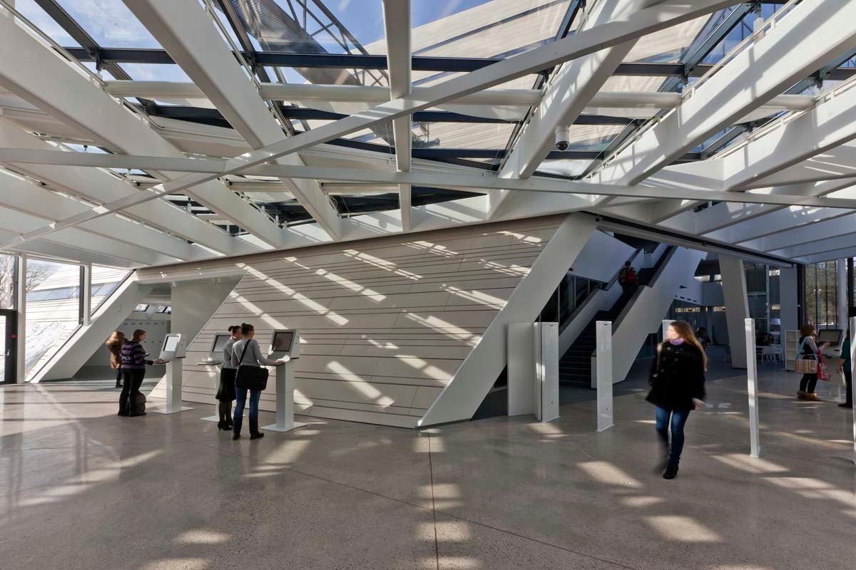
Vilnius University Library, by R. Paleko Arch Studija, Vilnius, Lithuania
Clarity of construction informed the color choice for this university library, which uses white as a background to accentuate exterior joints. As all the construction joints have been oriented horizontally, they appear in stark relief against the white surface, announcing the building’s assembly methods to any passersby taking the time to notice. On the interior, white is further employed as base surface in order to foreground the two items most commonly found inside: Books and people.
© ASTOC Architects and Planners, Cologne
© ASTOC Architects and Planners, Cologne
Extension of Hamborn Abbey by ASTOC Architects and Planners, Duisburg, Germany
Cleanliness of form and notions of purity were drivers in the coloring of this complex of religious buildings. A bright white façade, in addition to a crisp, sharp-cornered form, ensures the complex will stand out from adjacent brick buildings. In addition, both visitors and staff alike are sure to comprehend the associations of purity and truth between the chosen color and the religious practices housed here.
© dEMM® arquitectura
© dEMM® arquitectura
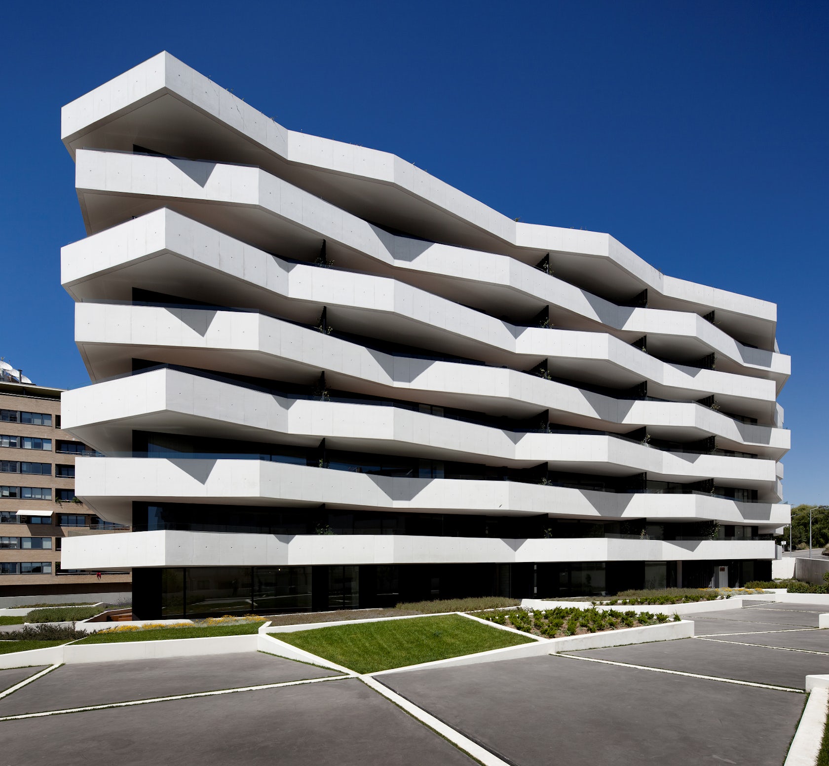
Living Fozby dEMM arquitectura, Porto, Portugal
A sharpness of formal contrast is brought to the fore with the crisp white coloring of this apartment building’s exterior balconies. Alternating in a jagged formwork to provide either shade from the sun or exposure to it, their acutely angled edges are seen clearly against other building elements when rendered in white. This color choice is reinforced at the ground level, where complementing planters are outlined in a matching hue.
Architects: Want to have your project featured? Showcase your work by uploading projects to Architizer and sign up for our inspirational newsletters.
Enjoy this article? Check out the others in our series on “The Psychology of Color”:
7 Uplifting Uses of Yellow in Architecture


