Architects: Showcase your next project through Architizer and sign up for our inspirational newsletter
When German artist Peter Dahmen was a design student, he couldn’t figure out a safe way to transport his 3D projects to class on his daily train commute. Instead of hauling oversized and incredibly intricate structures across town, he decided to create pop-up paper sculptures that could easily fold into a flat portfolio.
Transition to years later, and Dahmen, now a professional paper engineer, designs these projects for clients around the world.
Many of his amazing pop-ups resemble famous architectural landmarks, some built and some in-design, each constructed using gleaming white sheets of paper and some seriously accurate cutting and folding techniques.

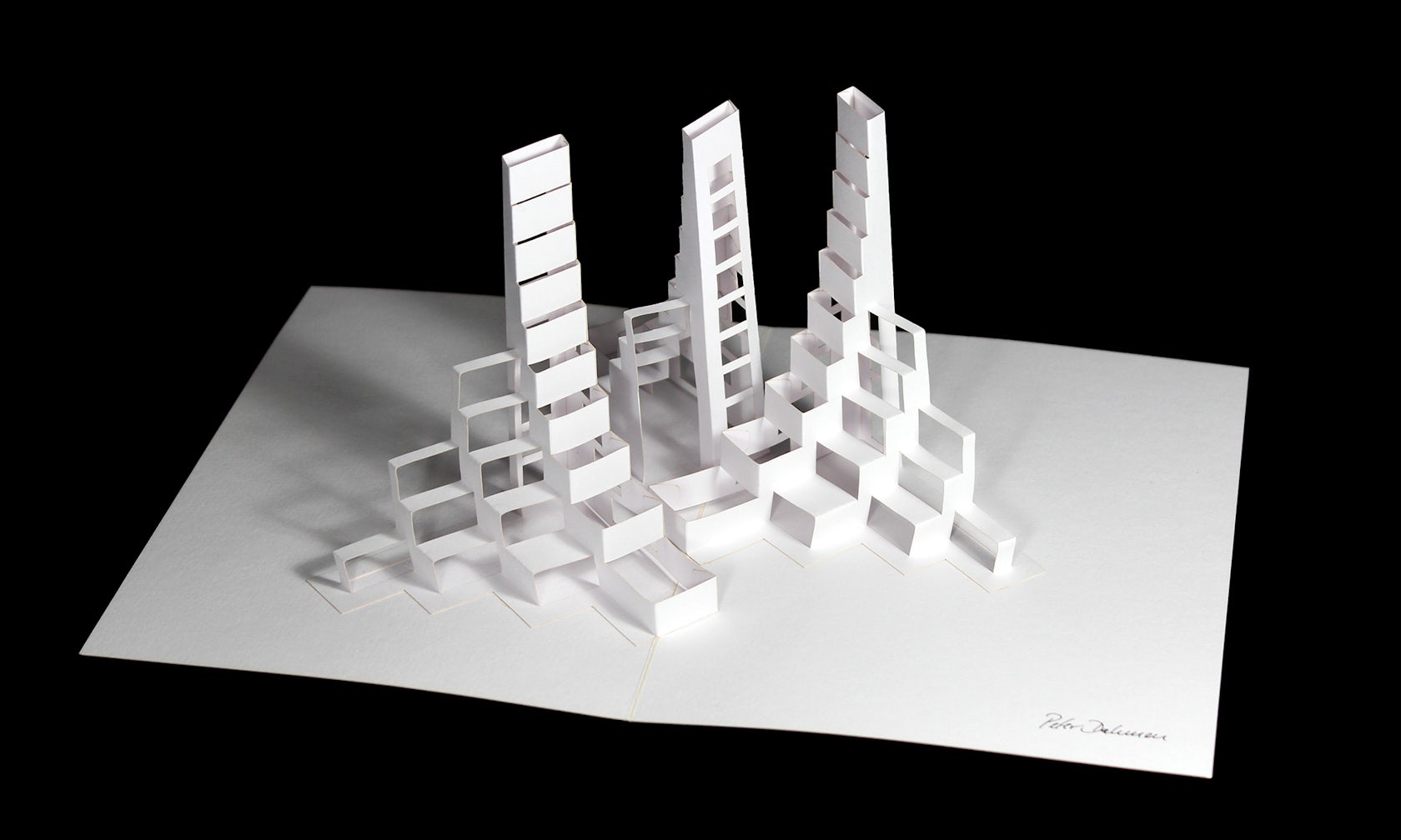
This pop-up card for Volksbank Vorarlberg resembles Foster + Partners’s latest proposal for a cascading tower complex in Mecca. The stepped formation of the building is mimicked in Dahmen’s tri-tower structure.

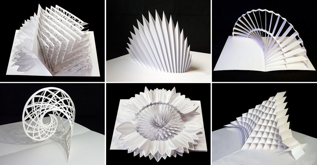
The likeness between this spiky structure and Santiago Calatrava’s new Oculus at the World Trade Center Transportation Hub is uncanny. Some may argue it looks like the back of a stegosaurus; Calatrava posits that it represents a beautiful bird taking flight.

This graceful globe echoes R. Buckminster Fuller’s famed geodesic dome in Montreal, Canada — or perhaps its proposed sibling, Dror’s vine-covered biosphere, designed to celebrate the 50th anniversary of Expo ’67.

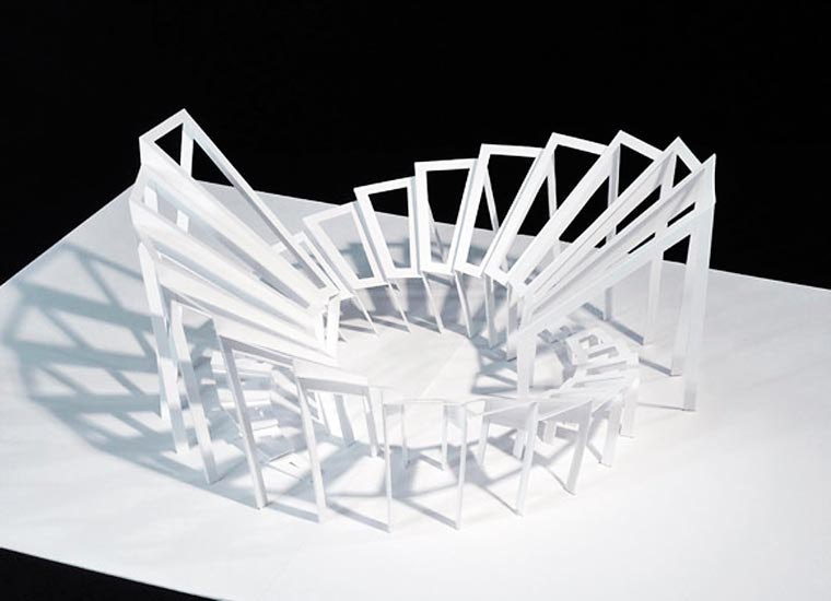
This staggered structure contains openings seemingly set back into the design. These “windows” are reminiscent of BIG’s stacked apartments in 8 House or VIA 57 West. It could even be a mock-up detail for the firm’s 2016 Serpentine Pavilion, the “Unzipped Wall.”
Check out this giant pop-up card Dahmen did for real estate company Rothschild 22 — intentionally creating a real building. His concept was later translated into a smaller brochure for marketing.
From pop-up bridges to wedding invitations to birds, butterflies and snowflakes, Dahmen’s diverse portfolio of pop-up sculptures features great concepts for architects to get inspiration from. Some of his more abstract designs, if they really aren’t meant to look like architecture, should be turned into physical pieces of public art or stand-alone structures. They’re just that impressive.


Architects: Showcase your next project through Architizer and sign up for our inspirational newsletter


