Architects: Want to have your project featured? Showcase your work by uploading projects to Architizer and sign up for our inspirational newsletters.
Miami is one of the world’s most diverse cities. Between iconic beaches and rich cultural life, the city’s architecture has come to reflect Miami’s vibrant and dynamic energy. From well-known Art Deco buildings to Mediterranean Revival structures and Tropical Modernist homes, visitors can find a wide range of styles. Today, Miami continues to redefine how landmark architecture is designed and built.
Taking stock of the city’s building language, the following projects showcase design innovation through façades and elevation drawings. As the primary means by which we first experience architecture, their façades play off the history and traditions of place. From the expressive parking garages in the Design District to a high-rise in Coconut Grove, they include projects completed within the last ten years. Through each elevation drawing, we get a glimpse into how buildings open up and create new types of enclosure.
Grove at Grand Bay
By BIG – Bjarke Ingels Group, Miami, FL, United States
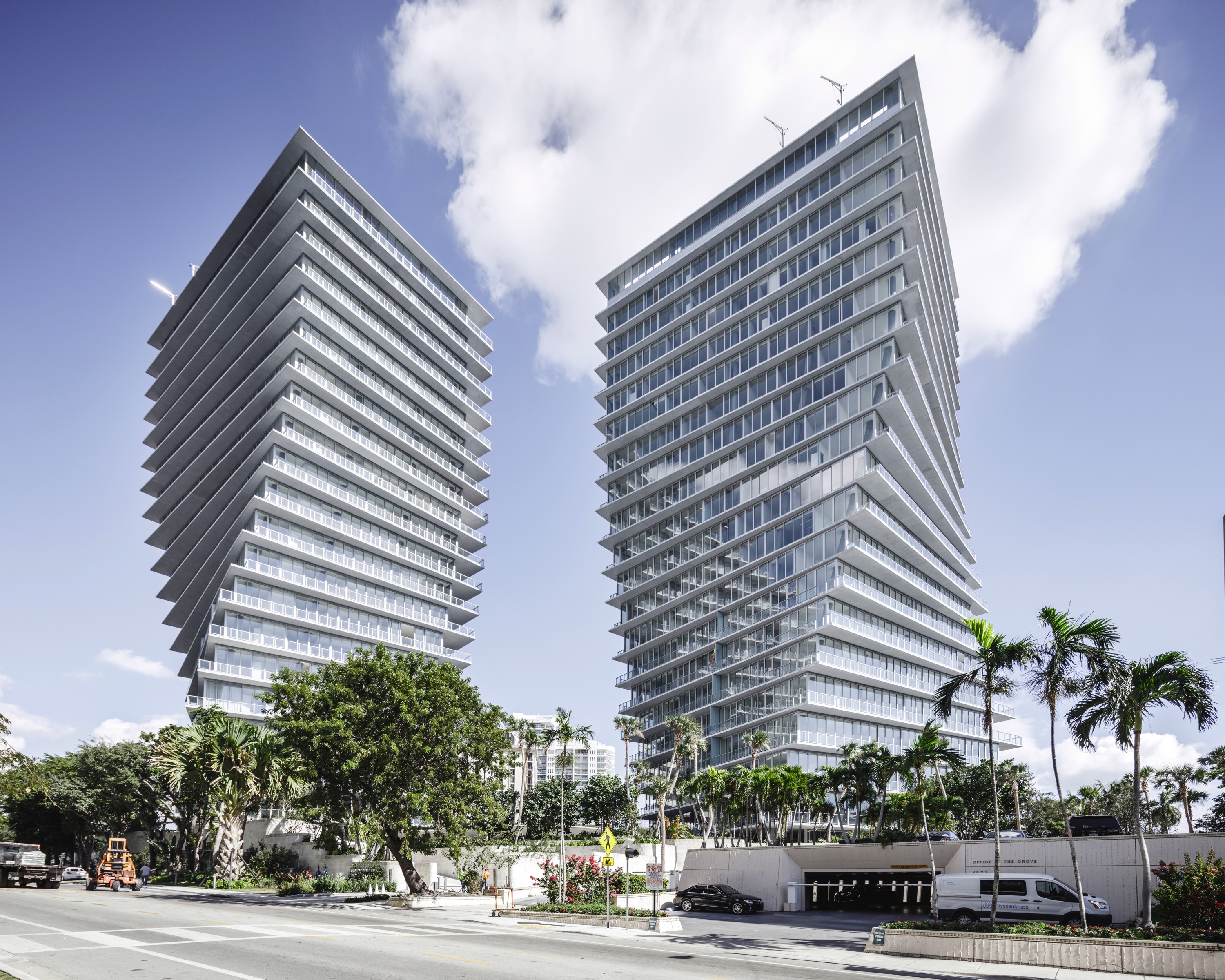
 Bjarke Ingels Group (BIG) solution for this tight, three-acre site south of Miami’s downtown was a pair of “dancing” towers with rotating concrete floor plates. The Grove at Grand Bay includes two 20-story residential buildings that showcase reinforced concrete to create distinctive high-rise forms. Capturing views of Biscayne Bay, the project became the first new residential high-rise development to be completed in Coconut Grove in more than 10 years.
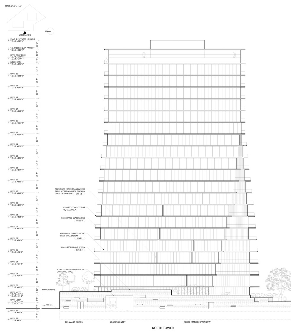
With its innovative structure, the Grove at Grand Bay was designed to be the first pair of all-residential towers to achieve LEED Gold in Miami-Dade County. As seen in the elevation drawings, the towers are an expression of the “dance” as they twist vertically into the sky. The design reinterprets the city’s contemporary vernacular of condominiums that includes brise-soleil-style balconies with floor-to-ceiling windows. The result are two towers that take off from the ground to capture panoramic views from the ocean to the Miami skyline.
University of Miami School of Architecture Thomas P. Murphy Design Studio Building
By Arquitectonica, Miami, FL, United States

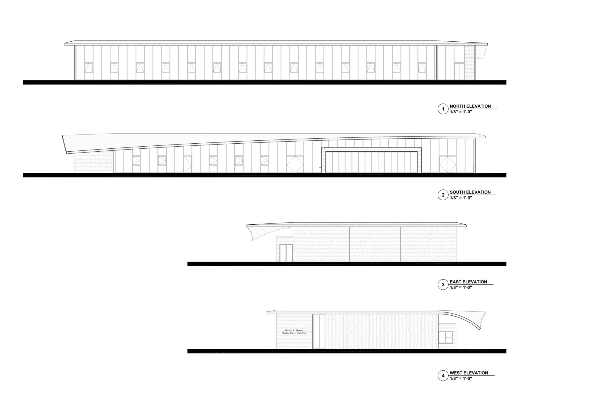
 As a seemingly simple expression in concrete, this new studio building for the University of Miami was made to serve as a teaching tool by illustrating some of the basic tenets of modern architecture. As the team describes, the southern wall peels away to address the portico of the existing auditorium and gallery. As seen in the elevation drawings, the warping corner of the roof folds over the southernmost tip of the building, shading the interior space from the strongest sunlight. As a result, the building has tall and flexible spaces, both indoors and outdoors.
From a technical point of view, narrow steel pipe columns support the 18-foot high ceilings. The aim was to create a sense of openness and allow natural light to permeate the building. Inside, the studio space is based on a twenty-five-foot square — a module of four student desks — repeated to total 13,000 square feet. Welcoming visitors through the structure, the main entrance spills into an informal lobby and continues as a corridor that runs through the studios.
City View Garage, Miami Design District
By IwamotoScott Architecture, Miami, FL, United States


 As one of a series of iconic garages in the Design District, this particular project was created by IwamotoScott. They worked with New York-based architects Leong Leong and Southern California based artist John Baldessari to design a portion of the City View Garage. Sited along the edge of the Design District adjacent to I195, the building’s façade has a strong presence from the freeway, and thus acts as a kind of billboard for the Design District. The beautiful pattern of this billboard is clearly seen in elevation.
The main body of the building is a parking structure above a level of retail storefront and includes a small six story office block. IwamotoScott’s portion of the façade wraps around the main corner of the garage and encompasses an elevator lobby, exterior stair and the office block. The modulated metal screen is made of folded aluminum modules of varying apertures to allow for natural ventilation. A gradient coloration reinforces the subtle gradation of five aperture sizes across the metal screen.
Wynwood Arcade
By DFA, Miami, FL, United States


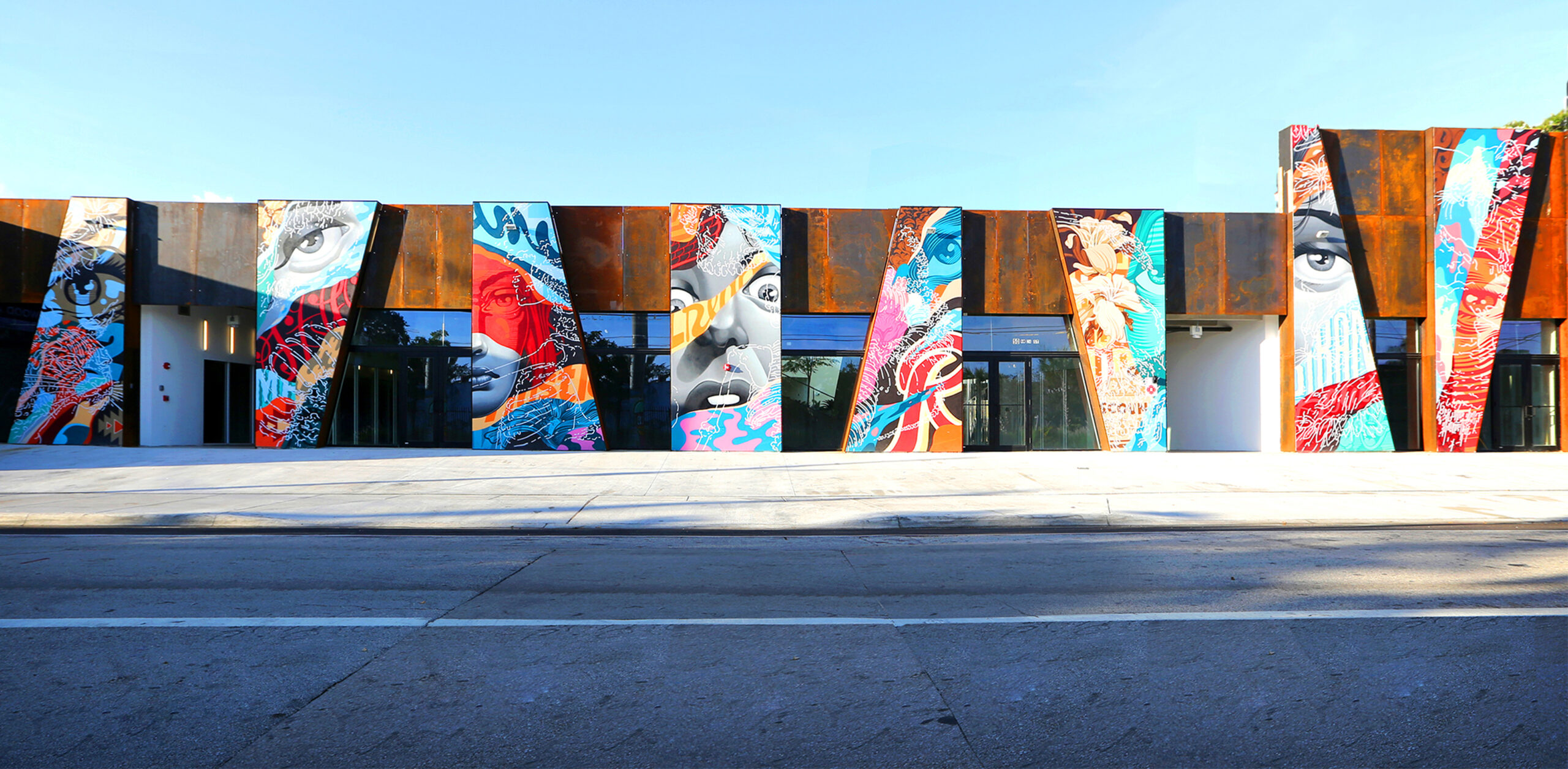
 Reconsidering the façade and its potential, the Wynwood Arcade project is located in the Wynwood neighborhood of Miami. DFA was contracted to renovate an existing one story warehouse space within a three lot parcel along NW 23rd Street. DFA transformed three side-by-side warehouses into a single destination for dining and shopping. Studying existing site-circulation, they determined that the long blocks of Wynwood could be better connected using diagonal lines cutting through the site.
The design team proposed a series of shaded, retail-activated streets organized by these diagonal lines. At the Wynwood Arcades, rather than creating a neutral canvas for street art, DFA created an architecture “in dialogue with art.” The artist Tristan Eaton’s piece responded to DFA’s diagonal façades with his own graphic intervention. The result are façades that brings art and architecture together.
Miami Sweet Bird South
By Reiulf Ramstad Arkitekter, Miami, FL, United States


 As the first project for Reiulf Ramstad Arkitekter in the United States, this retail village was made with a playful, characteristic façade. As the design team notes, eight duplex stores compose the building and share a common architectural language. By cantilevering the upper floor, people are invited to stop and admire the storefronts. Although each store has its own identity, the complex communicates one unique atmosphere to the passer-by.
The hope for the project was that the uncommon form raises curiosity. This irregular modulation and repetition is seen in the elevation drawings. From a material perspective, the wood tectonic refers to a craft spirit that is reflected in the exclusivity of its tenants. The team’s vision for Miami South Bird was to inspire a luxury destination that also rethought the everyday experience along the street. The iconic structure explores the relationship between consumer and culture, ideas and built architecture.
City View Garage
By LEONG LEONG, Miami, FL, United States


 As the other half of the prominent City View Garage, this façade was also an exploration into the potential of architectural elevations. Close to the Design District neighborhood and with its adjacency to the I-195 freeway, the design was made to establish the building as a prominent landmark. From the freeway, the western façade appears as a shimmering mirage. At street level, folded fins generate textures that echo the forms of surrounding palms.
For the façade design, the surface is composed of curvilinear shapes, punched and bent out of gold-colored, titanium-coated stainless steel. From a distance, they produce a texture that mimics the shimmering patterns of light on the surface of water. The variegated pattern absorbs the qualities of the environment and disrupts the legibility of the form. From inside the garage, the wave-like shapes of the openings create a patterned view of the city.
Miami Museum Garage
By K/R, Clavel Arquitectos, Nicolas Buffe, WORKac, and J.MAYER.H, Miami, FL, United States

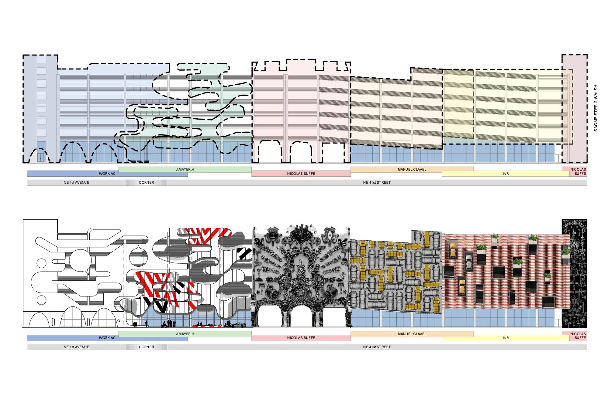
 As a truly landmark structure, this garage façade in the Miami Design District was created with WORKac, J. Mayer H., Clavel Arquitectos, Nicolas Buffe, and architectural firm K/R. The selected architects created images (in this case façades) with no knowledge of what the others had created. The result is a composite image whose components don’t necessarily integrate but come together in surprising ways.
For the garage’s shorter eastern façade, the New York firm WORKac designed Ant Farm, a very visual display of human activity that celebrates, social interaction, sustainability, art, music, and the landscape.J.MAYER.H.’S façade – titled XOX (Hugs and Kisses) – appears as gigantic interlocking puzzle pieces. Buffe’s façade design reflects his passion for video games, Japanese animation, and Rococo architecture, while Spanish firm Clavel Arquitectos’s Urban Jam draws from the rebirth of urban life in the Miami Design District. Finally, the façade by K/R was inspired by Miami’s automotive landscape; particularly it’s ubiquitous orange and white-striped traffic barriers.
Architects: Want to have your project featured? Showcase your work by uploading projects to Architizer and sign up for our inspirational newsletters.
 City View Garage, Miami Design District
  Grove at Grand Bay
  MIAMI MUSEUM GARAGE
  Miami Sweet Bird South
  University of Miami School of Architecture Thomas P. Murphy Design Studio Building
  Wynwood Arcade