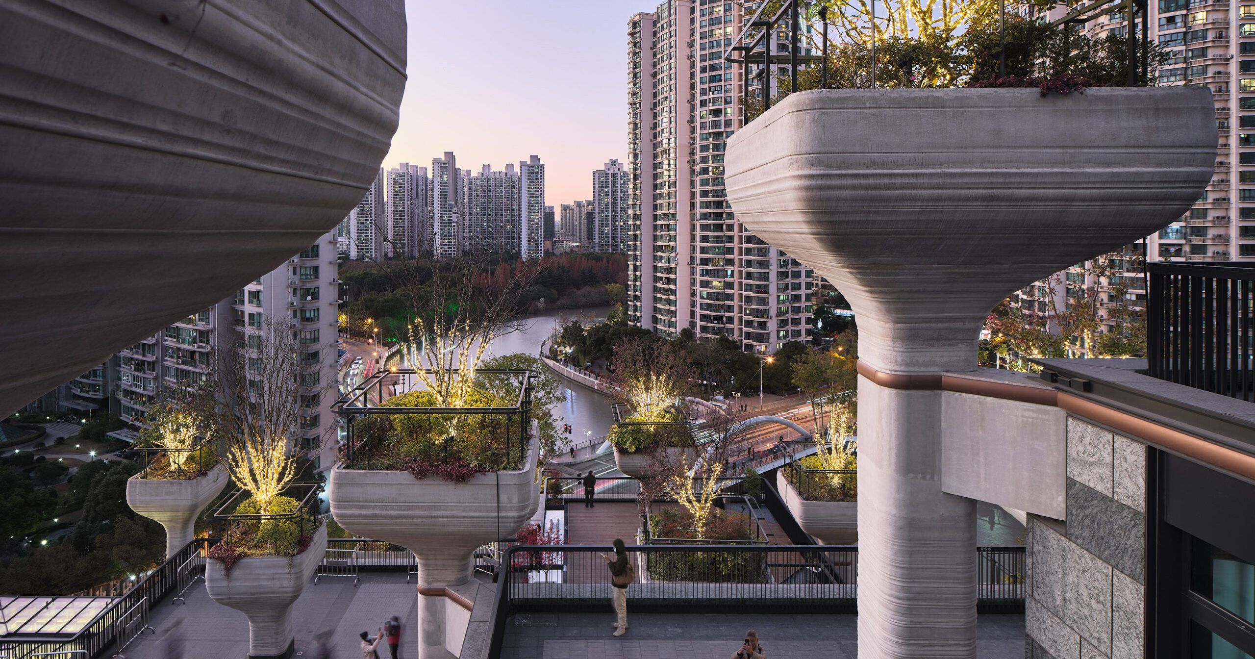
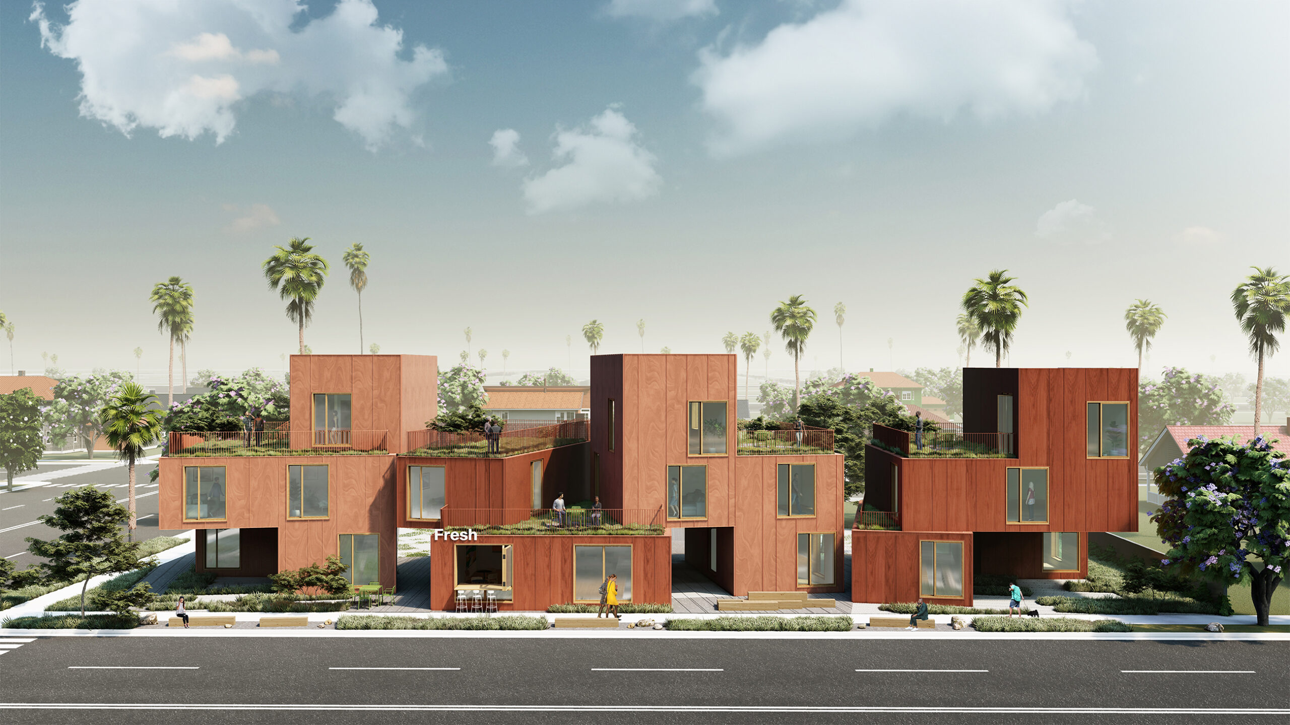
Architects: Want to have your project featured? Showcase your work by uploading projects to Architizer and sign up for our inspirational newsletters.
Architecture inspires us to look up. In our day-to-day, we often only see what’s right in front of us, following the path ahead. When we think about the many components and elements of architecture, canopies are unique in that they provide functional opportunities and the chance to integrate art and design. Canopies have been made throughout history and around the world to better control daylight and solar heat gain. They create a sense of wonder, inviting us to look up.
A canopy is an overhead roof structure usually made with a fabric or metal covering to provide shade and shelter. Beyond mitigating weather conditions, it’s also an opportunity to create moments of pause and reflection. They are elements that invite exploration and discovery as we look up to the structures above us. The following collection showcases ten awe-inspiring canopy designs through section drawings. While they include a range of sizes and materials, the projects are all made with creative structural systems that draw our gaze up to the sky.
Kendeda Building
By The Miller Hull Partnership and Lord Aeck Sargent, Atlanta, GA, United States

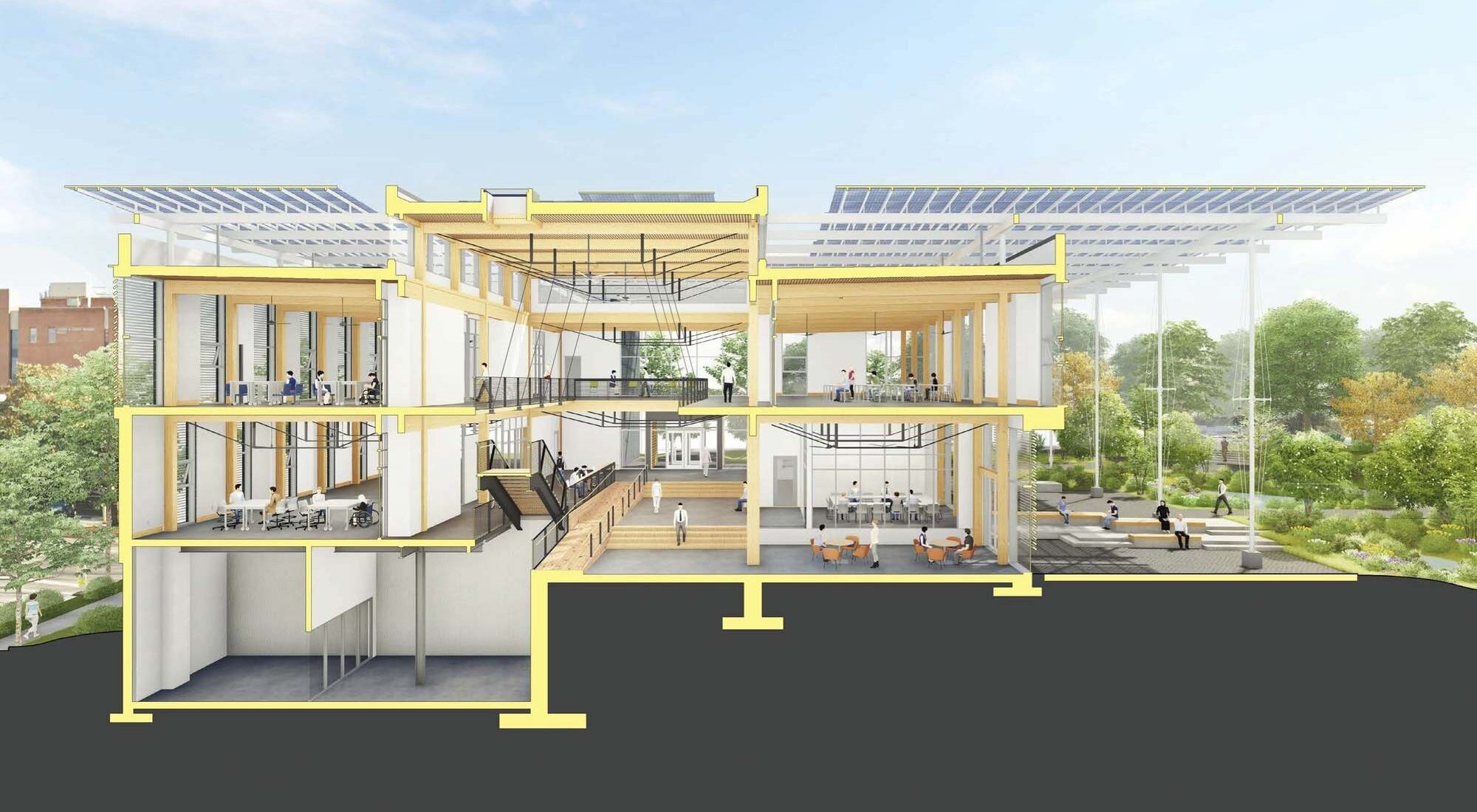
 Miller Hull’s Kendeda Building for Innovative Sustainable Design at Georgia Tech is located in the heart of Atlanta. It was created to foster environmental education, research, and a public forum for community outreach. Designed with Lord Aeck Sargent (LAS), the Kendeda Building achieved full Living Building Certification in 2021 after proving its net positive energy and water performance during its year-long occupancy period. As the first of its kind in the Southeast United States, its design and construction set a new standard for sustainability.
The design of The Kendeda Building is inspired by the vernacular southern porch. The team explains that the project reimagines this regionally ubiquitous architectural device for the civic scale of the campus. The Regenerative Porch performs the traditional tasks of creating a cool microclimate around the building and blurring interior and exterior conditions. The PV canopy generates more than 100% of the building’s energy demand and captures enough rainwater to meet 100% of the water used in the building.
Mission Possible – The ‘UN’ Opportunity Pavilion
By AGi architects, Dubai, United Arab Emirates
Jury Winner, 10th Annual A+Awards, Pavilions
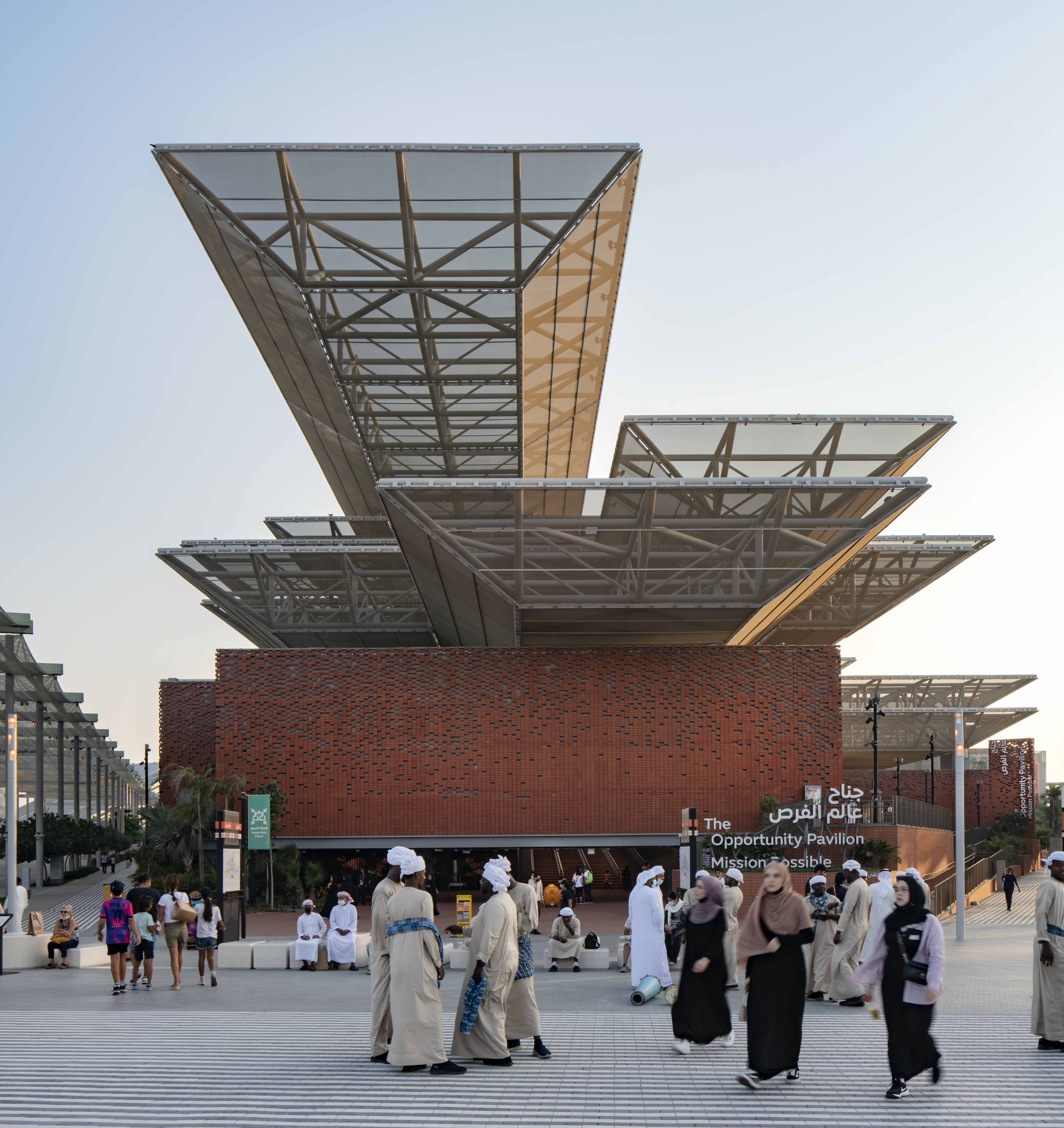
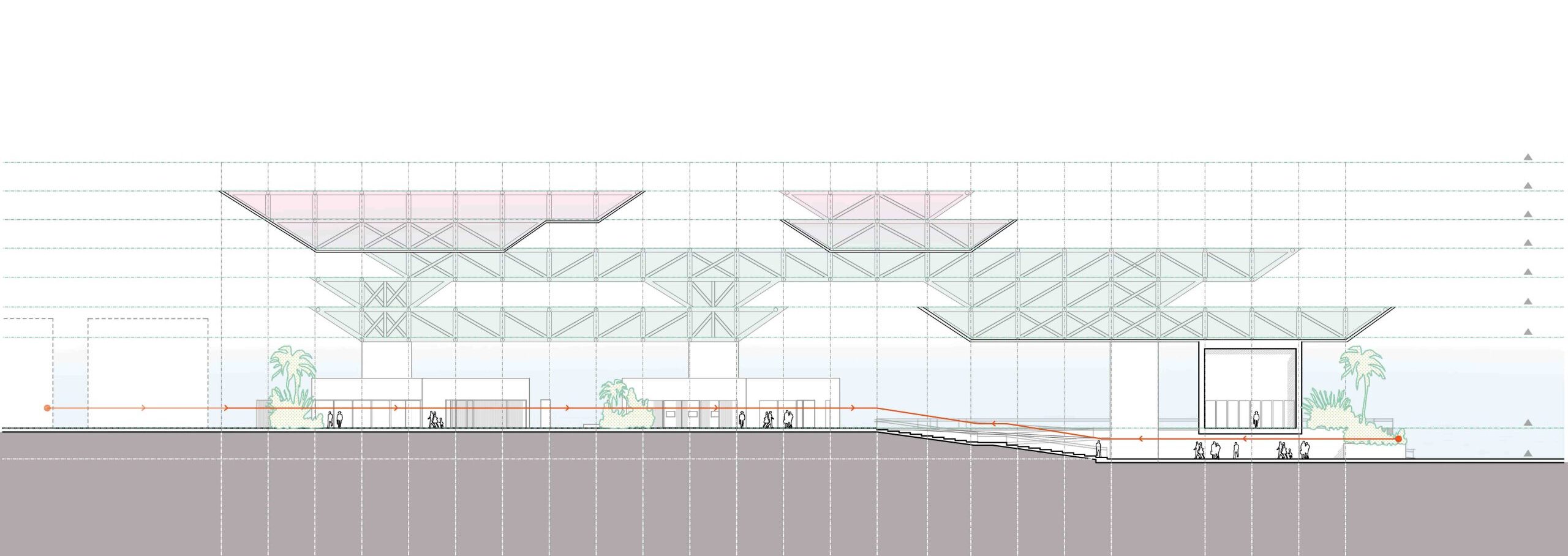
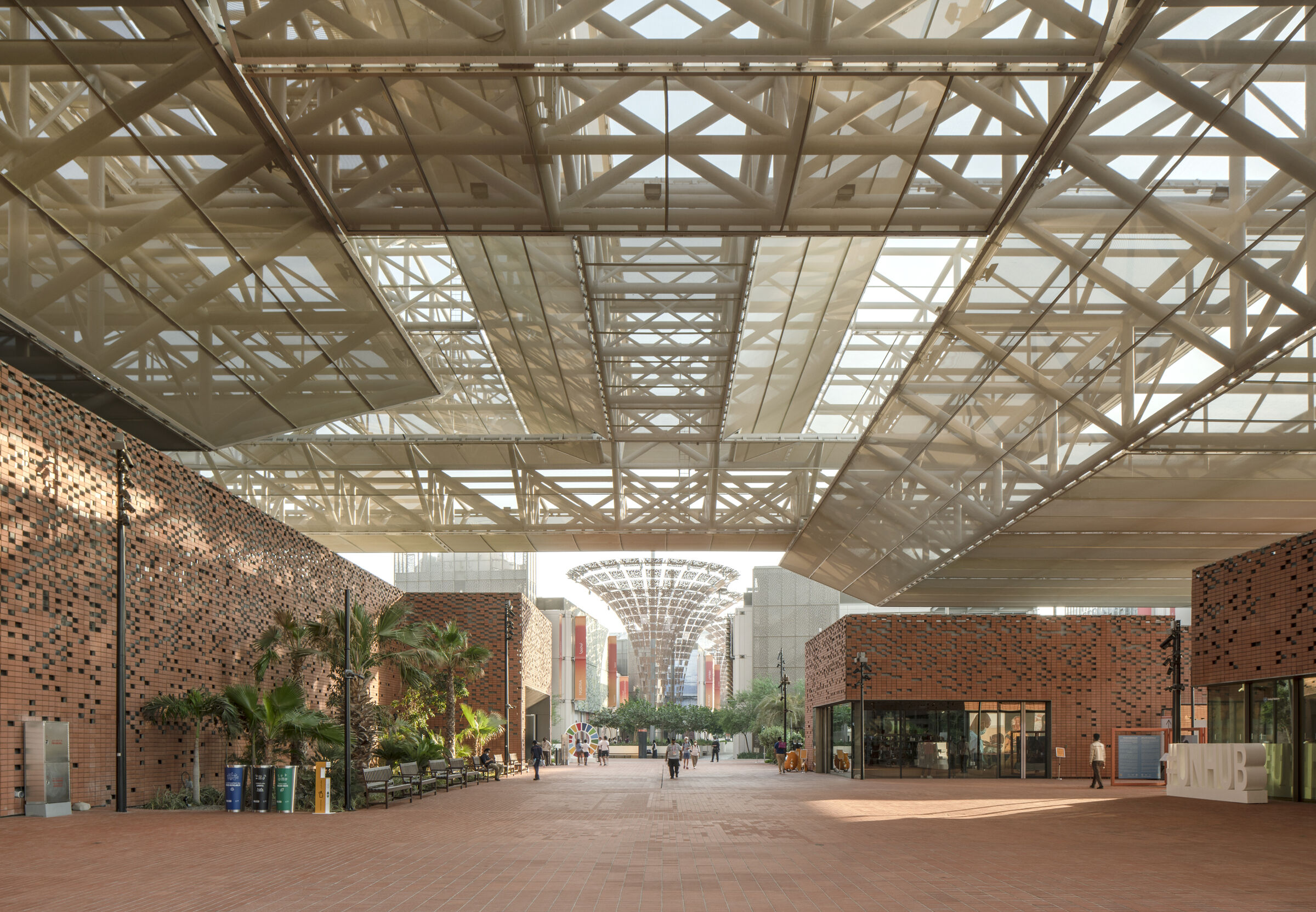 This pavilion was made as a public space that allows every visitors to connect across age, language and culture. It was conceived as a large plaza, providing continuity to the Opportunity District in which it is situated. The design builds on the urban history and concept of a plaza that is universal and lends itself to multiple cultures. Floating 32 meters above the ground, the pavilion’s canopy is ethereal, composed of six textile layers of fabric on metal structures.
The canopy protects the plaza from direct sun exposure, and the colorful elements overlap, creating layers, playing with transparency, light, shadows and color. A terracotta ‘carpet’ covers the ground and the pavilion’s facades – the first time this type of ceramic material has been used in the UAE in this way. This creates a backdrop that places emphasis on the pavilion’s public spaces and how humans interact within it.
SNF Energy Canopy
By Renzo Piano Building Workshop, Athens, Greece


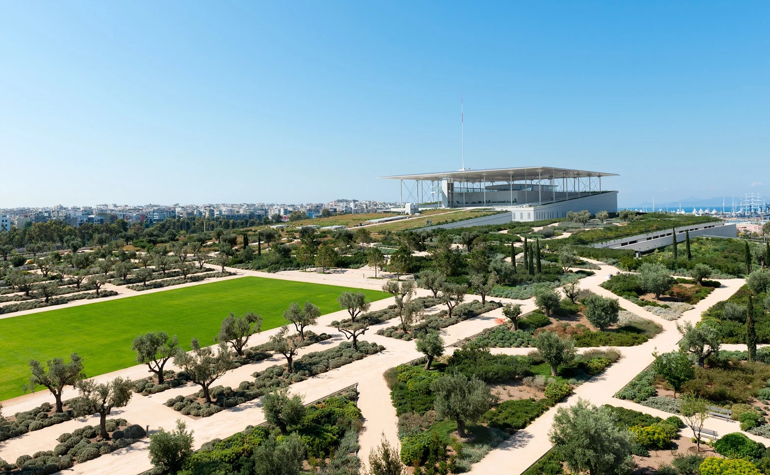 For the Stavros Niarchos Foundation Cultural Center, Renzo Piano Building Workshop created a landmark overlooking the sea. It culminates in the Energy Canopy, the last important milestone of the construction phase and one of the most innovative elements of the SNFCC. The SNFCC’s Energy Canopy is supported by 30 columns and composed of 717 individual, precast pieces over the Greek National Opera building. As the team notes, despite the fact that it weighs 4,700 tons, with its highest point at 150 feet (46 meters), the Energy Canopy creates the optical illusion of a very light structure.
Apart from its technical and aesthetic characteristics, the Canopy also plays a role in the optimal operation of the SNFCC, and its environmental sustainability. The Energy Canopy was been constructed in such a way that it was made to produce 2GWh of electrical energy per year, thus contributing to fulfilling the energy requirements of the Greek National Opera (GNO) and National Library of Greece (NGL) buildings, while also meeting the objective of minimizing CO2 emissions.
Cineteca Nacional Siglo XXI
By Rojkind Arquitectos, Mexico City, Mexico

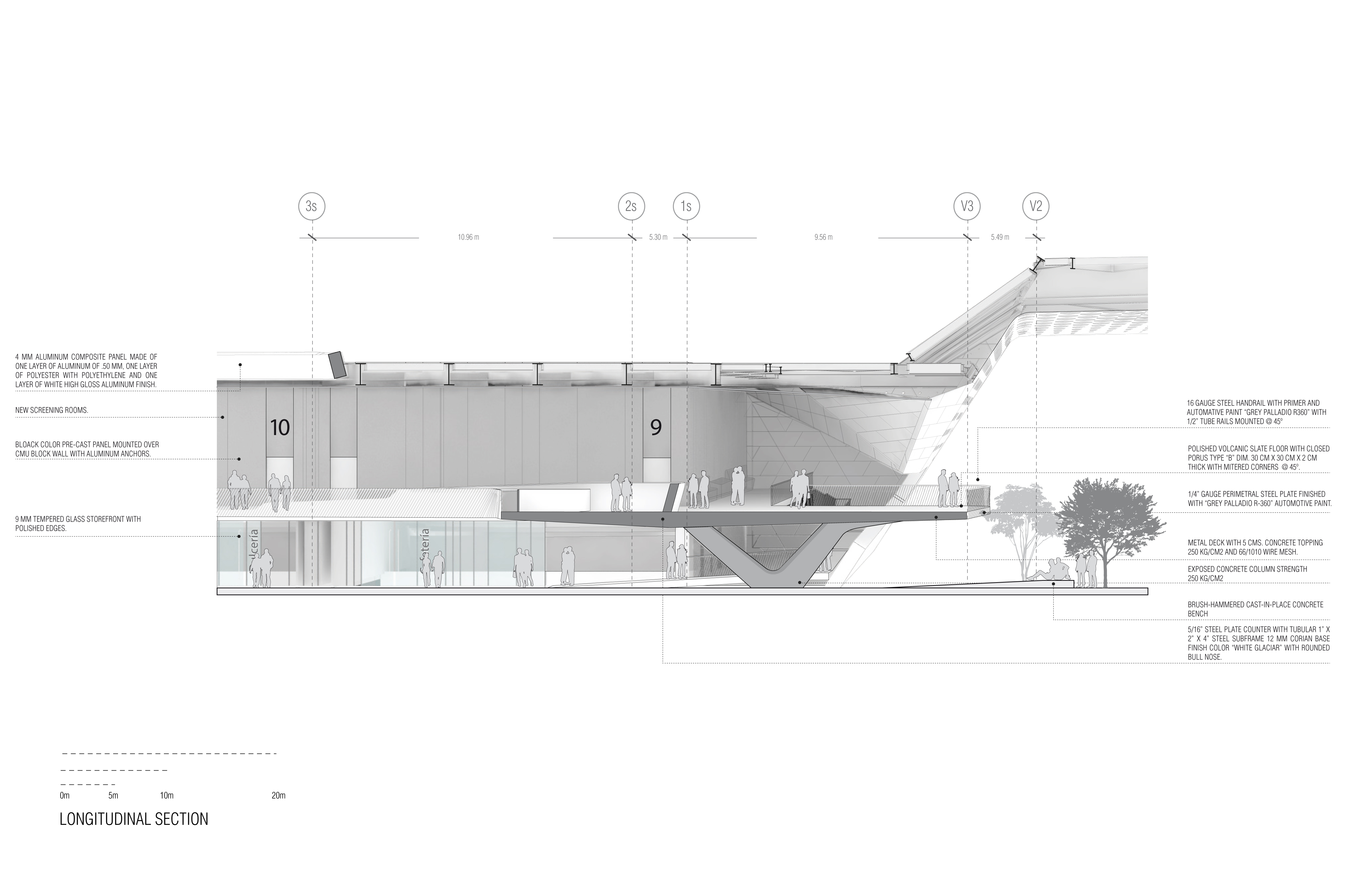
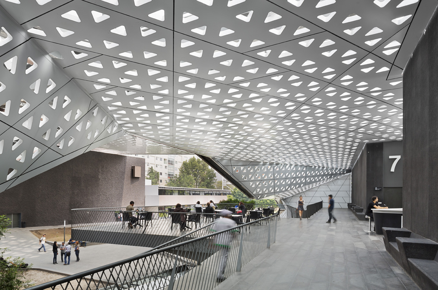 As an iconic site in the southern quadrant of Mexico City, the National Film Archive and Film Institute of Mexico is home to the most important film heritage of Latin America. Its campus occupied an underutilized site of considerable dimensions. Facing total renewal, Cineteca’s original project brief included the expansion and renovation of the existing complex including additional vault space and four more screening rooms.
The design team first considered the relocation of surface parking, which occupied 40% of the site, to a new structure and the reactivation of the ‘back entrance,’ across the street from the historic town’s cemetery, which had a more pedestrian friendly scale. A new large-scale public plaza sheltered with a hovering canopy now connects the existing complex with the new screening rooms. The sheltered space can accommodate additional program options such as concerts, theater, exhibitions and more.
Auckland Art Gallery
By Archimedia, Auckland, New Zealand
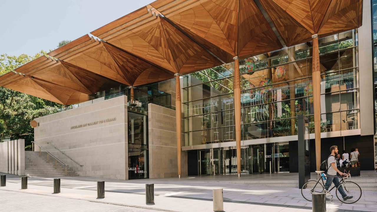
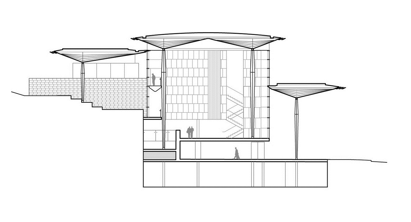
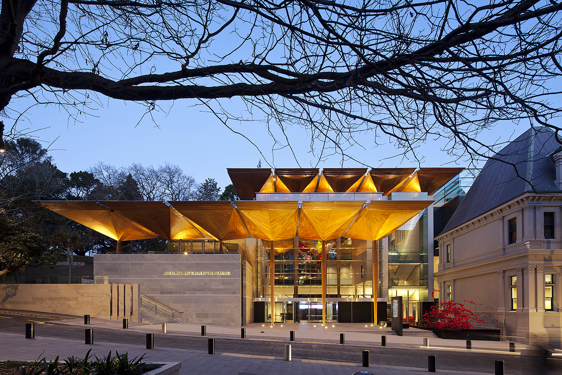 The Auckland Art Gallery by Archimedia was inspired by the organic natural forms of the landscape and important heritage buildings. The new building is characterized by a series of “tree-like” canopies that define and cover the entry forecourt, atrium and gallery areas. These light profiled forms “hover” over the stone walls and terraces creating a memorable image and character closely related to the beautiful overhanging canopy of Pohutukawa Trees. The built canopies are made from natural timber folded into organic geometric forms and supported on slender shafts.
These emblematic forms and canopies give a unique identity and image to the Gallery. While the hovering roof draw on natural forms they are also closely related to the scale, proportions and detail of the architecture of the existing Gallery. A careful study of the relative dimensions, proportions and alignments determined the final form and positioning of the new elements to create a complement with the original and proud turn-of-the century architecture.
Château La Coste Art Gallery
By Renzo Piano Building Workshop, Aix-en-Provence, France
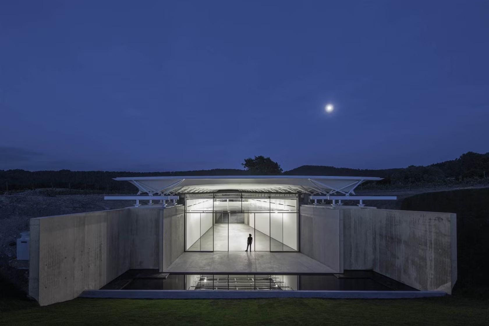

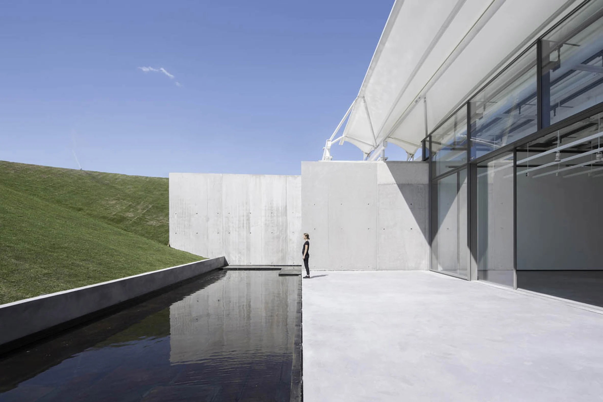 The new building designed by RPBW rises was built among grapevines at Château La Coste. As the design team outlined, the 285 square meters pavilion aimed at both displaying art and preserving wine. Due to the natural topography of the soil, it was decided to carve a 6 meters deep valley in the earth so as to fully incorporate the building into the vineyard. The pure glazed façades and roof contrast with the simple exposed concrete used for both the retaining and the exhibition walls.
The partly buried building highlights the roof canopy covered with a sail fastened to thin metal arches. These arches echo the layout of the grapevines. Inside, sculpture and photography exhibitions are displayed into a 160 sq. meters gallery benefiting from natural light. The remaining surface is dedicated to wine preservation. Thus, the exhibition space is surrounded by wine cellars whose scale is evidenced by the alcoves at the entrance of the gallery.
VELAA, The Sindhorn Village
By Architects 49, Bangkok, Thailand
Popular Choice Winner, 9th Annual A+Awards, Retail
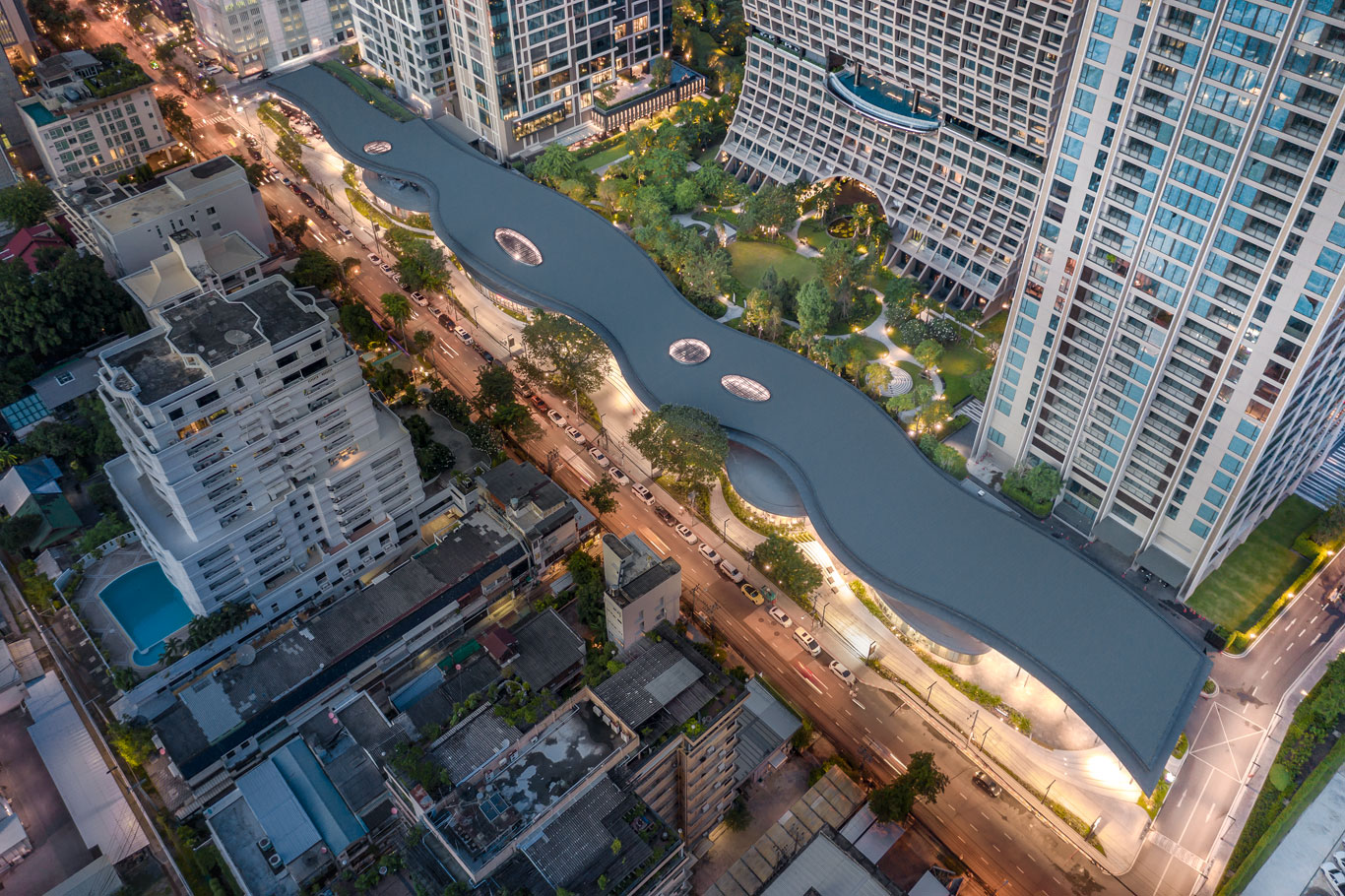

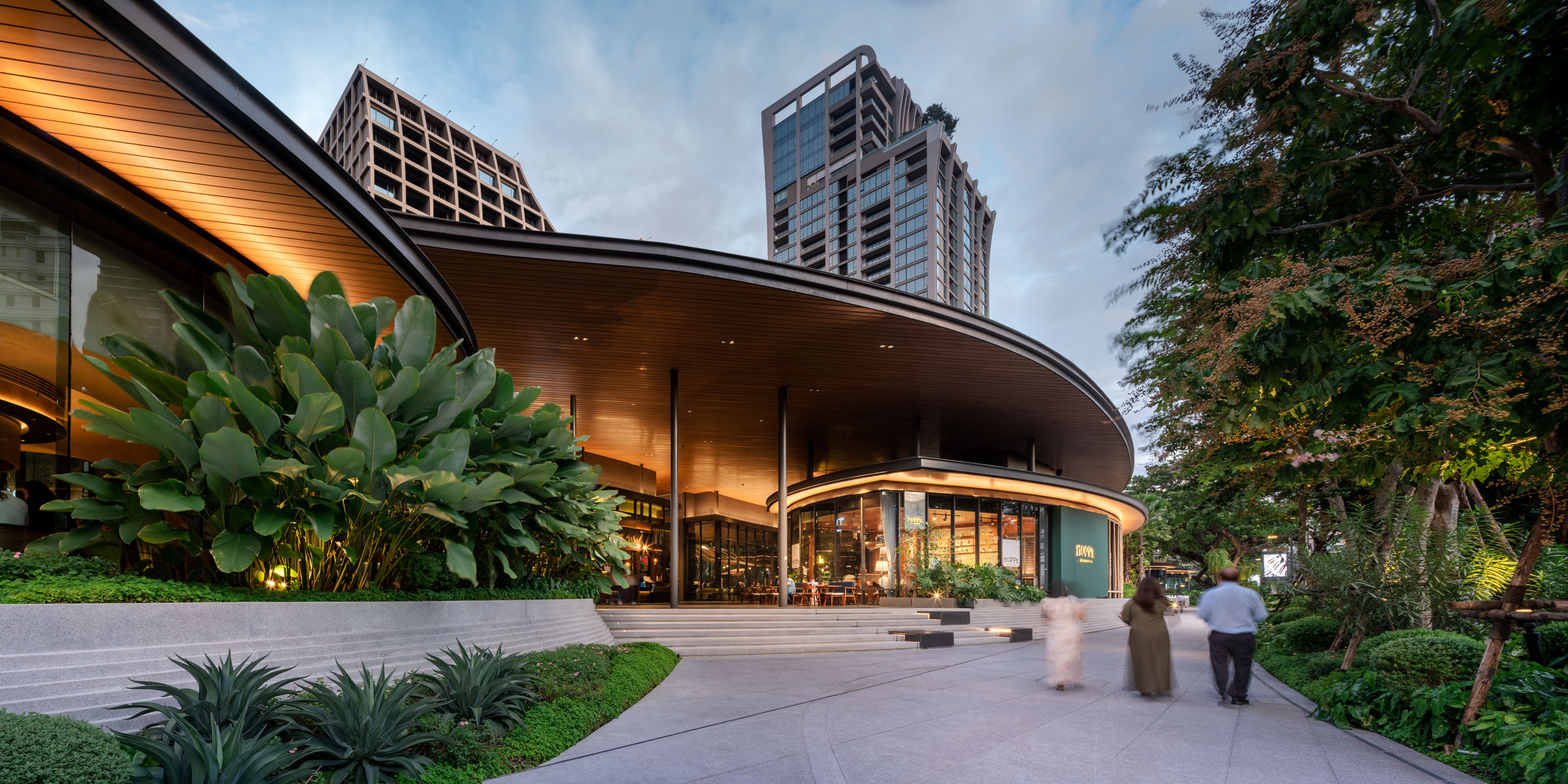 The Sindhorn Village was designed as a luxurious, mixed-use development in central Bangkok. The master plan features a Super Green, a generous green space with a low-density ratio to enhance residents’ living standards. It includes the Sindhorn Residence condominium, Baan Sindhorn serviced apartments, Kimpton Maa-Lai hotel & restaurant, Sindhorn Kempinski hotel & residences, an art museum and the Velaa retail plaza.
Velaa Sindhorn Village is the fruition of A49’s award winning design. It weaves Sindhorn’s central Super Green into the urban fabric. The single-story semi-outdoor retail mall merges with this green space underneath a floating roof canopy. It includes cafes, restaurants, shops, services and a below-ground supermarket. Areas dedicated to community use, or “green courts” are interspersed throughout this complex. The perforated canopy roof over the shopping areas and pedestrian walkways is supported by branches of treelike columns to accentuate the experience of strolling in a park.
Bamboo Canopy and Pavilions
By LLLab., Guilin, China
Jury & Popular Choice Winner, 9th Annual A+Awards, Pavilions
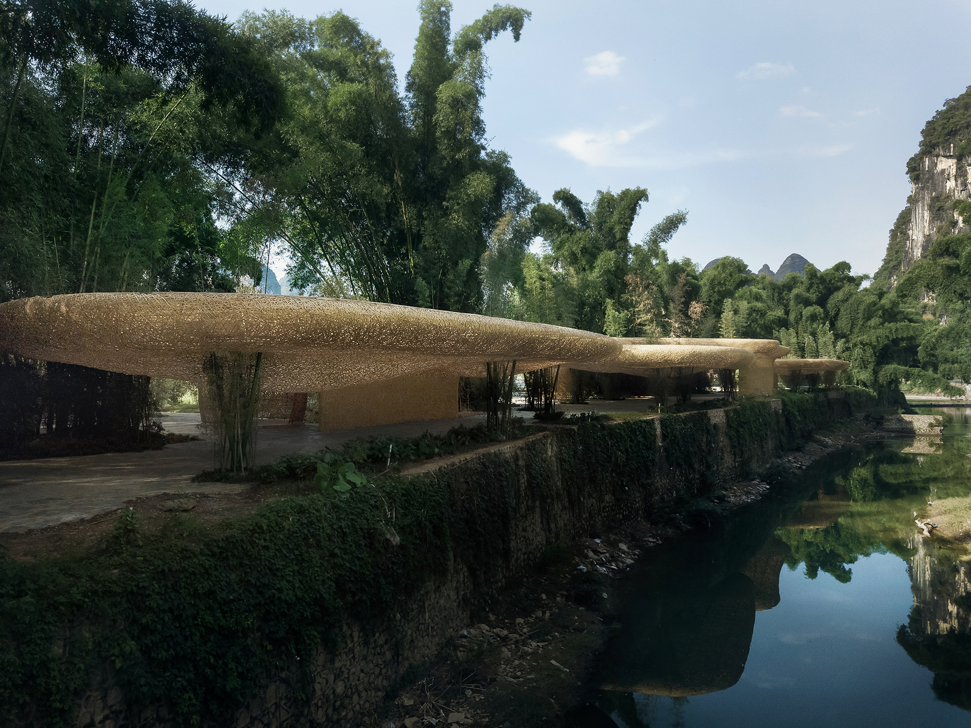

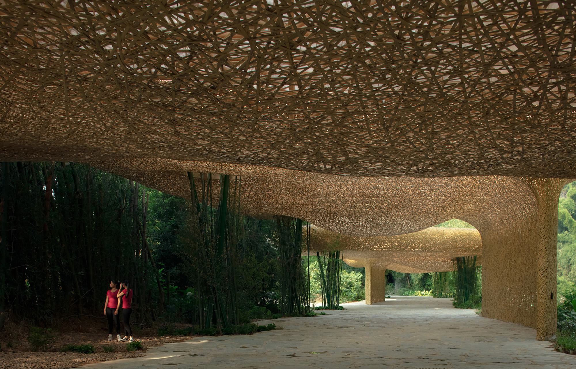 As an iconic canopy design, this stunning project is located in one of the most dramatic landscapes in China. Endless greenery surrounds the site filling space between large towers of rock. It was decided that the natural elements themselves would form the premise for what architecture would inhabit the site, and so the project centers around bamboo. The final project is a celebration of the material and the local context.
The new architecture looked at borrowing the materiality of bamboo, reconfiguring it to form new space. In doing so, this new space means not to contest. Instead it aims to augment, albeit very gently, the surrounding bamboo groves and hills. A continuous stretch of canopy was created amongst clusters of bamboo, providing area to walk sheltered from regular rainfall. In these, the architecture relies on bamboo not only for its composition, but also its constant referral to the parts that constitute the place.
Manetti Shrem Museum of Art
By SO – IL and Bohlin Cywinski Jackson, Davis, CA, United States
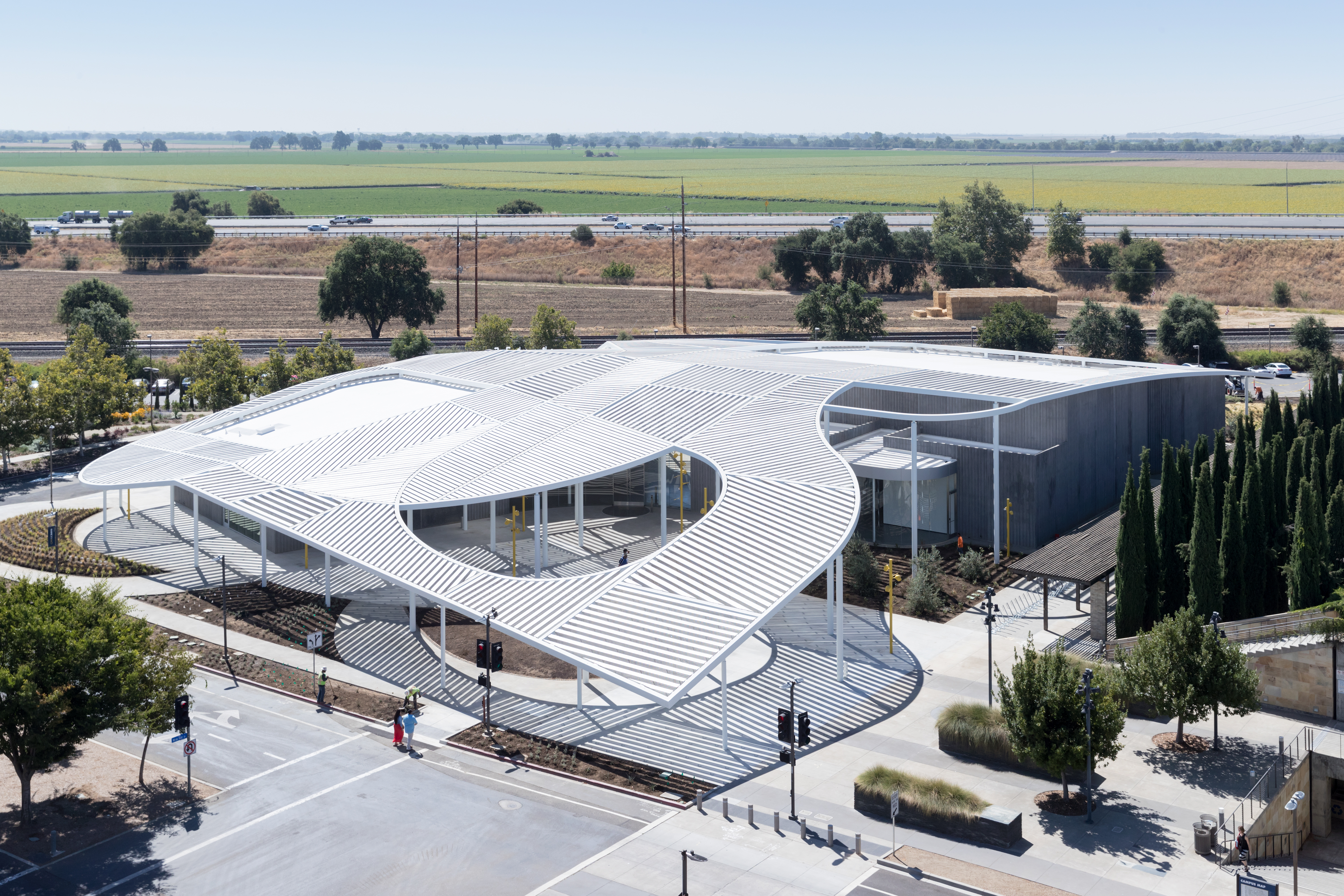

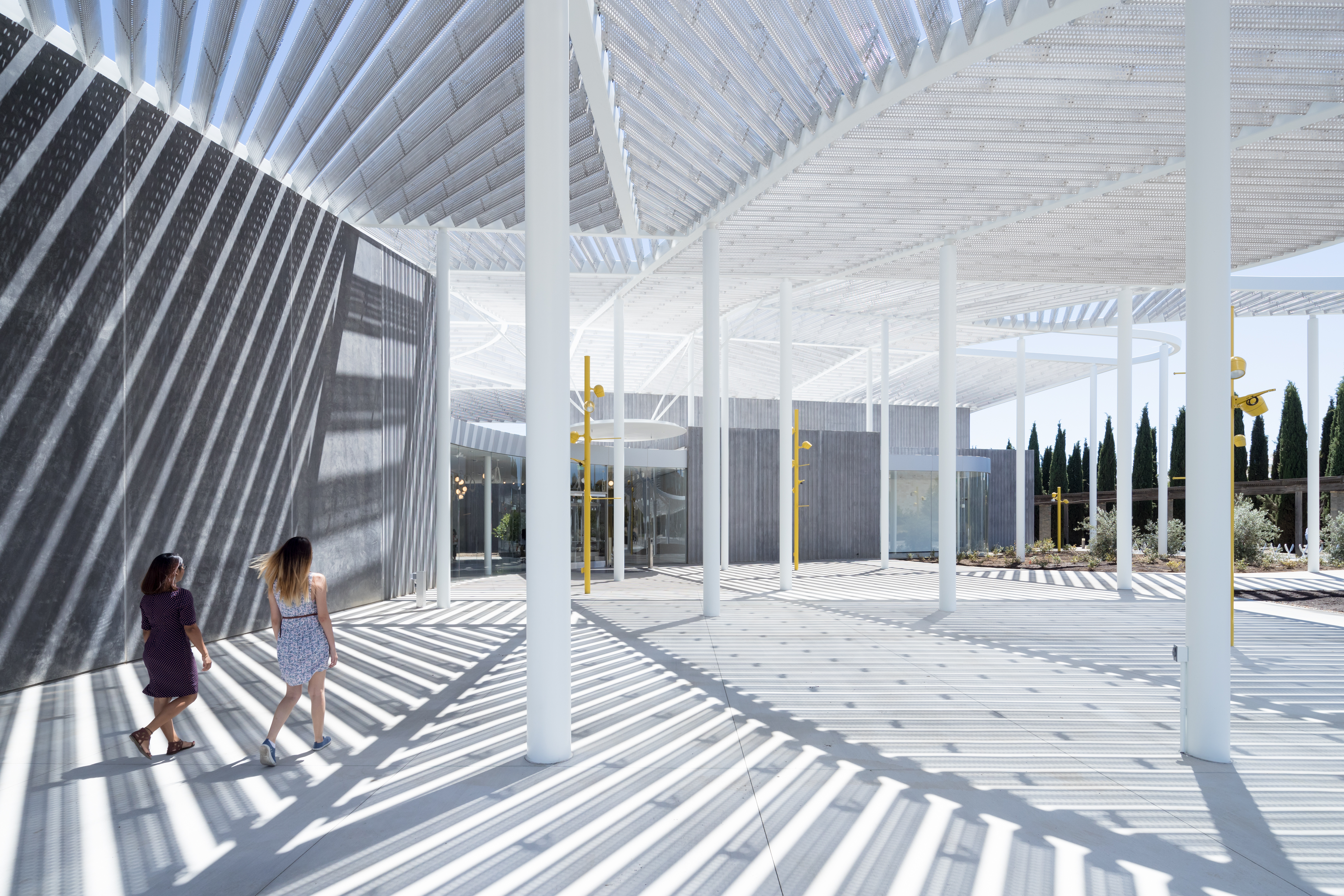 The design of the Manetti Shrem Museum at the University of California, Davis, captures the Central Valley’s spirit of optimism, imagination and invention. It was made around the idea of a museum as a landscape of cultivation. The overarching ‘Grand Canopy’ is a rolling form patchworked with aluminum beams over both site and building. An environmental silhouette, the design provides identity and awareness. Beneath the canopy, the spatial and experiential qualities of diversity and transparency underscore the museum’s democratic stance.
The unique form of the canopy draws visitors from a distance. The team notes that the subtle interplay of light and shadow across the public plaza helps blur the boundary between civic and institutional spheres. Inside, a glass-walled lobby invites interaction as the convergence of viewing, learning and making areas. These interconnected interior and exterior spaces create informal opportunities for experiencing art and learning, supporting the museum’s mission to have all visitors become students.
Louvre Abu Dhabi
By Ateliers Jean Nouvel, Davis, CA, United States


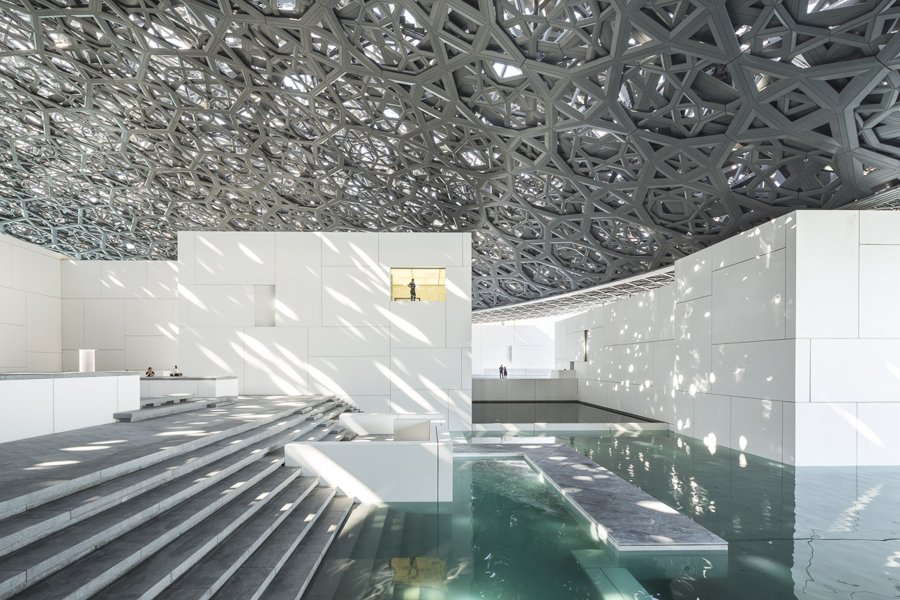 Upon its completion, the Louvre Abu Dhabi quickly became one of the most recognizable art museums in the world. Located in the United Arab Emirates, it was runs under an agreement between the UAE and France, signed in March 2007, that allows it to use the Louvre’s name until 2037, and has been described by the Louvre as “France’s largest cultural project abroad.” It is approximately 260,000 square feet in size, with 86,000 square feet of galleries, making it the largest art museum in the Arabian peninsula.
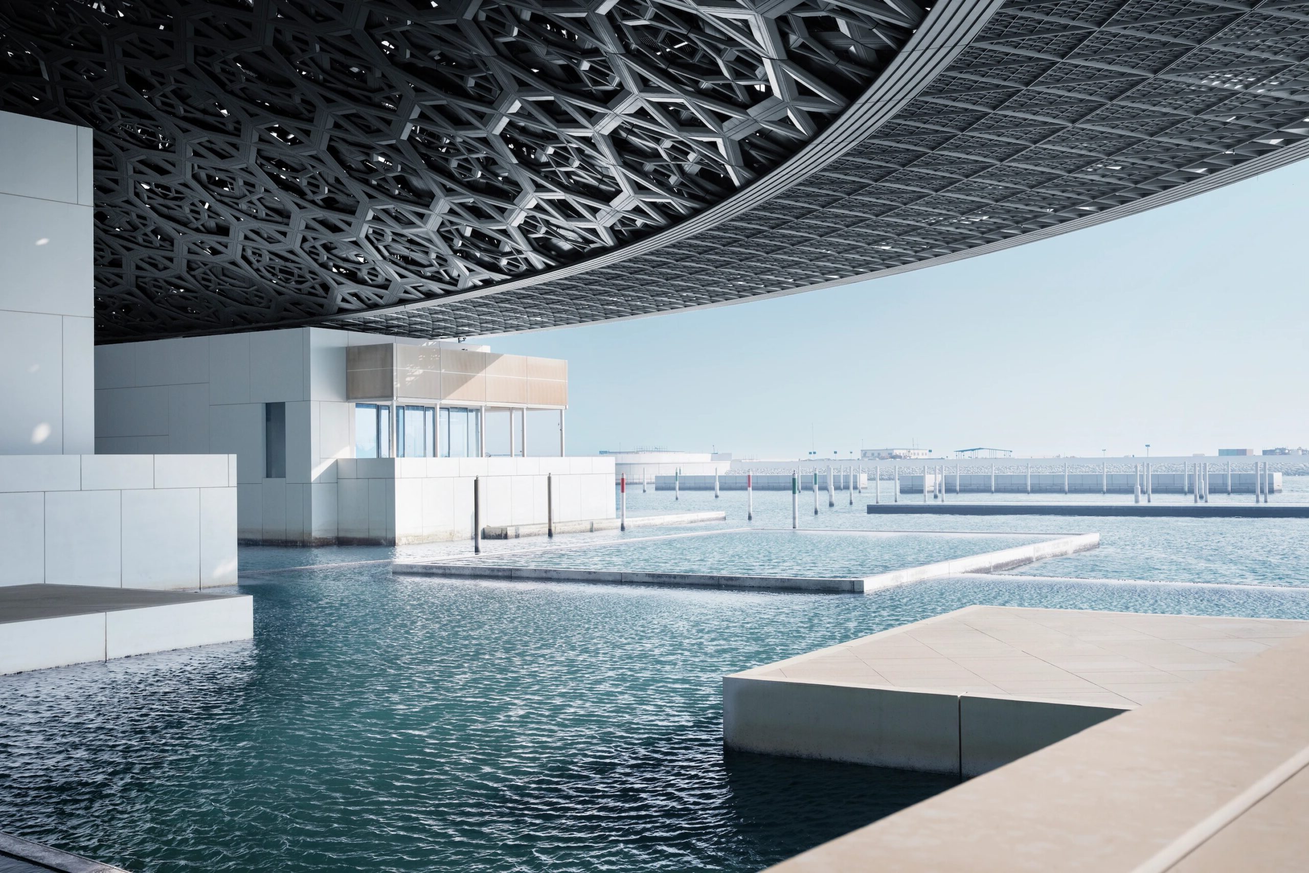
Artworks from around the world are showcased at the museum, with stated intent to bridge the gap between Eastern and Western art. The project’s intricate geometric dome is a continuous canopy that stretches over the entire project. The objective was to create a complex filter of the intensely bright desert sun, to create a dancing interplay between light and shadow around the galleries, plazas and reflecting pools. It’s made of nine layers, with four cladding tiers of specially designed and interconnected stars above, as well as below, a 16-foot-deep (5-meter) steel support structure.
Architects: Want to have your project featured? Showcase your work by uploading projects to Architizer and sign up for our inspirational newsletters.
 Auckland Art Gallery Toi o Tamaki
  Château La Coste Art Gallery
  Cineteca Nacional Siglo XXI
  Jan Shrem and Maria Manetti Shrem Museum of Art
  Louvre Abu Dhabi
  SNF Energy Canopy