Architizer’s newest print publication is available for pre-order! How to Visualize Architecture is an educational guide designed to help you master the craft of architectural storytelling and visual communication. Secure your copy today.
Architectural elevations are a classic mode of communication for architects, the third in a tripartite along with plans and section drawings. These orthographic projections lay out a structure’s external appearance, usually as a flat depiction of one façade. A typical elevation drawing shows what can be seen from ground level upwards, but is more akin to a diagram than a real-world representation of a building, since it lacks perspective. Generally, three-dimensional qualities are indicated through the variation of line weights and the graphic addition of shadows.
Elevations can reveal a range of information, from dimensions and materials to assemblies and structure. Increasingly, architects are exploring the potential of the elevation as a way to test formal and spatial ideas. The following collection of architectural elevation drawings show the relationship between orthographic projections and built projects. Drawn from across the world, they represent a survey of contemporary designs focused on rethinking traditional façades, enclosures and building envelopes.
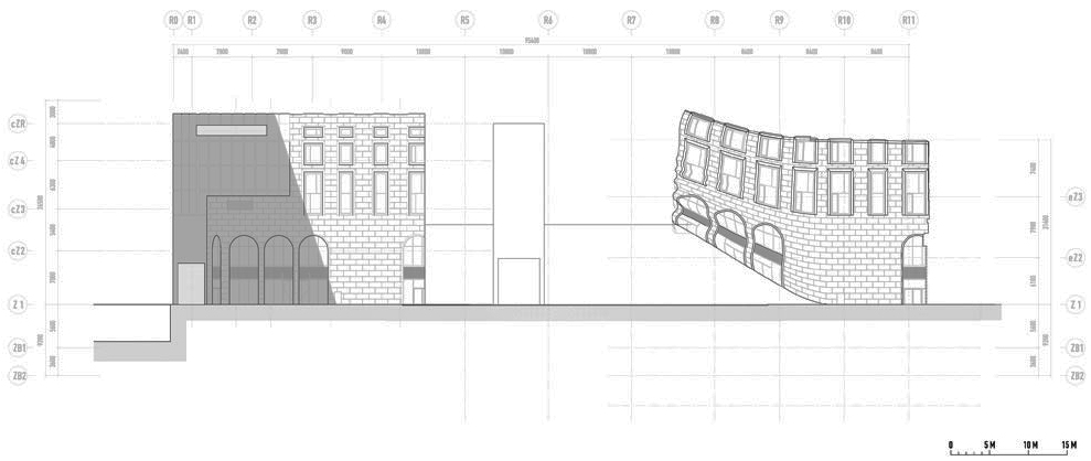
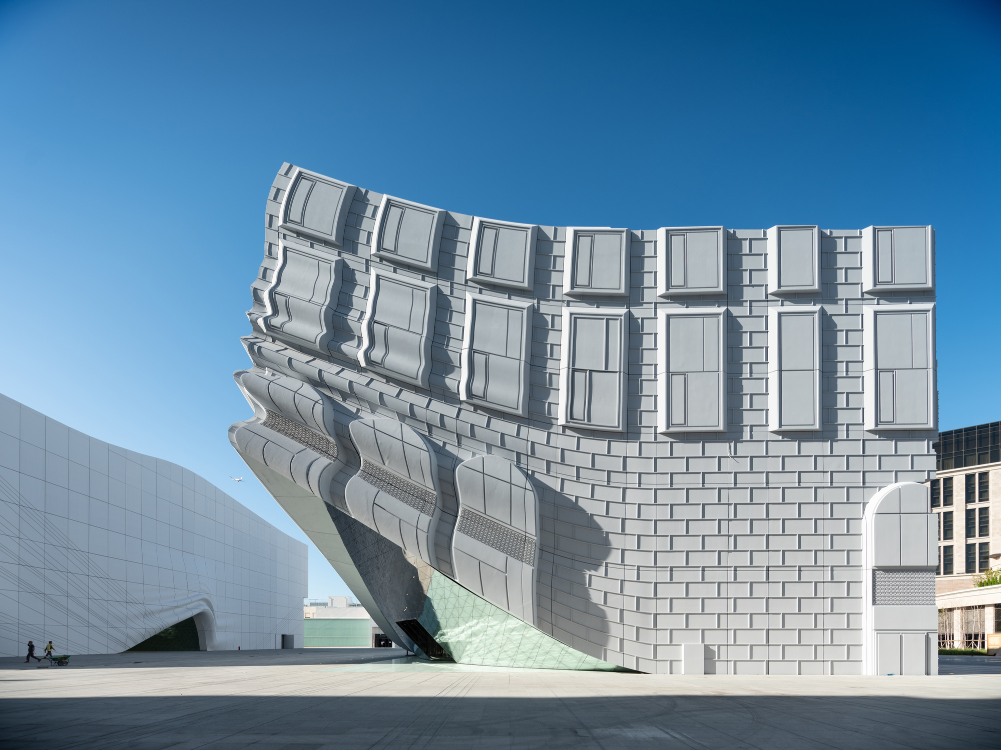
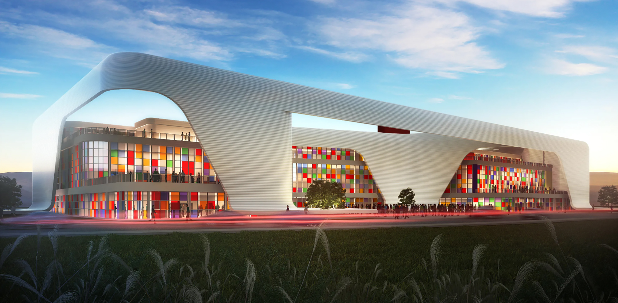
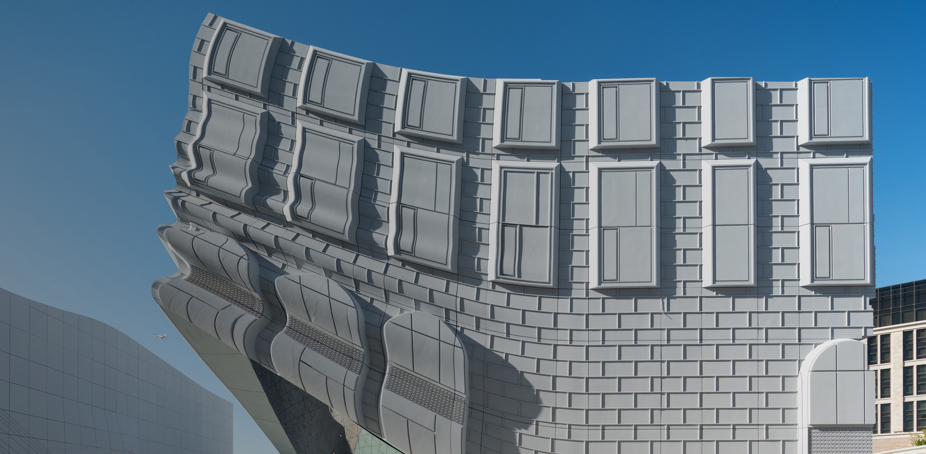
The Imprint by MVRDV, Seoul, South Korea
MVRDV’s The Imprint is part of the larger Paradise City complex of 6 buildings in total, which will provide a full suite of entertainment and hotel attractions less than a kilometer away from South Korea’s largest airport. Given the proposed program of the two buildings – a nightclub and indoor theme park – the client required a design with no windows, yet one that still integrated with the other buildings in the complex. The design of The Imprint therefore arises from a simple question: can the design have an expressive façade that connects with its surroundings even though it has no windows? As a result, the façades are lifted like a curtain at the entrances to reveal mirrored ceilings and glass media floors.
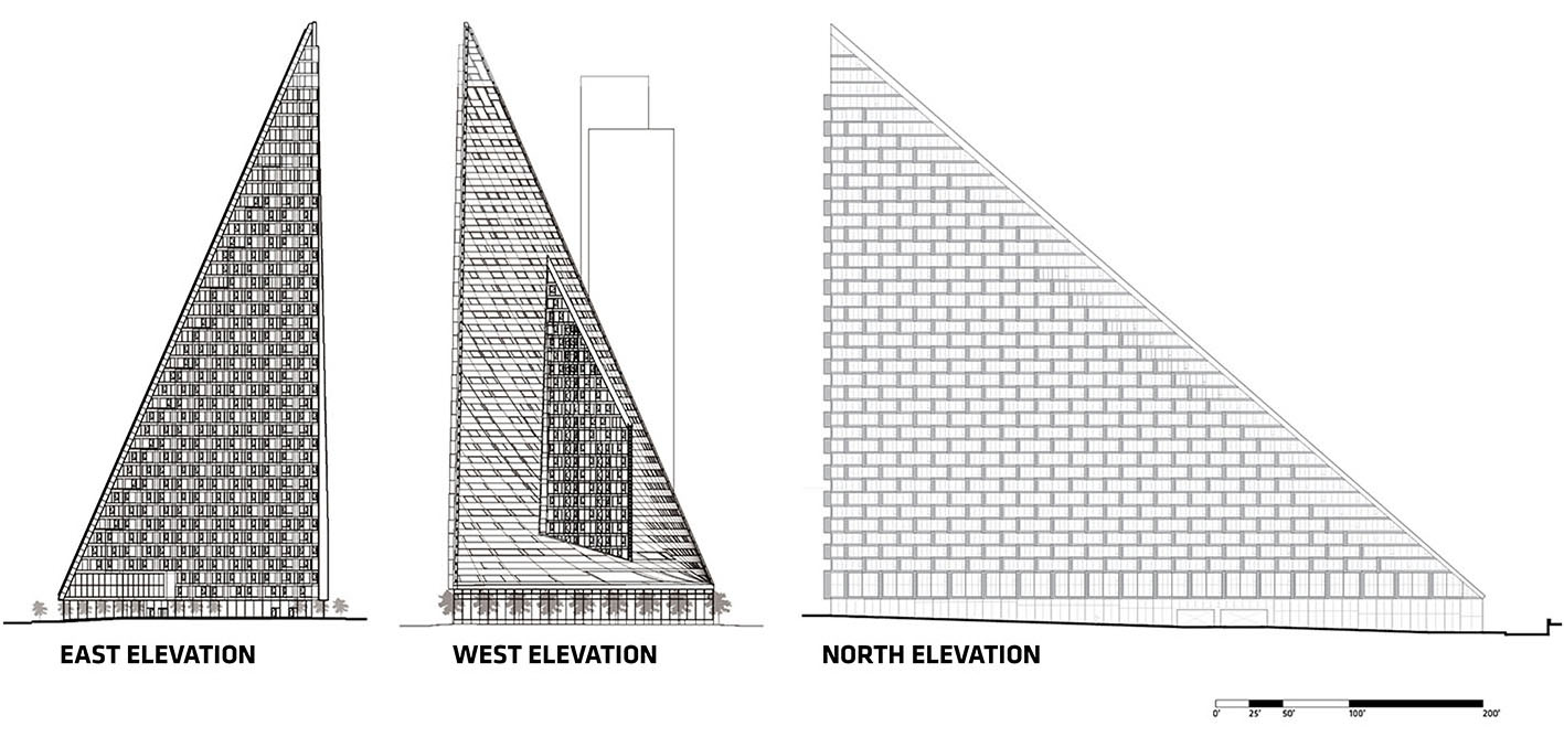
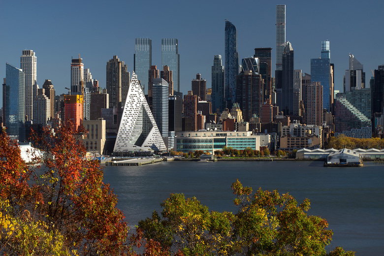
VIA 57 West by BIG – Bjarke Ingels Group
VIA 57 West by BIG – Bjarke Ingels Group, New York, NY, United States
VIA 57 West is a hybrid between the European perimeter block and a traditional Manhattan high-rise, combining the advantages of both: the compactness and efficiency of a courtyard building with the airiness and the expansive views of a skyscraper. By keeping three corners of the block low and lifting the north-east corner up towards its 450 ft peak, the courtyard opens views towards the Hudson River, bringing low western sun deep into the block and graciously preserving the adjacent Helena Tower’s views of the river. The façade features Mecho shading systems and the form of the building shifts depending on the viewer’s vantage point. While appearing like a pyramid from the West-Side-Highway, it turns into a glass spire from West 58th Street.
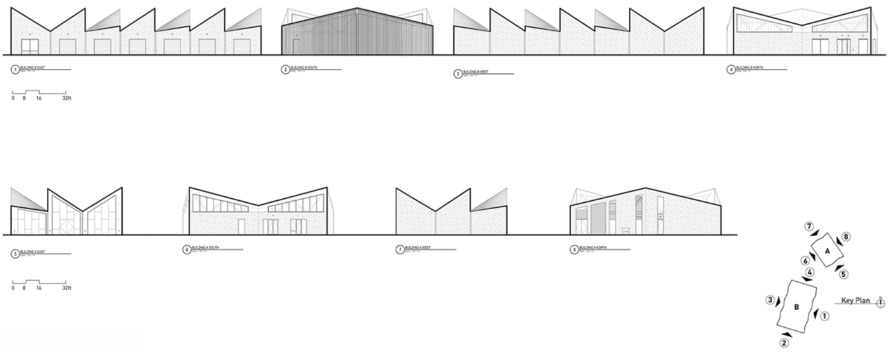
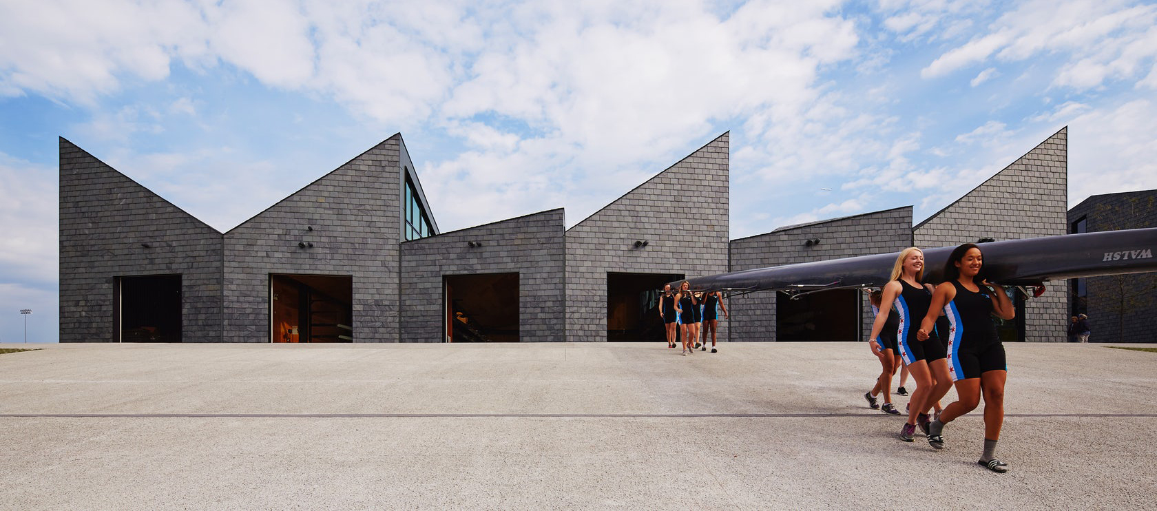
WMS Boathouse at Clark Park by Studio Gang, Chicago, IL, United States
The design for the boathouse structures translates the time-lapse motion of rowing into an architectural roof form. In addition to providing visual interest, this form also offers spatial and environmental advantages. The project features glass along the façade that was manufactured by Guardian Industries Corp. With structural truss shapes alternating between an inverted “V” and an “M,” the roof achieves a rhythmic modulation that allows southern light into the building’s upper clerestory. The clerestory glazing warms the floor slab of the structure in winter and ventilates in summer to minimize energy use year-round.
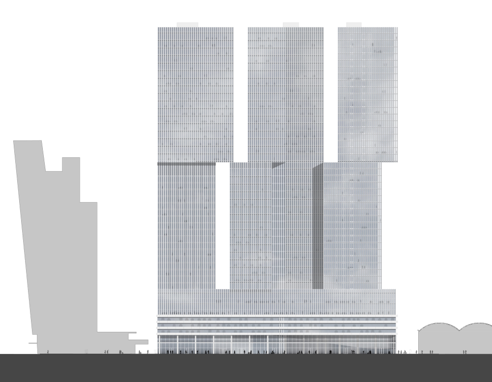
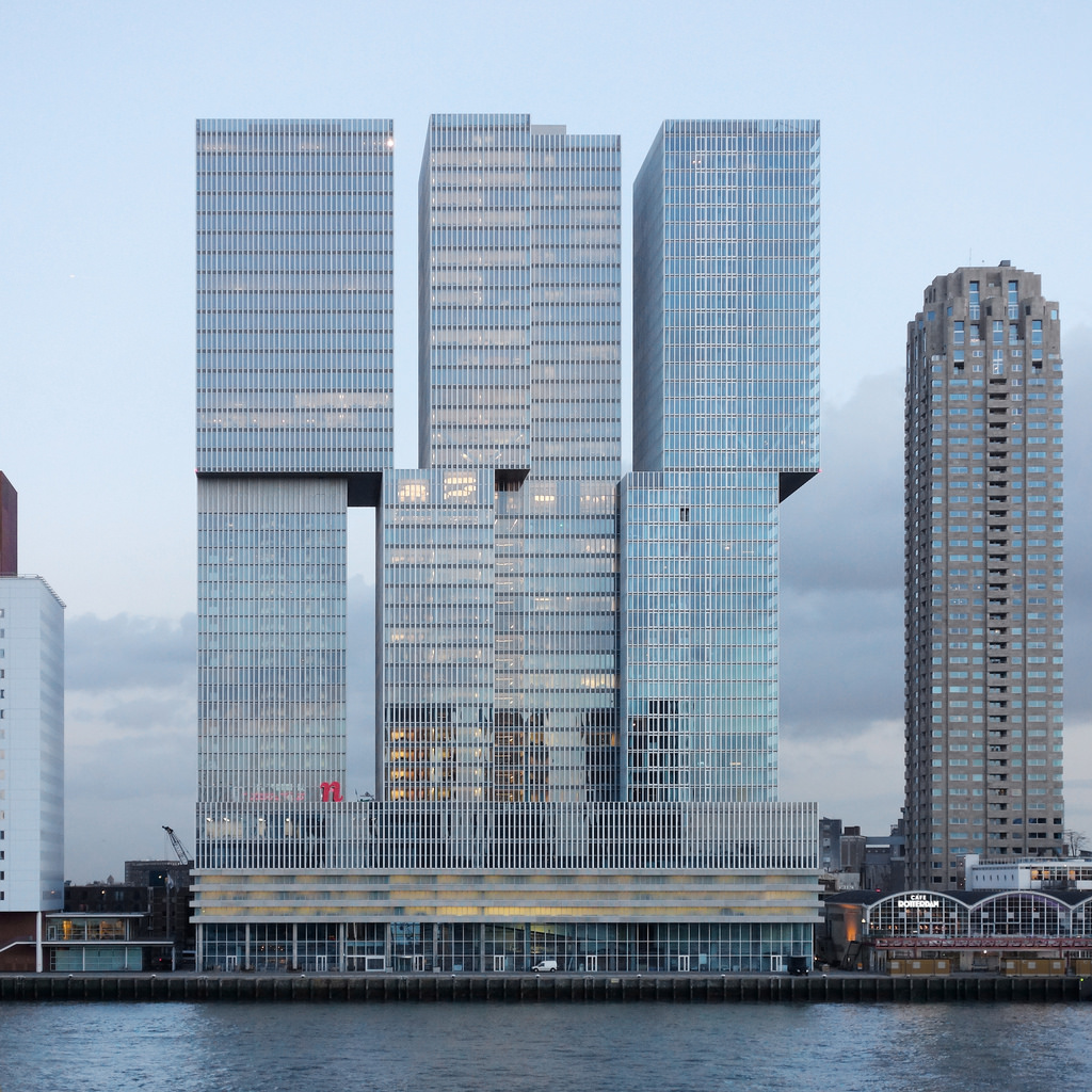
Image by Matthias Van Rossen via Flickr
De Rotterdam by OMA, Rotterdam, Netherlands
Standing as the largest building in the Netherlands, OMA’s De Rotterdam project explored urban diversity and density through three monumental towers joined by a shared plinth. Made with subtly irregular stacks, the design organizes program into distinct blocks that embrace a wide variety of uses. The building envelope was designed with floor-to-ceiling glass windows overlooking the River Maas with façades by Permasteelisa and TGM. De Rotterdam’s external faces have been clad with an aluminum post-and-beam construction, making for a filigree appearance which changes depending on the viewer’s position.
Grove at Grand Bay by BIG – Bjarke Ingels Group
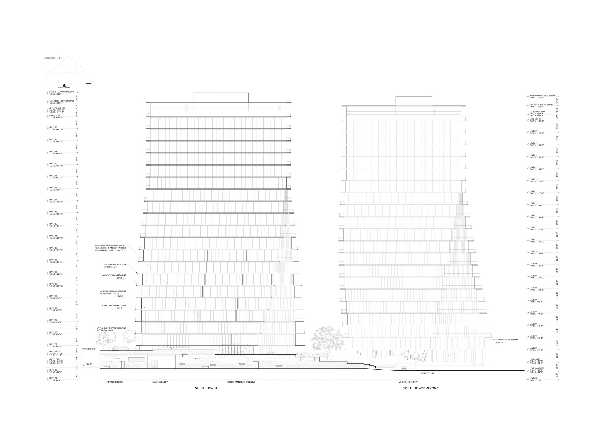
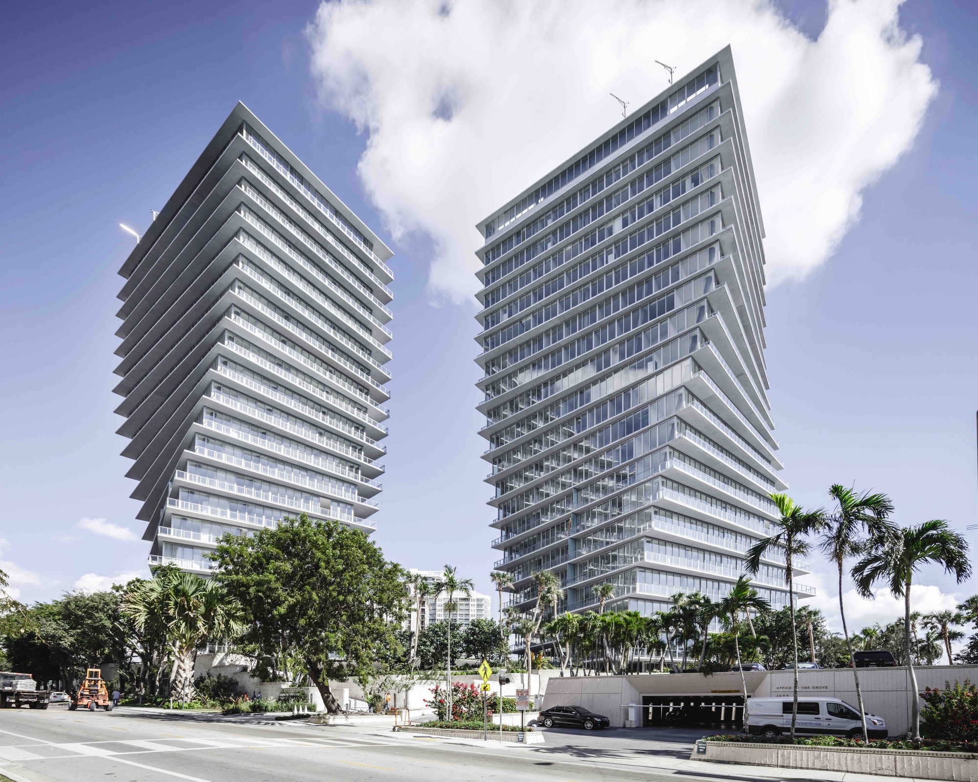
Grove at Grand Bay by BIG – Bjarke Ingels Group, Miami, FL, United States
The two towers of the Grove at Grand Bay respond to the surroundings and to each other, to give optimum views at every level. The towers take off from the ground to capture the full breadth of panoramic views from sailboat bays and the marina to the Miami skyline. The project was made possible by using Cemex and Aljoma for the building materials. Along the façade you can see the horizontal component of the gravity load in the columns that’s resolved in the slabs by transferring it to the interior core shear walls, which are the only consistently vertical structural elements in the building.
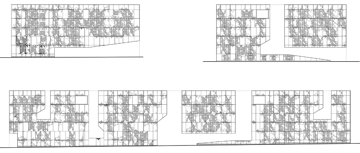
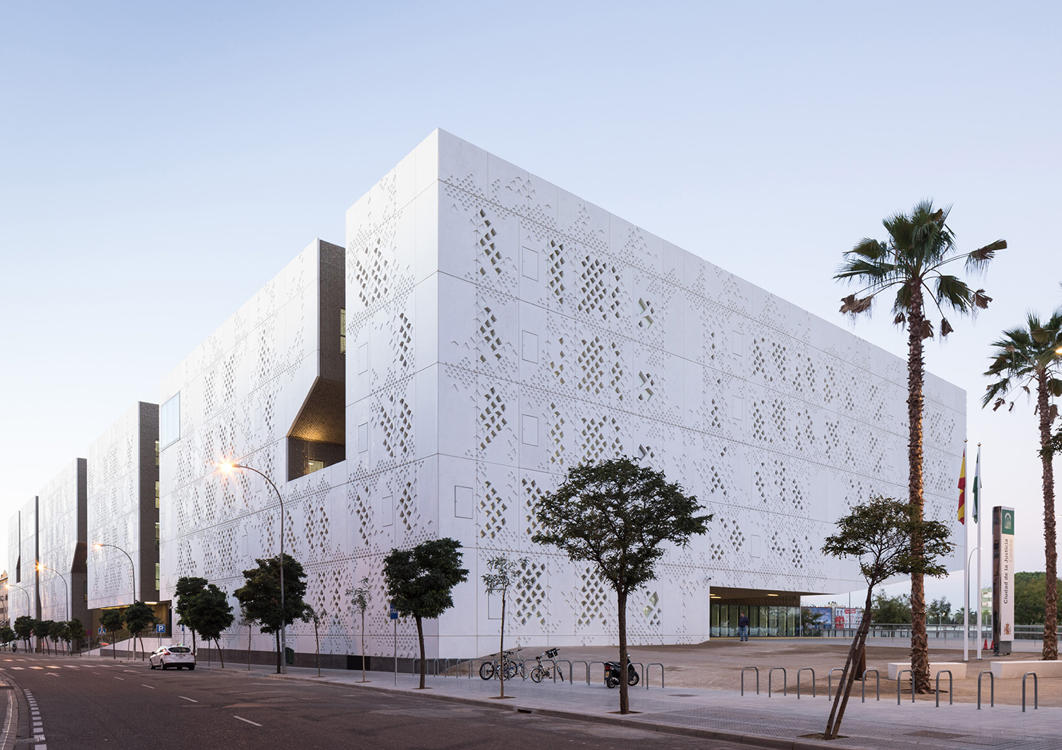
Palace of Justice by Mecanoo, Córdoba, Spain
The new Palace of Justice in Córdoba is located in Arroyo del Moro which is characteristically dominated by anonymous housing blocks, products of the rapid urban development of 21st century Spanish cities. The blocks that characterize the urban fabric of the zone were not designed to generate public space, but collectively they form a compact and coherent urban identity. Each elevation drawing depicts the complex texture of the glass fibre-reinforced concrete façades, as well as cut-out voids that manifest as sculpted courtyards. The project features Reynaers Aluminium along the façade to reinforce the idea of urban integration through fragmentation.

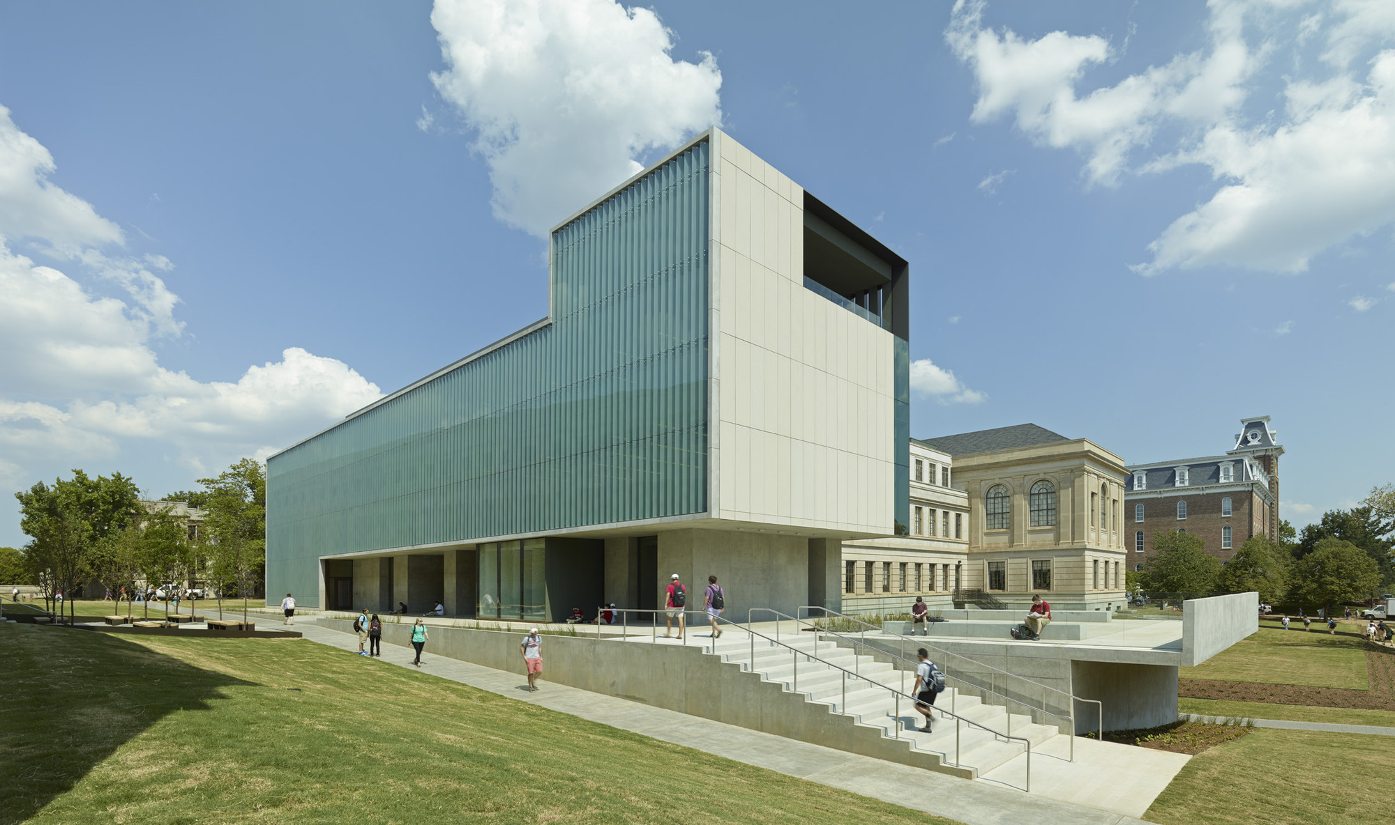
Vol Walker Hall and the Steven L. Anderson Design Center by Marlon Blackwell Architect, Fayetteville, AR, United States
Removing 13,000 square feet of library space in Vol Walker Hall, the new addition of the Steven L. Anderson Design Center features studio and critique spaces as well as an auditorium and roof terrace. Careful material detailing honors the building’s historic counterpart while establishing a powerful language of its own. Conveying a sense of mass and volume, the architectural concrete and Indiana limestone cladding was chosen to portray substance, weight and stability. As shown in the simple elevation drawing, a limestone rain screen by Stone Panels frames a fritted glass brise soleil that mitigates solar gain from the west, while simultaneously serving as a way to illustrate construction methods and environmental strategies for students of the school.
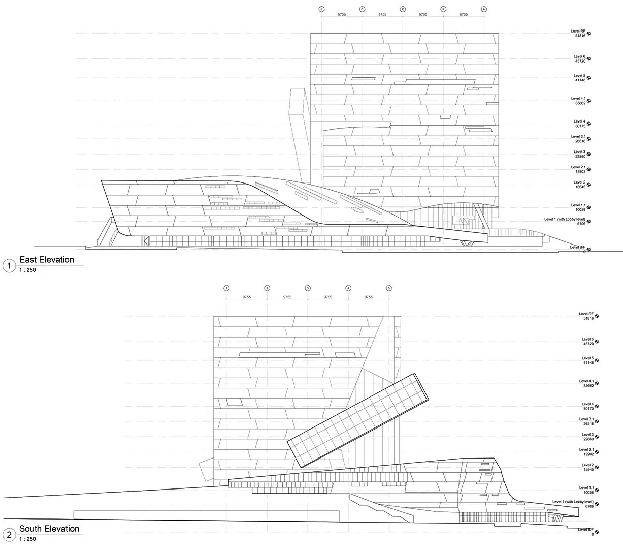
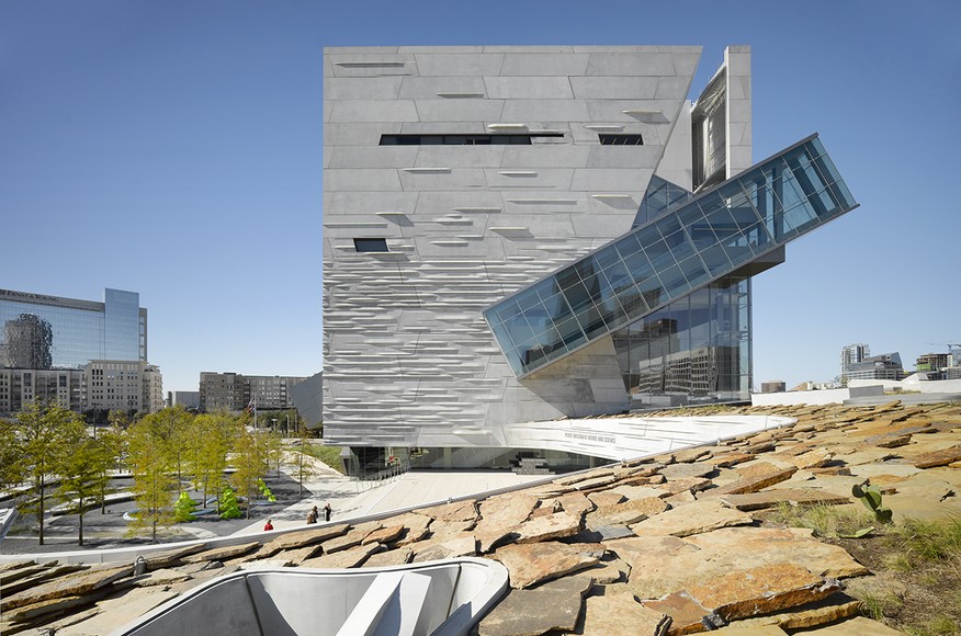
Perot Museum of Nature and Science by Morphosis Architects, Dallas, TX, United States
Giving shape to concrete, Morphosis Architects explored the material’s potential through the Perot Museum of Nature and Science in Dallas. Bringing a simple cube and plinth into high relief, the Perot Museum showcases a precast-concrete panel façade that’s both striated and refined. As a material investigation integrating structure and formwork, the elegant cladding solution was made possible through computer aided modeling and a collaboration with Gate Precast of Hillsboro, Texas. The Perot Museum is a showcase of versatility and technical ability. Combing creativity and craft, the design achieved LEED Gold certification with recycled materials used in the concrete panels and localized manufacturing.
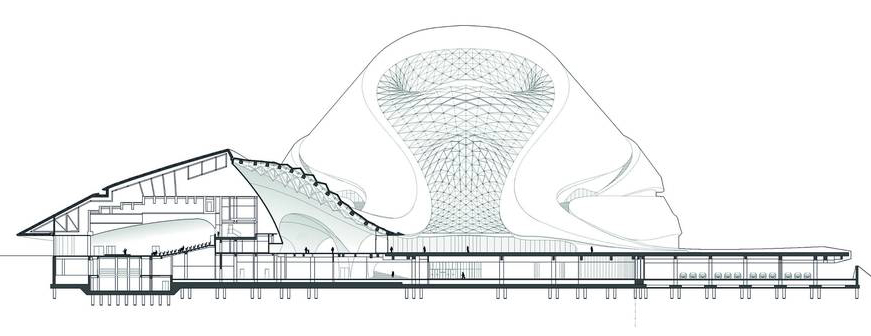
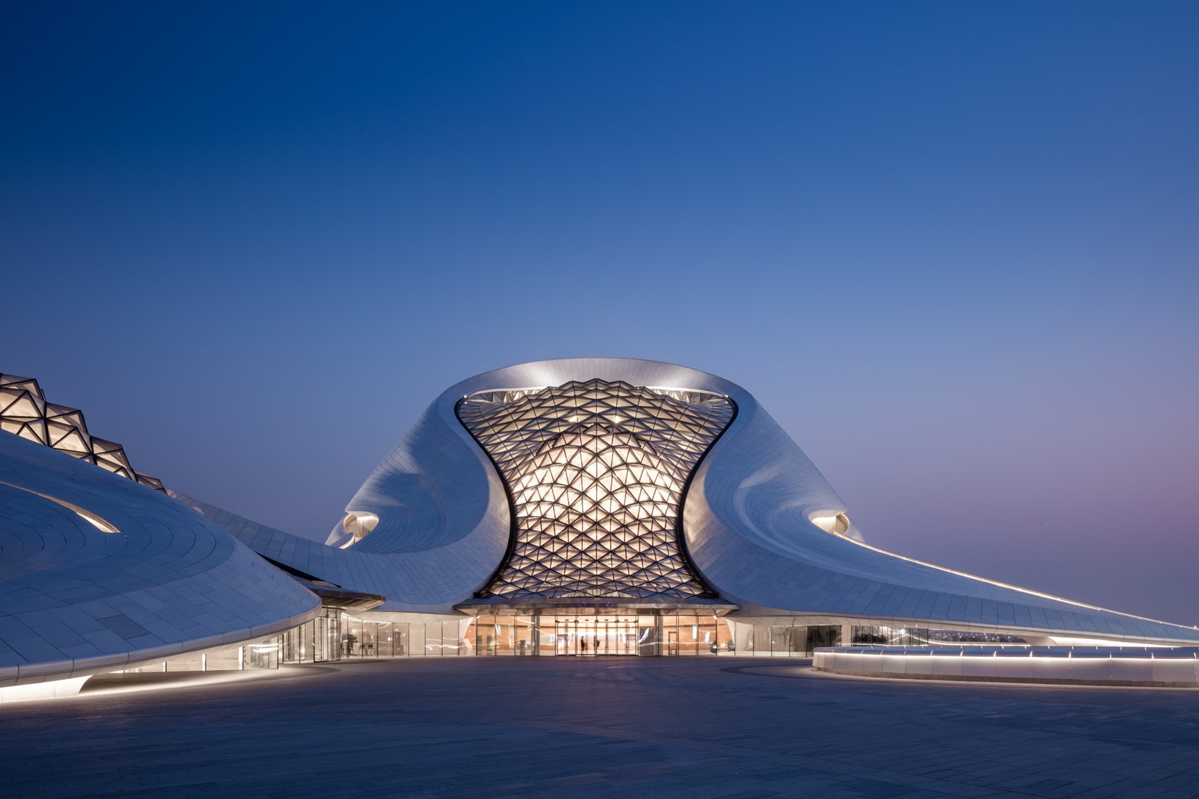
Harbin Opera House by MAD, Harbin, China
Embedded within Harbin’s wetlands, the Harbin Opera House was designed in response to the force and spirit of the northern city’s untamed wilderness and frigid climate. Appearing as if sculpted by wind and water, the building seamlessly blends in with nature and the topography—a transfusion of local identity, art, and culture. The metal roof cladding and curtain walls were both manufactured by Shenyang Yuanda Enterprise Group. On the exterior, the architecture references the sinuous landscape of the surrounding area. The resulting curvilinear façade composed of smooth white aluminum panels becomes the poetry of edge and surface, softness and sharpness.
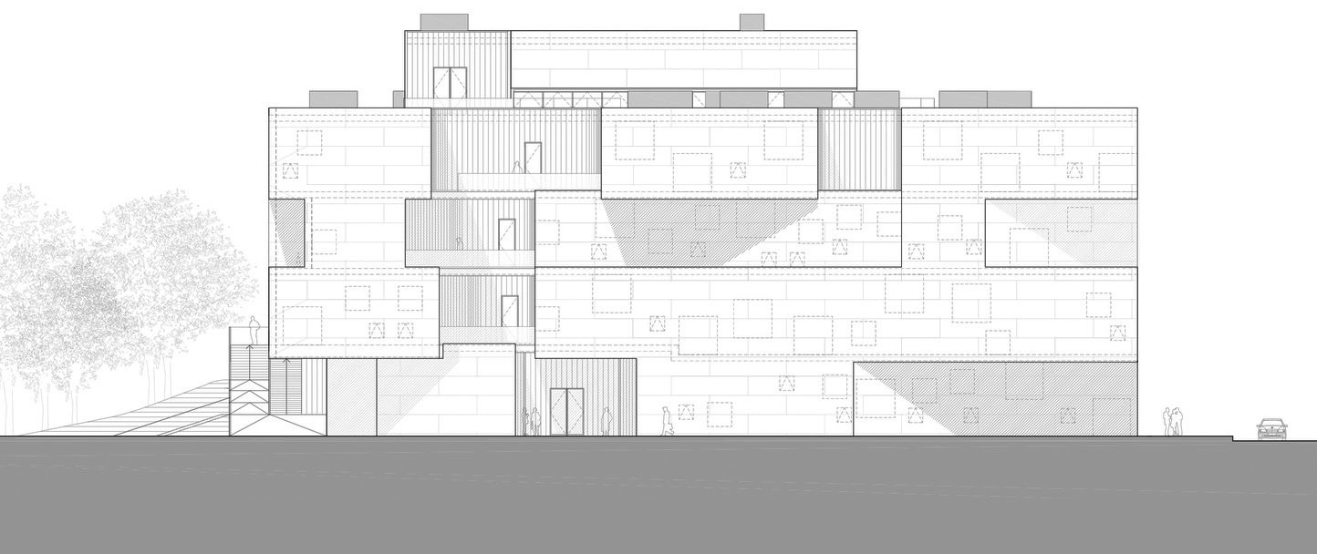
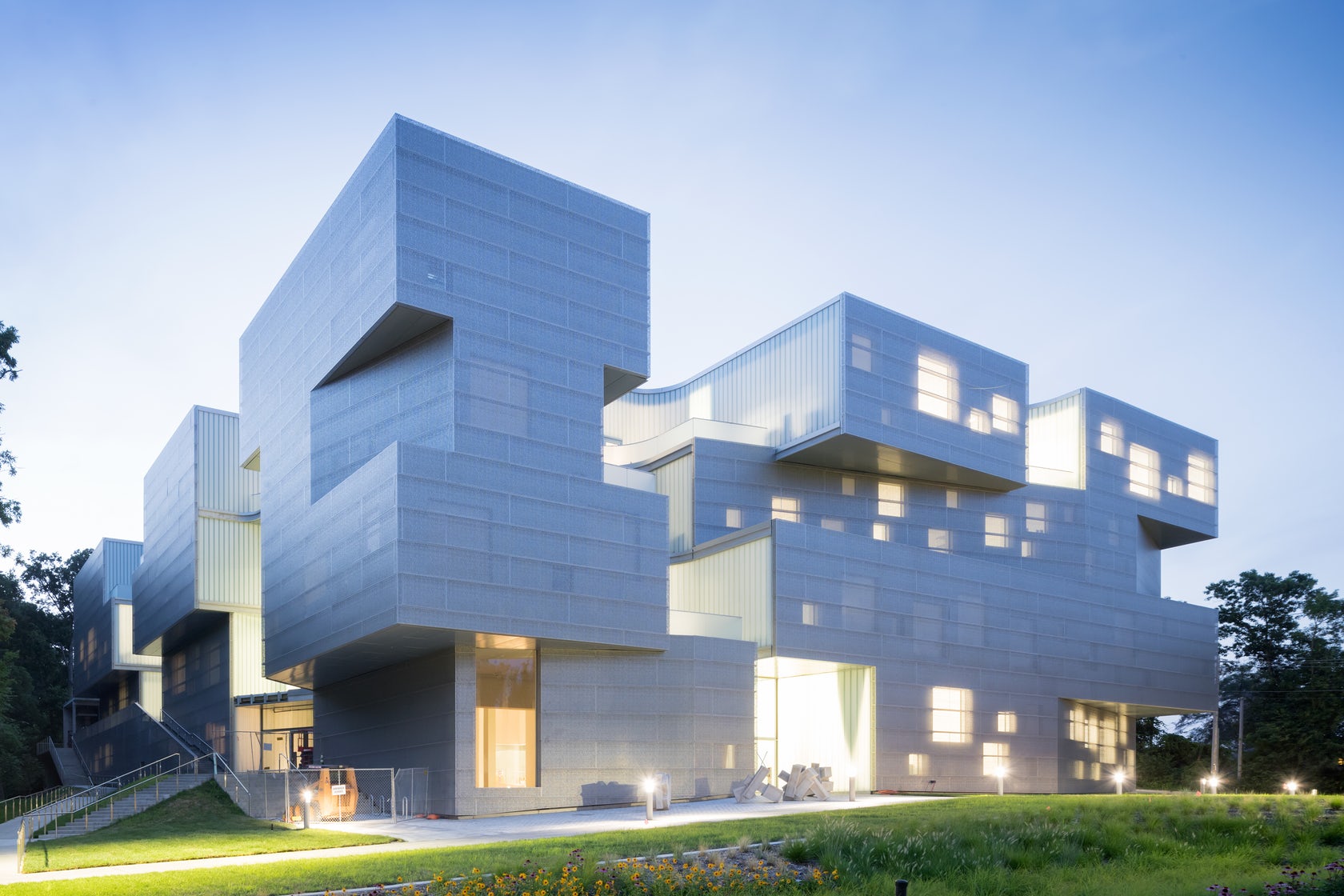
Visual Arts Building, University of Iowa by Steven Holl Architects, Iowa, United States
Formed around seven vertical centers of light, this visual arts building includes 126,000 square feet of loft-like space for everything from metalsmithing to virtual reality. Shifting geometry and floor plates combine with multiple balconies and a blue-green Rheinzink skin. The channel glass wall systems in the project were manufactured by Bendheim. As illustrated in the elevation drawing, several vertical “centers of light” are carved out of the building’s volume filling the interior with natural light and ventilation. Their shifted form creates outdoor meeting and informal working spaces, further encouraging interaction between the building’s five levels.
Architizer’s newest print publication is available for pre-order! How to Visualize Architecture is an educational guide designed to help you master the craft of architectural storytelling and visual communication. Secure your copy today.
 De Rotterdam
  Harbin Opera House
  Palace of Justice
  Perot Museum of Nature and Science
  The Grove at Grand Bay
  VIA 57 West
  Visual Arts Building, University of Iowa
  Vol Walker Hall and the Steven L. Anderson Design Center
  WMS Boathouse at Clark Park
