Architizer's diverse jury of global experts is currently reviewing submissions to the 14th A+Awards! Sign up to receive updates on Public Voting and spring winner announcements.
Over the past ten years, the A+Awards has been collecting impressive retail designs for commercial spaces around the world. Designing good retail not only entails creating a unique, memorable store that stands out from the rest, but also creating a space that contributes to impactful branding for your client. Award-winning commercial spaces create appealing experiences for visiting customers; they showcase products while acting as spatial representations of the brands’ identity. From façade to interior, the selection of forms and colors and the logic behind the display and circulation all play important roles in shaping the relationship between customer and brand.
This collection brings together a retrospective of the top retail spaces from last decade. Be inspired by these clever — oftentimes innovative — design solutions tailored for their clients and sites.
2012-13: Sugamo Shinkin Bank / Shimura Branch
emmanuelle moureaux architecture + design | Azusawa, Itabashi-ku, Japan
Popular Choice, 2012-13 A+Awards, Retail
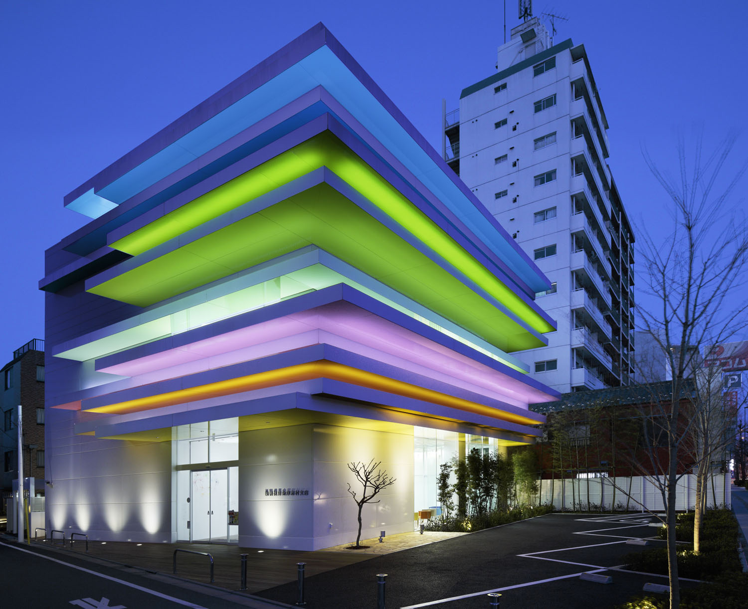
 In response to the third commission from Sugamo Shinkin Bank, the design team continued with their iconic rainbow color swatch to create a building that best echoes the bank’s motto: “We take pleasure in serving happy customers.” The façade features twelve layers of color that stretch out from the white walls following an energetic rhythm. At night, the layers are illuminated from inside, and the building appears like a vibrant neon beacon whose colors vary from season to season.
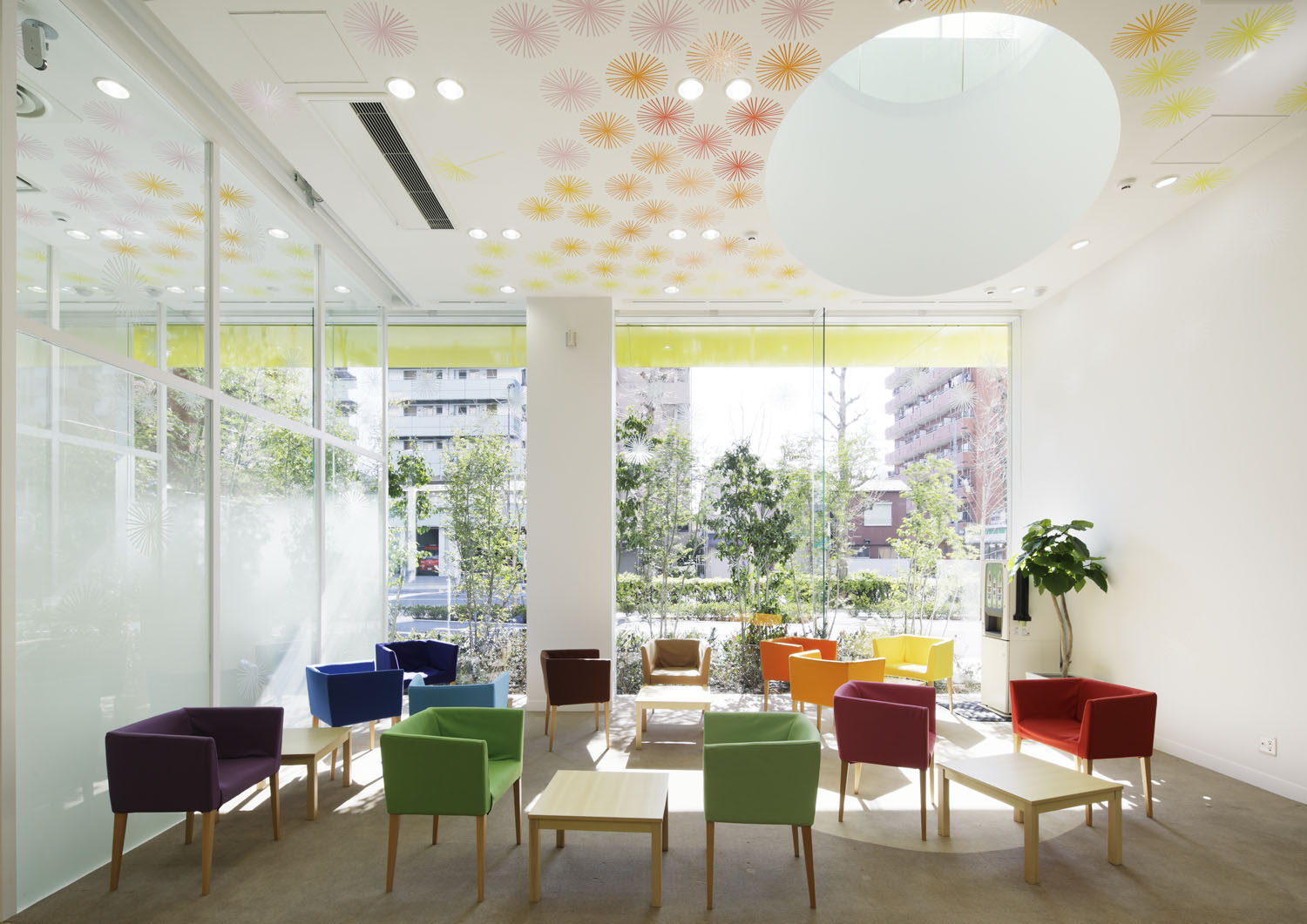
Upon entering the building, three elliptical light-wells invite skylight into the rooms. The whimsical, technicolor palette extend from the façade onto the internal walls and ceiling, taking the form of dandelion puffs and rainbow chairs.
2014: Sokol Blosser Winery Tasting Room
Allied Works Architecture | Dayton, OR, United States
Jury Winner, 2014 A+Awards, Commercial – Retail
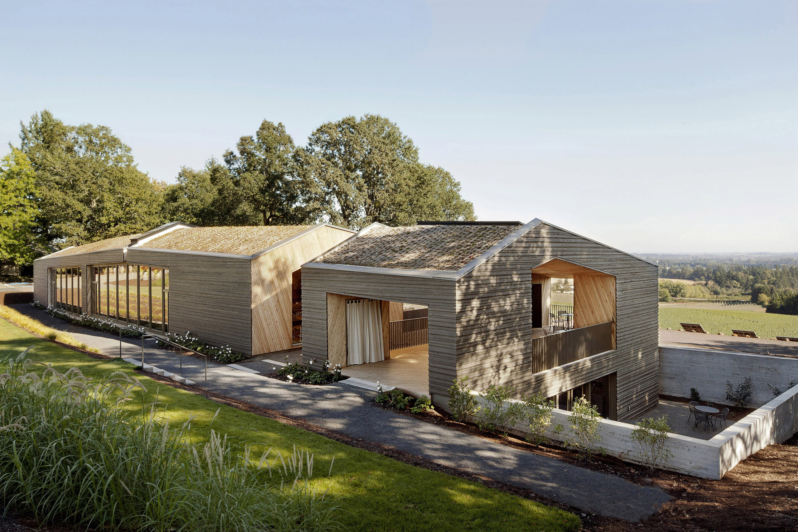
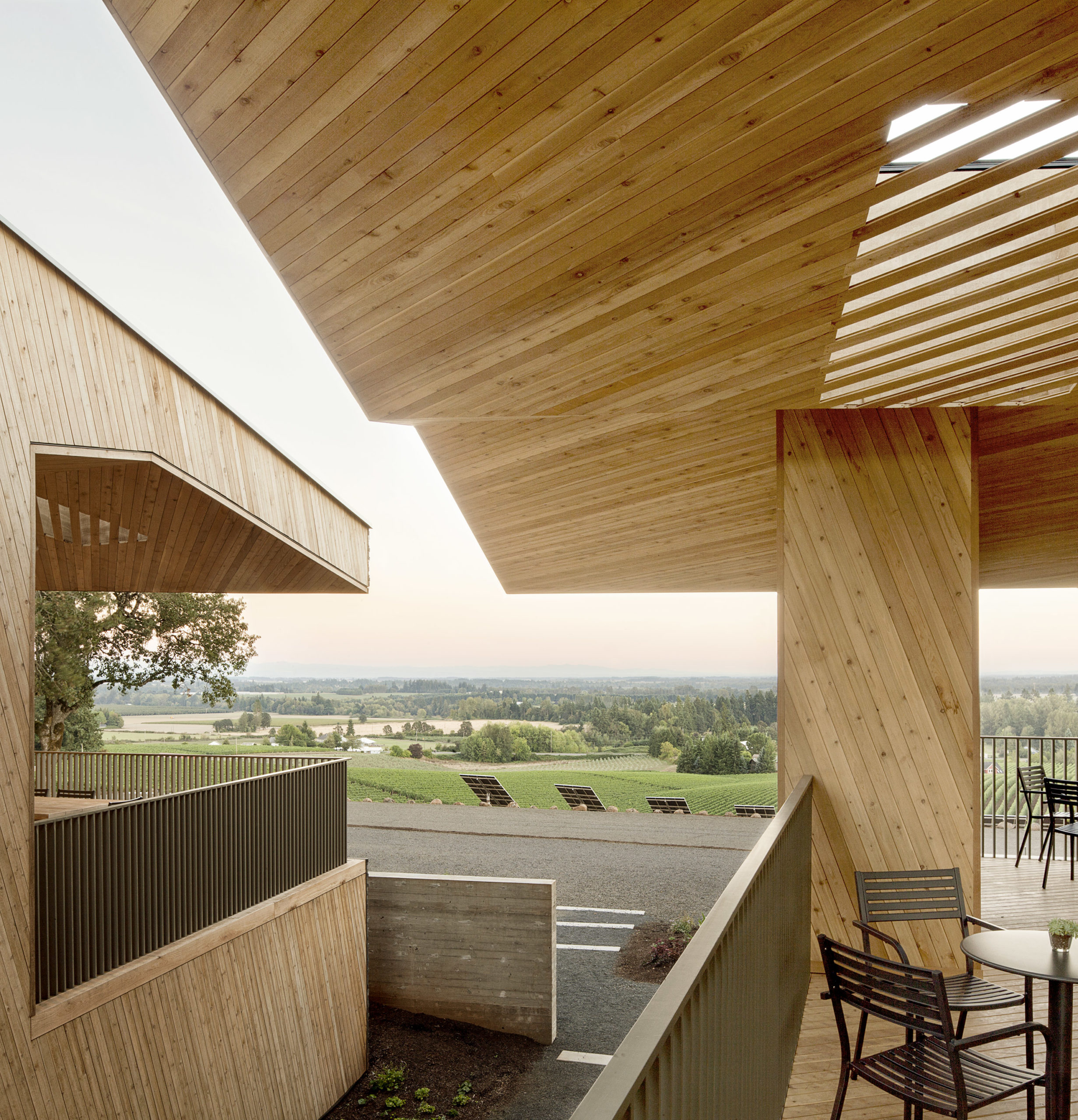 This timber structure houses the tasting room of Sokol Blosser Winery on the Dundee Hills; it also functions as an event space with views of the family’s vineyards and the whole estate. The timber’s warmth and intimate scale contribute to a welcoming, home-like atmosphere. The building is centered around the main tasting room, with a bar, hearth, library, kitchen and other functions. Meanwhile, the seating areas are strategically arranged to ensure nice views of the landscape, both indoor and outdoor.
2015: Wild Turkey Bourbon Visitor Center
de Leon & Primmer Architecture Workshop | Lawrenceburg, KY, United States
Jury Winner and Popular Choice, 2015 A+Awards, Commercial – Retail
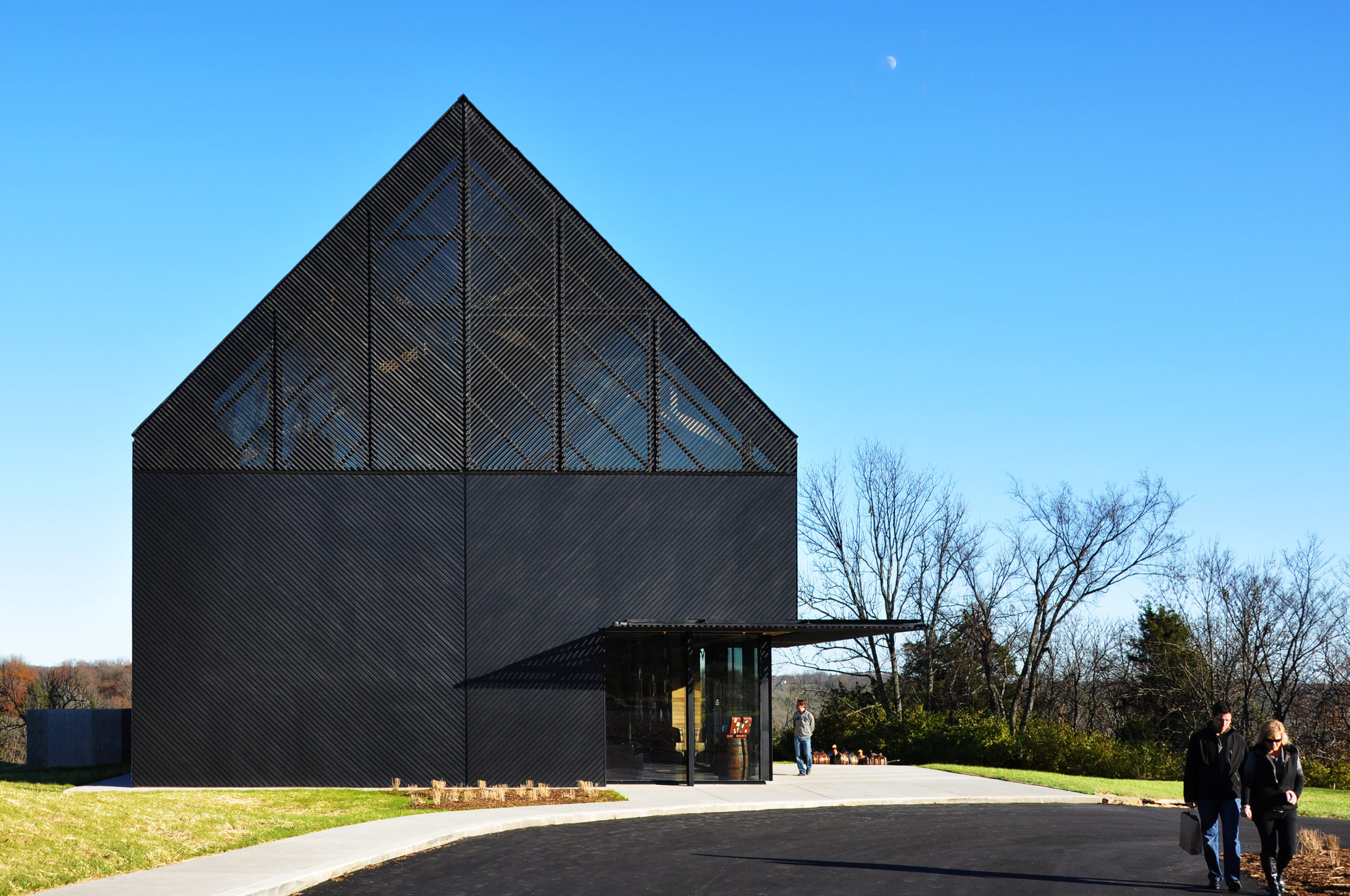
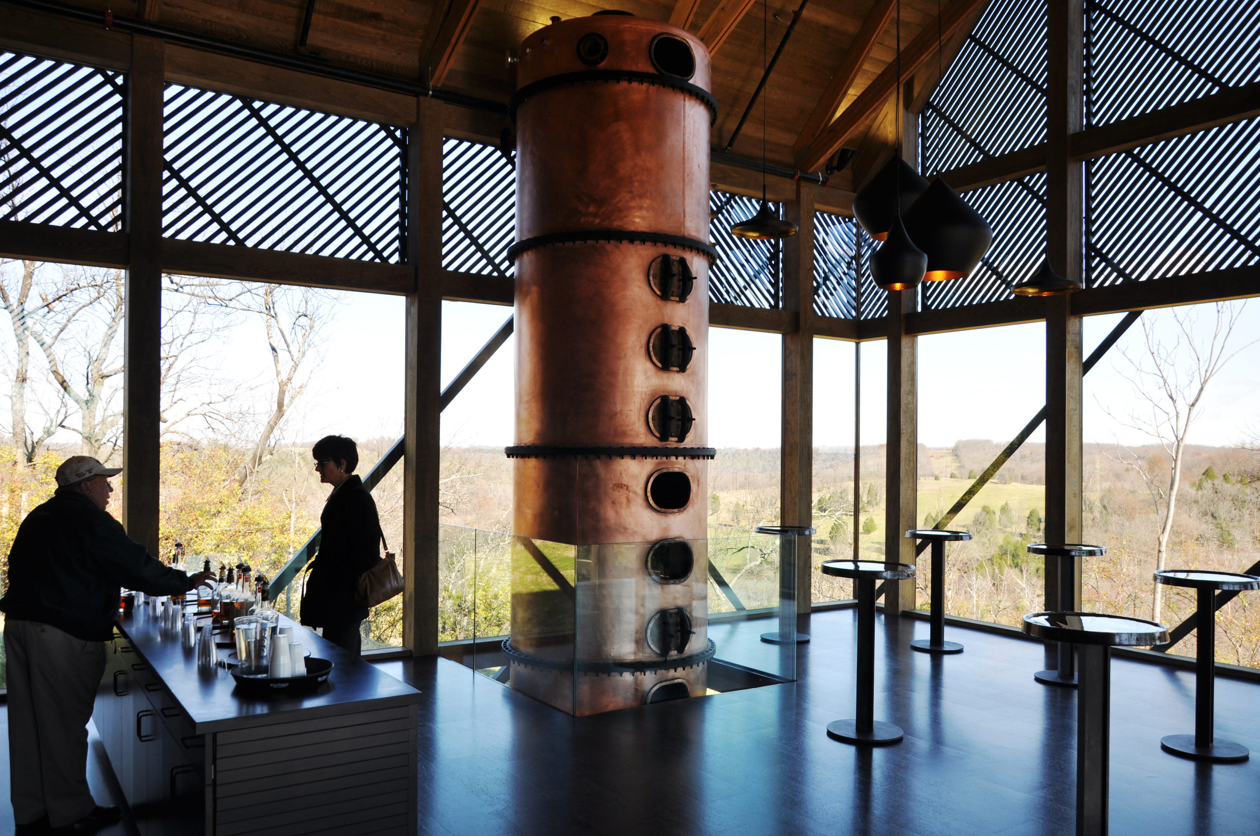 The dark silhouette of the latest addition to the Wild Turkey Bourbon Distillery complex stands out on the unsheltered landscape of Kentucky River. The Visitor Center houses exhibitions, a gift shop, event venues, a tasting room and offices, with a generous view of the river. Expertly combining simplicity and complexity, the building takes on the simple shape of the local tobacco barns while employing a rich façade consisting of clear glazing, opaque panels and light-filtering lattice. By thematizing the juxtaposition between the traditional and the new, the design gies expression to the distillery’s rebranding program which favors both devoted old friends and new fans of bourbon.
2016: UNILUX
SOMA | Beirut, Lebanon
Popular Choice, 2016 A+Awards, Commercial – Retail
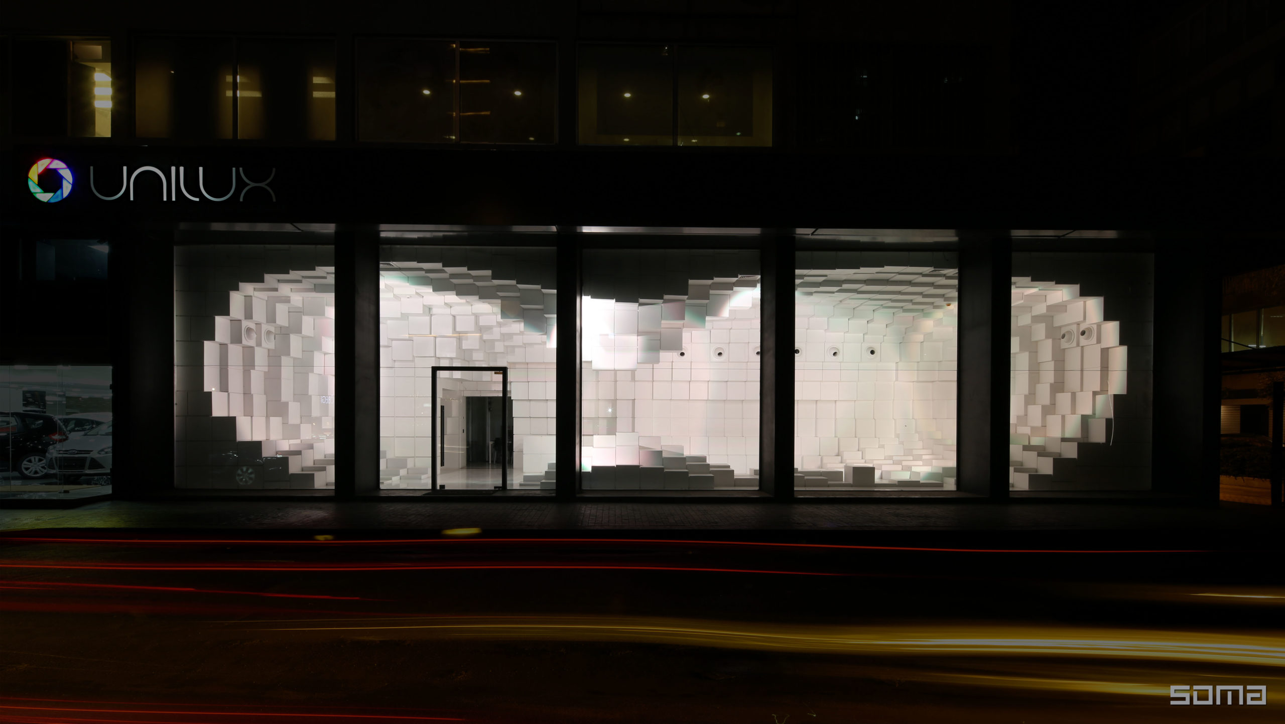
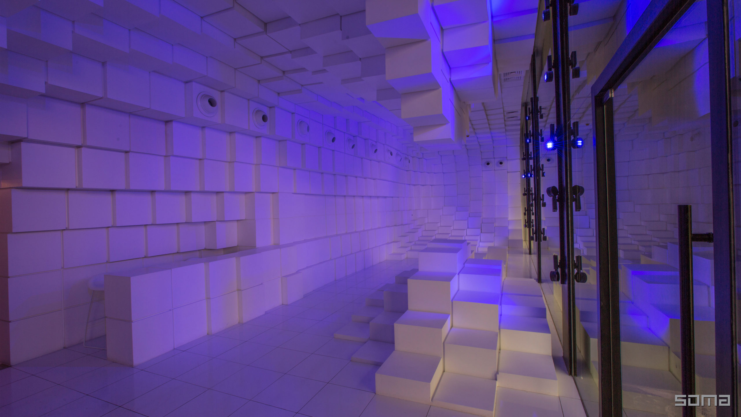 The Unilux showroom is located on a long and thin site of 65 x 13 feet (20 x 4 meters). The ground floor is designed as an interactive lighting showroom to exhibit the effect of Unilux’s lighting products. Furnished with geometric patterns of stacked white cubes, the showroom captures the light with its dynamic 3D form. Visitors can walk through the space and experience the lighting from different perspectives.
The space thus presents lights of different characteristics to the visitors while itself is also a showpiece that is visible from the street, inviting people in. Below ground is a catalog room that showcases a collection of products in a rather static way. The windows occupied by lights are colored white to present the lights in the best quality possible, while the floor and walls are made of a reflective black, which makes the space appear visually taller.
2017: Östermalm’s Temporary Market Hall
Tengbom | Stockholm, Sweden
Jury Winner, 2017 A+Awards, Commercial – Retail
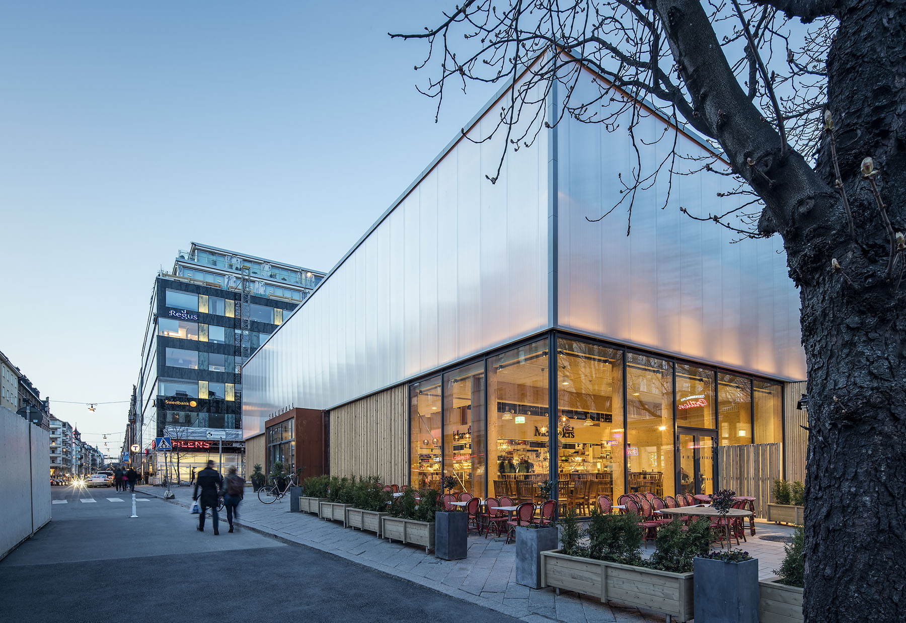
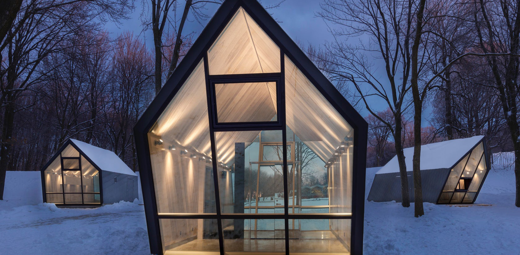
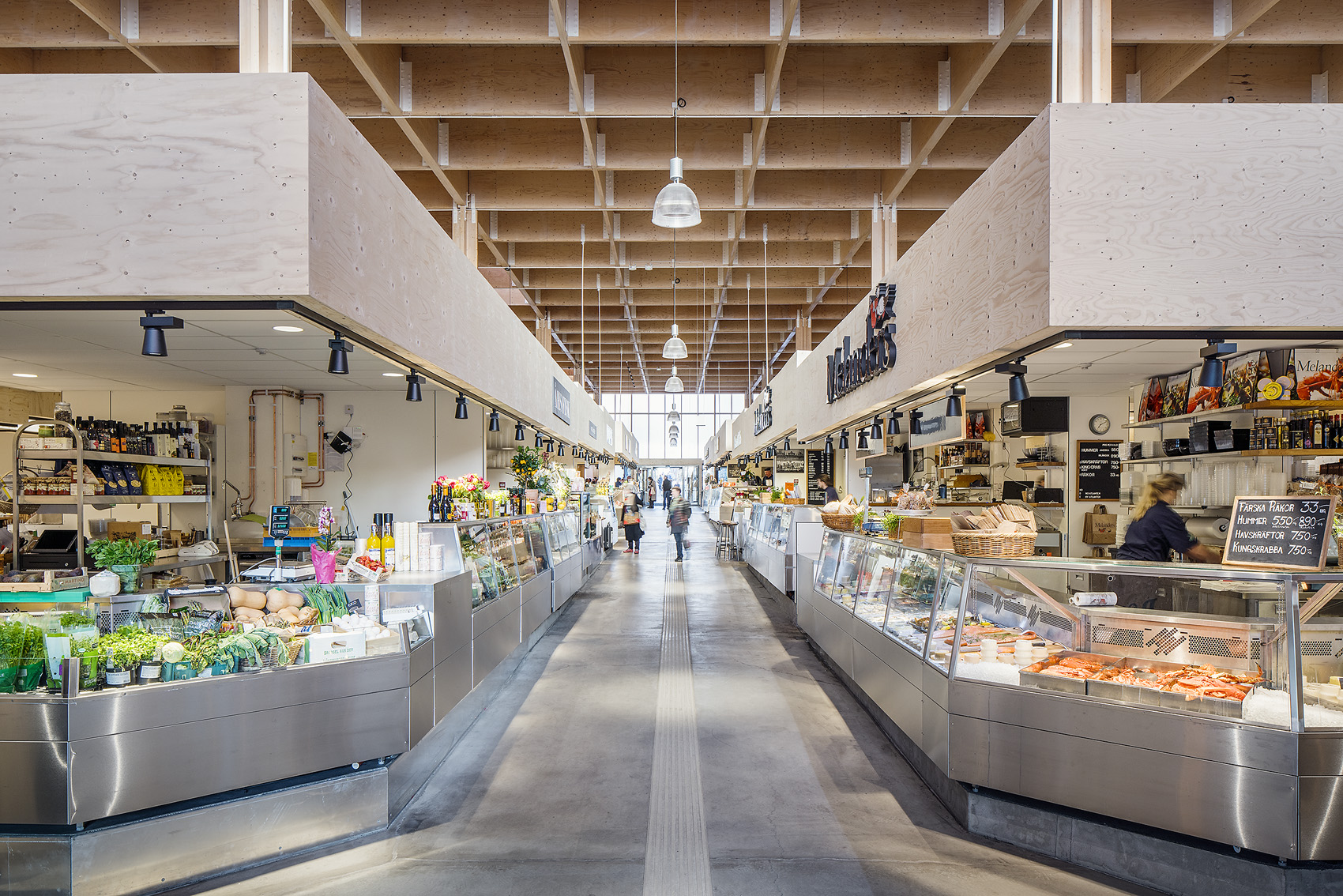 This temporary structure was built as a temporary home for stalls from the adjacent old market while it was being refurbished. Due to its temporary nature, the architects opted for lightweight, cost-efficient and reusable materials such as timber and polycarbonate. A modular mounting system allowed the building to be quickly set up, dismantled and transported to and from the busy Östermalm’s square, where it was located for a spell. To minimize the disturbance to the original pedestrian traffic on the popular public space, all four facades have an entrance for people to pass through the market area during its open hours while introducing new customers to the market.
2018: Cheese Tart Shop “BAKE”
07BEACH | Ho Chi Minh City, Vietnam
Jury Winner and Popular Choice, 2018 A+Awards, Commercial – Retail
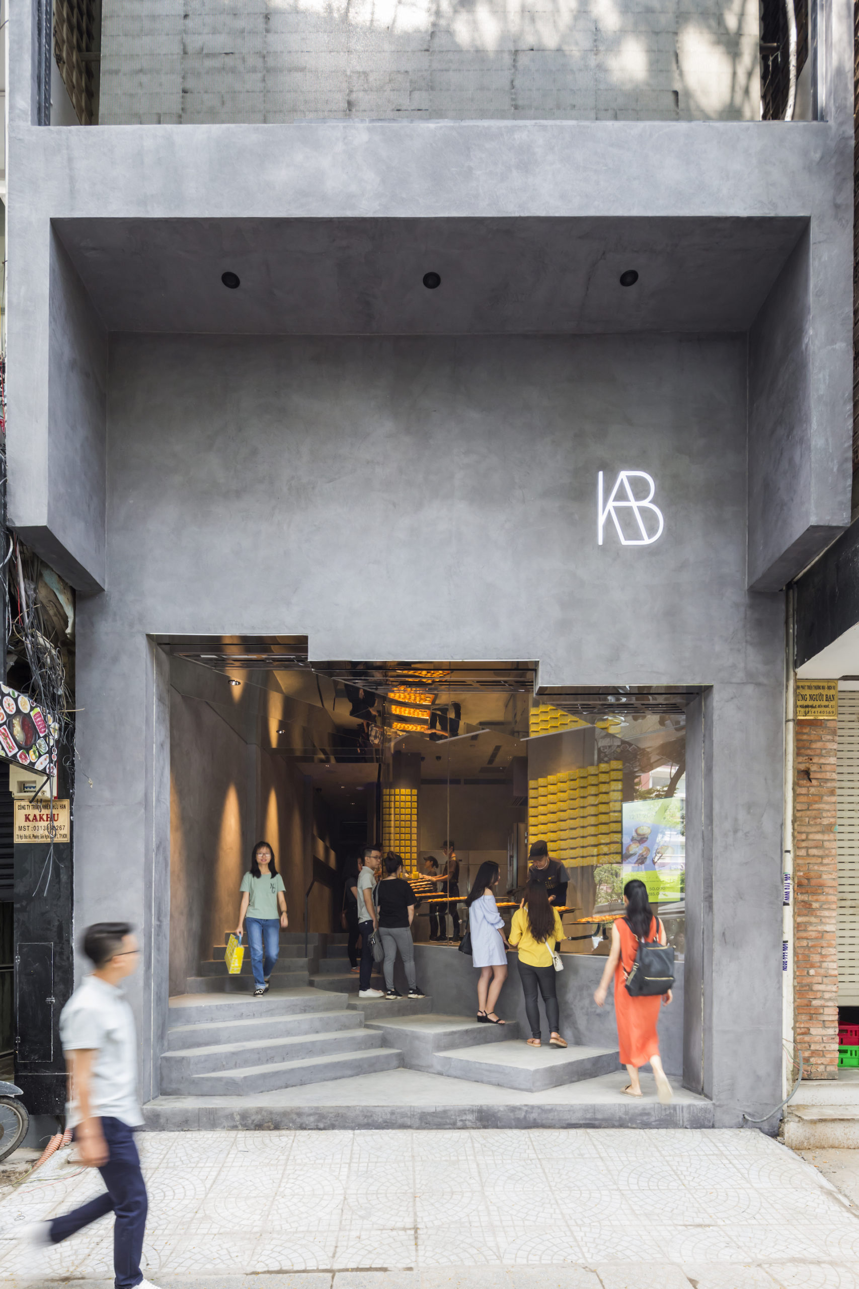
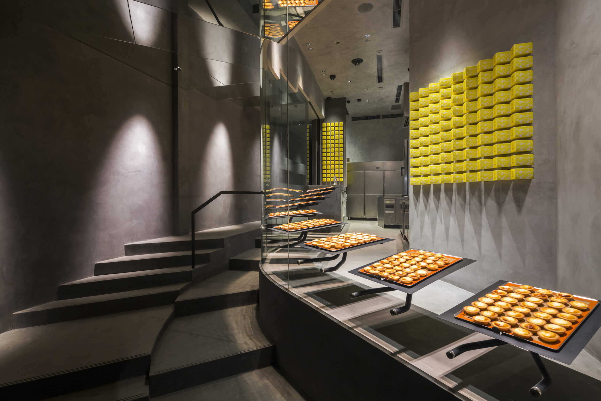 This project is carefully designed to display cheese tarts. The shopfront features a floor-to-ceiling window that curves inwards towards the inside of the shop, providing a sheltered queueing area while maintaining the exhibition function of the window. The glazing separates the circulation of staff and customers, while keeping the two visually connected. Customers can closely observe the tarts being packed as they queue; the design makes the store’s activities a source of entertainment in and of itself. The wall behind the staff is finished with light color of mortar, which guides customers’ sight towards the tarts. To better present the tarts to passersby on the street level, the ceiling above the stairs are also clad with mirrors that reflect the tarts in the window.
2019: THE DRAPE
GARDE Co., Ltd. | Osaka, Japan
Jury Winner, 2019 A+Awards, Commercial – Retail
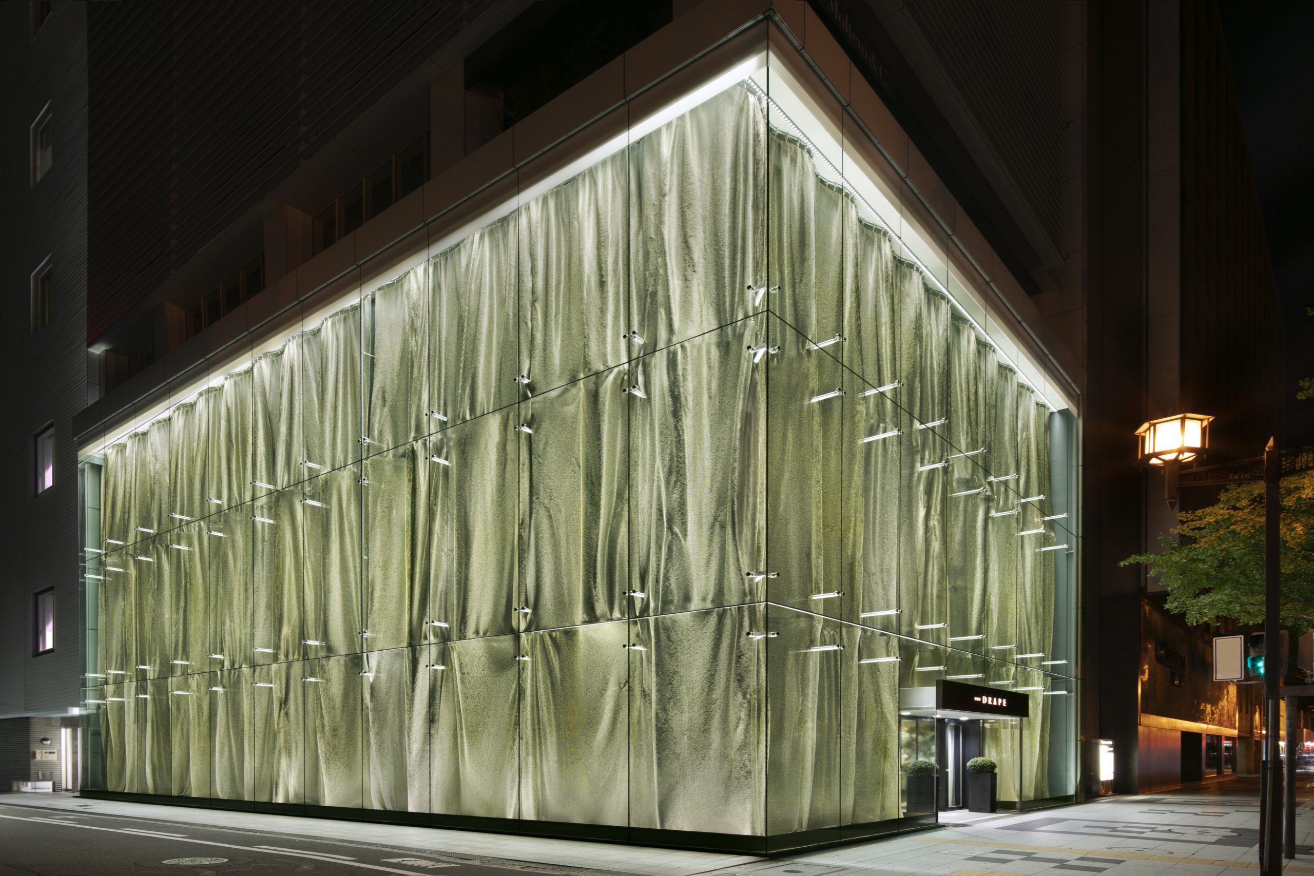
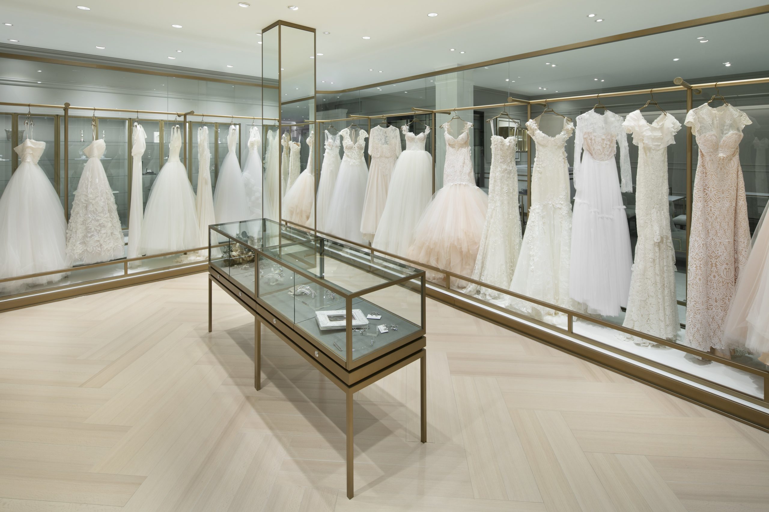
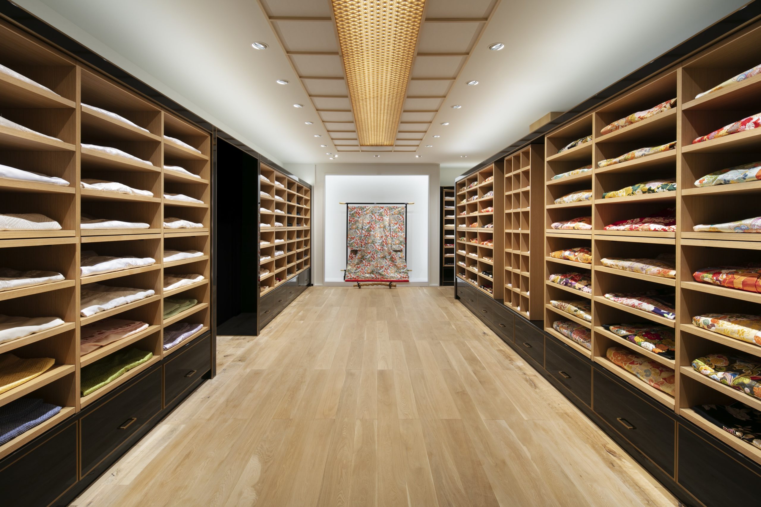 The Drape is a store of the Japanese wedding company Takami Bridal that provides high-end wedding clothing and event organizing services. Curtains of ring-mesh fabric drape down behind the full-height glazing, creating a patterned, eye-catching façade of metallic reflections. The interior is done with simplistic forms and colors that highlight the design of the dresses. Moreover, the kimono area of the shop is framed with warm timber finishing that differs from the showrooms of western bridal dresses. Kimonos are presented flat on shelves, to provide a straightforward comparison between colors and patterns.
2020: National Museum of Qatar Gift Shops
KOICHI TAKADA ARCHITECTS | Qatar
Jury Winner, 2020 A+Awards, Commercial – Retail
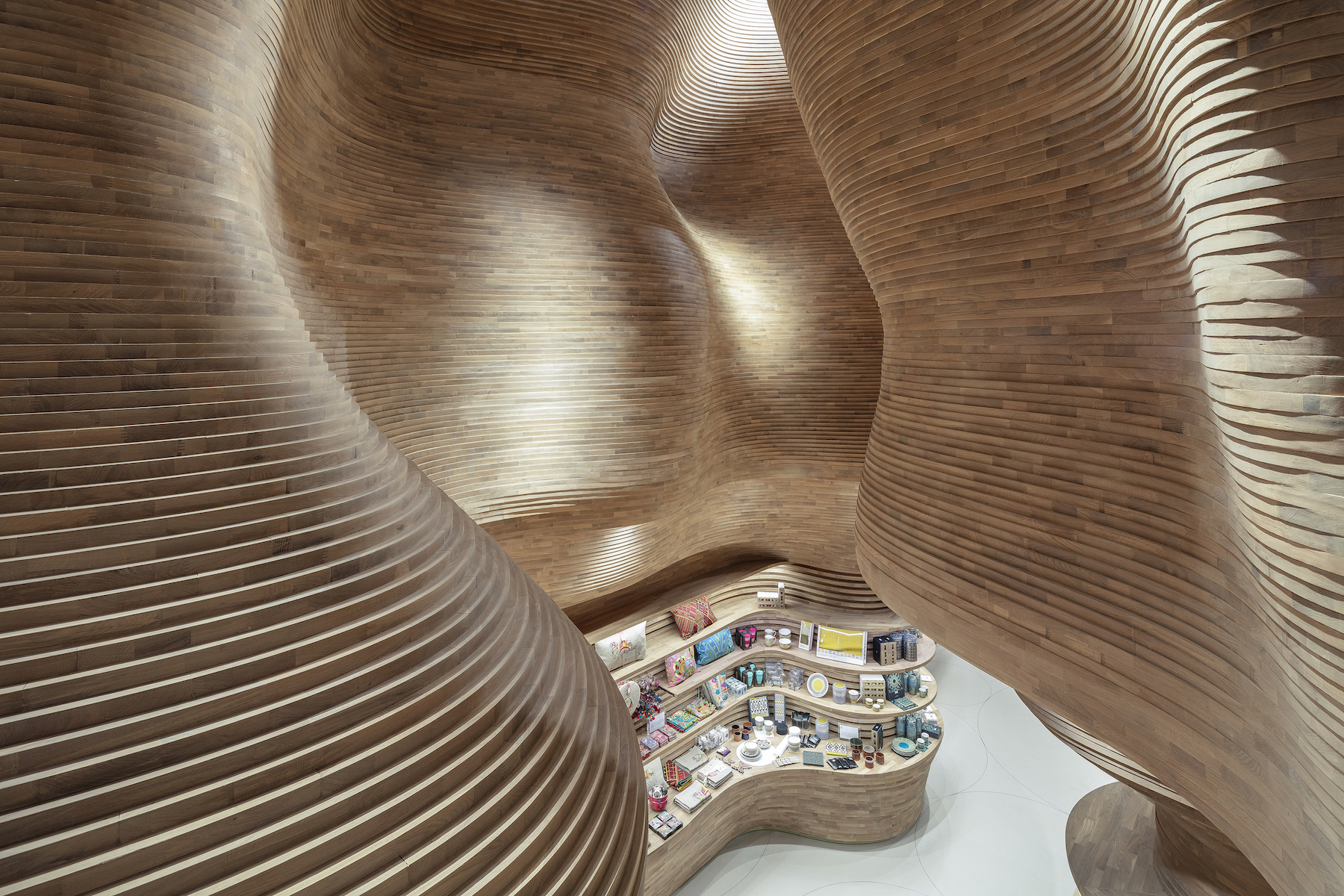
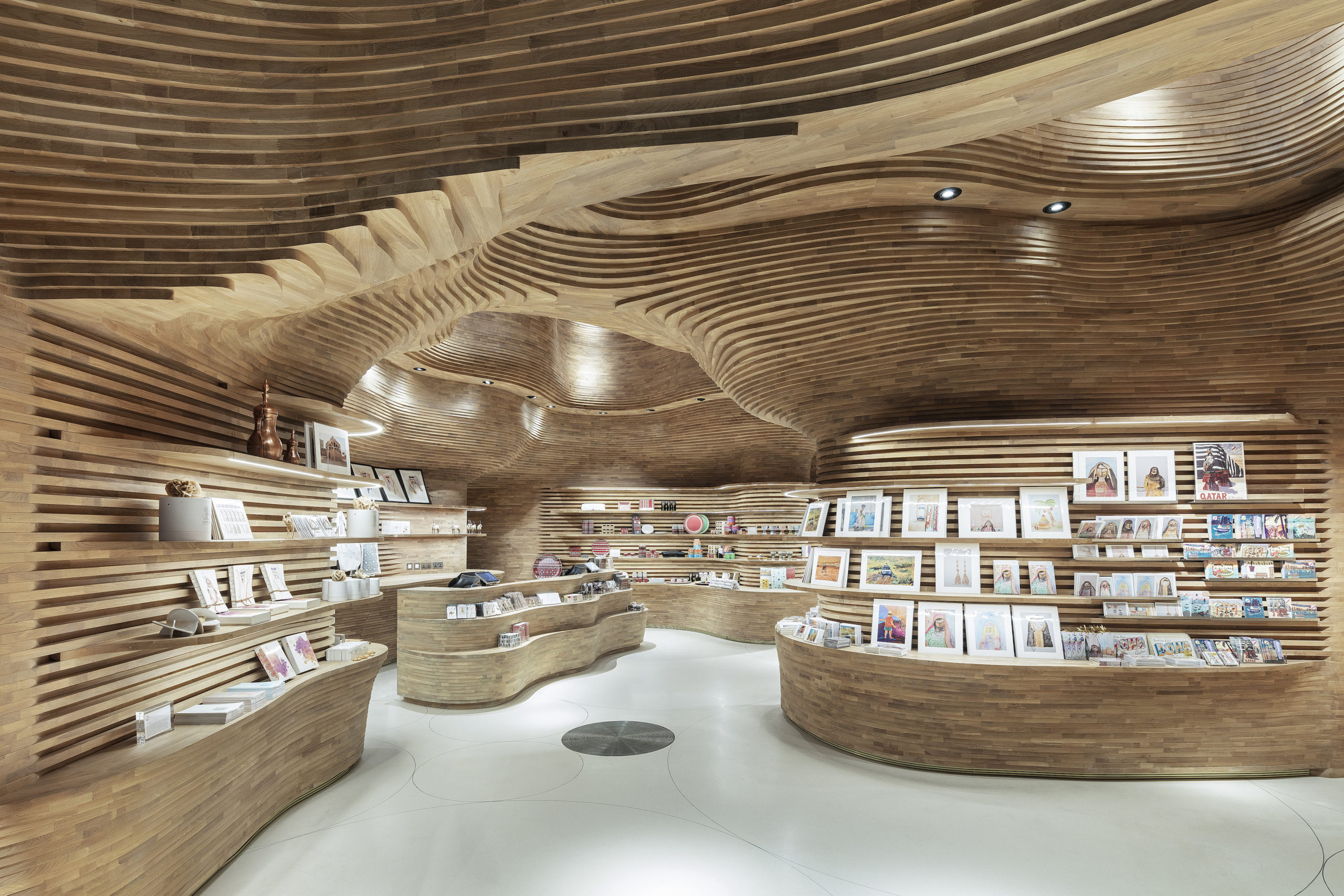 To celebrate the Dahl Al Misfir (Cave of Light), a beautiful underground landscape in central Qatar, the National Museum of Qatar’s gift shop recreates the natural picturesque with 40,000 pieces of timber. With the aid of 3D modelling and CNC cutting, the timber pieces are precisely crafted and form smooth curves without any visible fixings. With a surprisingly generous space overhead, the depth and massiveness of the original landscape are well replicated as a memorial of the natural heritage. The shops provide a unique shopping experience that cannot be found elsewhere.
2021: Velaa Sindhorn Village
Architects 49 Limited | Bangkok, Thailand
Popular Choice, 2021 A+Awards, Commercial – Retail
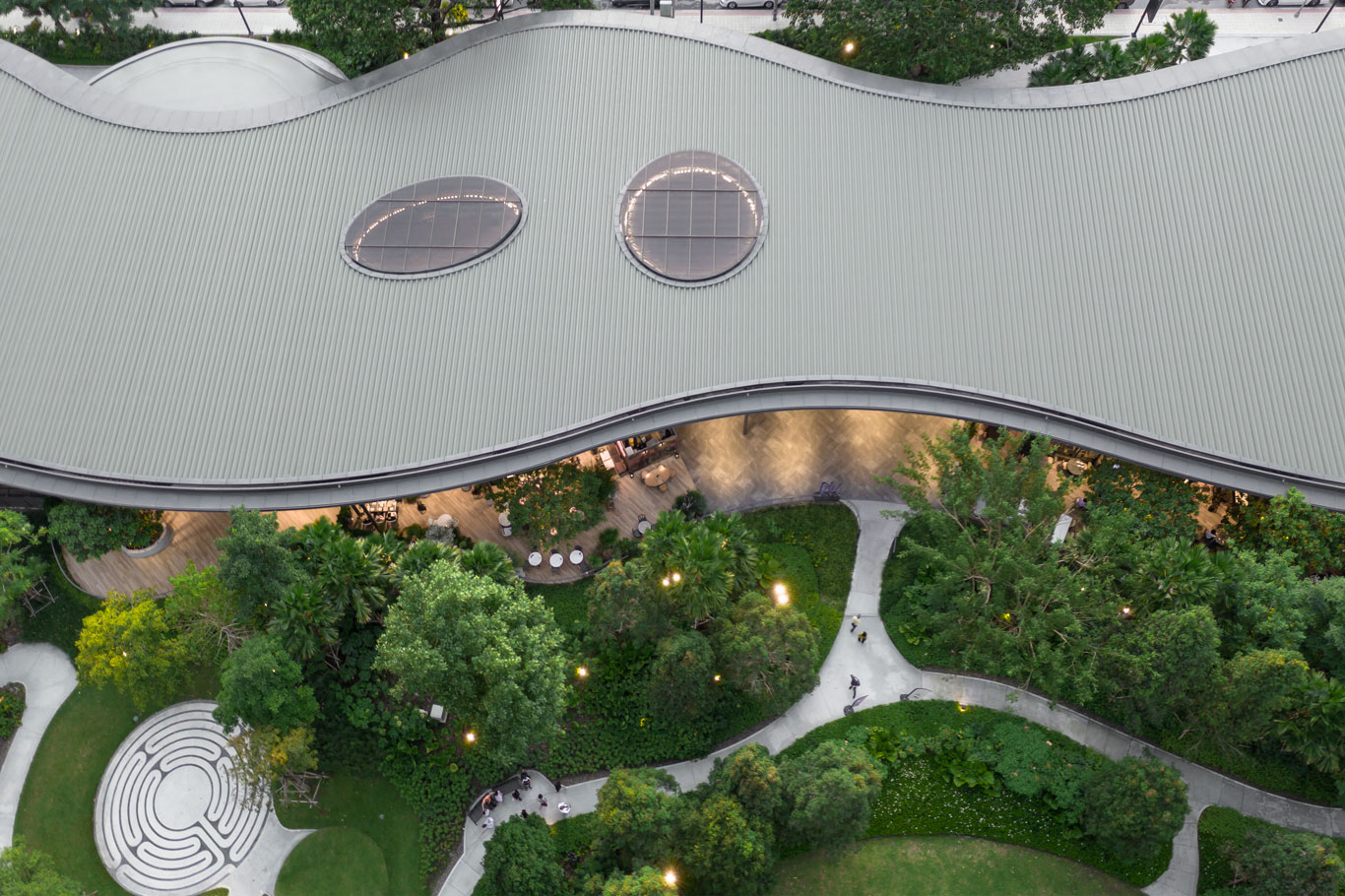
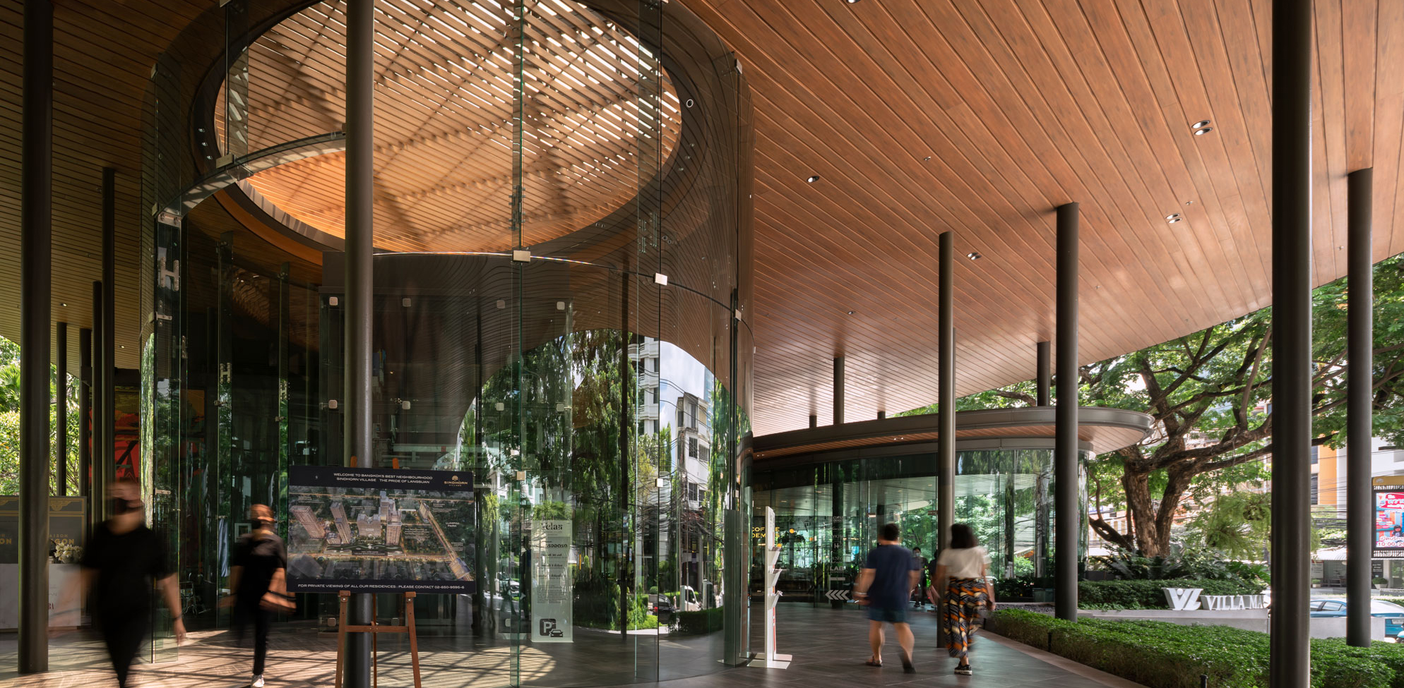
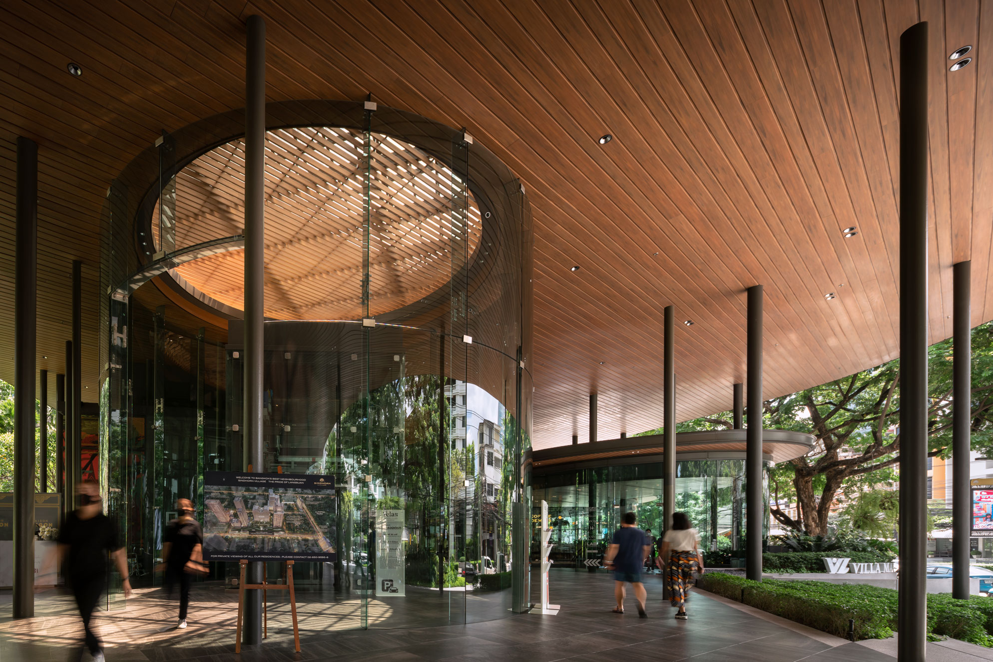 The Sindhorn Village is a commercial complex that provides an escape from the urban chaos and concrete jungles. Shops meander along Langsuan Road in a semi-outdoor space, embracing the urban green areas next to the complex. The experience of wandering among the shops feels like walking under the trees. The tall roof makes all shops visible from the street, keeps the area sheltered while allowing good ventilation for the tropical climate. The roof canopy is supported by columns resembling the thickness of the tree trunk. Furthermore, sunlight filters through the four louver openings on the canopy, mimicking the scenery of lights coming through the leaves.
 Cheese Tart Shop “BAKE” in Ho Chi Minh City
  National Museum of Qatar Gift Shops
  Östermalm's Temporary Market Hall
  Sokol Blosser Winery Tasting Room
  Sugamo Shinkin Bank / Shimura Branch
  THE DRAPE
  UNILUX
  Wild Turkey Bourbon Visitor Center