Architects: Showcase your next project through Architizer and sign up for our inspirational newsletter
When combined with elements like wayfinding or circulation, color profoundly shapes how we experience architectural space. While color-coded circulation has been used throughout history, it’s being increasingly used to highlight expressive forms or delineate multiple thresholds. Defining the boundaries of a wall or room, colored circulation draws attention by activating staircases, halls or platforms.
Taking a deep dive into novel circulation techniques, we’ve gather the following collection of projects that utilize color to emphasize a particular building path or movement. As elements defining perception, each route reinterprets traditional ideas on progression and sequence. Building identity, they make a statement and reveal the diverse ways that color can transform architecture.

© WORKac

© WORKac
Children’s Museum of the Arts by WORKac, New York City, N.Y., United States
WORKac is known for work that’s as inventive as it is serious and critical. In the children’s museum, the design is organized around a large central gallery with a color wheel that identifies different programs. This “wheel” organizes the different flows of people while articulating different spatial experiences.


© REX
Seattle Central Library by REX and OMA, Seattle, Wash., United States; photographed by James Ewing
Known across the world, the Seattle Central Library has become a celebrated civic and cultural project. Programming was at the project’s heart from the outset, directly shaping the building’s form while combining diverse functions. The library was designed as five platforms and four flowing planes connected by a series of bright-colored escalators, rooms and passageways.

© designstudio ltd

© designstudio ltd
W Hollywood Hotel & Residences by designstudio ltd, Hollywood, Los Angeles, Calif., United States
Stair Railing by CRL-U.S. Aluminum
The Hollywood branch of the international hotel chain uses a touch of movie magic. A red carpet fit for a premier cascades down its grand staircase, playfully nodding to its storied context. A transparent glass handrail makes sure that the color is visible across the room.

© selgascano

© selgascano
El “B” by selgascano, Cartagena, Spain
Inspired by the nearby port, this cultural museum was formed around the idea of creating an “interior beach” and promenade. Following the boundary of the old El Batel Beach, the reclaimed “beach-ramp” flows beneath the waterline to reveal brightly colored circulation that encourages movement.

© Paul Warchol Photography

© Paul Warchol Photography
Tower House by GLUCK+, Ulster County, N.Y., United States
Inspired by the trees that surround it, this vacation house features green enamel back-painted glass and a spacious living area on the top floor. Made with views to the Catskill mountains, the project includes glass-enclosed yellow stairs that ascend to the treetops.

© Behnisch Architekten

© Behnisch Architekten
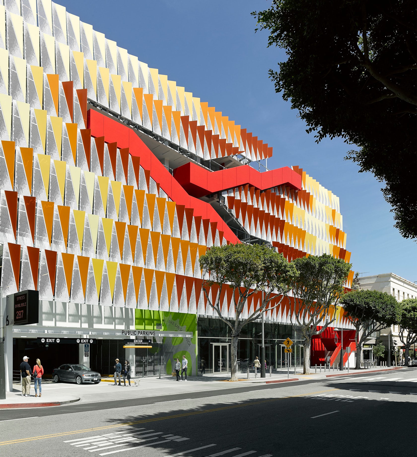
City of Santa Monica Public Parking Structure #6 by Behnisch Architekten, Santa Monica, Calif., United States
Located in downtown Santa Monica, this parking structure overlaps programs like retail, public space, storage and areas to relax. Built with a façade that features a red exterior diagonal stair, the envelope was made as a light-enhancing screen formed with perforated metal panels.

© DP Architects

© DP Architects
Singapore University of Technology and Design by DP Architects, Singapore
The new East Coast campus for Singapore University of Technology and Design was made to reflect a pedagogic model of inter-disciplinary and collaborative learning. Brightly colored and interconnected circulation paths combine with open atriums and large outdoor areas.

© Fernando Alda

© Cayuelas Arquitectos
Neuron Bio Headquarters by Cayuelas Arquitectos, Granada, Spain
As a new biomedical, pharmacological and technological research center in Granada, the Neuron Bio Headquarters is located near the Monachil River. A bright façade echoes colored interior stairways and walls, a strategy used to identify laboratories and programmatic areas to create a forward-looking image.


New United States Courthouse – Los Angeles by Skidmore, Owings & Merrill ( SOM ), Los Angeles, Calif., United States
Stair Railing by CRL-U.S. Aluminum
White is a color, right? Okay, maybe it isn’t, but this courthouse uses a very subtle translucency to create a whitish haze that introduces the only variation in color tone in the circulation spaces.

© MVRDV

© MVRDV
Why Factory Tribune by MVRDV, Delft, Netherlands
Designed around a newly created interior courtyard on the Delft University campus, the Why Factory features a three-story wooden structure that accommodates diverse programs. The project centers on a distinct, bright orange auditorium stair for learning and discourse.
Architects: Showcase your next project through Architizer and sign up for our inspirational newsletter


