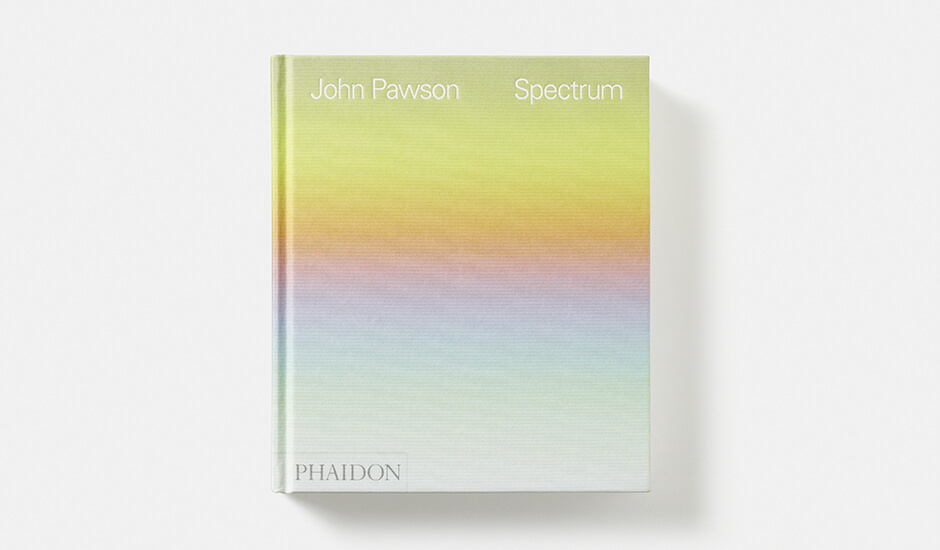

Last week, we profiled Black: Architecture in Monochrome, a fantastic new photo book from Phaidon that showcases buildings clad in the world’s most versatile hue. However, like the rest of us, Phaidon is not immune to the charms of color. They released another book this year, Spectrum, that features gorgeous photographs of surfaces of various colors, all taken by the esteemed architect and photographer John Pawson. Unlike Black, this book does not feature individual buildings, but rather zooms in on details, drawing out the full richness of the colors on display.
“The connection between photography and architecture is an intimate one,” wrote Pawson in the book’s Introduction. “Where others might sketch or make notes, my reflex is to reach for a lens. Each of the photographs here — selected from a collection measuring in the hundreds of thousands — represents one such moment of reaching for the lens. They include fragments of narratives of individual projects, but also far-flung travels and observations of the moment — the tiny things that catch the eye in the course of an ordinary day.”
Spectrum arranges these captured moments along the lines of a — you guessed it — spectrum, which each succeeding photograph featuring a color that is a shade different than the one that preceded it. The result is a seamless journey through reds, greens, blues and everything in between.
The following selections from Spectrum feature inspiring examples of color being used to emphasize architectural materials. Pawson intentionally eschews all but the most minimal contextual information for these images, leaving space for the viewer to imagine the limitless possibilities they suggest.
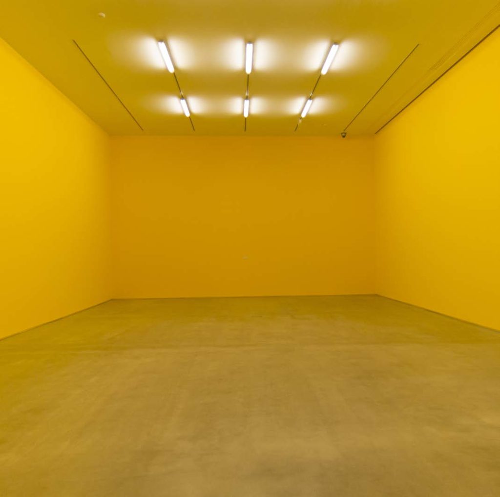
Barajas, Madrid. February 2013
1. Yellow Beams
Yellow is a color with mixed associations. While it is the color of sunshine, it can often be difficult to wield when used as a pigment. The wrong yellow can have a sickly aspect to it, which is why it has traditionally been known as the color of cowardice and deceit.
The yellow on display in this mysterious Madrid room is certainly of a robust, healthy sort, tending toward orange. The secret might be in the raw concrete floor, which grounds the space, or the flood of overhead light.
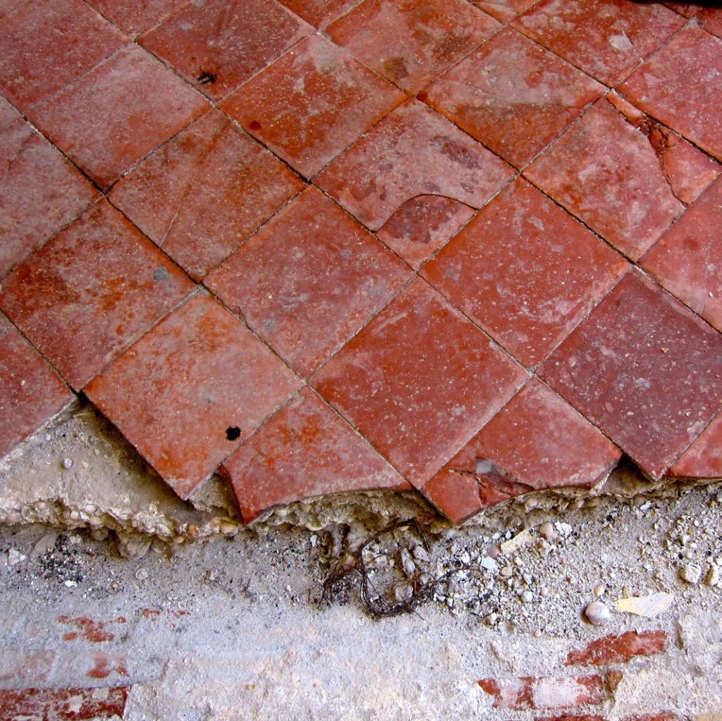
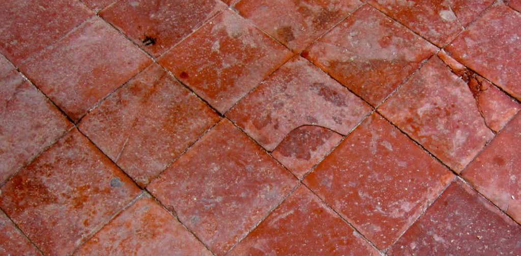
Jaffa, Israel. April 2013
2. Brick Red Tiles
Something about the sanguine richness of these cracked tiles is startling. They’re old, damaged, but not quite faded.
Red is a difficult color to work with, but done right it can make an extraordinary impact. For a classic example, look to the Puck Building in Nolita, a Romanesque Revival classic that all New Yorkers should recognize.
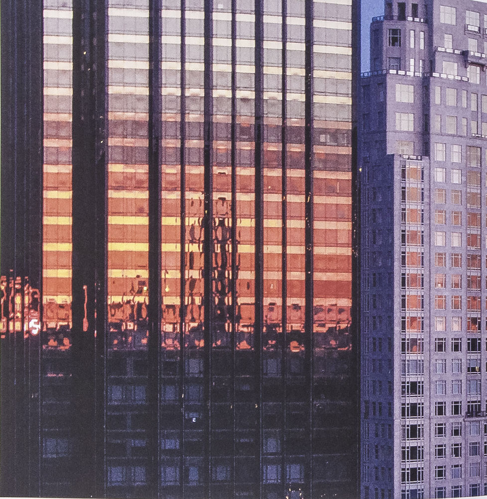
New York, New York. February 2009. Image via John Pawson
3. Luminescent Glass
Le Corbusier described architecture as “masses in light.” And the best way to take advantage of the light is, of course, glazed surfaces. Nothing quite matches a Manhattan sunset in which glass towers are temporarily emblazoned.
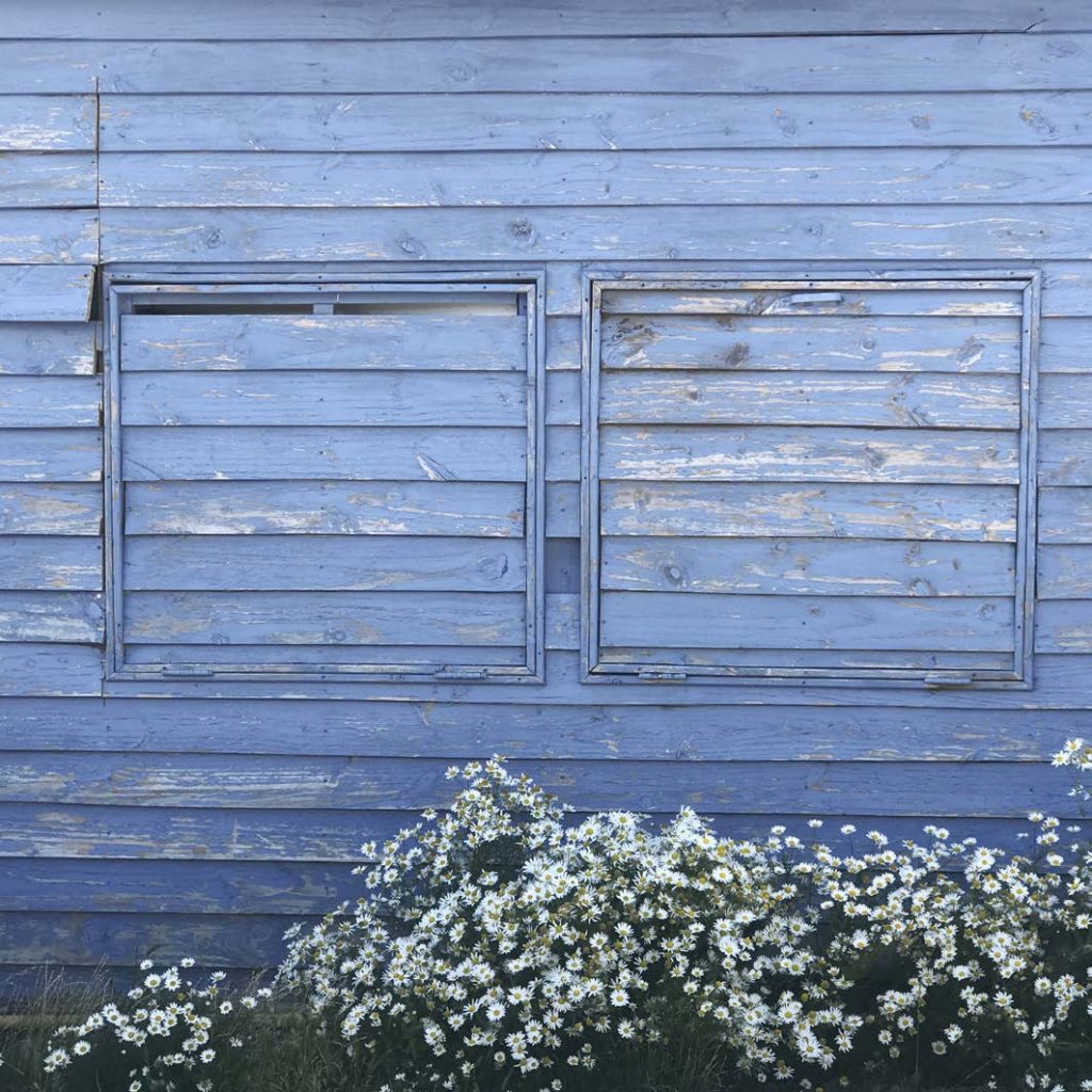
El Calafate, Argentina. February 2017
4. Blue Wood
One does not need to look to an expensive building to see colors and materials used to create beautiful effects. Chipped blue paint on the side of a barn can sometimes do just fine. Note the contrast between this rich, almost purple blue and the surrounding white chickweed.
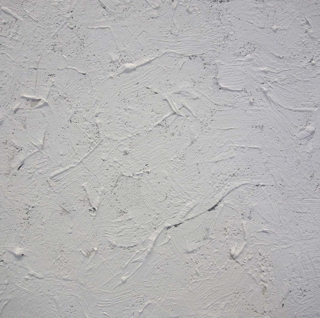
New York, New York, USA. April 2013
5. White Paint
“Color is an attribute people don’t necessarily associate with my work,” writes Pawson. “There is a presumption that it is all about whiteness.” But as Pawson understands, white itself is a color, prone to subtle variations in shade and texture. This photograph of a spackled wall brings out the richness of a surface that many would think of as incomplete.
Bloomsbury, London. July 2012
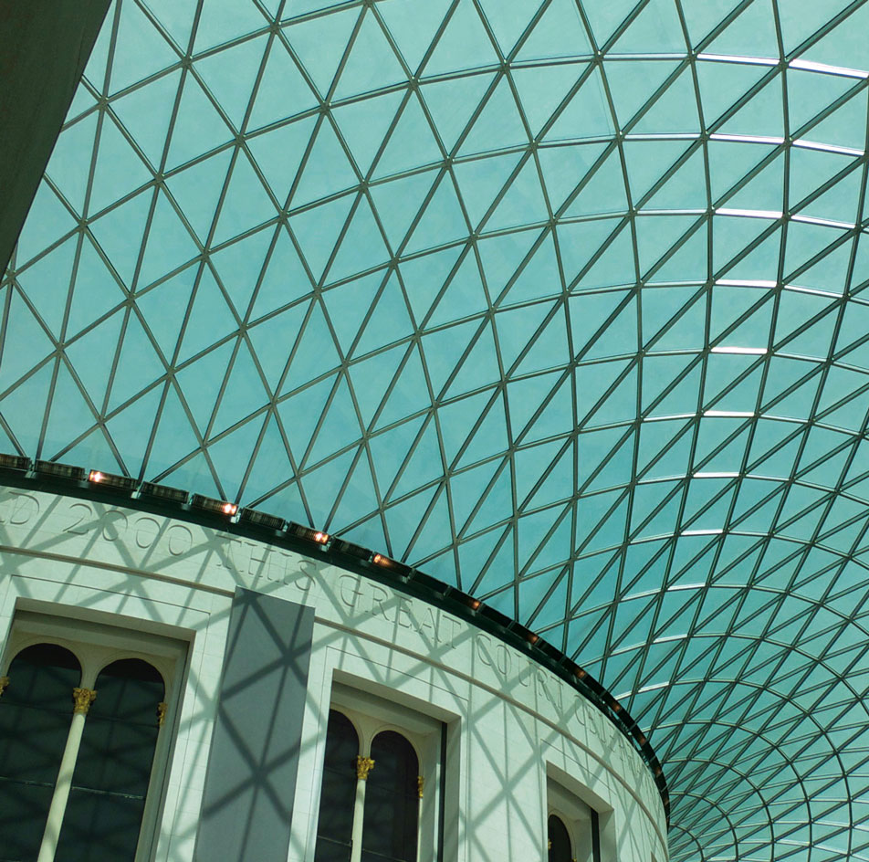
6. Aquamarine Glass
The Great Court of the British Museum is the largest covered public square in Europe. Its canopy of 3,312 tesselated glass windowpanes was designed by Foster and Partners and unveiled in 2000.
Pawson’s photograph captures a portion of the ceiling at a moment when the light was, as painters often say, “interesting.” It’s one of the few structures in the book that is immediately recognizable.
Bendinat, Mallorca, Spain. November 2011
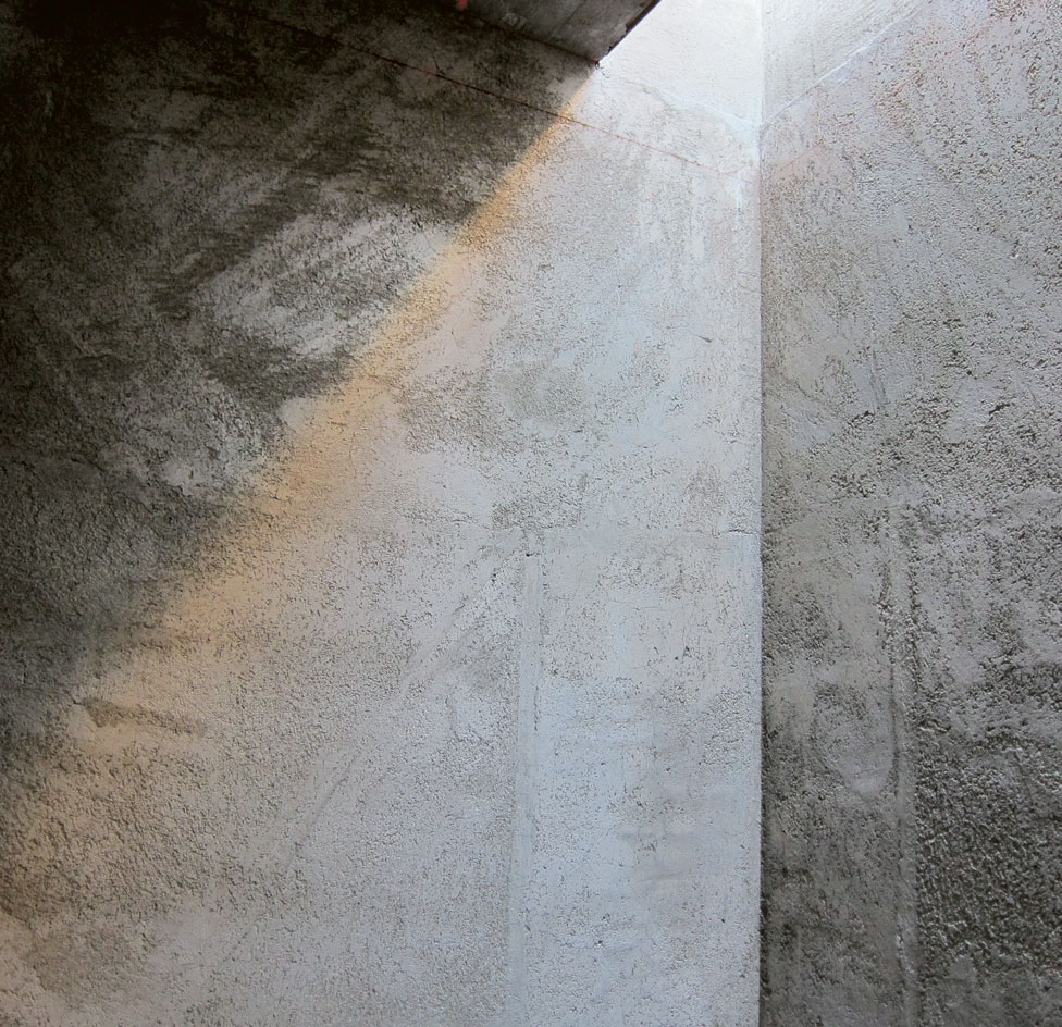
7. Raw Concrete
Spectrum features a number of photographs that linger over every architect’s favorite surface: raw unfinished concrete. Outsiders don’t get it, but for the sensitive viewer attuned to concrete’s charms, grays can be as captivating as blues or reds.
The sunlight flooding into this space from an aperture overhead is reminiscent of the Pantheon in Rome and its famous oculus, which stands atop what is still the world’s largest unreinforced concrete dome. When it came to concrete, the Romans knew their stuff.
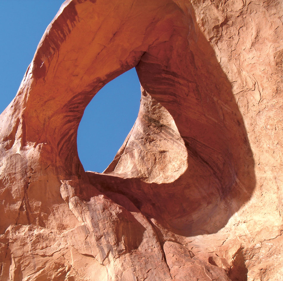
Sedona, Arizona. February 2005
8. Desert Rocks
While a natural surface, the red bed sandstone featured in this image should be an inspiration to architects. The complementary contrast between the orange-red stone and the turquoise sky is truly stunning. There are few things in nature that stand out this boldly and brightly.
All images via Phaidon unless noted otherwise. To see more of Pawson’s extraordinary photographs, check out Spectrum.