Architects: Want to have your project featured? Showcase your work by uploading projects to Architizer and sign up for our inspirational newsletters.
By design, glass ceilings tend to attract attention to themselves. Their functional purposes are fairly limited, and their shortcomings can be sizable (depending on how good the glass is at insulating), but we keep building them because they’re just so appealing. Glass ceilings enliven everything under them, imbuing the indoors with natural lighting that we seem to be instinctively drawn to.
These 7 glass ceiling projects are all of the above, yet, they are even more eye-catching, thanks to designs that boldly imitate nature. The structures below twist and curve in impressive, unorthodox and biomorphic ways, stretching the limits of what’s possible with glass ceilings.
44 Union Square/Tammany Hall
By BKSK Architects, New York, NY
Jury & Popular Choice Winner, 9th Annual A+Awards, Architecture +Collaboration
Photos by Christopher Payne/Esto and Francis Dzikowski
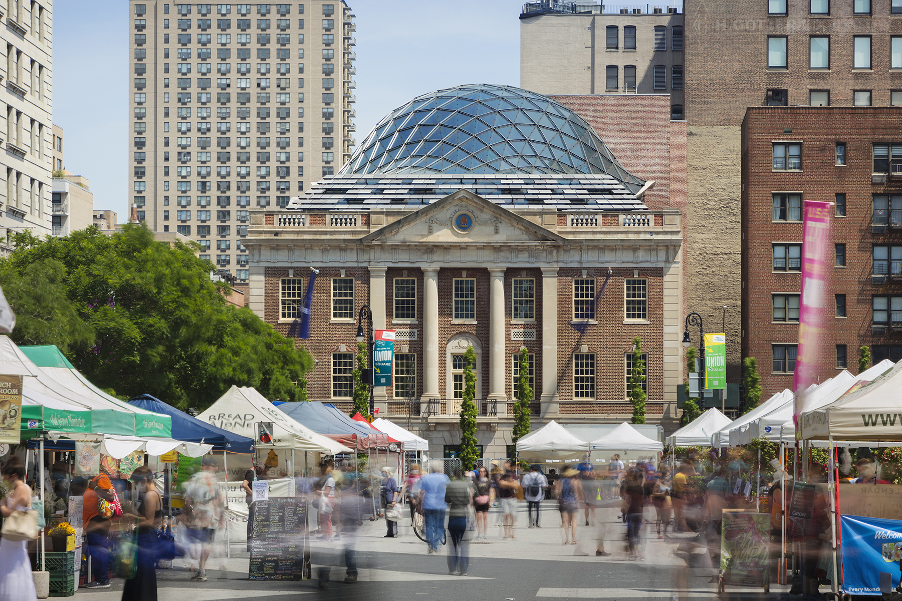
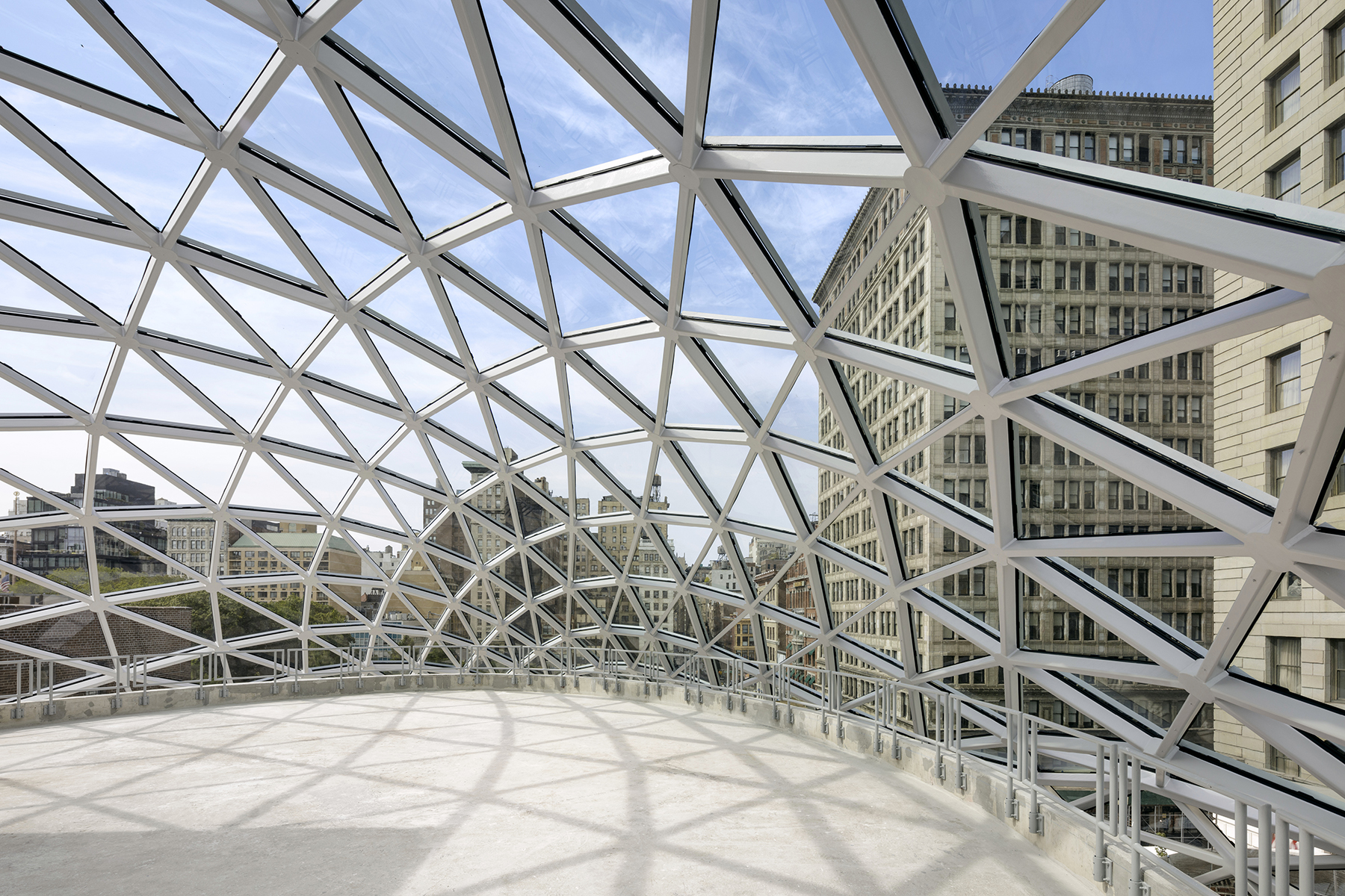
BKSK Architects’s recent redevelopment brings a historical landmark back to its former glory with a meticulous façade restoration that revamps the original building’s bronze and limestone storefronts. However, the new, eye-catching 3-story glass ceiling addition draws attention to an even earlier history. The free form grid dome made with a hipped roof of steel, glass and terracotta sunshades mimics the shell of a turtle – a homage to the Indigenous Lenape people native to New York. For BKSK Architects, juxtaposing these two sources of the city’s history “creates a meaningful visual dialogue between contemporary and historic architecture”.
Bálna Budapest
By ONL [Oosterhuis_Lénárd], Budapest, Hungary
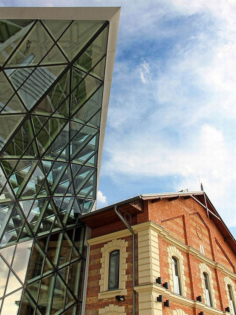
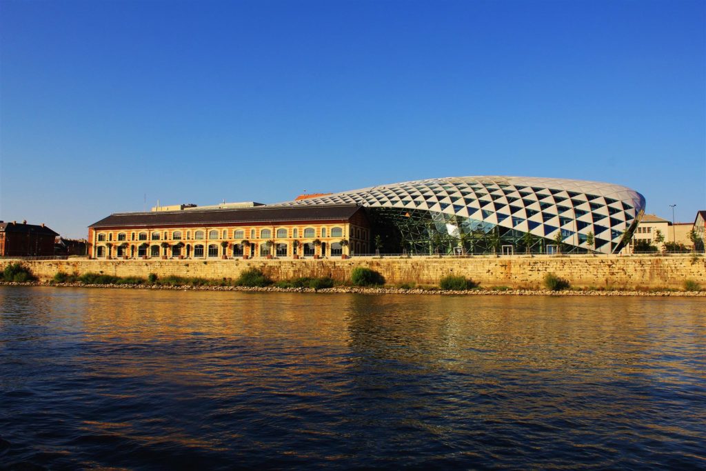 This redevelopment in Budapest seeks to reconnect the urban landscape with the adjacent Danube River with an aquatic-inspired glass addition to an old commercial center. Most noticeably, the curving glass dome imitates a streamlined body of a whale. But the design is subtle enough that the glass addition takes a life of its own, beyond its biomorphic origins.
Joe and Rika Mansueto Library at the University of Chicago
By JAHN, Chicago, IL
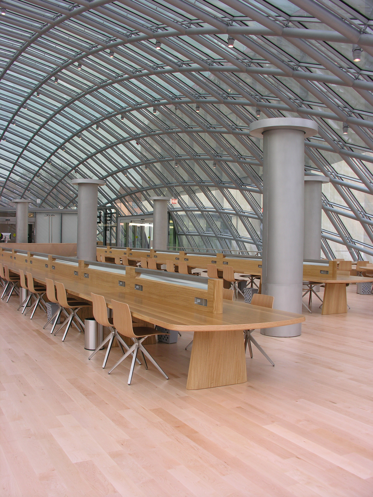
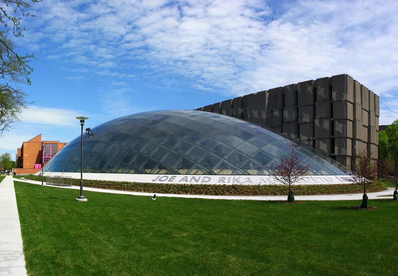 Given the eclectic mix of architecturally distinct campus buildings in its vicinity, it was fitting that this new library at the University of Chicago should stand out as well. The elliptical glass dome design elegantly rejects the common utilitarian box-shaped university libraries; in doing so creates a more natural and people-friendly place to do studies. Like a biodome, the library’s reading room offers a sunny, outdoor-like atmosphere without the inconveniences of being outside.
Middelfart Savings Bank
By 3XN, Middelfart, Denmark
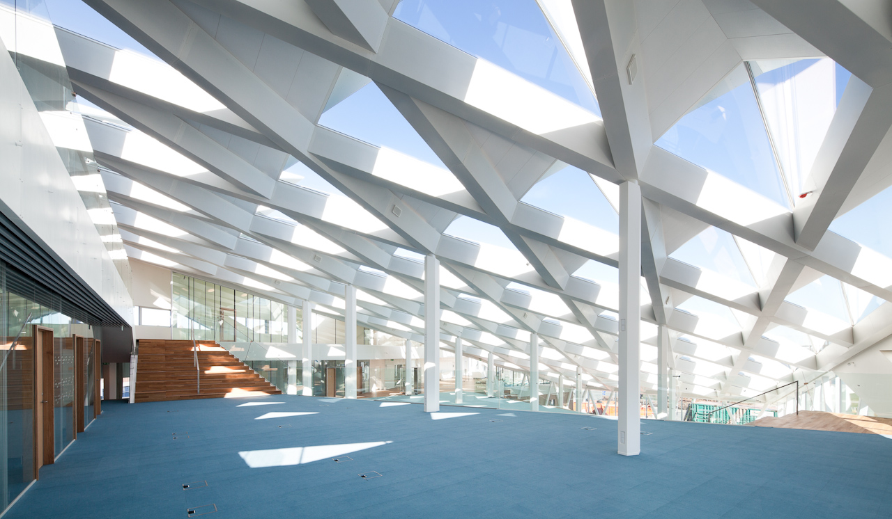
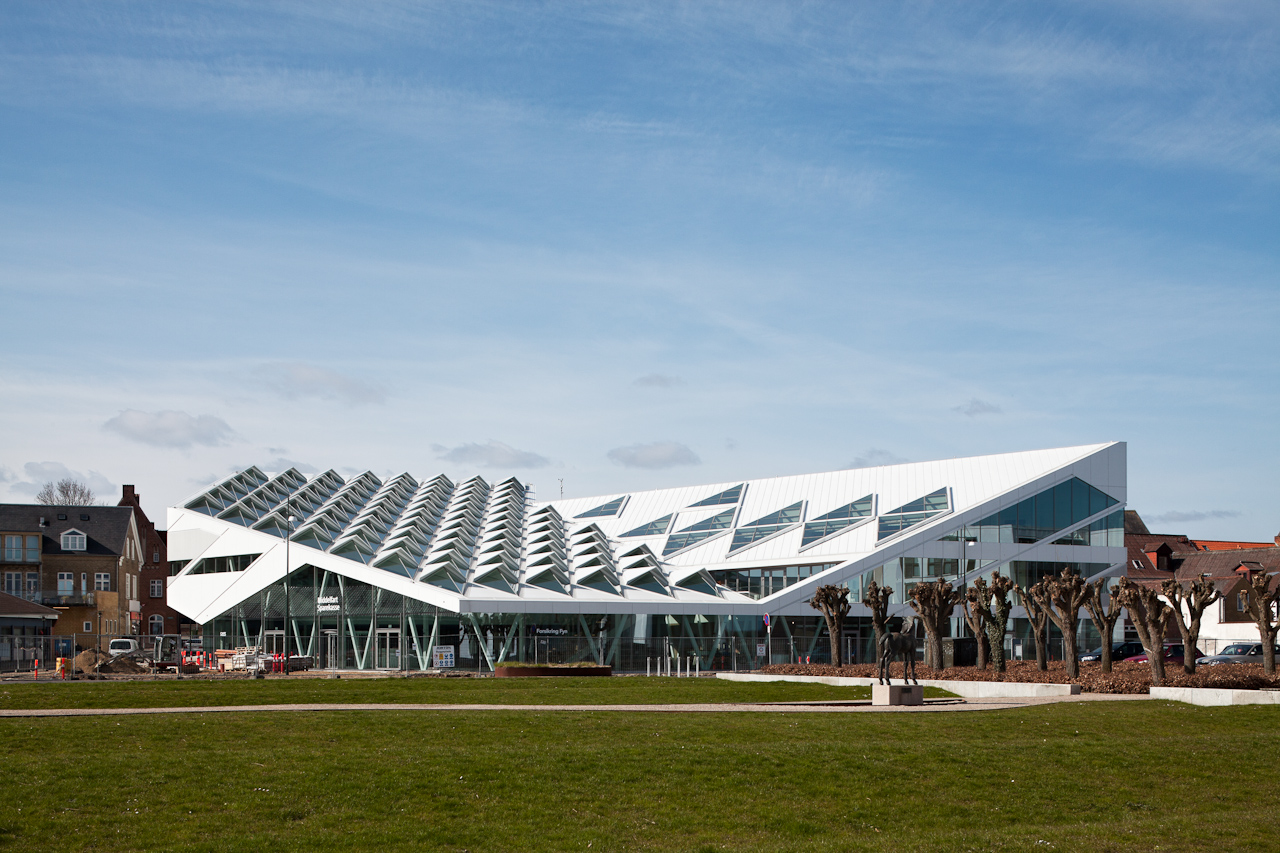 This new multi-purpose commercial space in the seaside town of Middelfart, Denmark brings a brisk change to the architectural cityscape, without excessively sticking out. The white slanted roofs offer a sharp contrast to the old town’s color palette, but the structure’s scale and proportions are not out of line with the neighborhood. Similarly, the triangular-shaped cornices that adorn the roof — which cleverly double as skylights — are a bold architectural choice, yet they simultaneously offer an imitation of ocean waves. It’s not a coincidence that those very windows provide a direct view of the Lillebælt seaside.
China Pavilion for Expo Milano 2015
By Studio Link-Arc, LLC, Milan, Italy
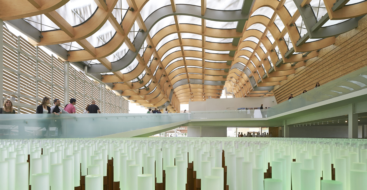
Photo by Hufton+Crow Photography
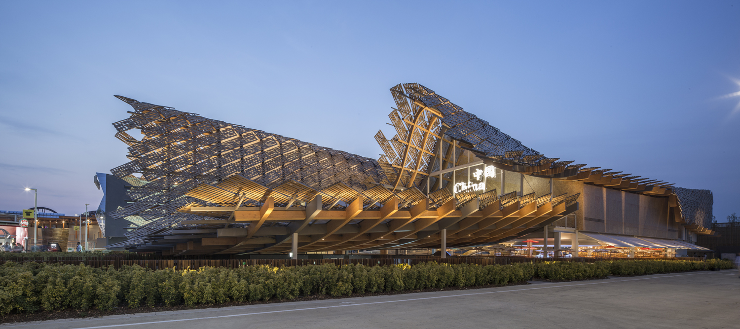
Photo by Hengzhong Lv
The unique curving roof of the China Pavilion at Expo Milano merges the profile of Milan’s skyline with the rolling natural landscapes nearby. It’s a statement of hope that city and nature can exist harmoniously, though the pavilion reminds us of this elsewhere as well. Outside, layered collections of shingled bamboo float above the roof, muddling the sun rays as they enter the skylight’s translucent membrane. The result is an ethereal atmosphere for visitors inside.
Salvador Bahia Metro Station
By JBMC Architects, Salvador, Brazil
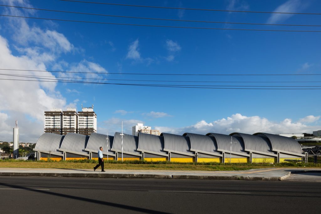
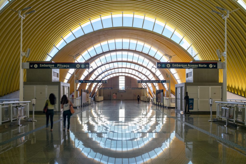 The central motif of this new transport hub in Salvador, Brazil consists in large overlapping semi-cylinders stacked like fallen dominoes. Conveniently enough, this slanted pattern allows for slivers of sun to pass through concealed, arching skylights, brightening the main station considerably.
MyZeil
By knippershelbig, Frankfurt, Germany
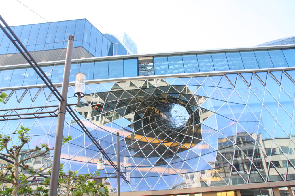
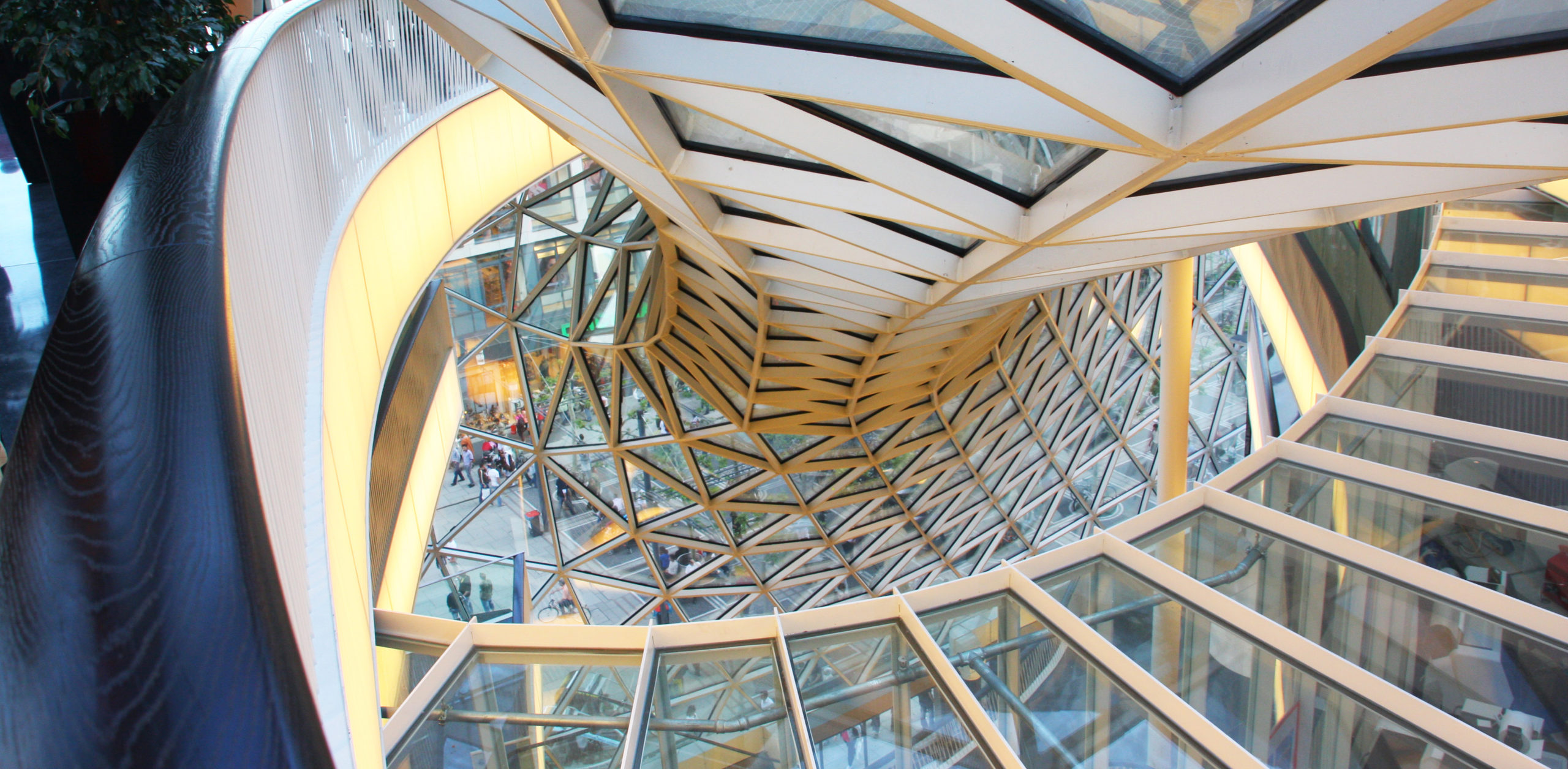
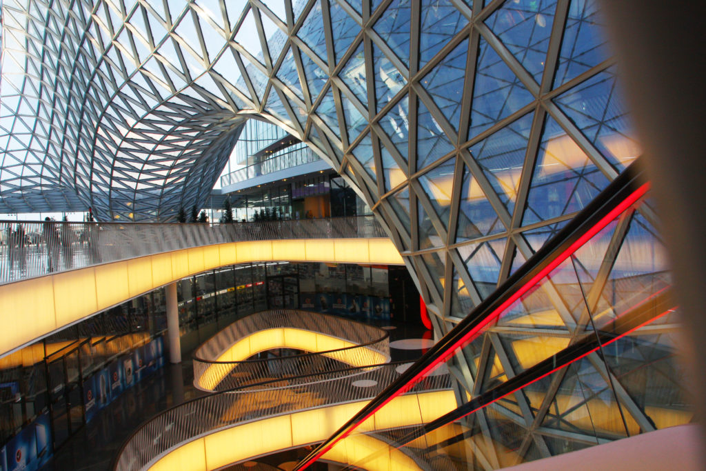 While the design concept for the roofing on this project was supposedly based on the shape of a canyon, this retail center in Frankfurt turns curving glass on its head very literally. The resulting concoction, a light and airy shell, appears like a water funnel, a vortex or a portal into another dimension.
Architects: Want to have your project featured? Showcase your work by uploading projects to Architizer and sign up for our inspirational newsletters.
