Architects: Want to have your project featured? Showcase your work by uploading projects to Architizer and sign up for our inspirational newsletters.
Shopping is no longer simply about going to a location and buying a product that you need. The concept has turned into a recreational activity where consumers can go to stores and simply interact with different products. Shopping malls and department stores are experimenting with different design and sales strategies to ensure that their location is the trending spot. After all, they must remain relevant in a time when online shopping is not only a popular lifestyle choice but a cultural norm.
The retail industry has evolved to a place where there are thousands of brands in the same product category that are vying for the attention of a very specific consumer pool. In this context, these brands need to stand out among the rest. Strong messaging, eye-catching branding, smart packaging and unique in-store experiences are just some ways brands have been trying to achieve this goal. Below are a few showrooms from across Asia that go beyond the standard display rack module and create a whole new world for their customers to enjoy.
Green Leopard Lighting’s Flagship Store
By Cun Design, Zhongshan, China
Jury Winner, 2020 A+Awards, Showrooms
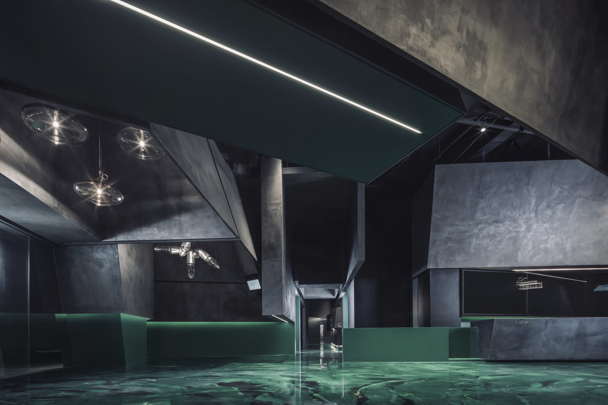
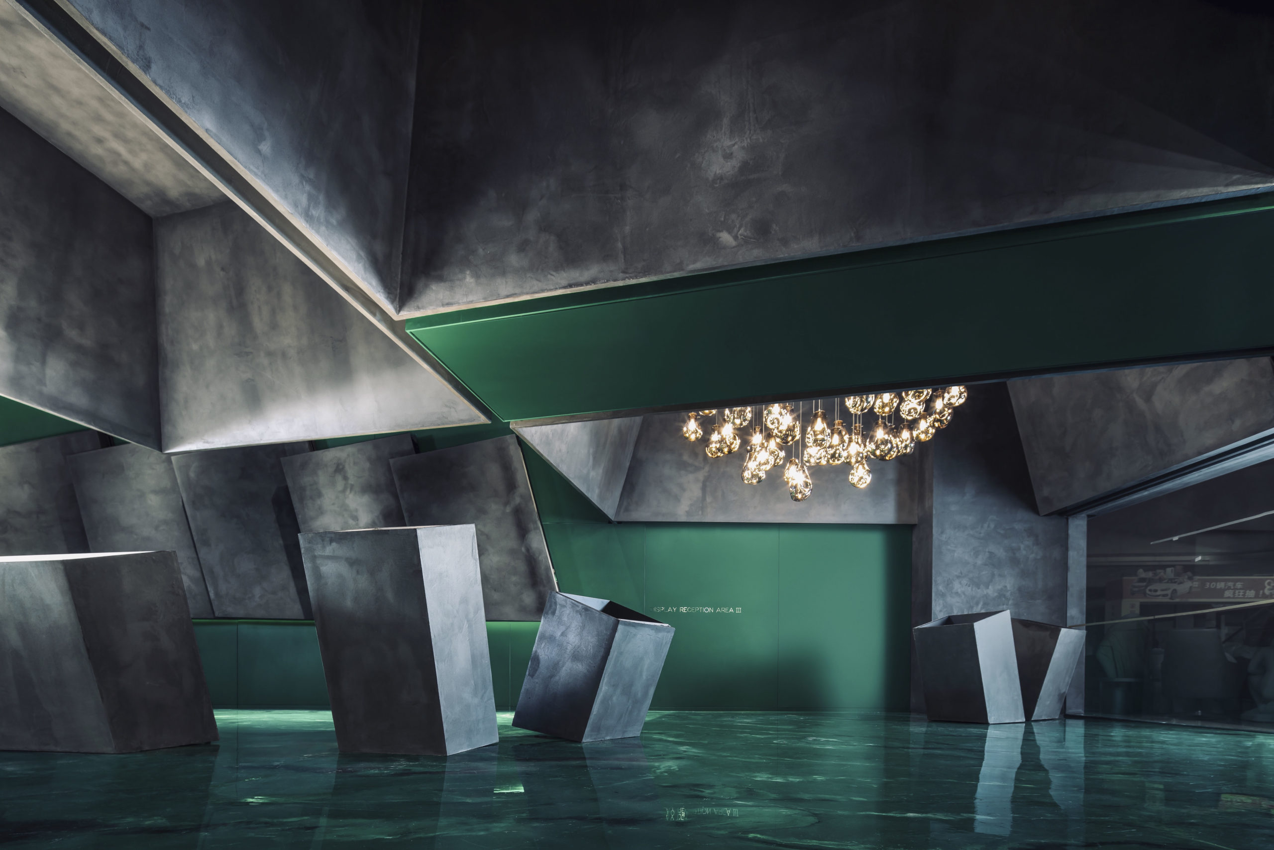 The town of Zhongshan in China is the source of 60% of the national market share of the lighting industry in the country and has over 3,600 lighting shops. Given the high level of competition, it is very important for each brand to stand out and create a unique experience for its visitors. Instead of creating a traditional display set up with furniture and curated living spaces, the architects created a moody space that is more like a geometric cave covered in glossy green and a cloudy grey. Geometric grey display blocks emerge from the green resin floors. Following the same theme, the ceiling is divided into polygonal boxes that create a focused backdrop for their lighting installations. These complex geometries are highlighted with the help of recessed and ambient lighting throughout the space.
ZIPLAB Off-line Store
By PMT Partners, Guangzhou, China
Photographs by ZENG Zhe
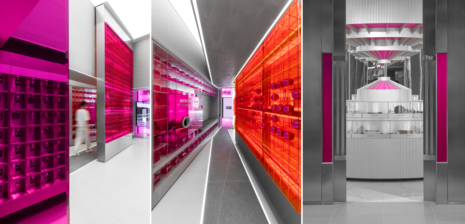
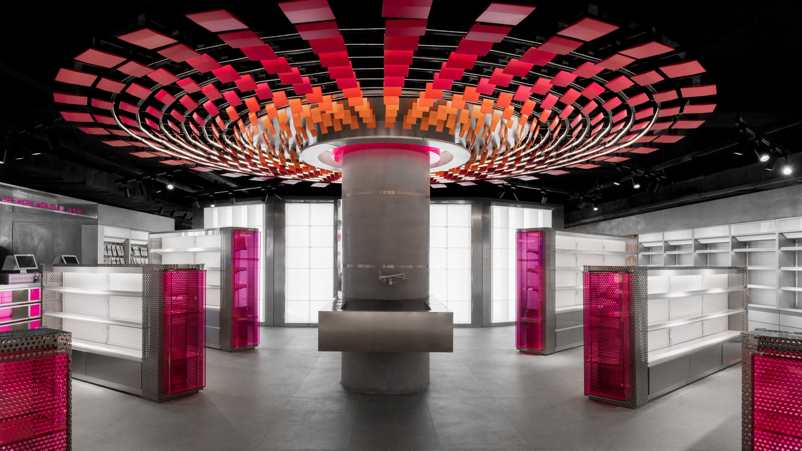
The brand ZIPLAB wants to foster the connection between consumers and the products. In this store, they have used the concept of a database to organize the spaces within and create a storyline. The offline retail space is divided into three zones: Archive Hall, Charging Tower and a Data Vault. Customers enter the store through the archive hall where they can see an acrylic wall supporting the hall and large jewelry display cabinets spanning horizontally. At the center of the store lies a large cylindrical installation termed the Charging Tower. This core is surrounded by rows of shelves in a symmetric pattern and leads to the data vault, the space that connects the experience of online and offline shopping. Here, the studio has created the idea of a cyber world using illuminated walls and mirrors.
Mantab Workplace
By S/LAB10, Kuala Lumpur, Malaysia
Images by Heartpatrick
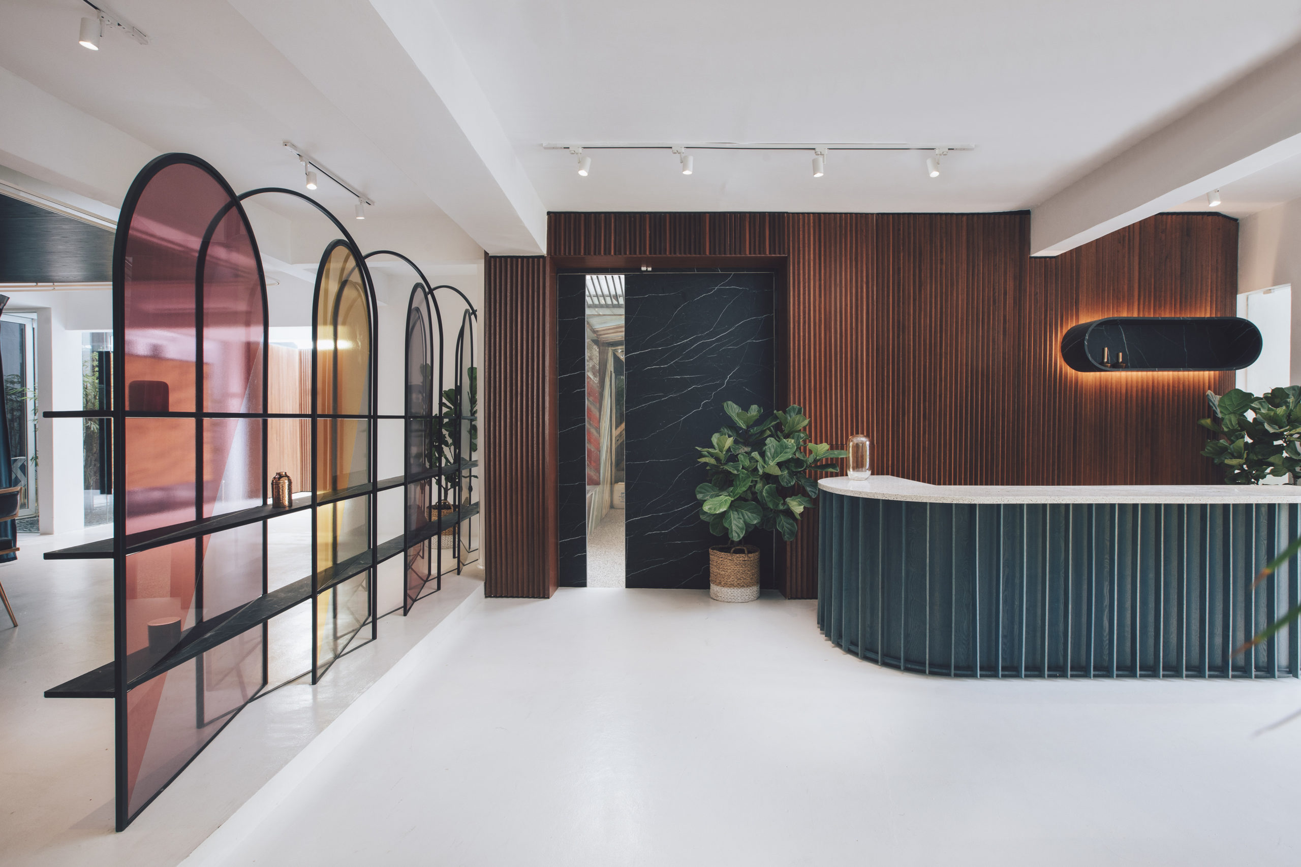
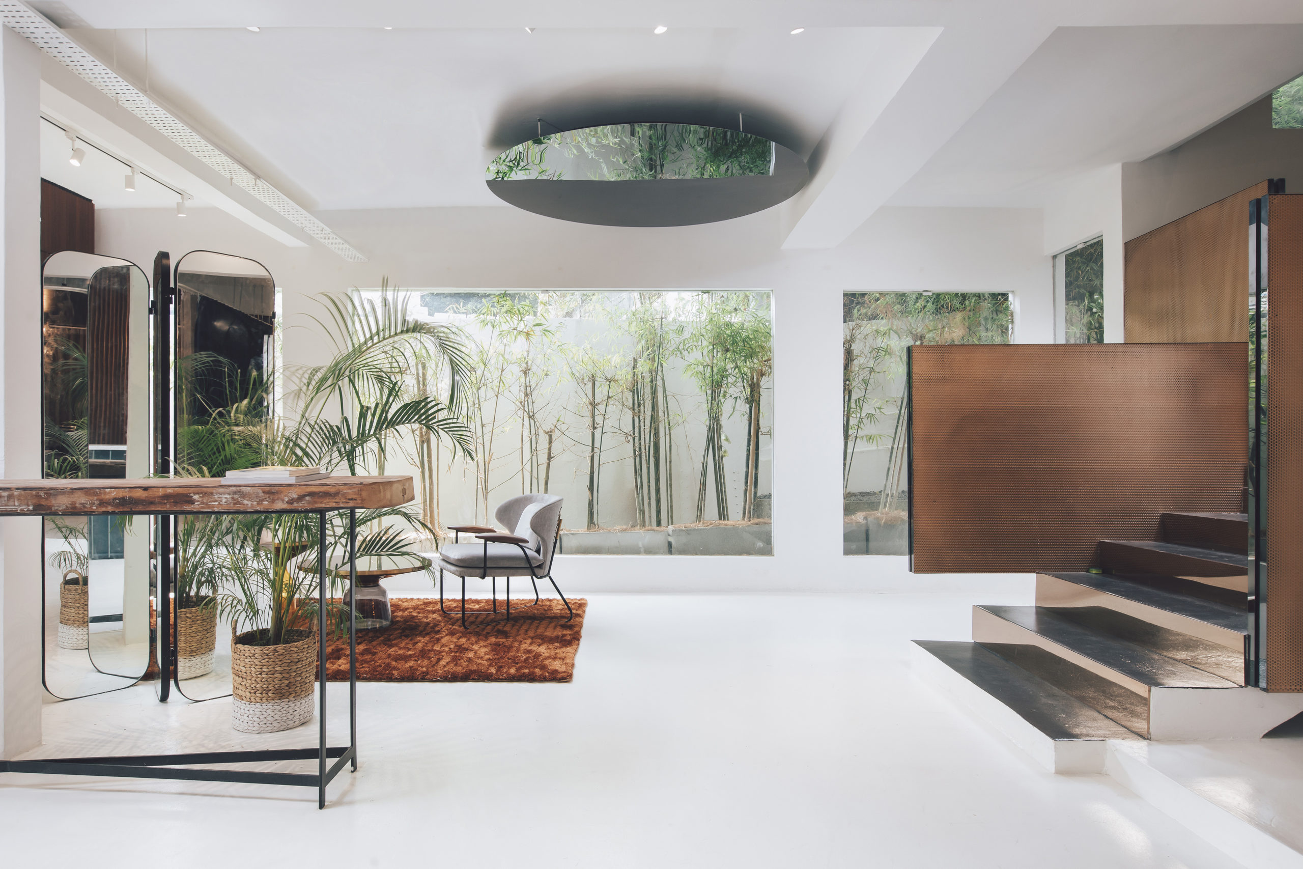
Panels of tinted glass, deep emerald surfaces and rich wooden finishes come together in this intimate showroom. The studio retained the basic structure of the existing house on site and elevated it using color and texture. The interior parts of this space feature a light backdrop that is accented by wooden additions and neutral furniture. Parts of the gallery also look out into the bamboo garden outside. The studio has also created an intimate conference area that can be opened up into the rest of the space using heavy curtains.
Timber Rhyme
By Studio Ardete, Chandigarh, India
Images by Purnesh Dev Nikhanj
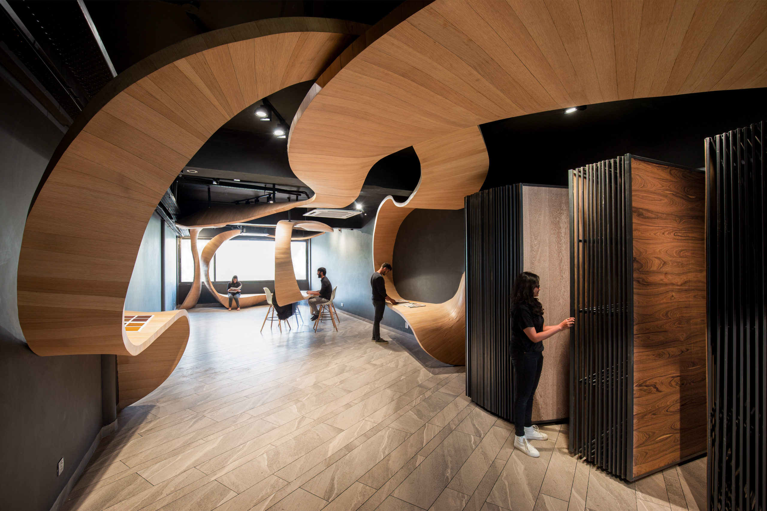
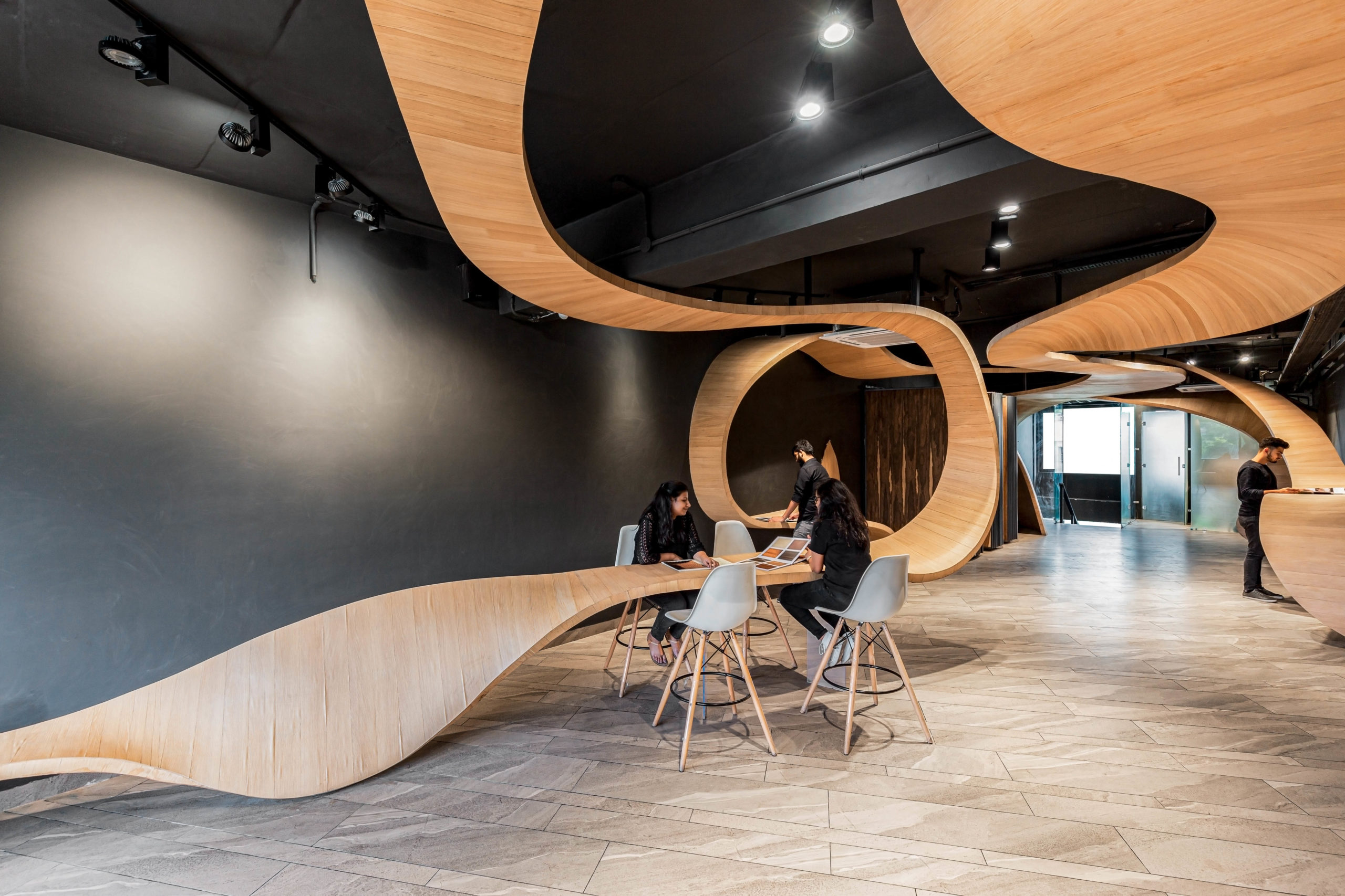
Plywood emerged as a cheaper alternative to natural wood after government restrictions on deforestation and increasing labor costs for woodwork. This material, which is also one of the main products sold by the owner of this space, is the hero of this showroom. It blurs the boundaries between art and function and aims to start a dialogue about the material, the craftsmanship of the carpenters and our understanding of space. The space explores the possibilities offered by plywood by creating a series of ribbons that travel through the rectangular space and create platforms to display, sit or work.
This ribbon also curves up in certain spots, almost creating intimate cocoons for smaller meetings. Flexiply and veneer are combined to create this long strip that varies drastically in width. The design is held up in certain parts by black metal bars suspended from the ceiling. Where required, clear acrylic ground supports have been added.
Fancy Pants Store
By Quirk Studio, Mumbai, India
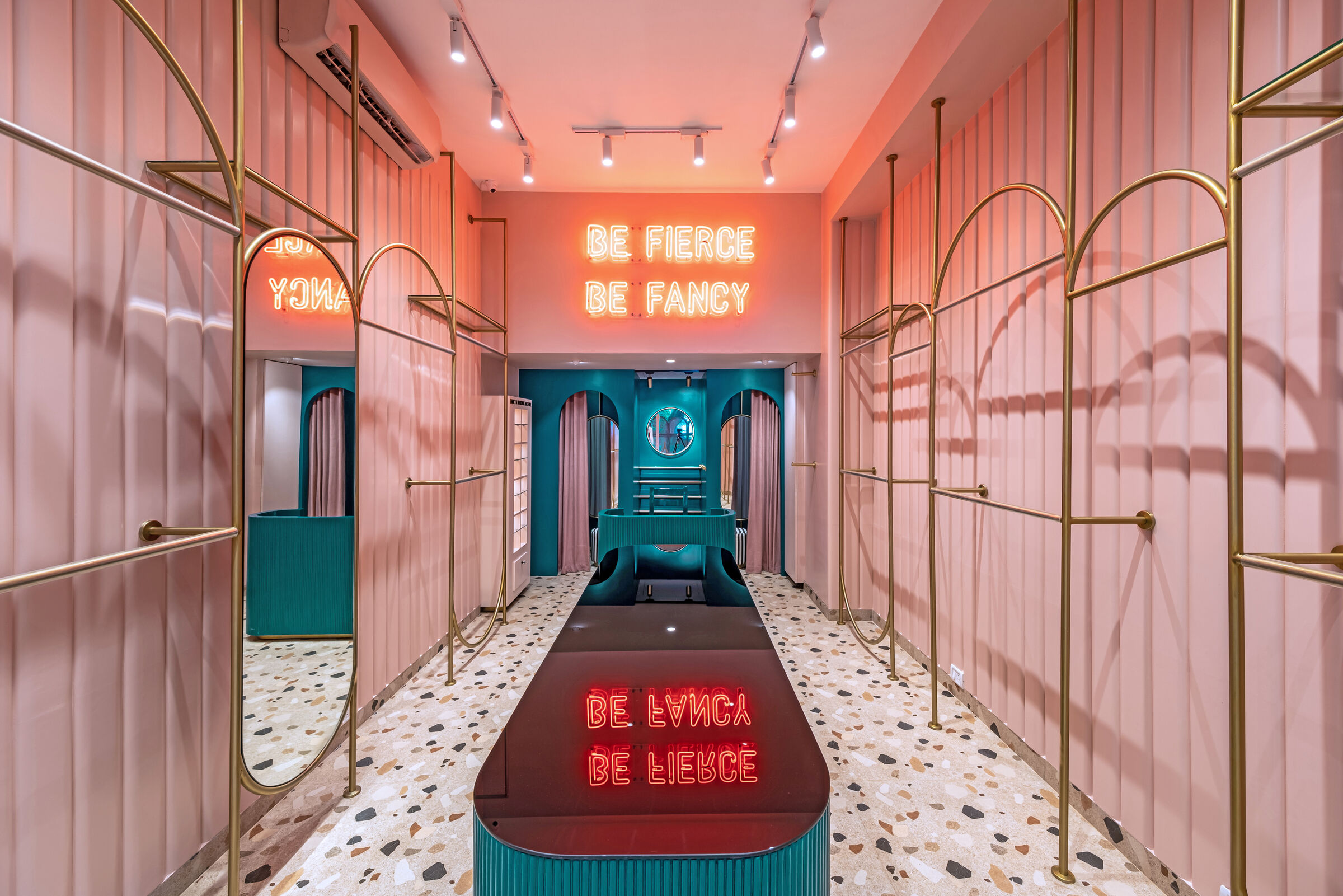
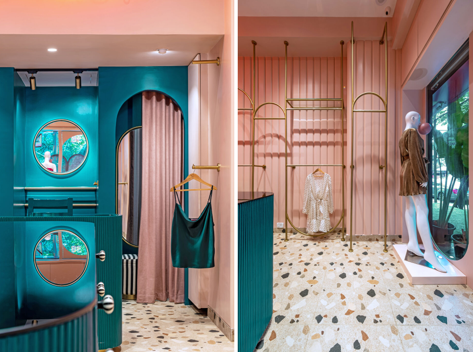 The story reflects the aesthetic of the brand, which is flamboyant, chic and feminine. Visitors are greeted by the brand’s ideology “Be Fierce Be Fancy” as soon as they enter. The store was to be fun and young but also mature at the same time to cater to a wide variety of customers. The brand’s signature color pink takes center stage and is complemented by emerald green walls and gold accents. Straight lines are complemented with curved geometries to represent the brand’s inclusive offerings. The brightness of the walls is muted down with pale terrazzo floors to make it less overwhelming.
Joy City Kid’s World
By ARIZON DESIGN, Shanghai, China
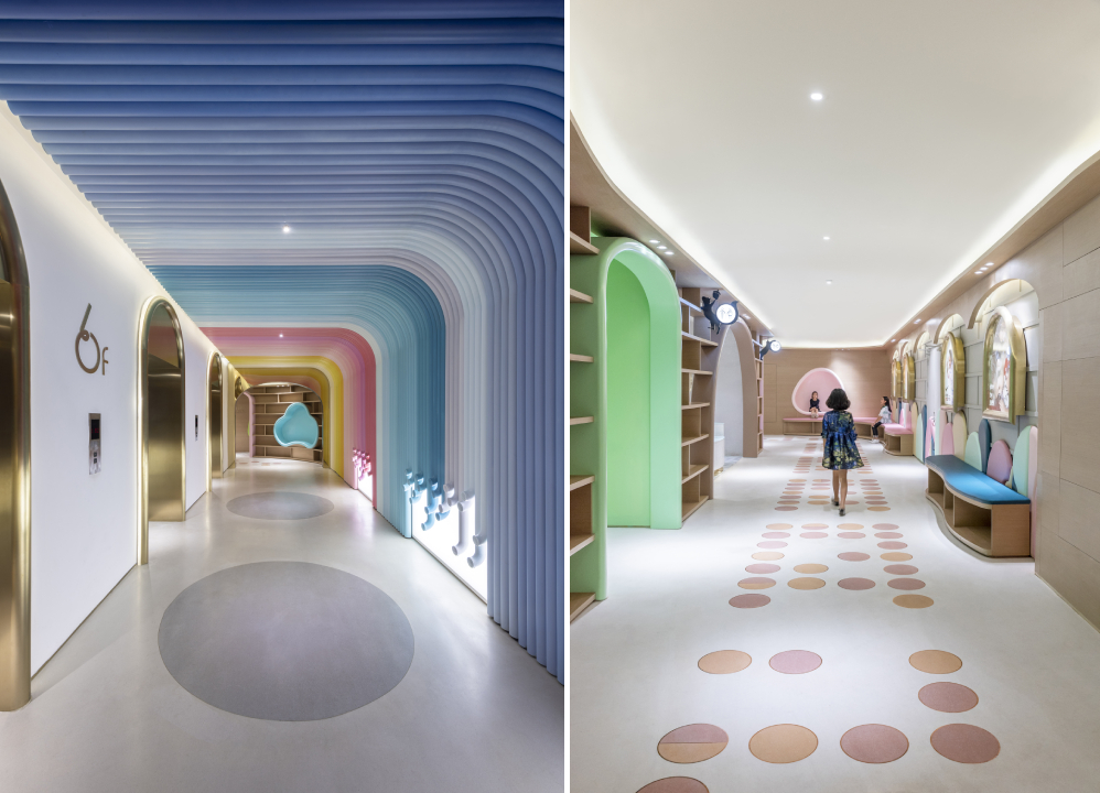
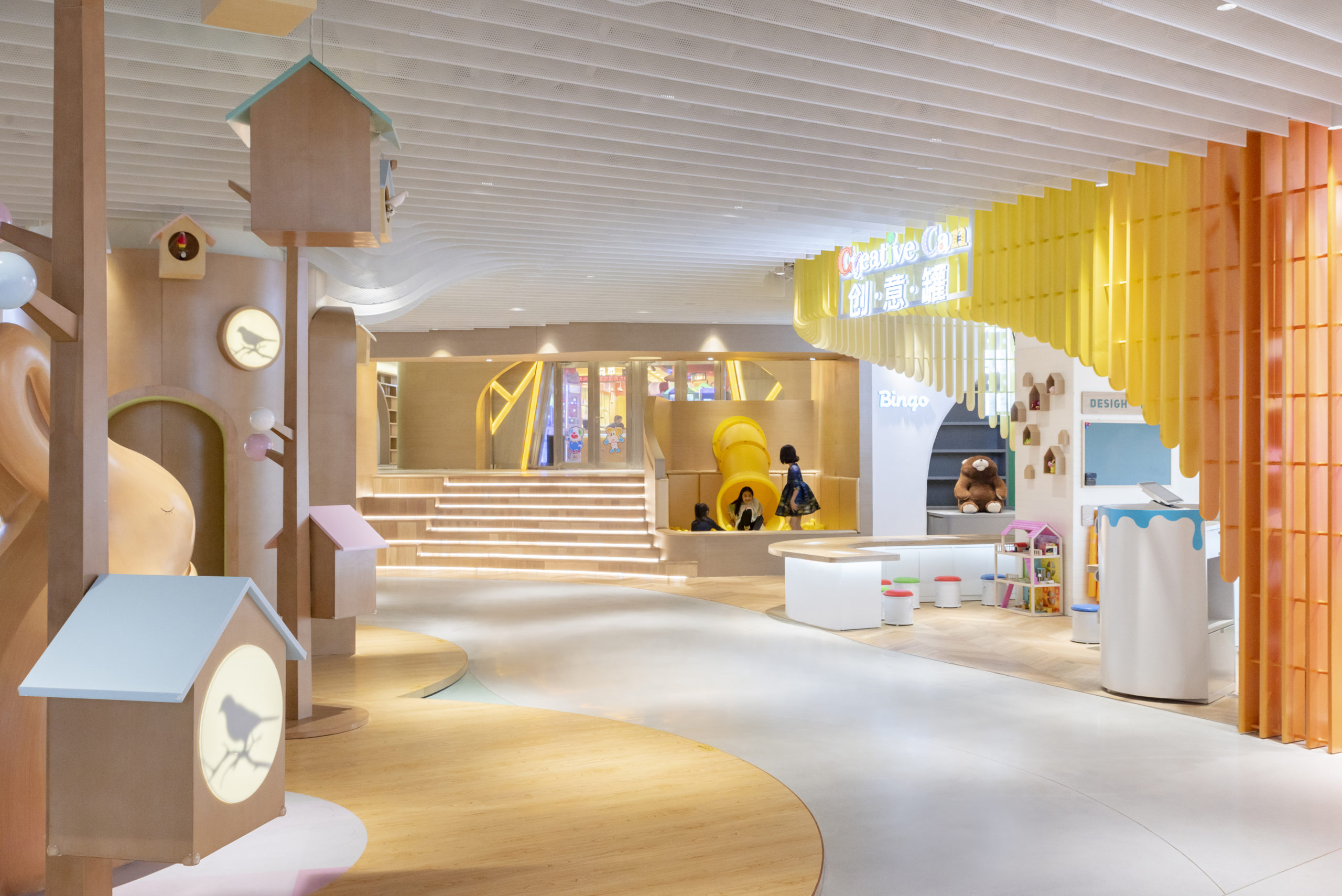 This retail space caters to children between the ages of three and 10. It is a space that encourages imagination, play and exploration. It is part of a bigger love-themed shopping mall in Shanghai. The store spans three levels of different heights where bright and pastel colors are woven in with neutral finishes. Inspired by Dandelion Hill, the architects used contoured lines across to create nooks and highlight spaces. In the lift hall, dandelion stems break apart into a singing stem installation. From there, they can go into the rainbow forest and flower bud house. Going ahead, at the center of this store is a fairy masquerade. The store creates an immersive experience where young customers can interact with the products as they run around and touch the different textures and colors throughout and create new worlds in their minds.
Key to Style
By Nendo, Shibuya-ku, Japan
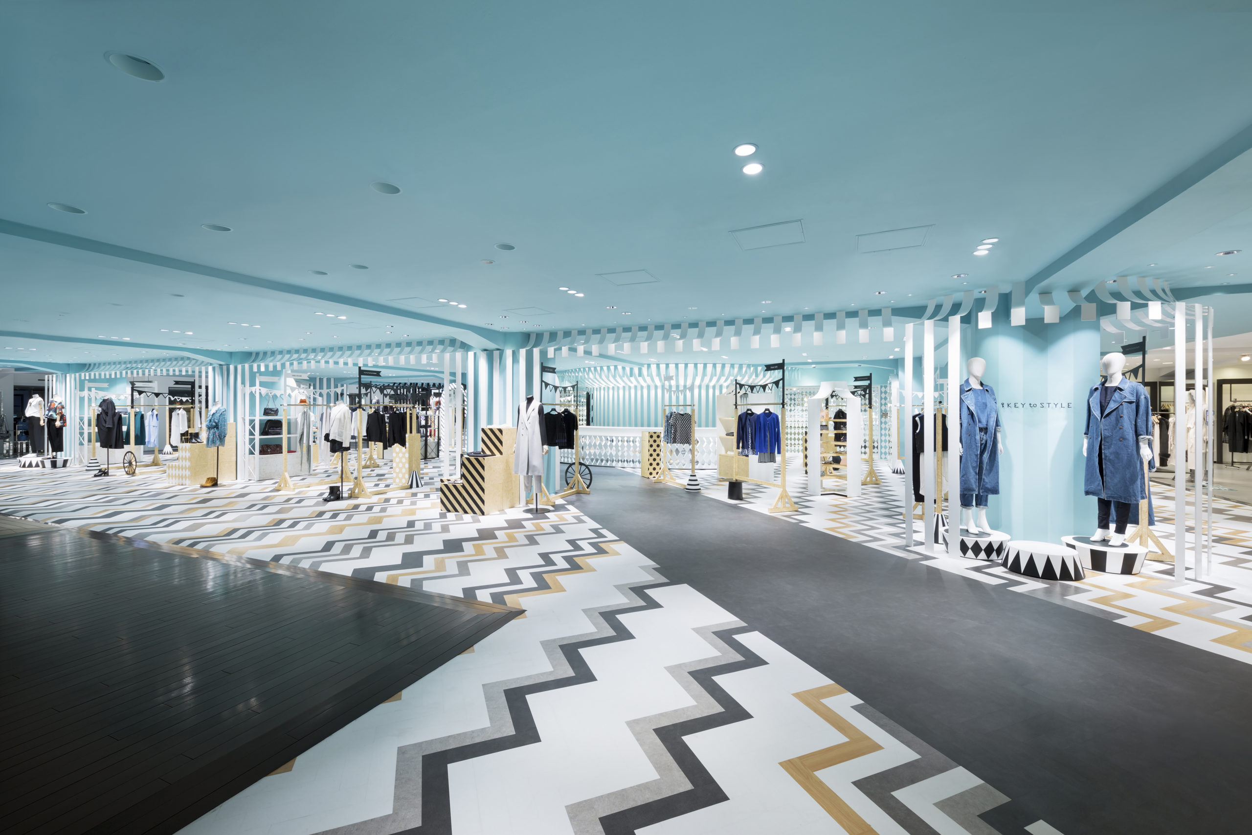
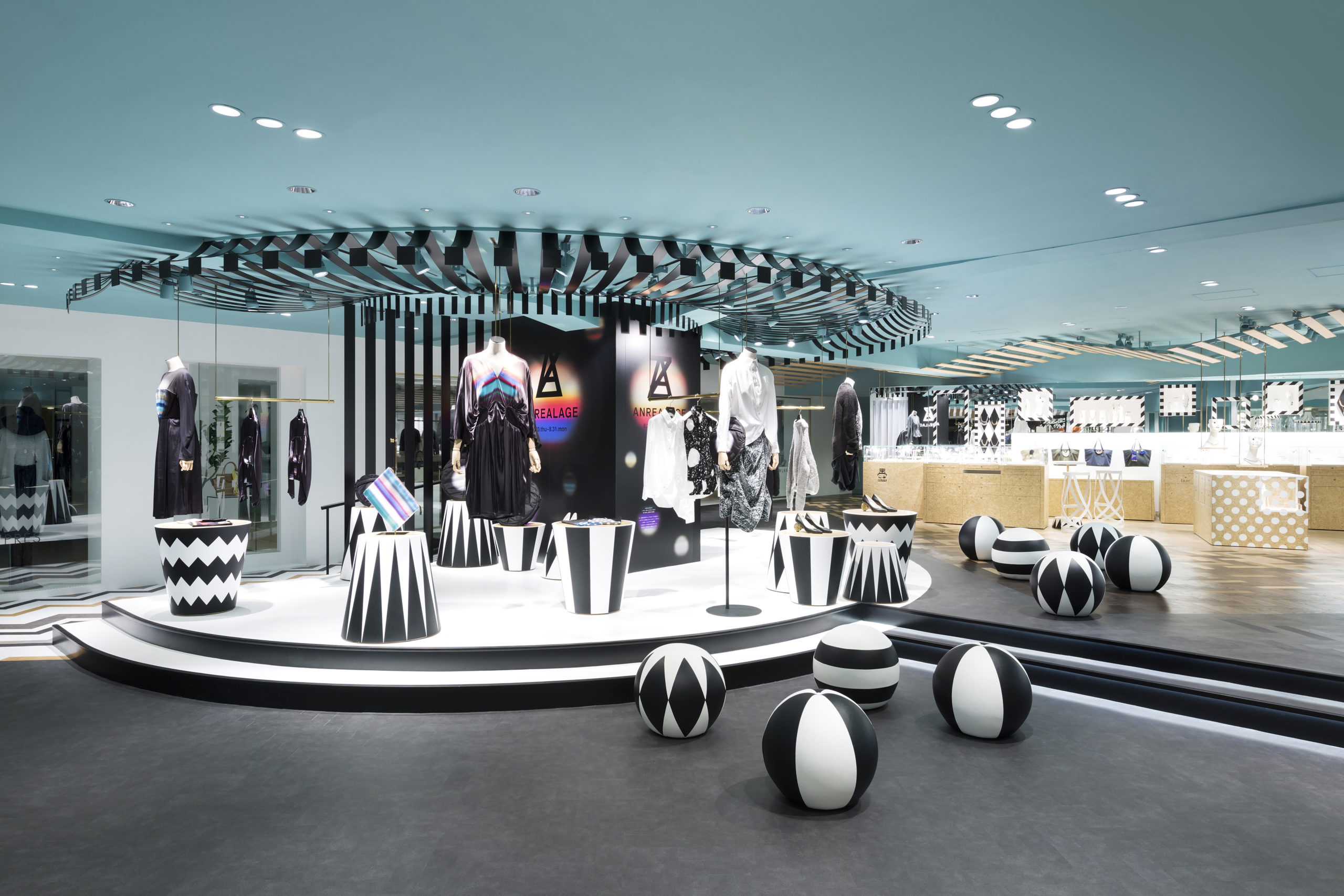 Circus meets monochrome in this lively store. The studio has created the mood of a mobile amusement park to attract young customers with the help of chunky stripes, harlequin motifs and decorative accessories. A large patterned entryway guides visitors to the main display area. Here, they are greeted with wooden featuring quirky elements like flags, trapezoidal bases, wheels and even top hats. Several shelves in this space feature diagonal strips and polka dots to add some energy. The pale aqua ceiling and walls offer some relief from the busyness of the other elements in the space. To top it all, the jewelry displays are also shaped as small carousels to stay with the theme.
Architects: Want to have your project featured? Showcase your work by uploading projects to Architizer and sign up for our inspirational newsletters.
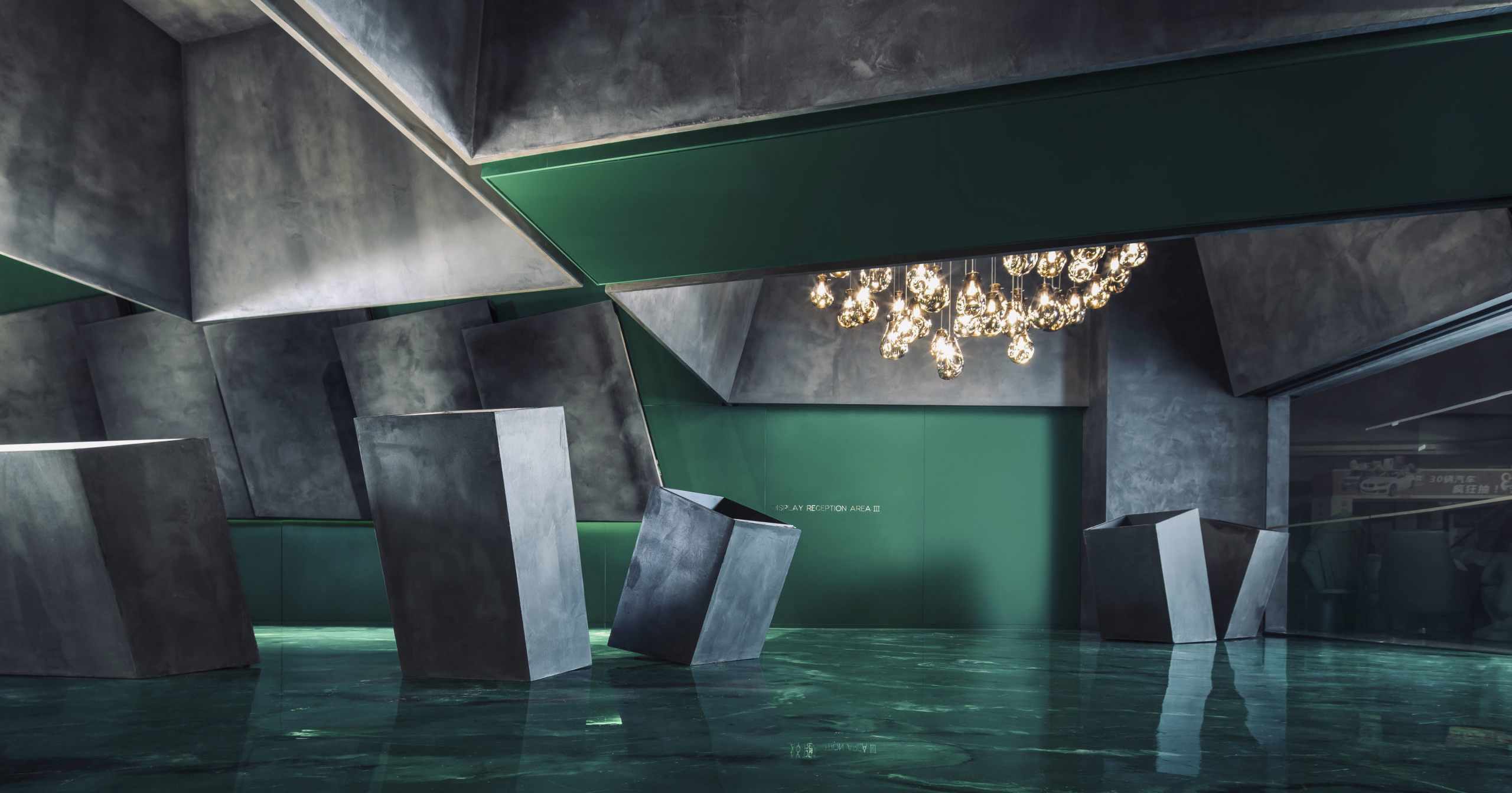
 Green Leopard Lighting's flagship store
  Joy City Kid's World
  Key to Style
  Mantab Workplace
  Timber Rhyme