The judging process for Architizer's 14th A+Awards is now underway. Subscribe to our Awards Newsletter to receive updates about Public Voting, and stay tuned — winners will be announced later this spring.
We each have our word for it: irregular, quirky, odd, eccentric — nuanced, even. There are countless reasons a building is described as “unusual,” and sometimes, if you’re lucky, it’s a compliment.
In most cases, what might at first be seen as an anomaly is an intentional design decision. By introducing unconventional elements to a design, be it material, form or scale, architects can challenge norms to create focal points or express artistic vision. These “anomalies” can become a building’s signature feature, providing a distinct visual identity and creating impact. They are excellent marketing tools and ignite conversations.
Other times, an anomaly arises because of the site; a project might have to change and evolve in response to its location. In doing so, the original design becomes distorted to accommodate the issue. These anomalies are endlessly interesting to architects and designers. It’s fascinating to see how the context of the landscape can define the parameters of human intervention. Sometimes, with all the will in the world, nature prevails, and we must relent and conform, adjusting our designs to accommodate what came before.
Then, of course, there is the anomaly that is created when a design takes a completely unexpected turn, creating something unplanned and imperfect. Most architects seek to smooth out these irregularities, but we’re making the argument that sometimes, though not always (safety first!), we should embrace the imperfections.
As Frank Gehry aptly said, “The creative act is not the province of visionaries alone. It finds expression in the choices we make, in the willingness to improvise, to adapt, to embrace the unexpected.” Unsurprisingly, he’s not wrong. In a world where uniqueness is few and far between and revival and reinterpretation are our lifeblood, perhaps it’s in these imperfections that we will find fresh inspiration and excitement in architecture. The following eight projects are perfect examples of the beauty of imperfection.
The Grand Mulberry
By MA | Morris Adjmi Architects, New York City, New York
Popular Choice Winner, Façades, 12th Annual A+Awards
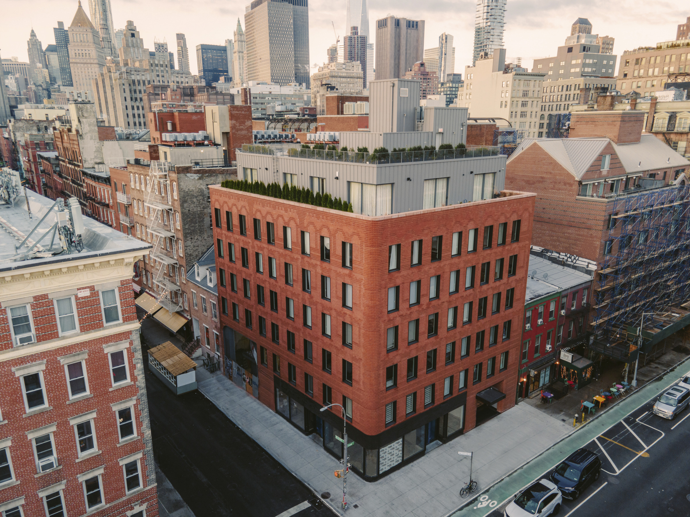
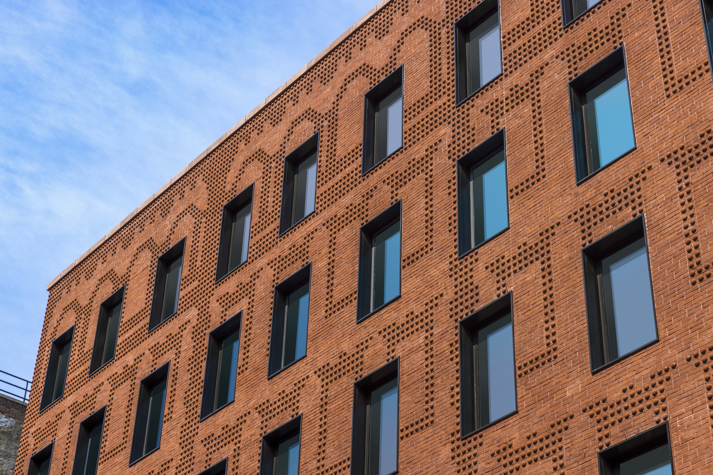
Photographs by Glen-Gery
The Grand Mulberry is a modern building in traditional clothes. On the corner between Grand and Mulberry Streets in the heart of Little Italy, the design of the contemporary condominium takes its inspiration from the rich heritage of the historic Italianate tenements that are found throughout the surrounding neighborhood.
Traditionally, Italianate tenement buildings featured a tripartite façade that consisted of a base, middle and top with differing details and brickwork used for each portion. Using custom-profiled brick, The Grand Mulberry is wrapped with a pattern of banding to replicate pediment windows, arched windows and a cornice. While the design does not align with the modern positioning of the windows, which is typical of a contemporary building structure, somehow, this offset pattern elevates the overall look of the building, making it stand out and say more.
Urban Discourse Machine
By Darkefaza Design Studio, Yazd, Iran
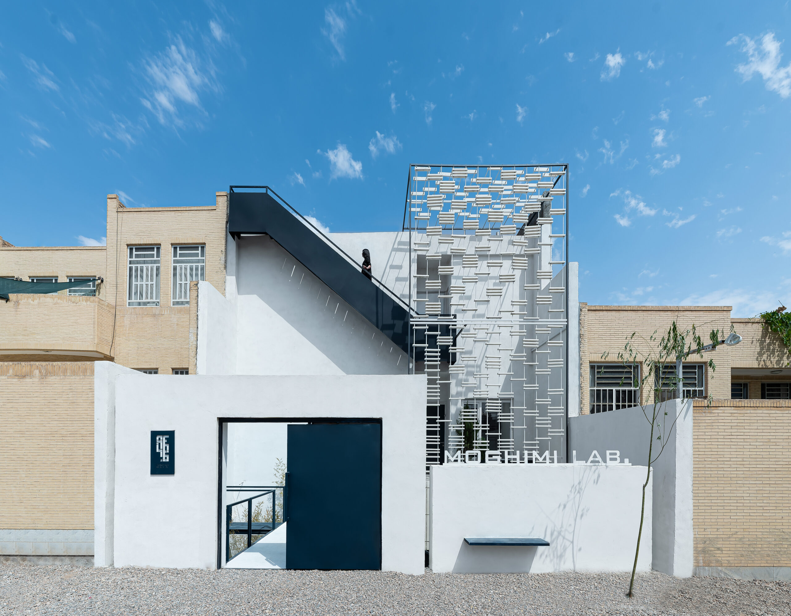
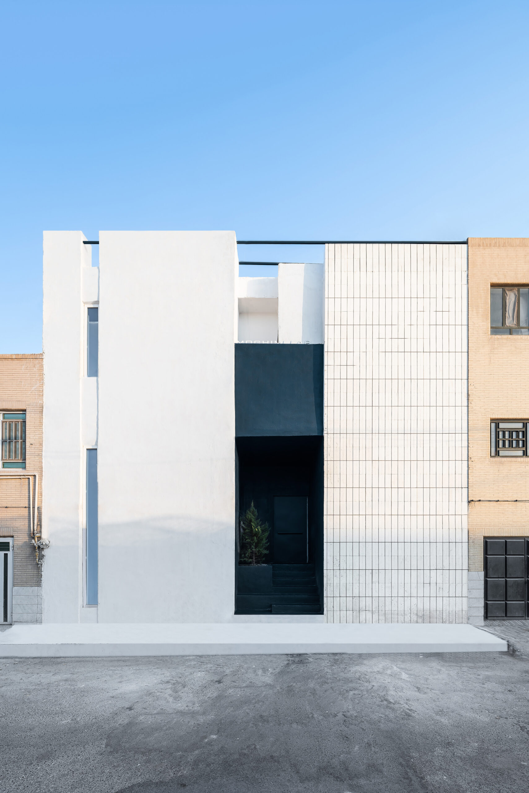
Photos by Mohammadhossein Hamzehlouei
Darkefaza Design Studio’s unusual project in Yazd reconsiders the role of a building’s façade. Using their expertise, they turned a once undefined exterior into a conversation with the city. Located in the modern Safayieh region, an area where many buildings follow a standard design strategy and appearance, the design began without a clear façade. Yet, over the course of the project it gradually evolved into a structure that uses its very surface to announce its purpose. The result is a building that draws on the historic motifs of Yazd to become a lively and engaging presence its local neighborhood.
LH
By STARH, Varna, Bulgaria
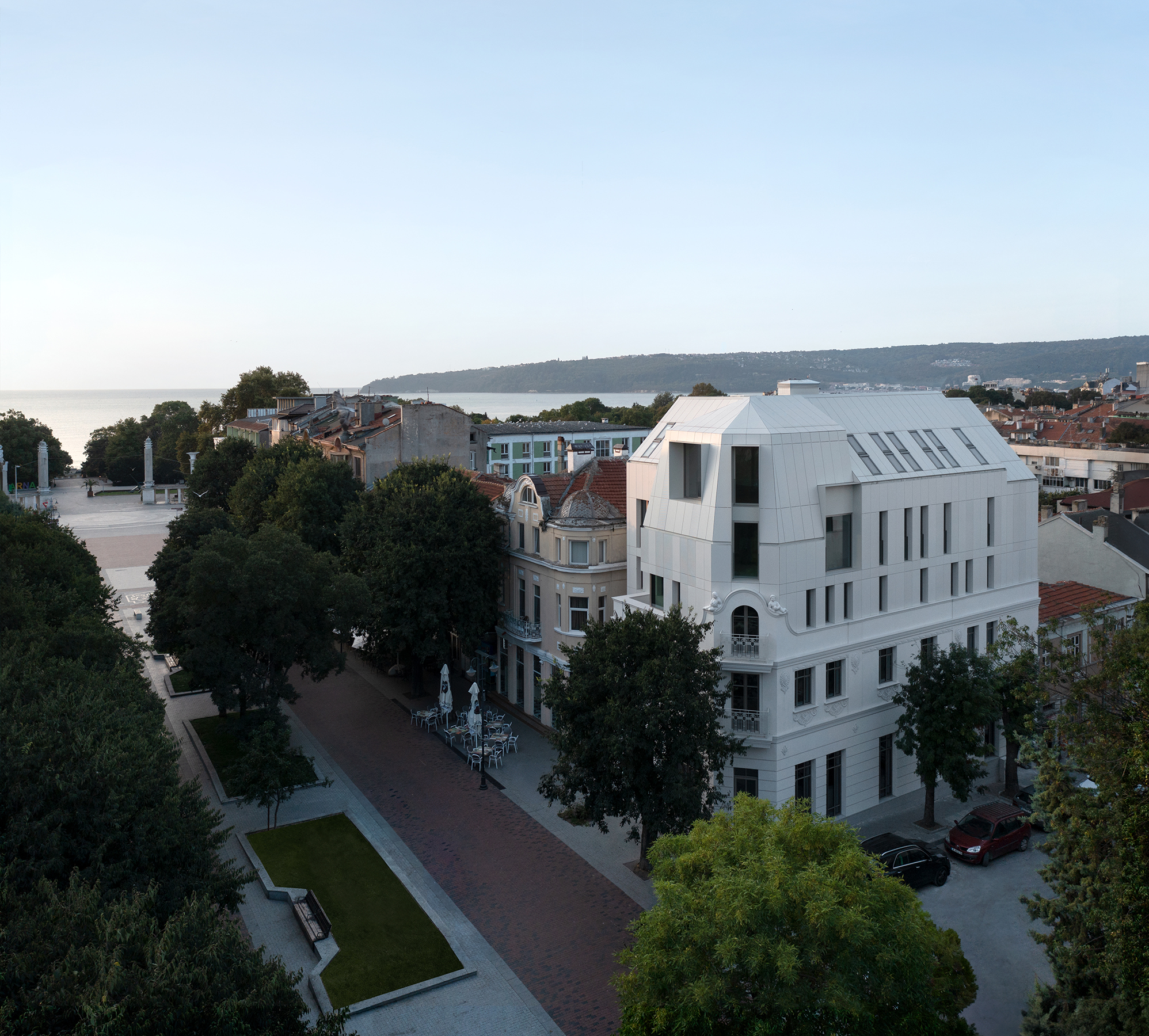
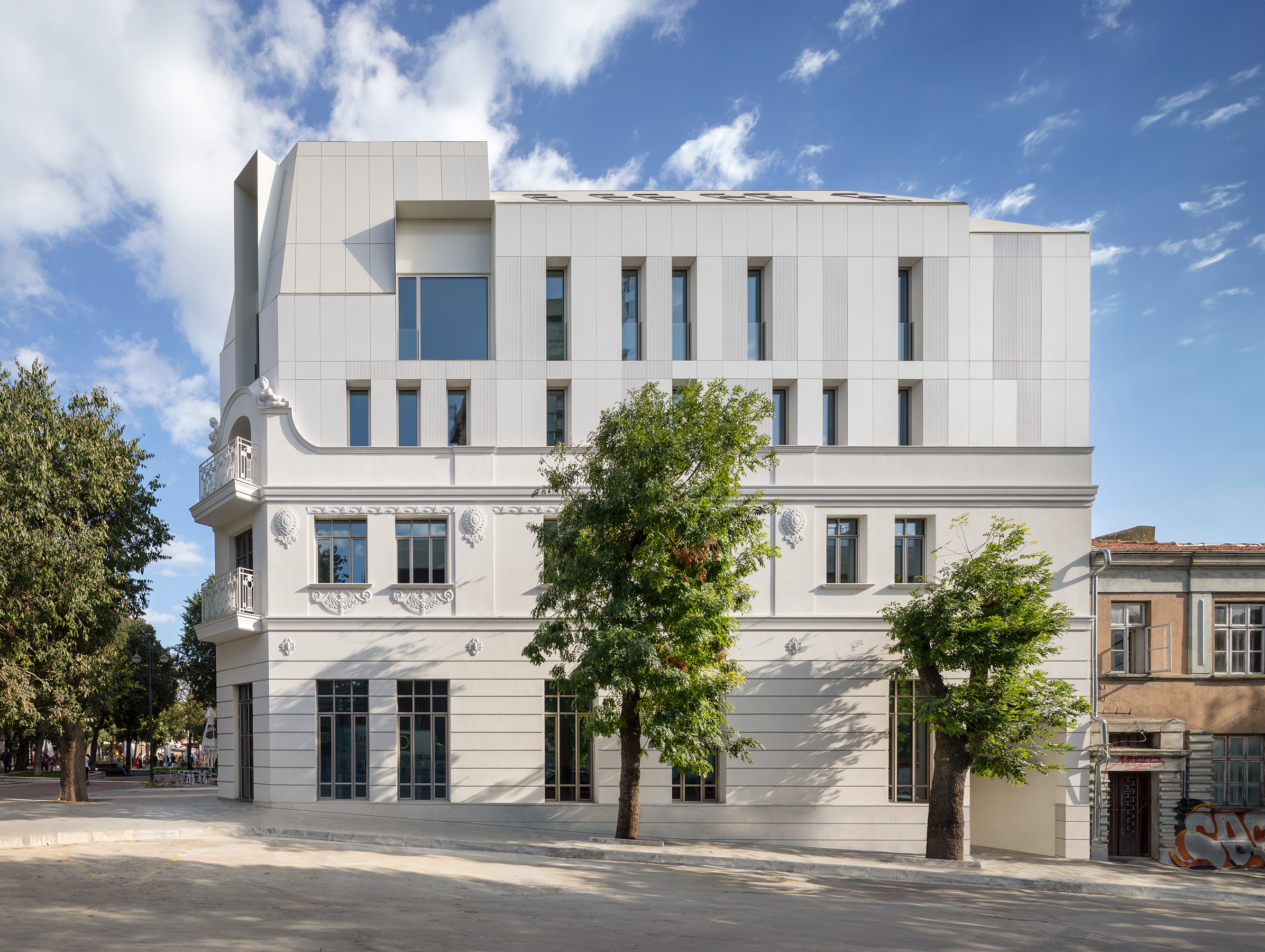
Photos by Dian Stanchev
STARH’s LH apartment building is as confident as it is white — completely. The semi-modern structure is bright and bold amongst the historic architecture that surrounds it. The building’s crisp, white façade of suspended fiber cement panels is a contemporary choice that sits in sharp contrast to the area’s traditional, highly decorative forms. Yet, this new design does not ignore its context. The façade’s rigid grid structure represents, thoughtfully, the original 1923 building, creating a conversation about old and new. In embracing this brave choice, LH adds a fresh layer to Varna’s architectural history, showing a profound respect for the past with a clear vision for the future.
Huizhen High School
By Zhejiang University of Technology Engineering Design Group Co, China
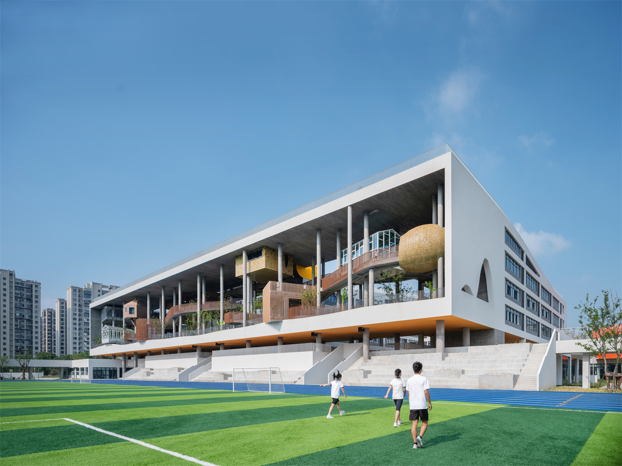
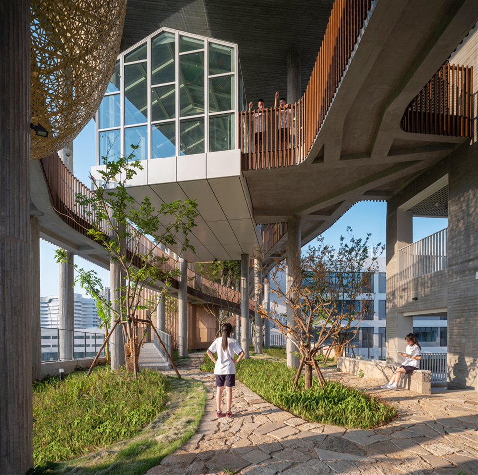
Images provided by WAF23
At Huizhen High School, the concept of “wasting time” is an intentional anomaly at a time where “efficiency first” typically dictates design. This approach turns its back on maximizing space and speed, instead offering its student body a “floating forest” where they can slow down and escape. The innovative design rejects a standard grid layout, scattering classrooms around the forest with perceived abandon. Meandering paths replace straight lines, and open spaces invite exploration, making this campus a rare exception — an environment designed to encourage unstructured, leisurely moments in a demanding academic setting.
Tile House
By The Bloom Architects, Vietnam
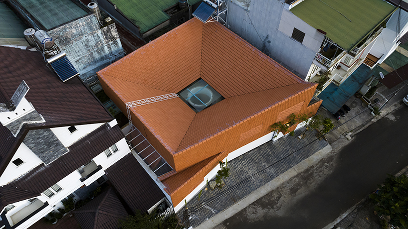
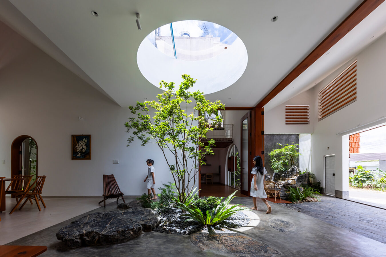
Photographs by Hiroyuki Oki
It’s not often a client would be happy to have a hole in their roof. However, in the case of Tile House, it’s a positively positive outcome. In Bao Loc in Vietnam, The Bloom Architects have turned a supposed flaw into a clever feature. With long, dry, sunny days followed by relentless rain, typically, houses in the area are clad in corrugated iron, a practical but uninspired choice. Tile House, however, opts for something different — embracing the natural elements rather than shutting them out. Using a strategically placed “light-wind hole” the house draws in the cool air to help ventilation. It’s a practical and refreshing approach where the outside world is welcomed in without hesitation.
Dalezhiye Kindergarten
By DIKA Architectural Design Center, Leshan, China
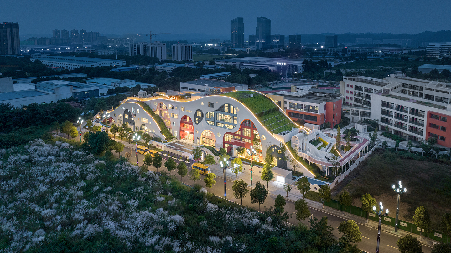
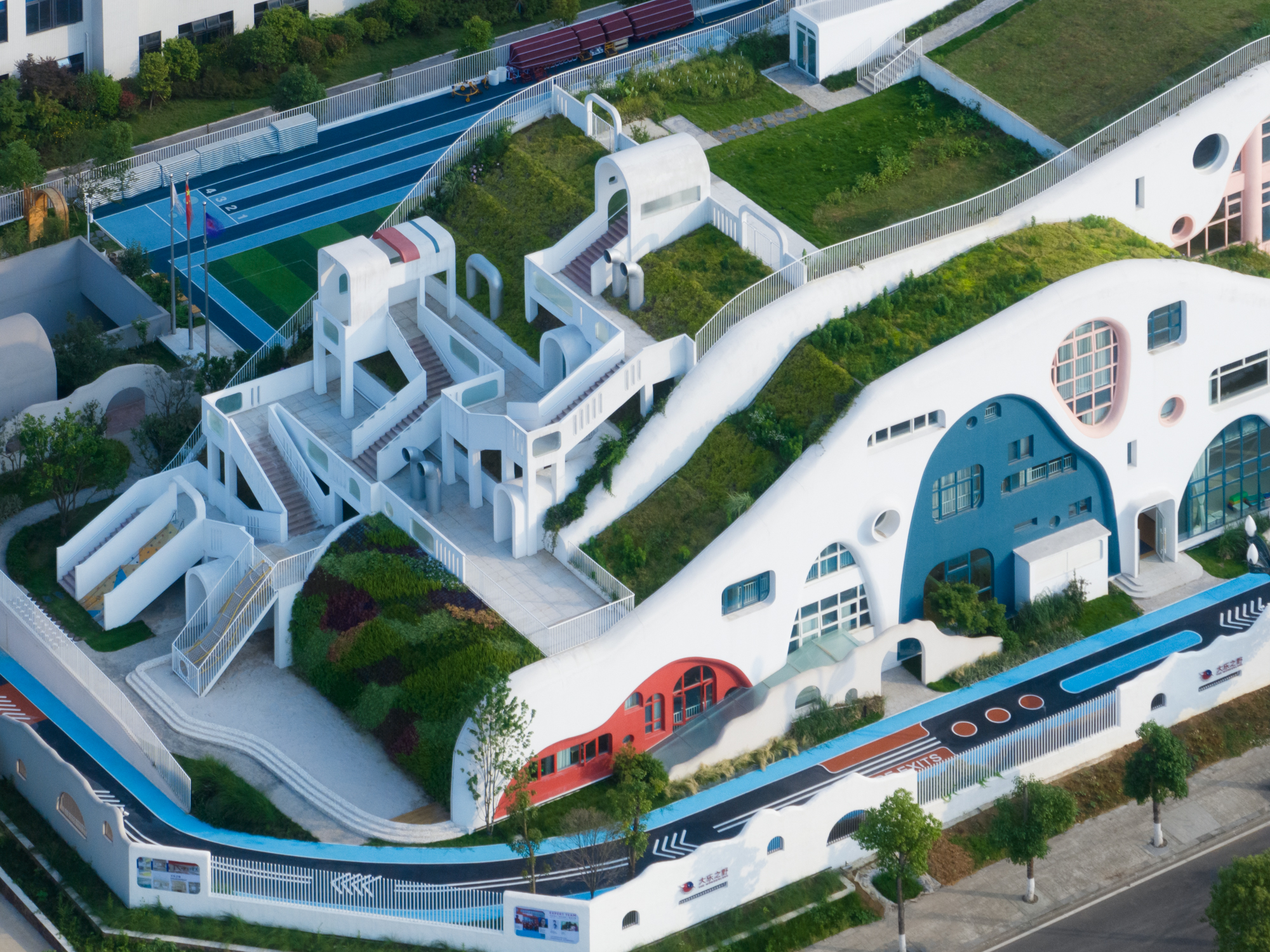
Photographs by Arch-Exist Photography
Designed by DIKA Architectural Design Center, Dalezhiye Kindergarten is a reflection of its young inhabitants. A free-form structure, the building appears to emerge naturally from the land, its organic shape an architectural mirror of the region’s mountainous terrain and red sandstone landscape. Rather than imposing itself on the land, the kindergarten becomes part of it. Its form is dictated by the site’s sharp slopes and varying elevations creating a highly dynamic space that feels as though it’s grown out of the earth itself.
Ushimaru Restaurant
By Axel Vansteenkiste Architecture, Sammu, Japan
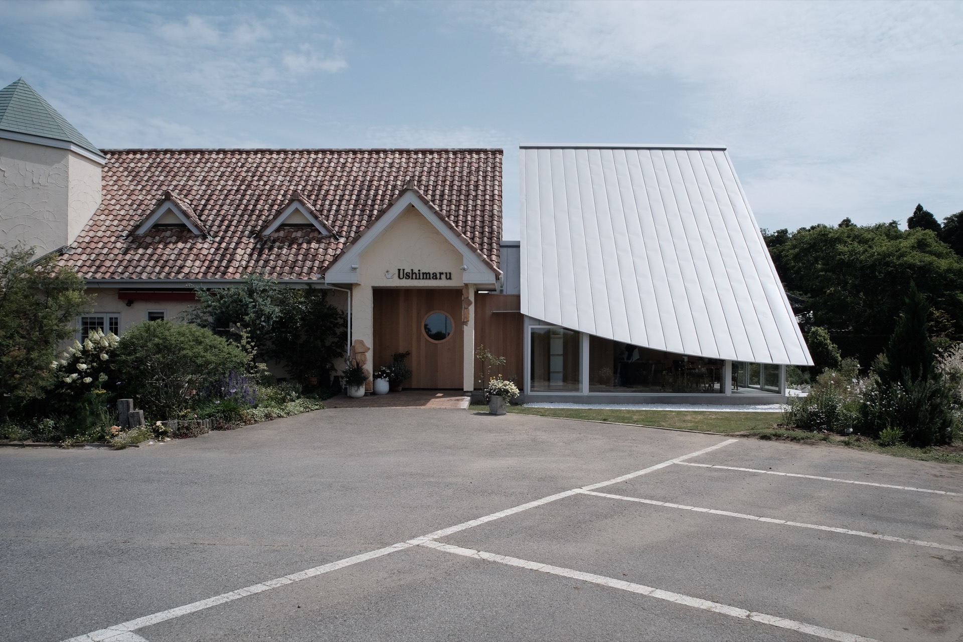
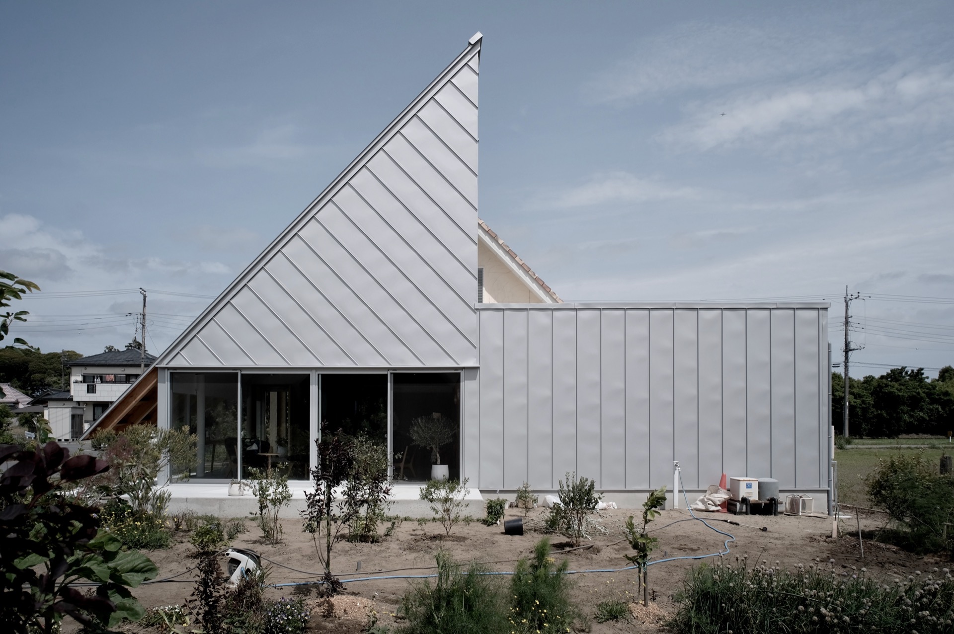
Photographs by Axel Vansteenkiste
Sometimes, a new addition can completely redefine a building’s presence. Ushimaru restaurant has long been known for its blend of European style and locally sourced cuisine. However, the recent redevelopment by Axel Vansteenkiste Architecture introduces a striking anomaly. The new addition, composed of two distinct volumes, extends the original structure while bringing a bold new look.
One volume, with its sharply pitched roof, opens the lounge to sweeping views of the landscape, while cleverly concealing the adjacent parking area. The other, more discreet, houses the expanded kitchen and service areas. The building’s low profile emphasizes the contrast between the welcoming openness of the lounge and the functional spaces beyond. Clad in reflective silver galvalume, the restaurant is now a contemporary landmark in the countryside.
The Wall Maze of Vi Park
By XING DESIGN, Shanghai, China
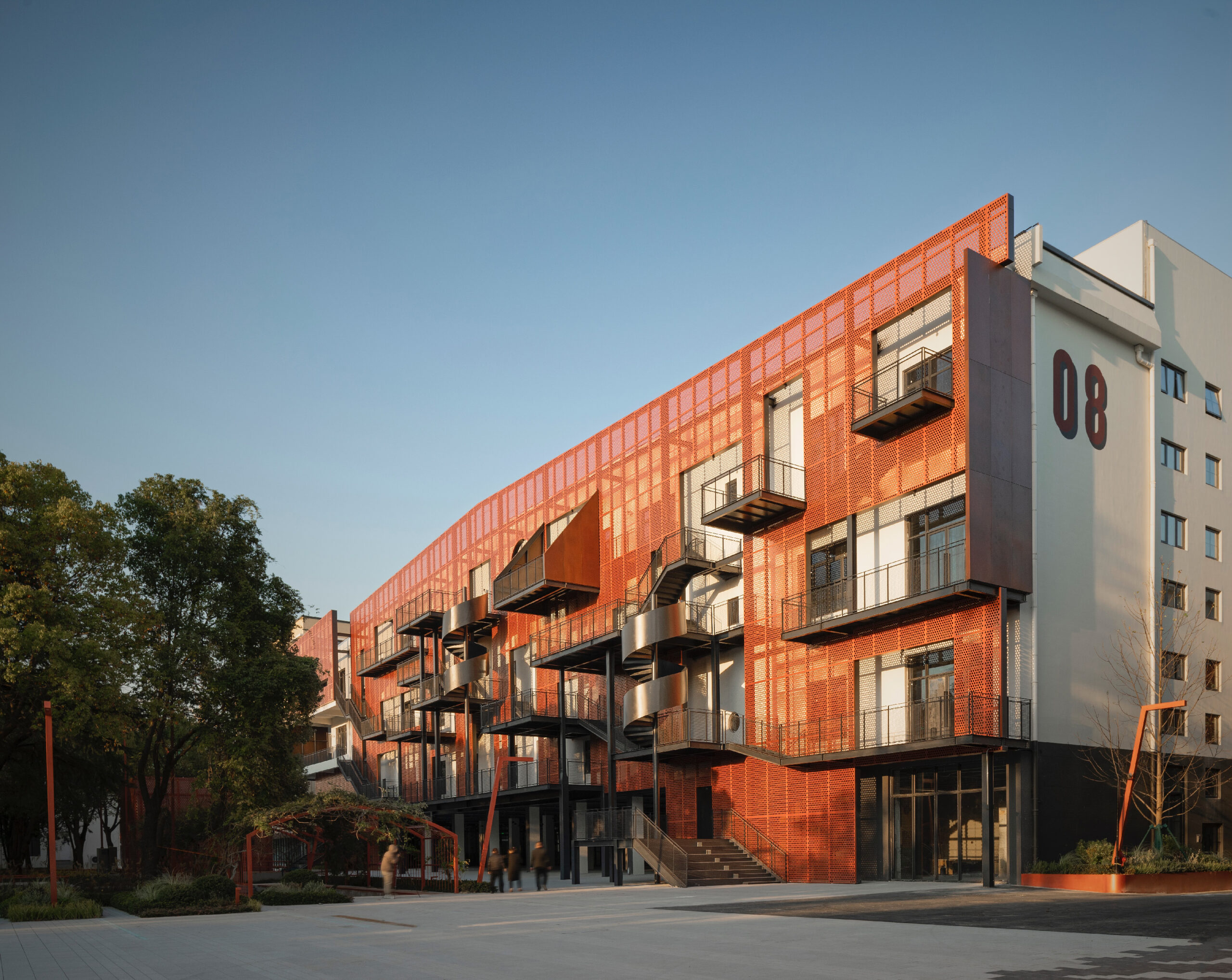
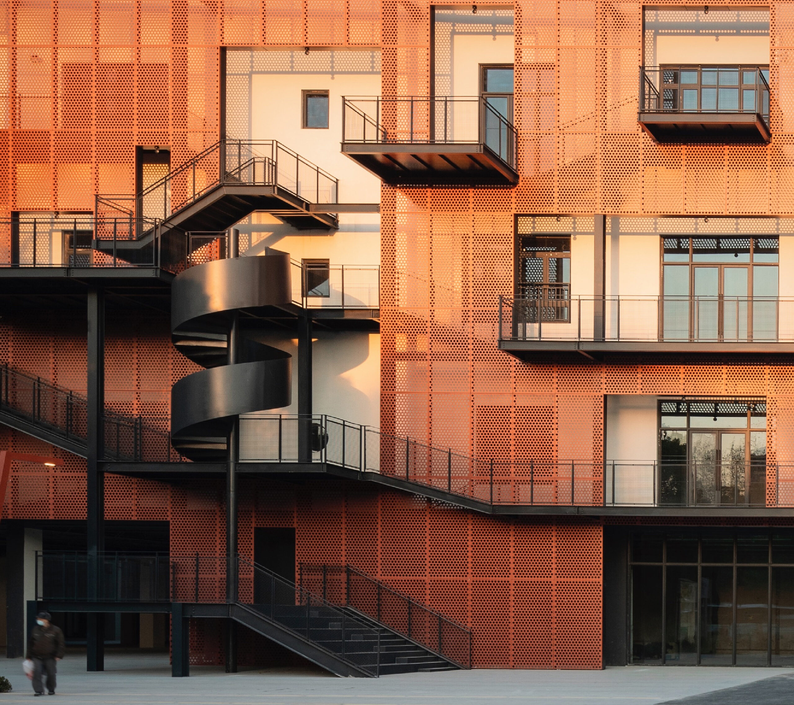
Photographs by UK Studio
Why is it we always put the interesting stuff on the inside? Well, at Vi Park, XING DESIGN are changing that. Located in the repurposed Shanghai Greater China Zhengtai Rubber Factory, the new design has a labyrinthine structure on the exterior. The so-called “Wall Maze” connects various offices and terraces spanning the façade, breaking the rigid order of typical office spaces, creating a new environment where work meets play. The maze-like design, with its ups and downs, becomes an unsuspecting experience—one where a casual walk can lead to new conversations or a moment of reflection amid the greenery. From the street, the façade appears playful and puzzling, with a hint of Esher, as paths seemingly cut off or go nowhere.
The judging process for Architizer's 14th A+Awards is now underway. Subscribe to our Awards Newsletter to receive updates about Public Voting, and stay tuned — winners will be announced later this spring.