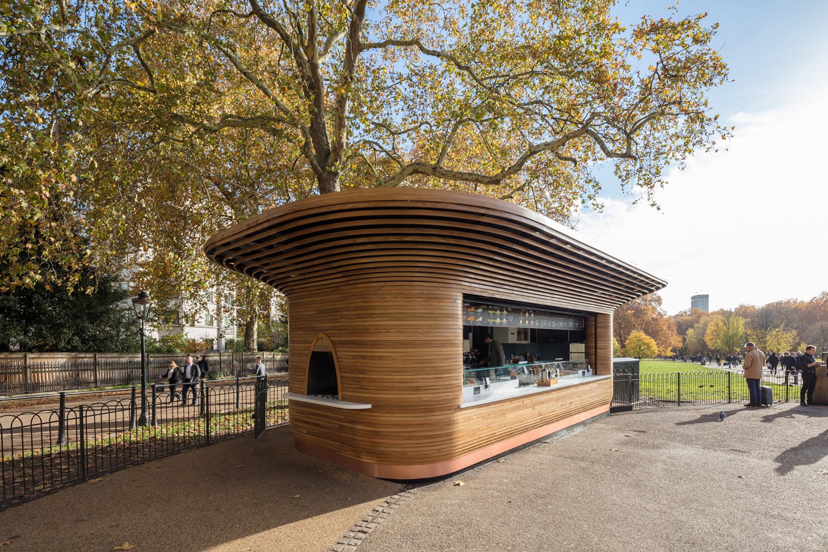
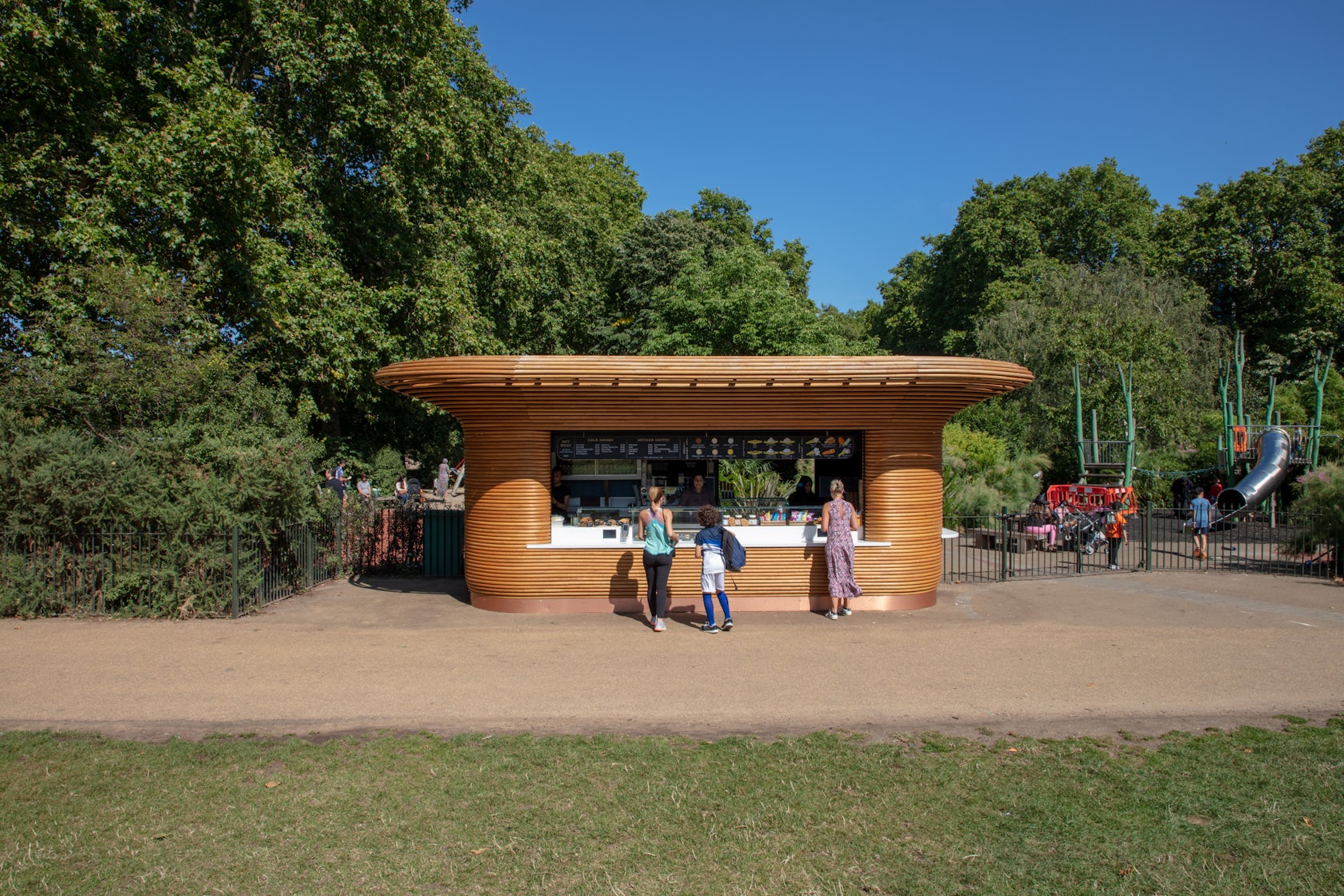
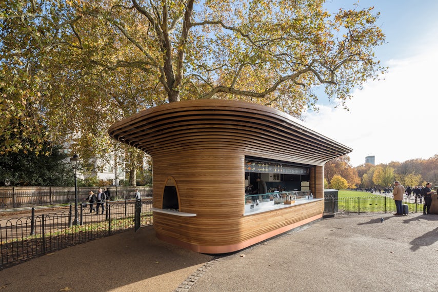
The Royal Parks Kiosks – Characterising the largest mobilisation The Royal Parks has seen in 14 years, Mizzi Studio’s family of nine kiosks occupies prominent locations around London’s beloved parks. Their design responds to the Grade I-listed landscape, with sustainable materials and traditional craft techniques creating simple, functional forms. The kiosks mark the entrances to Hyde Park, Green Park and St James’s Park, designed as 360-degree sculptural entities with canopies that swell out like a tree’s crown. All are made from sustainable timber, barring the flagship Horseshoe Kiosk, which is clad in tubular brass, mirroring the ornate metals of the nearby Queen Victoria Memorial.
Architizer chatted with Jonathan Mizzi, Director at Mizzi Studio, to learn more about this project.
Architizer: What inspired the initial concept for your design?
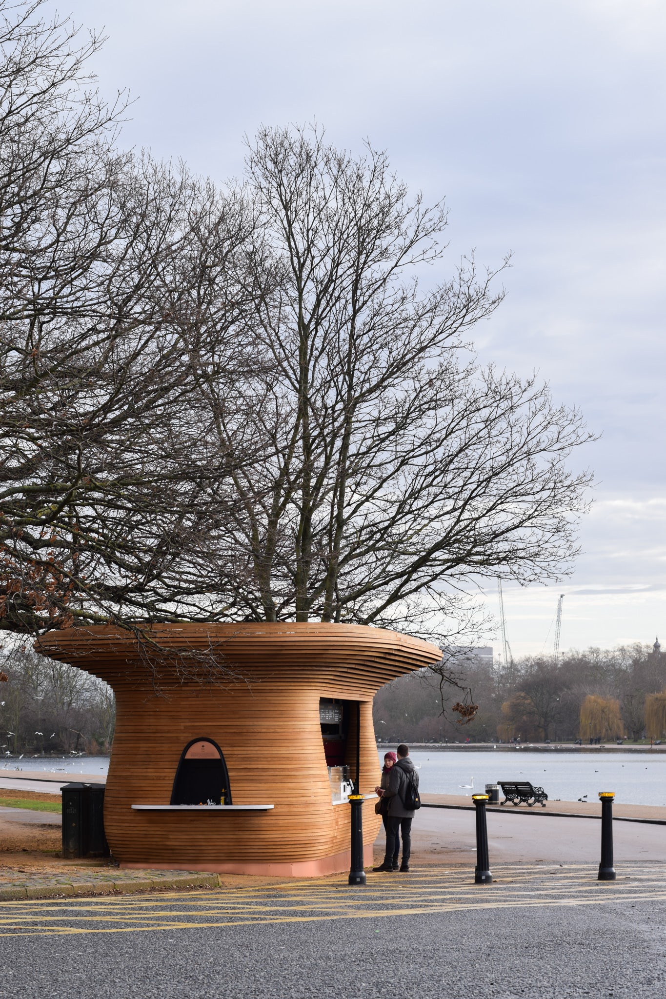
Jonathan Mizzi: The Royal Parks’ freestanding kiosks are inspired directly by their natural surroundings. Conceived as a family of individual curvaceous structures, their graceful tree-like canopy unites their design language. The majority of the kiosks are clad in hand “steam-bent” English oak timber, developed in collaboration with British designer and maker Tom Raffield, whilst the Horsehoe Kiosk is clad in brass, to mirror the opulence of its site besides Buckingham Palace. Each of the kiosks’ 360-degree sculptural canopy swells outwards like a tree’s crown, creating recognisable silhouettes. Their organic-inspired volumes follow a continuous shape with varying degrees of curvature and differing cladding profiles, each providing contrasting textures. Overall, each design variation is informed by the architectural or organic elements that the kiosk shares its space with.
© Mizzi Studio
What do you believe is the most unique or ‘standout’ component of the project?
The kiosks function as way finding beacons in and of themselves – acting as friendly reminders and orientation tools that sit respectfully within one of London’s most well-loved public realms. They are unique not just in the way they are designed, but through their low-impact construction – they are modular, freestanding, and able to be transported rapidly.
What was the greatest design challenge you faced during the project, and how did you navigate it?
The installation of the final kiosk at St James’s Park came following a four-year period of design and delivery, and although it marked a climactic moment for the team at Mizzi Studio, its opening only came after a year of public restrictions in the face of the Covid-10 pandemic – which was a huge challenge in the lifespan of this project. We saw this moment as a turning point for our studio, but also for the British public at large. London’s Royal Parks are beloved by both the capital’s residents and visitors alike. Pre-pandemic, London’s green lungs enjoyed visitor numbers of up to 77 million visitors each year, our team was eager to witness the Parks’ re-population and saw the fleet as an ambassador for that revival.

© Mizzi Studio
How did the context of your project — environmental, social or cultural — influence your design?
Aside from the spectacular landscape of the Parks, which directly influenced the design of the kiosks – our hope was that the fleet would stand as a new architectural structure and symbol of collective respite. We believe in the power of public space to bring people together and restore them both physically and emotionally. The aftermath of the pandemic became the context for the completion of the Royal Parks fleet, and therefore we saw this as a moment where architecture could help restore mental well-being, bring people together, and offer surveillance and support at a time when the city’s inhabitants felt most vulnerable.
What drove the selection of materials used in the project?
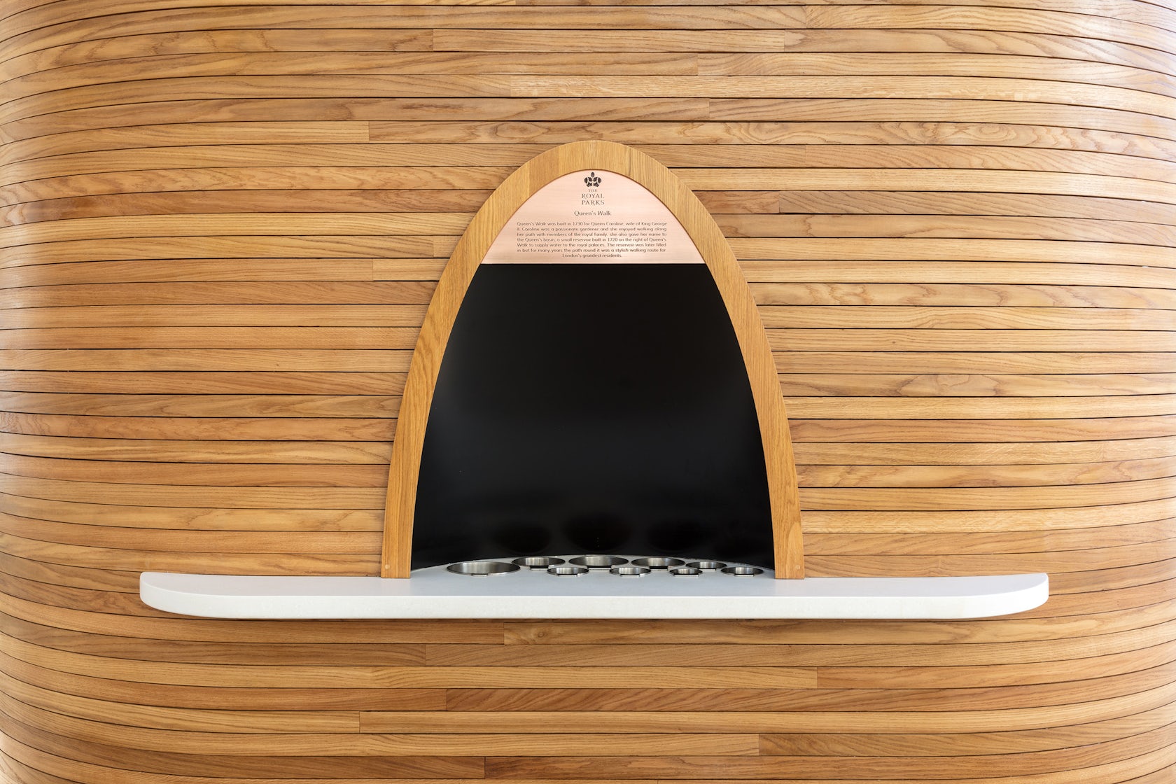
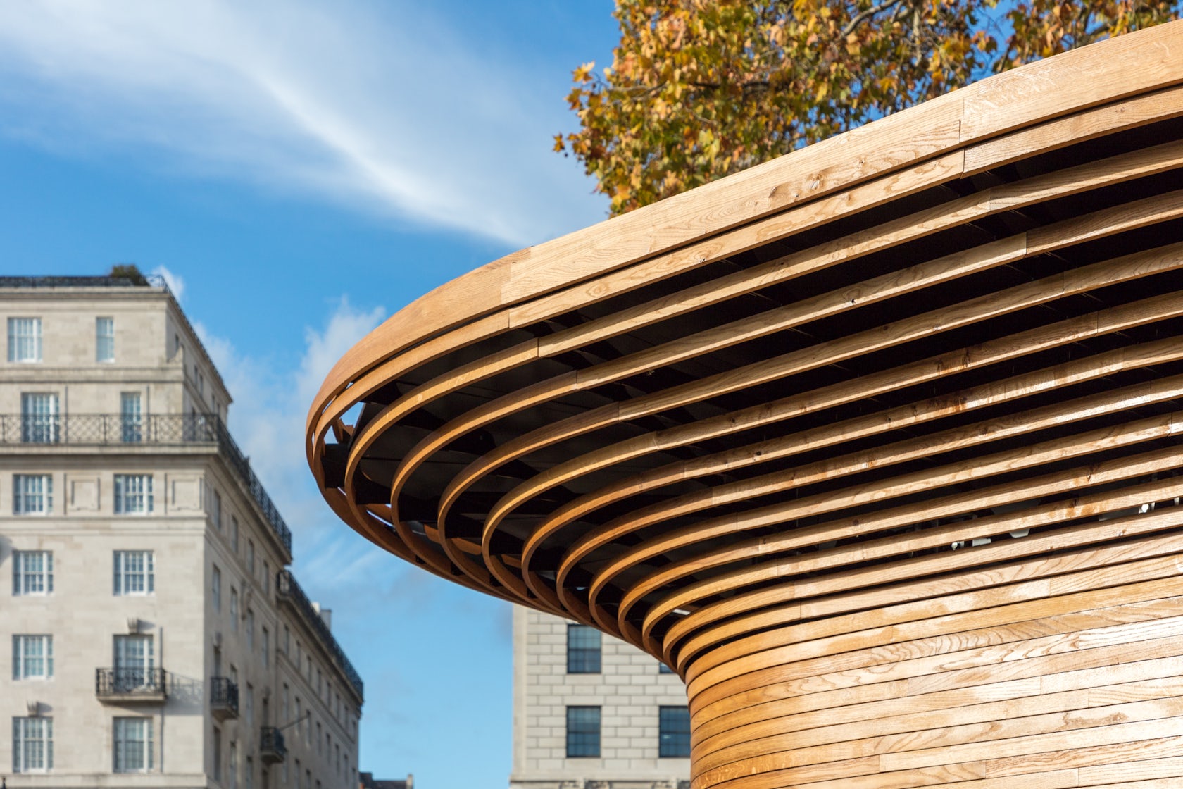
Our approach to this commission was to design in harmony with the verdant surroundings each structure was set to reside in. We therefore responded directly to the Grade I listed landscape, both in terms of form, and in our choice of the fleet’s materiality. The initial eight kiosks were clad in hand ‘steam-bent’ English oak timber, developed in collaboration with British designer and maker Tom Raffield.
© Mizzi Studio
What is your favorite detail in the project and why?
One of the most arresting kiosks within the fleet is the flagship Horseshoe Bend kiosk in St James’s Park. This kiosk takes the fundamental DNA of the rest of the kiosks and heightens its own sense of nobility through its materials. Its position beneath the Palace allows for this amplification. Our aim was to create a lustrous, eye-catching footer to a building that engrained in people’s minds and memories. The kiosk is therefore clad in tubular brass, mirroring the ornate precious metals of the nearby Sir Thomas Brock’s Queen Victoria Memorial.
How important was sustainability as a design criteria as you worked on this project?
Sustainability was a very important design consideration, as was central to The Royal Park’s brief and values, and Mizzi Studio’s vision for architecture to have minimal impact on the environment. Sustainability came in the form of our material selection and the kiosks’ modular design. Even where timber was swapped out for alternatives, we were careful to create designs that worked mainly through a mono-material palette, promoting less waste and greater efficiency.
© Mizzi Studio
In what ways did you collaborate with others, and how did that add value to the project?
Collaboration was central to The Royal Parks project. Together with Colicci’s Director Rob Colicci, Mizzi Studio spent months exploring the heritage of The Royal Parks. We channelled all of that research into a design strategy that was driven by nature and the variety of tactile experiences it offers. As a result of this process, we designed a fleet where each kiosk is unique, tailored to the history, nuances and demographics of its respective site within the parks. We also worked closely with Tom Raffield on the outcome of the steam-bent timber cladding. All in all, it was a wonderful experience of joined-up thinking
Were any parts of the project dramatically altered from conception to construction, and if so, why?
Not really. Every element existing within the kiosks has been designed to be placed at the correct angle, height and position in order.to yield a greater speed of service. Each kiosk has been split in to three sections with clear directional signage guiding queues to form in their relevant section. The kiosks have been meticulously designed to utilise every inch of space provided – a crucial measure for successful and long-lasting micro-buildings. A rear entrance for staff and storage leaves the sides of the kiosk free of unattractive entrances and storage paraphernalia, and available for elegant and efficient integrated service features. The units are each transportable in one piece, with the modular roof removed and split into two or four manageable parts. The whole structure can be transported in a maximum of two loads.
© Mizzi Studio
How have your clients responded to the finished project?
Everyone involved in this project – Mizzi Studio as designers, our clients, Colicci, and The Royal Parks themselves – has come away from this project with positive feelings about the offering we have given to London’s public in the form of excellence in design, catering, and public realm amenity.
What key lesson did you learn in the process of conceiving the project?
Looking at and listening to context is crucial to the success of any project, no matter its size, scope, typology or end users. As architects and designers, we must first and foremost consider our dual role as environmentalists. Whatever we design should seek out the least invasive, lowest impact, and most nature-positive solutions. Understanding what that means specifically for any given site means interrogating natural history, resources, evolution, and organic character. This is the most valuable lesson we learnt from The Royal Parks commission.
© Mizzi Studio
How do you believe this project represents you or your firm as a whole?
The architecture and design industry has seen a massive shift in practice towards trends that favour a nature-led approach. Mizzi Studio has been focused on this philosophy since day one of our foundation. Our architecture holds the natural world as its greatest teacher and inspiration – this ethos is central to The Royal Parks project.
How do you imagine this project influencing your work in the future?
As our studio matures are goals are less tied to place, sectors, or markets and more tied to the way they can meaningfully introduce positive change. What’s next for us is a massive effort to design all our future projects as carbon neutral buildings. This is an ambition that requires not just high design acumen, but the ability to activate discourse amongst the wider profession – to have discussions with suppliers, contractors and clients about the changes we want to make, and in some cases even navigate through difficult conversations tied with abandoning old practices. The prominence of The Royal Parks project helped us to understand the power of architecture as a signalling tool for inciting change.

© Mizzi Studio
Is there anything else important you’d like to share about this project?
The Royal Parks Family Fleet is testimony to our studio’s overarching design approach – we design buildings, spaces and objects that visually echo the beautiful organisations that exist in the natural world. We call our work ‘bio-architecture’, and this includes biomimicry, biophilia and also extends to zoomorphism. These three approaches combine to characterise our studio ethos, a philosophy that rests on bringing humans and nature closer together through thoughtful and innovative design solutions.
Team Members
Matthew Chilton, Associate and Project Lead
Consultants
PRP Engineering
Products/Materials
Hand steam-bent Oak cladding, Tubular solid Brass Cladding
For more on Royal Parks Kiosks, please visit the in-depth project page on Architizer.


 The Royal Parks Kiosks


