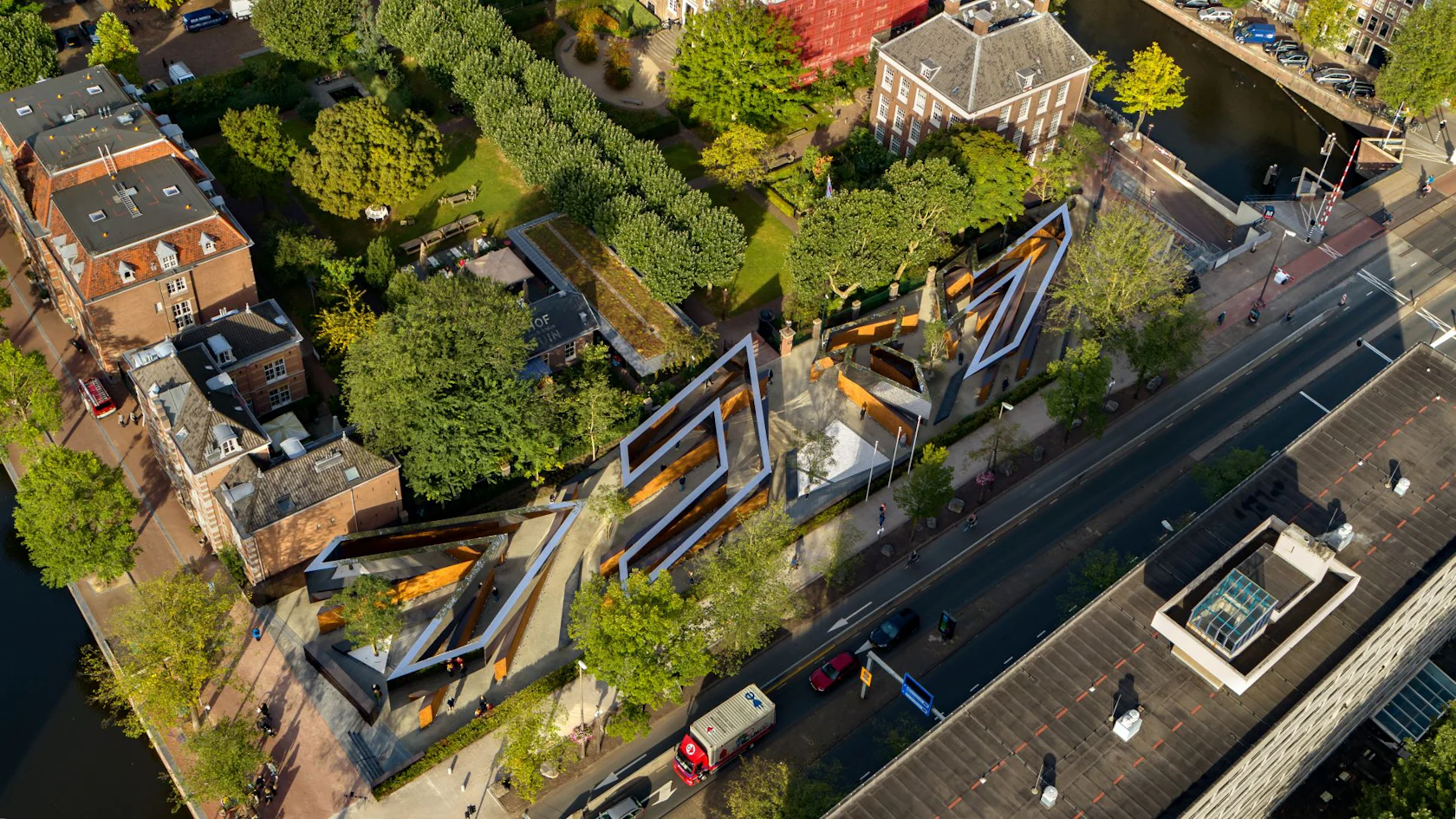
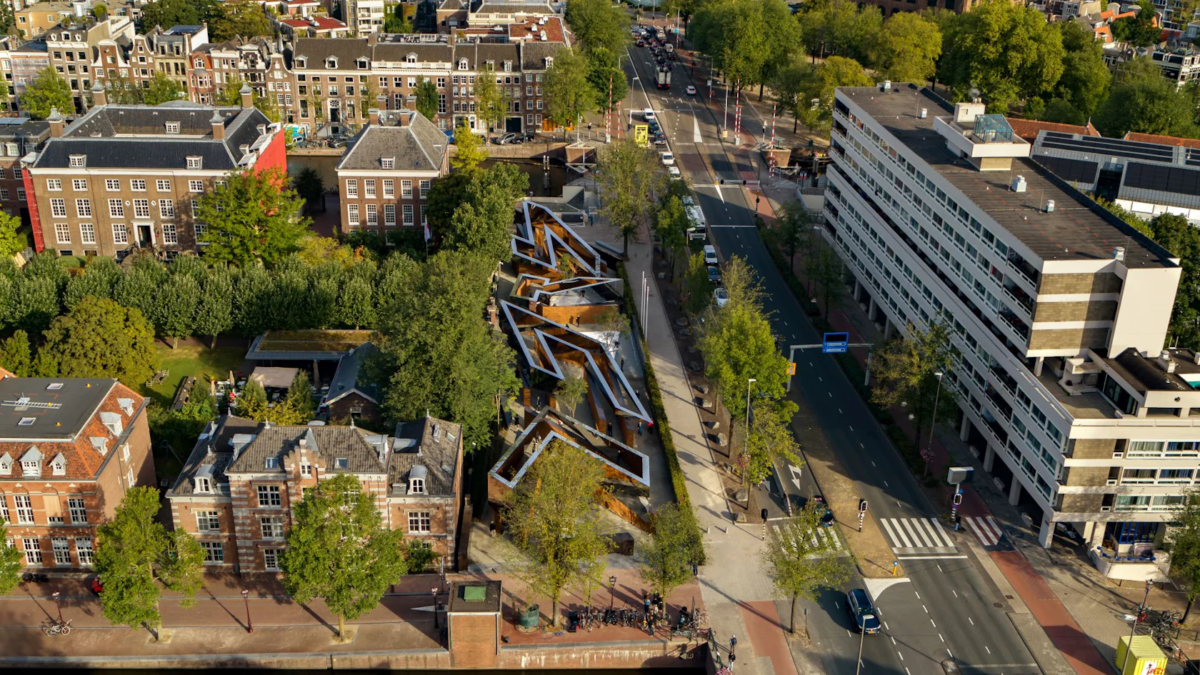
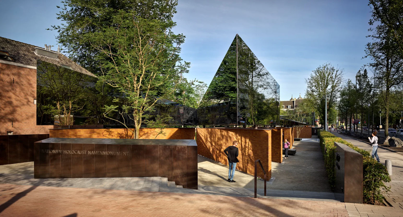
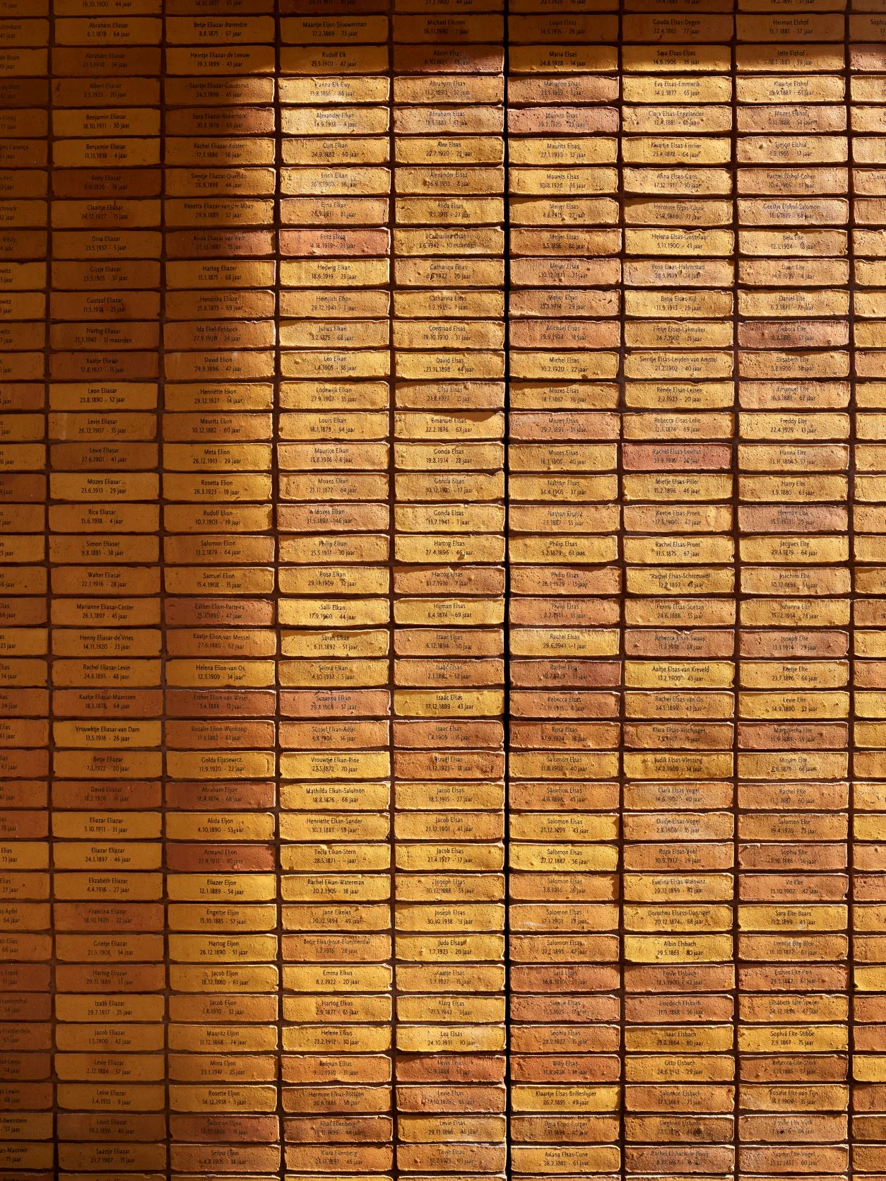
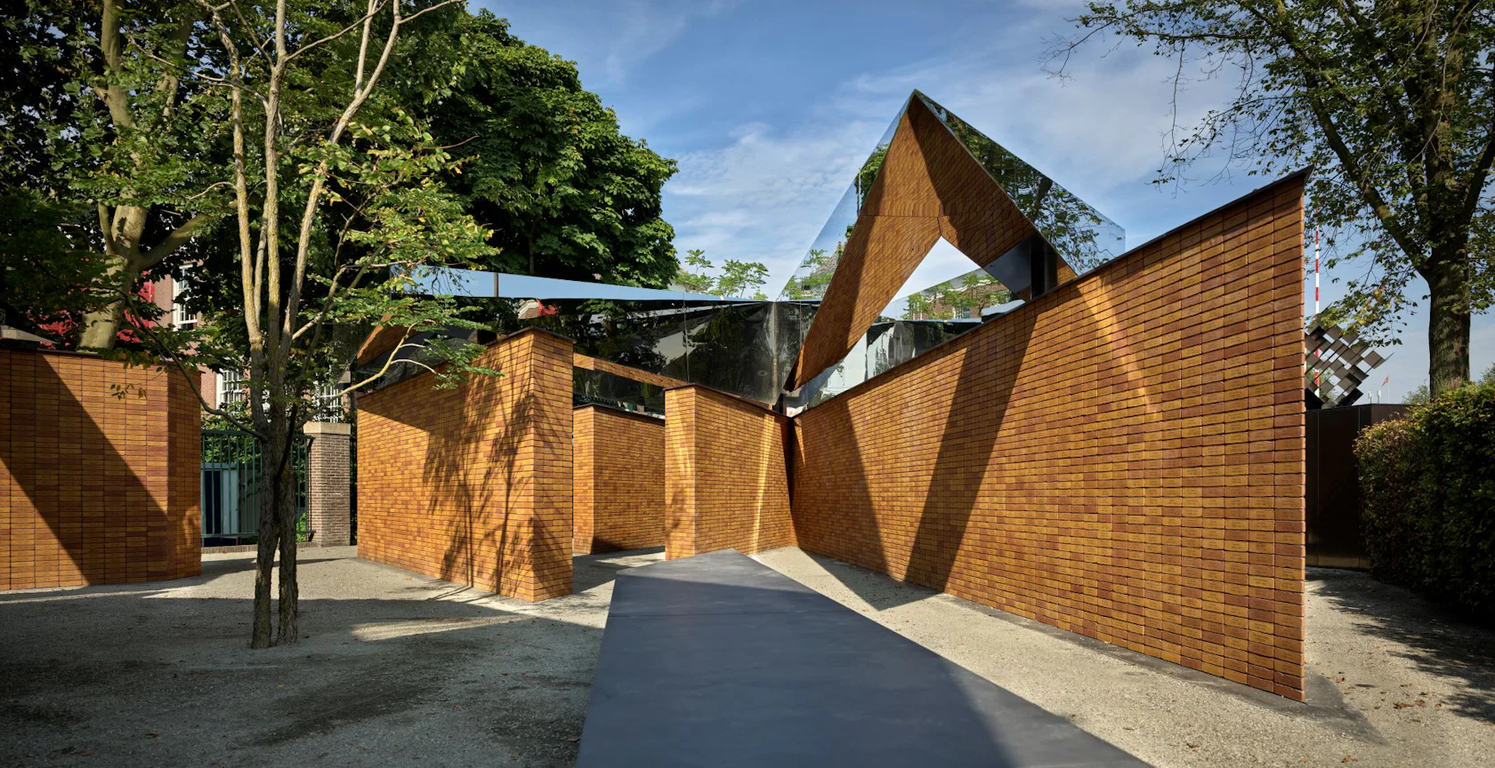
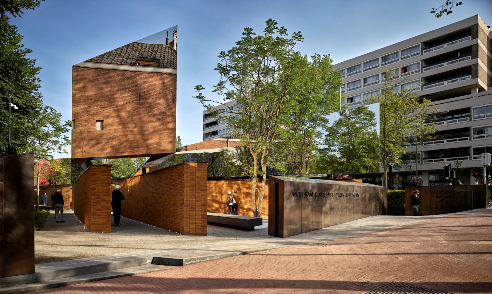
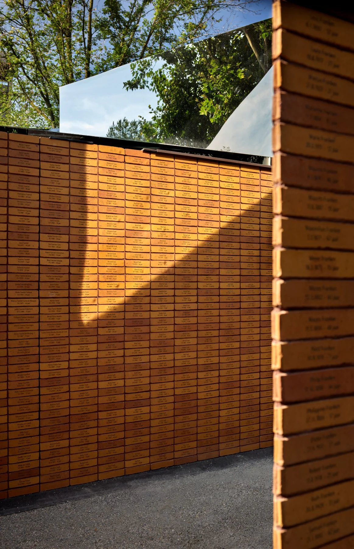
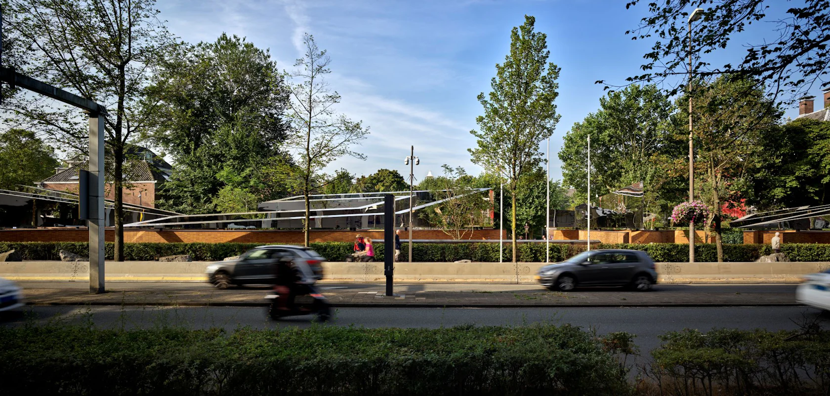
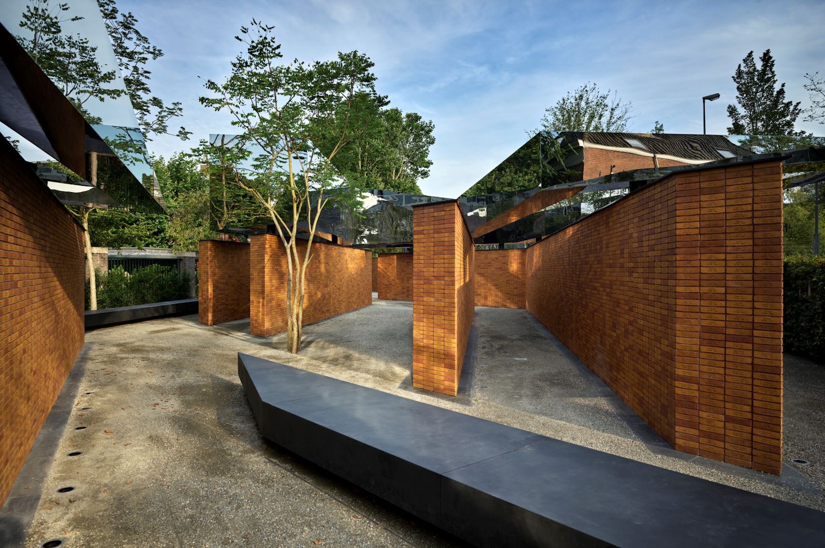
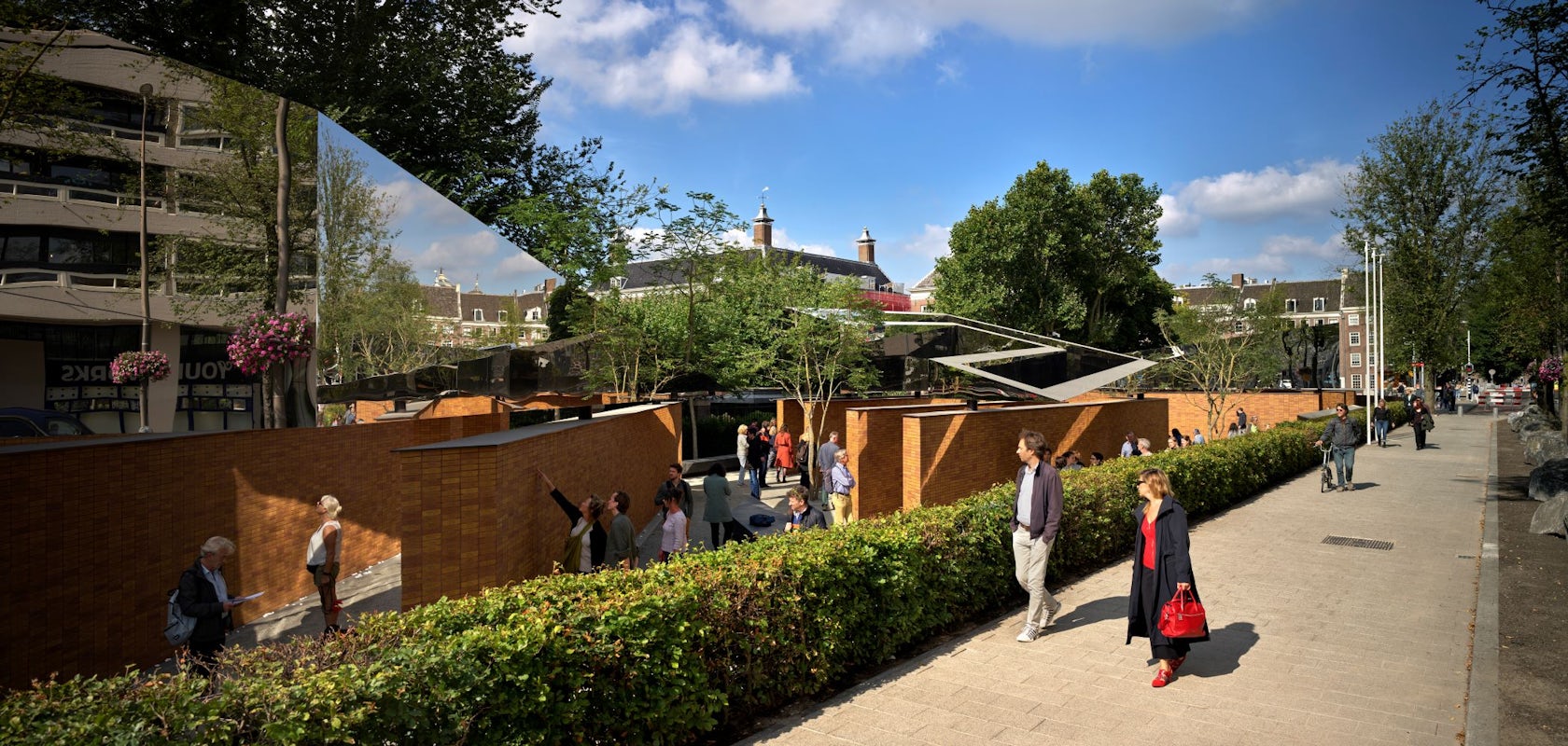
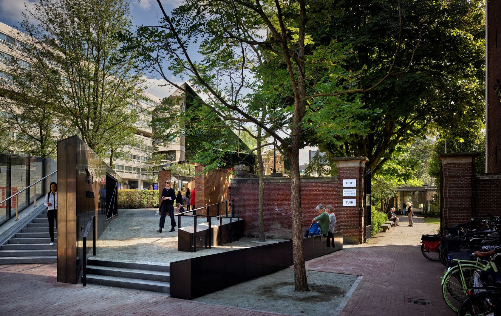
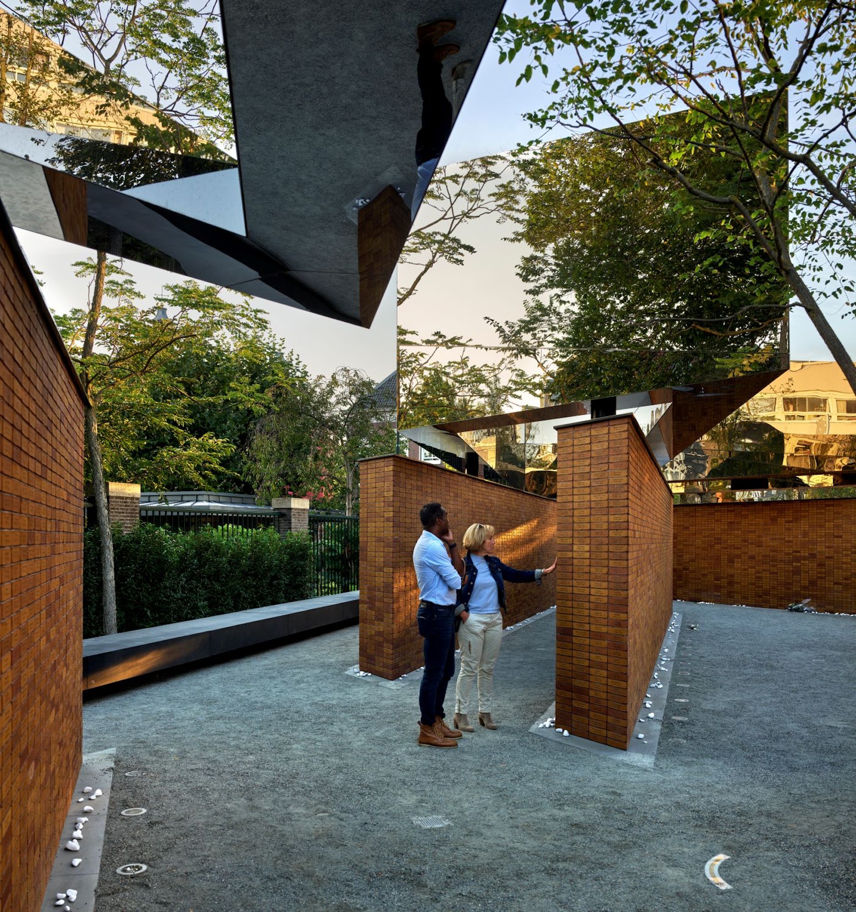
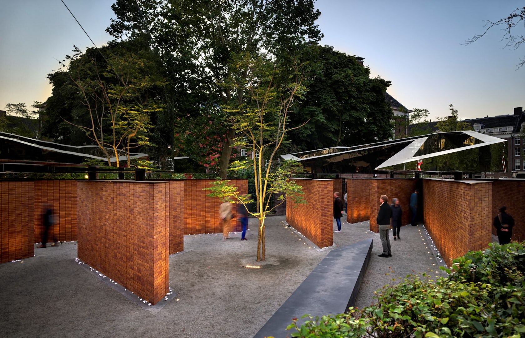
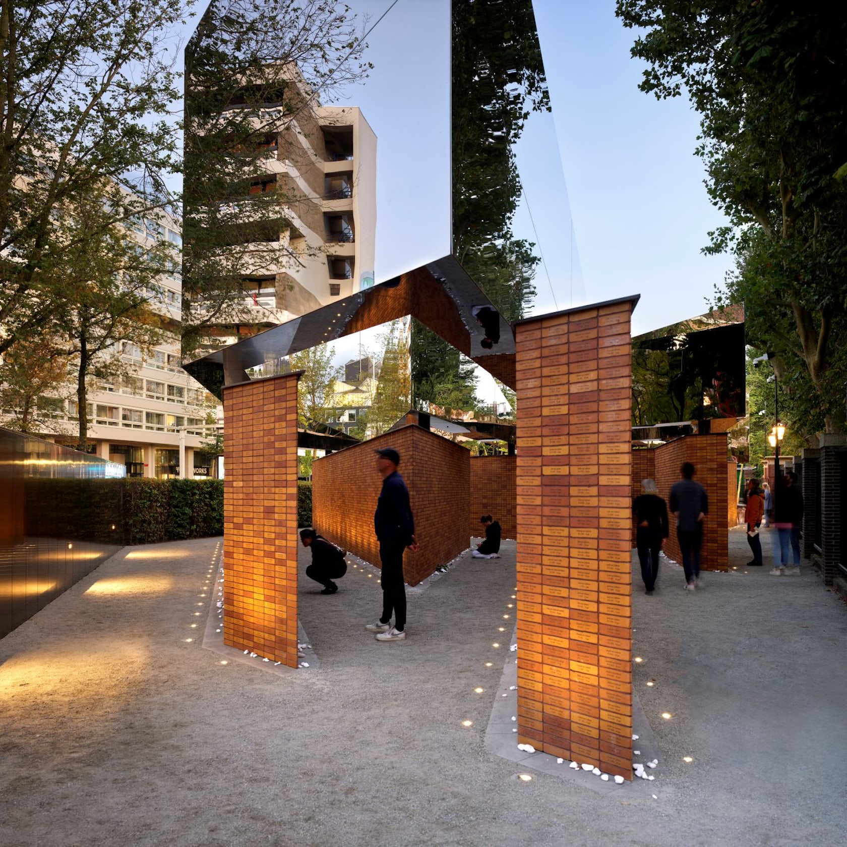
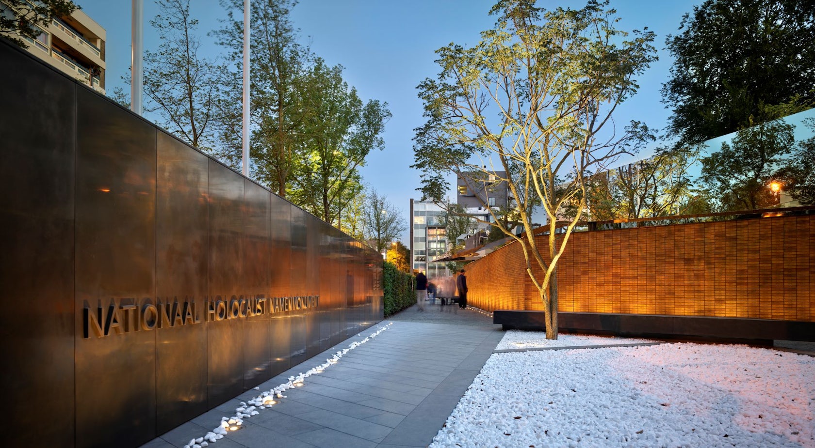
The National Holocaust Memorial of Names commemorates the more than 102,000 Dutch Jews, Sinti and Roma who were murdered during the Holocaust. The concept of remembrance is illustrated by four grand, mirrored steel Hebrew characters that spell the word ‘Le’Zecher’ (‘In Memory of’). This three-dimensional message of commemoration is supported by the 102,000 Name bricks that form its foundation walls. Situated in the heart of the old Jewish quarter of Amsterdam, the memorial offers a tranquil corner in the bustling city. As visitors enter the space, they find themselves within a labyrinth of brick walls – a serene environment for introspection and reflection. Hovering above them, the mirrored steel surfaces of the Hebrew characters reflect the neighborhood, the city and the country in which many Jewish families were lost.
Architizer chatted with Johan van Lierop, project architect at Studio Libeskind, to learn more about this project.
Architizer: What inspired the initial concept for your design?
Johan van Lierop: Daniel Libeskind’s concept for the design was to convey the message of commemoration by way of the four Hebrew characters לזכר, forming the word Le’Zecher (‘In Memory of’).
© Studio Libeskind, Rijnboutt
© Studio Libeskind, Rijnboutt
What do you believe is the most unique or ‘standout’ component of the project?
I personally feel that the 102,000 bricks, each inscribed with the name and age of an individual, is the most powerful part of the Memorial. Using a familiar element such as the brick makes the inconceivable number of 102,000 victims tangible. The brick represents a unique person, each with his or her own story.
© Studio Libeskind, Rijnboutt
What was the greatest design challenge you faced during the project, and how did you navigate it?
The project did not have a ‘greatest design challenge’ but rather many other challenges that were less apparent from its design.
One challenge that comes to mind is the logistical puzzle of converting the database of 102,000 names into the bricks in alphabetical order and to deliver them on site in the order that meets the mason’s workflow. One reads the names in alphabetical order from top to bottom, but the mason starts working from the bottom up and not necessarily in the right order of walls.
Then there was the structural engineering challenge of the large steel volumes. Initially, these volumes were designed as one single, monocoque structure. But due to site access limitations, the volumes had to be cut into smaller segments and assembled on site. Each volume weighs about 30tons, contains large cantilevers and has only 5 points of support.
© Studio Libeskind, Rijnboutt
How did the context of your project — environmental, social or cultural — influence your design?
One is constantly aware of the fact that you are dealing with a black page in history. The design must be peaceful and respectful, but also impactful as well as educational. It must offer personal space and at the same time serve as an all-inclusive public space.
We sought to keep a sober palette of materials, the main focus being the brick walls with the names, earthly and grounding, while allowing the more abstract, mirror-steel volumes to reflect the sky and its surroundings. This contrast of materials represents past and future, death and life, reflection and hope.
© Studio Libeskind, Rijnboutt
© Studio Libeskind, Rijnboutt
What drove the selection of materials used in the project?
The use of brick was a conscious choice of material, both from a conceptual point of view (as mentioned earlier) as from a cultural point of view, it being a ubiquitous material of the Netherlands. It also brings a unique and individual character to each name, as no brick is the same.
The use of stainless steel seemed the most obvious choice for the steel Hebrew characters. Its highly polished finish gave us the mirror quality that we envisioned (reflection) while still being very durable and low in maintenance.
© Studio Libeskind, Rijnboutt
How important was sustainability as a design criteria as you worked on this project?
Sustainability has been a design criteria in the sense that the project has to be built to last; Very durable and able to sustain for at least 50 years.
In what ways did you collaborate with others, and how did that add value to the project?
We had a very dedicated team of designers, engineers and contractors working very closely together since the early design process. Everyone felt the emotional and social importance of the project and kept a high standard of quality throughout the entire project.

© Studio Libeskind, Rijnboutt
How have your clients responded to the finished project?
Our client, the Dutch Auschwitz Committee, is very pleased with the project, whose outcome and impact has exceeded their expectations. Jacques Grishaver, chairman of the Auschwitz committee, has dedicated 15 years of his life to realizing this project. His determination and perseverance was very inspiring to witness.
© Studio Libeskind, Rijnboutt
Is there anything else important you’d like to share about this project?
On a personal note, I am very honored to have worked on such a meaningful and impactful project. It wasn’t until its opening ceremony that I truly felt the importance of this testament. I saw a Holocaust survivor touch the names of his murdered family for the first time and break down in tears. All these names I had passed by so many times during site visits now came to life, became a mother, a father, a sibling… I no longer saw the project through the eyes of an architect, but I became an eyewitness to the overwhelming impact this Memorial has on its visitors.
I have never felt something so powerful and humbling in my entire career.
The Memorial is a poignant reminder to never forget about the horrors of the Holocaust, and to educate future generations about the dangers of intolerance, indifference and hate.
Team Members
[Design Architect: Studio Libeskind]: Daniel Libeskind (Principal Architect), Stefan Blach (Partner-in-Charge), Johan van Lierop (Project Architect), Alex Tahinos (Designer) – [Architect of Record: Rijnboutt]: Paul Beijeman, Margret van den Broek, Bart van der Vossen, David Philipsen, Rob Korlaar – [Landscape Design: Rijnboutt]: Petrouschka Thumann, Patrick Kolanczyk
Consultants
General Contractor: Koninklijke Woudenberg – Project Management: Paul Rohls, Aumento bv – Structural engineers: IMd Raadgevend Ingenieurs (general), ABT (steelwork) – Brick Manufacturer: Rodruza – Masonry consultant: Metselwerk Adviesbureau Vekemans – Engravings: Reijnders Engraving and Laser Engineering – Steel fabrication: IP partners – Lighting Design: Ulrike Brandi Licht – Installations: Swart installatietechniek
For more on the National Dutch Holocaust Memorial of Names, please visit the in-depth project page on Architizer.


 National Dutch Holocaust Memorial of Names