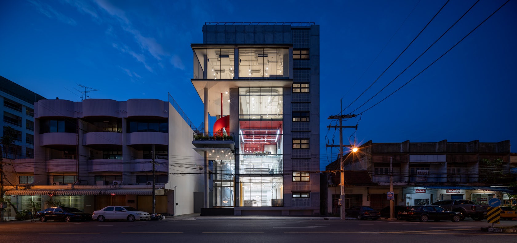
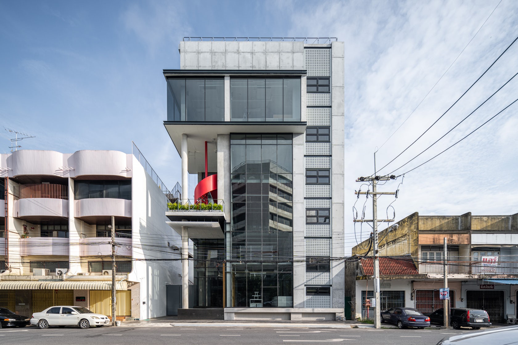
Project : Better Together, RetailYear : 2021Area : 1000 sq.m.Location : Prachatipat Rd., Hatyai, Songkhla ThailandArchitect : Nirostina Nisani – VIVE Design Studio, Bangkok-DubaiPhotographer : Beer SingnoiThe project is located on Prachathipat Rd, Hat Yai, Songkhla, Thailand. It is a 6-storey building with a total use area of 1000 sq.m.
© VIVE Design Studio
© VIVE Design Studio
The building is programmed to be as a one-stop service. It combines the Retails, Cafe, Co-Working Space and Meeting Room together in one building.
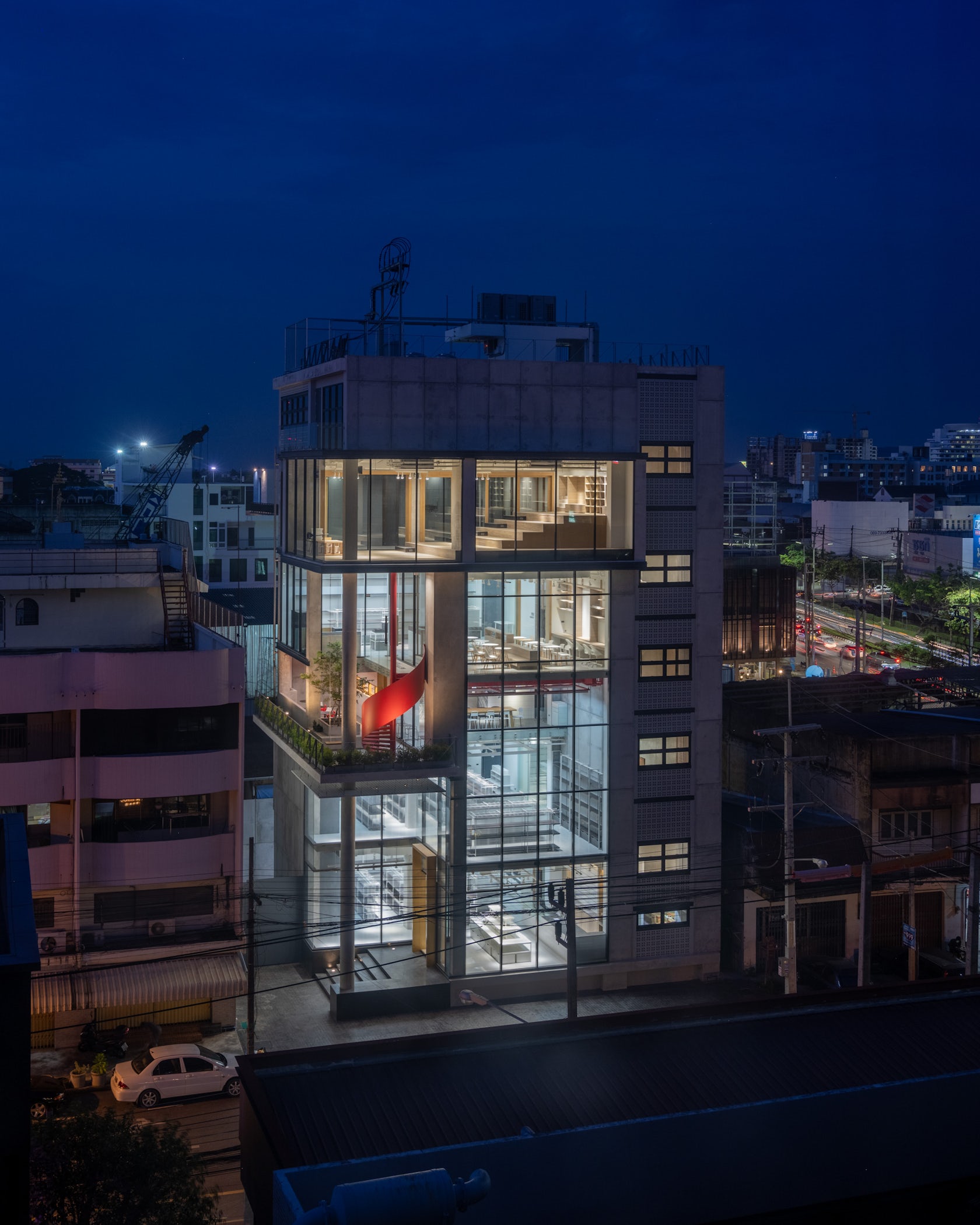
Due to site limitation, functions are designed to stack vertically spreading area usage, but those functions are designed to overlap intentionally, loosely creating an internal vertically space connected, the 1st and 2nd floors are stationary retail, the 3rd and 4th floors are cafes and co-working spaces, while the 5th floors are meeting and auditorium.
© VIVE Design Studio
© VIVE Design Studio
The storage room and office were pushed up into the 6th floor of the building.
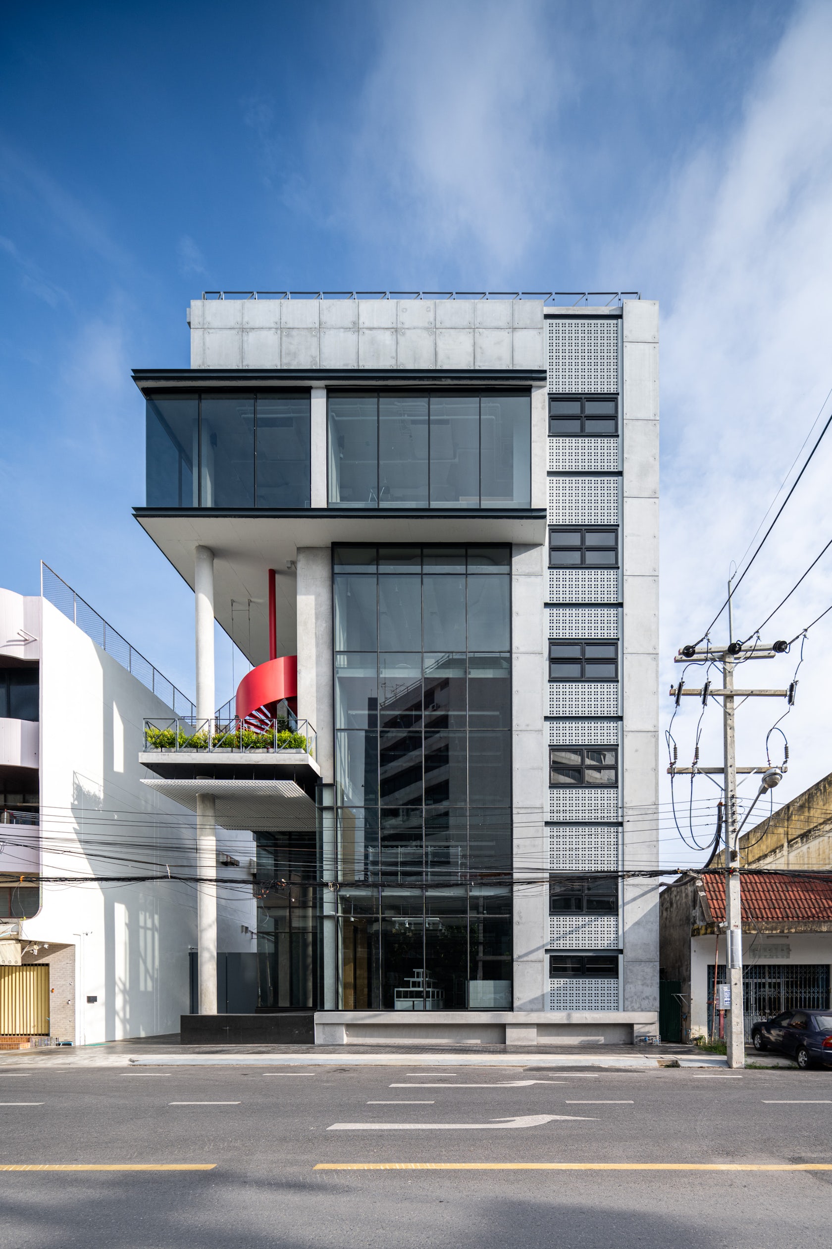
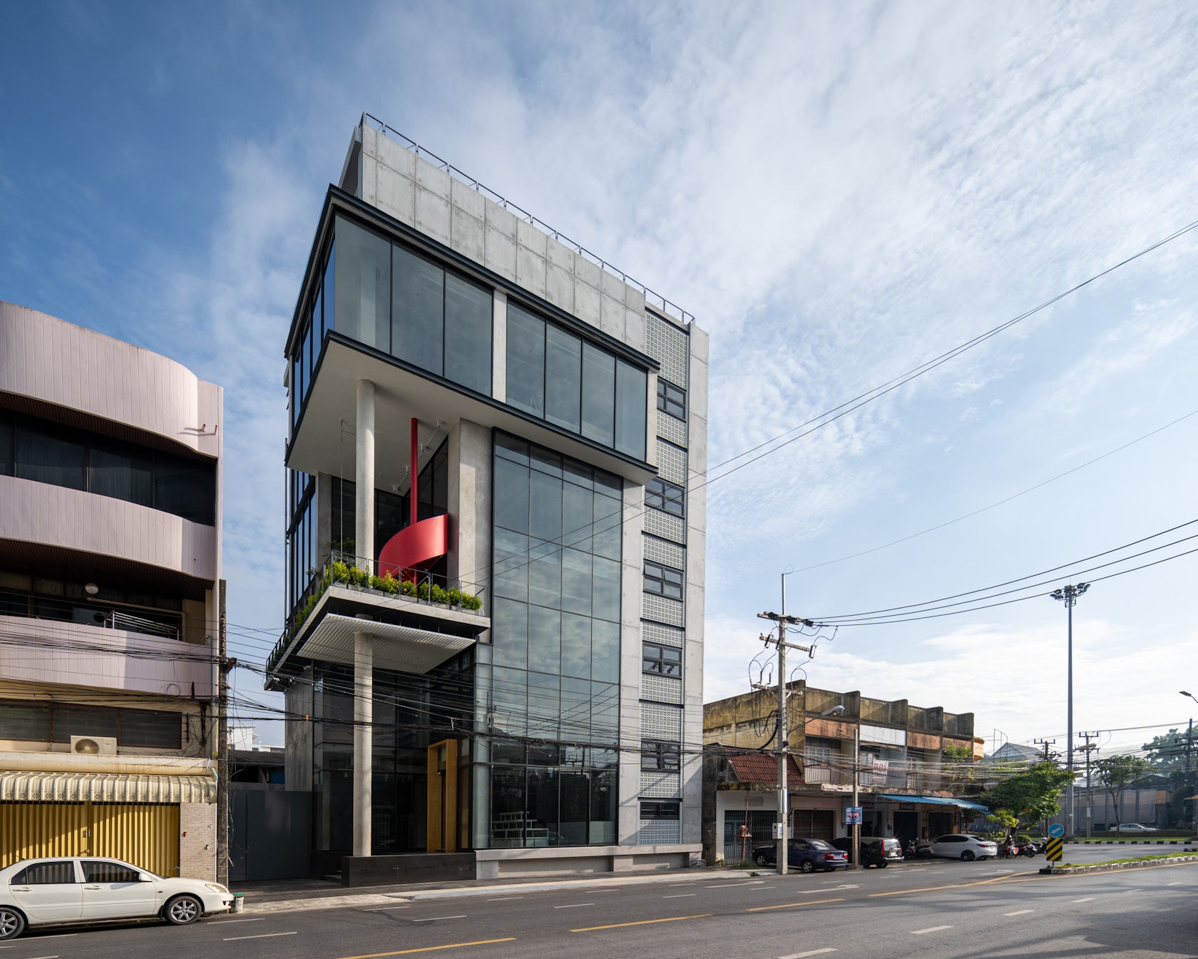
From the interior space propose reflected in the form of external architecture. Conceptually, revealing the activities of the whole building simultaneously from outside. By exposing the façade to work as a window display of the building and the section where different activities are happening variously.
© VIVE Design Studio
© VIVE Design Studio
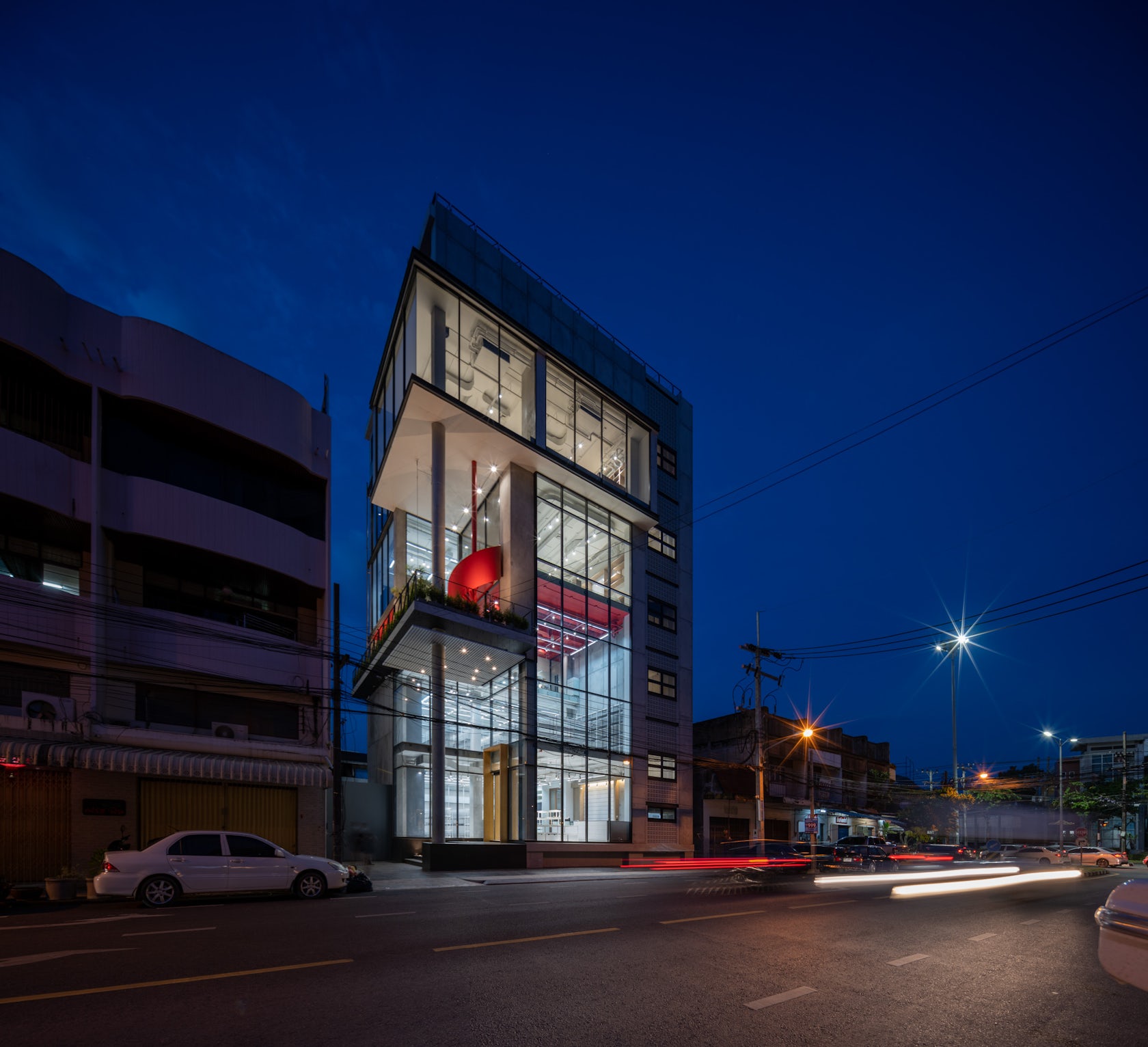
Space that overlaps inside, causing the Mass of the buildings that interlock each other, creating uniqueness from the neighboring buildings. At the same time, communicates with simple shapes, in order to maintain the facade of the surrounding context, the new building quietly fills the emptiness but can still be detected.
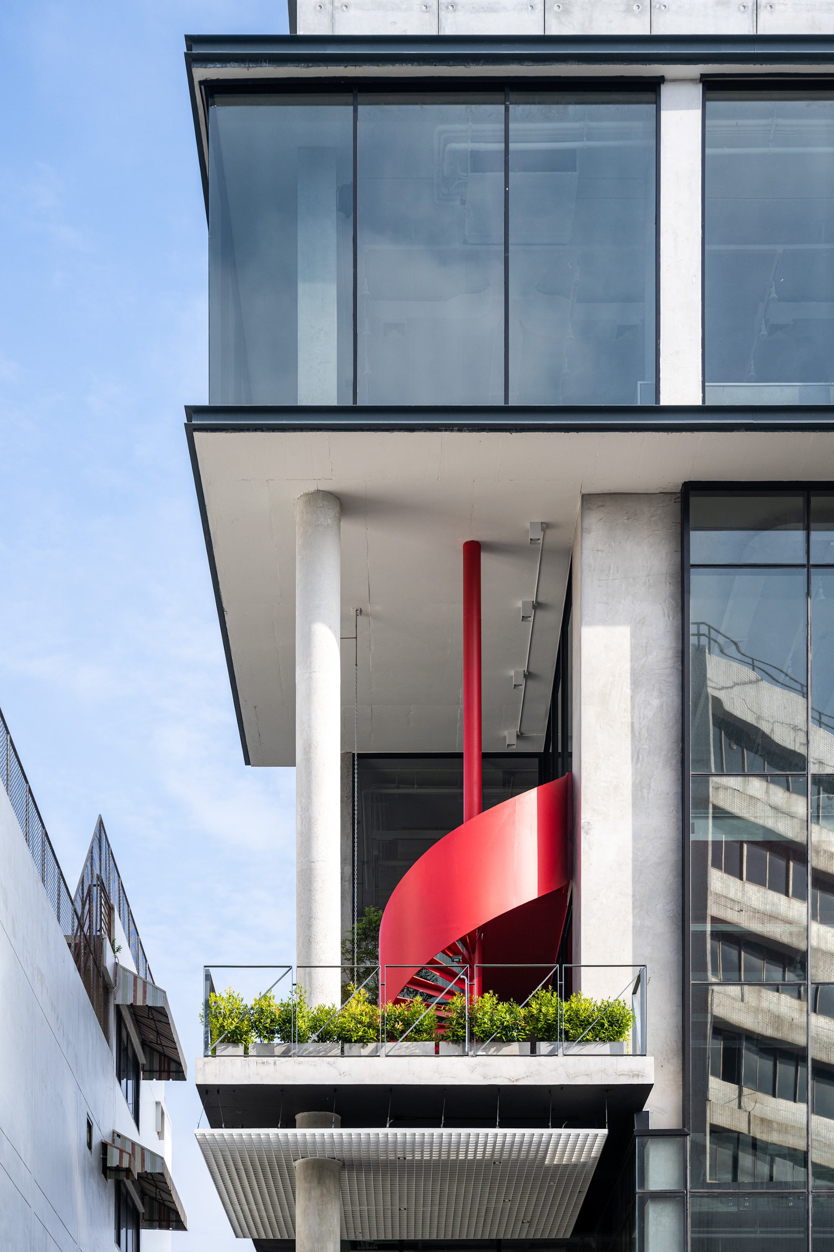
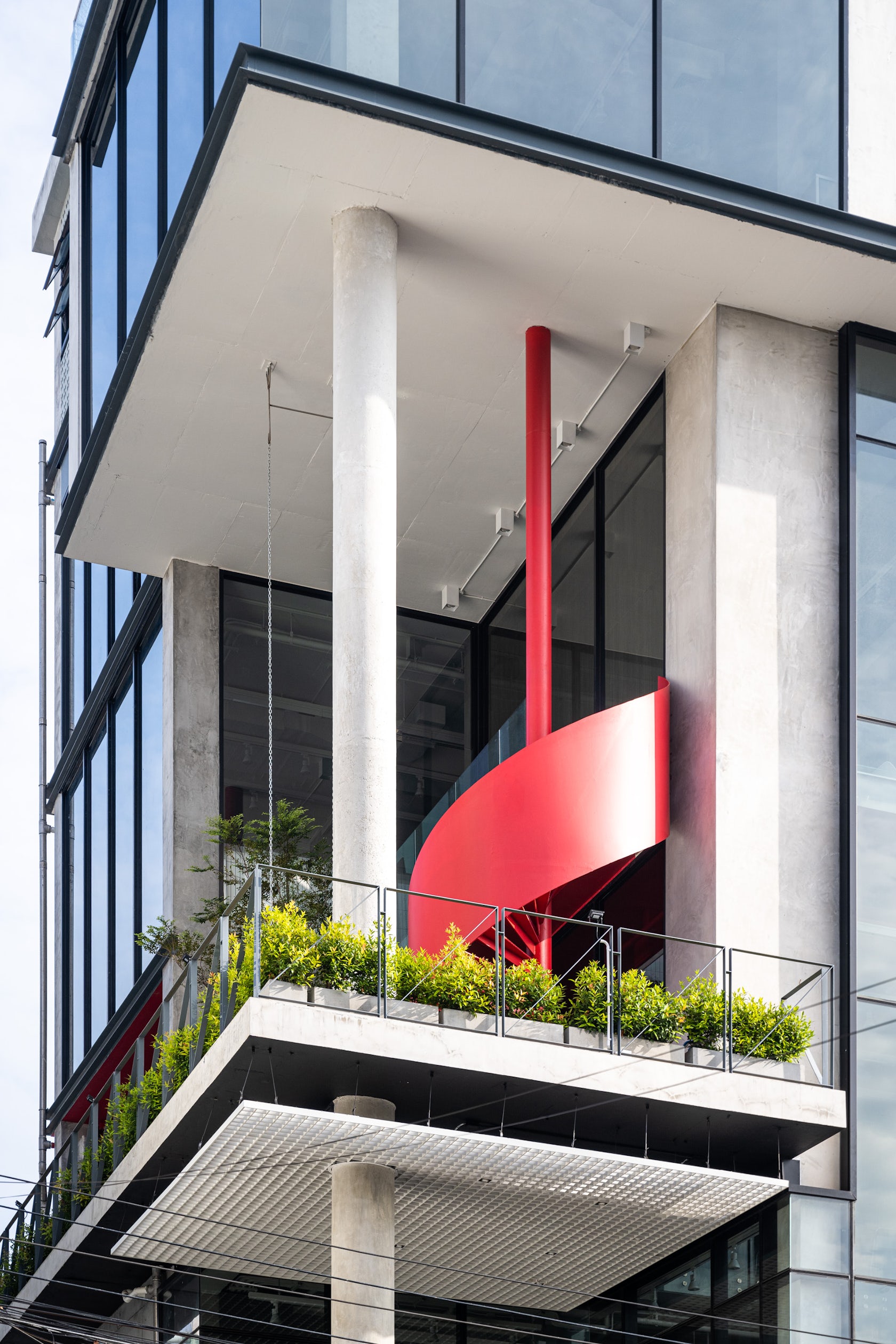
The front of the building opens up a narrow entrance to make it airier by showing Double Volume and round columns that support the front through to the 2nd floor additionally.
© VIVE Design Studio
© VIVE Design Studio
Moreover, the 3rd floor area also designed to open Mass to show Double Volume repeatedly by adding a bright red spiral staircase connecting the interior space with an airy corridor that can see the continuity to the 4th floor. The opening of the third floor into an outdoor area and the floating plants in the middle of the building make the building look clearly and airier in a narrow and limited space which is the main purpose of the building design.
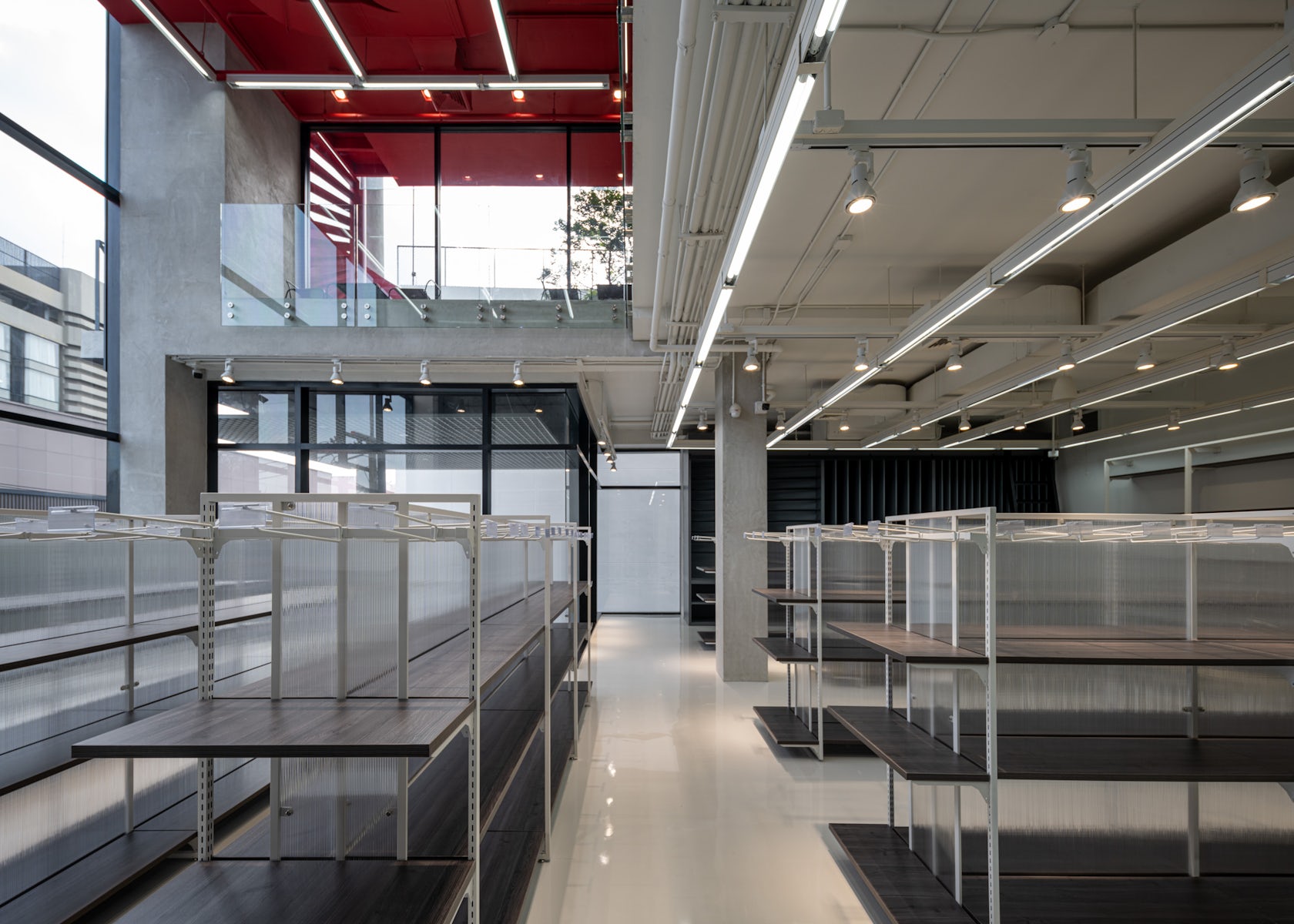
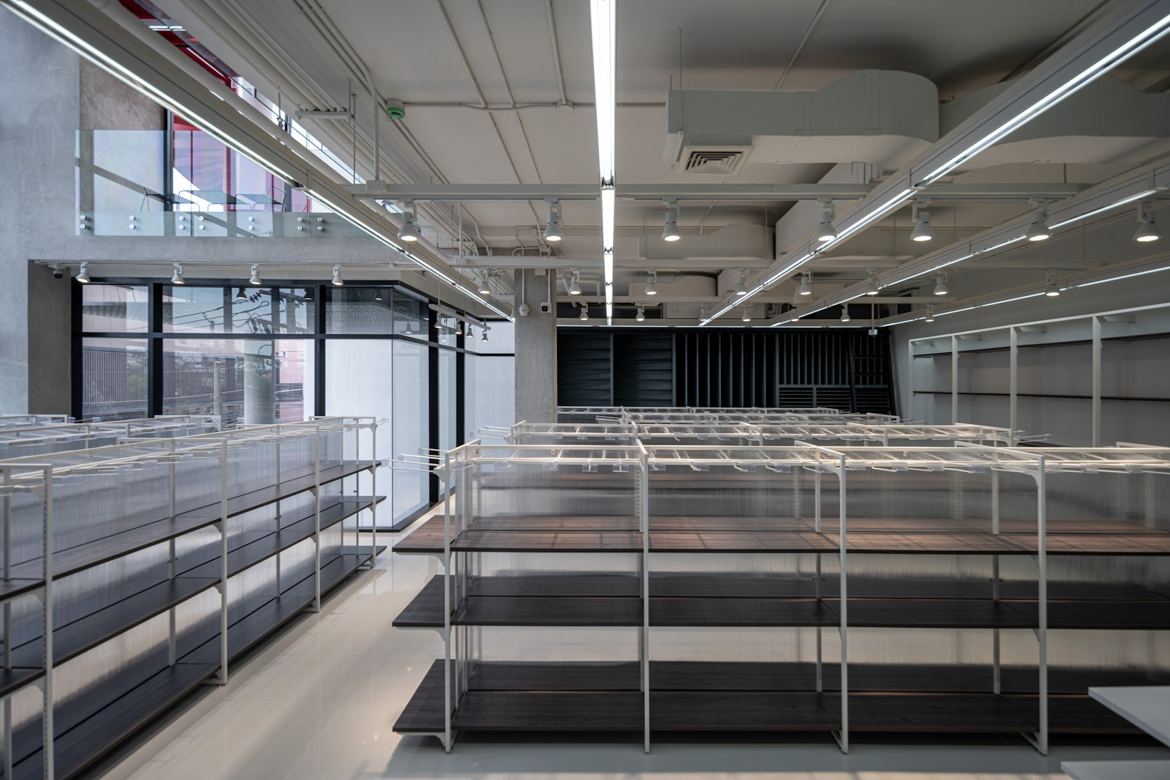
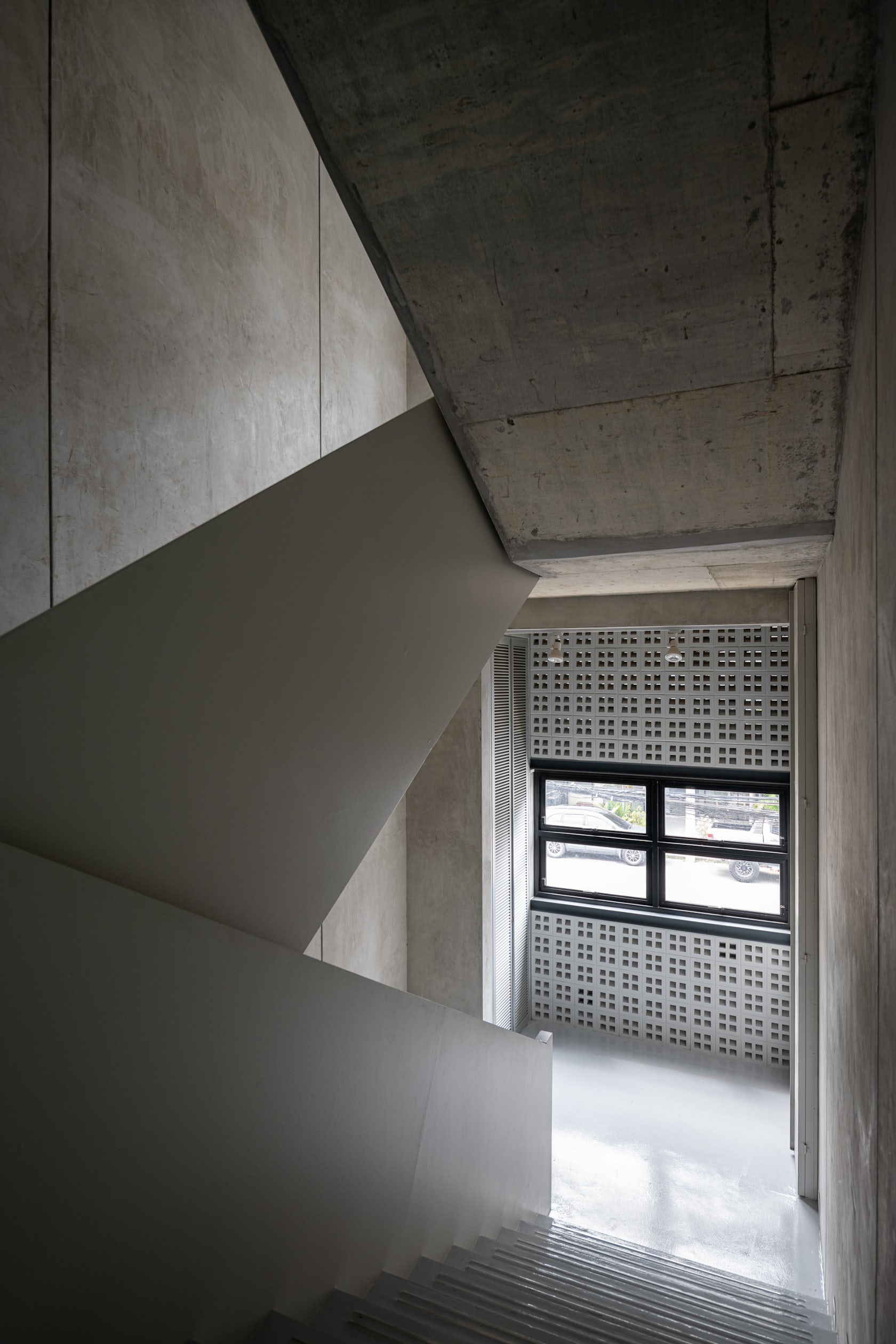
The material selection of the building emphasizes on showing the material naturally to reduce the cost of maintenance (Low Maintenance).
© VIVE Design Studio
© VIVE Design Studio
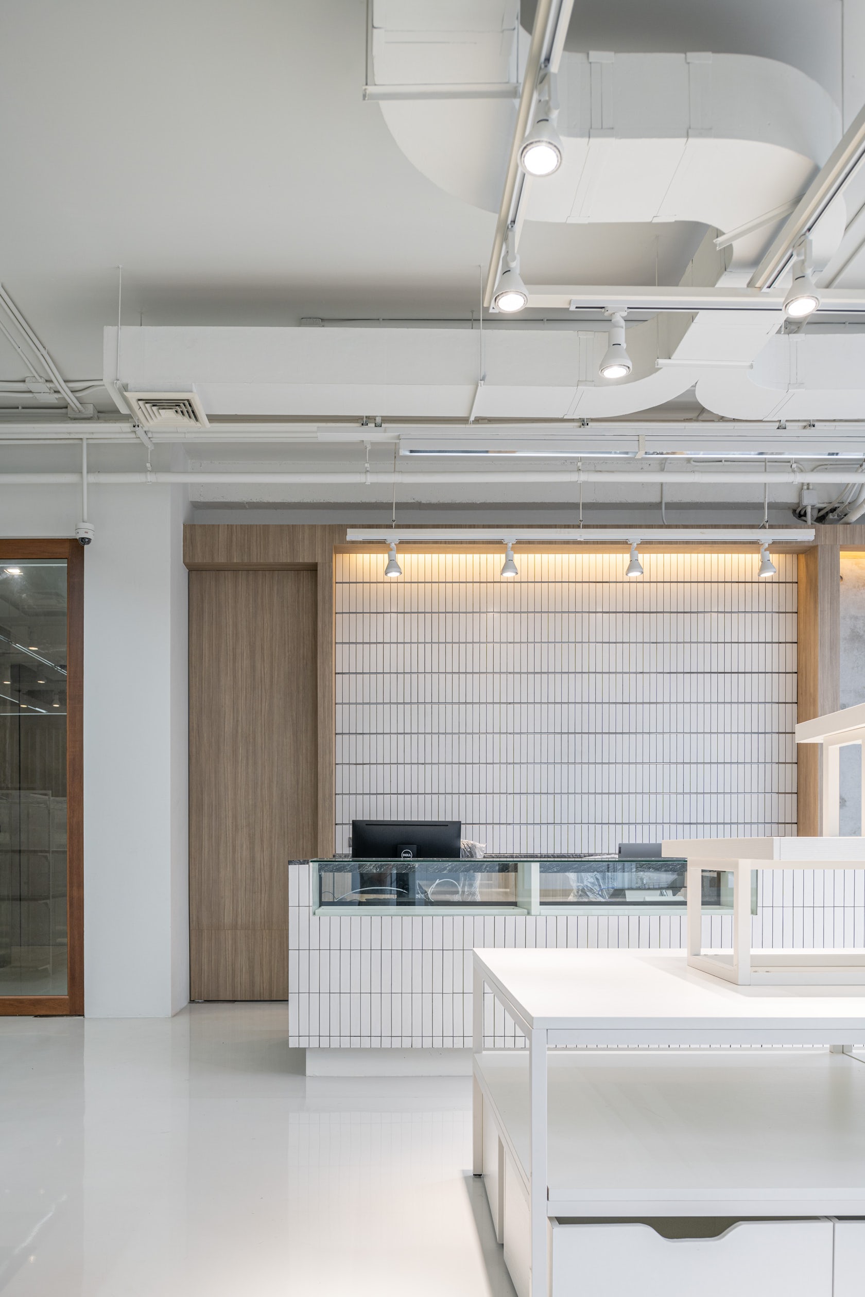
Exposed concrete walls and ceiling contrasts with the white epoxy floor, sleek and neat, combination of materials creating a perfect balance of both aesthetics and suitability. To make space more welcome by inserting stone and wood into the interior. In addition, white and black mosaic tiles with different scale and arrangement make the space wider..
© VIVE Design Studio
© VIVE Design Studio


 Better Together
