Architects: Showcase your next project through Architizer and sign up for our inspirational newsletter.
Encompassing much more than logos, taglines and website design, a good brand identity reinforces a company’s belief system and aligns it with a specific set of values. Architectural visualization, along with photography, plays a significant role in this narrative. Renderings are, for the most part, amalgams of several determining elements, including project typology, size and location. The final look of an image also depends on whether architects demand a specific POV, the involvement of marketing and PR departments in the production of visual content and the extent of creative freedom granted to visualization artists.
There is also the question of audience. Who are the images meant for: competition juries, publications, clients? Another determining factor is the budget. While some of the most captivating images of architectural design are produced by renowned visualization studios, others are done in-house and on smaller budgets. However, looking at an architecture firm’s portfolio, patterns emerge that demonstrate how the use of people in renderings can reaffirm their brand identity or betray the lack of one.
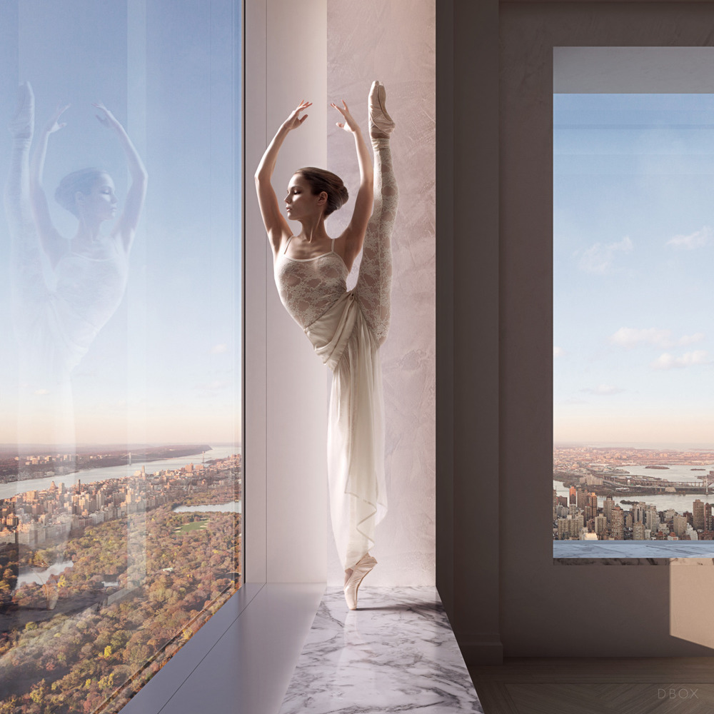
432 Park Avenue, image by DBOX
Most renderings try to tick the usual boxes: Show contextuality, accentuate flattering aspects of the design and communicate the way a project can benefit the city. People in renderings have become a powerful form of rhetoric that shows a declarative dedication to cultural mixing and creating spatial assets for urban communities.
The treatment of supportive visual elements such as people provides an insight into the way a few established architecture firms communicate their brands. In this guide, we’ve included projects of different typologies and sizes that use highly publicized “hero” renderings, with the exception of aerial views, which are generally less likely to feature human figures in any significant way.

Snøhetta (three upper rows), Bjarke Ingels Group (three bottom rows)
Not MY Project, OUR Project
Snøhetta doesn’t have a set formal style, but its projects are recognizable by reflecting the firm’s own cultural origins and the idea of creating balance between form and function, work and life, nature and built space. Often placing an emphasis on accessibility and inclusion, their designs dictate a strong presence of people in renderings. Even in images of small-scale, secluded projects, there is a level of intimacy that accentuates a human experience.
BIG’s interest in the social aspects of architecture can be seen in their images, which translate the firm’s diagrammatic design approach into scenes of vibrant urban life. BIG often features people in the foreground as well as individuals and groups taking part in specific activities. The interior image for the National Gallery of Greenland, created by Mir, shows two children and an elderly man in the foreground, kids gazing through curved glass walls onto an expansive blue sky, emphasizing the project’s immersion into its natural context while presenting an underlying social theme.
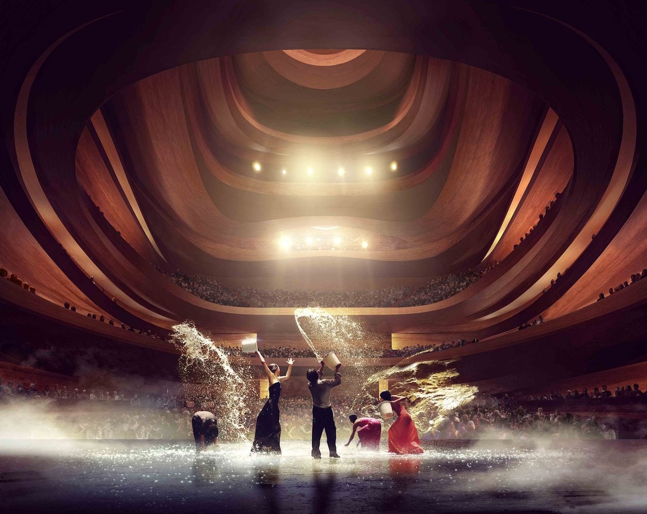
Busan Opera House by Snøhetta, image courtesy Mir

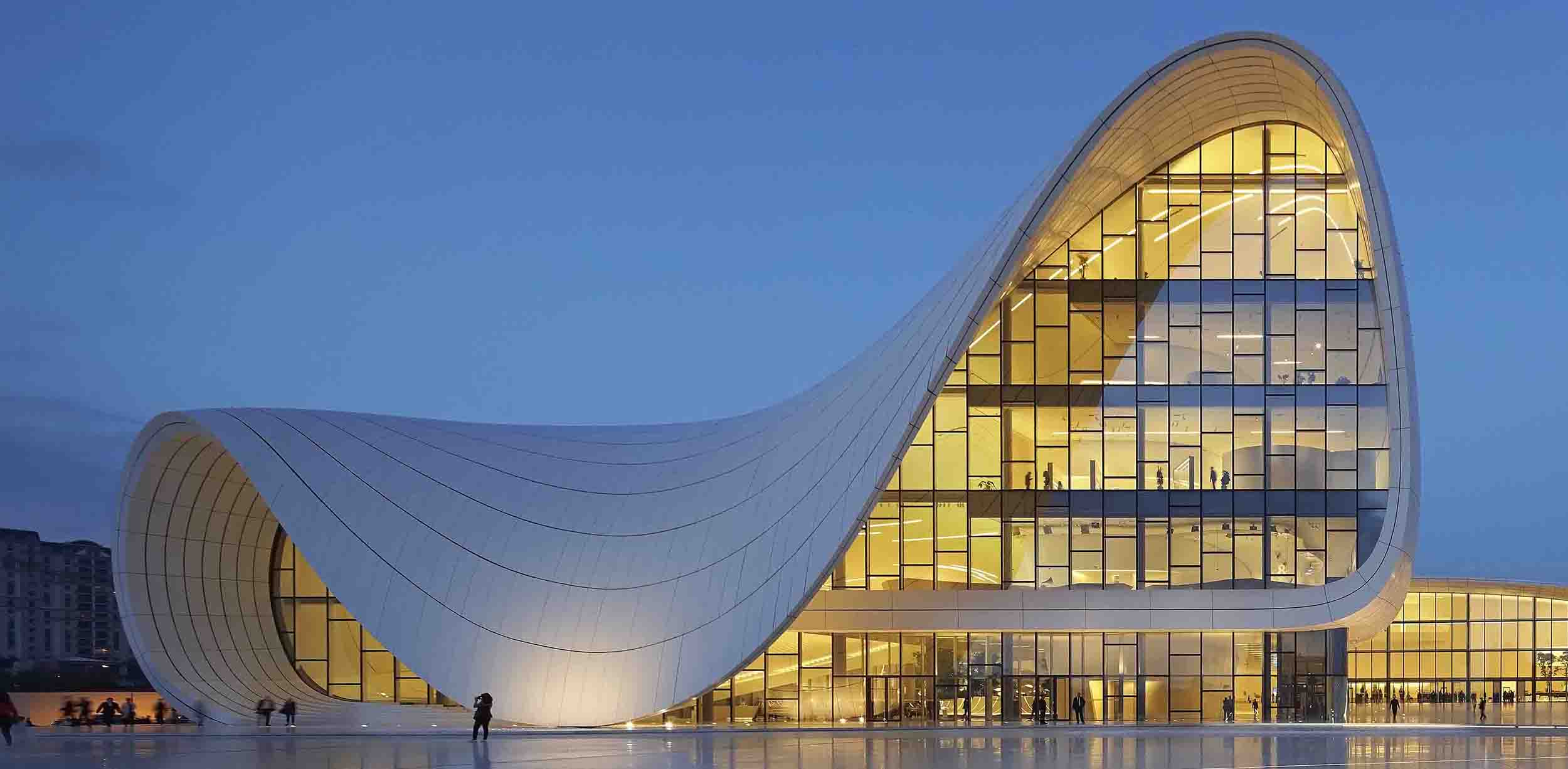
Heydar Aliyev Center by Zaha Hadid Architects
Lights Off
Performance spaces are a great opportunity for architects and 3D artists to convey atmosphere. MIR’s image for Snøhetta’s Busan Opera House, though one in a series of interior shots, has become very recognizable. Here, MIR replaced the usual POV from the auditorium to the POV of the performers, managing to show a large portion of the design while capturing the excitement of a performance.
The human figures are in movement, which makes the image more dynamic. Compared to it, the rendering for Zaha Hadid’s prize-winning Heydar Aliyev Center in Baku, Azerbaijan, technical quality and attention to detail aside, has a more sedate atmosphere. Here people are used as film extras that provide context but don’t distract from the design of the space. The same goes for MAD’s Harbin Theater, where the main role of people is to accentuate the design of the auditorium.

Zaha Hadid Architects (three upper rows), MAD Architects (three bottom rows)
Design Above All
Both photos and renderings of projects by Zaha Hadid Architects often “suffer” from limited human presence. Their visuals reflect the firm’s primary interest in the disciplinary aspects of architectural design. Channeling the abstract quality of Zaha Hadid’s drawings, the images are devoid of spontaneity commonly associated with the idea of livable space.
Recognizable curvaceous forms and bold spatial gestures are the main protagonists in the visual storytelling, creating an air of exclusivity dominated by unapologetic beauty. Images of projects by MAD, though more diverse in form than those of Zaha Hadid, share a similar language.
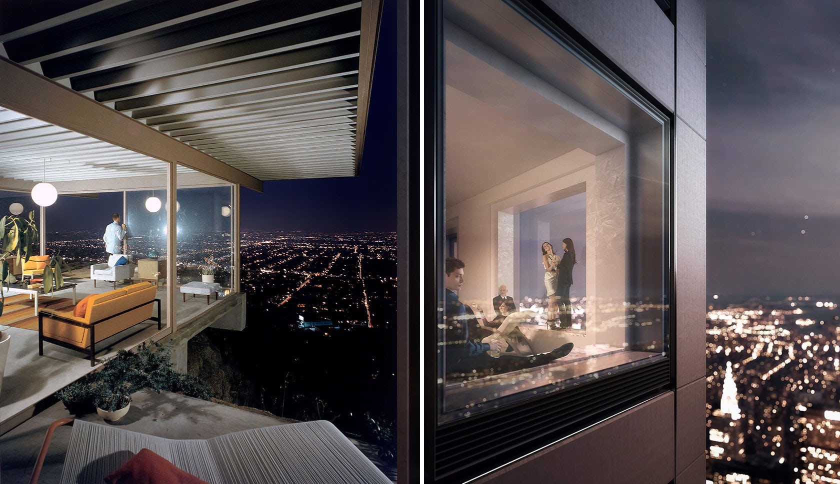
Left: photo of Stahl House by Julius Shulman; right: image by DBOX for 432 Park Avenue by Rafael Viñoly

Left: photo of Spencer residence by Julius Shulman; right: image by DBOX for 432 Park Avenue by Rafael Viñoly
Anatomy of a Lifestyle
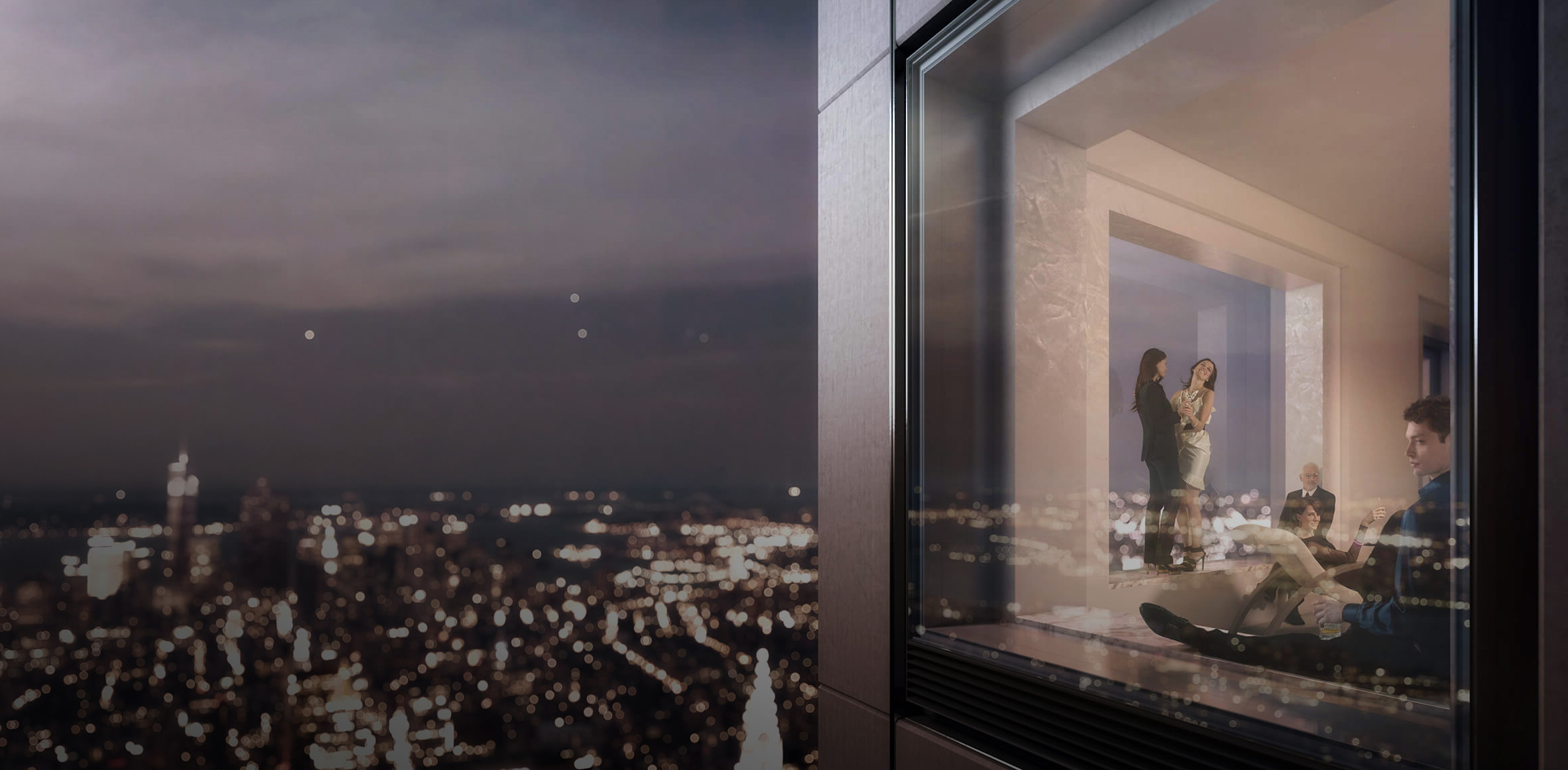
Renowned firms working on high-profile projects, like the 432 Park Avenue residential tower in New York, can afford to hire specialized communication agencies like DBOX to create entire marketing campaigns, renderings included, that best present the story of their projects. As a communications agency focusing on high-end real estate, DBOX uses their own photographic materials. Models are brought in, styled, shot in different poses and lit to fit the lighting setup of the rendering.

Image by DBOX for South Quay Plaza
For 432 Park Avenue they drew inspiration from Julius Schulman’s iconic photographs of mid-century luxury residences, including the Pierre Koenig–designed Stahl House in Los Angeles. Their campaign for South Quay Plaza in London included extensive research on the competition and the site, creating mood boards and profiling potential clients for each unit. The image above features a girl who actually works in a building near the residential tower. It is important to note that the team carefully chose every entourage element, from magazines to perfume bottles, to fit her character and lifestyle.

Images by Populous
GOOOOAAAAL!
When it comes to sports-related architecture, Populous is a great example of branding consistency. Their name, visual content and marketing materials all reinforce the concept of building for people. Populous often uses large crowds in motion and one-point perspective to draw even more attention to the central focal point and the building itself. While anyone creating a rendering of a stadium knows that in this specific typology, the presence of large groups of people is a given, these can be used to capture the excitement of going to a sporting event.

Feyenoord Stadium by Zwarts & Jansma Architects

Image by Virtual Planitfor Liverpool FC Stadium Expansion
If you compare the two images of the main fields shown here, the design differences seem almost insignificant. However, it becomes evident how, with a small shift of the camera and a more attentive approach to portraying crowds, drama and excitement can be added to an image. The waving of flags, the red flare haze and variations along the depth in the rendering of the Feyenoord stadium (top) make it easy to imagine which one of these matches is more interesting to watch.

Image by LUXIGON
A Note on Silhouettes
See-through people are rarely flattering in images. It is better to use silhouettes or scale figures if you’re using a non-photorealistic approach to rendering. Silhouettes can provide enough information on scale, draw the eye toward a specific part of the image without distracting from the architecture.

Photo by Fernando Guerra

Photo by Fernando Guerra
Here, photographer Fernando Guerra shows how to accentuate a building and communicate its function using human figures as silhouettes. Guerra’s work is a great source of inspiration when it comes to placing people in space. Photography, graphic design, film and advertising are all great places to look for ideas.
Happy rendering!
Enjoy this article? Check out the other features in our series on “The Art of Rendering”:
Methanoia Reveals the Story Behind Architecture’s Most Striking Visualizations
When Architectural Visualization Gets It Right: Victor Enrich’s Surreal Art
7 Magical Demonstrations of Hyper-Real Environments
Alex Hogrefe Creates Stunning Architectural Visualizations Using SketchUp and Photoshop
How Technology Will Revolutionize Architectural Representations
Striving for Real-Time Photorealism in Architectural Visualization
Create a Stunning Watercolor Visual Using SketchUp, AutoCAD and Photoshop
Architects: Showcase your next project through Architizer and sign up for our inspirational newsletter.
