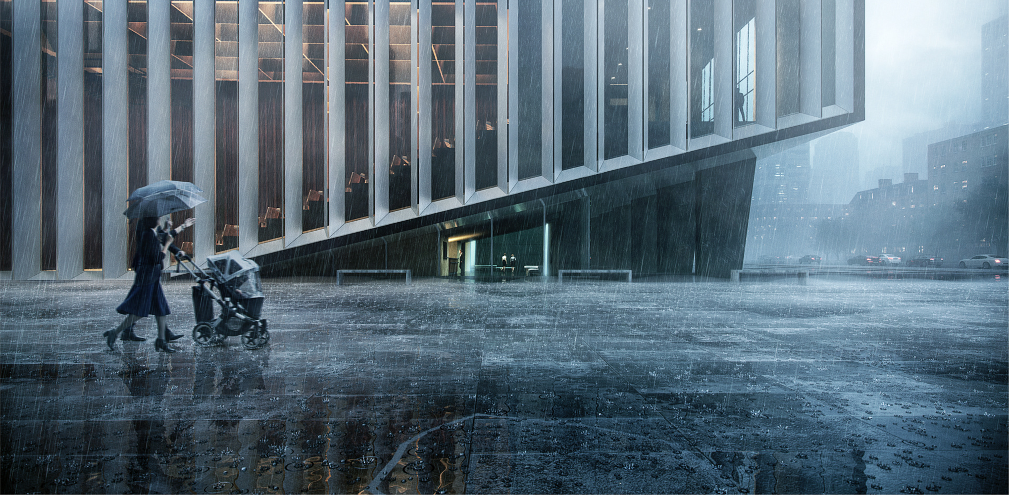
Featured above: “Rainy Day” by DEVISUAL. Architects: Showcase your next project through Architizer and sign up for our inspirational newsletter.
The One Rendering Challenge is a global ideas competition that poses a simple question: Can you tell a powerful story about architecture within a single visualization? it the button below for key program updates:
As you consider how to craft a winning entry for the competition, take a moment to consider what renderings are really for, and where the best inspiration for them might be found. Architectural visualization serves the purpose of communicating the ideas behind designs before they materialize. The best renderings tell a visual story in order to convey the essence of a project, in both the physical sense and in less tangible ways relating to atmosphere, character and mood.

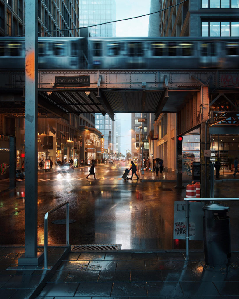
“Misty Chicago” by Mohit Sanchaniya features a photorealistic visualization of Chicago’s downtown; image via Mohit Sanchaniya
3D renderings are at the fore of the architectural visualization industry due to the level of detail that can be achieved with today’s ever-evolving rendering software. In particular photo-realistic renderings can be highly effective in laying bare a project’s design intent. As close to an actual photograph that can be achieved, this form of rendering lives and dies by the level of detail expressed by each of its components.
The composition, texture, form and color of certain objects under various conditions should be studied and understood in order to develop realistic depictions of them. These subtle nuances can greatly enhance one’s renderings by adding a genuine quality that highlights the unique and natural characteristics of a concept.
It’s easy and seemingly logical to abide by the standards of other renderings when embarking on one’s own visualization. However, in doing so, more attention is directed towards achieving the typical, “polished” rendering, rather than capturing the details of a specific moment and setting. As a result, renderings fall into the trap of becoming generic, bland, and indistinctive. They fail to signify how a place will look and feel in reality.

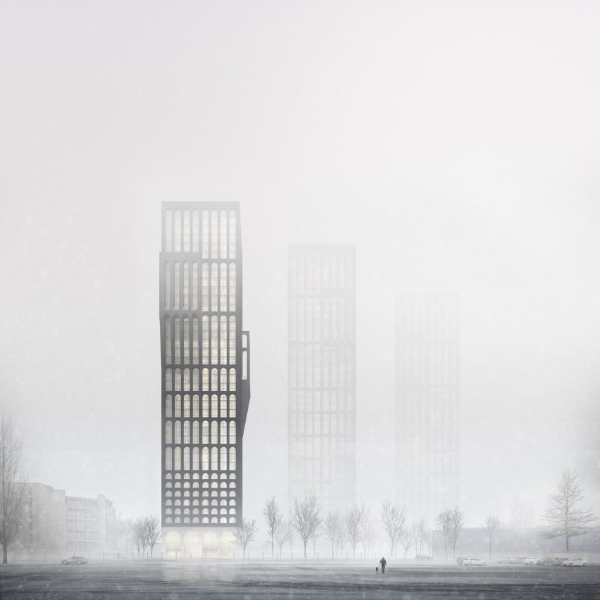
Darcstudio’s image of Mini Manhattan by Tim Groom Architects shows the project on an icy winter’s day; image via Dezeen
Among the jurors for this year’s One Rendering Challenge, a number of experts advocate other sources when seeking case studies for visualization. “Don’t look at renderings,” states Matthew Bannister, founder of international creative communications agency DBOX. “Look at art and photography, and use your eyes to tell you what is really happening in various conditions of light. Don’t let your brain convince you that grass is green and Sheetrock is white.”
Fellow Juror Keely Colcleugh, founder of creative studio Kilograph, reasserts this position: “Reference principles of photography and IRL (In Real Life) observation. Real life experience of architectural conditions (particularly light and shadow) cannot be replaced by digital ‘research’. You need the experience of places – including sounds, smells, sensations, and draw from these when creating art.”
In order to create a truly compelling image, referencing the real world should take a higher precedence over anything else. There are plenty of details available here that can breathe life into a visualization. For example, a photograph of an old heritage building will have imperfections — dirt on some of the stones, ivy growing up a wall, slightly crooked windows, and so on. A photograph of people sitting on a couch will distort the furniture or cast a shadow in a very particular way, which can inform a rendering and make it much more realistic.

“Venezia” by Rafael Reis recreates Venice, paying close attention to details such as old, peeling walls and overgrown vines; image via Rafael Reis
Further to this, rendering expert and One Rendering Challenge Juror Alex Hogrefe, founder of Visualizing Architecture, believes more time should be spent thinking about composition.
“It seems composition is an element of image making that a lot of people brush off when just starting out. It sets the tone of the illustration and defines the drama and energy of an image as much as lighting does. I suggest studying the great architectural photographers, because they are especially sensitive to unique and compelling image compositions.”
Renderings should be memorable and impactful. They should establish a distinct mood and tone. Detailing, down to the smallest imperfections, should be considered and captured wherever possible. Referencing the principles of architectural photography and real-world observation will prove to be invaluable to giving your visualizations real power.
Architects: Showcase your next project through Architizer and sign up for our inspirational newsletter.


