Architizer is building tech tools to help power your practice: Click here to sign up now. Are you a manufacturer looking to connect with architects? Click here.
By now, it is common knowledge that, with the right software, technical talent, and an eye for detail, architectural visualizations can display near-perfect levels of realism. Renowned visual artist Peter Guthrie remarked recently that many architectural renderings are now “indistinguishable from photos.”
This photorealism is something that architects and their clients are increasingly accustomed to, and there is a growing consensus that a precise visual representation of the built environment is no longer enough to move people the way it once could. As a result, a greater significance is now placed on qualities beyond pure realism; composition, narrative and atmosphere are essential in setting your image apart amid the ocean of renderings now proliferating across the profession.
Consider the following 12 pointers for creating truly atmospheric visualizations. Prepare to enter an ethereal world of architectural artistry …
1. See the light
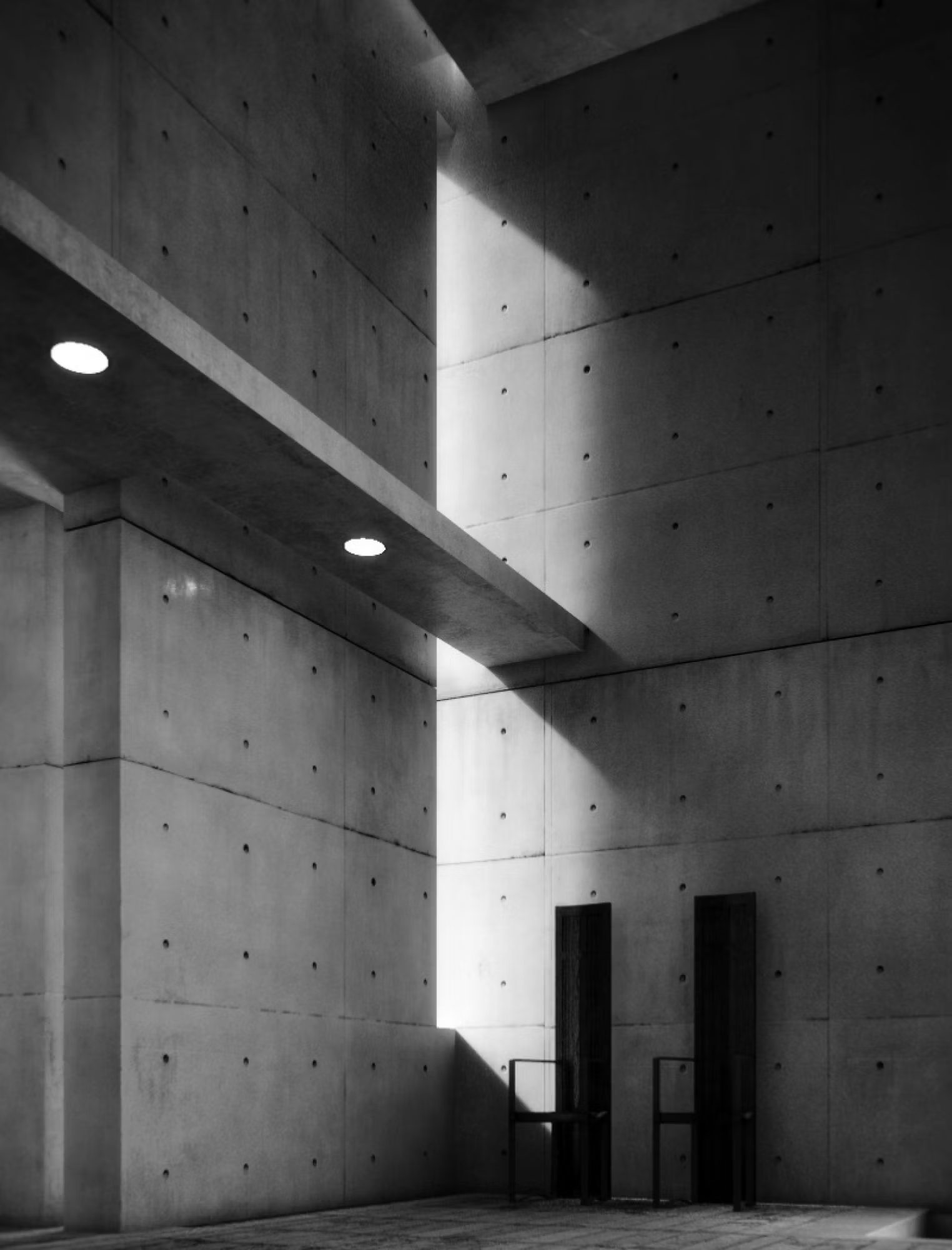
Kobe Church by Tadao Ando Architect and Associates, rendering by Gabriel Fabra
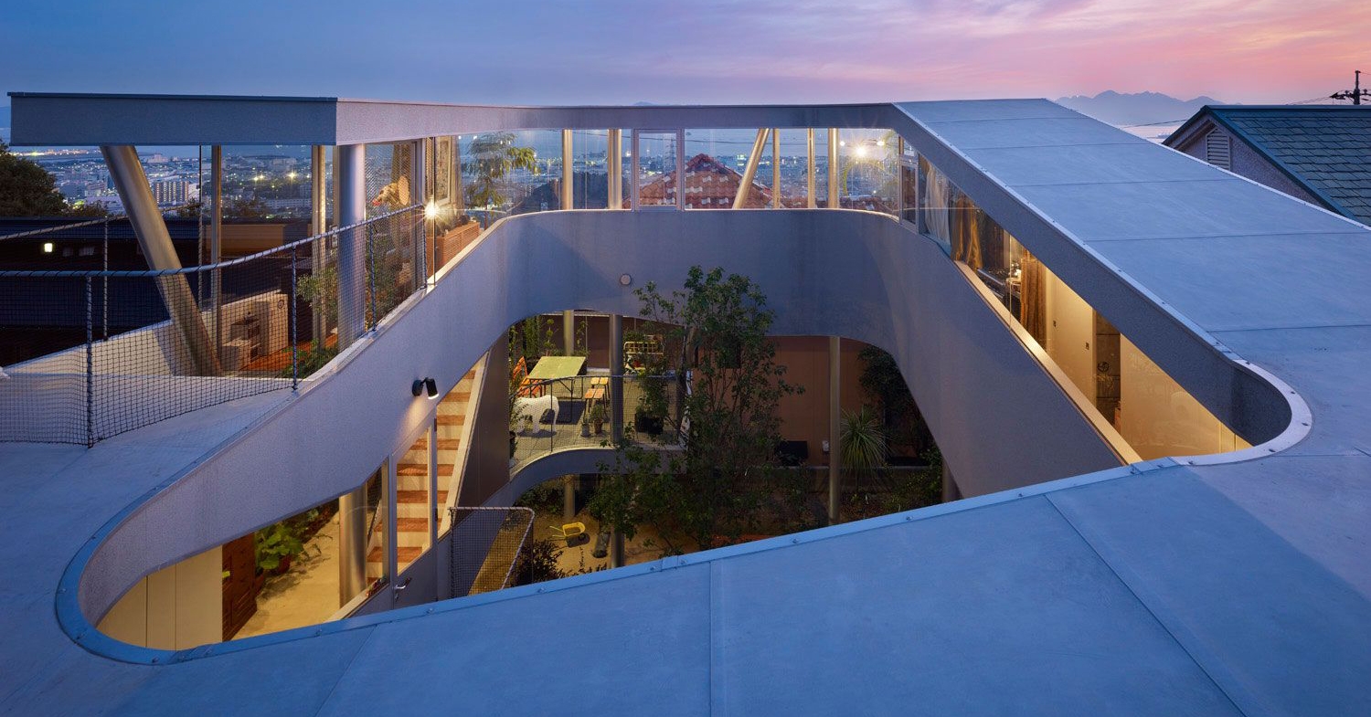
Tadao Ando’s best projects are defined by his subtle mastery of light, and this rendering beautifully captures the essence of the Japanese architect’s work. Fabra’s use of muted materials and minimal furnishings allow the eye to focus on the building’s most powerful feature, the sunlight streaming across Ando’s classic exposed-concrete surfaces. A similar effect is also achieved by digital artist András Páll in his striking visualization of Ando’s iconic Church of the Light (pictured at the top of this article).
2. Express scale
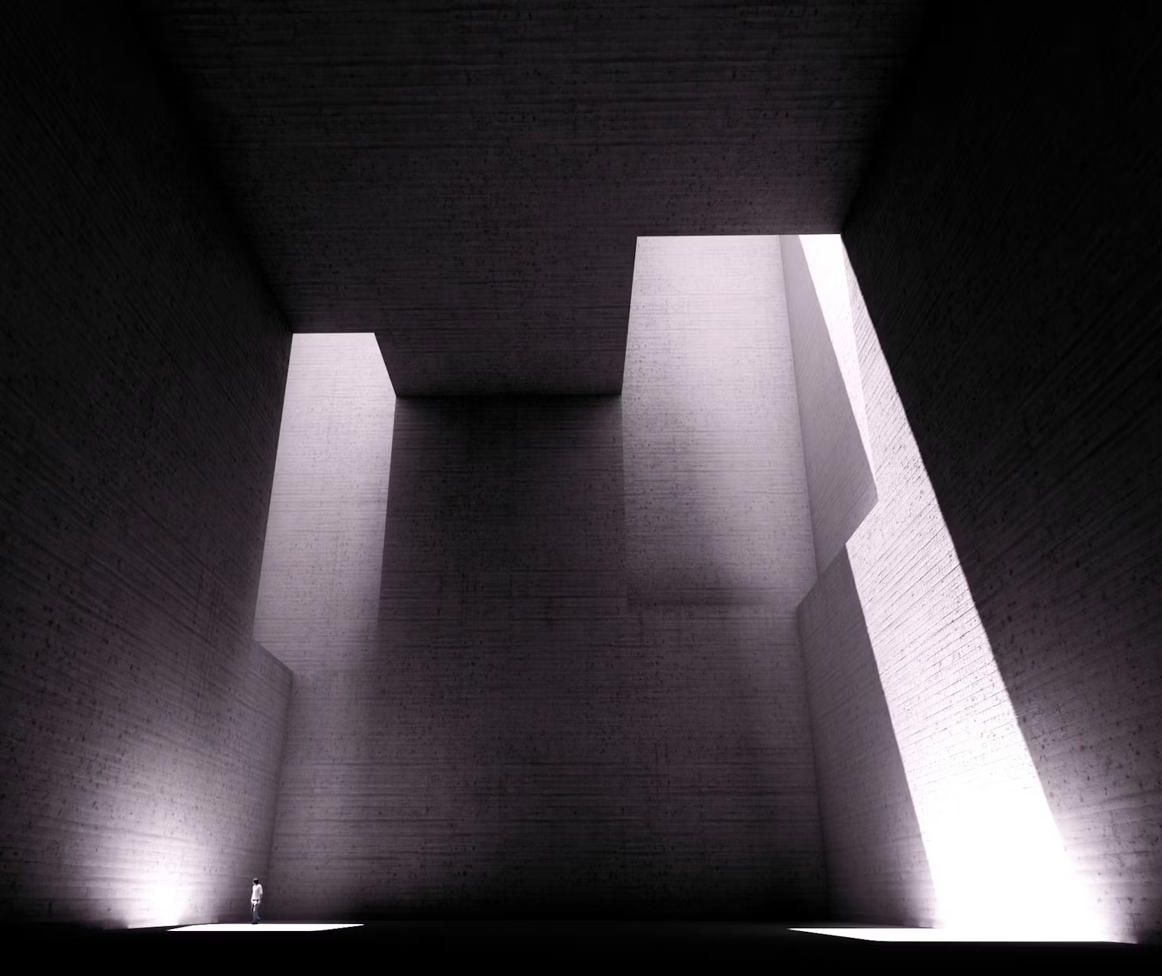
Monument of Tolerance, Tindaya Mountain, by Eduardo Chillida
Before he passed away in 2002, sculptor Eduardo Chillida envisioned a huge cave carved within a mountain on Fuerteventura in the Canary Islands. The scale of the artist’s extraordinarily ambitious project is thrown into sharp perspective with the addition of a single figure — revealing the colossal size of this cubic void of light and shadow. The late sculptor’s vision was minimal yet monumental, and this image cleverly captures the essence of both conditions.

3. Do a rain dance
Day to night tutorial by Alex Hogrefe
Founder of the blog Visualizing Architecture, Alex Hogrefe provided a comprehensive guide to transforming your street scene from day to night with the sole use of Photoshop. A particularly striking aspect of his final image, though, is the weather: Hogrefe applied rain to increase the atmospheric quality of the scene and also added car lights reflected in the wet road surface and a cluster of umbrellas beneath the warm glow of the windows above.

© Alison Furuto
4. Summon the mist
The Flying Dutchman by White Arkitekter, rendering by Mir
Last year, Lidija Grozdanic argued that “less is more” when it comes to storytelling and communication in architectural visualizations. One of the highlights of that feature was this unusual image by rendering masters Mir; while, all around, renderings are presented with crisp clarity, Mir chose to shroud the building in a cloak of fog giving a hint of the physical structure and sparking the curiosity of the viewer to explore the project details.
5. Inject movement
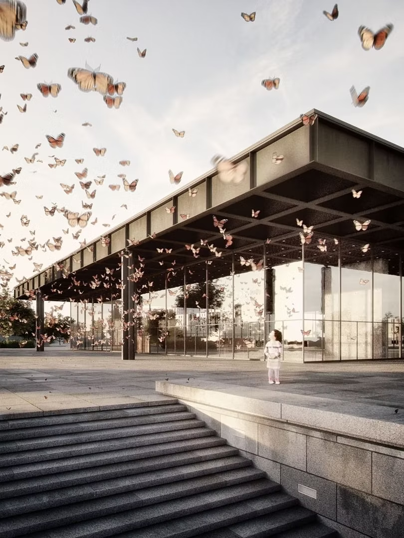
Neue Nationalgalerie by Mies van der Rohe, rendering by Stefan Hirschsteiner
Grand-prize winner of the Maxwell Render Challenge in 2012, Hirschsteiner’s image of this modernist classic is brought to life by a flurry of butterflies. While too much movement in the foreground of a rendering can distract from the architecture as a focal point, judge Ronen Bekerman argues that there is cause for exception, here, as Hirschsteiner illustrated “what modernistic buildings are meant to be: a clean slate to be filled with LIFE.”
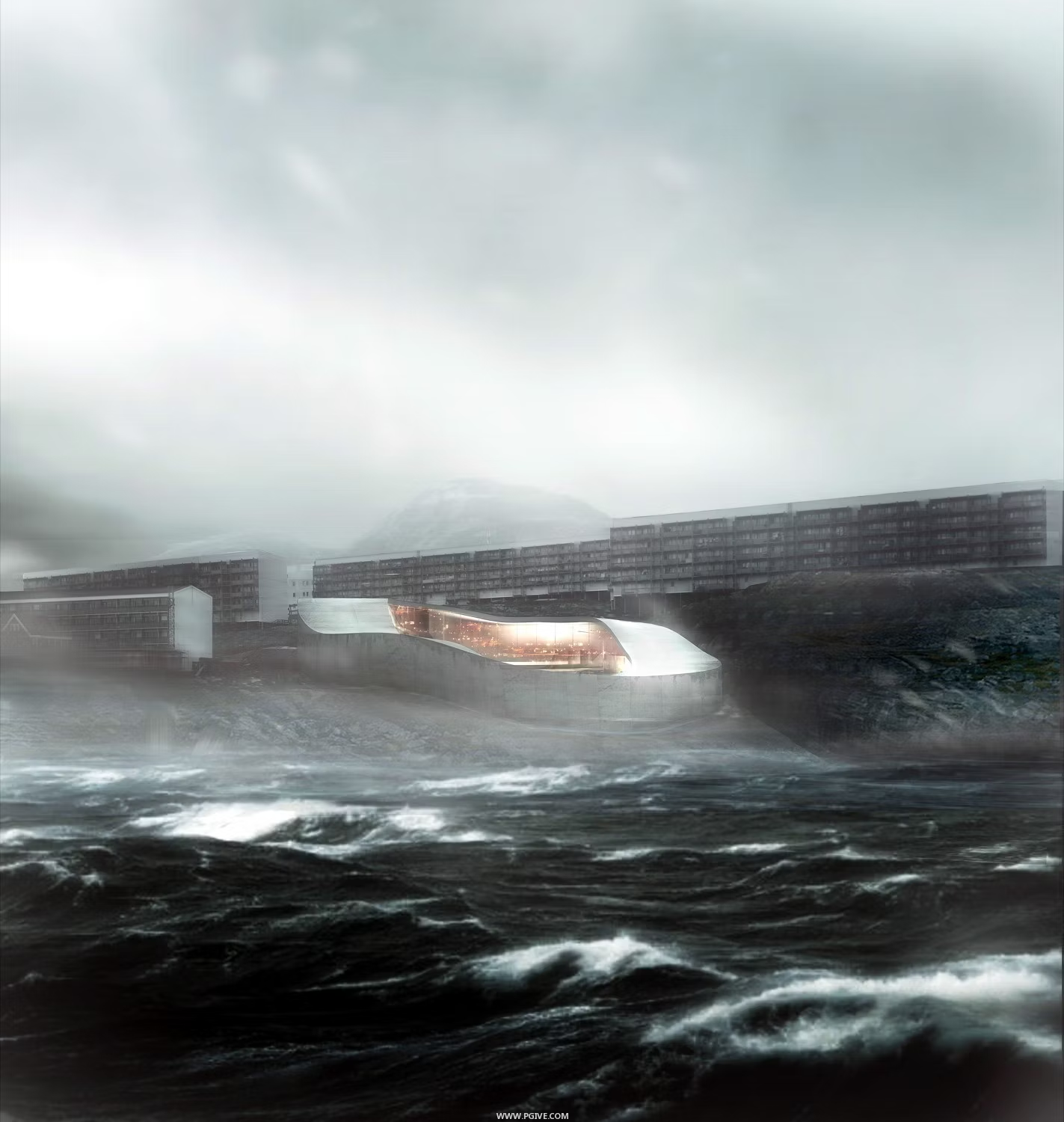
6. Harness the power of nature
Greenland National Gallery by BIG
Most architects agree that context is important when developing any design, particularly in parts of the world with extreme environmental conditions or a spectacular setting. Both characteristics applied to the National Gallery on the rugged coastline of Greenland, so it made sense to communicate this via the rendering, with a fierce ocean and stormy skies accompanying the distinctive ring-shaped building.
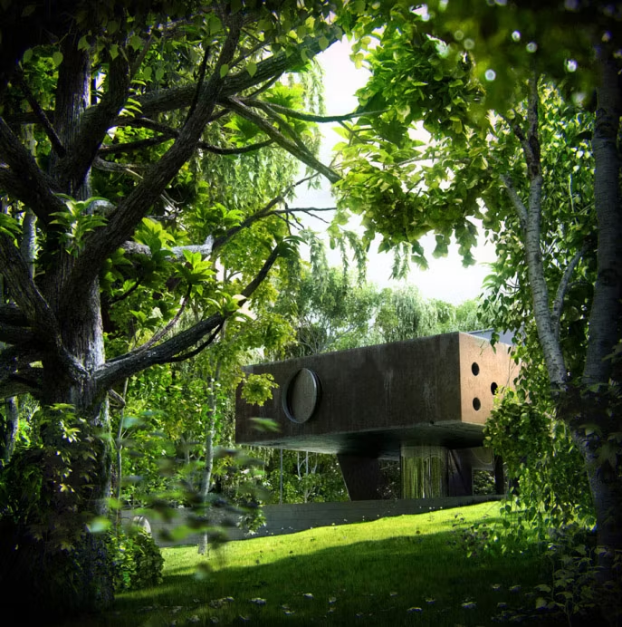
7. Add a natural frame
Maison à Bordeaux by Rem Koolhaas / OMA, rendering by Dimitar Rashkov
Situated on a cape-like hill overlooking Bordeaux, France, Rashkov endeavored to capture the scenic context of Rem Koolhaas’s classic residence Maison à Bordeaux by positioning the camera so that the house is framed by luscious greenery. The branches and leaves of the trees lead the eye toward the dwelling and provoke a sense of curiosity — as if one has stumbled upon a hidden temple of Modernism in a dense jungle.

8. Expose your materials
Rendering by Arkin Esref
As explained in our previous guide to rendering, expressing the age and textured patina of materials can make for a much more believable visualization, and it can also instill a powerful atmosphere — as this moody, modernist concept design illustrates. Architectural 3D artist Arkin Esref used a combination of 3d Max, Vray, and Photoshop to produce a sense of disquiet with heavily weathered concrete and a melancholy canine.
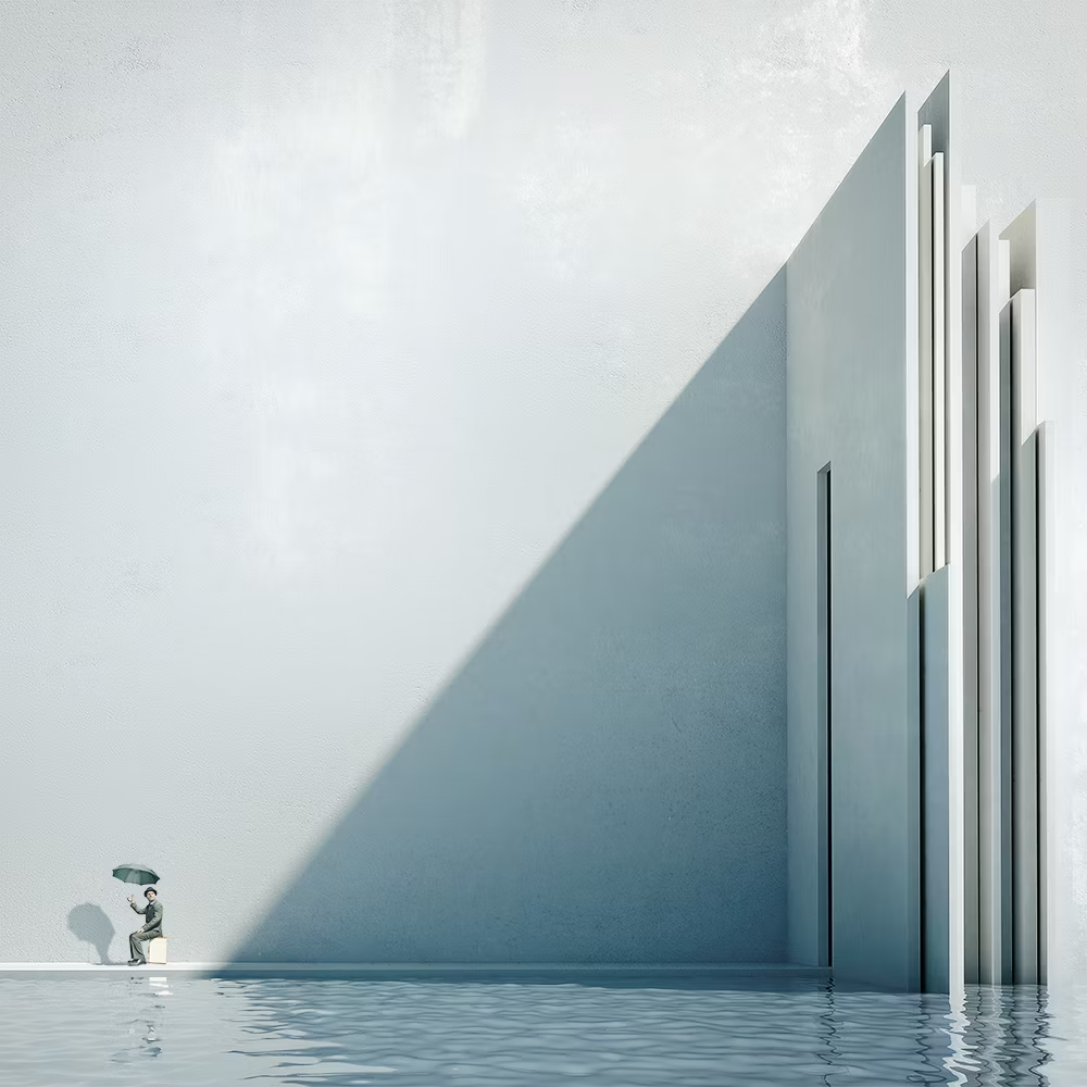
9. Remember that less is more
Perennial Quest by Michele Durazzi
The fewer the elements on display, the greater the impact they can have with a carefully balanced composition and a great sense of scale. The surreal, minimalist landscapes of Michele Durazzi are a case in point. Monochromatic architectural details, perhaps inspired by the likes of Oscar Niemeyer or Santiago Calatrava, are juxtaposed with solitary figures — emphasizing the monumentality of the built landscape and provoking a sense of mystery within each image.
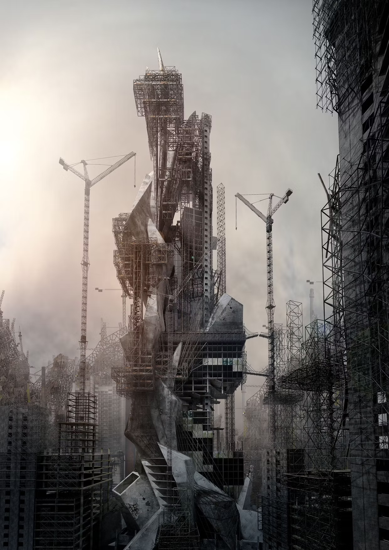
10. Embrace your imperfections
Megalomania by Jonathan Gales of Factory Fifteen
Animation studio Factory Fifteen — the perennial expert of architectural dystopia — is a master of depicting decay and dereliction in its renderings and brings a dash of chilling realism to future scenarios for our burgeoning metropolises. As illustrated by the stills from their project Megalomania — a vision of London in a state of perpetual construction — the application of rough, dirty textures and a plethora of irregular structural elements brings a truly foreboding atmosphere to the urban chaos.

11. Mix your mediums
Sebald, The Rings of Saturn by Robert Scott Gilson
The word “rendering” has been associated with computer-generated images for so long it is easy to forget that any medium can be utilized to produce powerful visualizations. Robert Scott Gilson’s Quarantena series is a stunning example of how many techniques can be combined to produce atmospheric landscapes; a combination of 2D CAD drawing, 3D modeling, and watercolors lends these curious orb-shaped dwellings an incredibly multilayered quality full of mystical intrigue.

12. Add a touch of mystery
The House That Jack Built by Jack Daws and Olson Kundig Architects
Ultimately, the best way to build atmosphere in any context is by having a strong, compelling narrative. Seattle-based firm Olson Kundig teamed up with artist Jack Daws to create before-and-after renderings that accompany a series of fictional events in which an artist attempts to build an enticing retreat but ends up causing a terrible accident that leaves him taking refuge within a perilous environment. It’s dark, it’s twisted, but there is no denying: it is incredibly atmospheric!
Architizer is building tech tools to help power your practice: Click here to sign up now. Are you a manufacturer looking to connect with architects? Click here.

