Architects: Want to have your project featured? Showcase your work by uploading projects to Architizer and sign up for our inspirational newsletters.
We first understand architecture through it’s façade, the face that it presents to us. This first impression is deeply tied to the materials and building systems a structure is made of. As designers and architects collaborate with manufacturers and fabricators, they continuously reimagine what this “first impression” can be and how buildings perform. A global provider based in Switzerland, Swisspearl is a manufacturer known for rethinking cladding and façades. The company’s guiding principle is to develop and produce forward-looking, functional and aesthetically convincing designs with architects, craftspeople and building material suppliers.
The headquarters of today’s Swisspearl Group is located in Niederurnen, where one of the first production facilities for fiber cement was founded in 1903. For many years, Swisspearl has been developing products made of natural materials for use in building envelopes, interior design and landscapes. The company’s products from their workshops in Niederurnen and Payerne have shaped Swiss building culture and, over time, have been used in projects worldwide. Swisspearl became well-known for cement composite panels (formerly called fiber cement panels or fiber-reinforced cementitious panels) offered in a wide color range. The following projects highlight their panels and product innovations used in architecture worldwide.
Denver Botanic Gardens Science Pyramid
By EUA, Denver, CO, United States
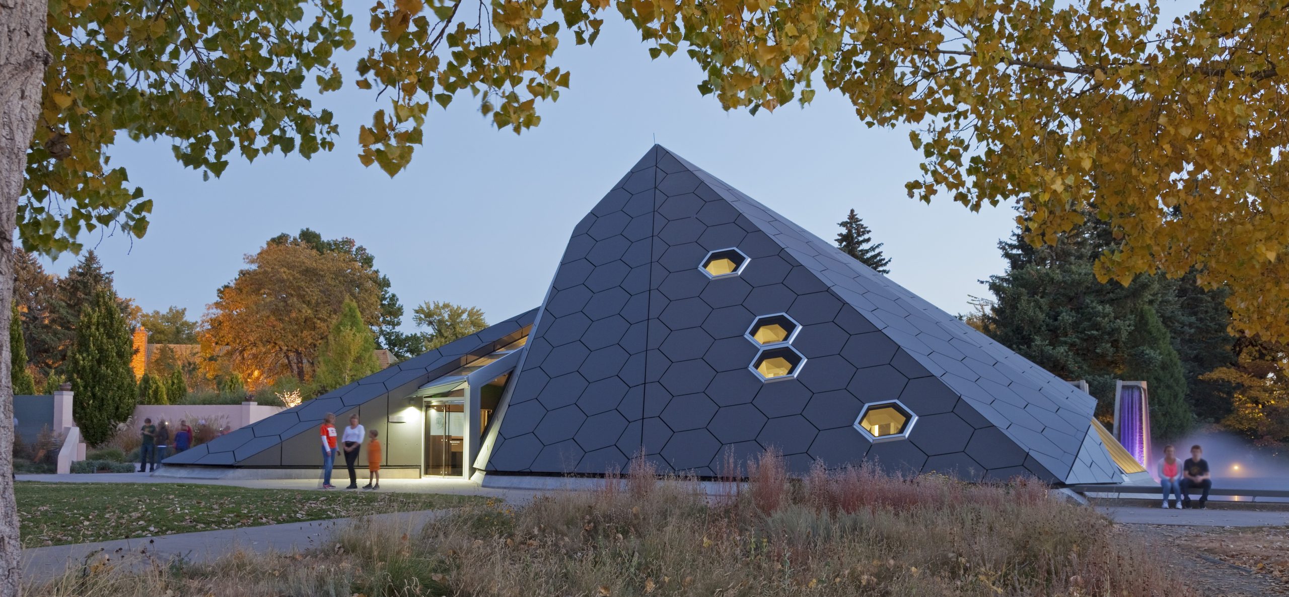
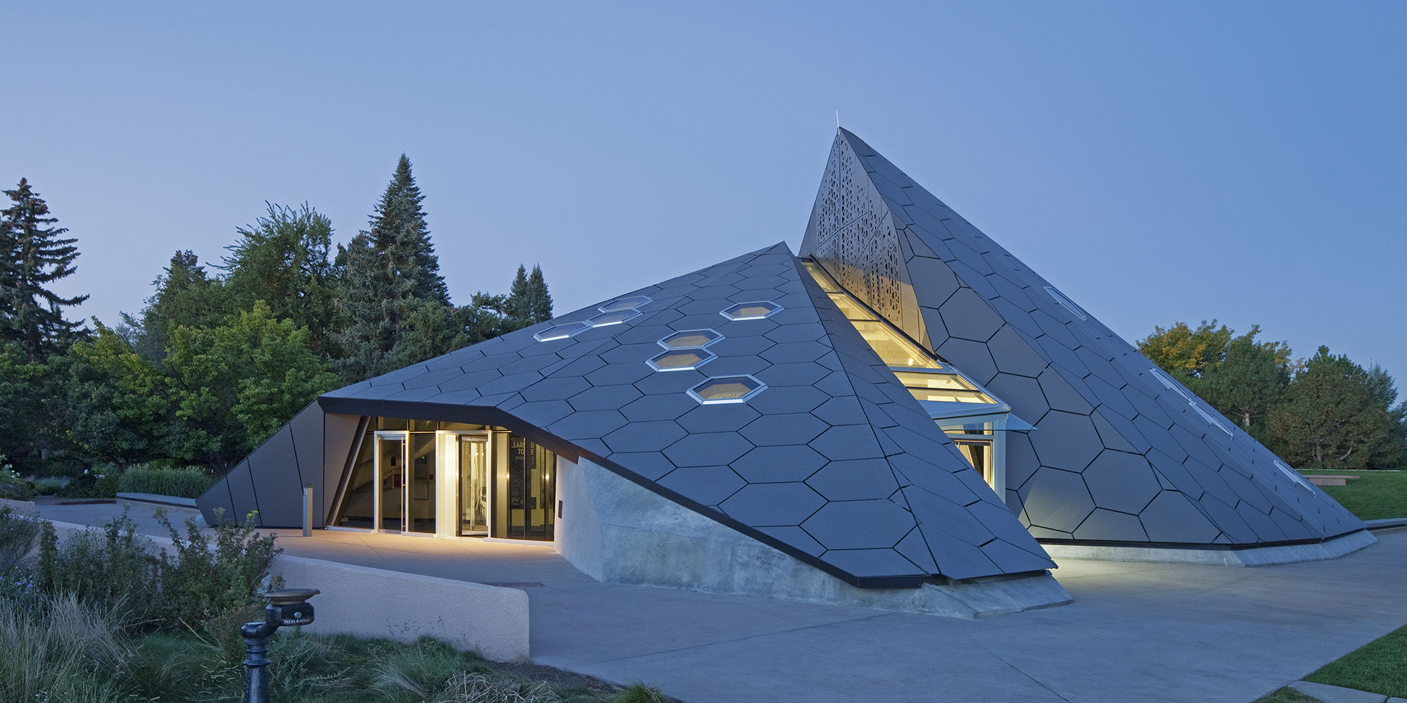 This iconic Science Pyramid was inspired by nature. The team wanted the façade of the building to mimic the hexagonal structure of a honeycomb. The pyramid’s two peaks and 16 facets twist and turn towards the sky as if it was a result of the earth’s colliding tectonic plates. Located in the center of the gardens, the pyramid’s proportions are a inverse of the adjacent amphitheater, made to create harmony between the building and the surrounding landscape.
Faced with the task of designing a transparent pyramid, as specified in the competition brief, the architects of the winning competition entry drew their inspiration from the geological processes causing the ragged rock formations of the nearby mountain ridges. The envelope of the structure informed by a biological metaphor and features almost 500 dark gray, hexagonal Swisspearl panels interspersed with thirty photo-voltaic collectors and multiple windows and skylights.
US Land Port of Entry, Warroad MN
By Snow Kreilich Architects, Warroad, MN, United States
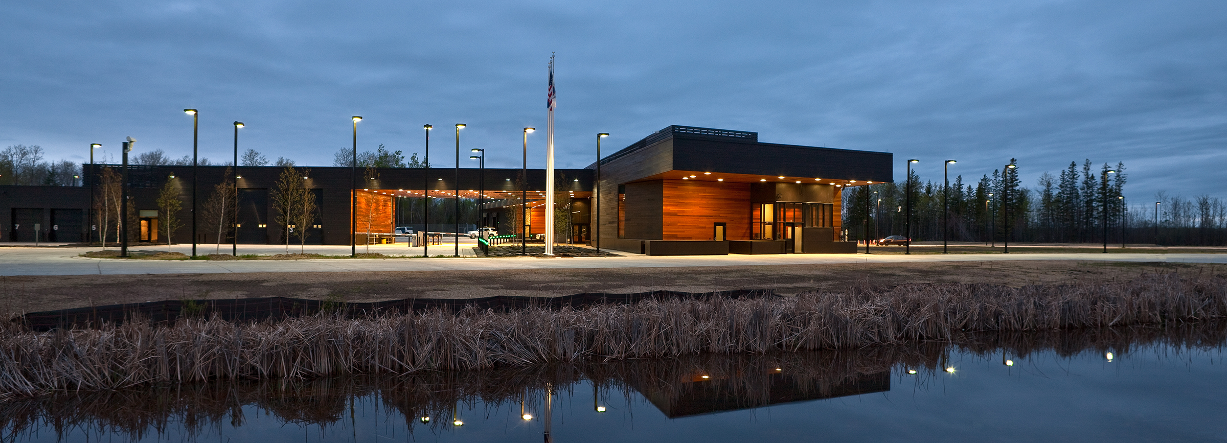
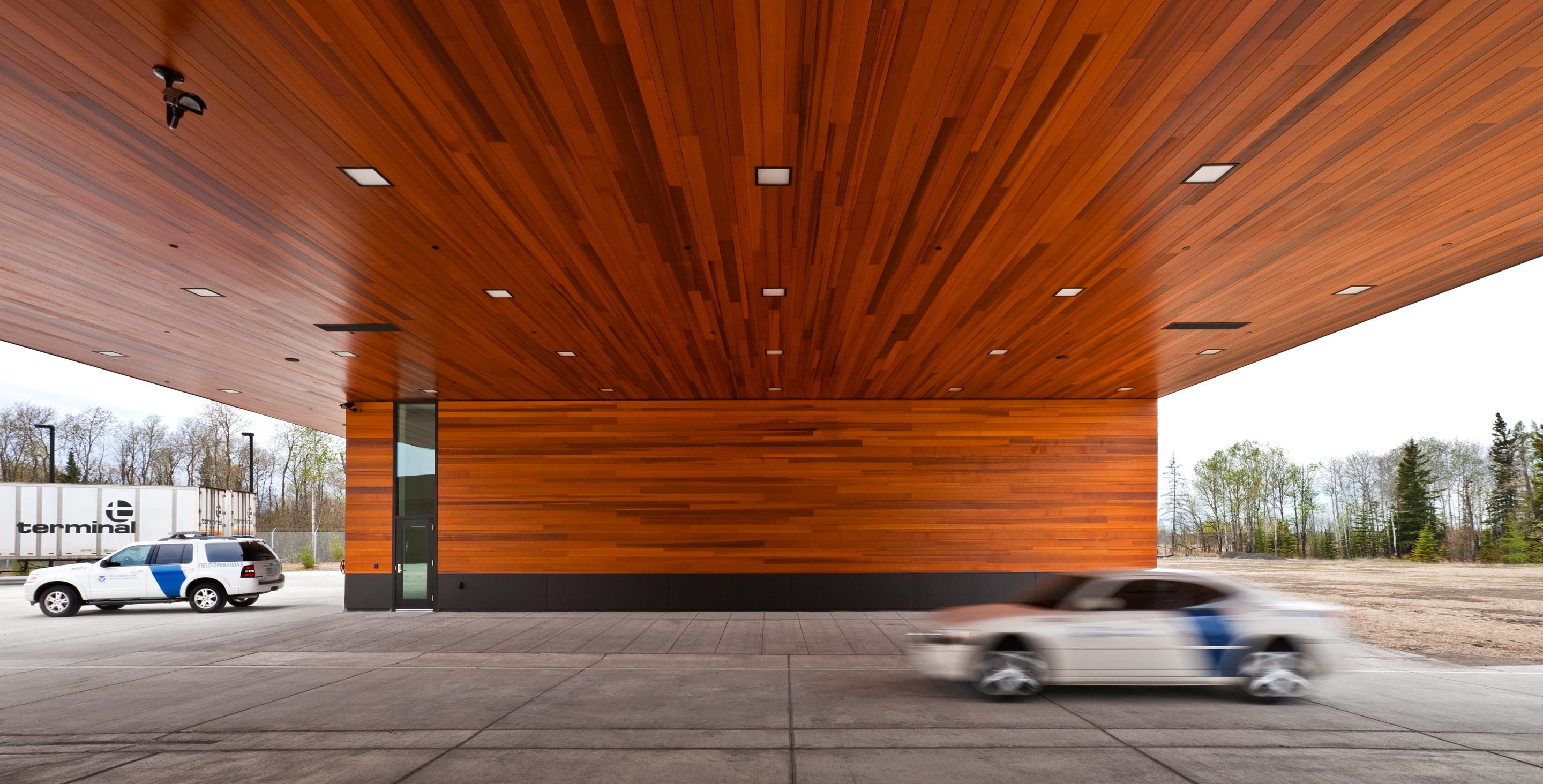
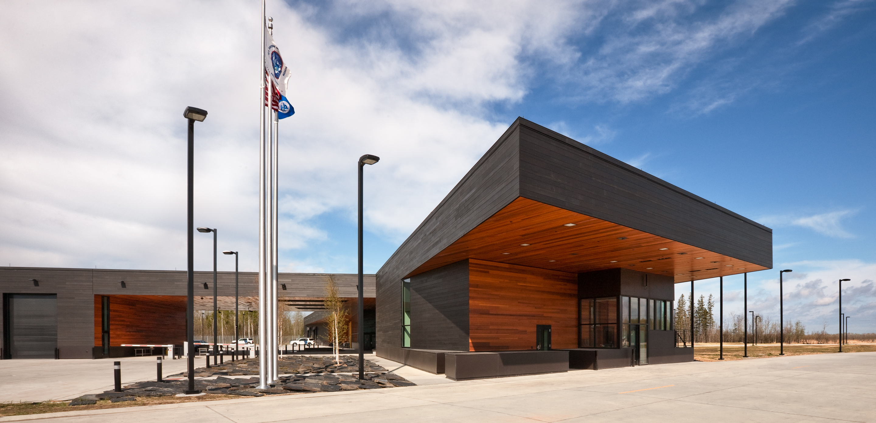 Snow Kreilich designed the Warroad Land Port of Entry to support the mission-driven demands of US Customs and Border Protection (CBP). The 40,108 square foot facility was conceived as a specific response to the vast open landscape along the Minnesota-Canadian border. In turn, its form reiterates the dominant horizon of the landscape while making reference to the East-West border. Inflected building forms facilitate intuitive use by visitors, the officer’s ability to survey the entire site, and vehicle access to secondary inspections.
Swisspearl was used along the building façade, along with cedar planks stained black. Surfaces that face inward, in contrast, are an auburn-colored cedar. The Warroad Land Port of Entry sets a new standard for remote, small ports in achieving the highest design standard for public buildings. While embracing CBP’s operational procedures and inevitably changing technologies, the design advances the dual mission to protect national security while facilitating trade and travel in a comfortable, efficient facility.
Davis-Harrington Welcome Center
By Dake Wells Architecture, Springfield, MO, United States
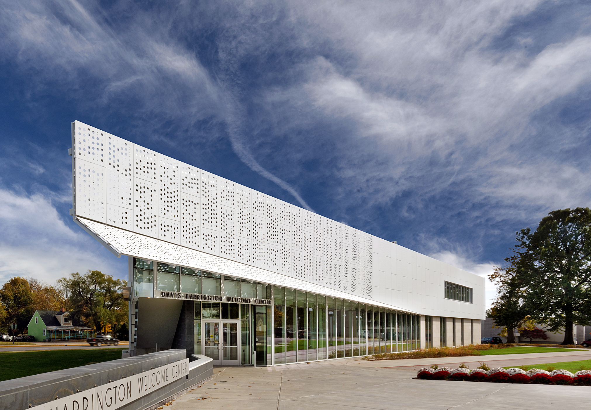
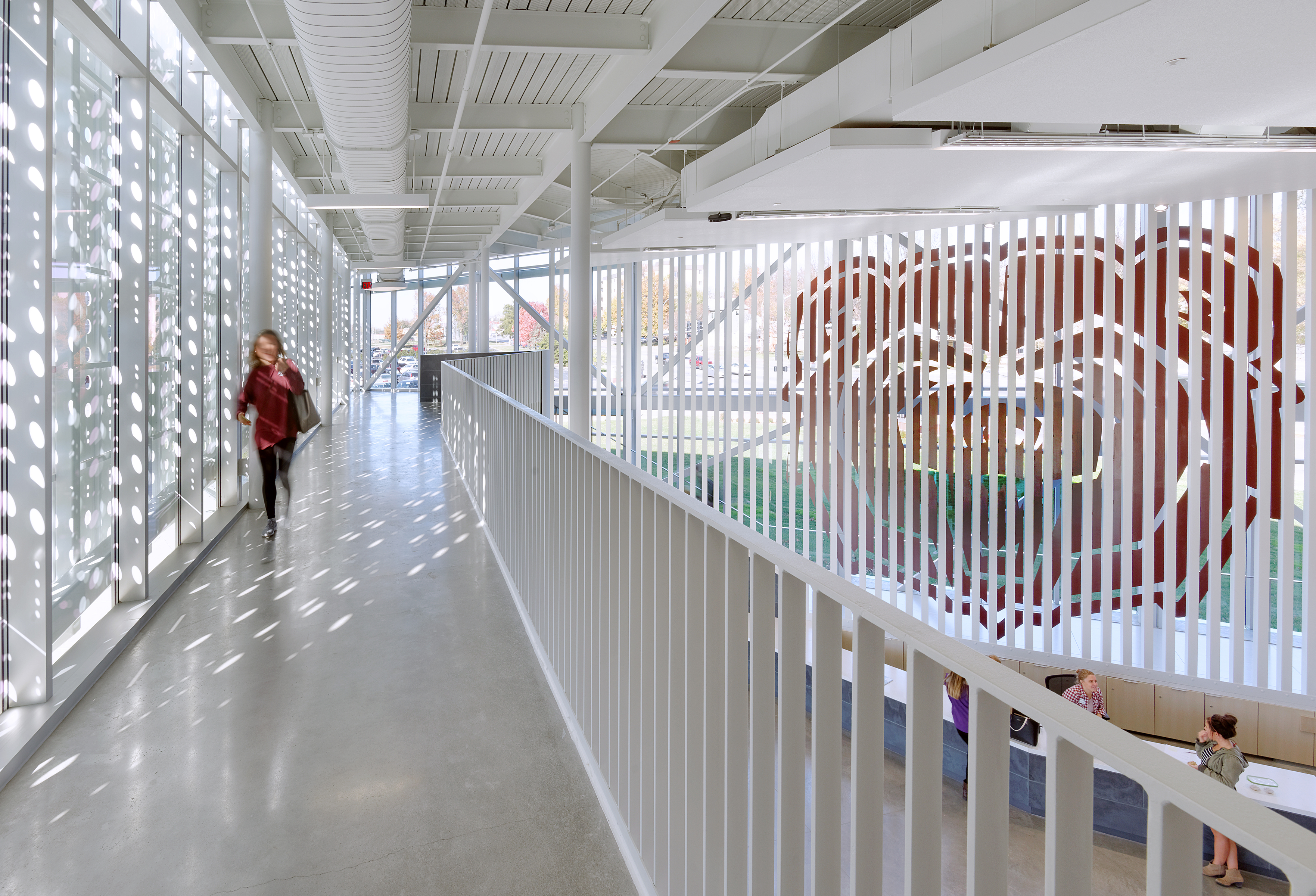
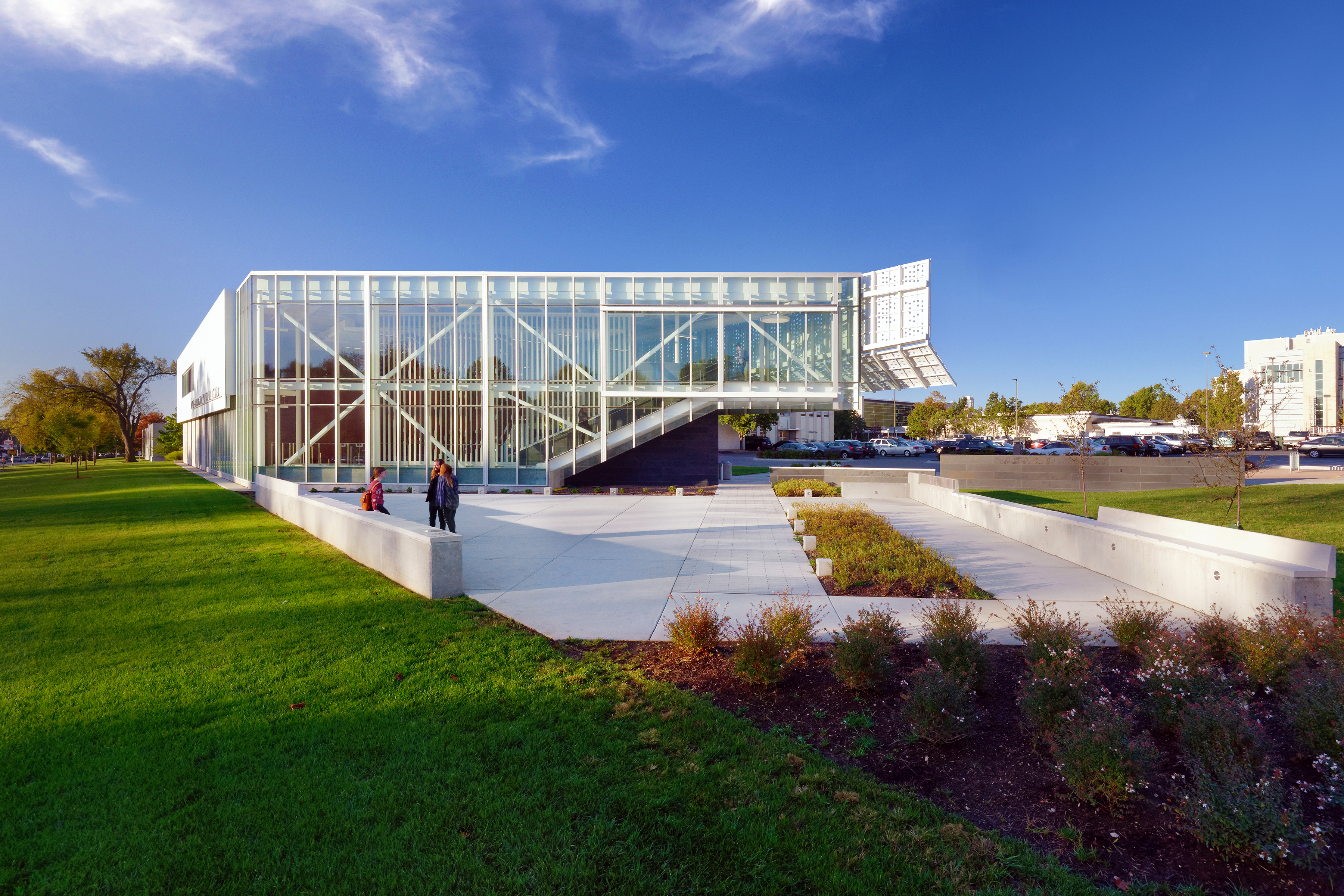 Dake Wells designed the Davis-Harrington Welcome Center as a new “front door” welcoming visitors to Missouri State University’s campus. The 13,000 square foot facility includes a two-story lobby and 100 seat presentation room to provide a multi-purpose venue for special events. Tasked by the University with providing a “signature piece of architecture”, the design solution was made to be both economical and monumental. The building program is arranged in a two-story scheme, placing administrative functions on an upper level in order to increase the building’s visual presence as it reinforces the campus edge.
The building enclosure combines a variety of materials in response to the surrounding campus context. The architects used a seemingly paper-thin layer of white Swisspearl panels to sheathe the fully glazed upper sections of the east and west façades. As the team explains, the latter extends slightly beyond the pointed corner of the building where the lower part folds slightly away to extend a welcoming gesture to visitors. Inspired by the pattern of a composition booklet, a seemingly random arrangement of circular perforations feeds dappled light into the atrium and allows views from the second-floor walkway.
Myriad Botanical Gardens
By Gensler, Oklahoma City, OK, United States
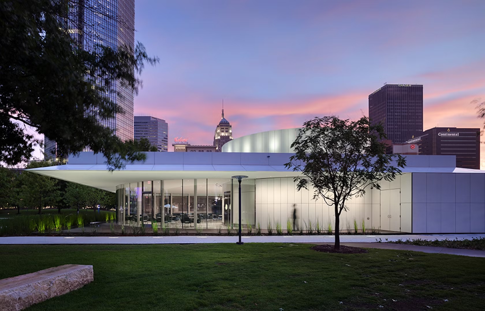
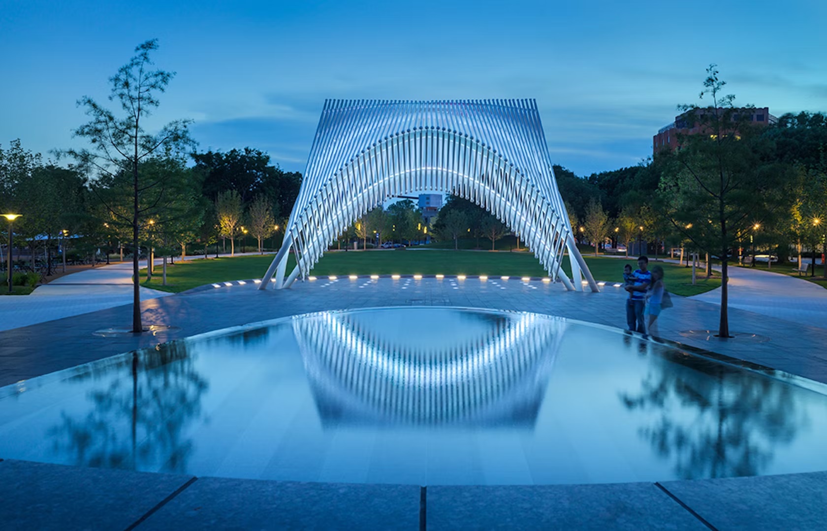 The design team wanted to transform Oklahoma City’s Myriad Botanical Gardens from an underused park to a vibrant center of activity for residents and visitors. By adding a new restaurant, open-air pavilion, bandshell and addition to the existing conservatory as well as redesigning the landscape, the design team set out to give the park new appeal. The buildings are linked through consistent geometry derived from the pure Euclidian form of the original botanical conservatory. The compositional elements that form the architectural language include single-story geometric forms, white cementitious panels, water-clear glass and extended overhangs.
Each structure has its own unique character informed by its distinct program. Swisspearl was used as siding for the project throughout. The restaurant is a perfect square, where cantilevered overhangs extend 18 feet on the west side to provide shade from the harsh summer sun. Twelve foot curved glass panels form the circular dining area. While the bandshell is a complex 3D sculptural and monumental form. Since the park’s grand re-opening, the new Myriad Botanical Gardens has added vitality to downtown Oklahoma City attracting visitors each year.
Kindergarten Cerkvenjak
By Superform, Municipality of Cerkvenjak, Slovenia
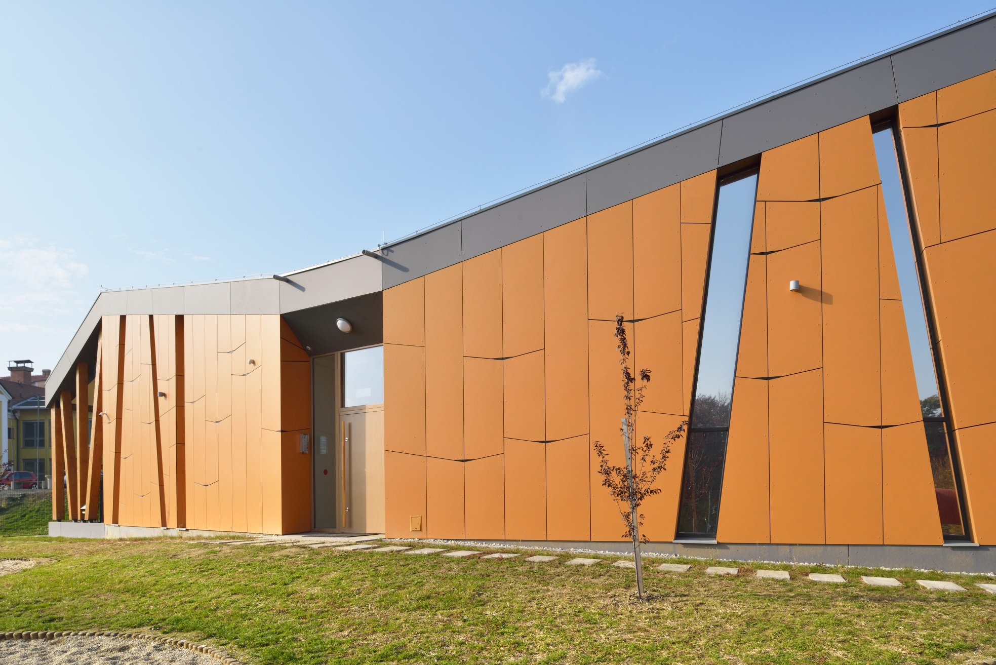
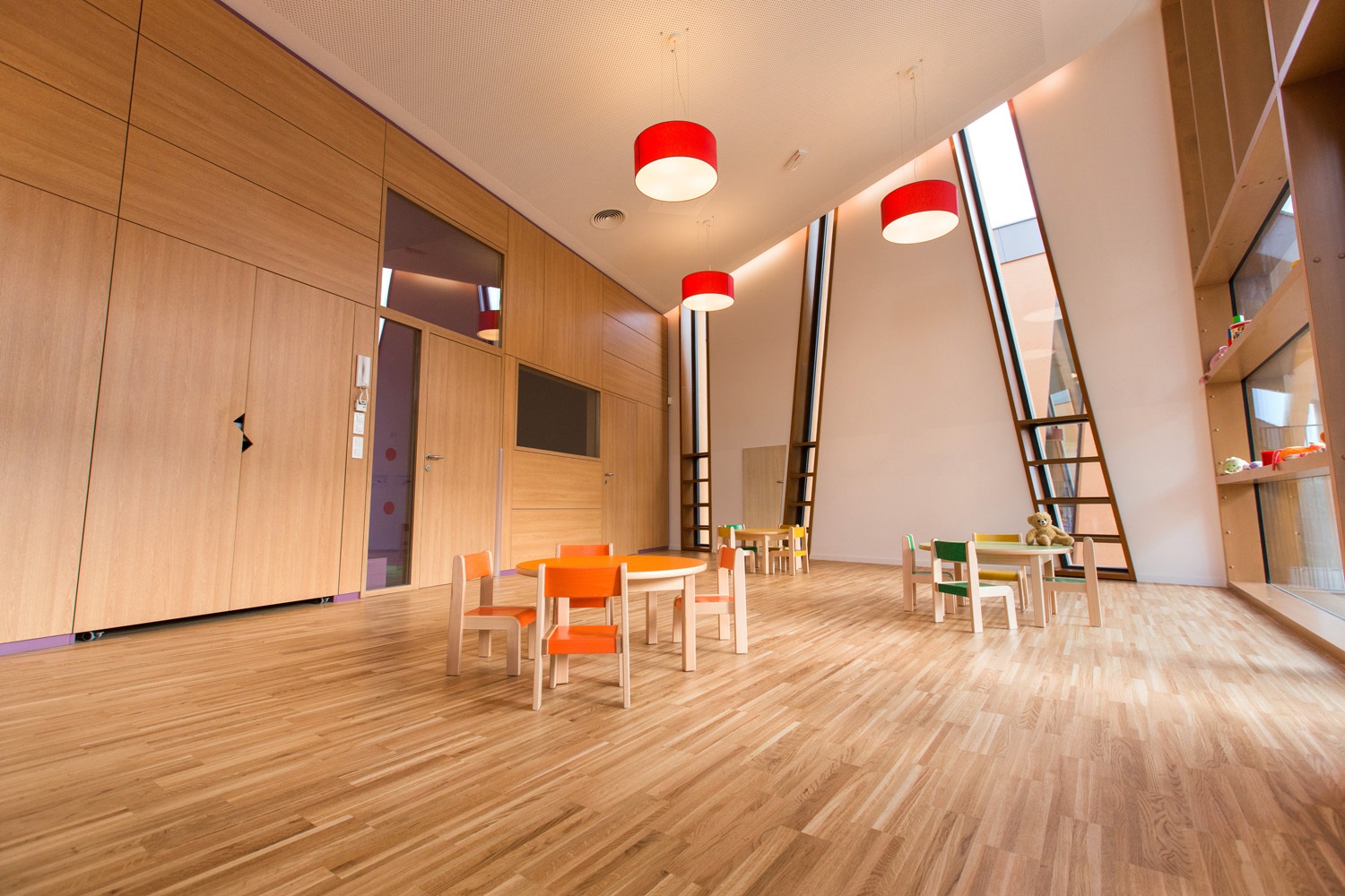
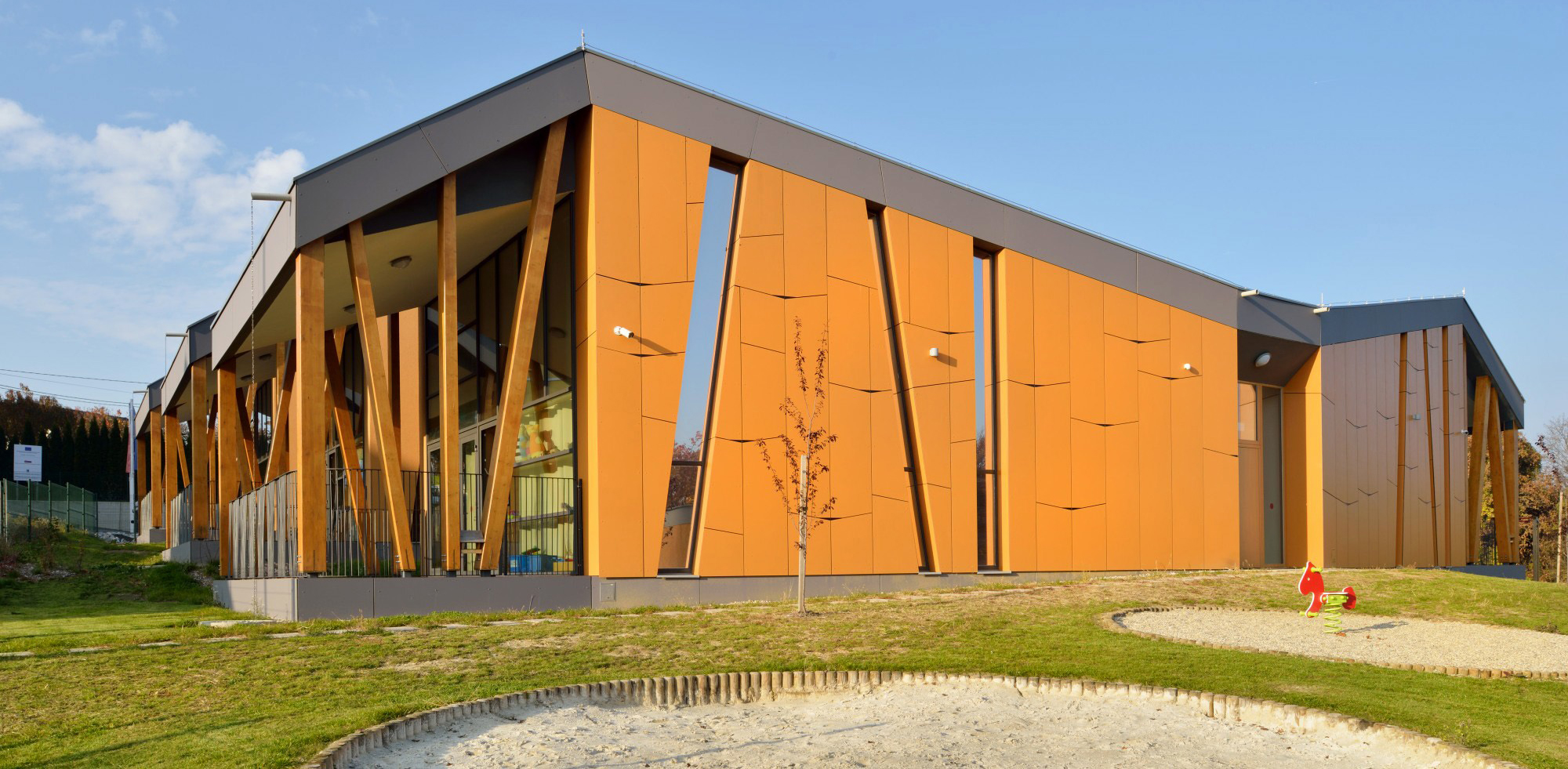
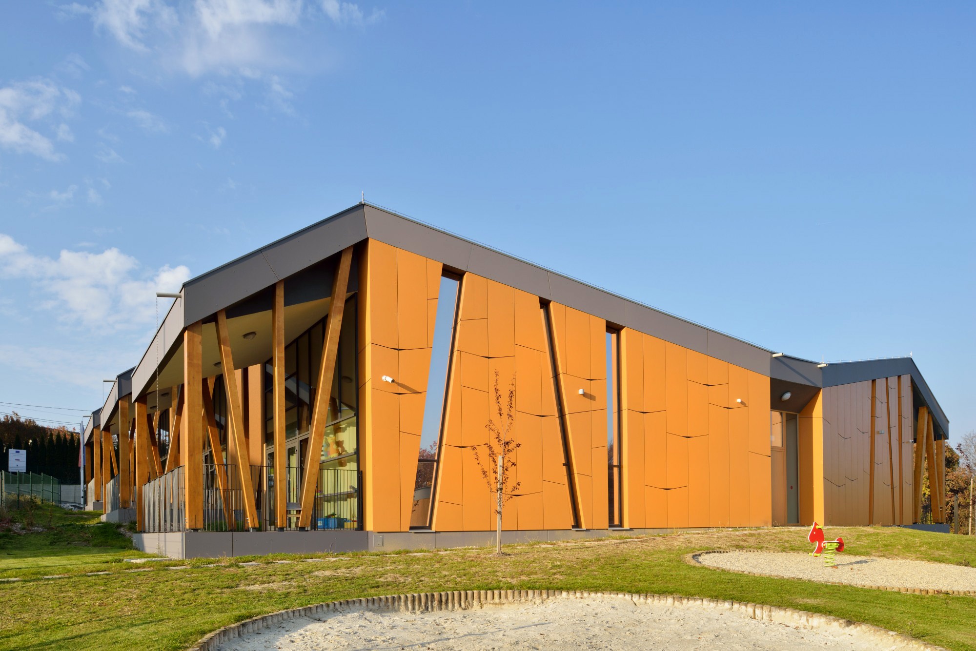 Desigend as a kindergarten is in the village of Cerkvenjak, this project is located in the center of the Slovenske Gorice region of Slovenia. The kindergarten was designed to be inseparably connected with the natural surroundings of the trees and playground equipment. The concept of the kindergarten is similar to its local surroundings with the rhythmic string of volumes and roofs. Because of this concept, the kindergarten does not surpass the scale of an individual house and gives the user — a child — a sense of home.
The architects drew the inspiration for this kindergarten from a nearby learning path running through the Slovenian village of Cerkvenjak. Intended to enrich the children‘s spatial experience, the hallway inside varies in width and each playroom unit boasts a unique, irregular and contorted shape. The design of the Swisspearl envelope support this idea. The kindergarten is a new program and function that upgrades the existing learning path. The result of using the principle of a learning path is a unique division and rhythm of the playrooms, where the kindergarten is closer to the scale of a child.
The Wallis Annenberg Center for the Performing Arts
By SPF:architects, Denver, CO, United States
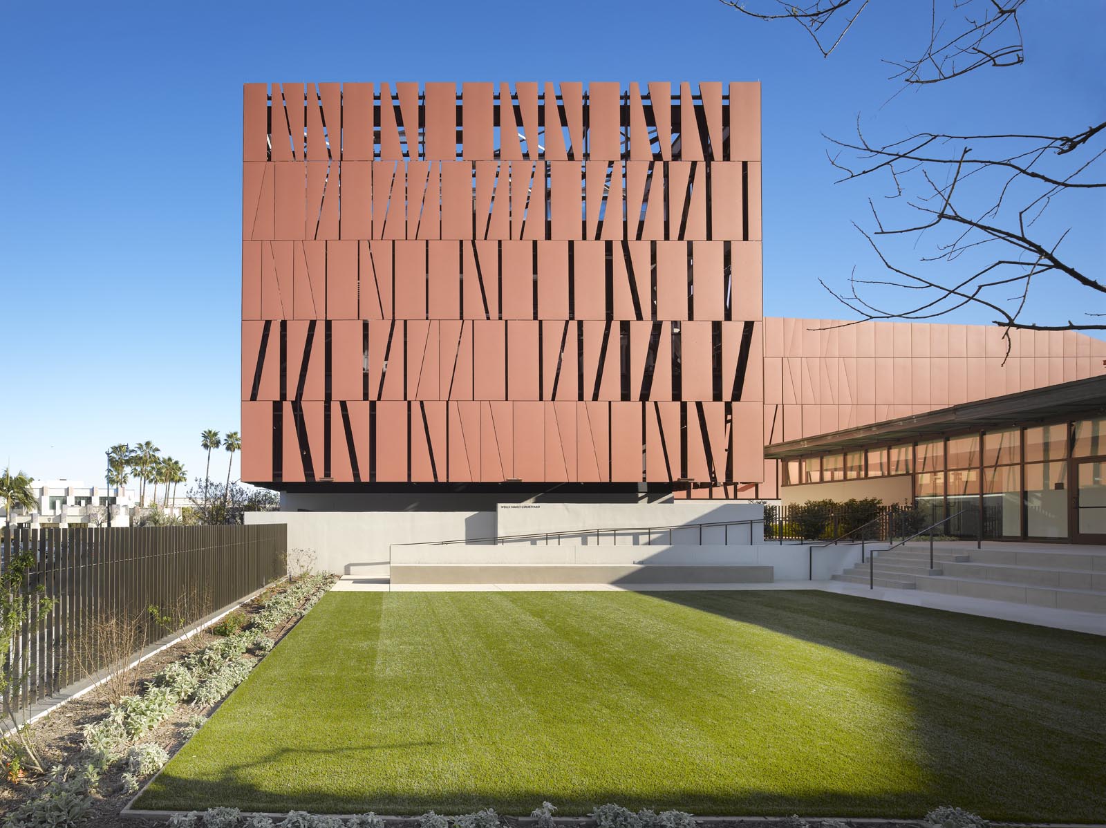
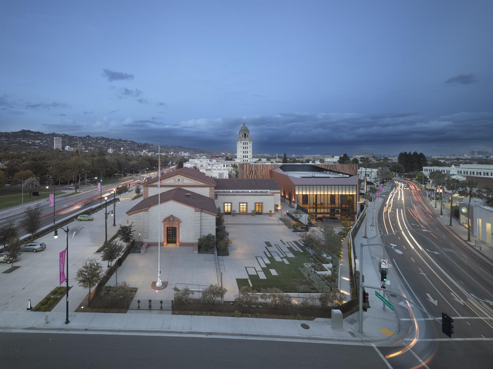
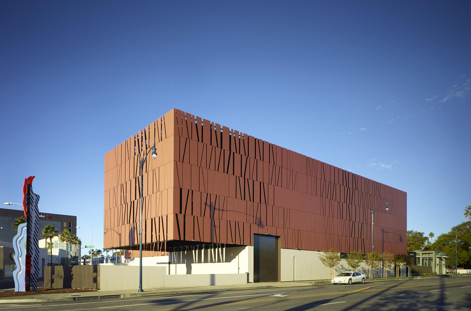 SPF:architects took on the revitalization of the dormant Beverly Hills post office site to create a new performing arts center. Built on the historic site, the new project includes a 500-seat theater building connected via promenade and outdoor sculpture garden. The historic WPA building built in 1934 is repurposed to house a 120-seat studio theater, a café, gift shop, box offices, administration facilities and a 3-classroom theater school for children. Outside, a garden and courtyard connect the historic with the new building with direct visual connection to the shops and restaurants of downtown Beverly Hills.
Celebrating the history of the site, the skin is formed in copper-colored concrete panels. A 4 foot by 9 foot envelope-shaped panel is repeated across the façade. The result is an abstract textural pattern, engraved into the building skin. Made out of Swisspearl cement boards, the team redesigned the façade to alter the size and modulation of the gaps between panels, resulting in 30% savings in material. The plan preserves and celebrates the historic architecture, as well as affords the Center the opportunity to create a new, state-of-the-art, flexible performing arts facility with ample back-of-house amenities.
Architects: Want to have your project featured? Showcase your work by uploading projects to Architizer and sign up for our inspirational newsletters.
 Davis-Harrington Welcome Center, Missouri State University
  Denver Botanic Gardens Science Pyramid
  Gensler
  Kindergarten Cerkvenjak
  Myriad Botanical Gardens
  US Land Port of Entry, Warroad MN
  Wallis Annenberg Center for the Performing Arts