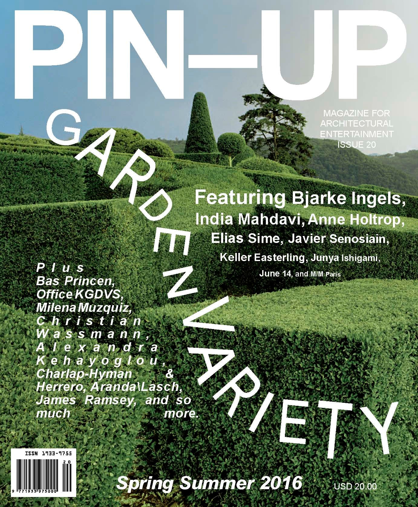
On the eve of PIN-UP magazine’s 10th anniversary, Architizer spoke with the publication’s founding editor Felix Burrichter about issue 20, graphic design in architecture and dream features for its future (Mr. Gehry, if you’re reading this … ).
Emma Macdonald: Congratulations on the new issue. What brought about its theme, ‘garden variety’?
Felix Burrichter: The idea of the garden was actually something that came out of, believe it or not, an interview with Jean Nouvel in the previous issue, in issue 19. It was kind of a lingering idea that I had, just something very vague that I wanted to do, and then in his interview, Jean made reference to Voltair’s Candide and tending to one’s personal garden.
The whole theme kind of crystallized from there; looking at the idea of the garden from many different angles. Your personal garden, the literal garden, garden history, history of garden architecture, landscape architecture, the garden of humanity.
I think it’s a very multilayered subject, and it lends itself really well to a spring/summer issue.

PIN-UP Issue 20
That makes sense for a publication that tends to be quite interdisciplinary. When coming up with an issue theme, is that how it has tended to happen? Quite organically (excuse the pun) in that way?
Just as a result of the climatic conditions that I find myself in, in the Northern Hemisphere, the summer issues tend to be more about the outdoors. The fall/winter tend to be more about the indoors. These themes are always kind of a loose umbrella, though; they allow us a lot of room for different ideas. You could even talk about the theme in terms of the spirit of an issue rather than a real ‘theme.’
It is very organic how they come about, though. You chose the right word because there is something very un-didactic about the way each theme kind of crystallizes. Halfway through you sort of realize oh, this is actually something that this issue really stands for or this issue is really exploring. With the current issue I’m going to have to say it was there from the beginning, but it really varies.
For example, I can already tell you that the theme for the fall issue is power, but I don’t actually know if it is something that ties into current cultural or political affairs. Whether the reason we’re doing a power issue is because it’s the election, I actually don’t know. Subconsciously, it could very well be something that’s on all of our minds.
But, you know, with spring we’ve still been feeling very flowery. In full bloom.

PIN-UP Issue 18
You’ve spoken about the importance of a very strong visual identity for PIN-UP before. How much do you think that is influenced by your architectural education? Do you see a crossover between architecture and publishing, in the way you choose to present things?
I think that for anyone who works in a visual field, design and the way things are presented is important. And that’s really what graphic design is: You present information, which I think is crucial for architects, too. For example, Michael Rock is now teaching a class at GSAPP on how to present projects in an interesting and captivating way, because I think a lot of architects are kind of sick of didactic patterns of how to present their work.
Frankly, I think that is also reflected in architecture publications as [a] whole, and that may have also been the impetus of why we started PIN-UP in the first place.
Specific to the actual design of PIN-UP and how my architecture background is reflected in it, I would say, in the very beginning, in typical ‘architecture egomania’ fashion I was convinced that I was just as good a designer as I was an editor and an architect.
I didn’t realize how ridiculous my conceit was to be able to design the magazine myself until I actually received the first design proposal from Dylan [Fracareta] and Geoffrey [Han], who were working on it together at the time. I realized wow, this is actually taking it to a whole other level that I would never have been able to take it to. In many ways it’s thanks to Dylan, Geoffrey, and now Erin Knutson — since issue 19 — that I’ve really learned about graphic design.

PIN-UP Issue 10
So, thanks to those guys it has always had a very specific design language. The content is very eclectic, and I think the emphasis on typography really is what ties it together in many new ways.
I’m also very proud that over the past 10 years, the magazine has constantly evolved. There is no issue that looks like the other. There’s a continuous evolution in the design of the magazine. Even when some design elements are the same, others have completely changed. There is continuity, but there is also a constant evolution of the design.
To me that’s very exciting because so many magazines feel the need to after, I don’t know, 10 issues or five years, to completely redesign. I never felt that we had to do that, because we shed our skin a bit with every issue and introduce something new. Which is maybe a little bit more of a challenge for the reader, but I think in the long term [the magazine] has really benefited from this evolution.
PIN-UP has been involved in several public events and collaborations recently. Is that something you see being part of the project more and more; that kind of diversification?
I want to say we’ve always done that, but maybe we didn’t always have the means to communicate it in the same way.
But yes, expect to see more of that in the future. I think there has also been kind of a culmination of things thanks to the 10-year anniversary, so without necessarily making it a ‘thing,’ a lot has been happening.
The conference [‘seeding’ eco-conference at the Museum of Arts and Design in New York] was a new thing that we’ve never done before. But we’ve done exhibitions before; we’ve worked with the Swiss Institute before; we’ve worked with many different places. It’s definitely something that’s going to continue happening, and hopefully more and more people will know about it.

Bernard DuBois vases at Sight Unseen’s OFFSITE fair
Was that important to you when you began the project, to be part of those things outside of the magazine itself?
It’s kind of a collateral effect. The magazine is the main vehicle, but then all these other things spin off from it. The conference was really an evolution of the theme of the issue; the conference was called ‘Seeding,’ it was about mental and physical well-being and living in harmony with nature and so on and so forth. That really was an extension of the garden issue.
The installation that we did for Sight Unseen’s OFFSITE with floral designer Brittany Asch, and the vases we did with architect Bernard DuBois, were also an extension of the garden issue but from a different perspective; favorite flowers, and what personal meaning flowers can have to people.
So, I love these things and then, of course, there are classic events that we do, for example, to celebrate the Architecture Biennale in Venice or in Chicago or design fairs around the country. We have another one in Chicago in the coming weeks. You know, we like an excuse for a party.
How did this issue’s feature with designer India Mahdavi come about?
India Mahdavi is a very interesting person, not only in her work, but in her personal background, as well; she grew up all over the world. She trained as an architect, but she works mostly in interior design, and I was fascinated with her work, of course, but perhaps even more so, her personality. It was fascinating to me how she navigated all these different cultural realms that she was partial to and kind of translated that into her work.

India Mahdavi’s gallery at Sketch, London; image courtesy India Mahdavi

India Mahdavi’s ‘cogolin’ carpet; image courtesy India Mahdavi
The idea of a garden ties into exteriorizing your personal experiences and turning them into something exciting and creative and productive and beautiful, and that was really the impetus for her feature.
What about Bjarke Ingels? Had PIN-UP spoken with him in the past?
This was the first time that Bjarke was featured in PIN-UP. It seemed the perfect timing because he also just celebrated 10 years. Which it’s hard to believe it has only been 10 years of Bjarke Ingels Group, given the size of his firm, which is incredible.
What I thought was interesting about him in the context of this issue is his way of dealing with nonhuman elements. Nature, essentially. The elements other than human. I think that it really is a reoccurring theme for him, and there is an unbridled optimism in his work that is different from what is generally known of architecture that deals with sustainability — which often can come across as patronizing and finger-wagging. We described him as “challenging the assumption that ethics and fun are mutually exclusive,” and I think that pretty much sums up his brand and what he is selling to the world of architecture.

© Ty Stange
Bjarke Ingels Group’s 8 House, Copenhagen; image courtesy Bjarke Ingels Group

Bjarke Ingels Group’s proposal for Hudson Yards, New York; image courtesy Bjarke Ingels Group
You’ve mentioned working on the next issue already. Are there architects you admire who are next on the list of features?
It’s a long list. It’s a very long list! I can tell you one thing: one person that we haven’t been able to interview yet and who we would love to. As an open call: Mr. Gehry, if you read this interview please call PIN-UP magazine. We want to talk to you.
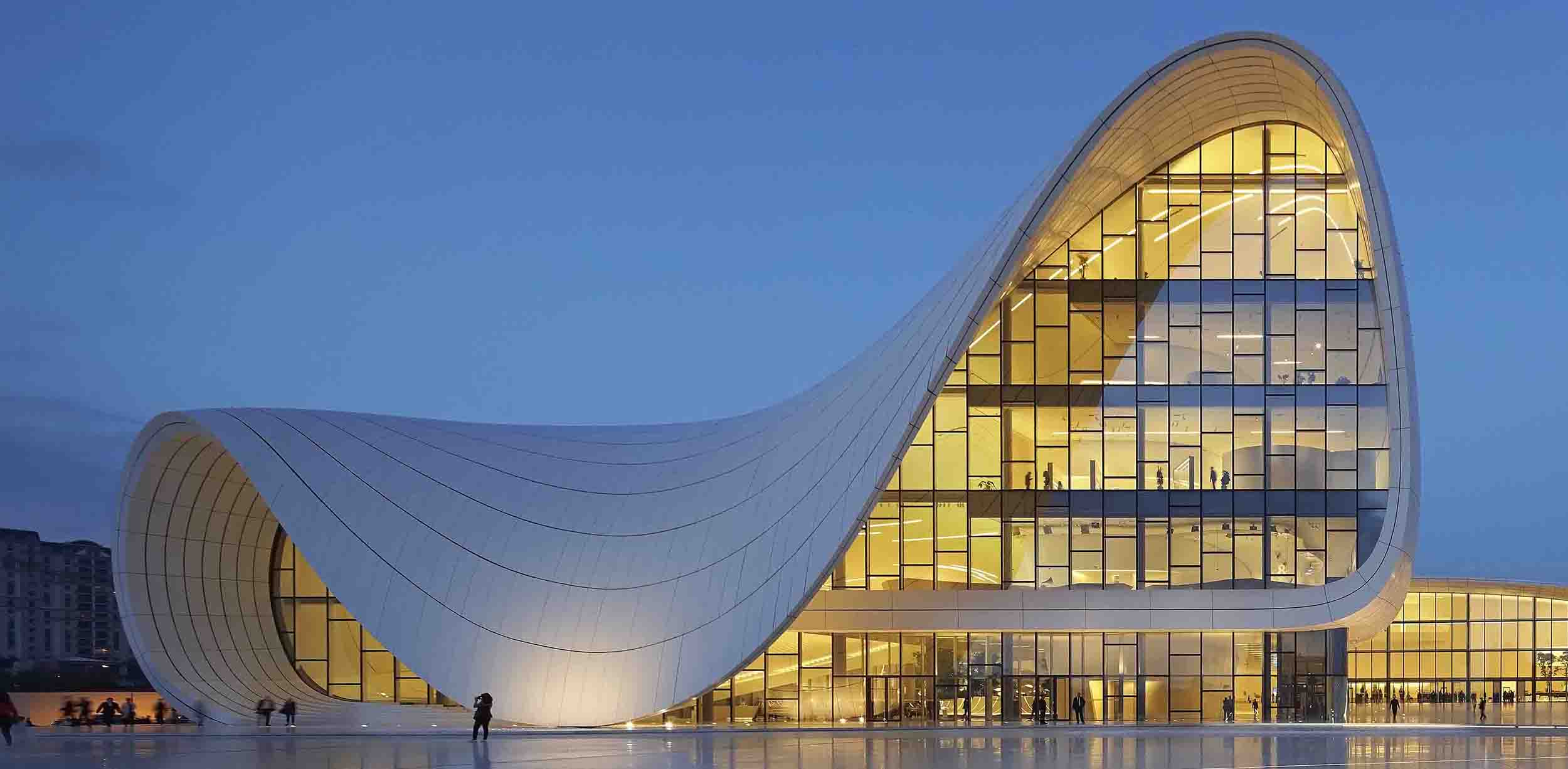
Interview edited for length and clarity; hero image: Javier Senosiain from PIN-UP issue 20, available here


