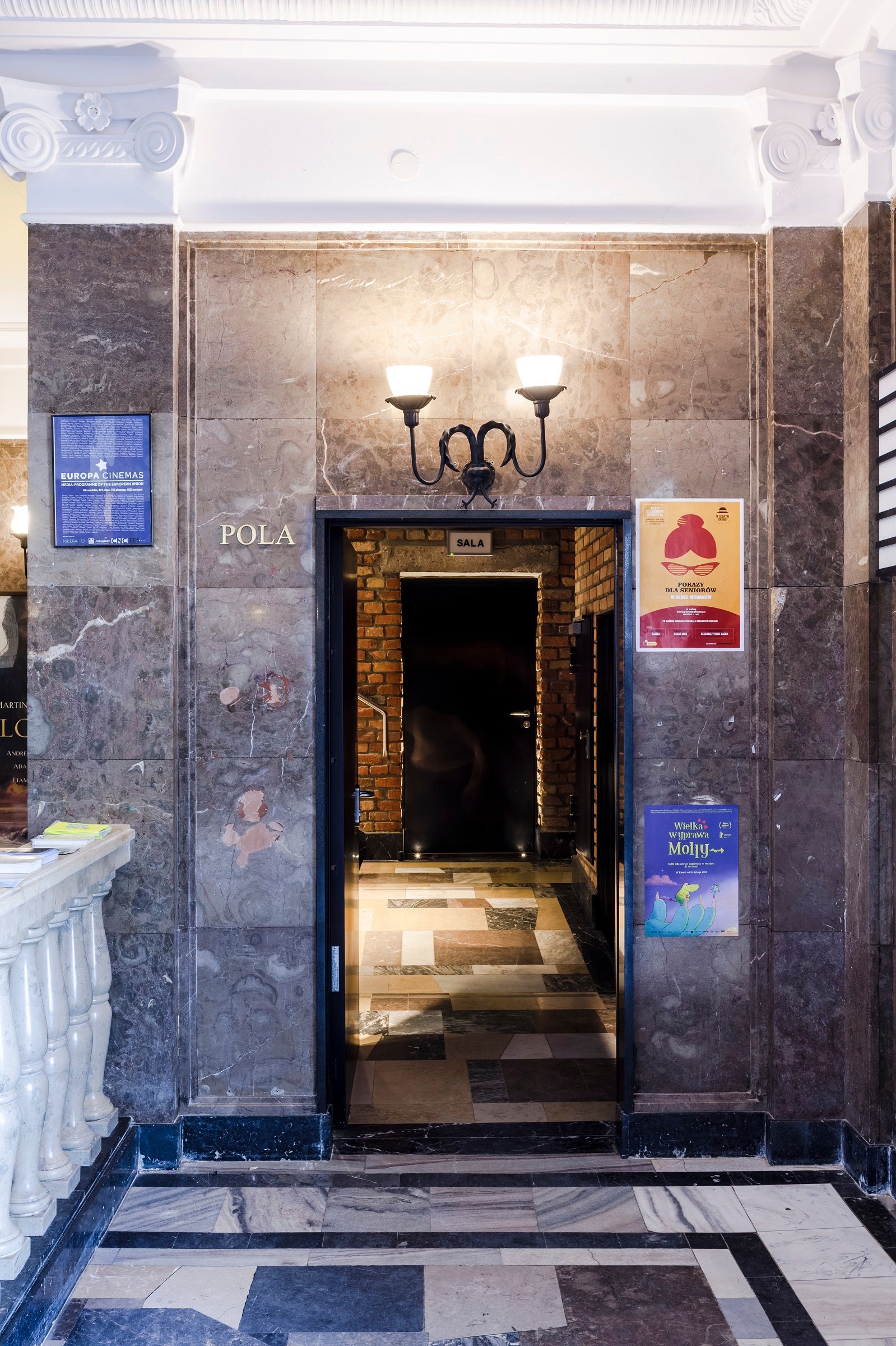
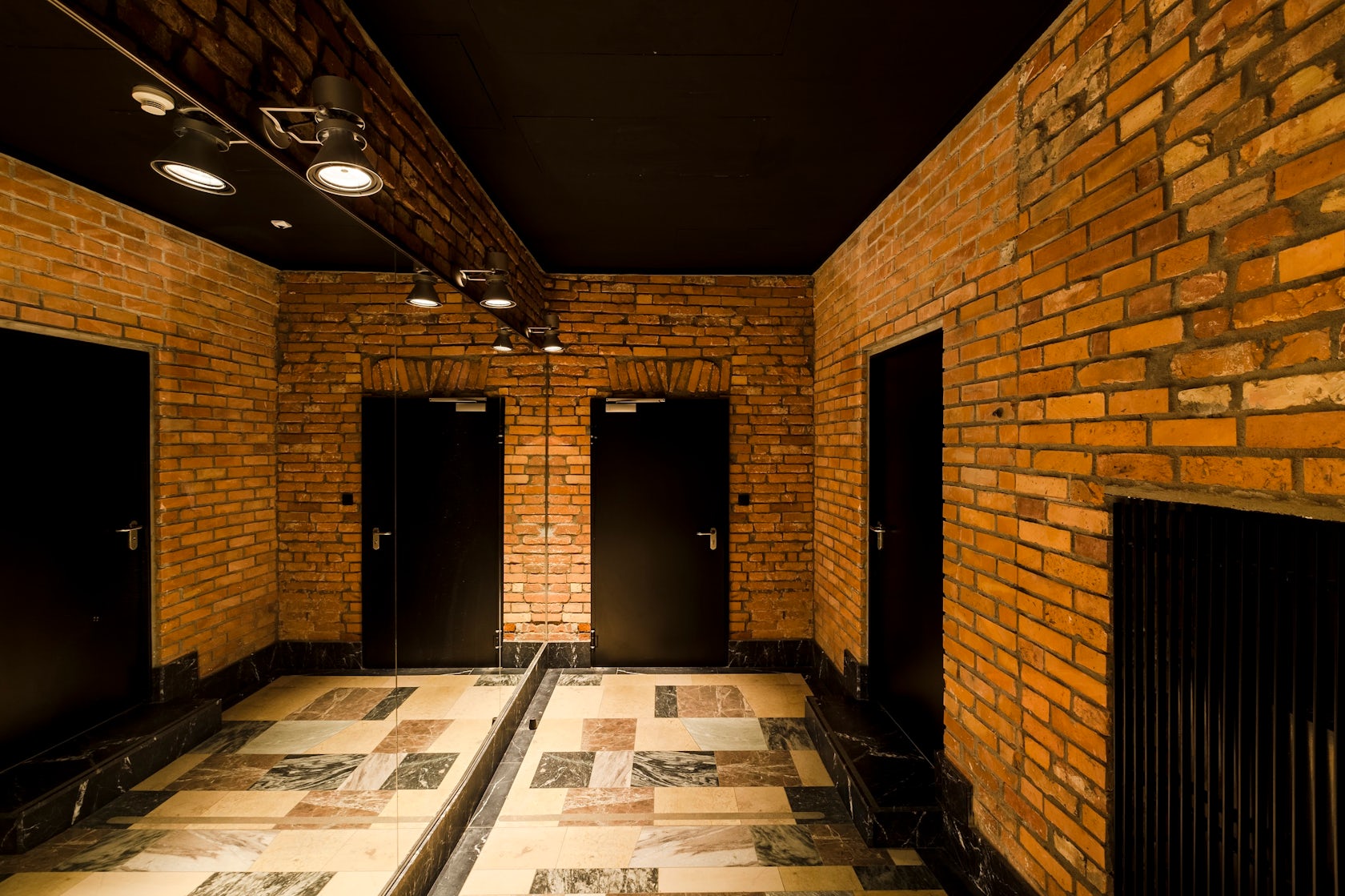
“Muranow” Cinema – Do you remember ‘The Matrix’ and the questions that remained in your mind after watching the film? Perhaps similar questions and doubts lie at the heart of this small architectural project: What is an original and what is an imitation? What is real and what is fake? What is valuable and what is worthless? What is authentic? What is an illusion? A reflection in a mirror? What is accidental and what is intended? Quite a lot of questions for two short corridors connecting the existing hall with the new cinema halls, isn’t it?
Architizer chatted with Piotr Hardecki, founder at Piotr Hardecki Architekt to learn more about this project.
Architizer: What inspired the initial concept for your design?
Piotr Hardeck: The cinema is located in the area of a former Jewish quarter destroyed by the Nazis during the WWII. The former residents mostly perished in German concentration camps. After the war, a landscape of destruction consisting of huge mountains of brick rubble remained. For political reasons, post-war architects had to design new buildings in a socialist realist aesthetic. The designer of the cinema, the excellent pre-war architect Bohdan Lachert, faced a choice: either to design in the socialist realist style or not to design at all. He decided to take on the task of rebuilding the destroyed capital, but neither the communists (his buildings bore too little resemblance to the architecture in the USSR) nor his old friends – the modernists, liked his designs. It was only decades later that his ideas were appreciated. These stories from the past had a strong influence on our project.
© Basia Kuligowska Przemyslaw Nieciecki / PION
What do you believe is the most unique or ‘standout’ component of the project?
In my opinion, a specific feature of our design is its uncompromising nature, rare in commercial projects. I appreciate the fact that the client has placed their trust in us, giving us considerable independence in the choice of aesthetics. I also find it inspiring to design with limited resources and budget. Such work requires more ingenuity and courage.
© Basia Kuligowska Przemyslaw Nieciecki / PION
What was the greatest design challenge you faced during the project, and how did you navigate it?
The biggest challenge was related to technical issues. The construction of the new cinema halls required the floor level in the rooms to be lowered significantly below the surrounding ground. A possible design flaw risked flooding the halls during heavy rains. In addition, in one of the halls there was a main drainage well under the floor. This well was (and still is) a key part of the basement drainage system under the whole building. We had to think very carefully about the problem and its solution in order not to cut the route of the rainwater drainage system. Our multi-discipline design team came up with solutions that worked well during the heavy rains and are still functioning properly today.
© Basia Kuligowska Przemyslaw Nieciecki / PION
What drove the selection of materials used in the project?
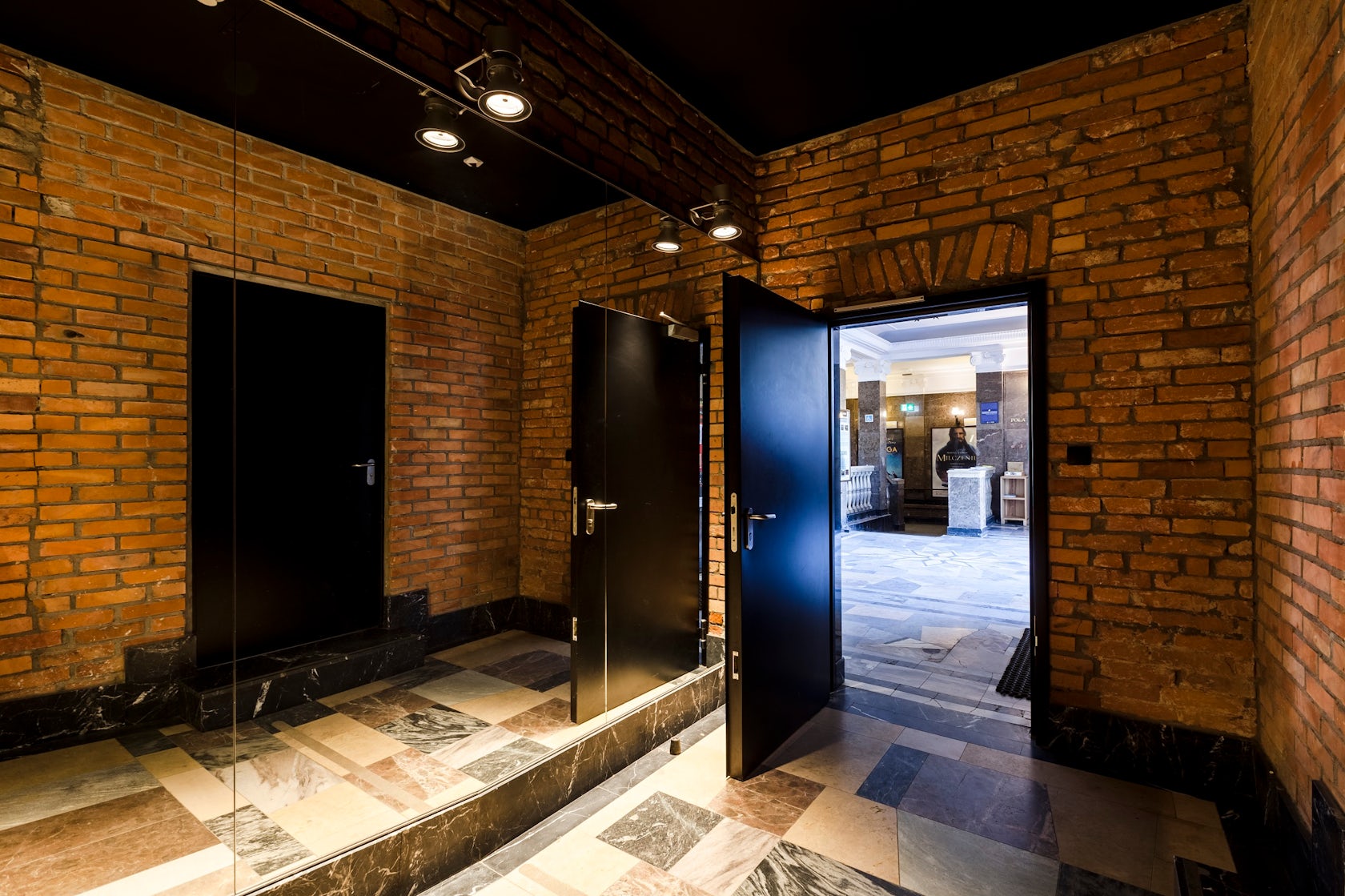
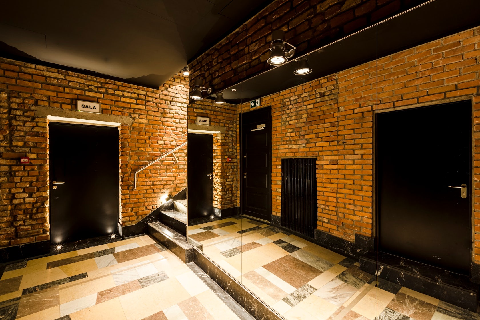
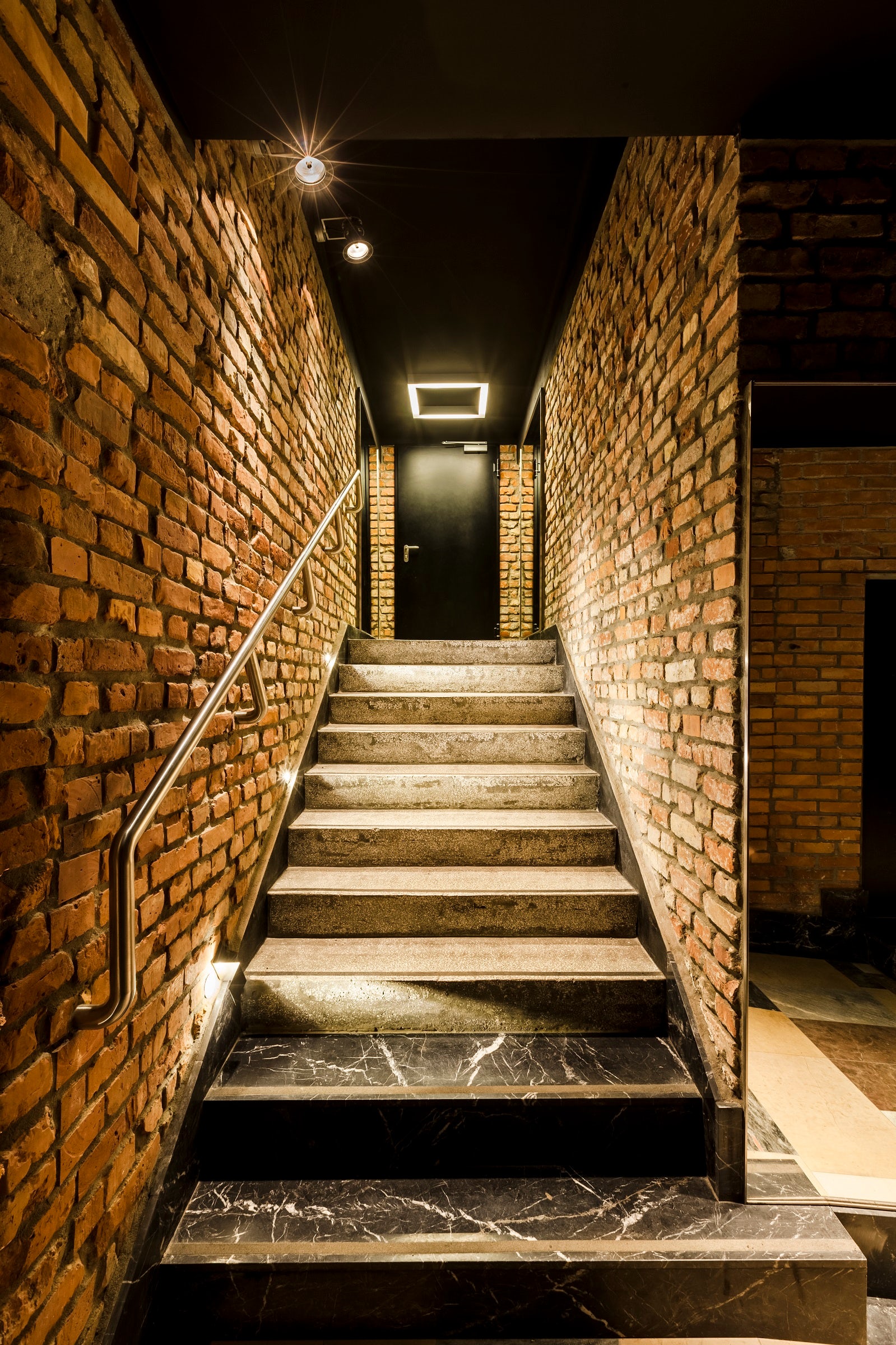
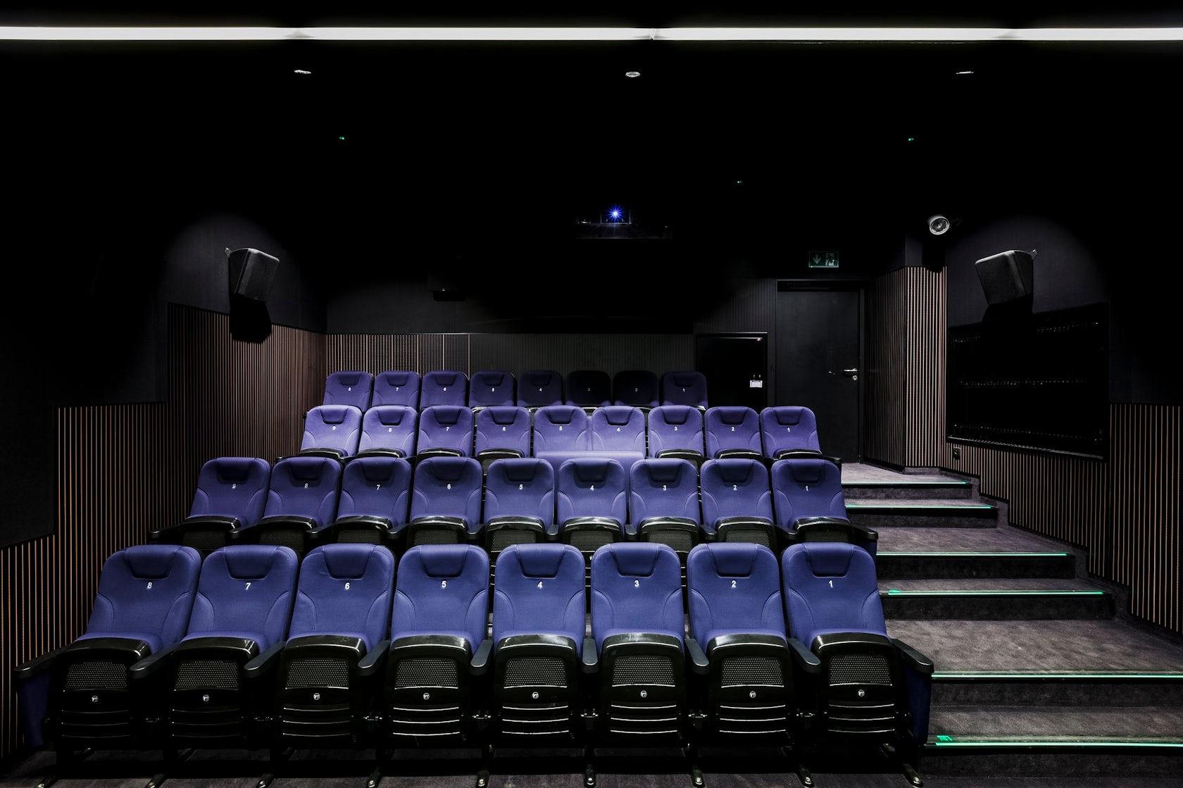
The austere and informal character of the corridors connecting the lobby with the screening rooms is deliberately contrasted with the ornate interiors of the old part of the cinema. It is intended to surprise the viewer and put him in a ludic mood. Luxury materials have been juxtaposed with common ones. A counterbalance to the bare brick walls is provided by a few costly additions: stone floors, modern lamps and mirrors intended to optically enlarge the small spaces. The materials used in the cinema interiors are primarily intended to meet acoustic requirements. The dark colours provide a backdrop for the audience and their activities.
© Basia Kuligowska Przemyslaw Nieciecki / PION
What is your favorite detail in the project and why?
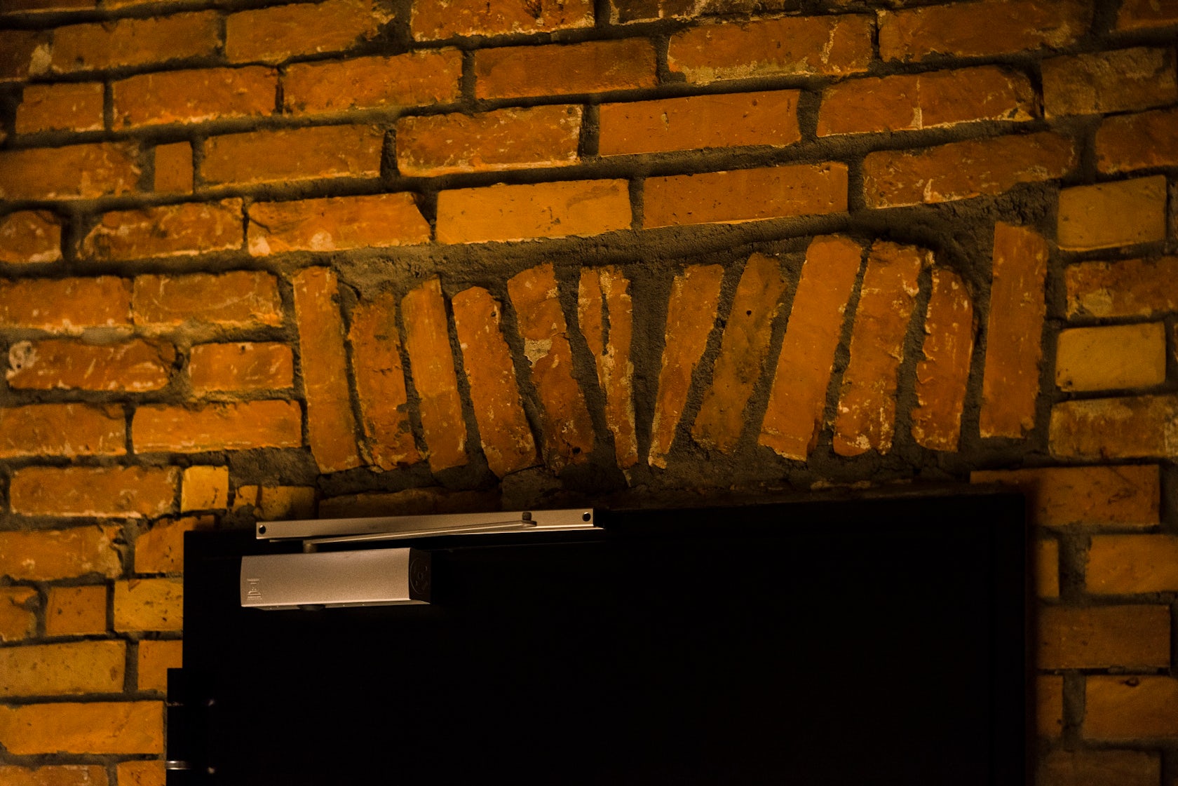
My favourite detail in this project is the brick lintel above the door, which emerged after the original plaster render was stripped off. It shows the nonchalance and sloppiness of the bricklayer, who probably never thought that his work would ever be exposed as decoration. I like the juxtaposition of the out-of-shape bricks with the even, technological edges of the fire doors below.
© Basia Kuligowska Przemyslaw Nieciecki / PION
How important was sustainability as a design criteria as you worked on this project?
In this particular project, the sustainable approach to design comes primarily from the reuse of space and materials. We were looking for a distinctive aesthetic achieved at a relatively low cost. Neglected, cluttered storage and back rooms were given new life as intimate cinema rooms. The limited investment budget provided the impetus to seek ambiguous beauty in the exposed original brick walls, multiplied by reflections in the mirrors, as well as in the refreshed terrazzo, contrasted with a stone floor that resembles (but does not imitate) the decorative floor in the lobby. An additional symbolic layer to the visible brickwork is added by the fact that in post-war buildings the walls were often built of bricks recovered from the rubble of destroyed Warsaw.
© Basia Kuligowska Przemyslaw Nieciecki / PION
In what ways did you collaborate with others, and how did that add value to the project?
In addition to the architects and designers normally involved in the project (constructors, sanitary and electrical designers), close cooperation with specialist designers and consultants in the fields of acoustics and cinema engineering was very important. During the realisation phase, we were keen to ensure that our ideas were understood by the contractor’s staff, so we were very often on site.

© Basia Kuligowska Przemyslaw Nieciecki / PION
How have your clients responded to the finished project?
The client breathed a sigh of relief when the construction was completed, as he was fed up with the noise and dust, especially as the other screening rooms were operating normally all the time. The two additional halls allowed for an increase in repertoire. In smaller halls, the cost of screening less profitable (but artistically valuable) films is lower. The annual film festival held at the Muranow cinema gained new opportunities. The cinema has become more competitive against the commercial multiplexes. Small cinema halls can screen films for schools in the mornings, which provides an additional source of income. Customer feedback has also been very positive. We are currently planning to adapt the former boiler room into another cinema auditorium.
What key lesson did you learn in the process of conceiving the project?
This project has taught us to look for potential in places that seem bland at first glance.
© Basia Kuligowska Przemyslaw Nieciecki / PION
How do you believe this project represents you or your firm as a whole?
This kind of project has been fairly unusual for our company at the time. Our speciality was educational buildings and projects with a strong connection to nature as well as urban planning. This was our first project with the theme of reuse. We have subsequently been involved in adapting other buildings to new functions and the experience we gained from this project has been very useful.
How do you imagine this project influencing your work in the future?
Over time, this project is gaining importance. Reusing existing buildings and adapting them to new functions is an important way of reducing greenhouse gases in the construction industry. On the other hand, preserving traditions and our cultural heritage is also important. Through our work on this project, we have developed ideas and principles that we will try to use in future commissions.
Team Members
Architecture: Piotr Hardecki, Marta Czarnomska-Siecke, Kamila Swiezewska
Consultants
Construction: Krzysztof Guraj, Sanitary installations: Jerzy Rotowski, Daniel Toczyski, Tamara Zawadzka, Electrical and telecommunication installations: Lech Ciepielewski, Acoustics, cinema engineering: Andrzej Kryszylowicz
For more on “Muranow” Cinema, please visit the in-depth project page on Architizer.


 "Muranow" Cinema


