Alright, I’ll admit – sometimes I’m positive I’ve seen it all when it comes to certain architects. I’ve long railed against the phenomenon of “Brand Architecture,” created by firms with a signature style that flies in the face of cultural, historical and political context. So, when I heard that he of the all-conquering titanium waves – Mr. Frank O. Gehry – had been at work on one of Philadelphia’s most significant public buildings, I was naturally apprehensive.
The 88-year-old Canadian architect has been something of a victim of his own success ever since his show-stopping Guggenheim turned the heads of critics, as well as hoards of tourists flocking in, back in 1997. Bilbao’s smash hit was viewed by many as a magical catalyst to spur the economic recovery and cultural rejuvenation of an entire city – some, however, might more readily describe the glistening edifice as a poisoned chalice.
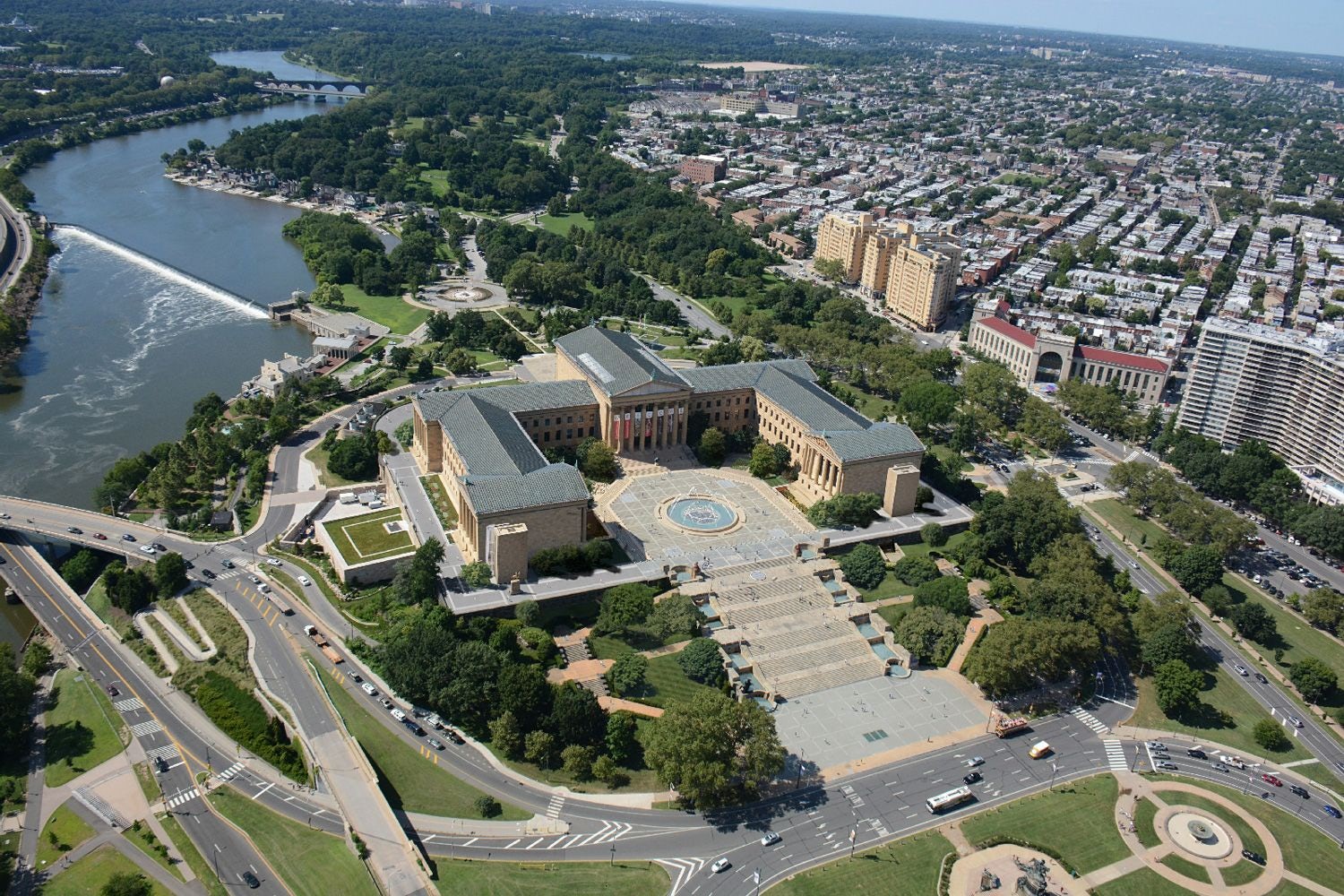
Images via AF Asia
Ever since that project, Gehry has been commissioned to design attention grabbing, headline architecture, with councils and mayors desperate for a slice of the perceived success seen in Spain. It has reached a point where anyone employing the architect could be accused of dabbling in architectural alchemy, speculating that the mere application of Gehry’s exuberant style will be enough to turn their bricks and stones to gold.
Those in charge of the Philadelphia Art Museum have other ideas, though.
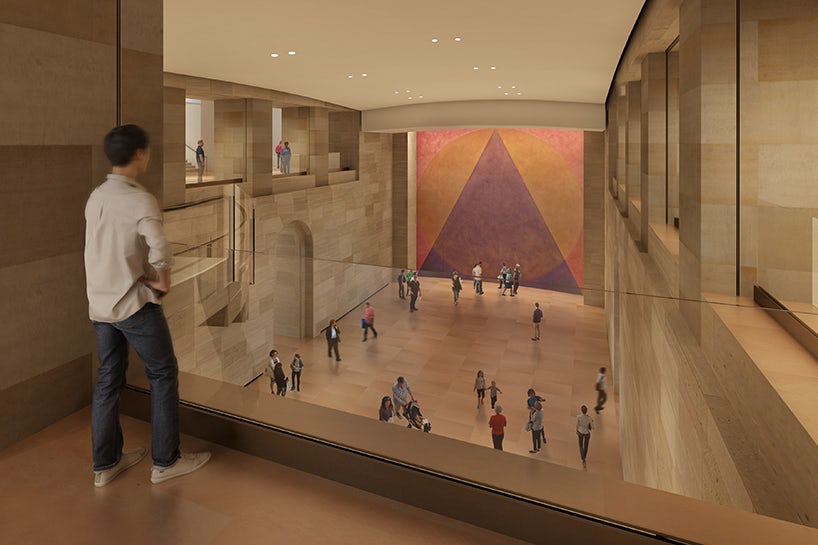
This enormous project has been something of a slow-burner: The museum first announced its plan to expand in 2005, commissioning Gehry as master planner a year later. In summer 2014, director Timothy Rub unveiled the project formally by putting the architect’s physical models and CG renderings on display in an exhibition called “Making a Classic Modern: Frank Gehry’s Master Plan for the Philadelphia Museum of Art.” Finally, work has begun on the next phase of the project, set to add 90,000 square feet of public space, including 23,000 square feet of gallery space.
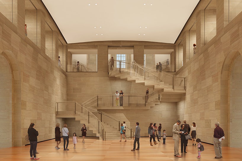
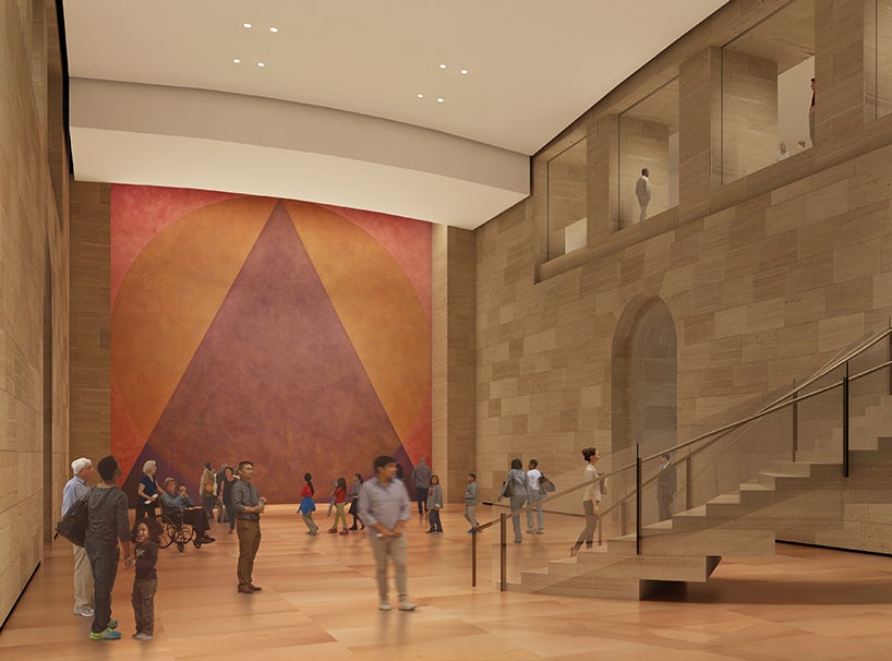
Crucially, the Museum’s brief did not call for an ostentatious façade, shimmering elevations, or sweeping, gestural forms arcing across the sky – in fact, it will not pierce the sky at all … the entirety of the additional exhibition space will be gained underground. Gehry explained the attraction of such a scheme to Robin Pogrebin of the New York Times:
“To be under the covers and to try to make architecture that way is a fascinating thought. All architects are intrigued by subterranean things; I don’t think I’m alone in that.”
Gehry is right, no doubt — architects, perverse as we are, have long delighted in the challenges presented by conditions below ground level. The absence of light and space conspires against us, and yet we become enthralled by the possibility of carving out, tunneling, and molding earth to create pristine caverns that are inextricably linked with their context. Just ask Bjarke Ingels, who recently saw his subterranean Danish Maritime Museum completed in Elsinore, or a certain Mr. Tadao Ando, creator of the extraordinary and sublime Chichu Art Museum.
Speaking of which, one can’t help but feel that this commission would be a more natural fit for an architect like Ando, who revels in the art of understatement, or David Chipperfield, a renovation specialist whose remarkable transformation of Berlin’s Neues Museum snagged the Mies van der Rohe Award in 2011. However, despite his reputation for grand pageantry, Gehry remained resolute:
“There is a kind of modesty thing,” he continued. “Most of us, we don’t set out to do the Bilbao Effect, as it’s being called. It’d be a real challenge to do something that’s virtually hidden, that could become spectacular.”
Gehry’s preemptive rebuttal of the Bilbao Effect indicates a complex built up after countless jibes in the media, generally revolving around the cult of Starchitecture and the negative connotations that come with it. Regardless, the proposals suggest that he may well be true to his word on this occasion, creating spaces with minimal fuss and maximum effect.
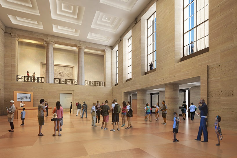
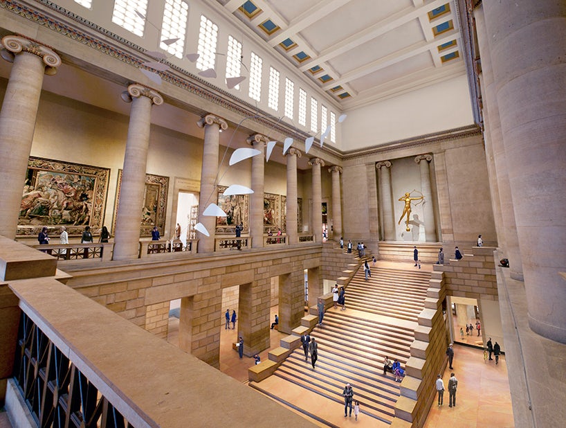
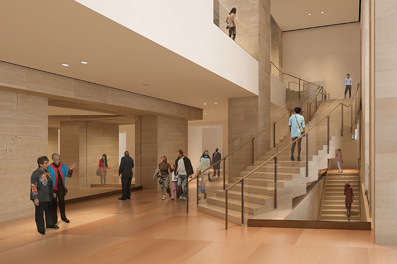
The Forum Gallery is set to be opened up in the heart of the museum, creating clear sight lines through the ground and first floor levels that aid wayfinding and provide a clean, elegant backdrop for large scale exhibits. Meanwhile, the north-south underground walkway, long closed to visitors, will become a space for arts events – its herringbone vaults are visible overhead, their beautiful texture left on display. The architect has showed restraint here, and it looks to have paid off.
Studying the subtly curvaceous stairway in the main forum, astute eyes may still be able to discern the author behind this renovation — but the overriding feeling is one of subtlety. Priority appears to have been given to the increased functionality of the gallery, with accessibility and pedestrian flow through the complex taking the lead over gratuitous form-making. Whether the approach is successful in increasing visitors numbers to the museum remains to be seen, but one thing seems clear: there are more strings to Gehry’s bow than one might have assumed, and for that, I hold my hands up … I haven’t seen it all, Frank. Kudos.
Yours artistically,
The Angry Architect
All

