Architects: Showcase your next project through Architizer and sign up for our inspirational newsletter.
Various housing crises in countries across the globe have gone on for so long now, it is hard to remember a time when there was just the right number of homes for everyone. This condition has been blamed on everyone from Margaret Thatcher and “Nimbies” to landlords and city councils, but one thing is for sure: The demand for housing, particularly of the affordable variety, remains as high as it has ever been.
This trend means big business for residential developers that specialize in constructing large-scale housing projects on the outskirts of cities and towns across the country, giving people the chance to buy their own home while still living within driving distance of amenities commonly found in urban centers. This sounds ideal for both the seller and the consumer — people are able to purchase the houses they desperately need, and the developers use economies of scale to make a profit and move on to even larger master plans.
Here’s the problem, though — those economies of scale frequently result in terrible architecture.
In their pursuit of profits, developers have become accustomed to minimizing space, rushing through planning with mediocre master plans and using the cheapest available materials for the houses themselves. This results in homes that are at best lackluster, and at worst unlivable. The only reason people keep buying them is a chronic lack of choice and an inability to afford sky-rocketing house prices within cities.
The following grievances arise from some of the worst practices in this sector, from the perspective of someone who has worked in a commercial architecture firm on these very projects. To be clear, no one person or party is to blame for these issues: Developers, architects, planning officers and governmental departments all have a part to play. Hopefully, though, collating these criticisms can provoke a discussion about how we can drastically improve our suburban landscape in the future. If you have a gripe of your own you feel has been left out, express your views over on Architizer’s Facebook page.
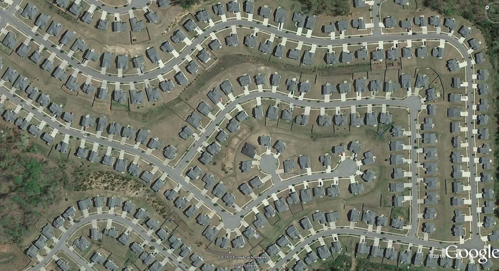
1. A Lack of Architectural Variety
One of the first things that comes to mind when thinking about suburban housing developments pertains to the diversity — or lack of it — in the architectural language of mass-produced homes, sometimes referred to as “tract housing” in the United States and Canada. Commercial developers and their architects are all too often guilty of colluding to create cut-price “cookie cutter” houses, reusing templates of previously designed buildings to produce residential landscapes characterized by monotony.
Extreme examples of such copy-paste architecture can be found in China and on the outskirts of Mexico City, but examples can also be found across the U.K. and the USA, where commercial motives have meant that “place making” drops further and further down the priority list.
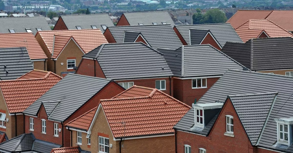
2. Contrived Architectural Variety
The counterpart to a lack of variety is forced variety. Wary of being hit with the above accusation, some developers advocate a mixed bag of materials, roof styles, porches and window details to provide a sense of architectural diversity. The problem is, these variations are all applied to the same “cookie cutter” templates as before, and the resulting aesthetic is incoherent and overly busy. Unlike the true variety of forms and styles present in older cities — where new buildings have been added over long periods of time — this lack of continuity lacks integrity. It is fake. Which leads us to my next point …
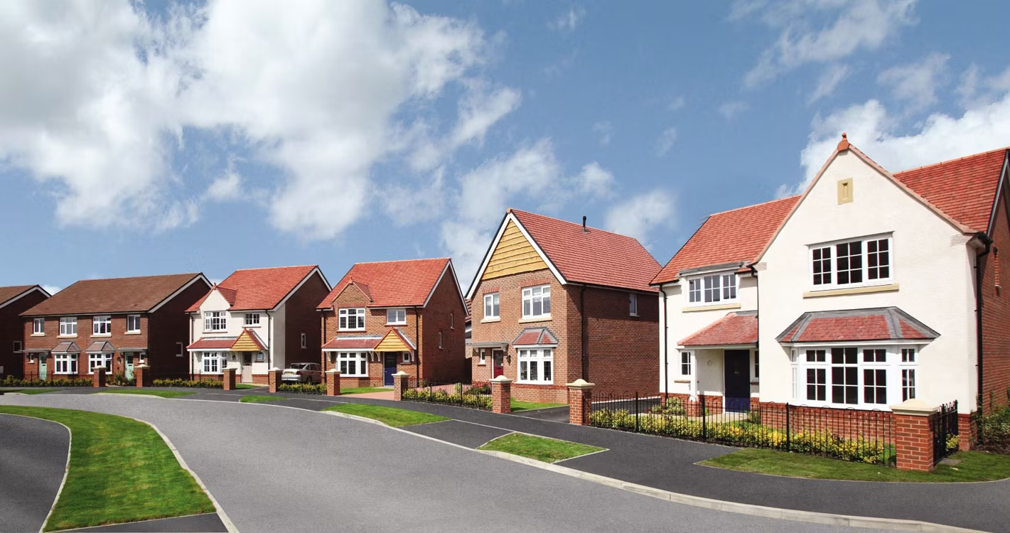
Redrow Homes somewhere in the U.K.; via Singletrack
3. Pastiche Detailing
Pale imitations of styles or periods from the 19th and early 20th century litter the suburbs of both Europe and America. Superficial odes to the past are everywhere — false chimney stacks, superfluous columns and even dainty turrets can be found in high numbers, enough to make Mies van der Rohe and Le Corbusier turn in their graves. The other issue with these faux period details is that, all too often, developers want the look without the cost, which results in architects being coerced into specifying cheap materials that mimic the solid, well-built houses of old. One material in particular springs to mind, and that is …

GRP chimneys; via Tuke and Bell
4. GRP (Glass Reinforced Plastic)
The widespread use of glass reinforced plastic (otherwise known as GRP) is great for developers’ wallets, but not for the quality of the mass-produced houses they construct. The prevalence of this deceptive material is not all the fault of the clients or their architects: Much of that lies at the door of planning restrictions, which often dictate that buildings must include redundant components such as chimneys in order to be permitted.
The solution is provided by manufacturers such as Storm King, and while their chimneys, porch roofs and faux-classical columns are of a reasonable quality, they are ultimately still plastic — a material which is bad for the environment and possesses a highly questionable architectural lifespan. GRP has not been around for 100 years yet, so it remains to be seen how the material truly ages. However, my bet is that it does not stand up to the elements quite as well as good, old-fashioned bricks and mortar.
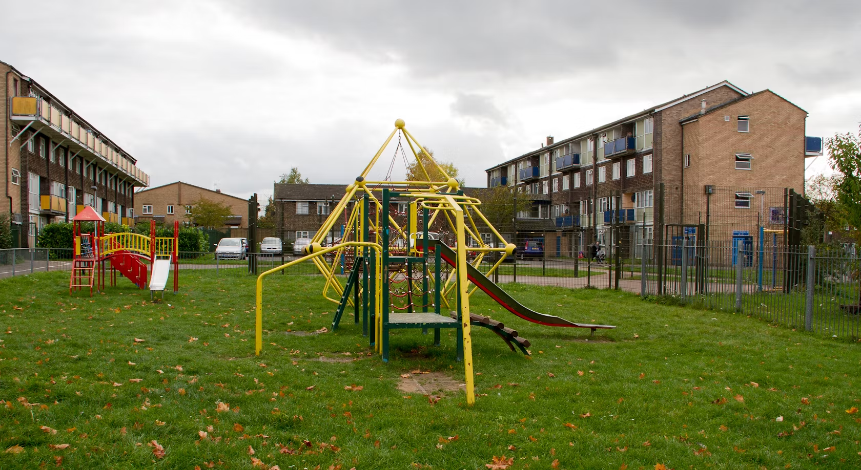
5. Low-Quality Open Spaces
Further problems can be seen throughout the public realm of many housing developments, often as a result of planning regulations that were brought in with good intentions but which are translated into a dysfunctional reality. Public open spaces are a perfect example.
A set amount of square footage within each development is required to contain open green space and, depending on the scale of the project, obligatory play apparatus may be included. The problem is, these are not profitable for developers, so they are viewed as a nuisance and are shoved into corners and out of the way wherever possible. The result? Desolate strips of grass and pitiful landscaping that is never used by the residents it was intended for.

6. Car-Dominated Developments
Car ownership is as high as ever across Europe and the United States, with roads and parking dominating the suburban landscape on both sides of the Atlantic. Planning authorities have taken steps to prioritize pedestrians over cars in urban areas, but on the outskirts of cities, our continual reliance on personal vehicles undermines this mission.
A huge amount of space in housing developments is therefore taken up by garages, rear alleyways, roads and additional parking spaces, to the point where almost half of space within developments are made up of hard standing in one form or another. While space for cars will continue to be a necessity in the near future, this issue could be remedied by more high-density housing designs that make developments more walkable to urban centers or public transport stations. The trouble is, there is …

Accordia by Feilden Clegg Bradley; via FCB Studios
7. No Faith in High-Density Housing
There is a longstanding romanticism attached to many things people believe they require for “the good life”: a back garden, a double garage, a white picket fence out front and — most of all — complete separation from those pesky neighbors. This vision is largely why suburbia looks the way it does, and why each plot takes up vast amounts of space in addition to the aforementioned roads and parking spaces.
The idea of high-density housing is therefore unappealing to many, and the benefits it carries — less green field sites being built over, more economical land use for developers, more space for ancillary services like shops and clinics and stronger social cohesion — are often left unexplored. Firms such as Alison Brooks Architects, who designed Newhall Be housing, and Feilden Clegg Bradley Studios — creator of the Stirling Prize–winning Accordia development — have shown that good quality, high-density housing is possible.

Via Google+ (Mail Boxes Etc. Cardiff)
8. Bad Affordable Housing
While materials for every house in these types of developments are typically on the cheap side, those used for the requisite affordable housing (often 35 percent of units in each project) are generally the lowest quality of all, as developers attempt to minimize the cost of these less-profitable dwellings. Affordable units are also grouped in the least favorable parts of a site, such as beside a noisy highway or in the shadow of power lines.
There are ways to quell this occurrence — “pepper potting” means affordable are intermixed throughout developments to increase social cohesion, a strategy that has been proven not to “drag down the value” of private houses, as some have suggested. More must be done to improve the quality of these properties and reduce the social stigma surrounding them.
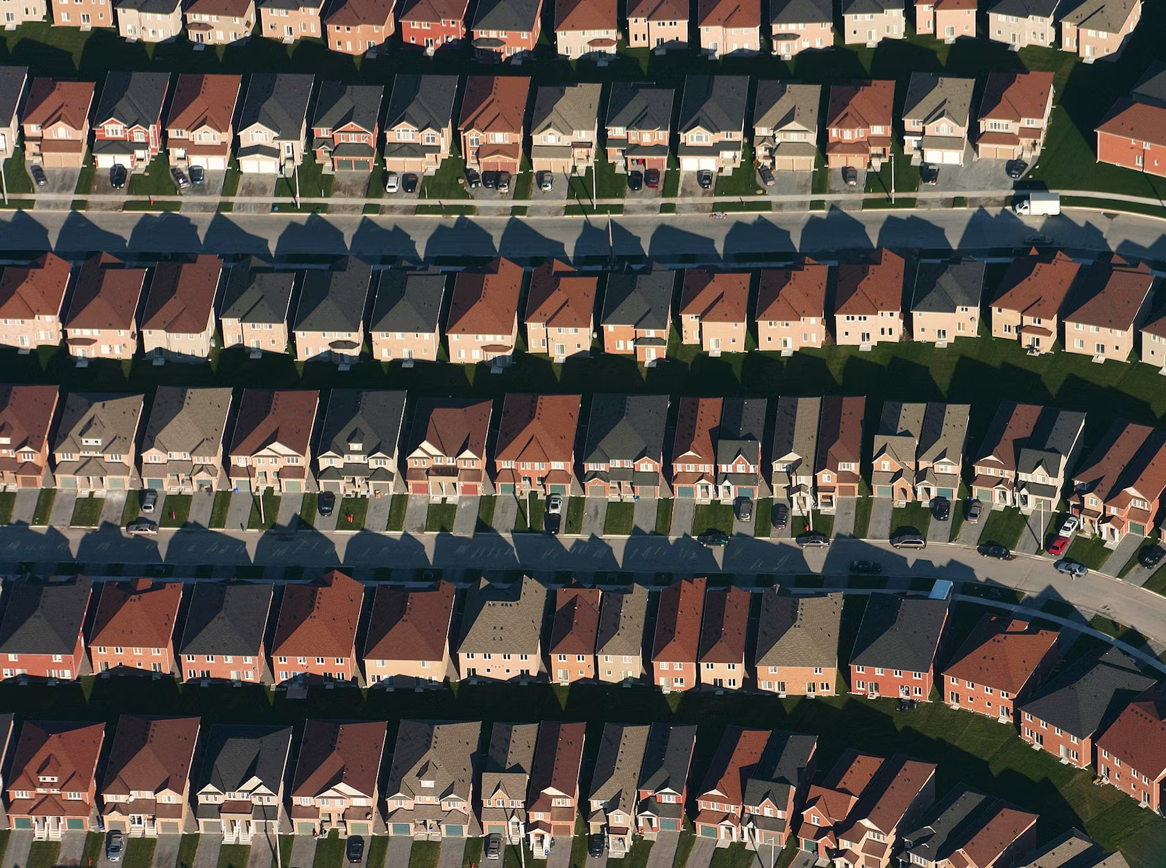
Markham, Ontario; via Wikipedia (IDuke)
9. Tiny Homes, Tiny Plots
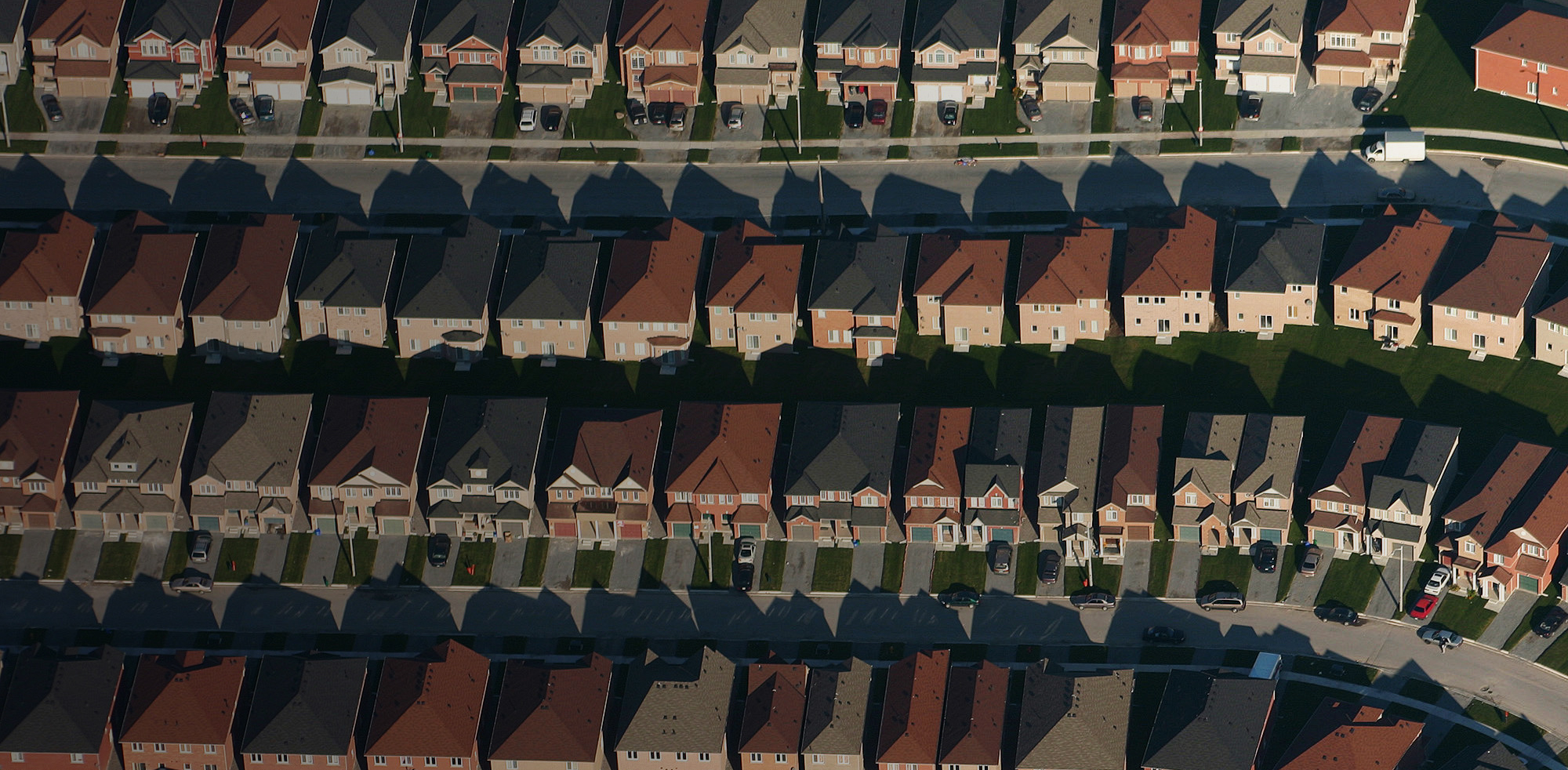
As of 2013, the average one-bedroom new-build home in the U.K. measured just 46 square meters (495 square feet). According to the Royal Institute of British Architects (RIBA), this is about the same size as an underground train carriage. Cozy. Meanwhile, the plots themselves are also made as small as possible (within the bounds of local planning regulations) in order to maximize profits. This can lead to scenes like that of Markham in Ontario, Canada — see the above photograph. This is high-density housing done the wrong way — instead of cramming tiny bedrooms in tiny semi-detached houses on tiny plots, the typologies referred to in point No. 7 should be investigated.

Dallas suburbs; via Wikipedia (Andreas Praefcke)
10. A Poor Mix of Programs
Finally, the implementation of mass-produced residential housing on the outskirts of cities is fundamentally flawed on a programmatic level. These developments are often over-reliant on existing amenities in urban centers — shops, restaurants, clinics, schools and leisure facilities — which leads these services and their associated infrastructure to come under immense strain. A more mixed approach to new development, with a combination of residential, commercial and public buildings throughout, would reduce people’s reliance on cars to get around, while also aiding social cohesion as dormant street fronts become activated.
Do you agree with these grievances? How would you do things differently? Let us know over on Facebook.
Architects: Showcase your next project through Architizer and sign up for our inspirational newsletter.
 Newhall Be


