By James Biber, architect of the USA Pavilion at EXPO 2015.
Expos, since their inception in the Victorian London of 1851, have managed to rely on architecture as the leitmotif of modernity. Paxton’s Crystal Palace was the first truly modern building: fully demountable, entirely prefabricated of iron and glass, commissioned by competition, and realized from conception to opening in nine months. It employed new construction technology and resulted in the largest covered space in existence … not to mention the 14,000 exhibits that essentially coalesced into the new world.
A chance for architecture to stand-in for national character is both surprising and completely expected…
The frenzy of World Expositions that followed — 1853 in New York, 1855 in Paris, 1861 in Metz, and more than 25 others in the 25 subsequent years — began to reorganize the world from a single unified building to a campus of coordinated buildings. Equipped with a central iconic, usually a vertical, central element and bespoke landscape, they (d)evolved to the raucous free-for-all that they eventually became. Within less than 100 years, empires faded and nationalism rose until the corporate nation-state challenged sovereignty.
While Expo Milano 2015 maintains some of this amalgam, there is at work a real attempt to rein in the object in the round and the anti-urban proclivities of recent fairs. It began with a brilliant idea from Jacques Herzog that had each nation on an exactly equal-sized plot lining a single tented axis. He proposed covered sites that would allow nations to build modest temporary buildings and use the savings to sponsor a real global conversation addressing the food challenges of the century, during which nine billion people will compete for food by 2050.

Herzog and de Meuron’s original proposal.
He had it exactly right and, at the same time, exactly wrong: no nation would participate if they could not be part of the identity parade that these Expos have become. A chance for architecture to stand in for national character is both surprising and completely expected; rather than athletic prowess, military might, or cultural gravity, 145 nations have come together to compete on design. Expo Milano 2015 is the largest, densest, newest design fair on the planet … for six months.
Herzog’s brilliant plan was altered by Stefano Boeri to allow differing site sizes and the Vanity Fair that Herzog feared, but in its urbanity and masterplanning intelligence, it is the only recent Expo to reference the first Expo’s scale, formal cross axes, and truly urban demands put on the pavilion designers.
The best pavilions limit their ambitions and do something singular well, rather than fail at complexity.
What we have is, yes, a collection of competing freestanding buildings — but with enough order and intention to make a fully legible organism out of the grab bag of organization. The scale is challenging: the 1851 variety was 1,851 feet long, a meaningless and yet entirely resonant figure just as the World Trade Center is 1,776 feet tall.
The latest site is three times as long, making the lack of the very old or physically challenged visitors obvious. This would be easily remedied with pedicabs or other onsite transportation, but so far the only bicycle-powered transport is for ice cream sales stations. The lack of seating along the main 100-foot-wide boulevard is similarly troubling, but easily remedied, and in fact has begun to appear in the first month since opening.
The organizers have built an entirely new sustainable city largely out of view of the local population and opened in less than five years from its announcement. It is a laudable achievement even if the sustainable aspect of the undertaking is a bit of an oxymoron, considering its six-month lifespan.
Queues, an obsession of the organizers, are a frustration to the visitor in spite of the attention they receive. Buildings with no queue issue timed tickets forcing visitors to wait “only 20 minutes” (as one pavilion put it). Insisting that “no one is in line” is met with shrugs. Accessibility ranges from hour-long queues to walk-in pavilions.

© SAVERIO LOMBARDI VALLAURI
USA Pavilion by Biber Architects
One professional praised the USA Pavilion we designed as the only one expressing true power by being entirely open at a grand scale. With no queue and essentially transparent, the porous and open-air boundaries of the pavilion demonstrate the confidence, he said, to forgo visible security or barriers to entry. A USA Pavilion fronted by long queues and frustrated crowds unable to enter was exactly what we hoped to avoid. The bonus is an audience open to content, a daily rooftop party and a sense of choice that visitors get in few other pavilions.
National pavilions, the soul of any Expo, range from the sublime to the ridiculous, but this has always been the norm for modern World’s Fairs. The best pavilions limit their ambitions and do something singular well, rather than fail at complexity. Too many are simply adverts for tourism and give up on content altogether, except for the “come for our x, stay for our y” variety.
A few headliners include (in addition, of course, to the USA) the following. And, full disclosure, I haven’t seen nearly the entire Expo and am strongly averse to queues:
© Iñigo Bujedo Aguirre Photography

© Iñigo Bujedo Aguirre Photography
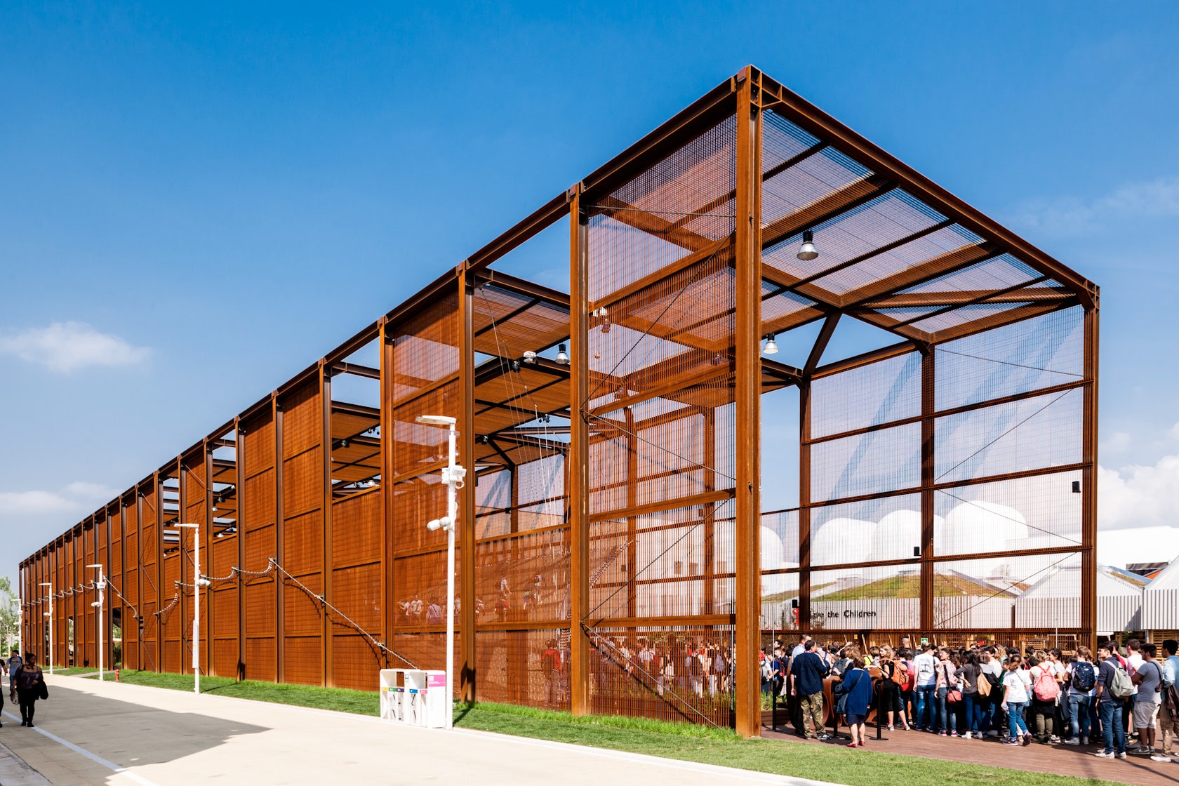
Brazil Pavilion by Studio Arthur Casas
Brazil, with its simple, rusted, open steel frame holding a walkable ‘meshsurf’ as the “American Gladiator” entry route is an open invitation. Beautiful and fun, it manages to create an instant group activity that is as uncontrived as it is formally gorgeous.

© Wolfgang Buttress
UK Pavilion by Wolfgang Buttress
UK has a single focus — bees as an indicator of agricultural health — and hoists a lacy metallic hive (connected electronically, if dubiously, to beehive activity in the UK). The wildflower meadow forecourt, raised to allow a bee’s eye view, is a successful setup to the largely ephemeral hive object. Ephemeral, but impressive from below, inside, and at night from anywhere nearby.
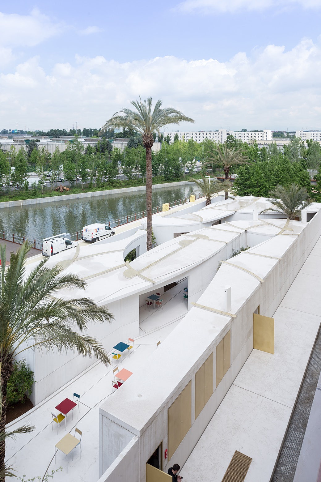

Bahrain Pavilion by Studio Anne Holtrop. Photos by Iwan Baan, via ArchDaily.
Bahrain does something so modest, finely crafted, and unexpected (compared to, say, UAE) that it is among the most charming and appropriate, if content-light, pavilions. Made from precast concrete, the one-story, domestically scaled pavilion is planned for disassembly and relocation to Bahrain at the end of its run.

Russia Pavilion. Image via Russia2015.com.

Russia Pavilion. Photo via Russia Expo 2015 on Facebook.
Russia, finished minutes before opening in an impressive marshaling of labor, is as bombastic as Bahrain is modest. The massive saber (sickle?)-like cantilever, as seen from the roof of the USA Pavilion, boasts the highest occupiable public perch at the Expo. The USA boasts the most fun on any roof, plus a seriously cool shading device.
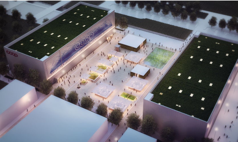
Future Food District by Carlo Ratti Associati. Image via EXPO2015.
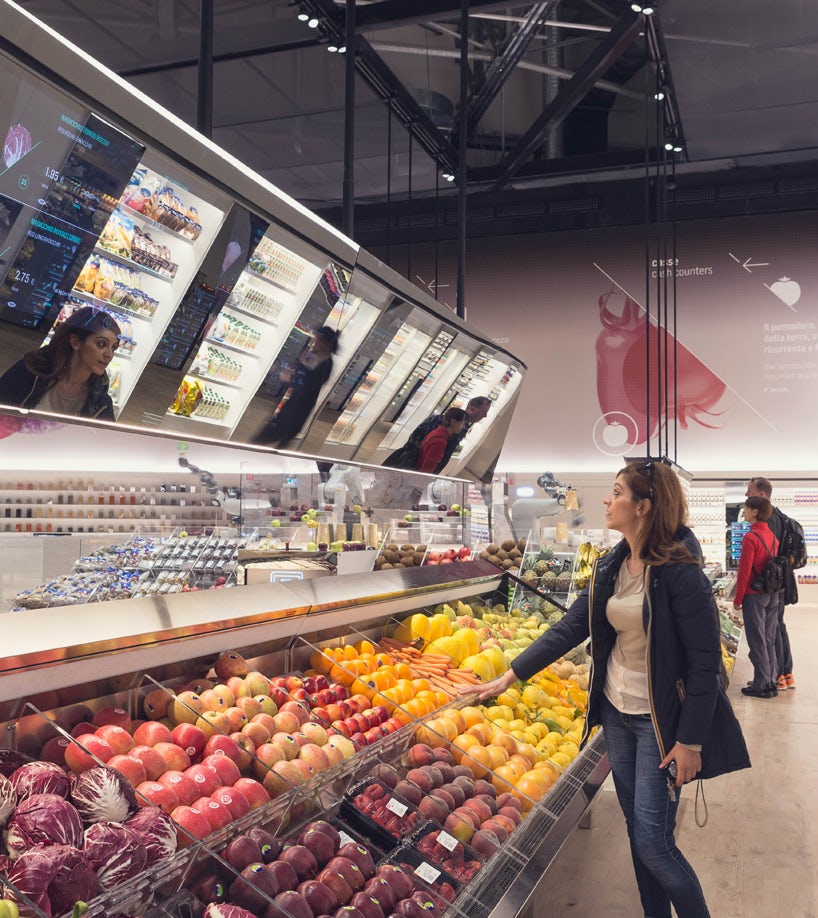
Future Food District by Carlo Ratti Associati. Image via Designboom.
Future Food District is an actually functioning, enormous, and tech-driven supermarket (though doing the weekly shopping at the Expo is a bit out of the question). Data-driven and beautifully merchandised, it is spotted with displays such as a nimble ABB robot demonstrating that, yes, a zillion-dollar machine can put an apple in a box, though it fails to do so every time just to avoid the sight of a machine senselessly making vast piles of unbought product.


Chile Pavilion by Cristián Undurraga. Photos by the architect, via ArchDaily.
Chile’s elegant building is most successful content-wise in what it places underneath the floating wooden diagrid: food for sale and consumption in the shade of the hovering box.

Austria Pavilion by Klaus K. Loenhart. Photo via Dezeen.
Austria, Chile’s neighbor, fills a simple open-topped rectangle with an actual piece of Austrian forest — so moist, fragrant, and believable that it transports one as quickly and convincingly as any pavilion at the fair.

Santa Sede. Photo via EXPO 2015.
Vatican, called Santa Sede for ‘Holy See,’ seems a perfect Franciscan (as in Pope Francis) offering. It has the best typography and signage, with “Give us this day our daily bread” floating in a ‘steel rod light’ typeface casting readable shadows on the faceted volume. Behind the huge yellow curtain (whose iconography is doubtless important but beyond me) are two open half chapels, one with a Gothic arch and one with a Renaissance vault, displaying its constituency rather than its riches.

Slow Food Pavilion. Photos by Marco Jetti via ArchDaily.
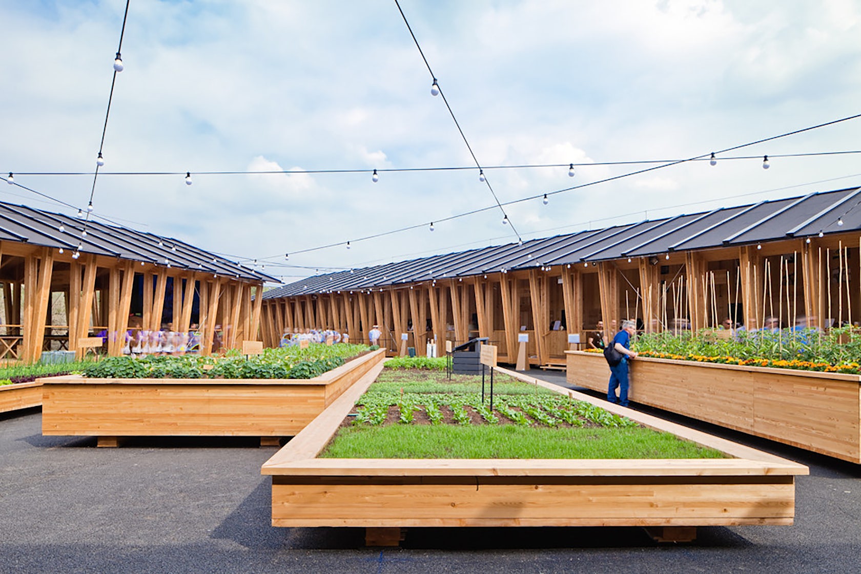
Slow Food is the only offering by Herzog and de Meuron aside from the original masterplan. Living up to their own ideas, the pavilion is a set of simple open sheds with some of the most elegant picnic tables ever, all ready to be packed up when the Expo ends.
The Expo is not so much a news scoop as a long-form article. I plan to methodically trudge through every pavilion by the end of the Expo and update this top-10 list with a bottom-10 list and a review of the copious corporate pavilions.
And if the Expo is a marginal reason to visit Milan in the next five months, add to it the sublime Prada Foundation by OMA, the disavowed MUDEC museum by David Chipperfield, and a monumental show at the Triennale Design Museum on the Art of Food. A Freccia train gets you to Venice in two hours and 35 minutes for the Art Biennale.
Convinced? See you there!
James Biber, FAIA LEED, is the Principal of Biber Architects and lead architect of the USA Pavilion at Expo Milano. Trained first as a biologist, then as an architect, he has practiced architecture in a multidisciplinary environment for more than 25 years. biber.co
Photo at top via Expo Milano.


