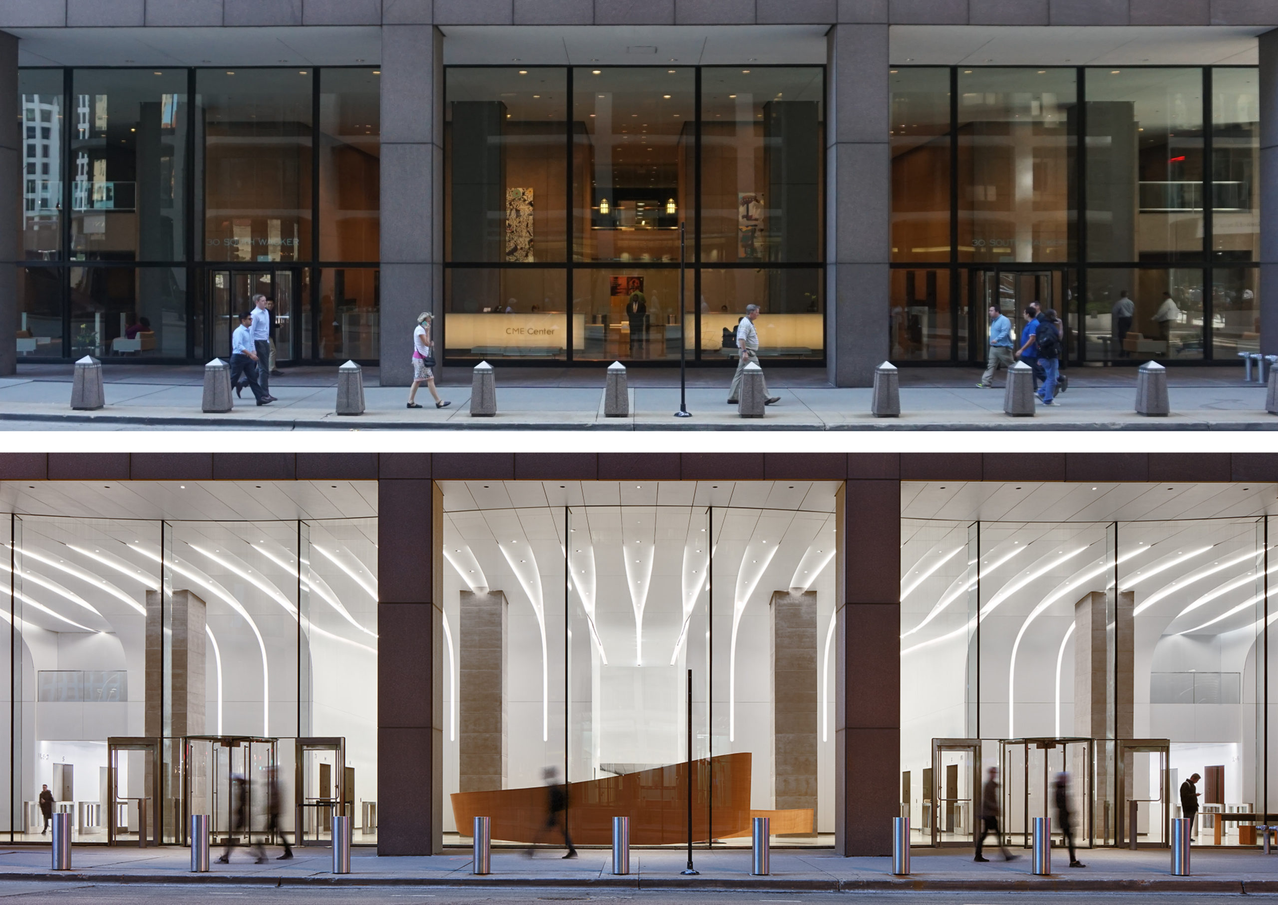
CME Center – A 2.4 million square feet two 40-story-tower complex built in the 80’s needed to regain viability in a market focused on attracting young talents. The transformative ground-plane repositioning radically changed the building’s street presence and its place identity by creating an urban communal realm furnished with living rooms for the people in and around the building. The living rooms provide the place varieties necessary for both private and social daily routine. The project focuses on creating a new urban destination supporting people’s identities and communities. The project went on to achieve a 96% lease occupancy during the pandemic market conditions.
Architizer chatted with Yugene Cha, Partner at Krueck Sexton Partners, to learn more about this project.
Architizer: What inspired the initial concept for your design?
Yugene Cha: Le Corbusier famously said that “The plan is the generator”, and circulation is the heart of a plan. For a vibrant urban communal realm, we focused on people’s circulation paths. The proximity to the major commuter rail stations, the Chicago River, the El trains, and South Wacker Drive brought tens of thousands of people circulating in and around the project (CME Center alone houses over 6,000 people). The project intuitively guides the circulation paths by means of curved glass (the curves guide the circulation and entry points) and the cross grain created by the ceiling-wall coves. The white solid surface material continues from the exterior ceiling into the lobby ceiling and wall signifying a single unified urban place identity. From the joint lines (needed for the solid surface material tolerance) emerges a distinct and exuberant street presence, that also becomes a backdrop for the urban living rooms.

© Krueck Sexton Partners
This project won in the 10th Annual A+ Awards! What do you believe are the standout components that made your project win?
It was a big surprise and a tremendous honor for us to receive this award. We were lucky to have a client who believed in the design process based on human nature. We can only guess that the clarity of purpose, the ingenuity of the entire design team, and the topnotch execution by the builders brought the jury member’s attention to our project. We are especially excited about an urban public realm project receiving such prominent recognition.

© Kendall McCaugherty © Hall + Merrick Photographers
What was the greatest design challenge you faced during the project, and how did you navigate it?
The project being a renovation effort, the greatest challenge presented itself during construction as the builders started to fully uncover existing conditions only after the construction had started. Extensive existing condition surveys and selective demolitions were performed during the design phase, but the complete understanding of the boundary conditions was only available after the completion of the design documentation. The simple and adaptable design fundamentals such as built-in tolerances and separation of boundary conditions at base, head, and walls afforded us enough flexibility to resolve the complexities.
Also, the use of solid surface as a new building cladding material in Chicago posed a challenge in acquiring municipal building permit approval. The material fabricator, Porcelanosa, helped expedite the necessary testing and data collection to prove that the material met the municipal government’s life safety requirements.

© Kendall McCaugherty © Hall + Merrick Photographers
How did the context of your project — environmental, social or cultural — influence your design?
The market’s search to attract young talents led us to focus on the needs of the workplace of the future – an urban public realm and living spaces focused on comfort, community, and identity. The project was designed before the pandemic; the need for public amenities is all the more significant in the post pandemic market with people’s keen awareness for physical and mental health and wellness.
The location of the project, being surrounded by tall buildings, in downtown Chicago, enabled maximum daylighting and sight lines without the concern for summertime solar heat gain. Daylight and open sight lines were key in creating a truly urban communal realm since natural daylight and connection to outside help lower stress and provide a richer experience overall.

© Kendall McCaugherty © Hall + Merrick Photographers
What drove the selection of materials used in the project?
The single solid surface material was used to clearly signify one space under the building instead of a common separation between the inside and outside. The crystal clear envelope enhances the inviting quality of the urban living rooms.
What is your favorite detail in the project and why?
The welcome desk, the banana table, and the ribbon elevator walls are all made of wood, a warm and comforting material used wherever people touched down and engaged with the space.

© Kendall McCaugherty © Hall + Merrick Photographers
How important was sustainability as a design criteria as you worked on this project?
The project was an effort to build less while achieving market viability for a legacy property. By repositioning the lobbies into a urban communal realm, the property was able to achieve a 96% lease occupancy without high embodied carbon interventions such as façade upgrades of the entire 40-story tower complex.
The project went on to reduce operational energy usage by integrating a new heat exchanger to the existing HVAC system.
Daylight was maximized by use of low iron structurally glazed system and the white solid surface material. Daylight sensors and motion detectors minimize the electrical load for artificial lighting. Daylight was a key design factor for the users’ health, productivity, and wellness.

© Kendall McCaugherty © Hall + Merrick Photographers
In what ways did you collaborate with others, and were there any team members or skills that were essential in bringing this Award winning project to life?
We were fortunate to have a sophisticated client (Amy Preston, then project executive at Tishman Speyer) bring on board builders and fabricators very early in the design process including Thornton Tomasetti, ESD, Roschmann Group, and Porcelanosa. This allowed the team to identify and tackle challenging conditions from early on. Such conditions include the suspended glazing panels above entry doors and the garage ramp drive way, solid surface’s complex 3-dimensional corner geometry, seamless integration between glazing / solid surface / and the existing building, etc.
For a living space such as this project, lighting was key to the project success. George Sexton Associates’ help was indispensable in tuning the light for a livable atmosphere that minimized energy usage by means of active controls (daylight sensors, motion sensors). The fixture selection process was a critical aspect that had to work with the intricate solid surface details.

© Kendall McCaugherty © Hall + Merrick Photographers
How have your clients responded to the finished project?
We heard that one of the major tenants in the building decided to stay due to the project. Also, we were told that the building was able to achieve 96% lease occupancy during the pandemic market conditions. Even in normal conditions they say the upper 80’s to lower 90’s percentile is deemed successful. We’d like to think that the high lease occupancy was partly due to the project’s success.

© Kendall McCaugherty © Hall + Merrick Photographers
What key lesson did you learn in the process of conceiving the project?
In a high stakes project with multiple stake holders making decisions, setting a clear project performance criteria and forming a shared position were critical in the design process. In this project, the shared position was to attract and maintain tenants. The project performance criteria were functional circulation, meaningful placemaking, and a lasting presence. Once the position and performance criteria were set, every decision was judged against these. This prevented subjective agenda and preferential decisions (“I like …!”) and allowed the whole team (owner + designer + builder) to focus on those goals. Most of all, this kept us focused and accountable.

© Kendall McCaugherty © Hall + Merrick Photographers
How do you believe this project represents you or your firm as a whole?
Urban communal realms such as this project are very important to us, because these environments make cities livable. We believe that design is a human right; everyone needs good design in order to live and grow to their fullest potential. Urban communal realms are one way to aid in this.
At the same time, we can confidently propose such an approach because we know good design is good business. To benefit the client and their goals in the most effective way, we strive to provide the best design process; we believe this is possible only when we understand human nature and how we live together. That is why the foundational idea for the project was about creating a place of identity formation, community cultivation, and comfort. These goals were important because they have to do with our sense of belonging. And without belonging, humans suffer.

© Kendall McCaugherty © Hall + Merrick Photographers
How do you imagine this project influencing your work in the future?
There is a growing awareness towards Privately Owned Publicly-accessible Spaces (POPS) and we are excited to contribute to the growing number of these urban communal realms. The focus on identity, community, and comfort in creating a place to belong has been proven to be relevant in CME Center repositioning project. We plan to use the findings from this project and continue our effort to create places that elevates our everyday life and bring people together.

© Kendall McCaugherty © Hall + Merrick Photographers

© Kendall McCaugherty © Hall + Merrick Photographers

© Kendall McCaugherty © Hall + Merrick Photographers
Team Members
Ron Krueck, Luke Haas, John Janda, Jolie Xie, Hans Papke, Katie Dinnen
Consultants
Lendlease, General Contracting; George Sexton Associates, Lighting Design; Thornton Tomasetti, Envelope Consultant and Structural Roschmann, Glazing Design Assist; Stutzki Engineering Inc.,;Exterior Glazing Engineers Reflection + Porcelanosa, Solid Surface Design Assist ESD Global,; MEP & Sustainability; RRJ, Waterproofing Consultant; Jensen Hughes, Code Consultant Forcade Associates, Signage Consultant
Products and Materials
Porcelanosa Krion, Tianjin North Glass
For more on CME Center, please visit the in-depth project page on Architizer.


 CME Center


