Architects: Want to have your project featured? Showcase your work by uploading projects to Architizer and sign up for our inspirational newsletters.
Light is its own building material. As a means to explore haptic qualities of form and space, light shapes architecture. Exemplifying this idea, the Clyfford Still Museum by Allied Works was conceptualized as a single body opened by light on all sides. Embracing light and its potential to frame experience, the museum was created with textured-concrete designed by Brad Cloepfil with installation mockups by contractor Saunders Construction. The custom concrete formulation, which was developed by the Martin Marietta Corp, provides a distinctive variety of surface relief and texture to the design.
Photograph by Jeremy Bittermann
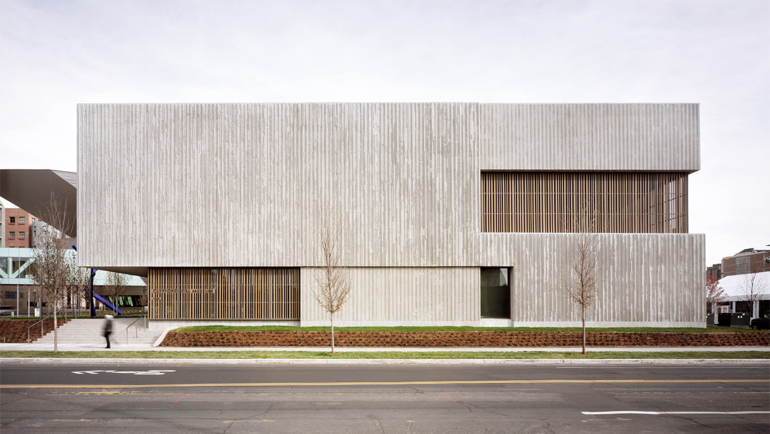
Clyfford Still was an abstract expressionist painter known for expressive brushwork, abstract forms and monumental scale. Located in Denver’s Civic Center, the museum is devoted to Still’s life and work. Formed with a new public forecourt with a dense grove of deciduous trees, the design is a simple, rectangular structure organized on two floors with nine interconnected galleries.
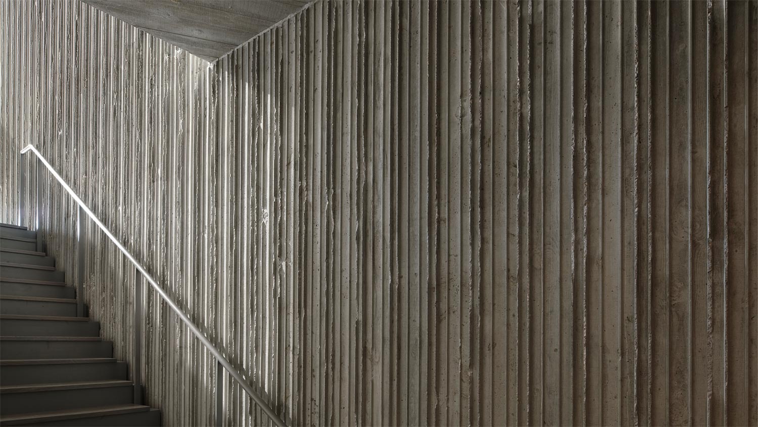
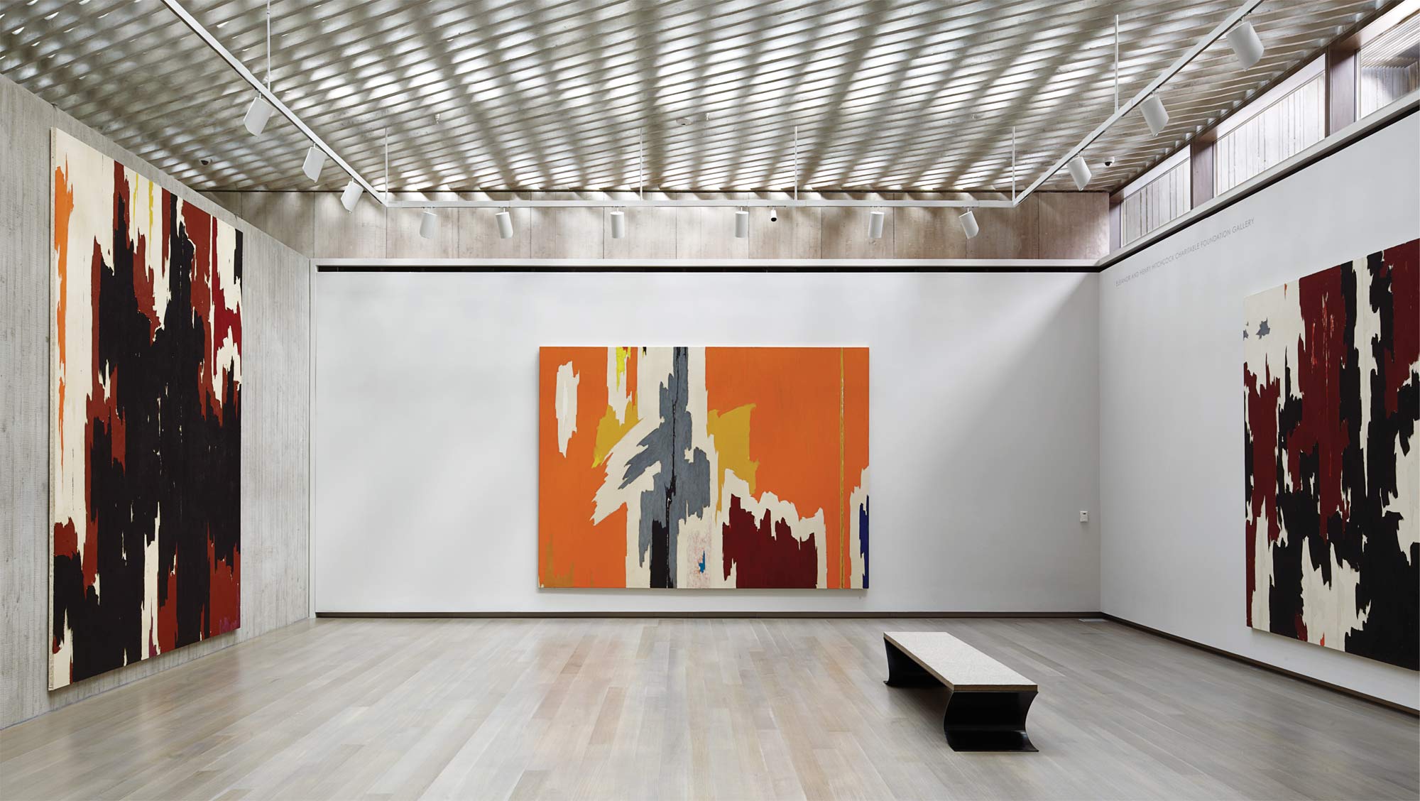
These gallery spaces were meant to respond to the evolving character of Still’s art through proportion, scale and intensity of light. At the same time, the galleries respond to specific needs of the collection, and are chronologically organized to trace the phases of Still’s career. Showcasing construction and materials, the project features cast-in-place concrete with a variety of specialized wood formed finishes, stained white oak, and western red cedar. The concrete finishes were created as thin, vertical and fractured lines.
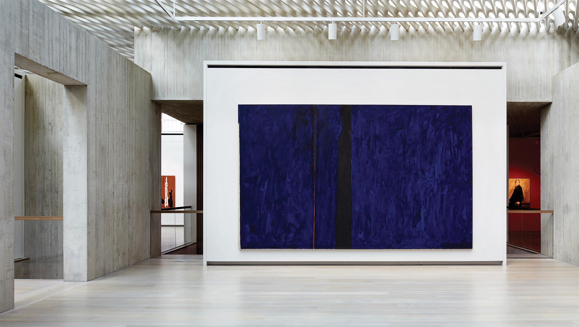
Photograph by Jeremy Bittermann
Rethinking the most widely used manmade material, the museum uses a custom blended concrete sourced from Texas and Wyoming mixed with both fine and coarse aggregate. Building information modeling was used to prepare lift and shop drawings for the building concrete. Made with exterior and interior walls ranging from one to two feet thick, the walls double as structural elements. Poured 43ft high with no horizontal construction joints, the walls were made with a stainless-steel vertical crack-control system behind the face of the concrete. The building models incorporated each tie-hole and wood pattern, as well as the form savers and rebar.
While steel panel forms were built, a wood-batten pattern was used to create the building façade. The concrete was poured over multiple months in varied weather conditions. Over 4,600 cubic yards of concrete was used in the foundation, walls and decks. As such, a range of admixtures were included in the concrete to maintain consistency. The milled-wood form liners were detailed and placed as individual vertical strips throughout the design. Cloepfil used intersecting concrete planes for the walls, floors and ceilings. Various planks of Hem-Fir wood were used as the formwork. Saunders Construction created the building’s fins by beveling some of the Hem-Fir formwork boards. Gaps were left, and the fin edges broke as boards were pulled off to create the museum’s jagged surface. The result is vertical lines that reference Still’s paintings.
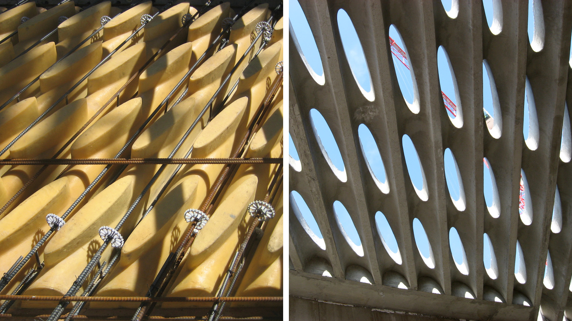
Photographs courtesy Allied Works
Photograph by Jeremy Bittermann
In the galleries, a poured-in-place concrete screen was created in collaboration with Arup and KPFF. The thin surface features distorted ovals that run diagonally across the ceiling. Structurally tied to the adjacent walls, this allows light into the galleries below.
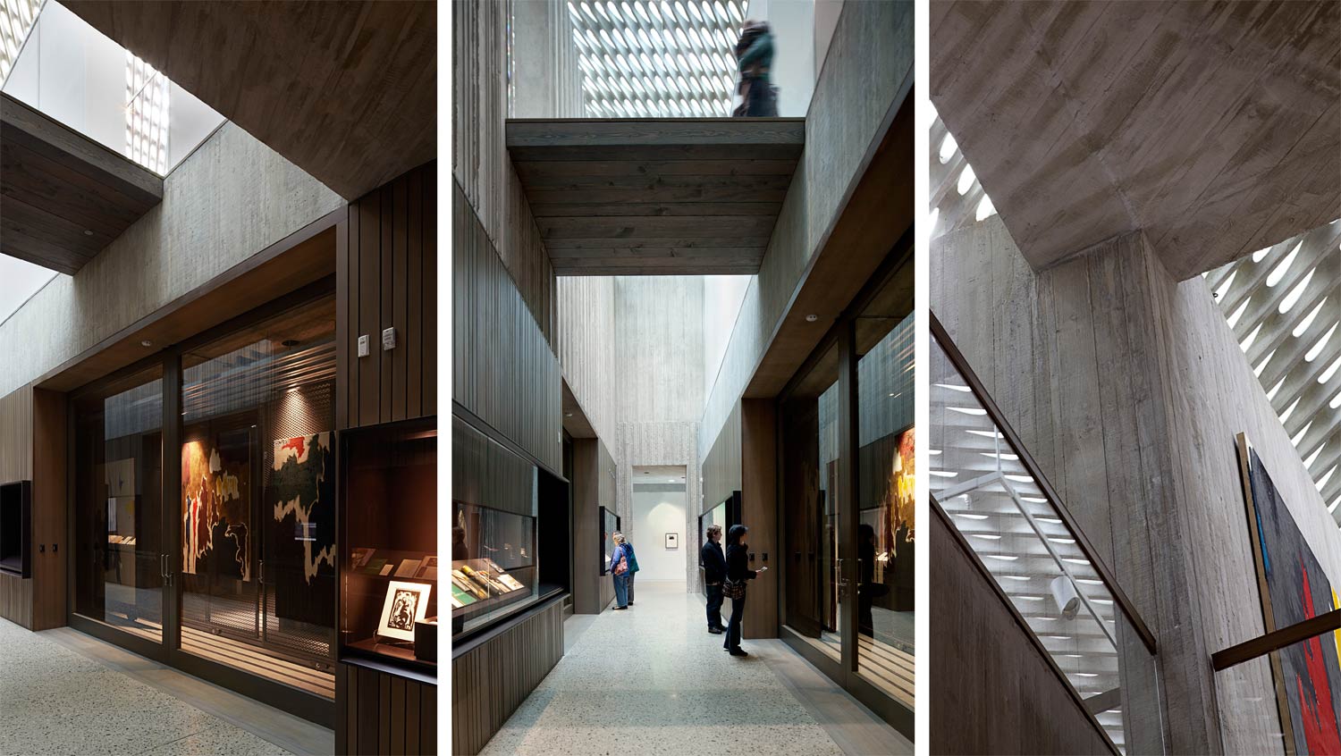
Likewise, formwork in the poured concrete ceiling in the lobby runs at a 30-degree angle, and is reflected in the concrete ceiling screen on the floor above. Natural light also filters through a series of skylights built to work with diffusing glass, motorized shades, and electric light. The concrete stands as a heavy structural element within the building, with a range of flat walls and vertically ribbed walls.
Photographs by Jeremy Bittermann
Complexity and depth was created by applying three different textures. Flush boards were used to form the interior gallery walls, while boards were routed for a 3/4 inch relief at inset walls and a 1-1/2 inch-thick relief on the thickest walls. Together, these form seven different fins. On the ground floor, a flush, rough-sawn pattern makes the vertical planes appear as rough pillars, while along the street the ridges are tightly spaced to address the western sun.
As a building made, the Clyfford Still elegantly rethinks concrete in relationship to light. As Cloepfil said, “We wanted the concrete to create the light, and the light to have weight.” By changing the rhythm of the concrete formwork, the texture of the building envelope varies and breaks down the elevation. Two patterns were used for the façades based on how the building faces intersected with the ceiling geometry. Revealing a process of making while catching light, the design’s handcrafted aesthetic embodies a rigorous and critical approach to architectural detailing.
Architects: Want to have your project featured? Showcase your work by uploading projects to Architizer and sign up for our inspirational newsletters.
