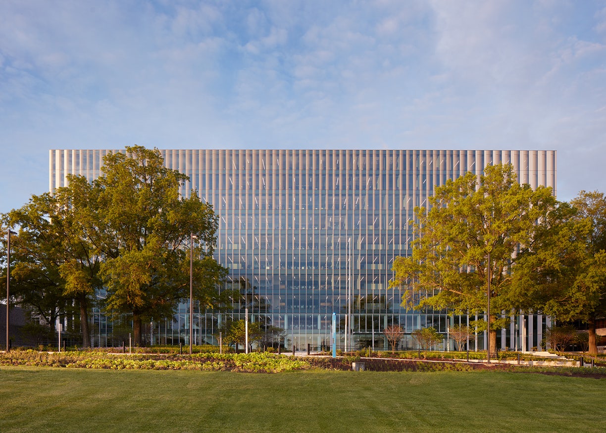
The Arthur J. Altmeyer Federal Building serves as the primary offices for the Social Security Administration personnel and executive leadership. It is a ten-story concrete framed building houses the campus boiler plant in its basement and has had no major alteration since its construction in 1959. The team was tasked with pushing the performance and workplace into the future, while honoring its history. This transformation symbolizes the investment in the future of Social Security. The vertical expression of the new façade reinstates Altmeyer as the signature building of the campus and a manifestation of Social Security: dutiful and restrained.
Architizer chatted with Matt Kreilich from Snow Kreilich Architects to learn more about this project.
Architizer: What inspired the initial concept for your design?
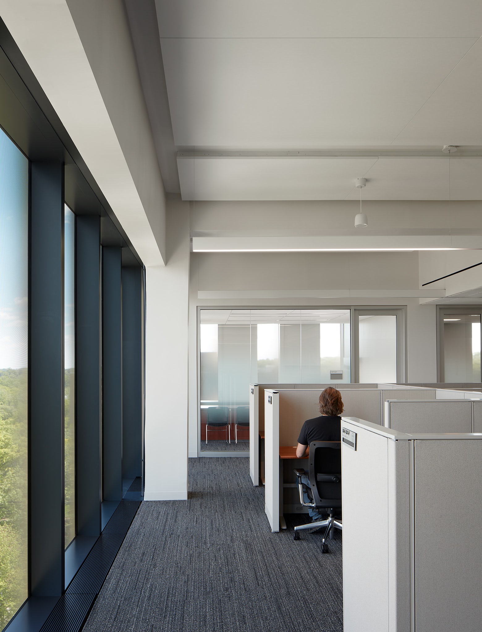
Matt Kreilich: The existing building was not well-adapted to the site from either a performative or civic standpoint. There was a 20-degree temperature swing from the north side of the building to the south due to a minimally insulated original façade system, inefficient mechanical systems, and a compartmentalized floorplate off a long double-loaded corridor. The critical need for improved occupant comfort first drew upon passive design strategies to influence the design. Its long slender footprint allowed the design to keep a more transparent public north face, while controlling heat gain with more opaque south, east and west facades. The private offices and workstations were pulled off the perimeter allowing a thermal buffer for the occupants. The largest conference spaces were co-located on the lowest two levels to create 33% more efficient use of space.
© Kendall McCaugherty © Hall + Merrick Photographers
What do you believe is the most unique or ‘standout’ component of the project?
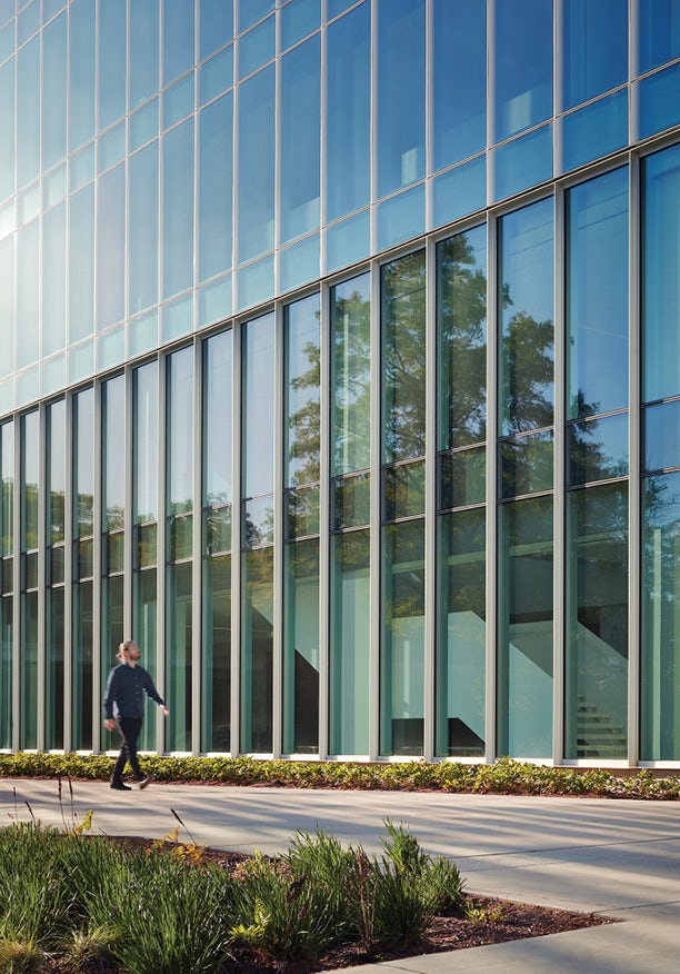
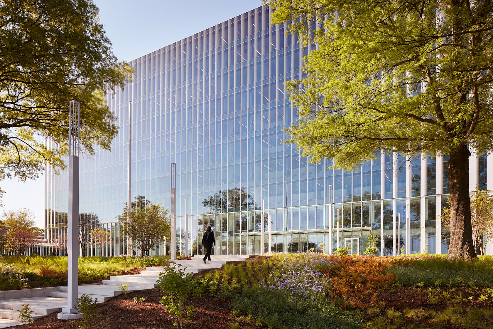
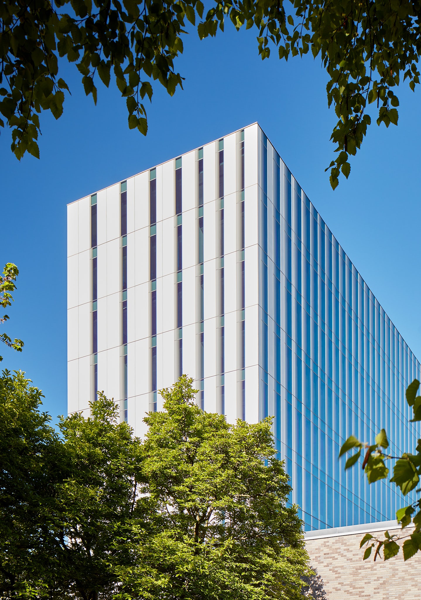
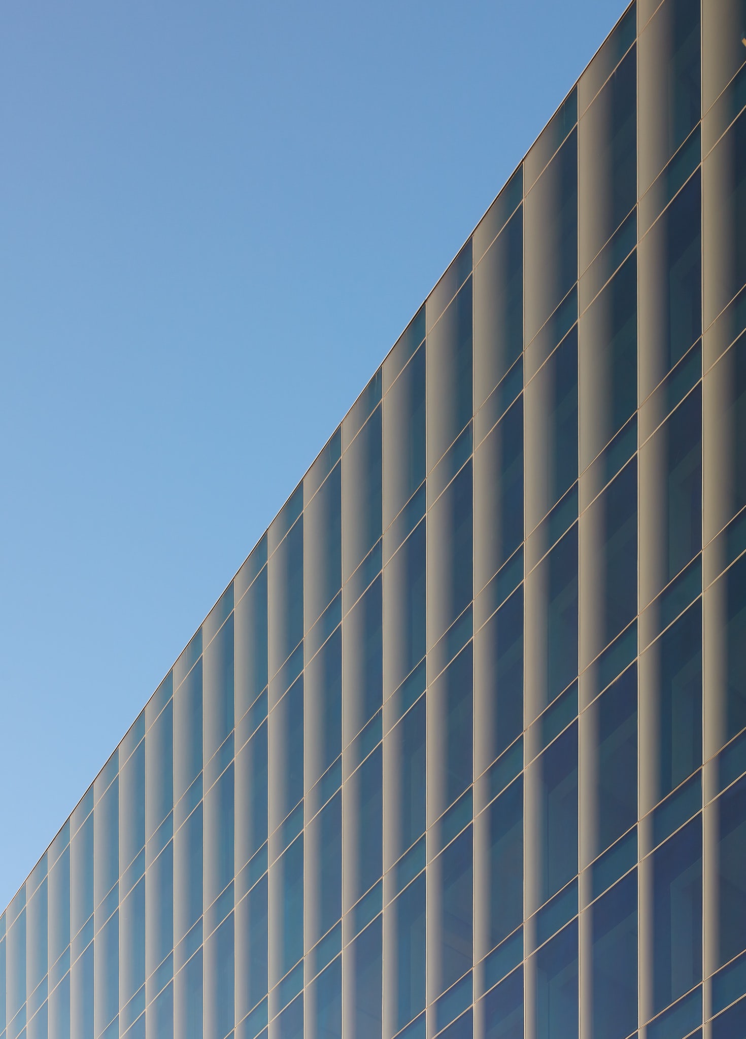
The most compelling component is the adaptable façade design, and the way it smoothly transitions from fully transparent glass to opaque aluminum panels through a gradation of panel sizes and frit configurations. Carefully tuned to neighboring buildings, site vegetation and solar orientation, the façade design increases occupant comfort by mitigating glare and solar heat gain while providing biophilic views and daylight throughout all regularly occupied spaces.
© Kendall McCaugherty © Hall + Merrick Photographers
What was the greatest design challenge you faced during the project, and how did you navigate it?
The greatest challenge was achieving a 16% Energy Use Index (EUI) improvement over the ASHRAE baseline while plugging into an existing campus boiler plant within the basement of the building. The campus plant had to maintain operation throughout the life of the project and beyond. Any mechanical systems selected for the Altmeyer Building had to be compatible with the existing plant making the high-performance façade compensate for a relatively dated physical plant. In addition, the installation of the new enclosure had to happen quickly, and maneuver around a secure site.
© Kendall McCaugherty © Hall + Merrick Photographers
How did the context of your project — environmental, social or cultural — influence your design?
It was important to honor the history of the agency as well as push the performance and workplace into the future. In this role, the modernization of this building needed to reflect the Four Guiding Principles of Social Security:
- Best investment of taxpayer dollars
- Most effective use of space
- Safety and security of SSA employees
- Optics (both internal and perceived)
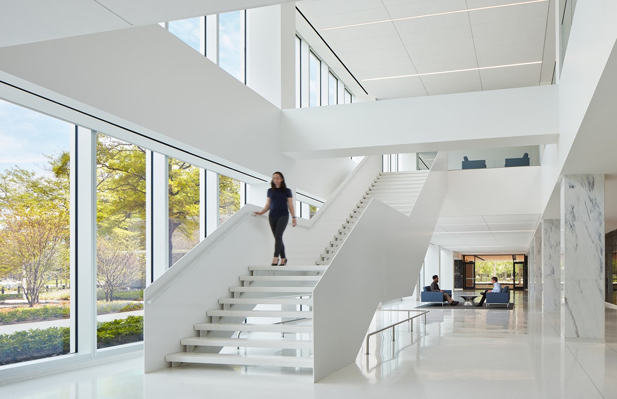
In addition to the Social Security’s goals, the GSA’s PBS-100 Standards and the Design Teams’ commitment to the AIA 2030 initiative, minimizing the carbon footprint, improving performance, and resilience were major influencers in the design. In the end, the design allowed daylight into all habitable spaces, through finely tuning the openings to the solar orientation, while reducing solar heat gain. After the passive strategies were outlined, mechanical system design supplemented the overall performance.
© Kendall McCaugherty © Hall + Merrick Photographers
What drove the selection of materials used in the project?
The exterior drew upon the tonality and subtle variations of the original building’s gray brick but re-cast the material with a lighter, more transparent character. When considering durability, maintenance, and patina, anodized aluminum became the key opaque material. The applied micro texture softens the light and reflections of the surrounding landscape and celebrates the subtle color variations throughout the day.
The completely reconfigured workplace interiors were designed to be bright and luminous. Wherever possible, the existing building’s concrete structure was exposed and painted white to allow indirect daylight deeper into the floorplate. The elevated materials were re-used and re-configured to create moments speaking to the agency’s history. Doing so salvaged more than 56% of the building’s construction waste and diverted 3,402.26 tons of waste materials from landfills.
© Kendall McCaugherty © Hall + Merrick Photographers
What is your favorite detail in the project and why?
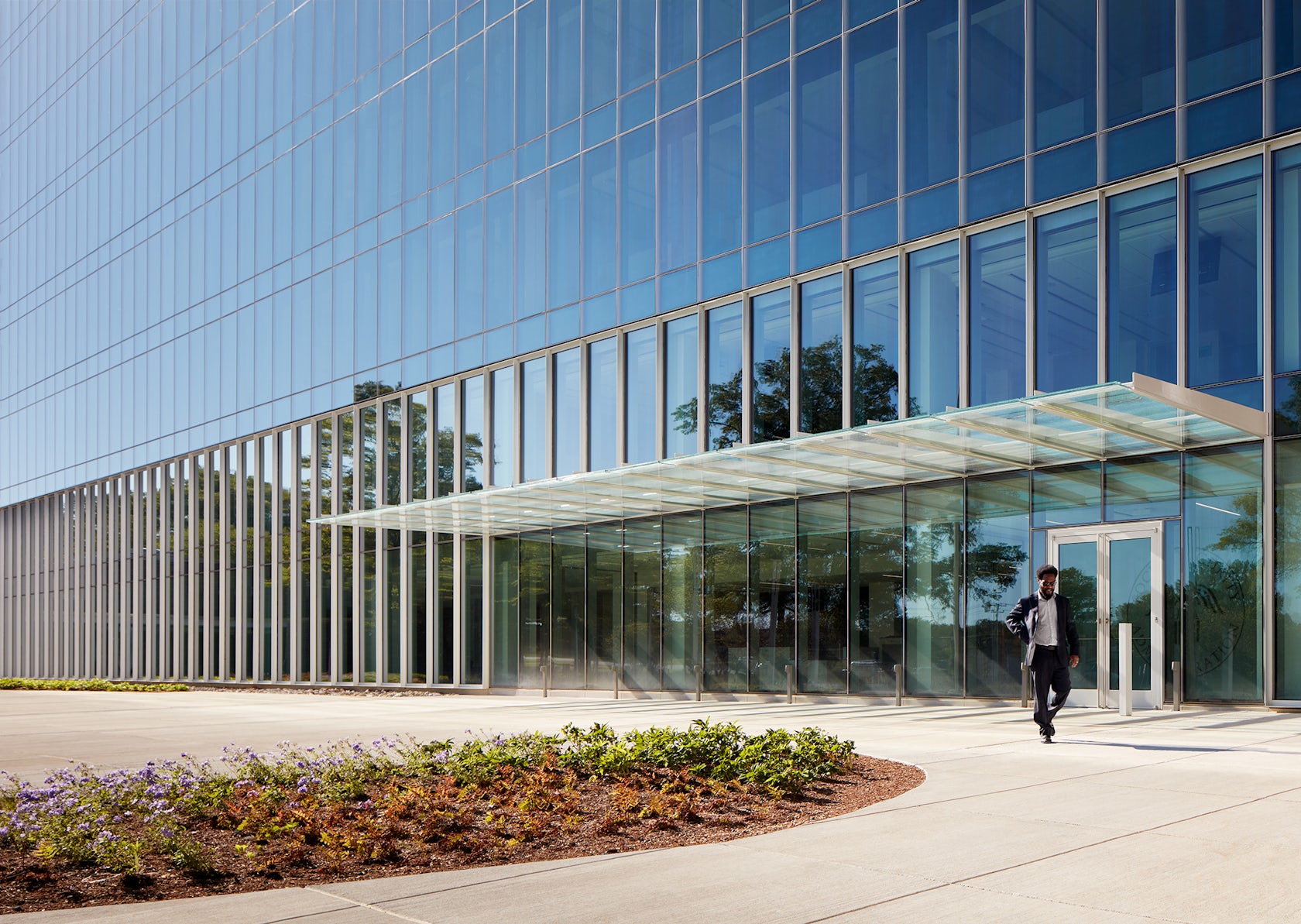
The main entry canopy details are especially interesting. They address many challenges within its configuration but manages to maintain a clean and minimal profile. The canopy’s 13’ cantilever, carefully threads through the Curtain Wall, and attaches back to the original concrete structure. The canopy creates a pedestrian scaled expression lifted from the façade system at grade to punctuate the entry point using the same visual vocabulary. Thermal isolation details, rain diversion, and security measures are all integrated into the details while keeping the canopy visually restrained.
© Kendall McCaugherty © Hall + Merrick Photographers
How important was sustainability as a design criteria as you worked on this project?
The performance, durability, resilience, and carbon footprint of the project were driving factors of almost all the design decisions along the way. The team was dedicated to designing a high-performing building and committed to its realization through a continuous feedback loop of full building energy models, performance mockups, enclosure commissioning, and enhanced commissioning. Every step in the process was an opportunity to optimize the detail toward a collective performance in the end. In addition, the goal of providing equitable access to quality daylight and views within the space guided many of the design decisions.
© Kendall McCaugherty © Hall + Merrick Photographers
In what ways did you collaborate with others, and how did that add value to the project?
Collaboration throughout the design and construction process was paramount to an integrated and high-performance design. The Peer Reviews with the GSA as part of their Design Excellence Program set a high bar for the performance and durability of the project from both a security and environmental perspective. The mechanical engineers led a continuous feedback loop between the evolving design and the full building energy model. The façade fabricators, installers, and GC collaborated with the design team to optimize schedule, constructibility, and costs while maintaining the aesthetic expression. These daily efforts by all parties resulted in the finely tuned unitized façade system.
© Kendall McCaugherty © Hall + Merrick Photographers
Were any parts of the project dramatically altered from conception to construction, and if so, why?
To achieve the high-performance goals, originally the façade design consisted of double height panels. However, due to some factory limitations of the selected fabricator, the enclosure system needed to be modified to a single-story unitized system. With more joints in the system, it became a challenge to achieve the original performance goals established early in the design process. However, the close collaboration of the full team brought the overall performance within the original goals and even eliminated some steel in the process. Through this process, the original design intent of a strong vertical expression was maintained as were the performance goals.

© Kendall McCaugherty © Hall + Merrick Photographers
How have your clients responded to the finished project?
Social security personnel have gravitated toward the day-lit workspaces and commented on how open each floorplate feels. It supports a less silo’ed experience, and a more comfortable workplace.
What key lesson did you learn in the process of conceiving the project?
A constant feedback loop of enclosure and systems performance at a detail level as well as at an overall level is essential in making a high-performance design become a reality. The constant testing of assumptions from the thermal analysis at the details, to the overall building performance kept the design on track. The material and formal development of the enclosure and spatial qualities of the interior must be developed simultaneously.

© Snow Kreilich Architects
How do you believe this project represents you or your firm as a whole?
Our studio thrives on collaboration and integrated design. We feel there is more depth to the design and richness in the spatial experience when there is extensive collaboration. Context can be celebrated and enhanced through simple yet layered moves.
How do you imagine this project influencing your work in the future?
Through this project, we developed a great relationship with our mechanical engineer, façade fabricators and installers, in particular. The collaboration with all parties of this project pushed each team member a bit further. No one team could have provided a complete solution for this complex project. In the end we found the collaboration truly rewarding, and will look to create the conditions for this kind of synergy on future work.
Team Members
Julie Snow (Snow Kreilich); Matt Kreilich (Snow Kreilich); Tyson McElvain (Snow Kreilich); Kathryn Van Nelson (Snow Kreilich); Doug Gerlach (Snow Kreilich); Natalya Egon (Snow Kreilich); Brett Gustafson (Snow Kreilich); Matt Tierney (Snow Kreilich); Mia Blanchett (HGA); Deb Young (HGA); Paula Storsteen (HGA); Mark Zevenbergen (HGA); Ben Nilsson (HGA); Guillermo Arriondo (HGA)
Consultants
Sarah Berseth (HGA Mechanical); Sean Cotton (HGA Structural); Michael Woodson (HGA Electrical); Chrysanthi Stockwell (HGA Lighting Designer); Will Babbington (StudioNYL); Josh Moore (StudioNYL); Anneliza Kaufer (The Olin Studio); Sarah Miller (The Olin Studio); Ben Townsend (WDP & Associates); James Reinertsen (Sustainability Design Consultants); Evan Shook (facadetek)
For more on Arthur J. Altmeyer Social Security Federal Administration Building Modernization, please visit the in-depth project page on Architizer.


 Arthur J. Altmeyer Social Security Federal Administration Building Modernization
