Do you have an outstanding image that tells a compelling architectural story? The 2026 Vision Awards has a range of categories, from hyperrealistic or artistic renderings to expressive drawings or hybrid digital mediums. Start your entry >
Drawings are intrinsically tied to scale. The relationship between linework, program and detail directly relates to what we’re trying to represent. As architectural projects become larger and more information needs to be conveyed, sometimes the best move can be to show more with less. This is especially the case in skyscraper drawings, where the scale of a building requires careful consideration of what you choose to show in technical and conceptual drawings, as well as what you choose to leave out.
Often, depictions of skyscrapers are through photographs. Whether capturing the building in its entirety through an urban or aerial shot, or simply framing a piece of the whole, rarely do we see drawings. Sections tell you about the human scale of a work, how things come together and how a building is made. Skyscraper sections are exercises in revealing specific types of information. Examining the relationships between drawing and monumentality, this collection of skyscraper sections explores representation at an epic scale
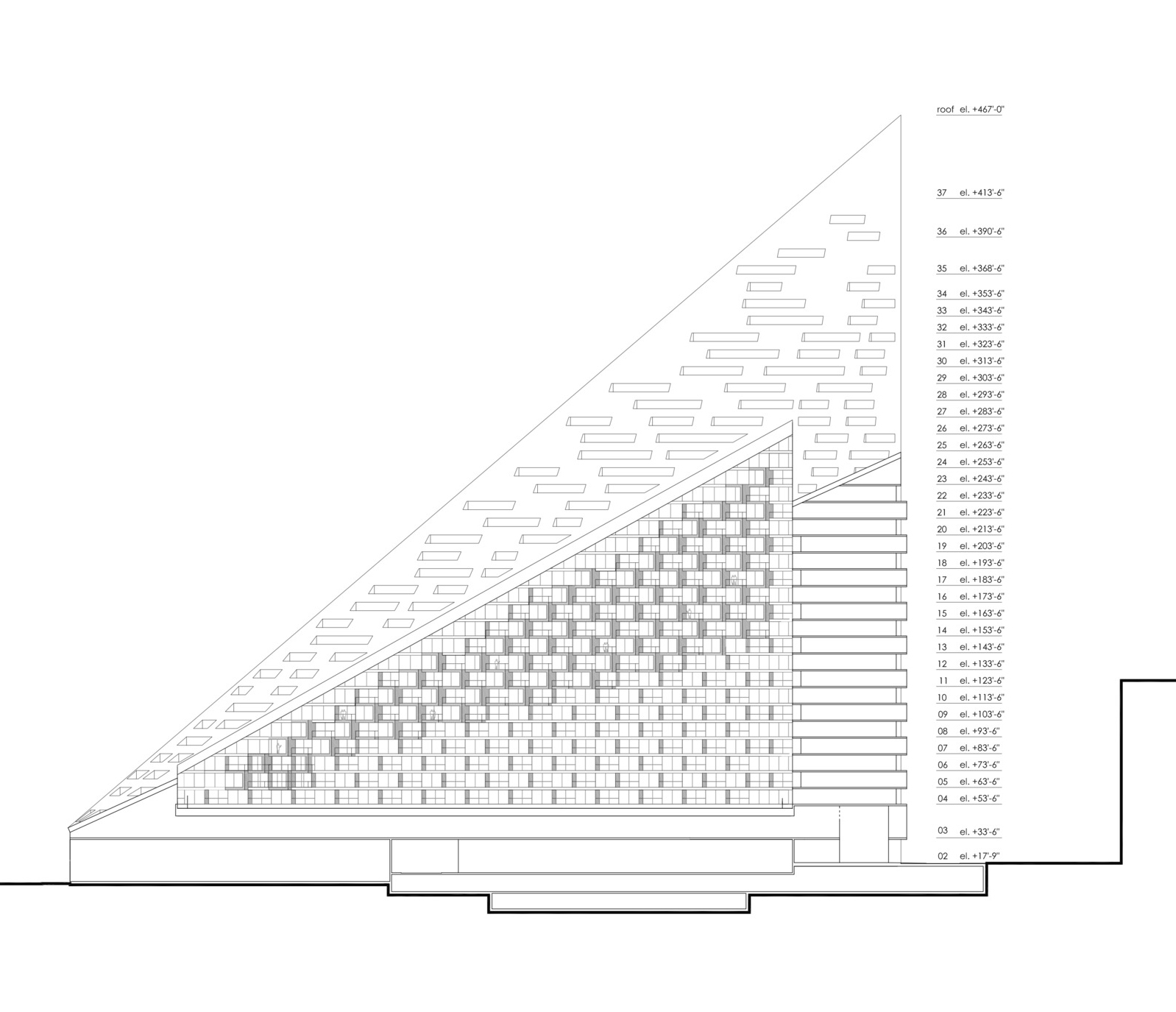
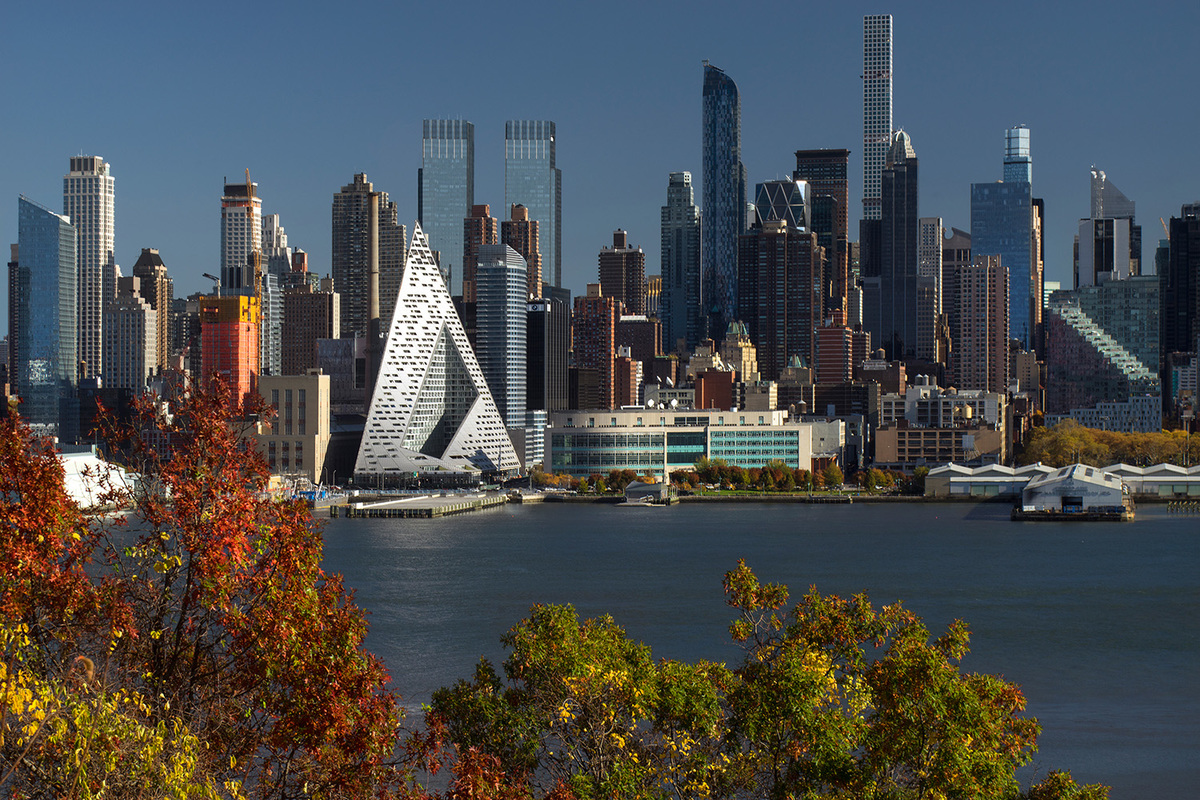 VIA 57 West by Bjarke Ingels Group, Manhattan, New York
VIA 57 West defies convention. Challenging the status-quo, the iconic skyscraper was designed by Bjarke Ingels Group as a new landmark in the skyline of lower Manhattan. Named the best skyscraper of the year by Emporis, the project’s “courtscraper” form combines the best qualities of a European perimeter block and a classic American skyscraper. By keeping three corners of the block low and lifting the north-east corner up towards its 450 ft peak, the courtyard opens views towards the Hudson River, bringing low western sun deep into the block and graciously preserving the adjacent Helena Tower’s views of the river.
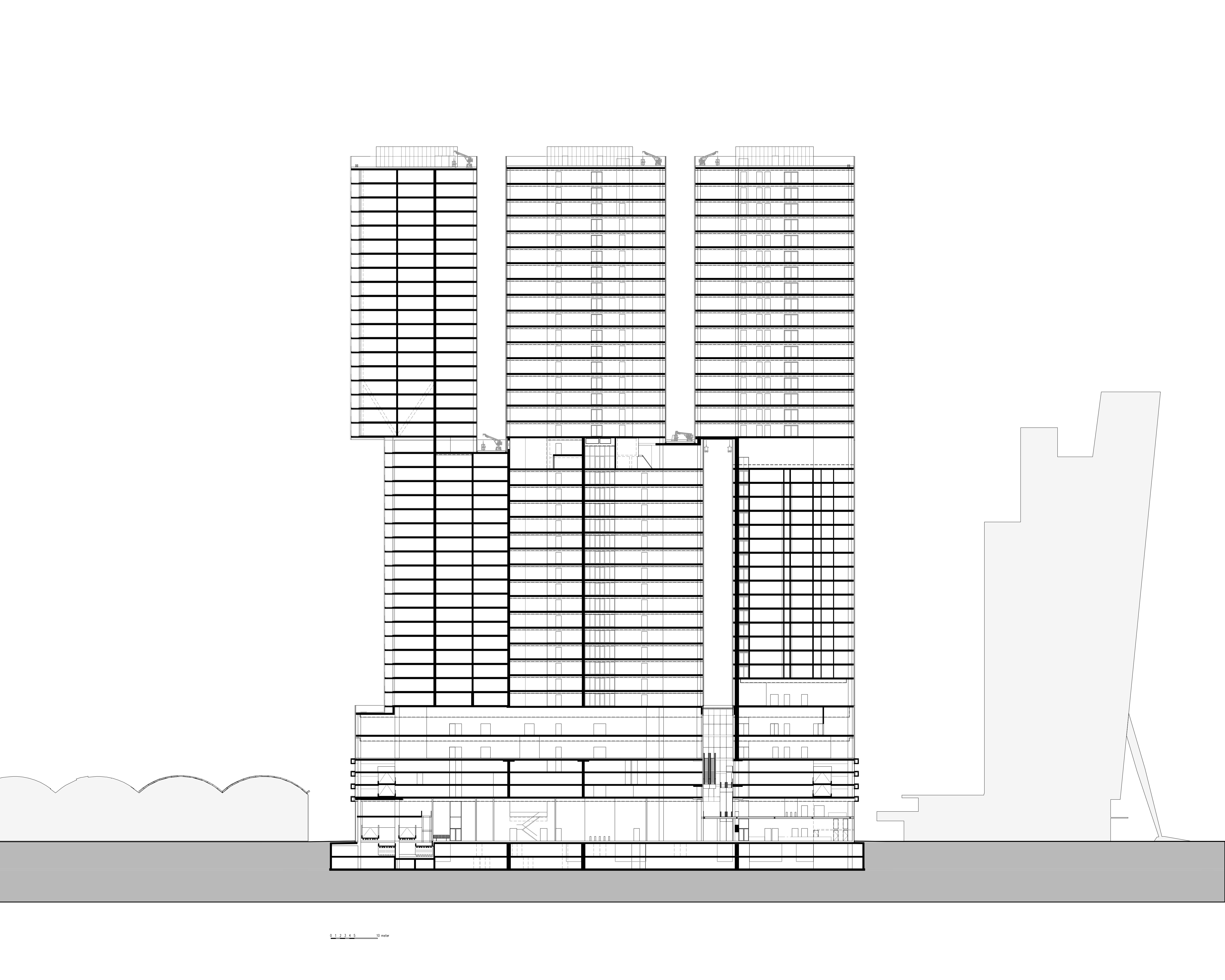
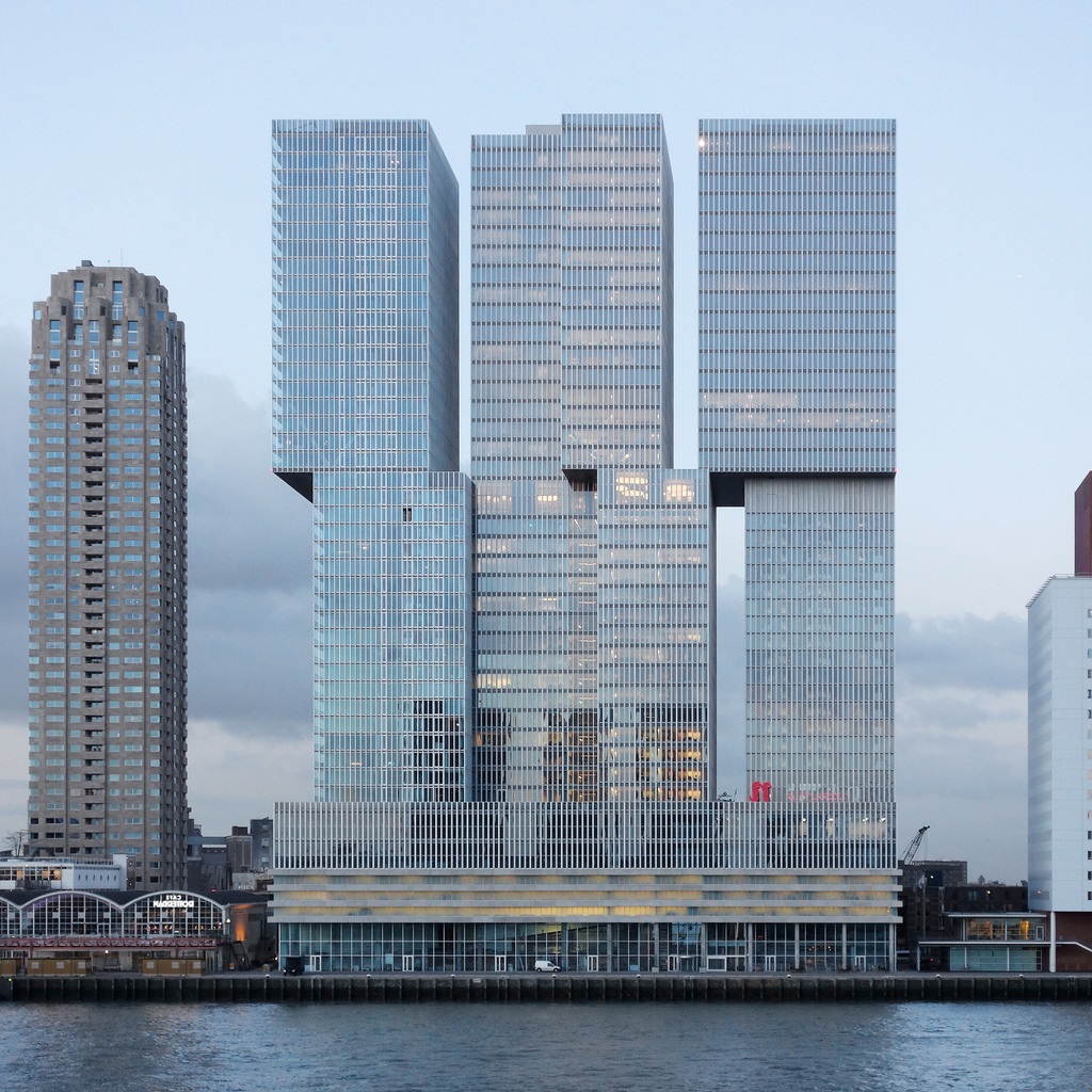 De Rotterdam by OMA, Rotterdam, Netherlands
Standing as the largest building in the Netherlands, OMA’s De Rotterdam project explored urban diversity and density through three monumental towers joined by a shared plinth. Made with subtly irregular stacks, the design organizes program into distinct blocks that embrace a wide variety of uses. The building envelope was designed with floor-to-ceiling glass windows overlooking the River Maas. De Rotterdam’s external faces have been clad with an aluminum post-and-beam construction, making for a filigree appearance which changes depending on the viewer’s position.
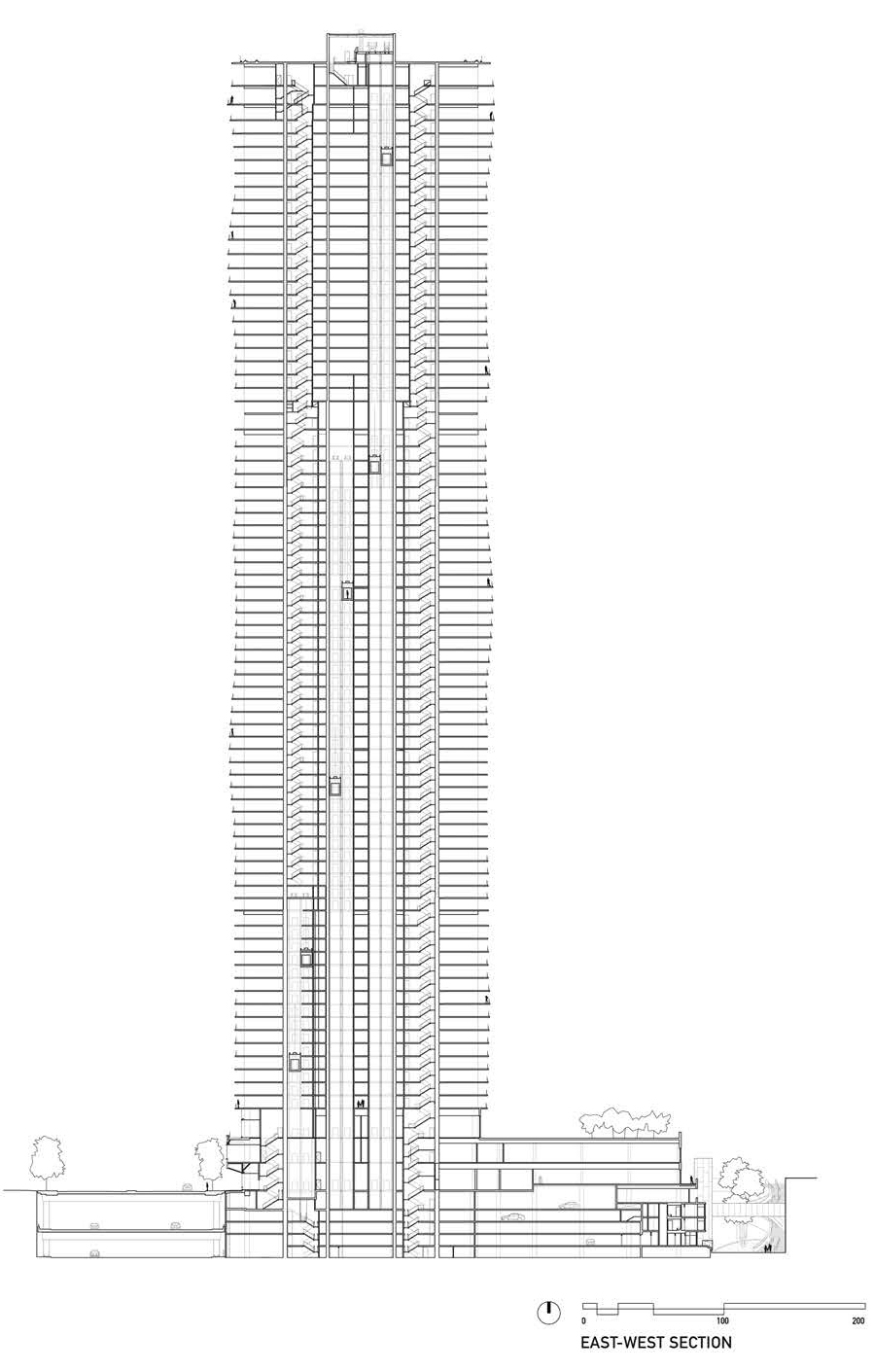
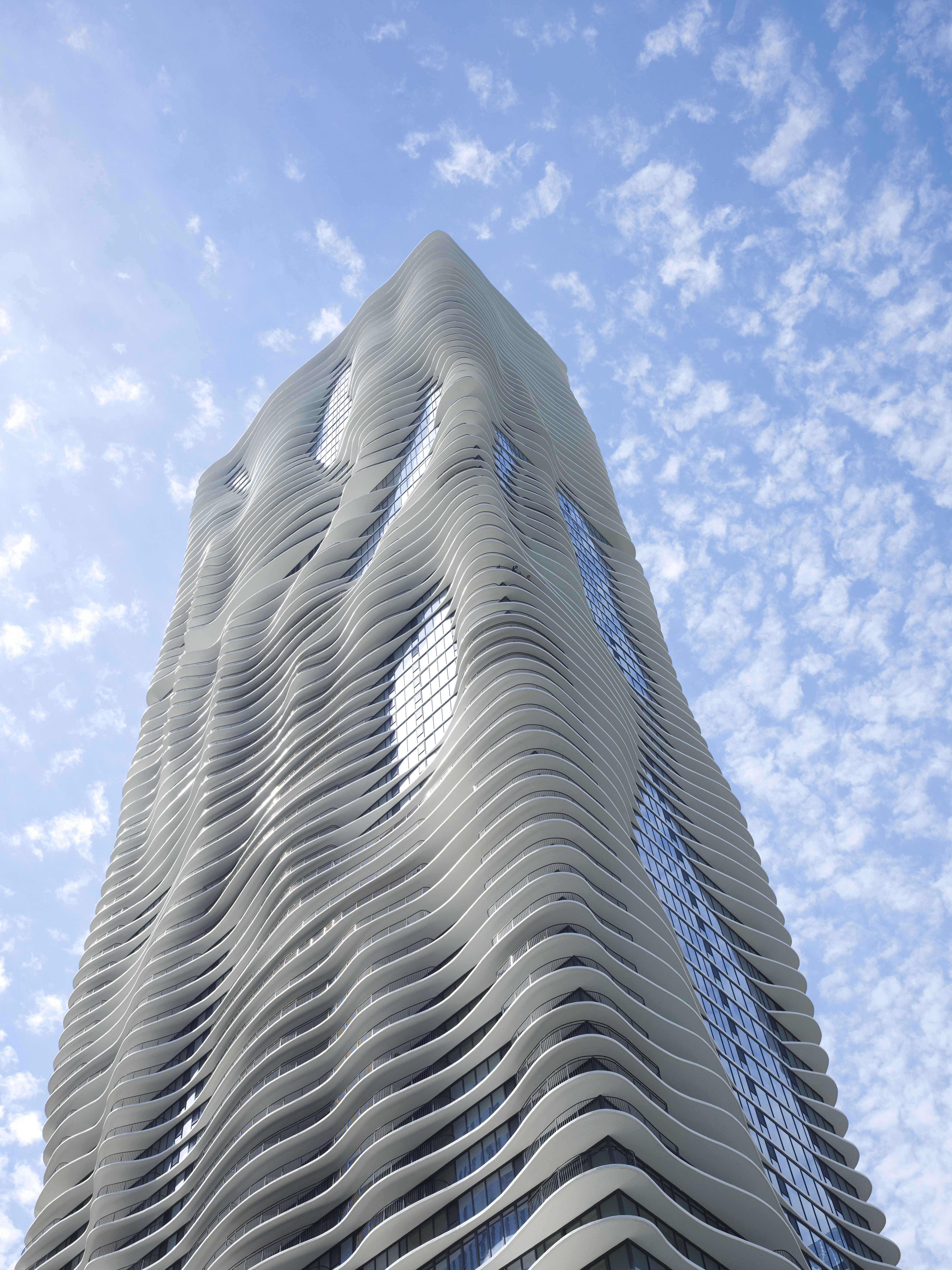 Aqua Tower by Studio Gang, Chicago, IL, United States
Aqua Tower is one of few tall buildings to create a community on its facade. Combining a hotel, offices, rental apartments, condominiums, and parking, along with one of Chicago’s largest green roofs, Aqua facilitates strong connections between people and to the city. The design for Aqua uses architecture to capture and reinterpret the human and outdoor connections that occur more naturally when living closer to the ground. Its distinctive form is achieved by varying the floor slabs across the height the tower, based on criteria such as views, sunlight, and use.
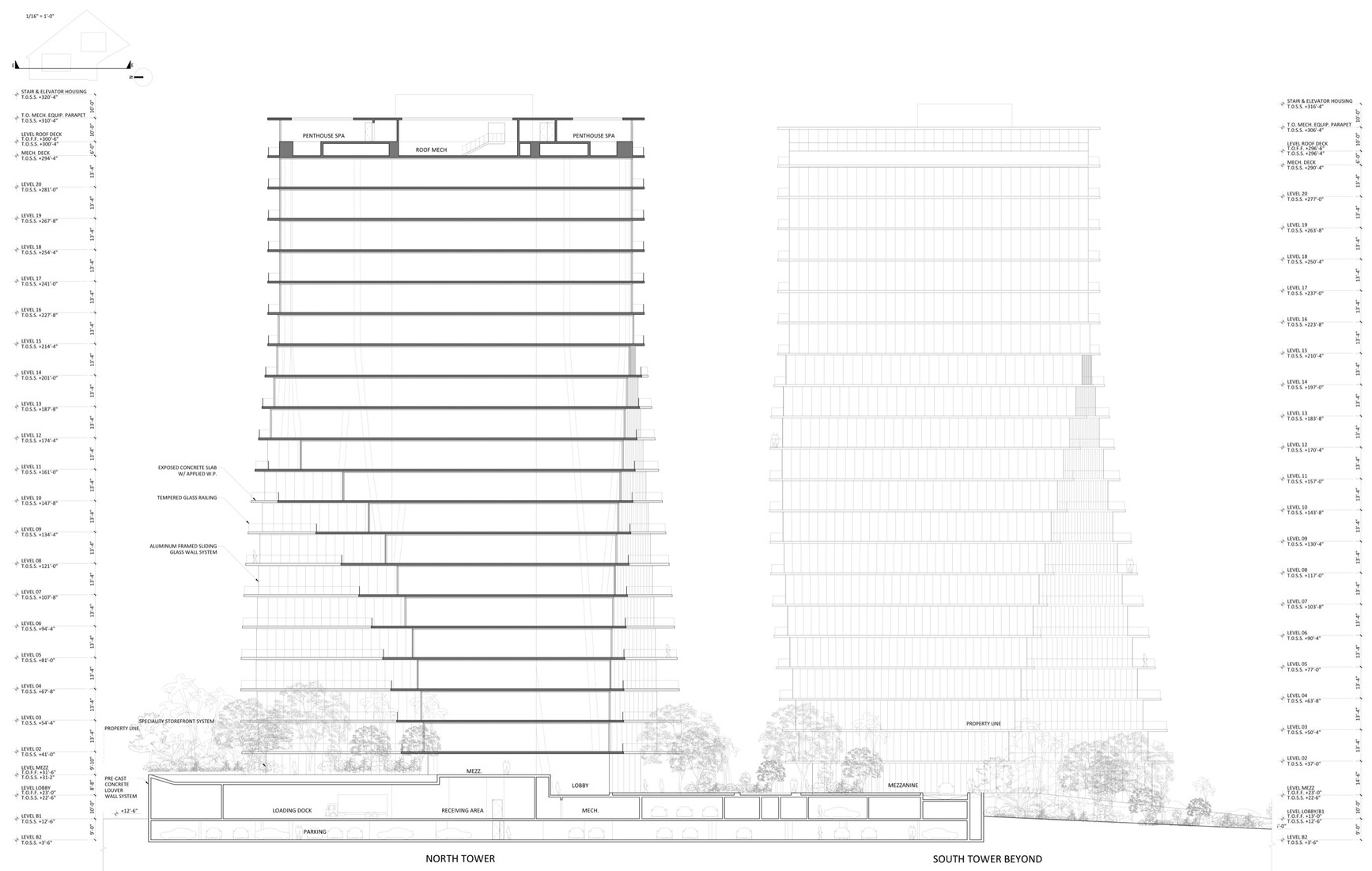
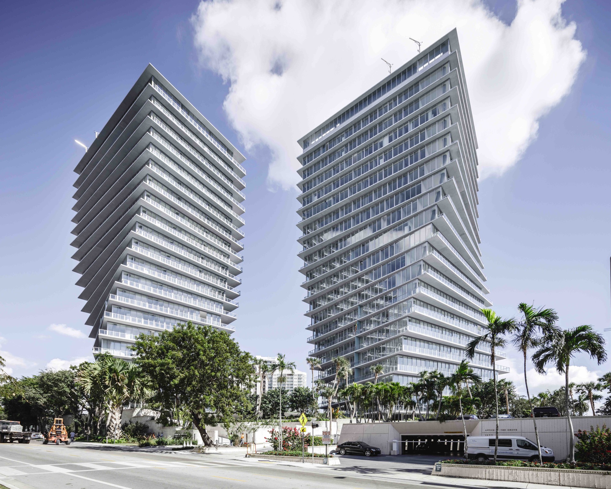 Grove at Grand Bay by BIG – Bjarke Ingels Group, Miami, FL, United States
The two towers of the Grove at Grand Bay respond to the surroundings and to each other, to give optimum views at every level. The towers take off from the ground to capture the full breadth of panoramic views from sailboat bays and the marina to the Miami skyline. Along the façade you can see the horizontal component of the gravity load in the columns that’s resolved in the slabs by transferring it to the interior core shear walls, which are the only consistently vertical structural elements in the building.
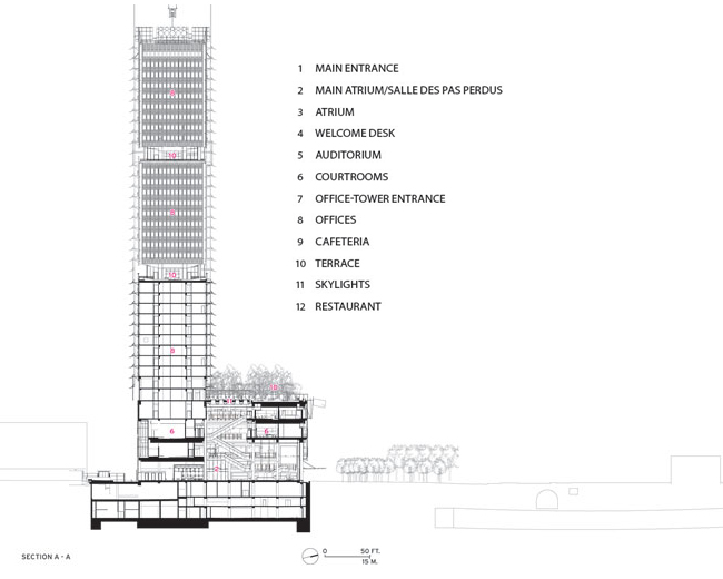
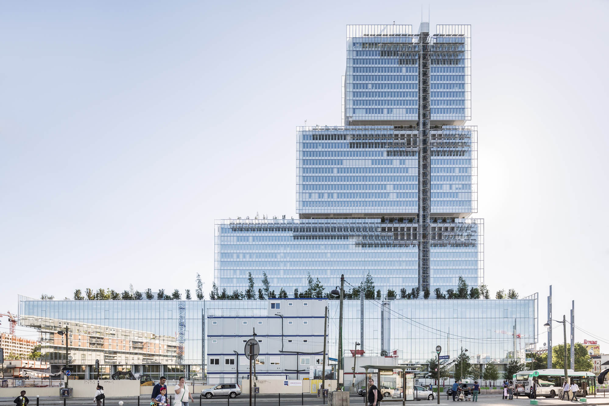 Paris Courthouse by Renzo Piano Building Workshop, Paris, France
This 525-foot-tall building is a series of stacked glass volumes sitting on an L-shaped site on the northern edge of central Paris. The key idea behind the design of the courthouse was twofold: to reunite all of the judicial institutions, law courts and offices that had been dispersed around the capital, and to provide a cornerstone piece of architecture that would mark the redevelopment of the Porte de Clichy neighborhood. The rectangular glass volumes are narrow and they reduce in size as the tower rises. Plenty of natural light reaches the interior through the long sides of the building and the double-skin facade.
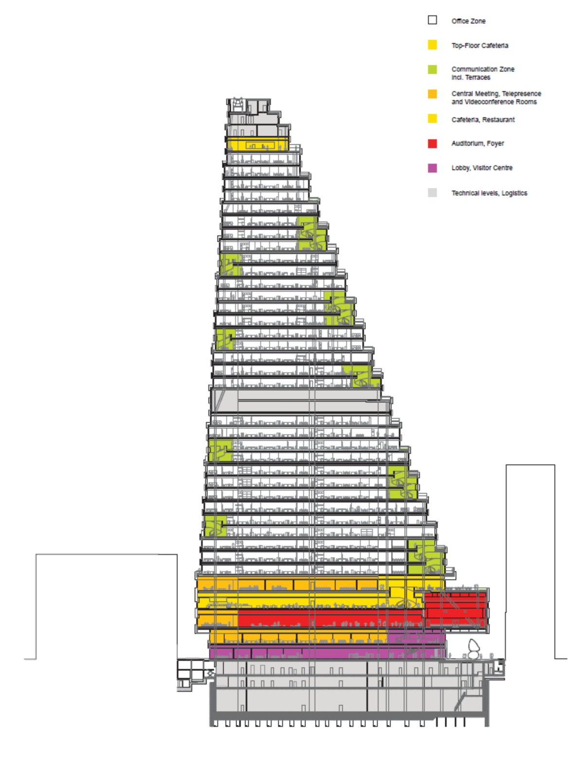
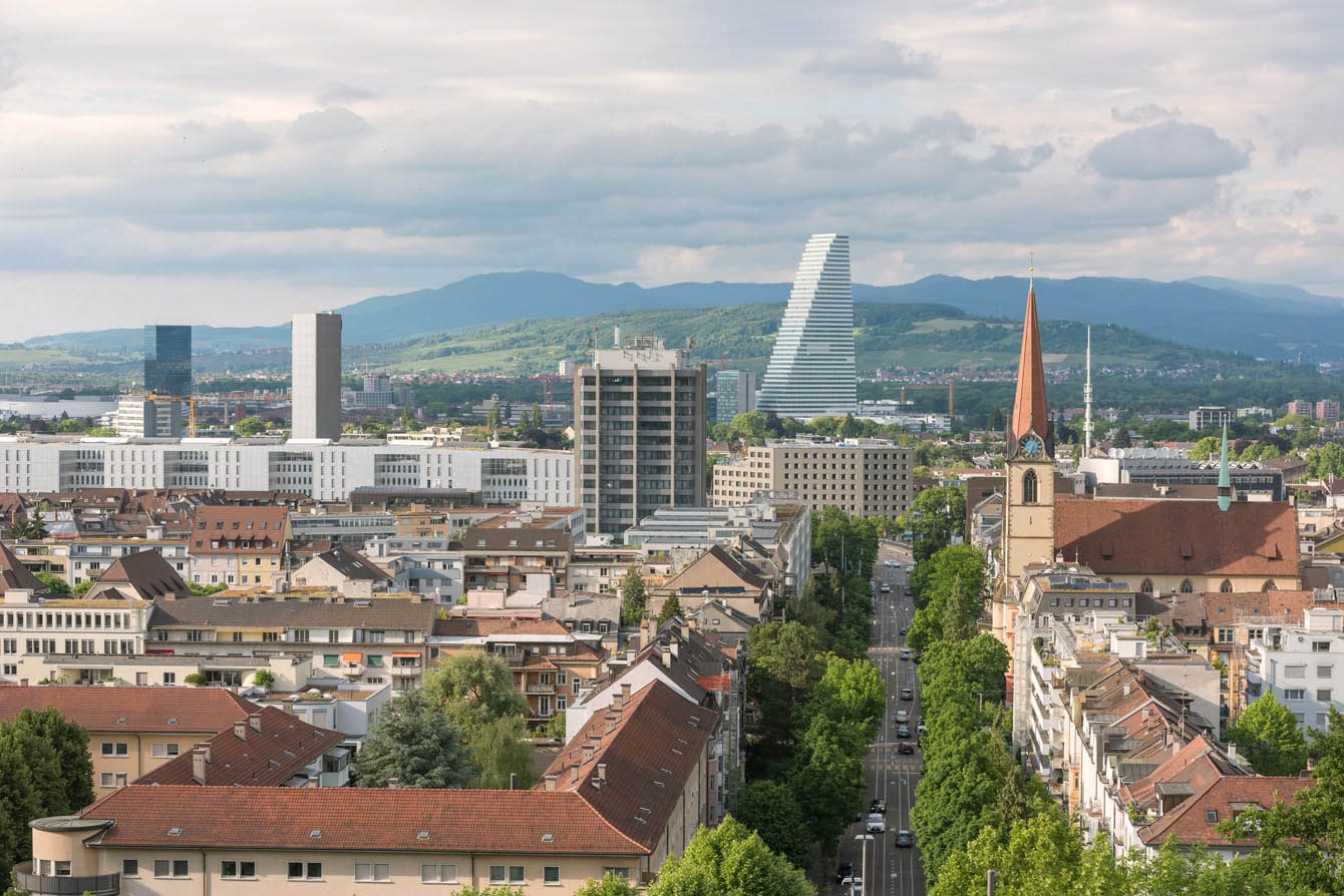 345 Roche Building by Herzog & de Meuron, Basel, Switzerland
For the design of this 178m tower, Herzog & de Meuron focused on developing a high-rise typology that visualizes and fosters the internal organization and communication within various departments. The tower houses workstations relating to various departments previously scattered throughout the city. These have been brought together in one place in a process of “office re-entry”. This allowed the team to create a smooth flow of communication between various departments. Office re-entry involves synergies enabled not only by the convergence of staff from different fields but also by the overall sense of corporate identity which is enhanced by the integration of staff on the site.
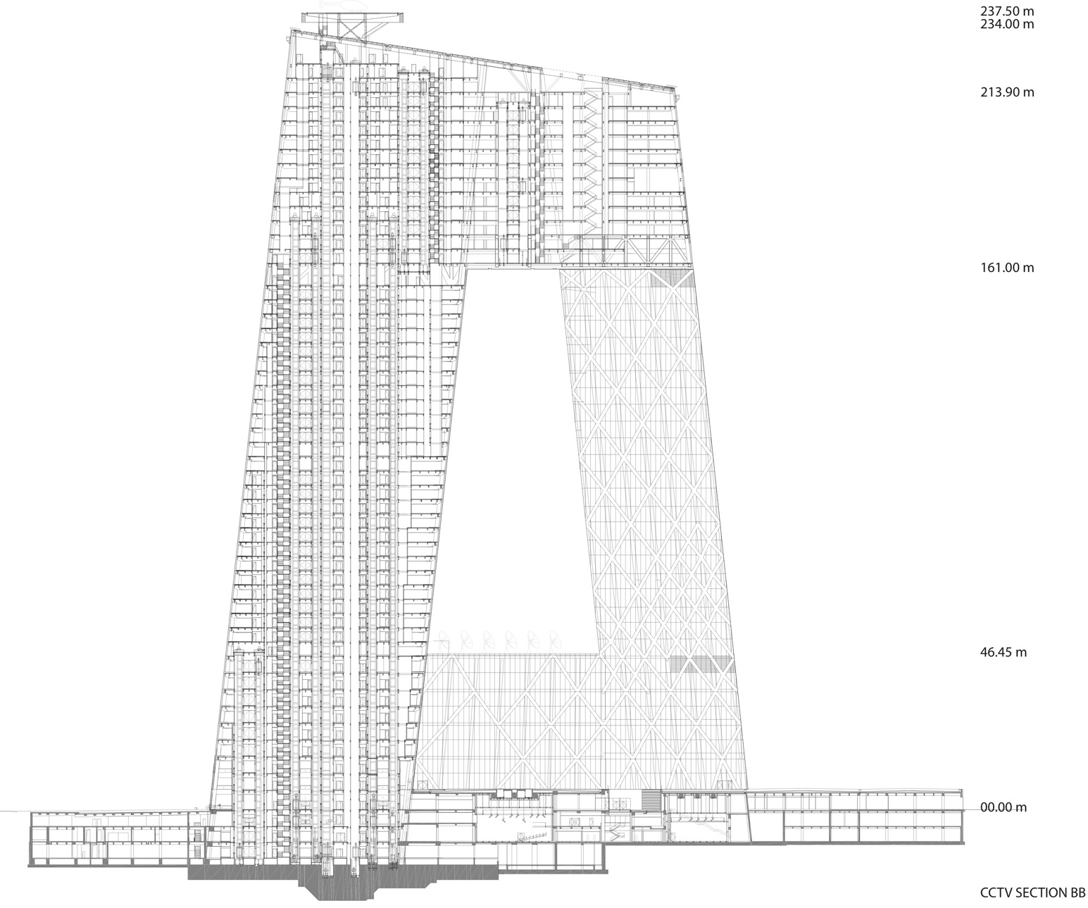
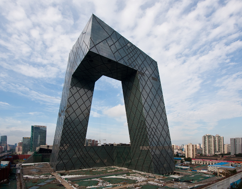
CCTV Headquarters by OMA, Beijing, China
The new headquarters for China Central Television combines the entire process of TV-making – administration, production, broadcasting – into a single loop of interconnected activity. Rising from a common platform accommodating production facilities, two towers – one dedicated to broadcasting, one to services, research, and education – lean towards each other and eventually merge in a dramatic, seemingly impossible cantilever. CCTV’s distinctive loop aims to offer an alternative to the exhausted typology of the skyscraper. CCTV proposes a truly three-dimensional experience, culminating in a canopy that symbolically embraces the entire city. CCTV consolidates all its operations in a continuous flow, allowing each worker to be permanently aware of their colleagues.
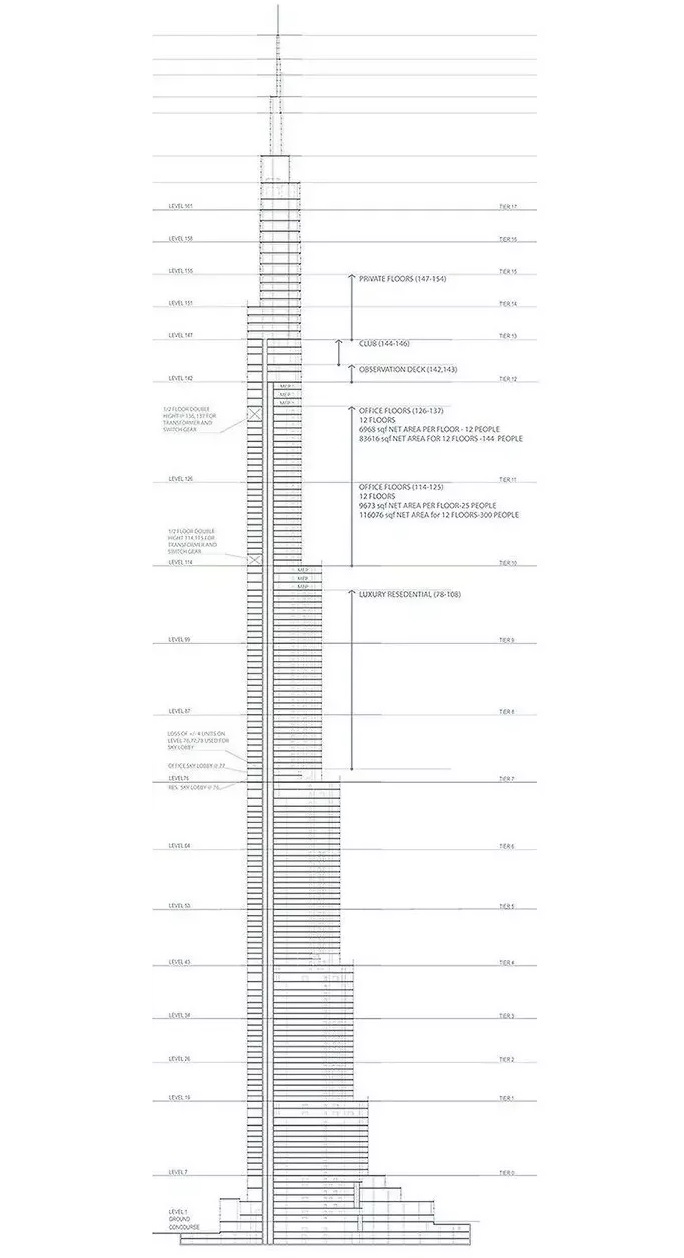
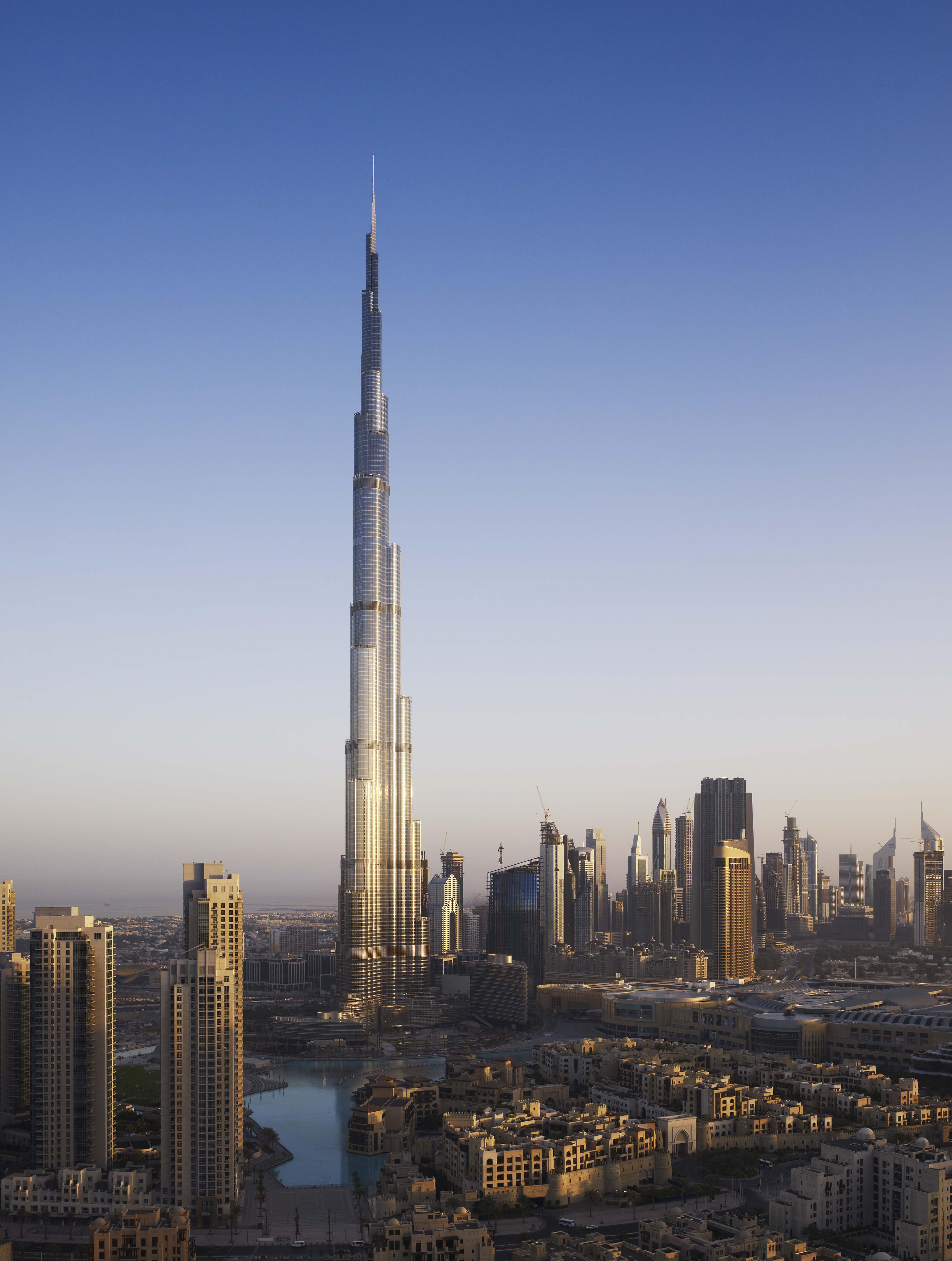 Burj Khalifa by Skidmore, Owings & Merrill LLP ( SOM ), Dubai, United Arab Emirates
The design and engineering of Burj Khalifa redefines the supertall building. By combining new technologies and cultural influences, the design firm created a global icon that is a focus of a model for future urban centers and speaks to the global movement towards compact, livable urban areas. The Tower and its surrounding neighborhood are more centralized than any other new development in Dubai. At the centerpiece of the new downtown, Burj Khalifa’s mixed-use program focuses the area’s development density and provides direct connections to mass transit systems. Burj Khalifa’s architecture has embodied references to Islamic architecture and reflects the modern global community it is designed to serve.
Discover More Architectural Drawings
Do you have an outstanding image that tells a compelling architectural story? The 2026 Vision Awards has a range of categories, from hyperrealistic or artistic renderings to expressive drawings or hybrid digital mediums. Start your entry >
All drawings and photographs courtesy of the architects.

 Aqua Tower
  Burj Khalifa
  CCTV Headquarters
  De Rotterdam
  The Grove at Grand Bay
  VIA 57 West