Architizer’s newest print publication is available for pre-order! How to Visualize Architecture is an educational guide designed to help you master the craft of architectural storytelling and visual communication. Secure your copy today.
Details define architecture. How a building comes together shapes the way we experience space, and in turn, the quality of a structure. Architecture begins at a material level, and from there we combine materials through detailing to control temperature and humidity, to create structural stability, or to simply shape an aesthetic. A project can be formally or spatially inspiring, but if it isn’t detailed properly, things can literally fall apart at the seams.
We’ve rounded up a collection of pristine, minimalist detail drawings that showcase intricate architectural assemblies. From curtain walls and sun screens to windows and roofs, each of the details reveal how architects think across scales. These details are drawn from every kind of project, from residential housing to commercial and educational spaces. Collectively, they show some of the most clever moments within design and construction through the lens of drawing.
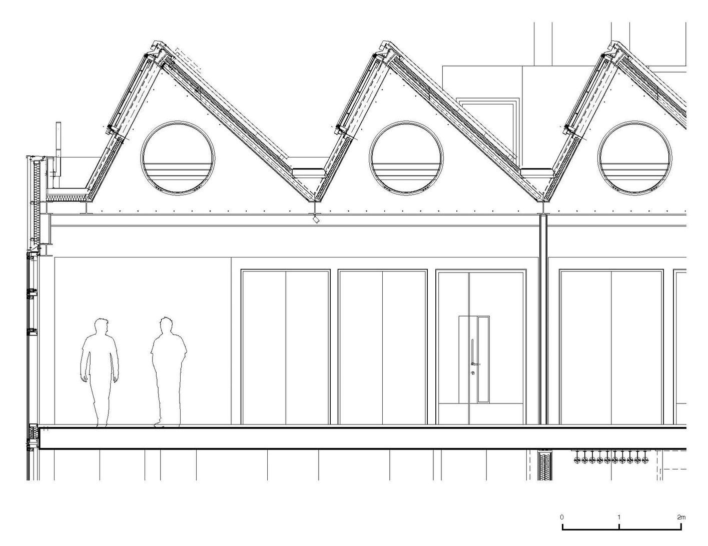
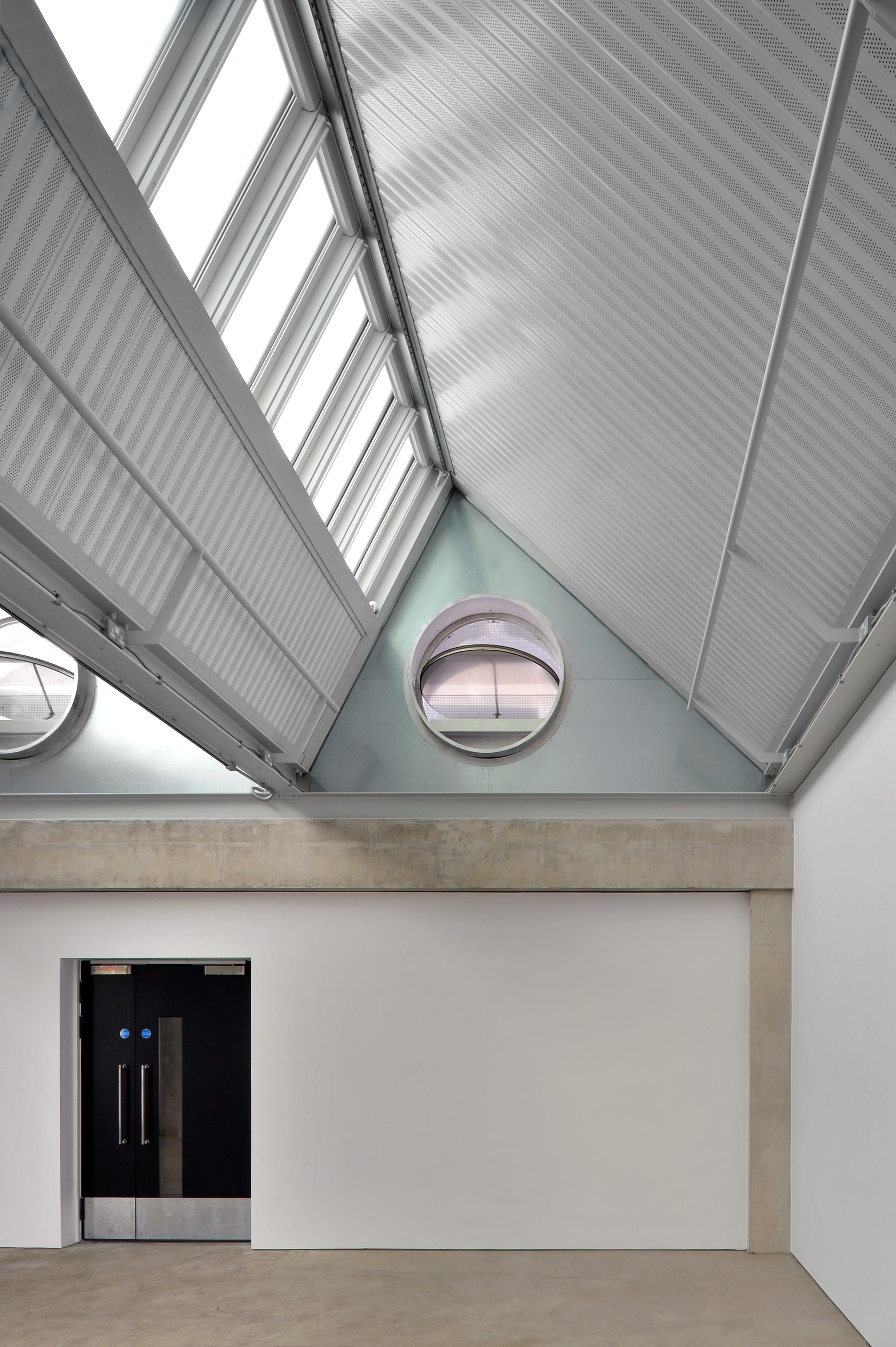
Dyson Building: Department of Fine and Applied Arts by Haworth Tompkins, London, United Kingdom
The Dyson building was designed a major new development to the Royal College of Art after it moved to Kensington Gore in 1962. It forms the centerpiece of the RCA’s Battersea Campus, and the development sits alongside the RCA’s existing Painting and Sculpture Programs on the site. A large top-lit ‘machine hall’ links the two blocks and forms the heart of the building, designed to house the large presses used by printmakers. A more public zone of retail and business space is arranged along the street frontage.
As well as containing the Printmaking and Photography programs, the building is also home to a 220-seat lecture theatre, a public gallery and the College’s business incubator. The building is conceived as a creative ‘factory’ both in the industrial sense (as a place of industry), and through the reference to Andy Warhol’s Factory as a place of art production. The building’s aesthetic is functional and derives from the way it made with an in-situ concrete structure exposed throughout and used expressively to form a series of dramatic interlocking spaces.
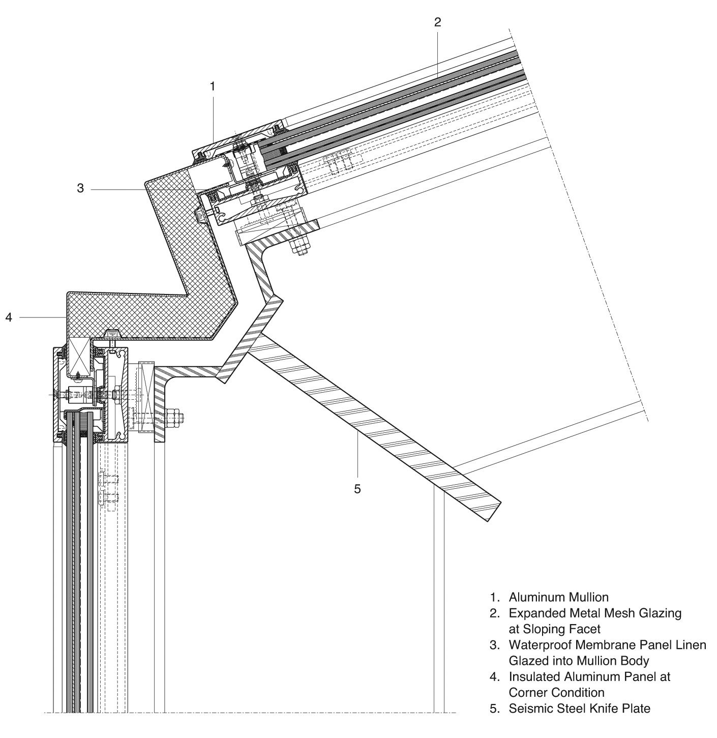
Seattle Central Library Detail Courtesy OMA and REX
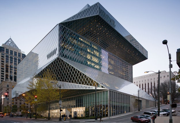 Seattle Central Library by OMA and REX, Seattle, WA, United States
Façade by Dewhurst Macfarlane & Partners and LMN
One of OMA’s most well-known buildings, the Seattle Central Library has become a celebrated civic and cultural project. Programming was at the project’s heart from the outset, directly shaping the building’s form while combining diverse functions. Built for the circulation of knowledge across different forms of media, the library was designed to present information equally and legibly. It is composed of five platforms and four flowing planes wrapped in a steel diagrid façade.
The building’s glass and metal skin began with the simple concept of wrapping the entire building in a continuous layer of transparency. Made to unify shifting planes of glass, a diamond module system was used for the mullion framing throughout the envelope. The curtain wall glazing system was built with numerous components, from I-beam latticed steel and aluminum splice plates to threaded rod attachments. The façade panels were fabricated entirely in Germany and then shipped to Seattle for installation.
Chicken Point Cabin Detail Courtesy Olson Kundig
 Chicken Point Cabin by Olson Kundig, ID, United States
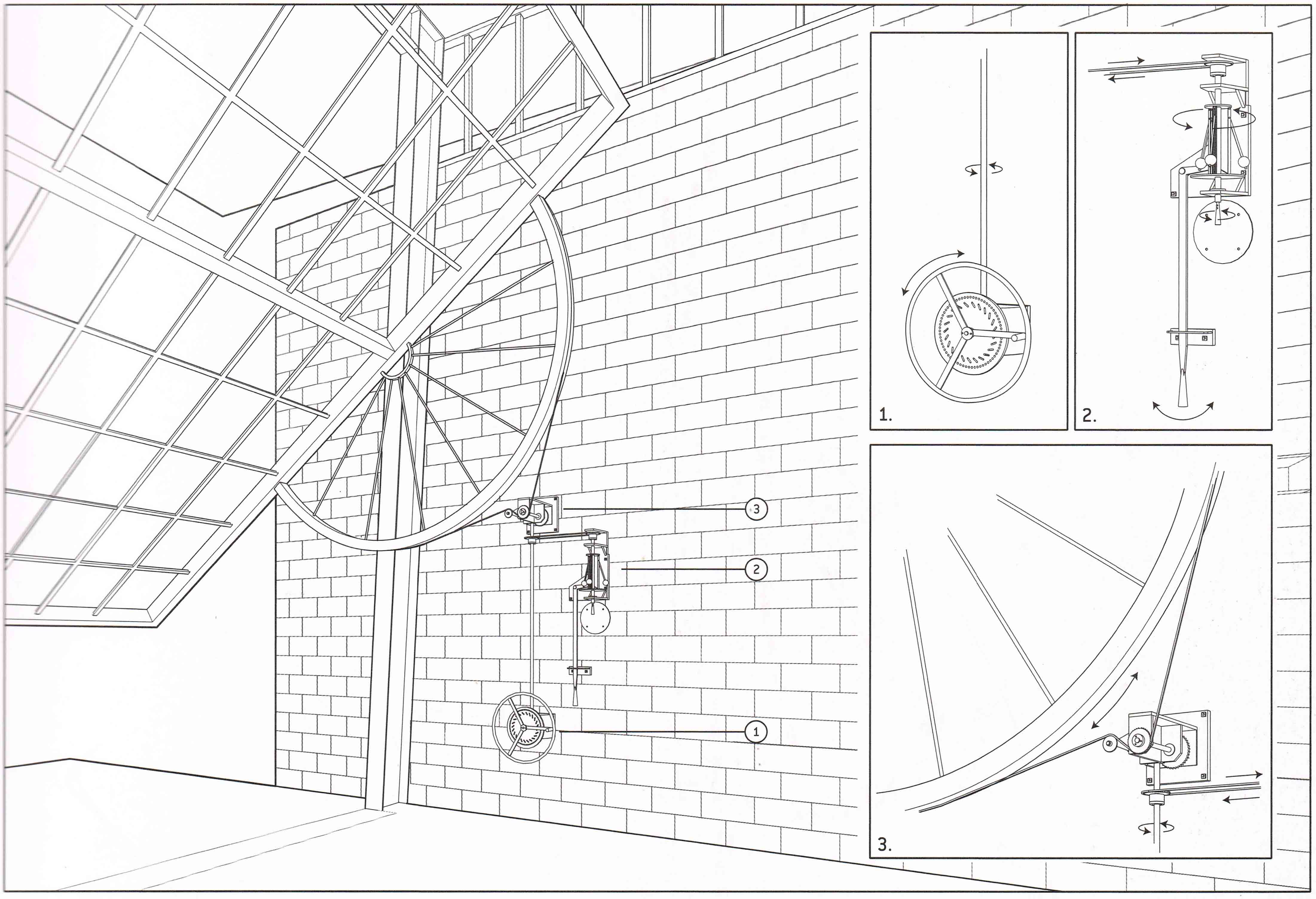
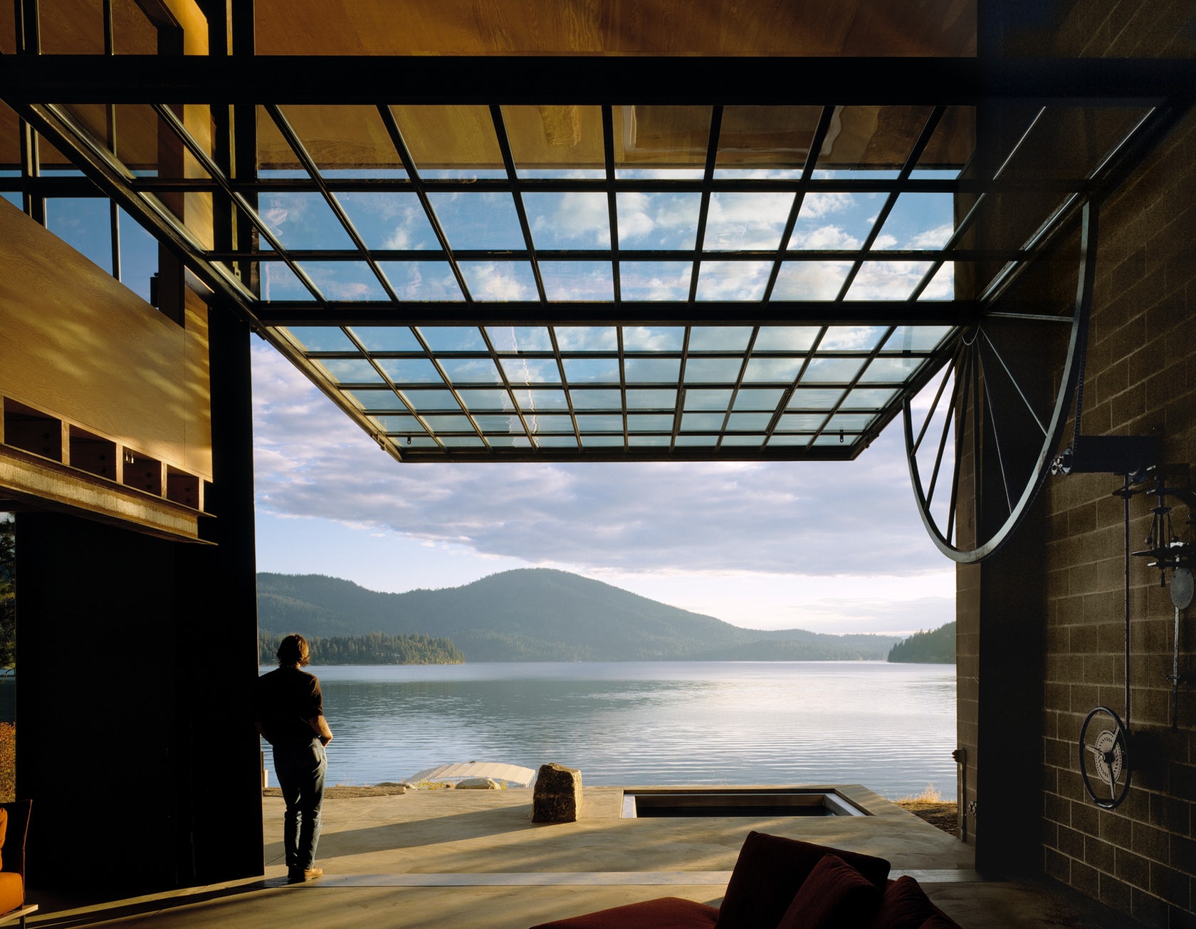
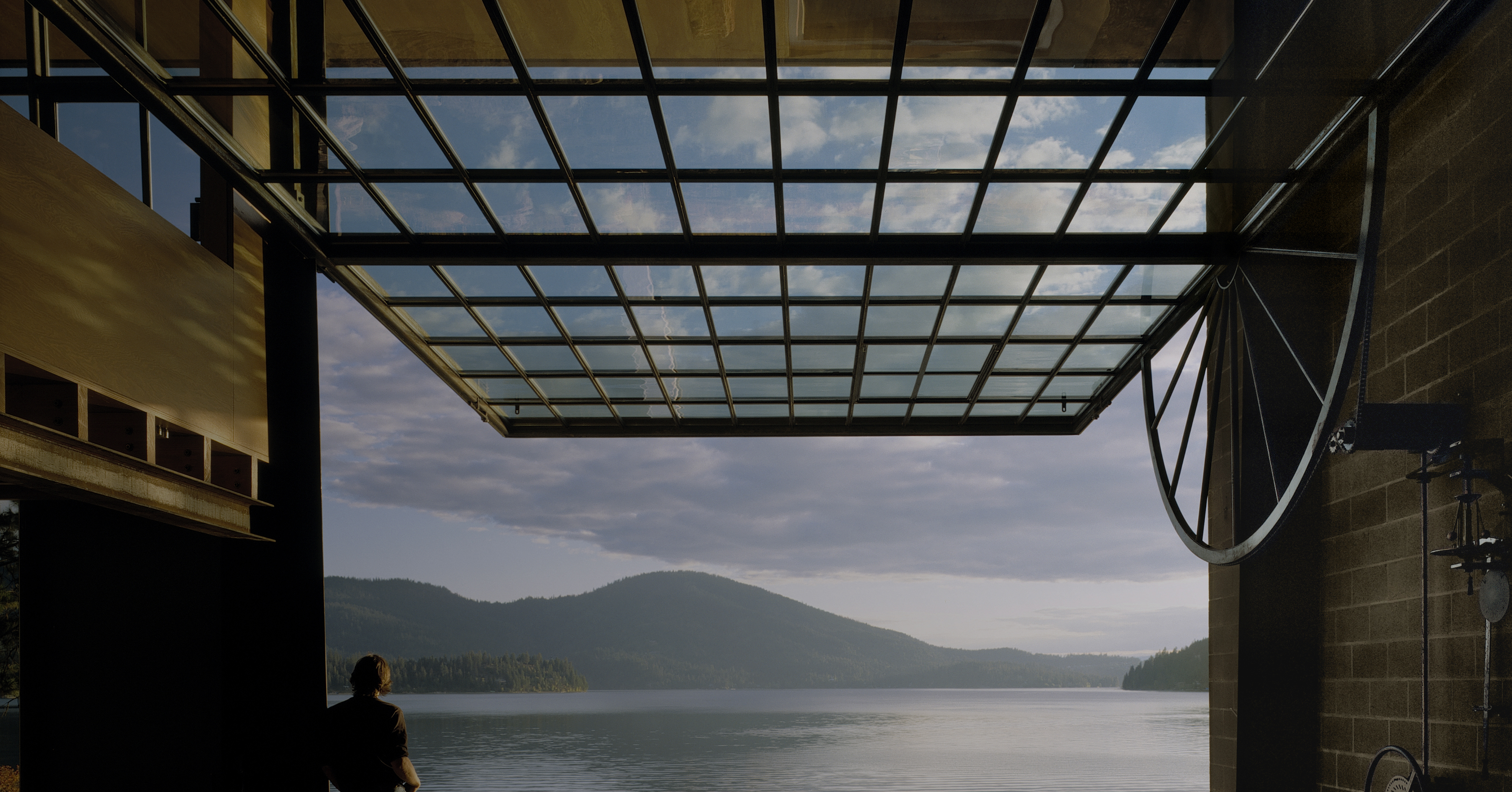
The owners of Chicken Point Cabin and their two young children bought the waterfront property—located half an hour from their house in northern Idaho—in order to build a lakeside cabin. Their intent was to be able to use the house year-round, but especially during the summer, when the local weather can get oppressively hot. Their only directive was to make the house as open to the water as possible. The result is a large pivoting picture window on the waterside that literally opens up to the landscape.
The cabin’s big window wall, measuring 30 feet by 20 feet, opens the entire living space to the forest and lake. A hand-cranked mechanism employs a counterbalance principle through a set of gears, like that of a bicycle, that allow minimal input of force to pivot the six-ton steel and glass window. Although the gizmo employs sophisticated mechanical engineering, the result is not unlike the opening of a tent flap, allowing fresh air and unimpeded views.
 Country Garden Studios by Ashworth Parkes Architects, Warmington, United Kingdom
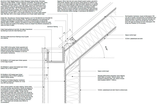
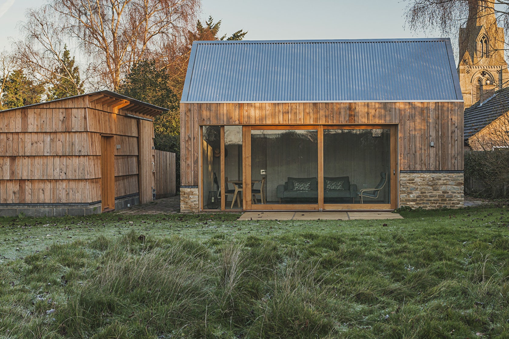
This project is a collection of new agricultural style buildings at the threshold between the formal garden of the main house and meadow beyond in a small Northamptonshire village. The brief asked for the demolition of an existing garage, a garden store and the remains of an old piggery. In their was designed a Studio building with catering facilities and a bathroom, a garden storage building with room for an office at one end, a carport and a greenhouse.
APA selected sawn larch timber as vertical cladding for the main studio’s façade. They asked the contractors to split 200-millimeter boards into four differently sized strips in order to generate ‘random’ widths for the exterior. This detail resulted in a more disheveled look, according to the architects — one that’s representational of the type of timber the farmer may have found around the site. APA chose the sawn larch over cedar because of its timeless appearance.
 Balancing Barn by MVRDV, Thorington, UK
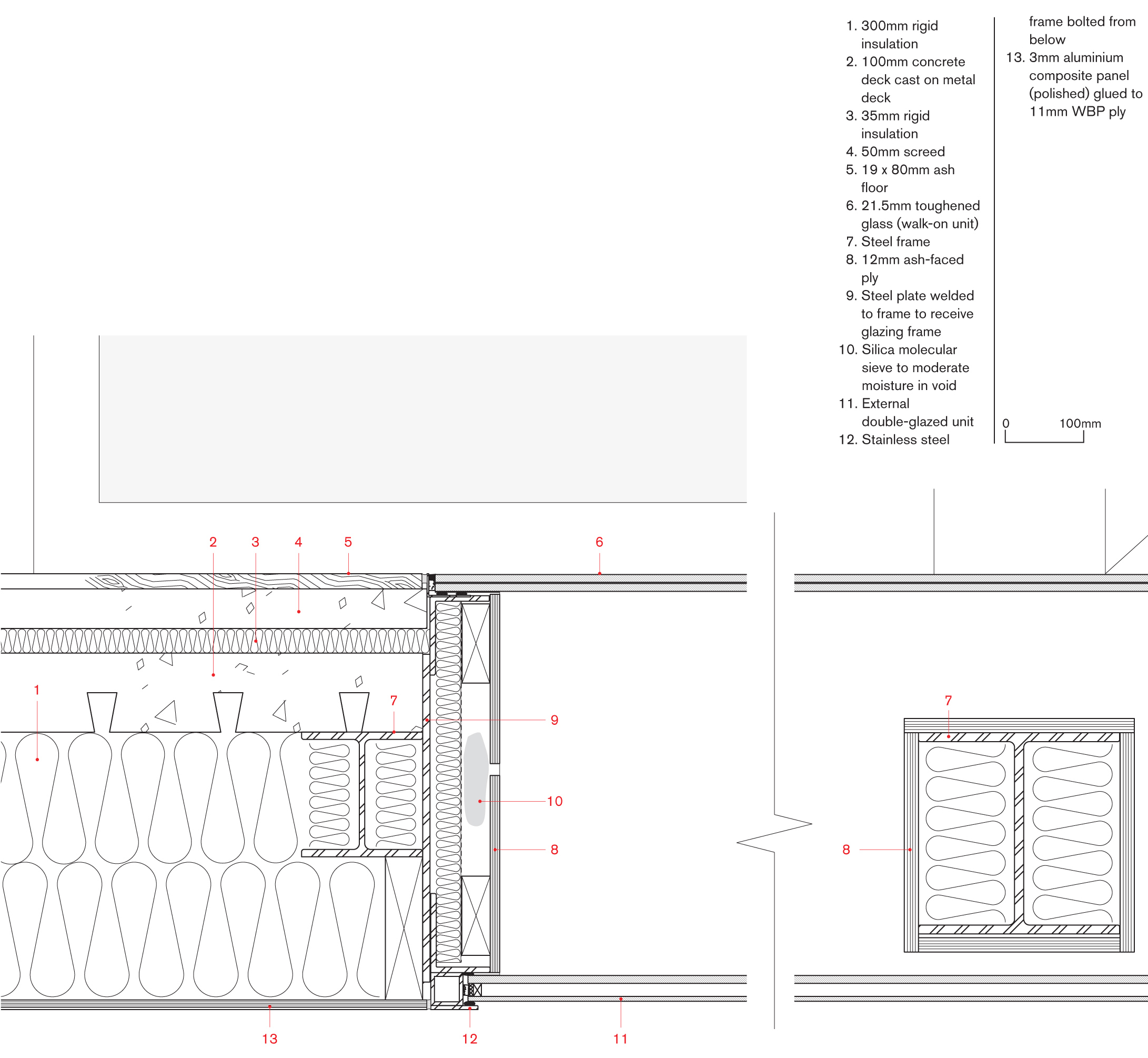
Aluminum Manufactured by Reynaers Aluminum
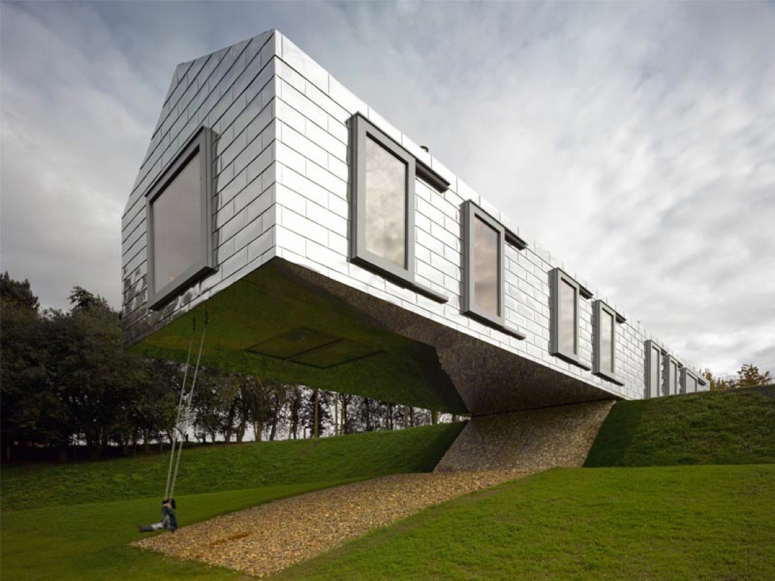
Balancing Barn is situated on a beautiful site by a small lake in the English countryside near Thorington in Suffolk. The Barn responds through its architecture and engineering to the site condition and natural setting. The traditional barn shape and reflective metal cladding take their references from the local building vernacular. In this sense the Balancing Barn aims to live up to its educational goal in re-evaluating the countryside and making modern architecture accessible.
At its midpoint, the Barn starts to cantilever over the descending slope, while the structure balances on a central concrete core, with the section that sits on the ground constructed from heavier materials to keep it stable. The detail above depicts the moment at which a glass floor panel is embedded in the floor of the cantilevered section.
Façade Detail Courtesy OMA
 De Rotterdam by OMA, Rotterdam, Netherlands
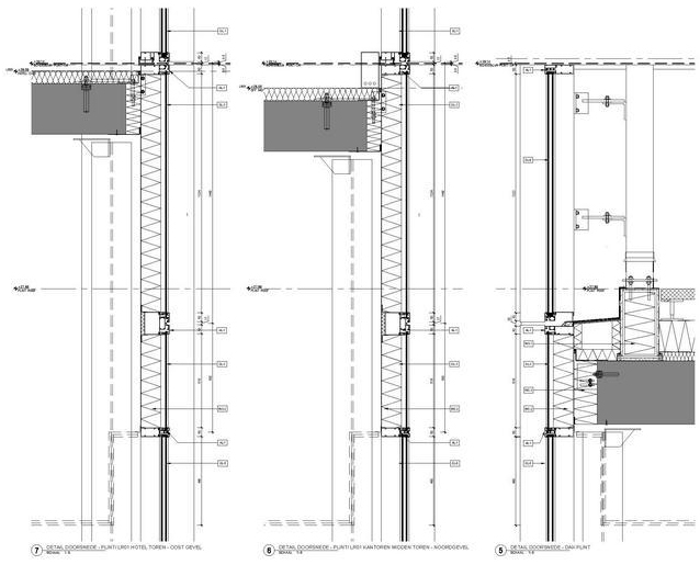
Façades by Permasteelisa and TGM
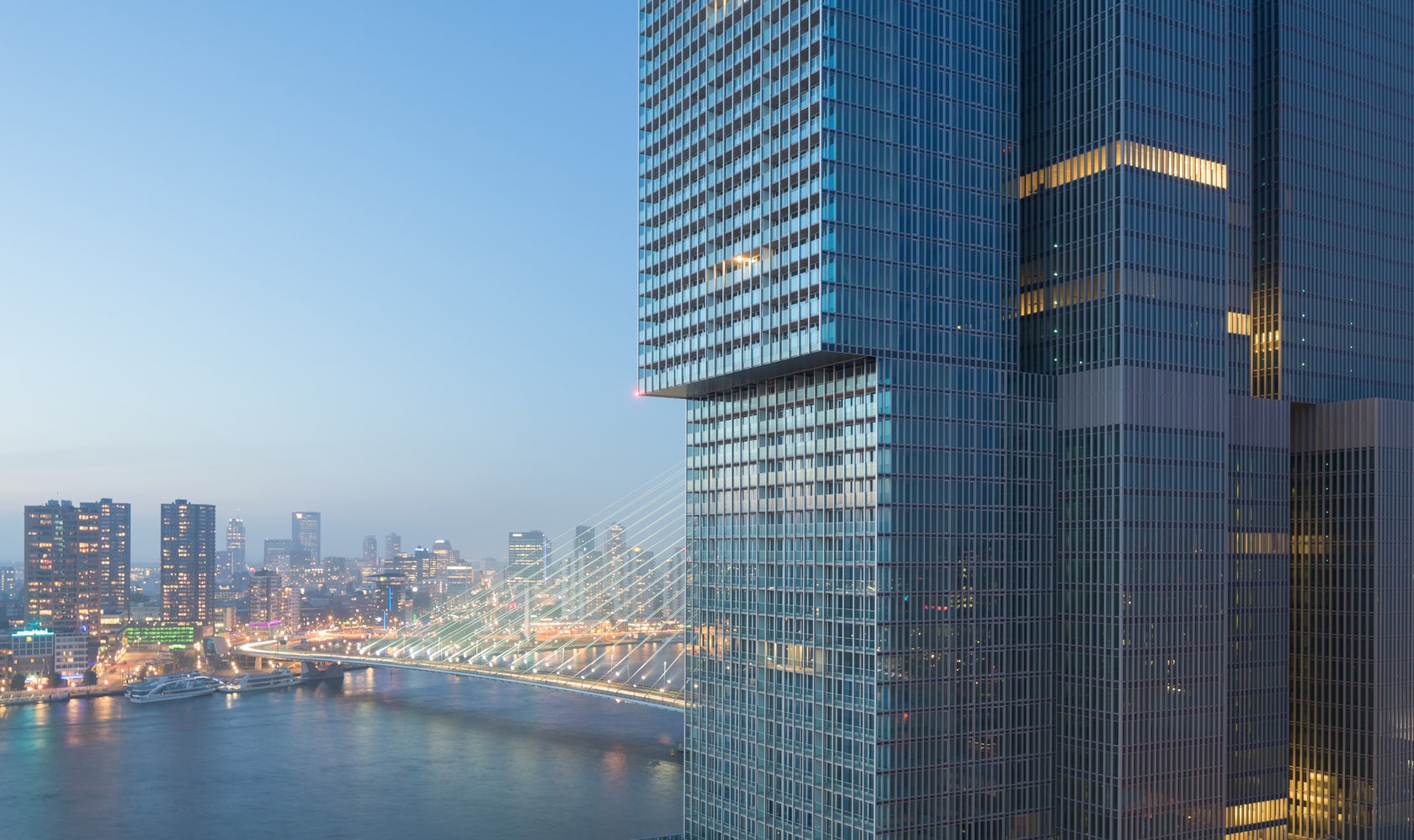
Standing as the largest building in the Netherlands, OMA’s De Rotterdam project explored urban diversity and density through three monumental towers joined by a shared plinth. Made with subtly irregular stacks, the design organizes program into distinct blocks that embrace a wide variety of uses. Formed around the idea of a vertical city, the project has 1.7 million square feet of utilizable floor space along the port area district.
The building envelope was designed with floor-to-ceiling glass windows overlooking the River Maas. De Rotterdam’s external façades have been clad with an aluminum post-and-beam construction, making for a filigree appearance which changes depending on the viewer’s position. This provides the complex with a unifying compact shell.
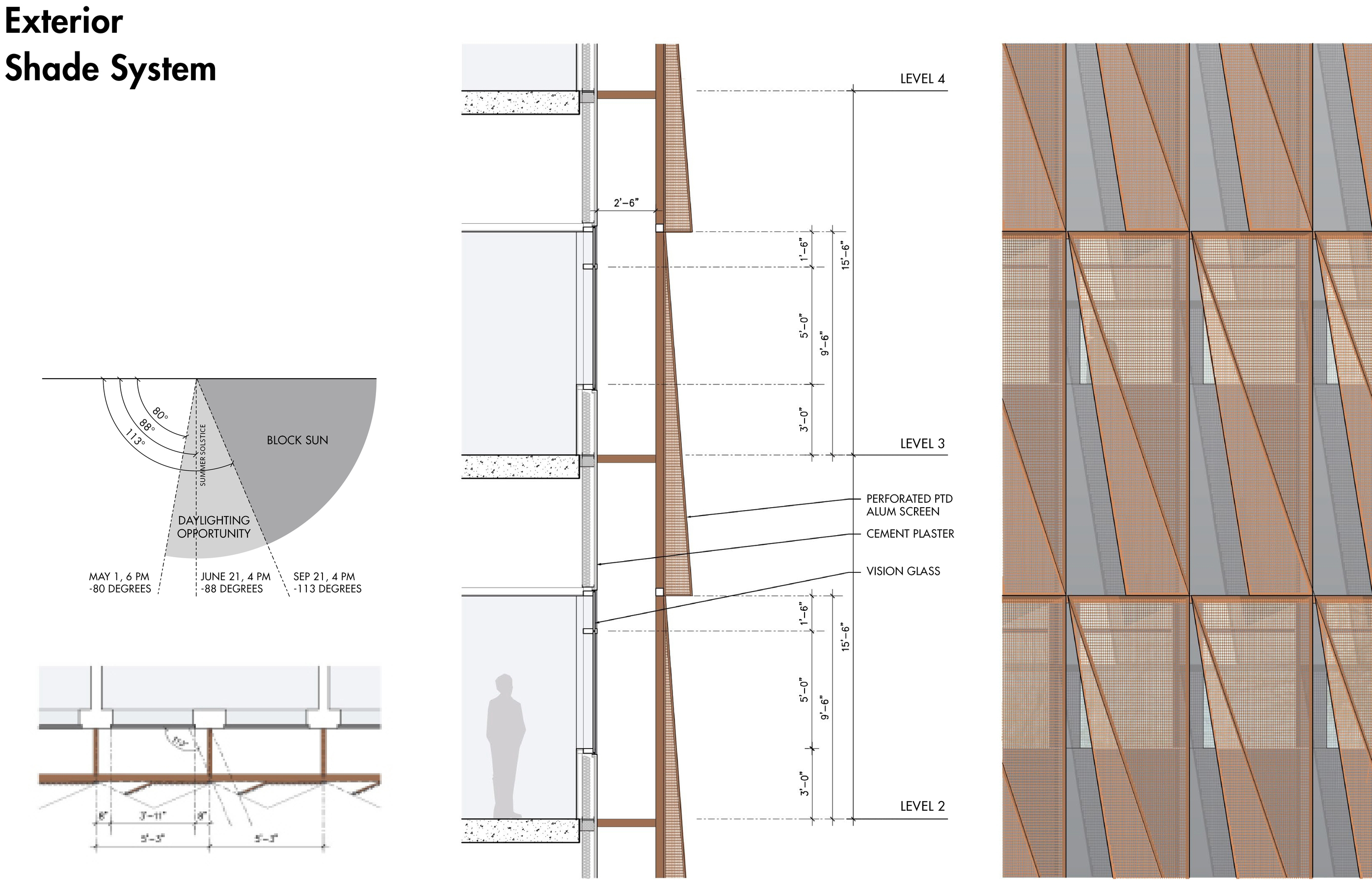
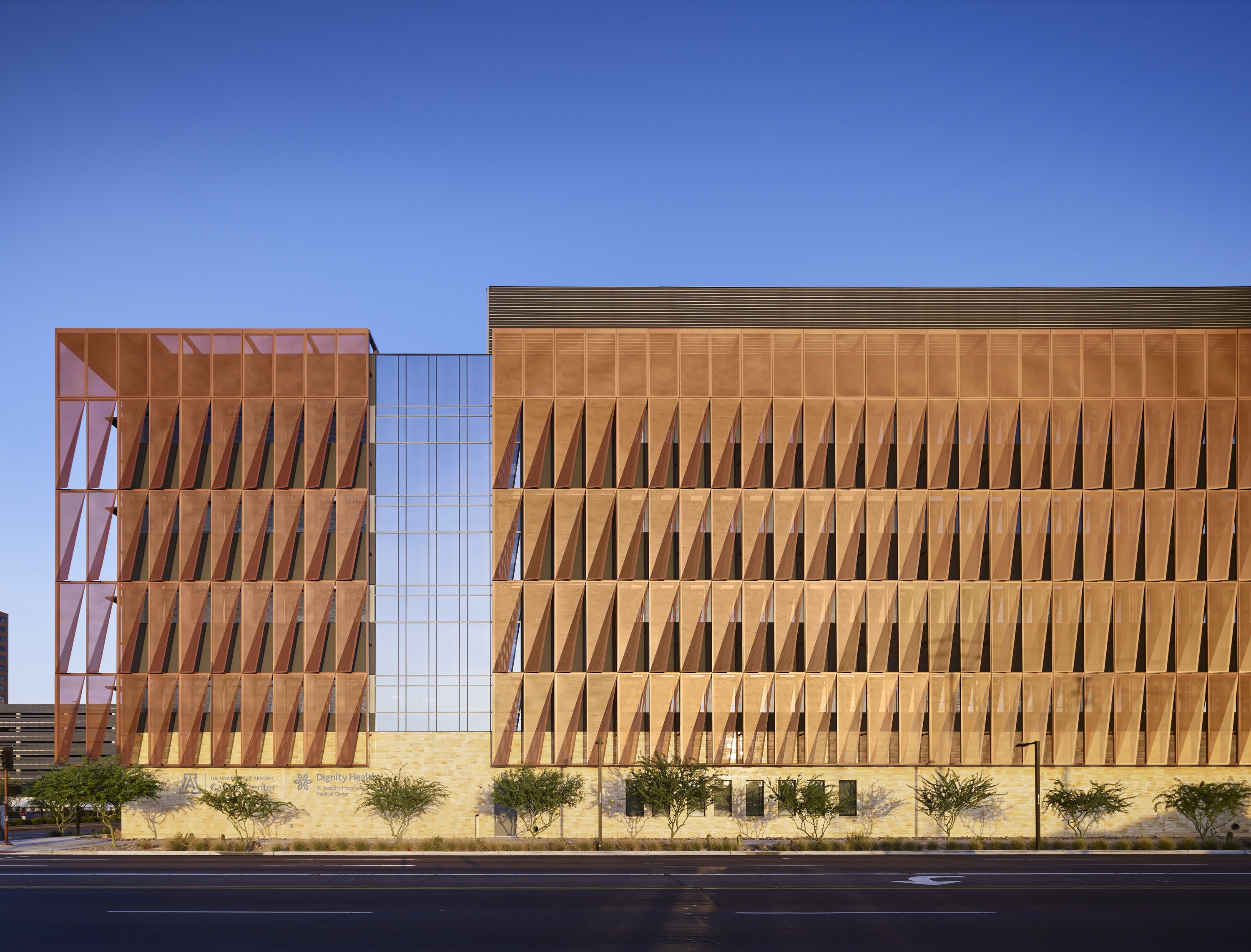 The University of Arizona Cancer Center by ZGF Architects Phoenix, AZ, United States
Sun Screens Manufactured by Kovach Building Enclosure
Built as the only National Cancer Institute-designated comprehensive cancer center, the project is sited in Arizona around patient-centered care. The Comprehensive Cancer Center on the Phoenix Biomedical campus includes the new 220,000 SF building includes spaces for radiation oncology, a retail / clinical pharmacy, a boutique, a support and wellness center, infusion, a clinical laboratory with a research component, diagnostic imaging, endoscopy and interventional radiology, exam and procedure rooms, and conference rooms throughout, as well as one floor of shell space to accommodate future growth.
By creating a layered envelope of glass and copper-colored metal, the design creates a landmark identity on campus while reflecting the patient experience: their comfort, privacy, and warmth. ZGF partnered with Hensel Phelps as part of a design-build and worked with material manufacturers Kovach Building Enclosure, Viracon, KT Fabrication and Sun Valley Masonry.
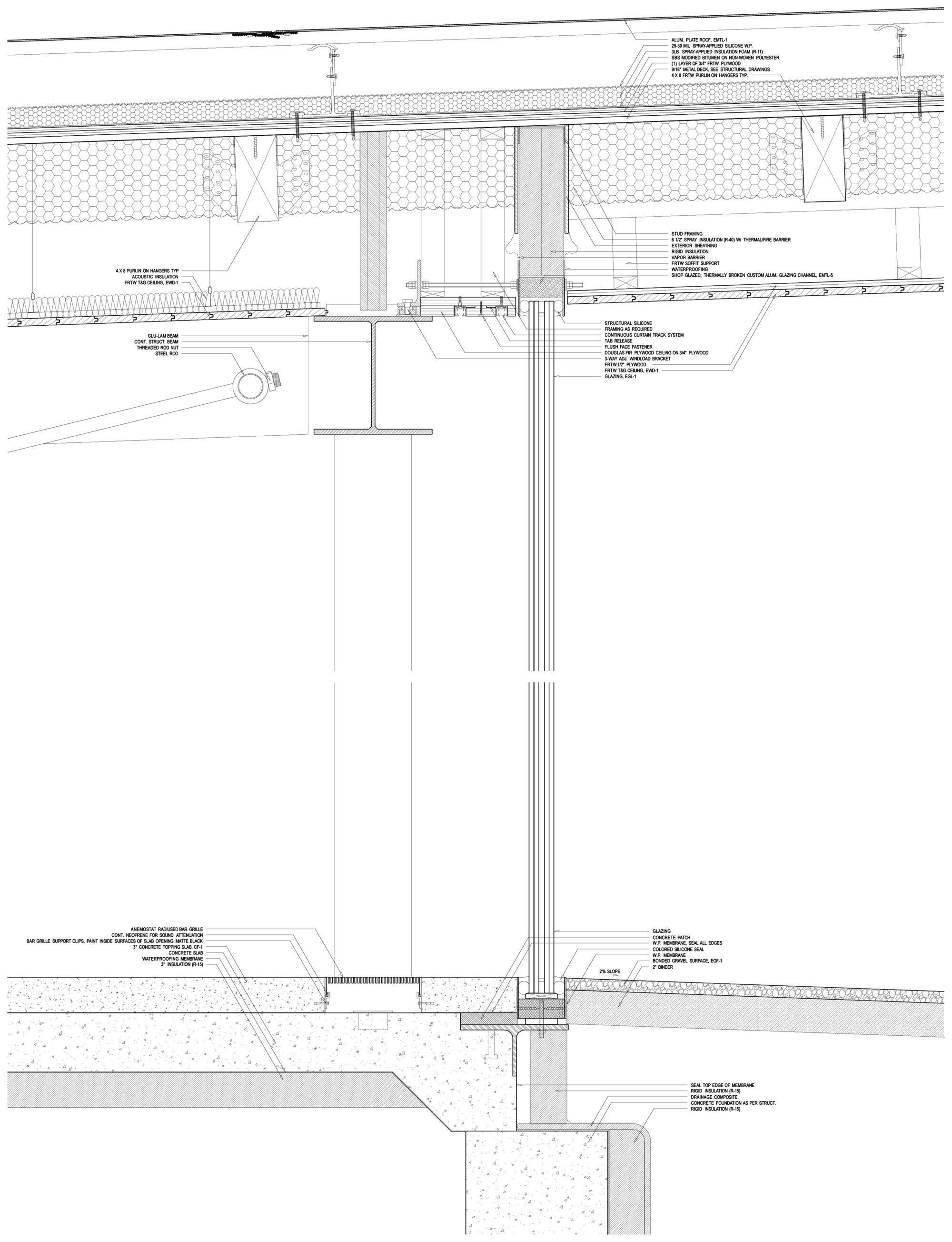
Wall Section Courtesy SANAA
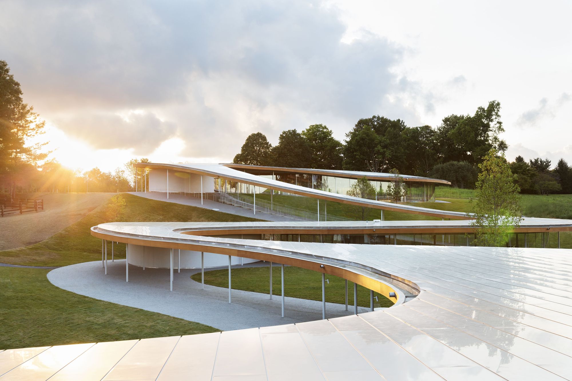 Grace Farms by SANAA, New Canaan, Conn.
Aluminum Rainscreen Roof manufactured by Zahner
Located in New Canaan, Connecticut, the multipurpose building and landscape project was made with Handel Architects to embrace open space for people to experience nature, encounter the arts, pursue justice, foster community and explore faith. SANAA was inspired by the idea of making the architecture a river that’s part of the landscape, an element that doesn’t draw attention to itself. The result is a simple, elegant building that rethinks the relationship between architecture and landscape.
The Grace Farm’s River project floats as a ribbon of glass and steel above the hilly landscape. Working with Zahner, SANAA wanted to give life to the idea of a building that’s part of nature. The structure combines a sanctuary, library, court, commons, and pavilion under an aluminum roof. Featuring a dual curvature panel system, the roof design consists of standard-sized sheets of exterior anodized aluminum. The project uses a light-weight system to achieve the shape with several custom aluminum extrusions that form a channel between the aluminum skins. Here, a floating aluminum plate provides a visual transition between panels.
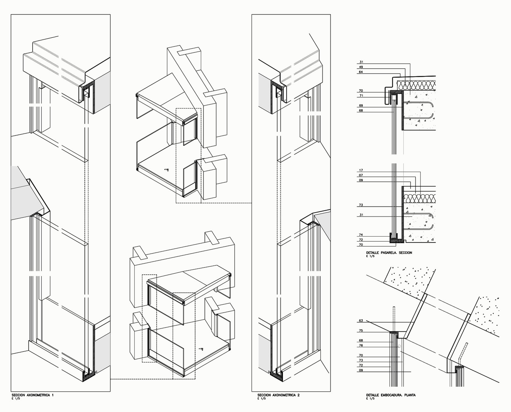
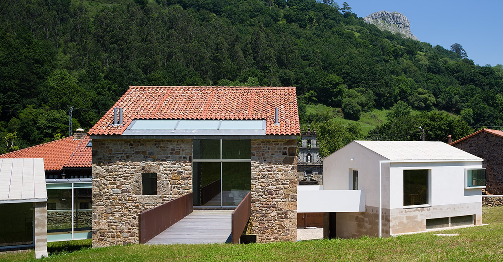 Restoration and extension of a house in Rubalcaba by riaño + arquitectos, El Astillero, Spain
This project is located in the Rubalcaba district of Liérganes and faces what was once the ancient “Camino Real” that ran parallel to what is now San Roque de Riomiera road. Within a short distance of the town stood a “casona” or large house, which belonged to the Rubalcabas in ancient times, and which is in the same district as the famous cross, chapel, mill and bridge over the River Miera.
A pavilion was built on either side of the main building: one, with a square plan and two floors, to house the garage and a library, and another, with a rectangular plan and two stories, to accommodate the utilities, a wine cellar and the guest rooms. The slope of the terrain half buries these volumes which are arranged like natural platforms and open directly onto the back garden – via the guest pavilion in the first case – and via the sun terrace/bridge in the case of the main building. The detail above shows how pristine glazing details were designed to strike a bold contrast with the textured stone walls of the original casona.
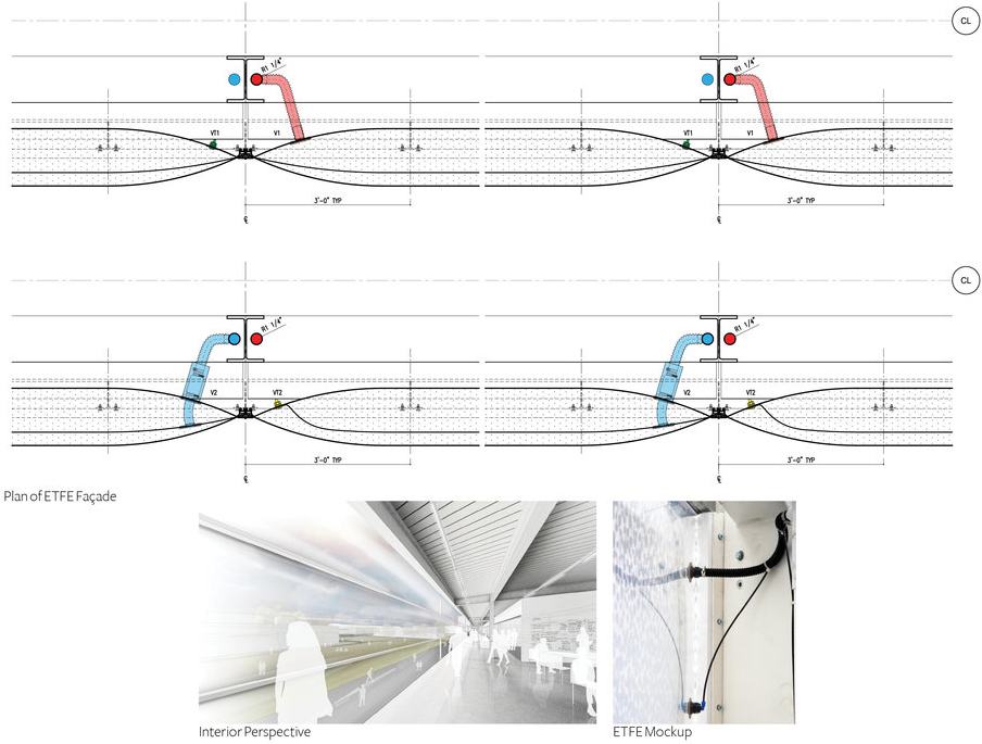
Facade Diagram Courtesy John Ronan Architects
 IIT Innovation Center by John Ronan Architects, Chicago, IL, United States
Exterior Glazing Manufactured by Oldcastle Building Envelope and Guardian Glass
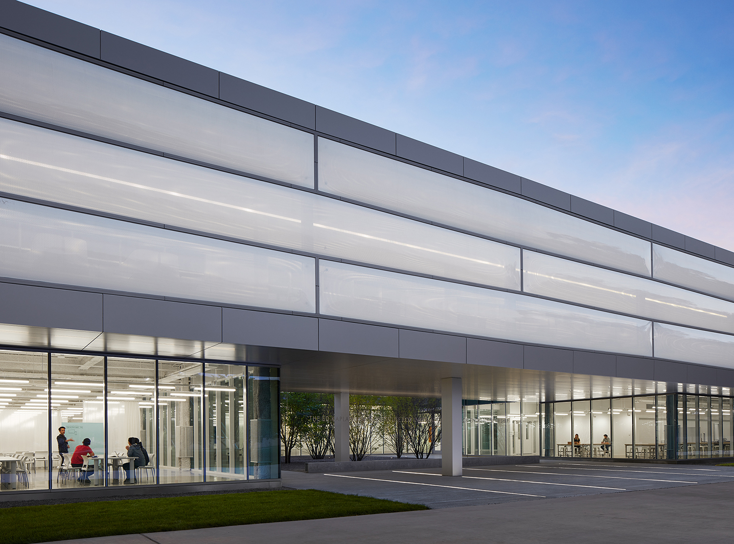
The Ed Kaplan Family Institute for Innovation and Tech Entrepreneurship at the Illinois Institute of Technology is devoted to fostering collaboration, innovation, and entrepreneurship between IIT’s students, faculty, alumni and partners. The building hosts a variety of collaboration spaces for IIT’s project-based experiences, including state-of-the art prototyping and fabrication facilities, and it serves as the Mies campus home for the Institute of Design.
The horizontal, open and light-filled building is designed to encourage encounters between students and faculty across disciplines. The Center is wrapped in white ETFE on its upper levels, which cantilever over the main floor, creating a certain sense of lift to the building. Despite this structural contrast, the use of exterior glazing, which encloses the Innovation Center’s ground floor, plays a critical role in tying Ronan’s new structure into its historic surroundings.
Architizer’s newest print publication is available for pre-order! How to Visualize Architecture is an educational guide designed to help you master the craft of architectural storytelling and visual communication. Secure your copy today.
All drawings and photographs courtesy of the architects.
 Balancing Barn
  Chicken Point Cabin
  De Rotterdam
  Dyson Building: Department of Fine and Applied Arts
  Grace Farms
  IIT Innovation Center
  Seattle Central Library
  The University of Arizona, The University of Arizona Cancer Center


