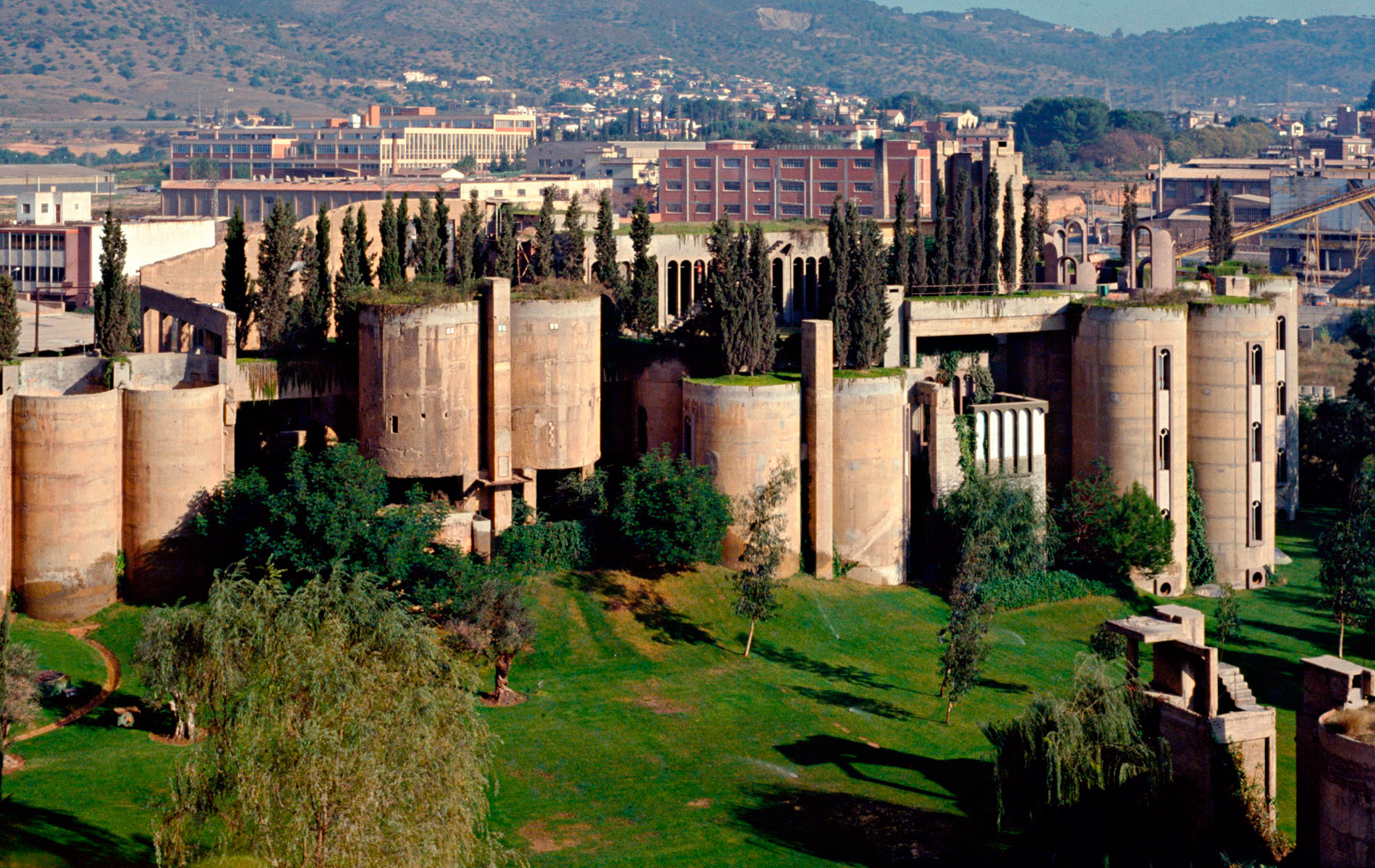
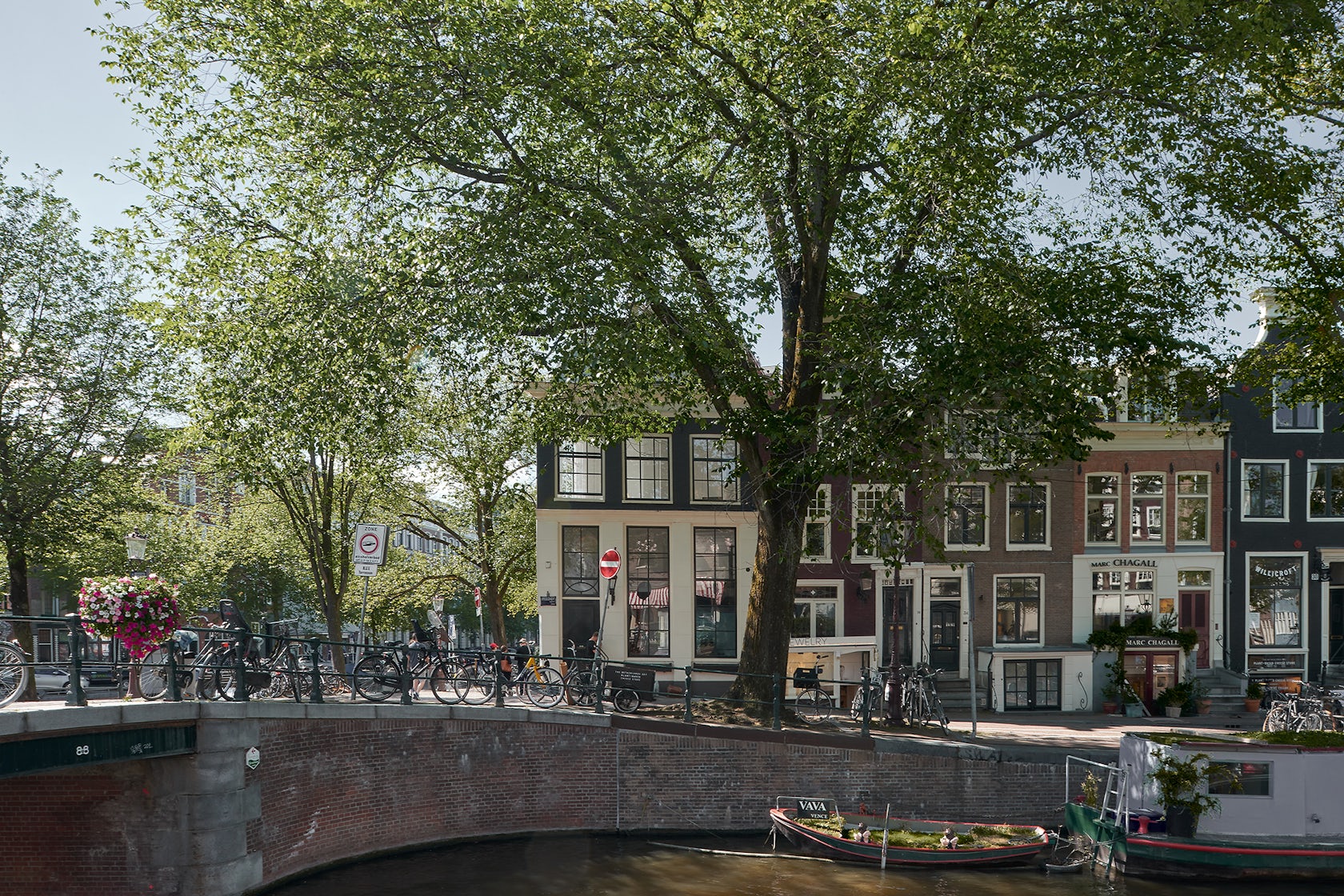
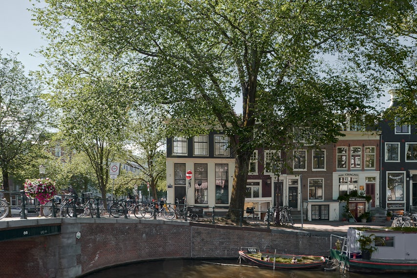
Amsterdam Canal House – The client initially wanted to only renovate and make the two top floors of this canal house more sustainable. During the renovation work, however, they decided to expand the project and tackle the entire house. Ultimately, increasing assignment made it possible for us to create a more peaceful and unified design. Each floor of the house has unique characteristics, but now feels part of a carefully designed, integrated whole.
Architizer chatted with Serge Schoemaker, Founder & principal architect, at Serge Schoemaker Architects to learn more about this project.
Architizer: What inspired the initial concept for your design?
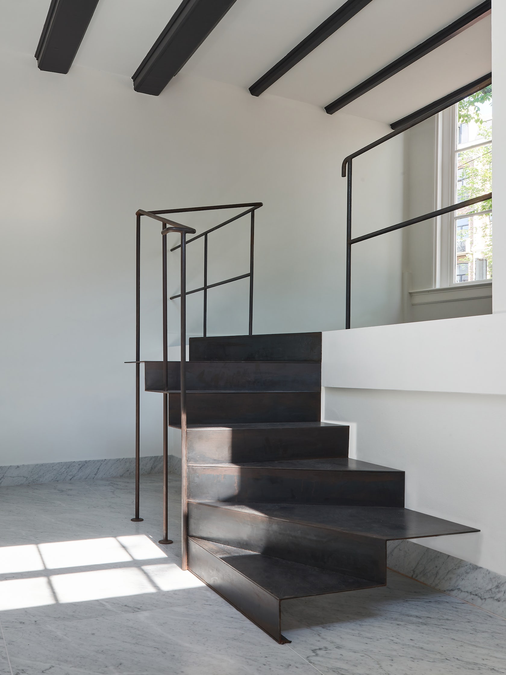
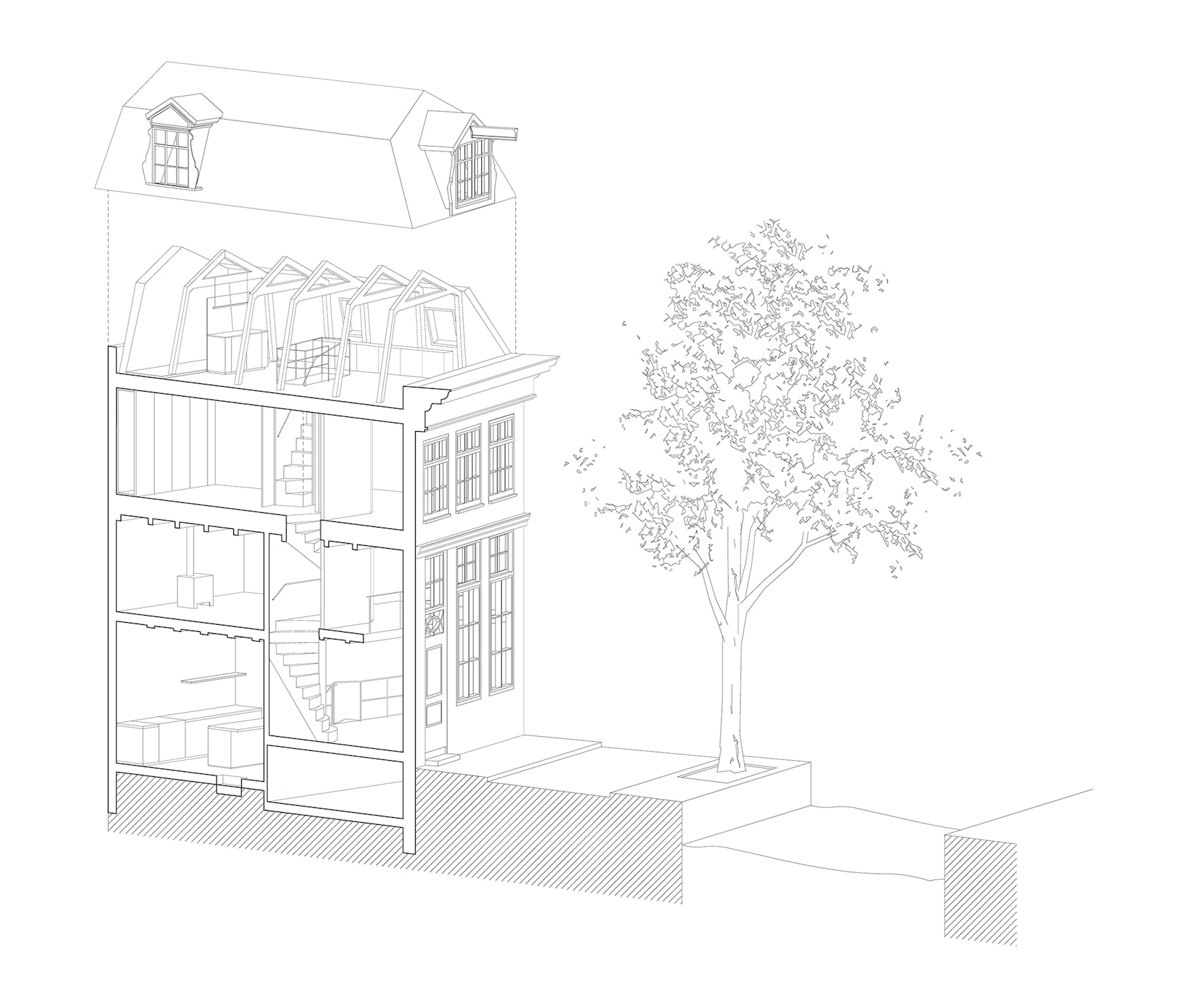
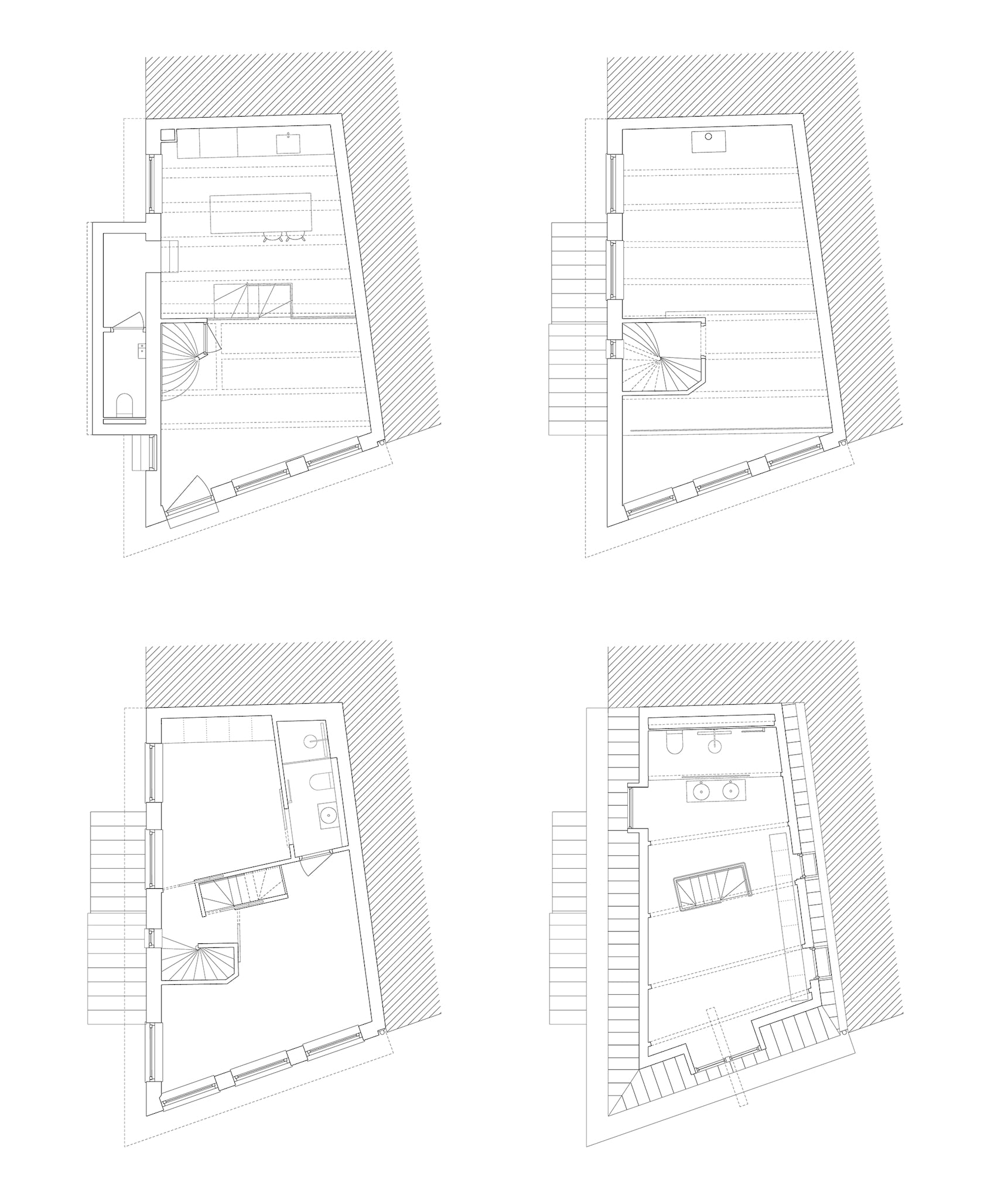
Serge Schoemaker: This 17th century corner house was originally two (even smaller) canal houses that were at some point combined into one house. This consolidation resulted in a complicated floor plan and section. Additionally, the house has a relatively high number of floors (five) compared to its floor area (143m2). We have taken this historic condition as the foundation of our design and derived inspiration from it. We wanted to visually emphasize the crooked facades and staggered floor levels of the existing building. This led to the design of the vertical circulation and stair elements which have such a distinctive relationship with the angled walls and complicated floor levels.
© Serge Schoemaker Architects
© Serge Schoemaker Architects
What do you believe is the most unique or ‘standout’ component of the project?
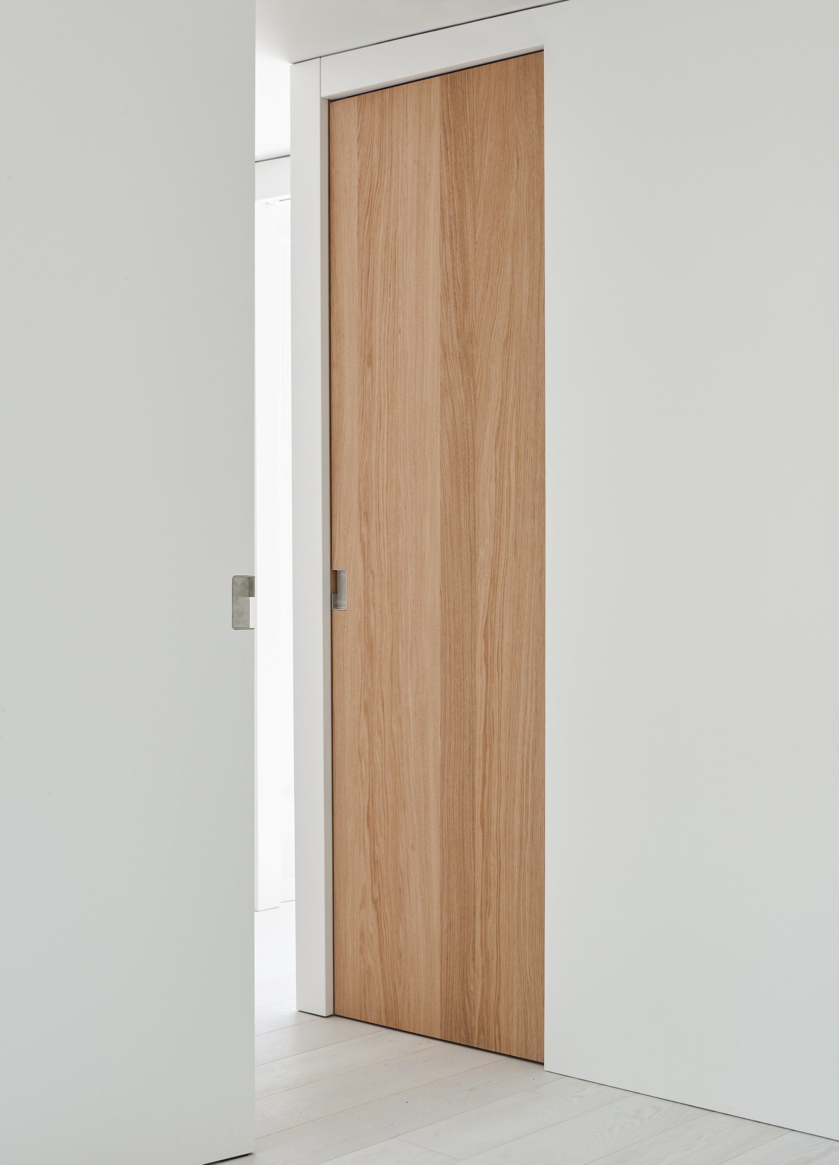
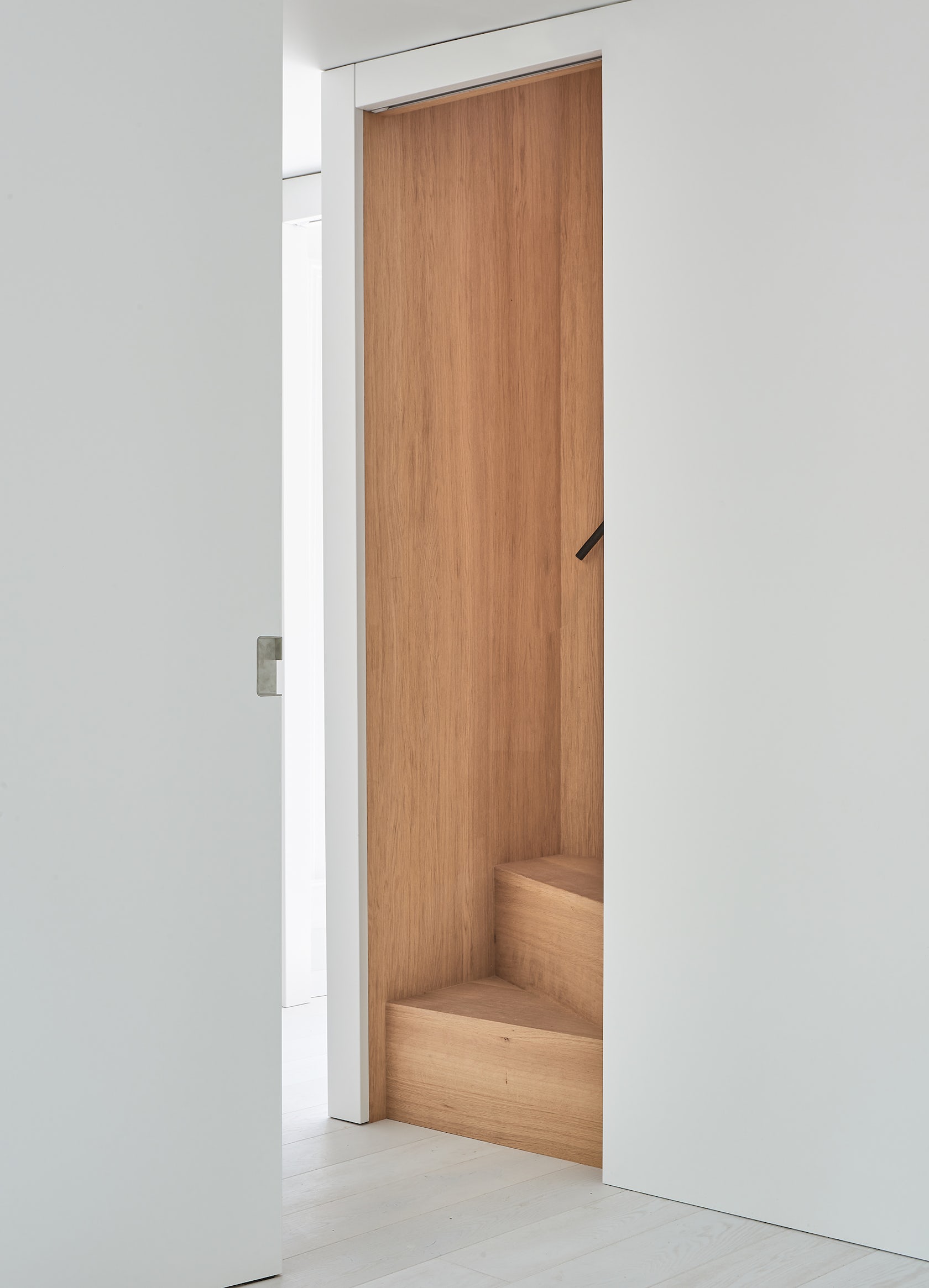
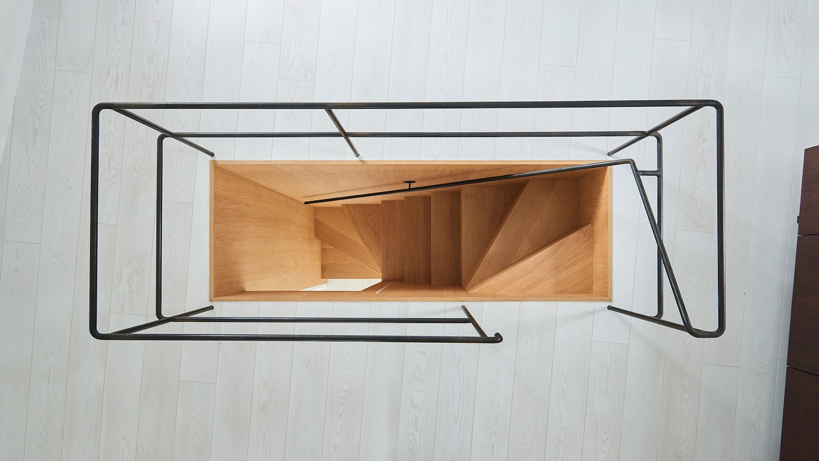
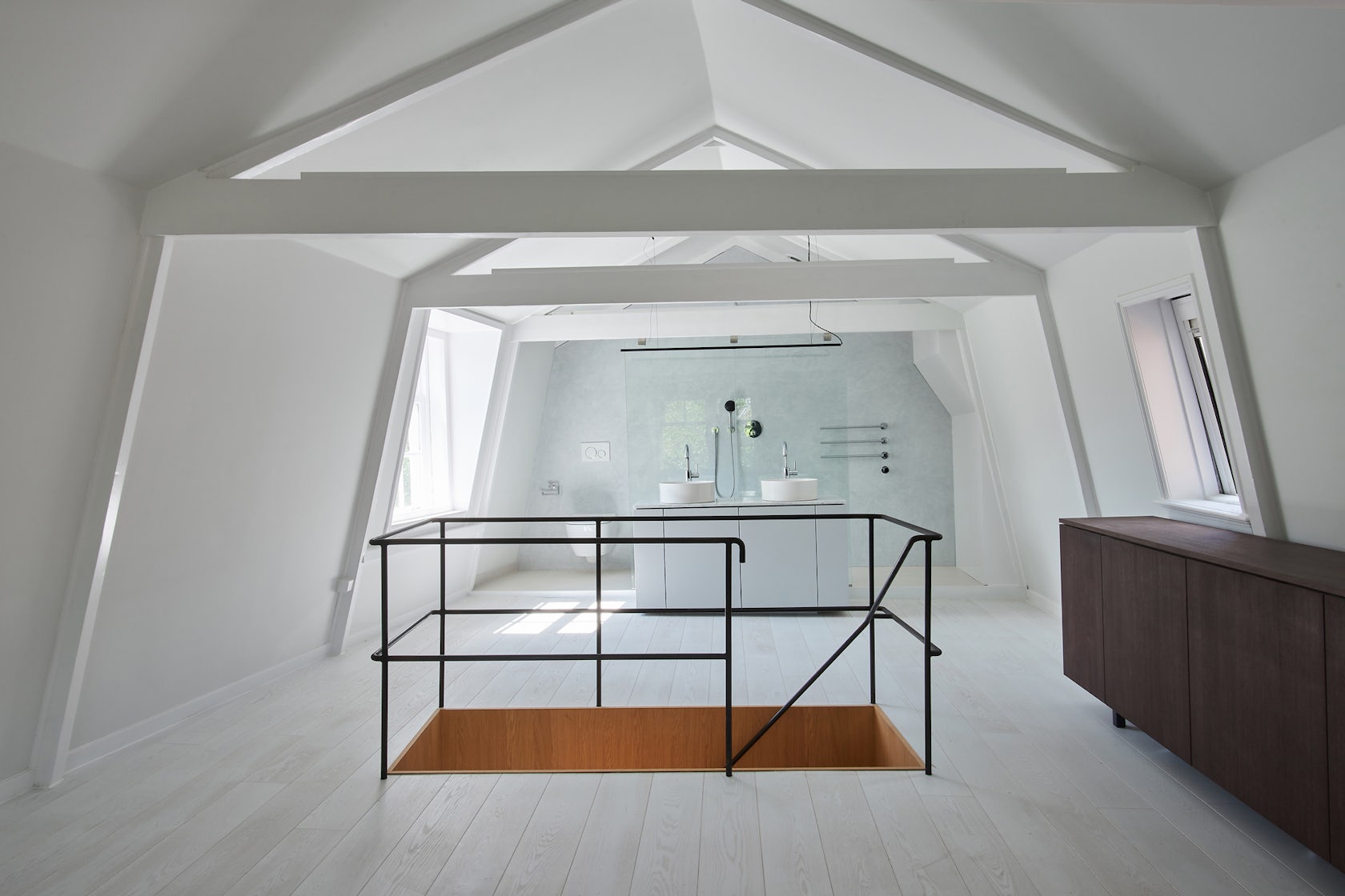
In order to create a connection to the attic level, we introduced a small timber clad staircase. This staircase is designed to take as little space as possible. We have hidden the staircase behind a sliding door and built it in as if it were part of the cabinets. As you rise up, the stair opens up and you suddenly find yourself in the middle of a daylight-filled living space under the historic roof. The slender metal handrail in the stairwell continues in the attic in an elegant, open balustrade, which refers to the cast iron details from the construction period of the building. This element represents a strategic intervention which with the minimum amount of change completely changes the visitor’s relationship with the building’s history and spatial qualities.
© Serge Schoemaker Architects
© Serge Schoemaker Architects
What was the greatest design challenge you faced during the project, and how did you navigate it?
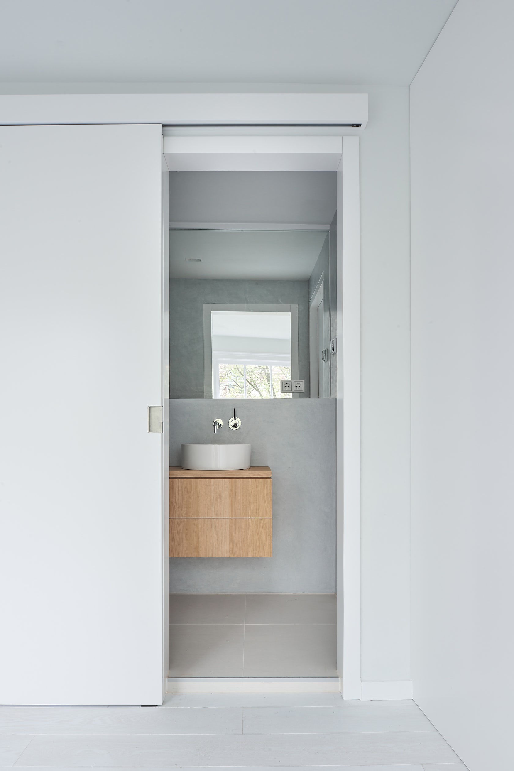
The biggest challenge was therefore to accommodate all of the desired spaces and facilities in a functional way divided over five floor levels with a very limited floor space – and to make them all accessible. At the same time, we wanted to keep the floor plans as open as possible to ensure a spacious feeling and an unobstructed view of the historic floor-to-ceiling windows and the city. We have achieved this by looking for minimum interventions for, among other things, the bathrooms and stairwells. Where possible, sliding doors have been used or space-separating elements have been omitted. For example, the kitchen on the ground floor is connected directly with the entrance area and even the bathroom in the attic is open to the living space.
© Serge Schoemaker Architects
© Serge Schoemaker Architects
How did the context of your project — environmental, social or cultural — influence your design?
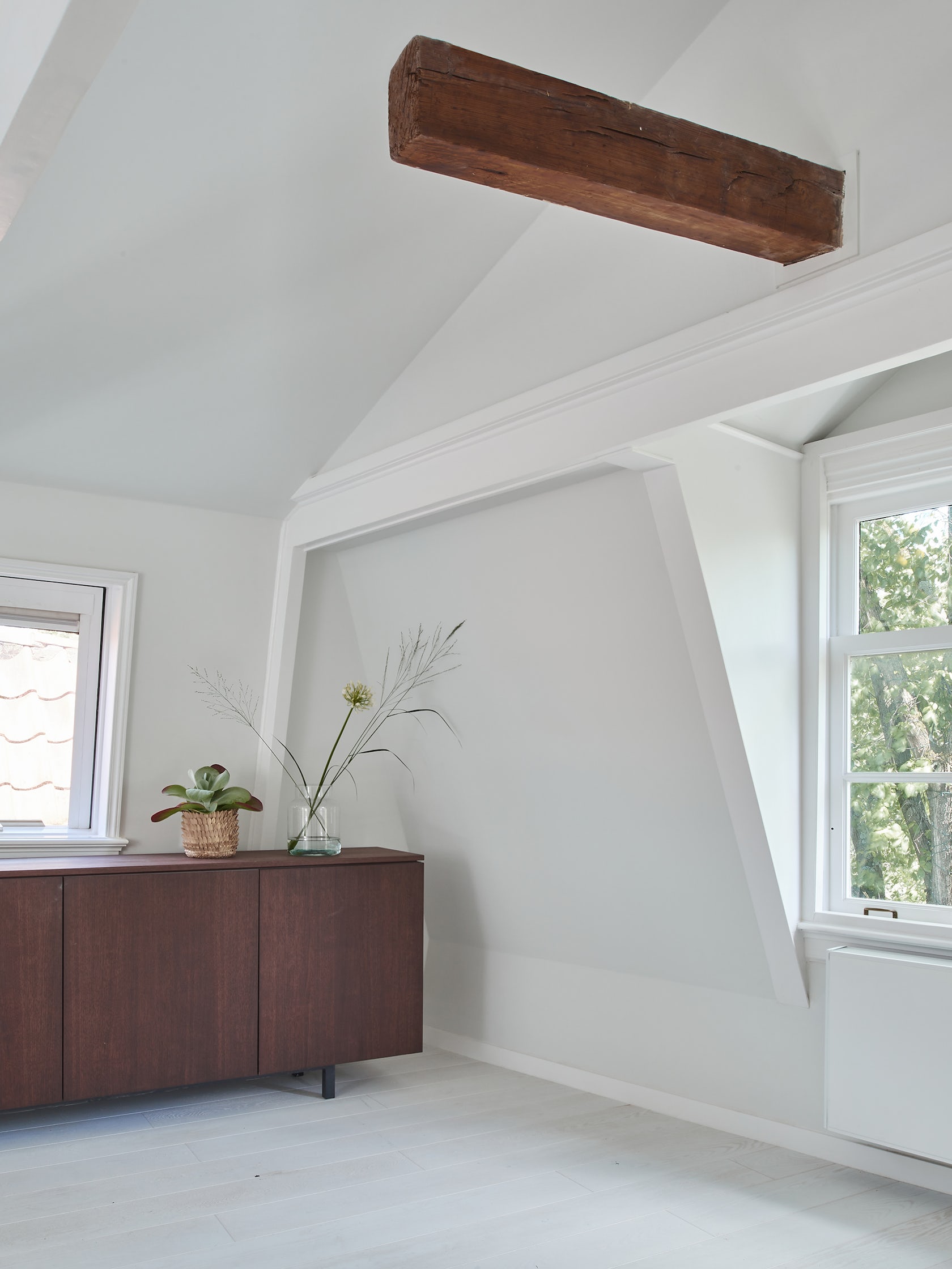
The house is located in the heart of the historic city center and part of the Amsterdam Grachtengordel World Heritage site. In addition, the 17th century building is also a national monument and overlooks two very popular canals in Amsterdam. The history and location of the house were therefore extremely decisive during the renovation – both in the design and in the execution. We didn’t want to change the exterior, but at the same time create a completely new interior. We have striven for a design that enhances the unique properties of the building and that in both form and material fits in with the historical context in a careful, restrained way. In this context, we also found it especially important to create a sustainable interior, in the broadest sense of the word, that will last for a long time.
© Serge Schoemaker Architects
© Serge Schoemaker Architects
What drove the selection of materials used in the project?
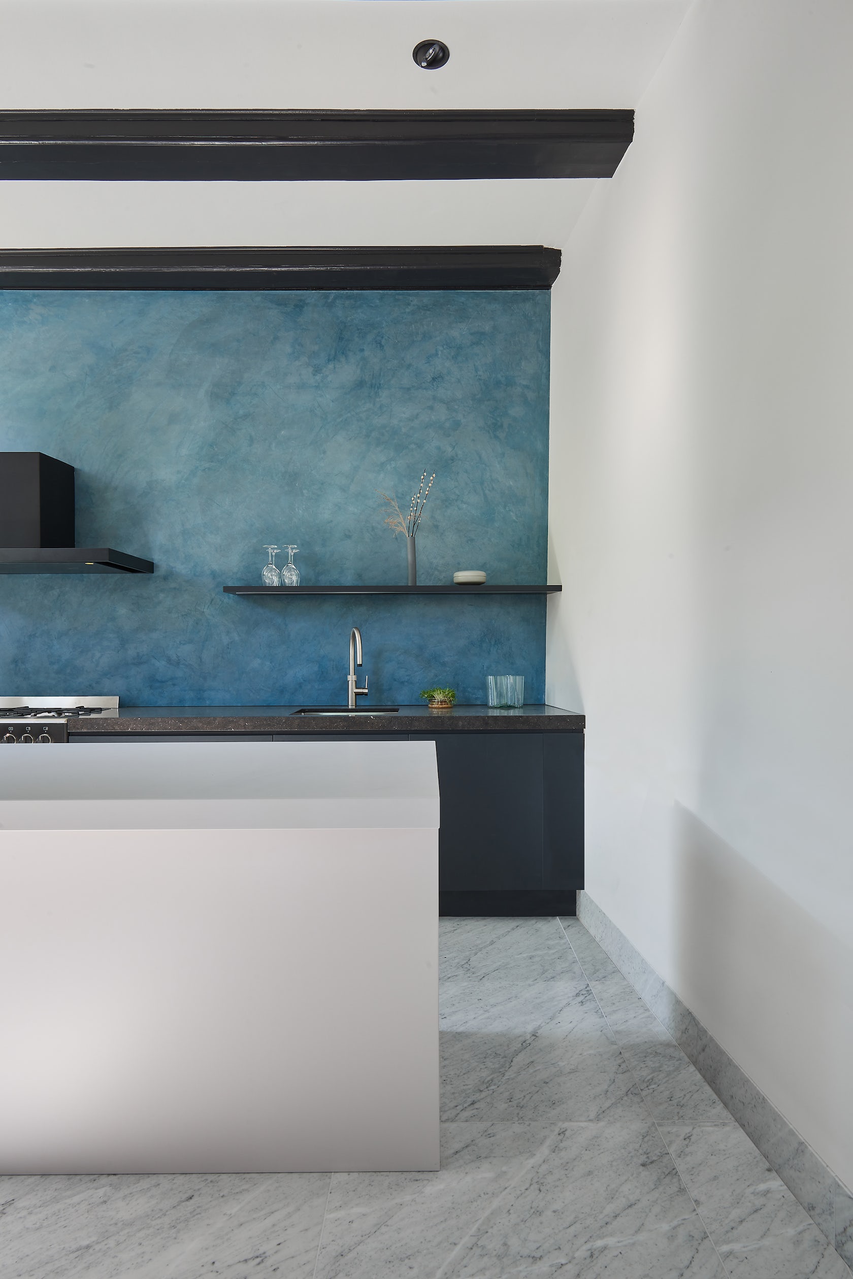
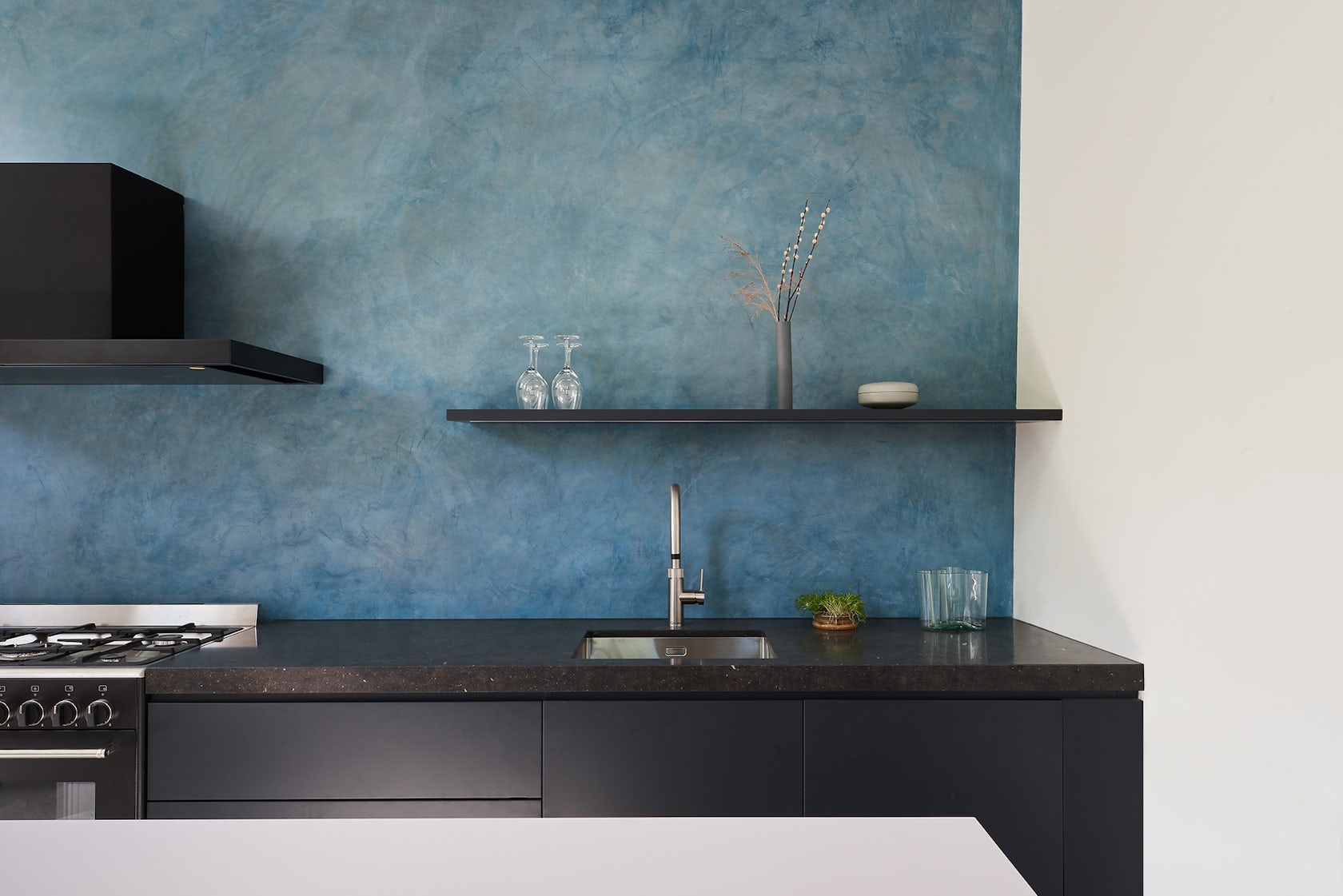
The choice of materials was mainly guided by the need to create space and light. That is why we have used a lot of light-coloured materials. We also matched the materials to the construction period of the house and mainly made use of hardwood, natural stone (white marble floor tiles in the kitchen), metal and plaster. By using waterproof plaster on the walls of the bathrooms, a busy tile pattern is avoided in these relatively small spaces. The most pronounced, however, is the high, plastered back wall of the kitchen: the natural blue pigment and the crystal structure of the calcium carbonate in the plaster give this wall a unique appearance and depth which enhance the feeling of space from the front door all the way to the back of the house.
© Serge Schoemaker Architects
© Serge Schoemaker Architects
How do you believe this project represents you or your firm as a whole?
We frequently work with historic buildings and our design process consistently starts with a careful analysis of the existing situation: what qualities are present, and how can we strengthen these? What limitations are there, and how can we use them to realize something unique, and tailor-made for the specific context? This working method often leads to surprising solutions, which at the same time feel very natural. In addition, we work with beautiful materials and details, which are an integral part of the design for us in order to achieve the desired atmosphere of a place. This attention to the building process often results in projects that are sensitive to their place. In our opinion, this ethos can be seen in this renovation of a national monument in Amsterdam.
© Serge Schoemaker Architects
© Serge Schoemaker Architects
Credits
Team members: Serge Schoemaker, Maiara Camilotti | Farimah Chaman Zadeh, Henrik Holte
Photography: MWA Hart Nibbrig
For more on Amsterdam Canal House, please visit the in-depth project page on Architizer.
 Amsterdam Canal House
