18 Loftus Street – Quay Quarter Lanes is the rejuvenation of a city block in the heart of Sydney City at Circular Quay. Our project; 18 Loftus Street, anchors the South-West corner of the precinct with a primary outlook over Macquarie Place Park. Contained within the building are 36 apartments, six retail tenancies and precinct wide services. The design seeks to give the building a singular identity overlaying an incremental transition of form and opening size. Interiors are designed with a health and wellness focus, guiding internal form, material selection and colour for living, bathing and sleeping spaces within each home.
Architizer chatted with Jad Silvester from Silvester Fuller to learn more about this project.
Architizer: What inspired the initial concept for your design?
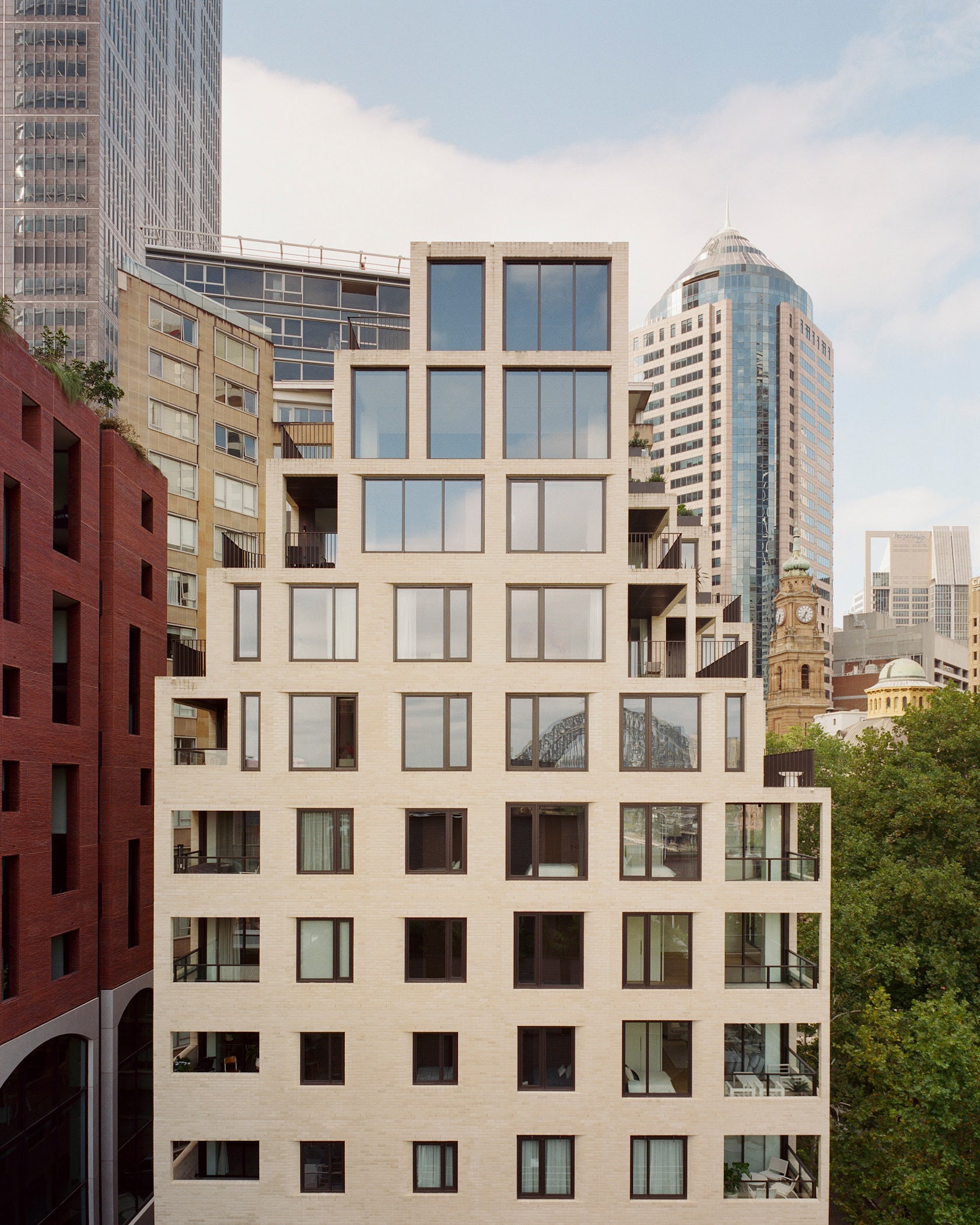
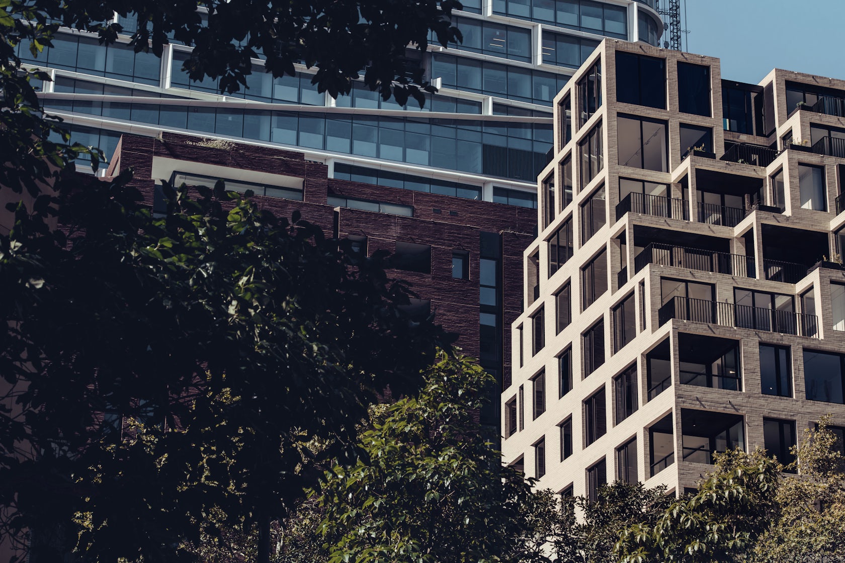
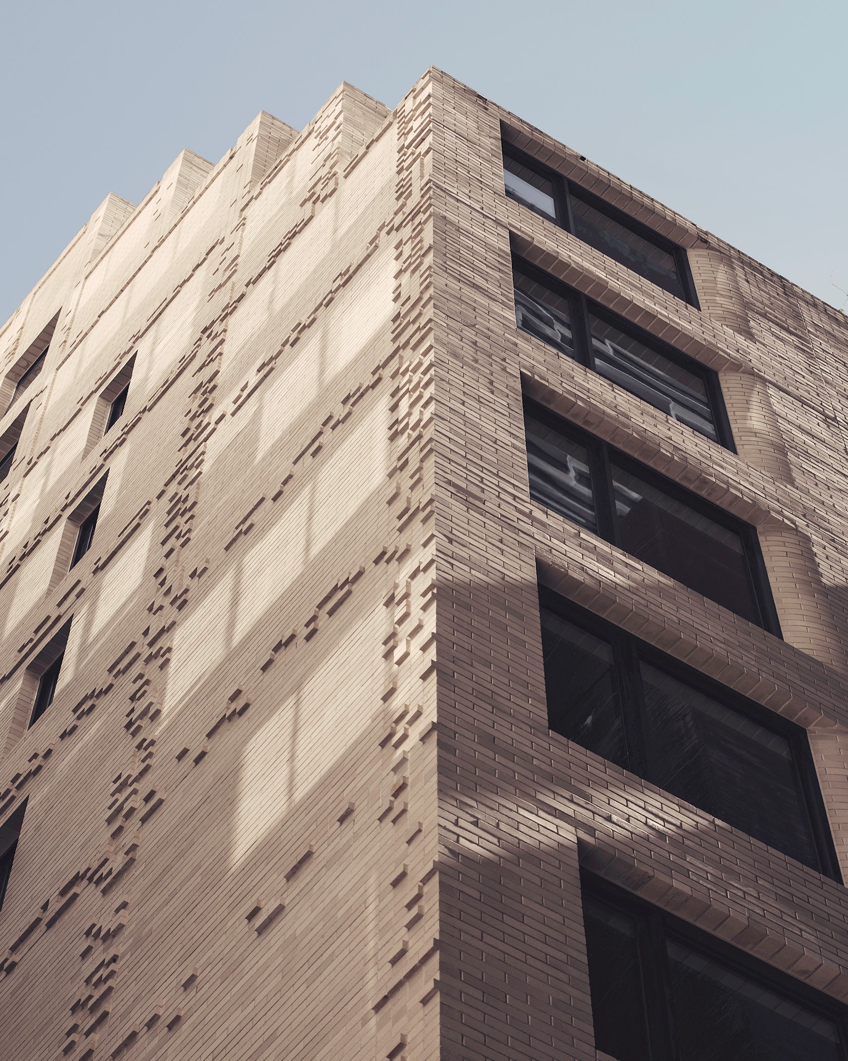
Jad Silvester: Given the relatively small scale of the building and the collection of diverse buildings surrounding the site, our approach has been to produce a building with a singular identity overlaid with an incremental transition that enables each apartment to respond to it’s specific location and orientation. Optimisation of view, sun, outlook, proximity and privacy takes place via subtle manipulation in the scale and orientation of openings. The outcome is a building which transforms horizontally and vertically from one typology to another. At its base the building appears as a solid with subtracted openings, similar in language to its historical context, before rising vertically and dissolving into a finer structure with larger openings.
© Rory Gardiner
This project won in the 10th Annual A+Awards! What do you believe are the standout components that made your project win?
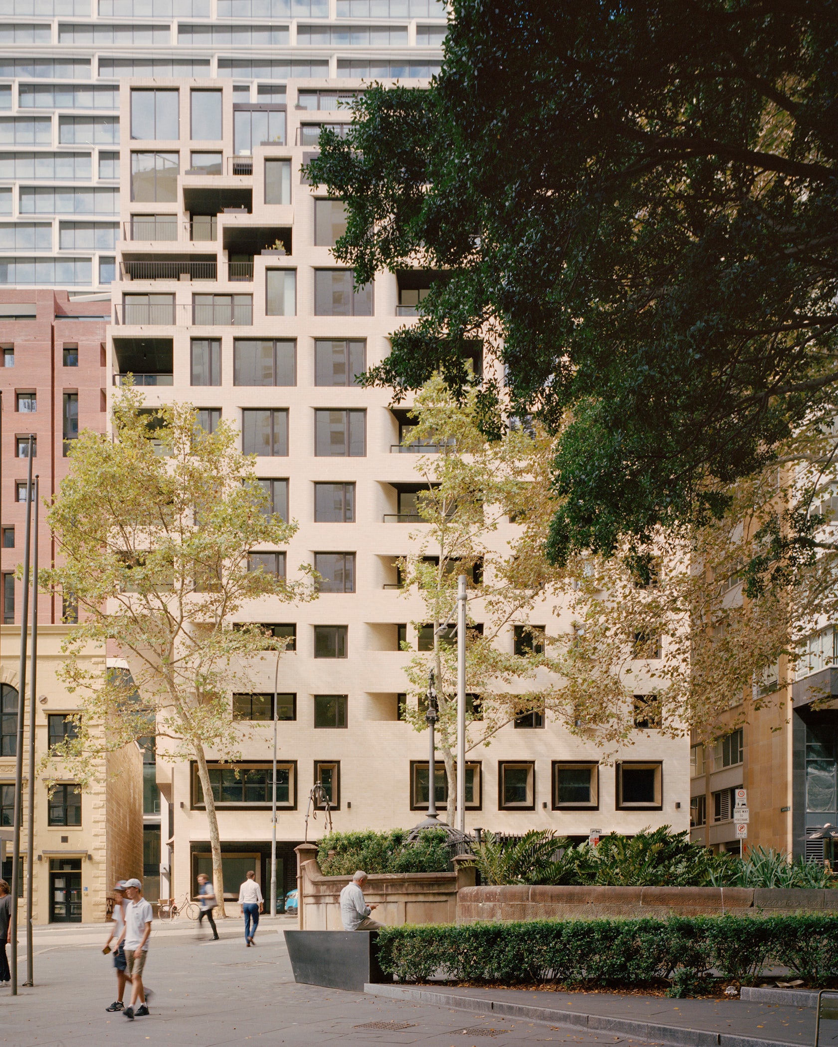
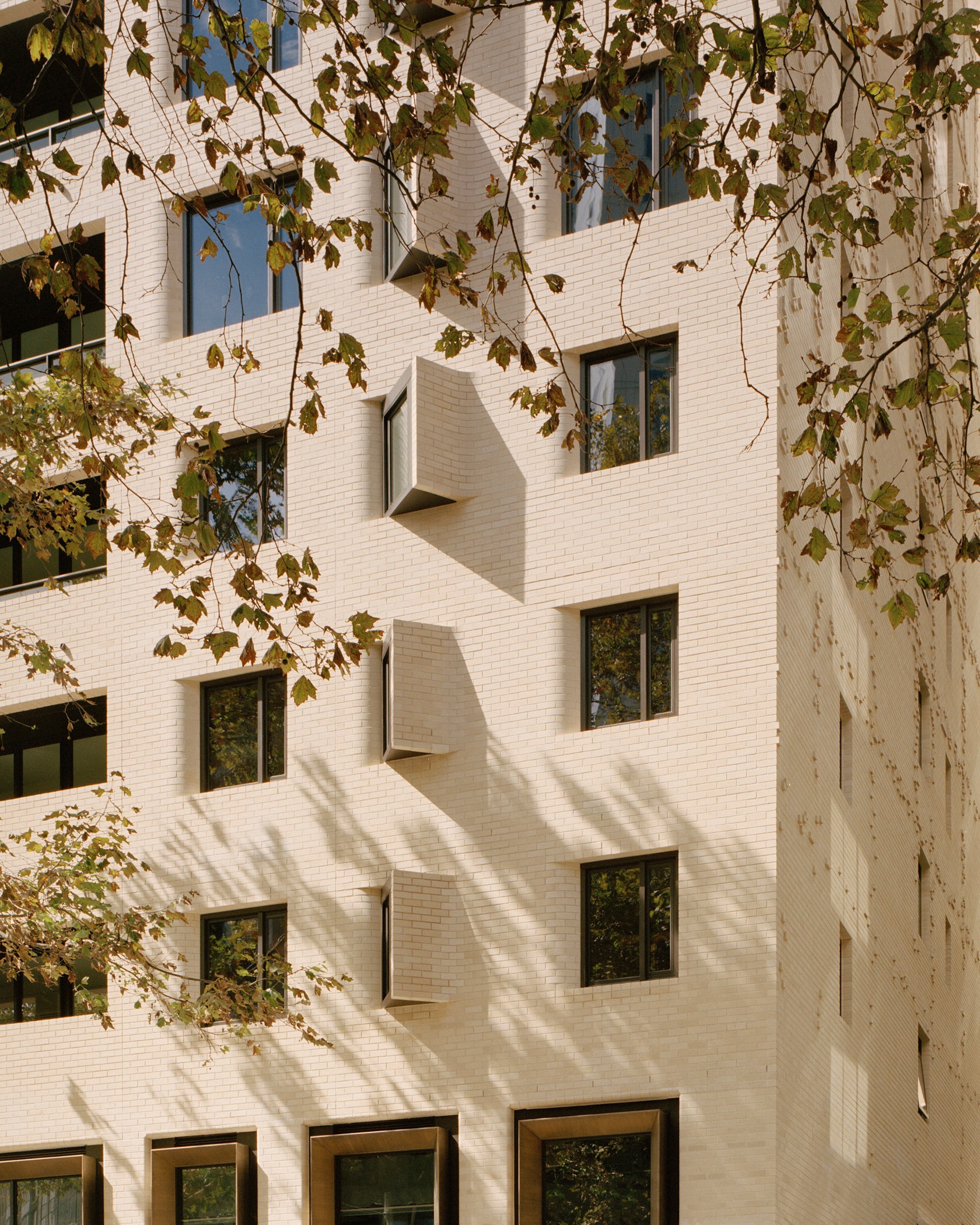
The opportunity to author both the architecture and interior design has enabled a singular concept to unite and connect the exterior and interior. A primary orthogonal grid defines both the building exterior and the apartment plan. Overlaid on the exterior and the plan is a softening which serves to both orient openings in the facade and guide movement through the apartment. These design methods of grid and softening work together to unite interior and exterior creating a consistent and coherent project identity.
© Rory Gardiner
What was the greatest design challenge you faced during the project, and how did you navigate it?
Quay Quarter Lanes is a complex project with many designers authoring individual buildings yet a requirement to arrive at a cohesive whole, a truly mixed-use development, combining retail, hospitality, boutique commercial offices and apartments to form a rich new neighbourhood experience that celebrates its location and built evolution over many decades whilst also acknowledging our First Nations past. The project team agreed on a shared vision for the site and the use of masonry as the structural language for the new buildings. Working in parallel allowed for greater coordination and consolidation of access and servicing of the precinct. This approach enabled an increase in active frontages to all buildings, creating additional space for artisanal retail and hospitality venues around every corner. A “sticky” ground plane is created through bespoke urban furniture, planting and five comm
© Thomas Walk
How did the context of your project — environmental, social or cultural — influence your design?
The precinct wide project design team was assembled through an alternate design excellence process for established and emerging practices. Intentionally selecting individual authors for each building as a strategy for implementation has created a built environment that more closely resembles a gradual evolution of an urban fabric over many decades.
We were selected as an emerging practice tasked with creating a boutique residential building located at 18 Loftus Street within the new laneway precinct. Our approach was to conceive of a building that could sit cohesively within greater precinct yet provide a unique, individual architectural identity that contributes to the architectural diversity so important to the success of city making projects. Our approach sought to identify meaningful drivers for both the architecture and interiors that would result in a highly responsive project.
© Thomas Walk
What drove the selection of materials used in the project?
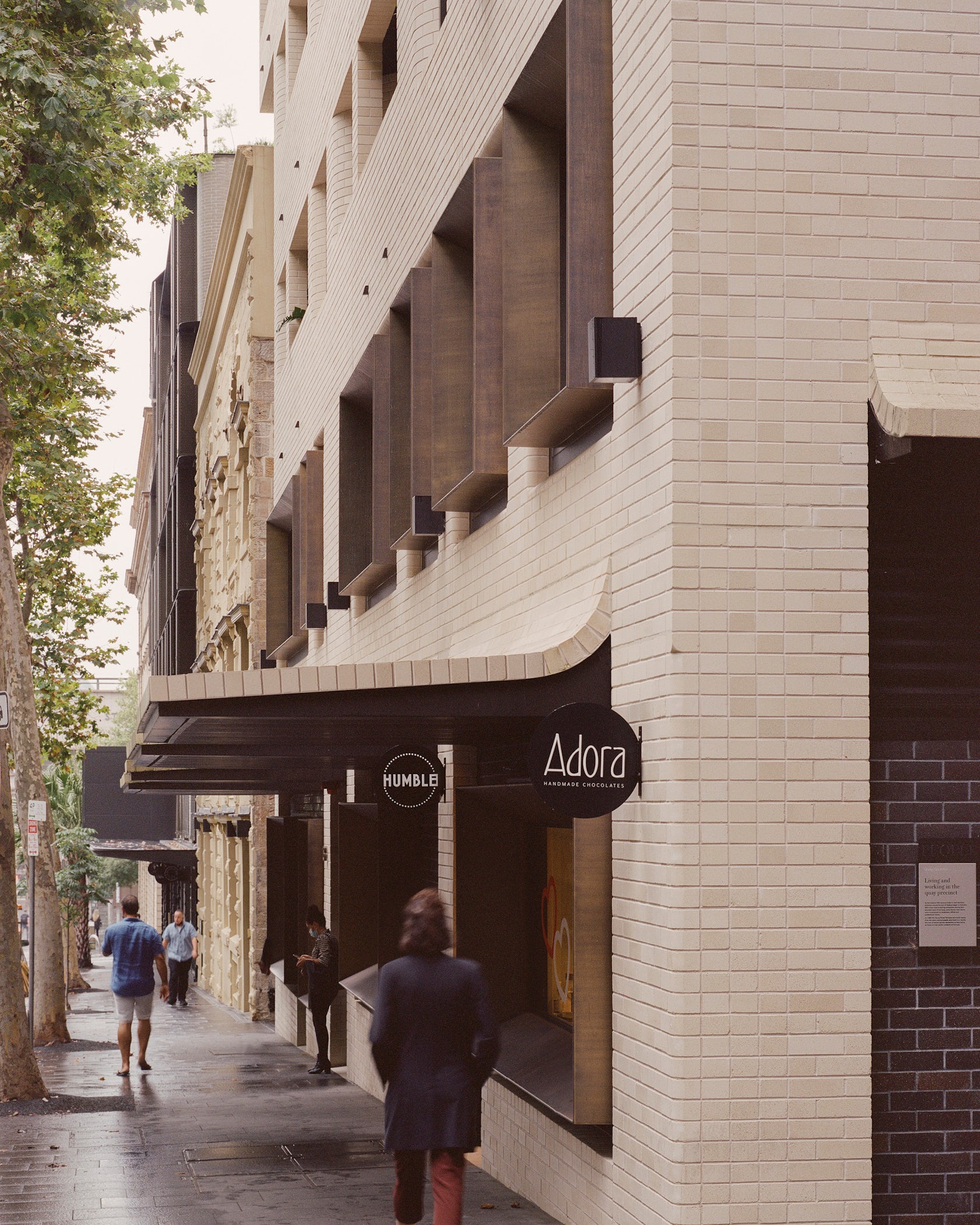
The natural materials chosen for the exterior of the building are intended to age with time, developing a patina, displaying signs of use and weathering as the building settles into its city location. The primary built form steps incrementally, approximating the allowable building envelope creating terraces to the sky and shaping a new pedestrian laneway below. A primary orthogonal grid, of lightly coloured brickwork is subtly refined by a secondary softening to the window and balcony openings. This softness is introduced to orient towards primary views and enhance privacy to selected spaces. At the base of the building the brick skin is lifted, creating canopies and revealing retail frontages. Enhancing the retail tenancies on ground and level one is the addition of brass window frames, inviting views into these spaces, differentiating them from the private residences above.
© Rory Gardiner
What is your favorite detail in the project and why?
The apartment interiors were guided by our intent to find deeper meaning in interior architecture. Prioritising health and wellness unlocked an opportunity to specifically craft the individual primary spaces of living, sleeping and bathing within each apartment. Consequently the material type, colour and tones change from space to space. Darker toned, cocoon-like spaces for sleeping contrast against brighter living spaces. Bathing spaces are bright also, with their wet areas formed from continuous surfaces, reducing joints and aiding cleaning. Touch points including handles and tapware were specified in brass for its anti-microbial properties.
© Rory Gardiner
How important was sustainability as a design criteria as you worked on this project?
The design approach for 18 Loftus Street with regard to sustainability began by analysing the fundamentals of building orientation and opening size, these having the biggest effect on the environmental impact of the project. Each elevation of the building was analysed and opening sizes scaled in response to daylight, view, solar exposure, noise, privacy and proximity. Materials were chosen for not only their textural quality but their structural durability and ability to change and age over time. The primary facade material of brickwork is locally made and sourced. The ability to share services across multiple buildings was embedded early in the project allowing improved efficiency for all services and freeing extra space for tenant activation. The project was continuously assessed for its positive impact on the public, residents and tenants.
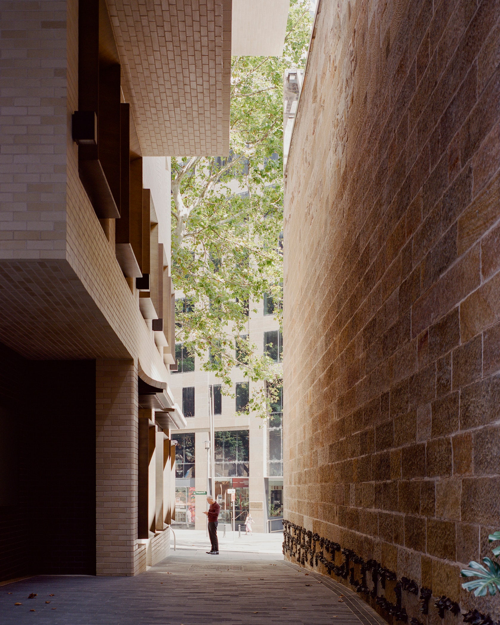
© Rory Gardiner
In what ways did you collaborate with others, and were there any team members or skills that were essential in bringing this Award winning project to life?
Quay Quarter Lanes is the rejuvenation of a city block in the heart of Sydney City at Circular Quay. The project comprises a collection of new and restored buildings and laneways. Three new buildings designed by SJB, Silvester Fuller and Studio Bright complement the site’s heritage wool store Hinchcliff House, restored by Carter Williamson and the Gallipoli Memorial Club, restored by Lippmann Partnership. Stitching the new and old is a public domain and landscape design by ASPECT Studios.
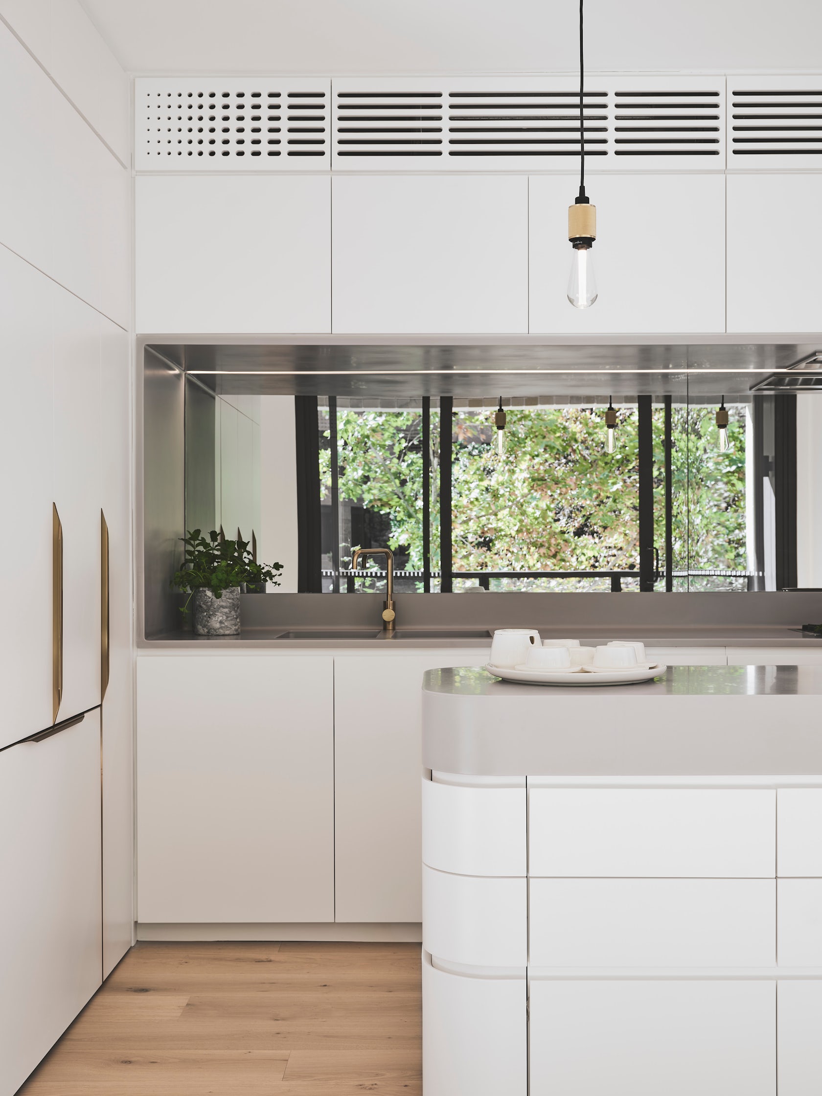
© Martin Siegner
How have your clients responded to the finished project?
In the words of our Client: “…Quay Quarter creates an energetic city neighbourhood with amenity that supports the lifestyles of residents and visitors through retail, wellbeing and social experiences. Re-imagined laneways, new arcades, art and heritage, plazas and seating areas encourage socialising and networking.
18 Loftus Street provides homes at Circular Quay combined with ground and first floor boutique retail. Its masonry sits beautifully within the surrounding historic fabric, providing high quality new residences and is testament to the design excellence created by Silvester Fuller. The interiors are well considered, creating a “cocoon-like” retreats for residents with fine materiality and colour selection.” Murray Middleton, Development Director, AMP Capital.
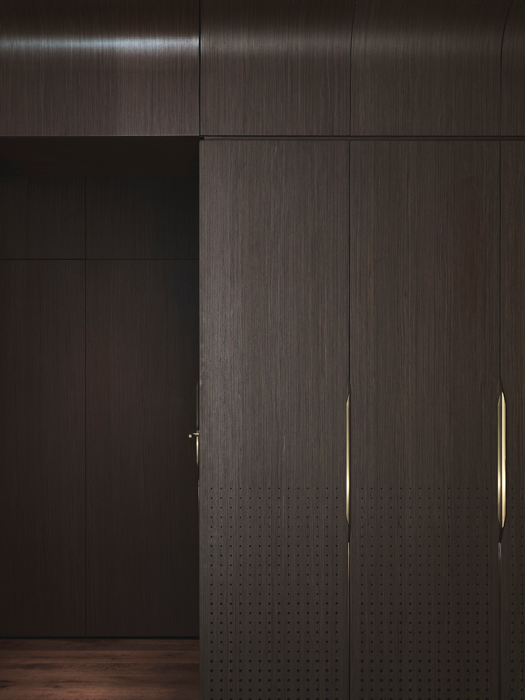
© Martin Siegner
How do you believe this project represents you or your firm as a whole?
Our projects share a rationality of thought, often with surprising outcomes. A commitment to discover the hidden architectural opportunity within each project is at the core of our design process and drives us to find better solutions through the exploration of multiple possibilities. Whilst this process is consistent across all projects, it allows each project to respond specifically to its circumstance, detached from a particular style, yet focused on creating environmentally, socially and economically sustainable places.
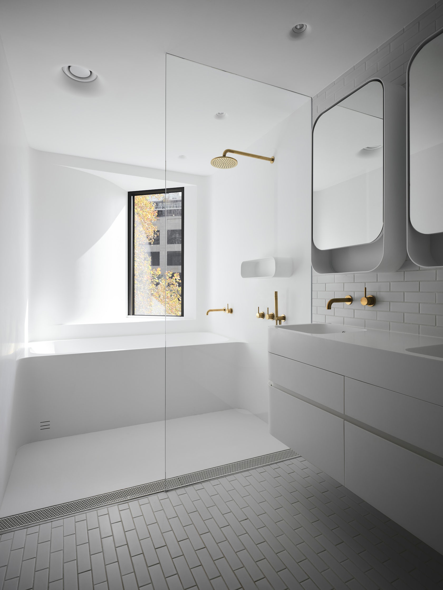
© Martin Siegner
Is there anything else important you’d like to share about this project?
The health, hygiene and wellness concept for 18 Loftus Street was conceived back in 2014. The resultant diversity of spaces within each apartment went against the advice from real estate advisors, who insisted on providing buyers with a light, a medium and a dark colour scheme from which to select their preference. Yet our client trusted our team to propose something new, an idea based on deeper thought, beyond personal taste and with a genuine ambition to create healthy environments using antimicrobial surfaces, seamless materials and natural easy clean materials well before pandemics would bring the qualities to our attention.
Team Members
Jad SIlvester, Penny Fuller, Helen Stumbaum, Bruce Feng, Rosamond Kember, Marek Sinagl, Lachlan Cuthbert
Consultants
Landscape and Urban Design – ASPECT Studios, Public Artist – Jonathan Jones, Public Art Curator – Barbara Flynn, Planning and Heritage – Urbis, Design Engineers – ARUP
Products and Materials
Brickworks: Bowral Bricks – Chillingham White, Bowral Blue (Dry Pressed / Special Shapes), Blueprint: Natural Brass Window Boxes
For more on 18 Loftus Street, please visit the in-depth project page on Architizer.


 18 Loftus Street