Architects: Want to have your project featured? Showcase your work by uploading projects to Architizer and sign up for our inspirational newsletters.
If you’re anything like me (cough, cough — a millennial), you’ll remember the early 2000s pretty well. Just in case you don’t, were expectantly tucked away in a doomsday shelter, or perhaps you’re on the younger side of the readership, here’s a recap: Y2K was weird — like, really weird.
Some folks thought the world was going to end because our clocks and calendars couldn’t comprehend 01.01.2000 as a date, and many more thought all our relatively new and little-understood computer systems were primed to shut down spontaneously (millennium bug anyone?). But most of all, people felt it was a time of a great shift, moving out of the old and dated 1900s and into the shiny new millennium, the “two thousand’s”. What a time to be alive. Everyone was on tenterhooks and poised for the upcoming new year. There was a palpable static energy around, and it was as unsettling as it was exciting.

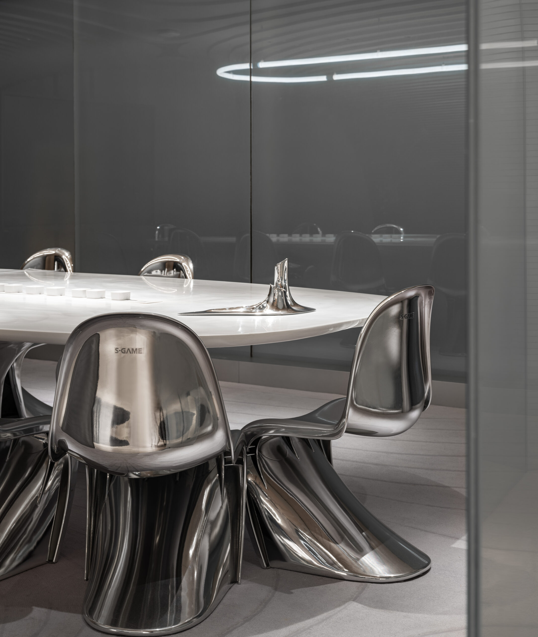
S-GAME Office by LYCS Architecture, Zhongguancun, Haidian, Beijing | Photos by Zhu Yumeng
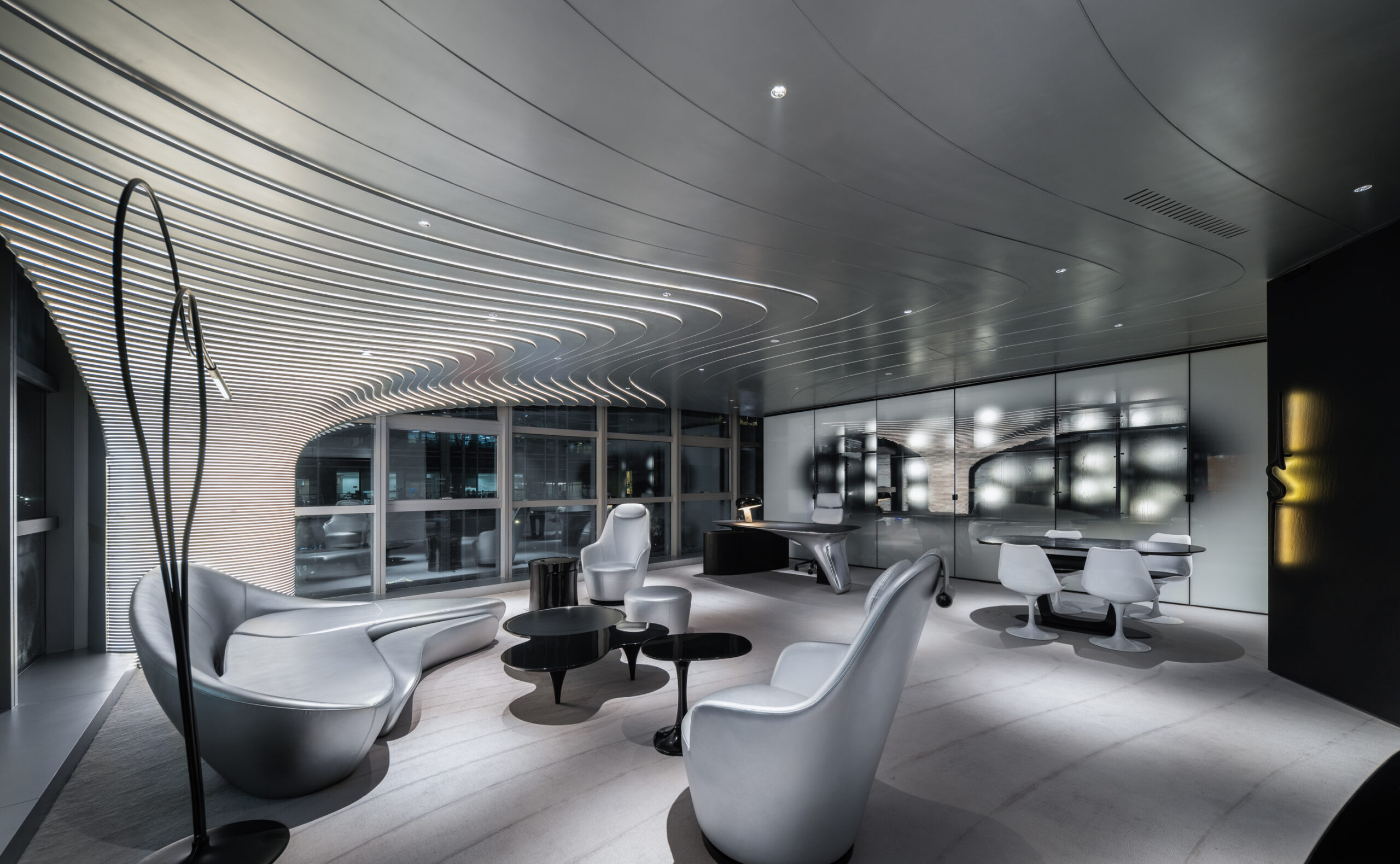
When the turn of the century didn’t bring our infrastructure to a terrifying halt, the dot.com bubble continued to swell, and excitement and anticipation for the future dominated our physical surroundings; fashion, retail, art and architecture took on an ultra-modern and futuristic aesthetic. We were heading into the modern ages, and by God, we had better look like it. Sharp lines were out, and curvature was in. Bubbles were best. Shiny, synthetic materials were standard, while inflatable furniture, moon-boot footwear and alien-inspired hairstyles captured the spirit of the age. Chrome, in particular, did well for itself during the millenium. It was a futuristic, glittery and cyber-obsessed time. The Matrix “digital rain” screensaver was everywhere, and for a brief moment, utopian futurism and faith in a new age of boundless possibility filled our spaces. It was wonderfully weird.
Like many trends, the Y2K aesthetic was never destined to last. Its ideas, deemed too extravagant and costly to replicate, failed to break into mainstream fashions. As the initial optimism of the new millennium waned, so did the Y2K aesthetic. We were left with the realization that the millennium had brought about little change, and life was much the same as it had always been. The biggest difference was that we now had to get used to writing twenty instead of nineteen.
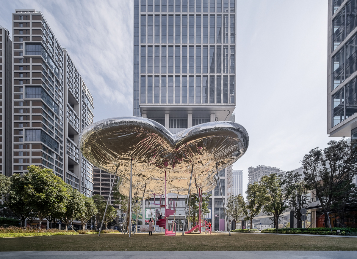
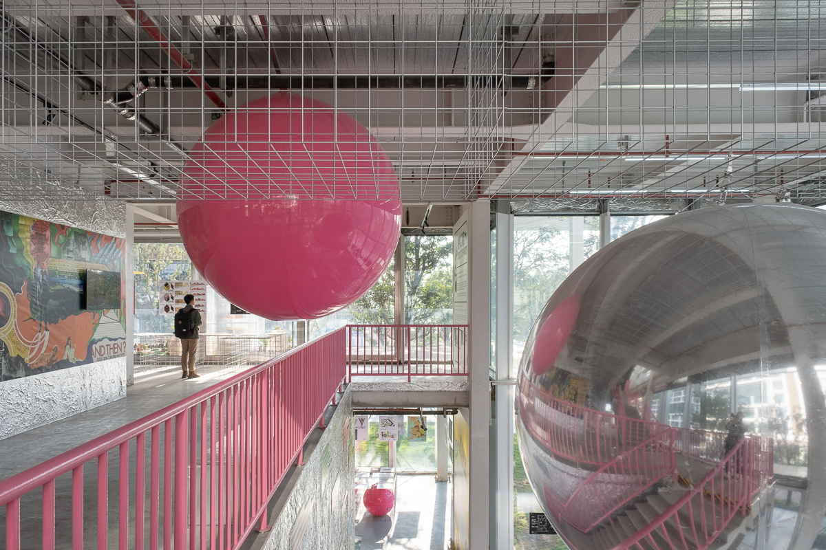
Qianhai Superposition & Back to Future by Studio 10, Shenzhen, China | Photos by Chao Zhang
However, thanks to the trend revival machine that is TikTok, the Y2K aesthetic has made a triumphant return. This social media app, beloved by Gen-Z, has become a gateway to 2000s culture, introducing Y2K fashions, hairstyles, accessories and designs to a new generation. With its help, the Y2K aesthetic is now officially launching into its second era.
This time around, the Y2K aesthetic isn’t as literal as it was. Futuristic doesn’t need to be shiny; modern doesn’t need to include every bit of technology possible. Like those of us who witnessed the trend the first time around, the architecture and design we see today, inspired by the early 2000s, has grown up. There is subtlety and finesse that didn’t exist in the previous manifestation. It’s cooler and more sophisticated in a way that the blue eyeshadow, glitter hairspray and cargo pant-wearing millennial of the past could never have achieved.
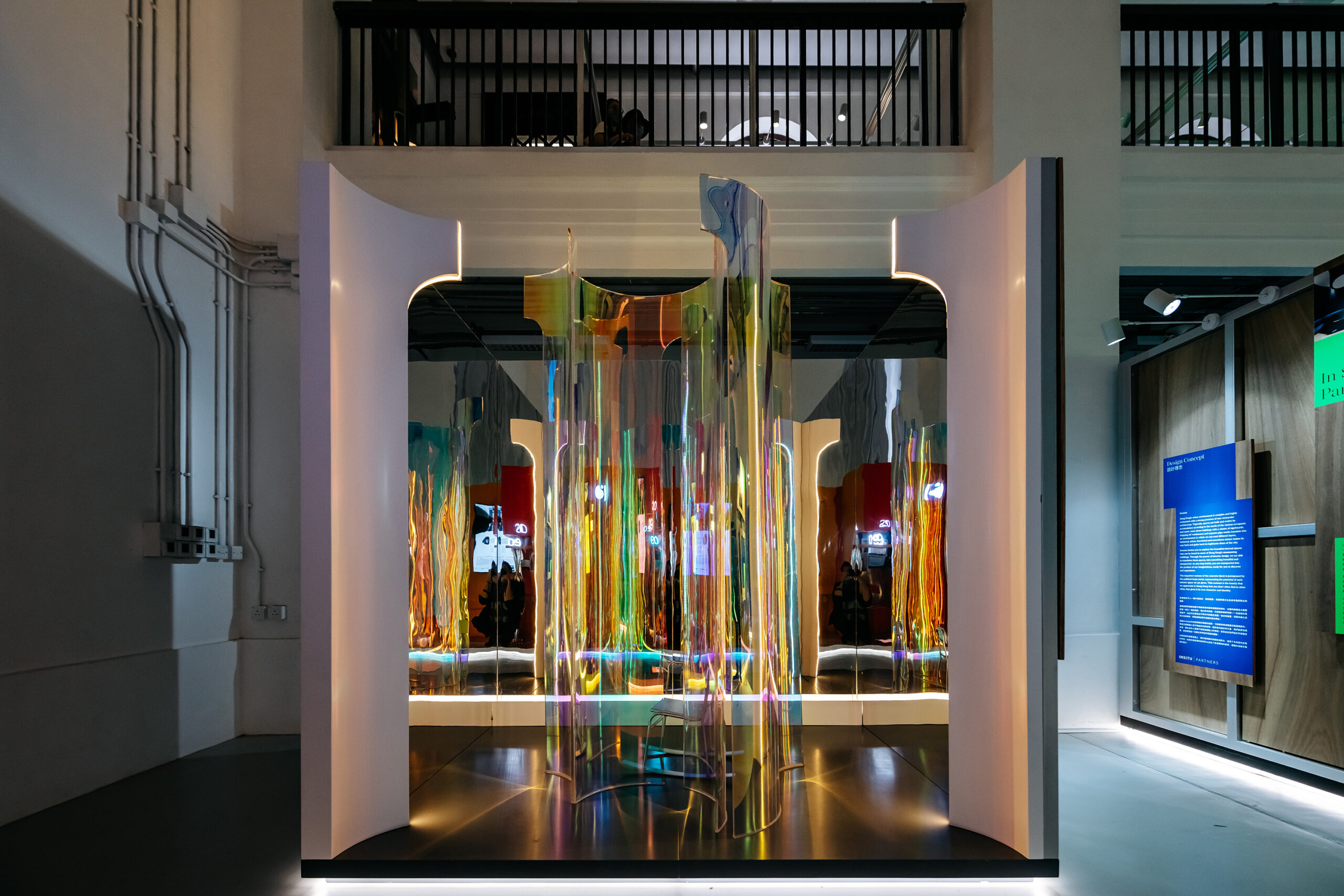
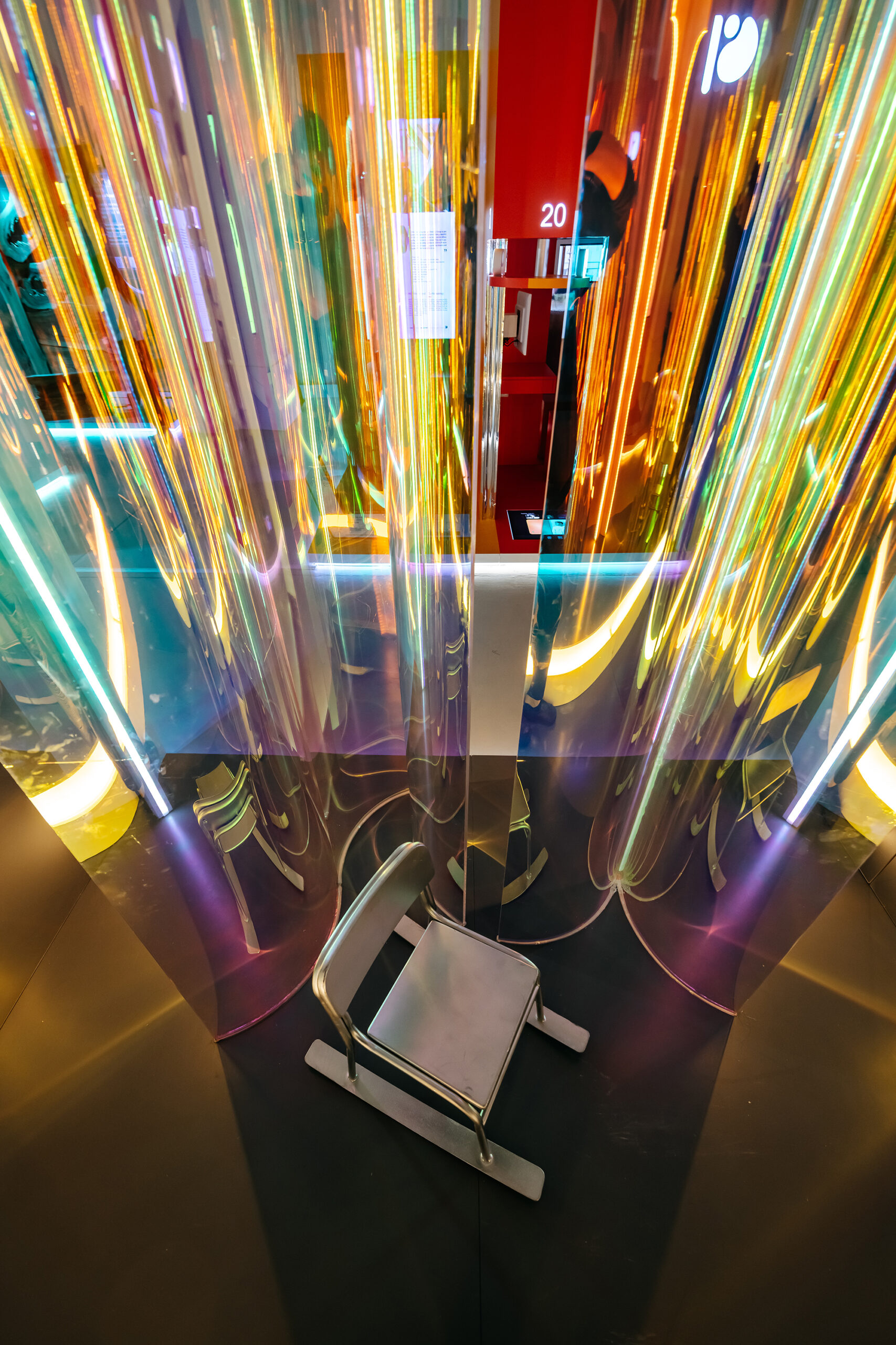
Interstice by O&O Studio, Hong Kong | Photos by 1km Studio
A key feature of early 2000s decor was the marriage of ’70s nostalgia with retrofuturism — a creative trend inspired by older portrayals of the future. The style brought together the bold hues of the ’70s, such as lime, hot pink and clementine, with sleek chrome, soft lilac or cool blue in a bold juxtaposition often intertwined with pattern and the essence of movement. The addition of iridescent acrylic and glass captures the ideals, adding a shimmering, otherworldly quality to furniture and decor.
While futuristic optimism is the source of this trend, nostalgia is truly the driving force here. It is what we used to believe the future would look like when we looked forward from the ‘60s and then again in the 2000s, and now, once more in 2024, our longing for a shiny, bright and hopeful tomorrow is ever-present once again.
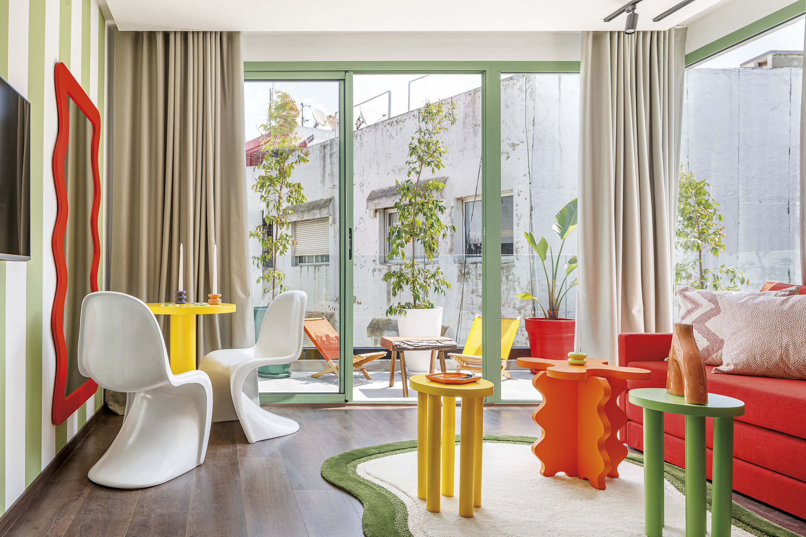
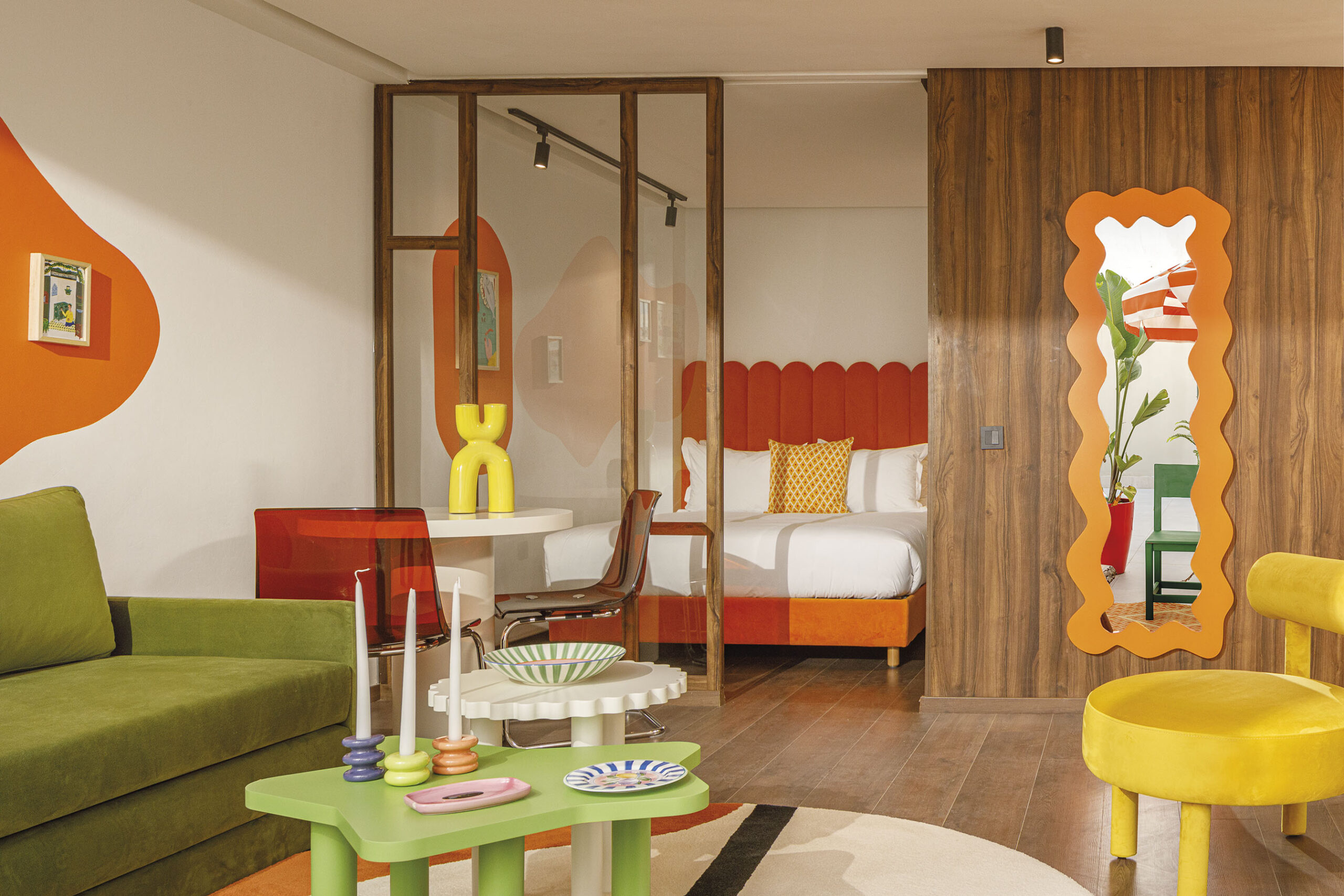
BasilicÔ by Studio CAYS, Casablanca, Morocco | Photos by Alessio Mei Photography
Furniture in the Y2K era was centered on comfort, or at least the appearance of comfort, with bean bag chairs and inflatable sofas gracing the floors of the trendiest rooms. Today, a fascination with cozy, laid-back seating is nothing short of an obsession with oversized, over-stuffed furniture in every showroom. Big, rounded shapes dominate our seating. These items were, and continue to be, bold and full of personality, and the idea of contrasting sophisticated pieces with the playful, youthful energy of these Y2K styles is the preference, with designers opting for more refined versions to add a whimsy that simultaneously caters to a grown-up aesthetic.
The height of the eccentric Y2K design was seen and is equally remembered in the quirky decor accents that were so prominent. Lava lamps, mirror tiles, heaps of mismatched pillows, and beaded curtains reigned supreme. This enthusiasm for lively and dynamic decor is reemerging, visible in the current craze for squiggly furniture, mismatching colors and patterns that overload the senses in a way that transcends traditional maximalism. It’s bright, it’s bold, and if we were to listen to any of the traditional design rules, it really shouldn’t work. But somehow, it does. It’s a level of boldness that at first shocks and later encourages a positivity that is unmatched. How can you be sad in a space like BasilicÔ? It’s just too much fun.
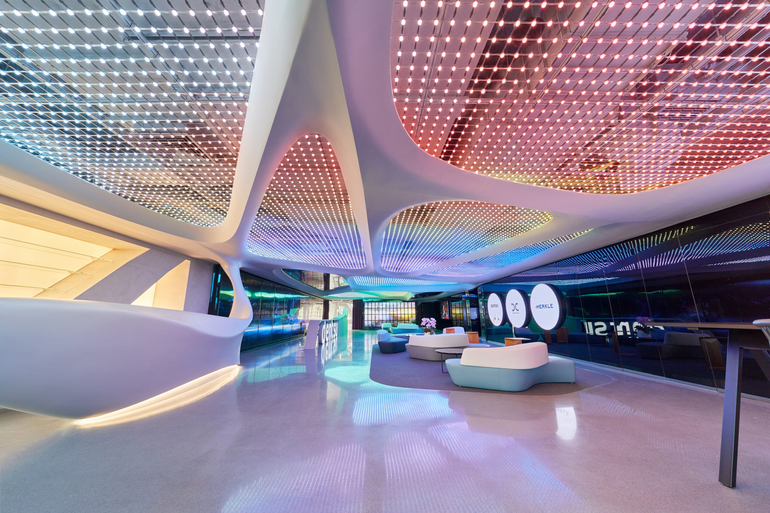
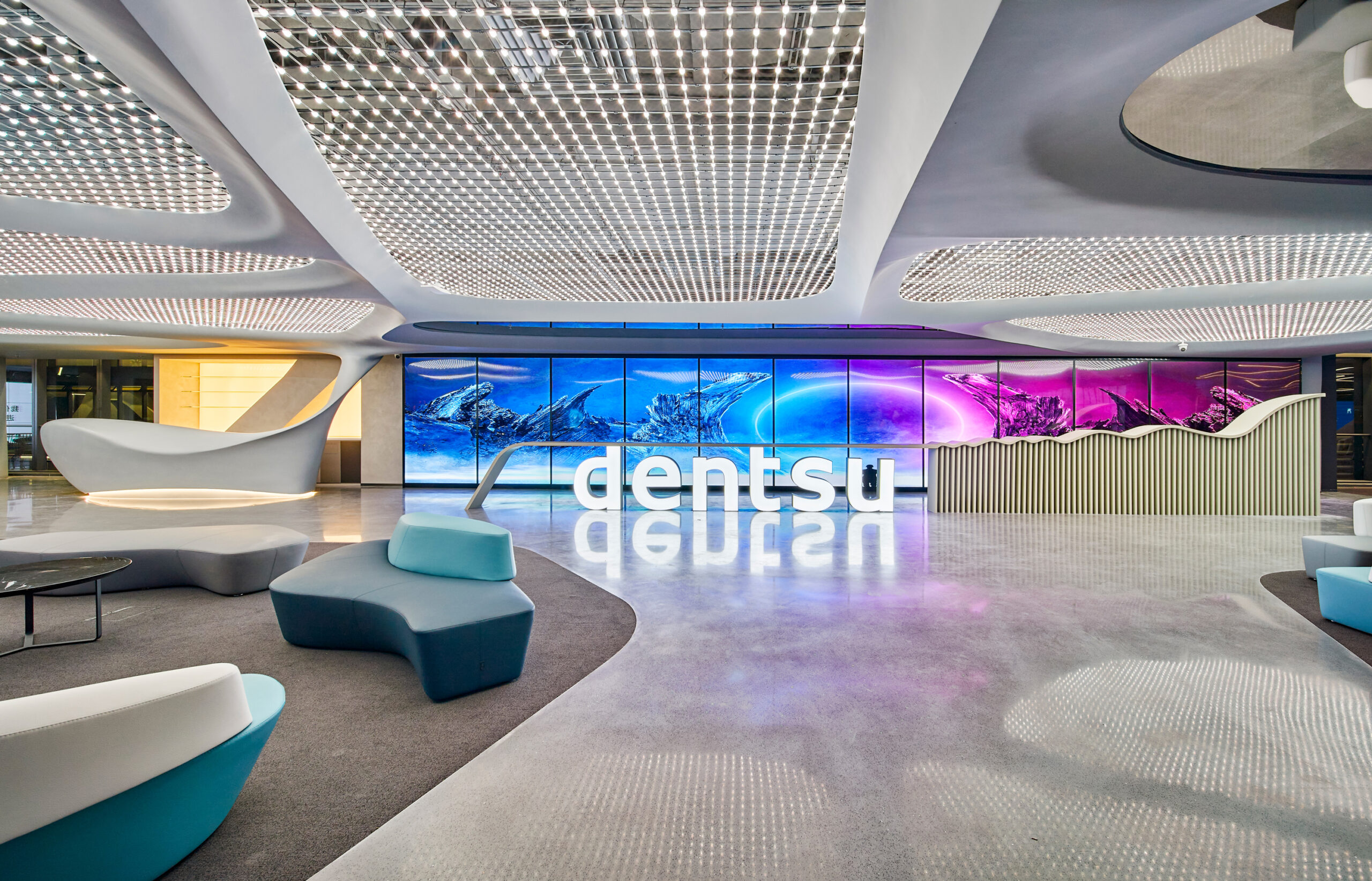
Dentsu China Headquarters by K&H International, Shanghai, China
In the early 2000s, we dreamed of a future where technology and art seamlessly intertwined; we used neons, holographic paper and magic eye pictures to create a world where the holograms and technologies from TV really existed. Today, technology has advanced greatly, and that vision has become a vibrant reality. As can be seen in the brilliant example put forward by K&H International at Dentsu China Headquarters, the essence of Y2K nostalgia can truly utilize the cutting-edge advancements of the present.
Digital art and lighting installations, with their immersive experiences and interactive elements, bring to life the futuristic aesthetics we once only imagined. The use of vivid colors, dynamic animations, and holographic effects once again evoke the playful and experimental spirit of the Y2K era. As we integrate these digital masterpieces into our spaces, we create environments that are both nostalgic and forward-thinking, celebrating the evolution of technology and its profound impact on artistic expression.
So, hunt out your foot pumps, get your lounge furniture inflated and power up the old G3 because Y2K is back, and it’s more fun than ever.
Architects: Want to have your project featured? Showcase your work by uploading projects to Architizer and sign up for our inspirational newsletters.
