Architects: Want to have your project featured? Showcase your work by uploading projects to Architizer and sign up for our inspirational newsletters.
As designers, we often see our projects in 2D, working with layers and lines to produce plans and elevations that could easily be considered artworks in their own right. To the trained eye, a well-drawn elevation is a thing of beauty. Our drawings are a place where, through the deep understanding of space and dimension that is common to designers, we can experiment with the intricacies of form and placement to explore the interaction between objects. Yet, the true magic happens when the successful elevation drawings are translated into reality, a skill that can transform spaces into immersive environments that captivate and inspire visitors.
“Visual Vignettes” are carefully composed moments within an interior design scheme that capture the balance of a two-dimensional elevation while harnessing the user’s or visitor’s sensory perceptions. They result from bridging the gap between the theoretical and the tangible. Visual vignettes are where the art of designing meets the science of space planning, turning abstract lines and shapes into moments. By thoughtfully manipulating light, texture, scale, and other parameters, designers can craft these vignettes to instill emotion and create memorable spaces — as is exemplified in this year’s A+Award-winning projects.
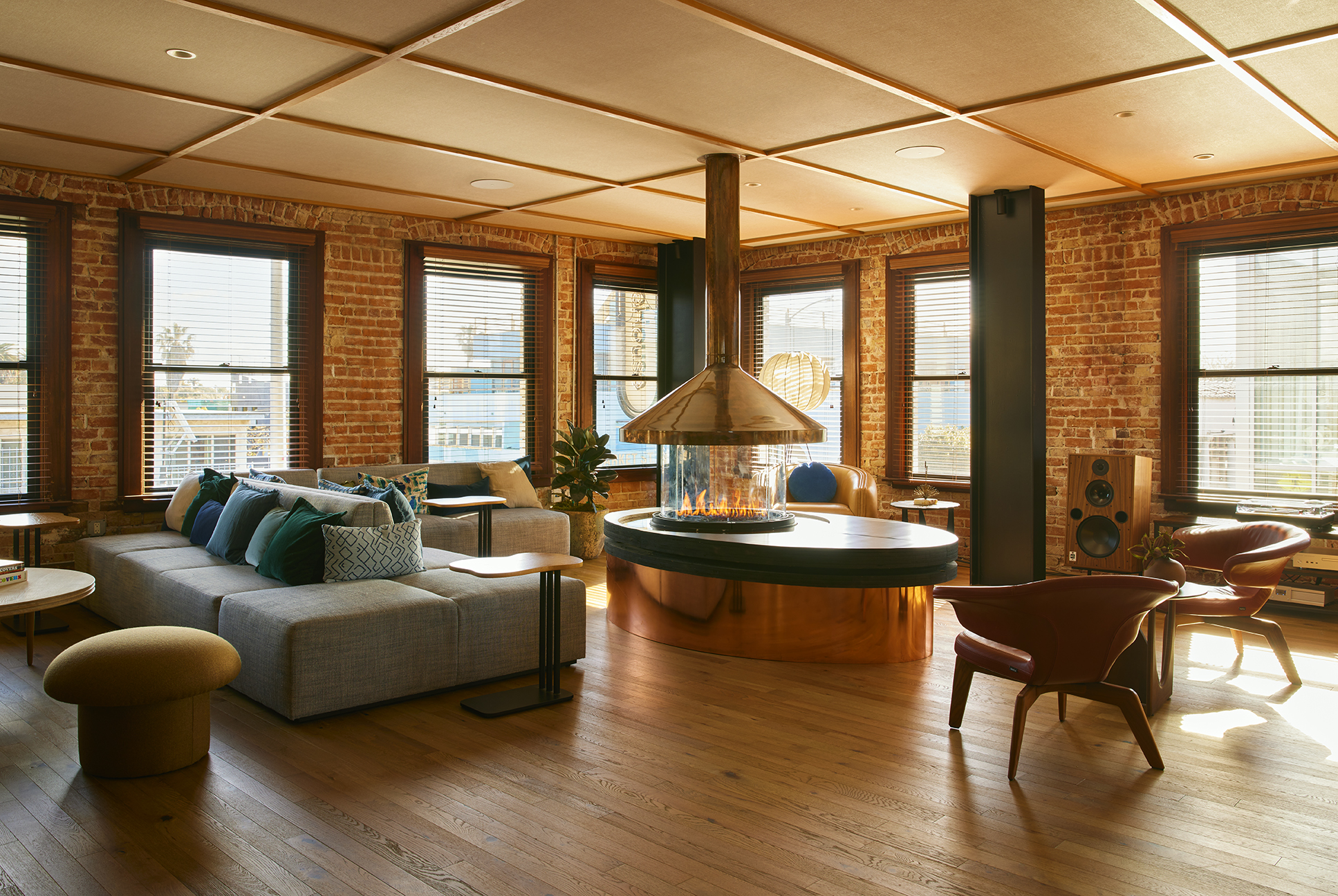
NeueHouse Venice Beach by Loescher Meachem Architects and DesignAgency, Los Angeles, California | Popular Choice Winner, 12th Annual A+Awards, Remote Work and Coworking Space
Establishing focal points is a great place to begin when building a visual vignette within a space. The aim is to guide the viewer’s eye and create a clear visual hierarchy. By creating a focal point in a space, your aim is to draw attention to a specific area or object, making certain that a chosen element or area stands out. These could be created by specifying a striking piece of furniture, highlighting unique architectural features, or choosing an artwork that effectively illustrates the desired atmosphere for the space. Intelligent placement of focal points in a room allows a designer to direct a visitor’s gaze with purpose to coordinate a sense of order and reaffirm the intended narrative of the space.
When striving to create visual vignettes, the principle of balance is key. Balance in a space ensures that no single element overshadows the others. For the person experiencing a space, balance or lack of it is one of those feelings we can never really put our finger on. When it’s right, typically, a user will feel a sense of comfort. When it’s not, a sense of uneasiness that cannot be determined is common. There are many ways to achieve balance in a design. However, two of the simplest to master are based on humanity’s innermost desire for order and ordered chaos.
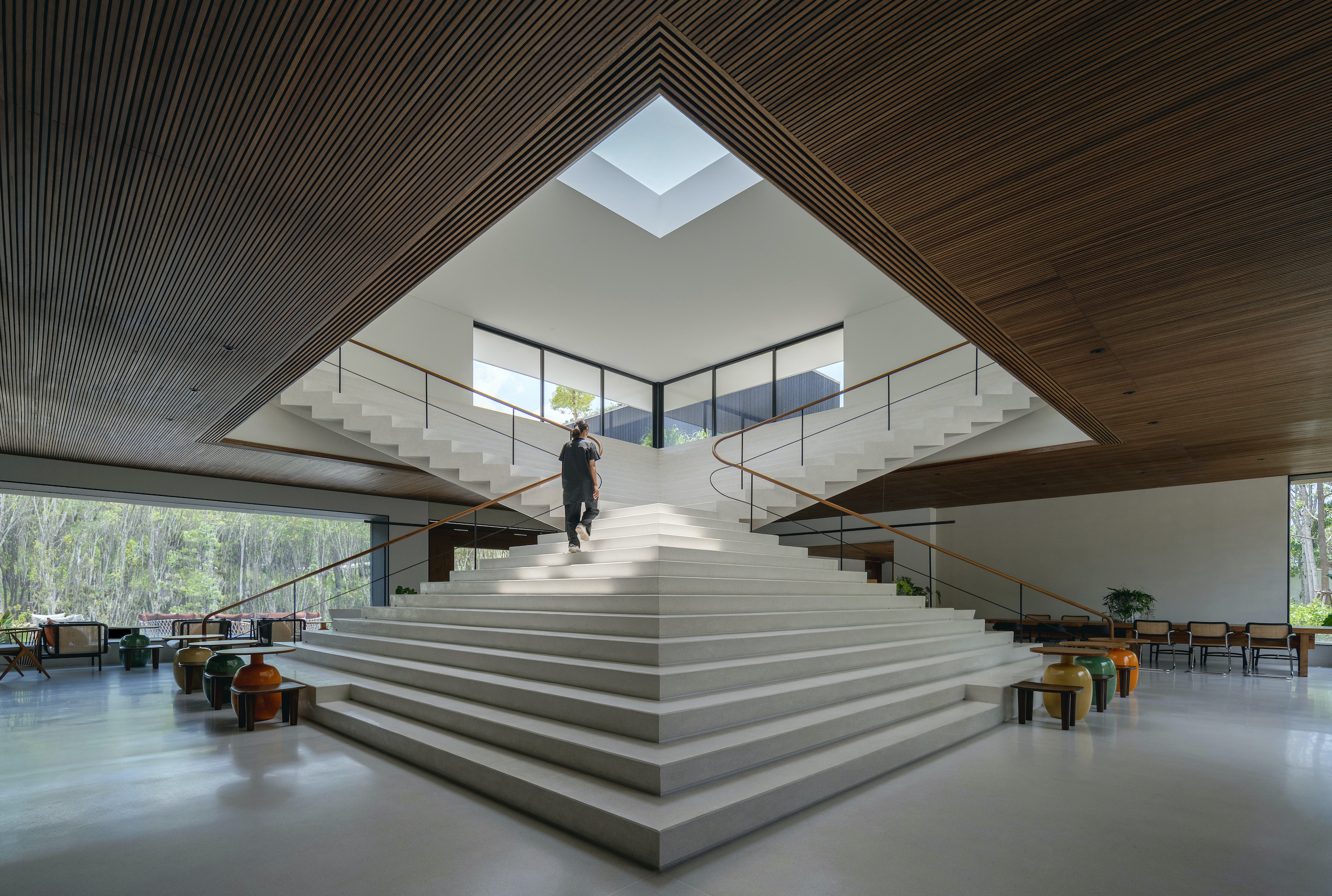
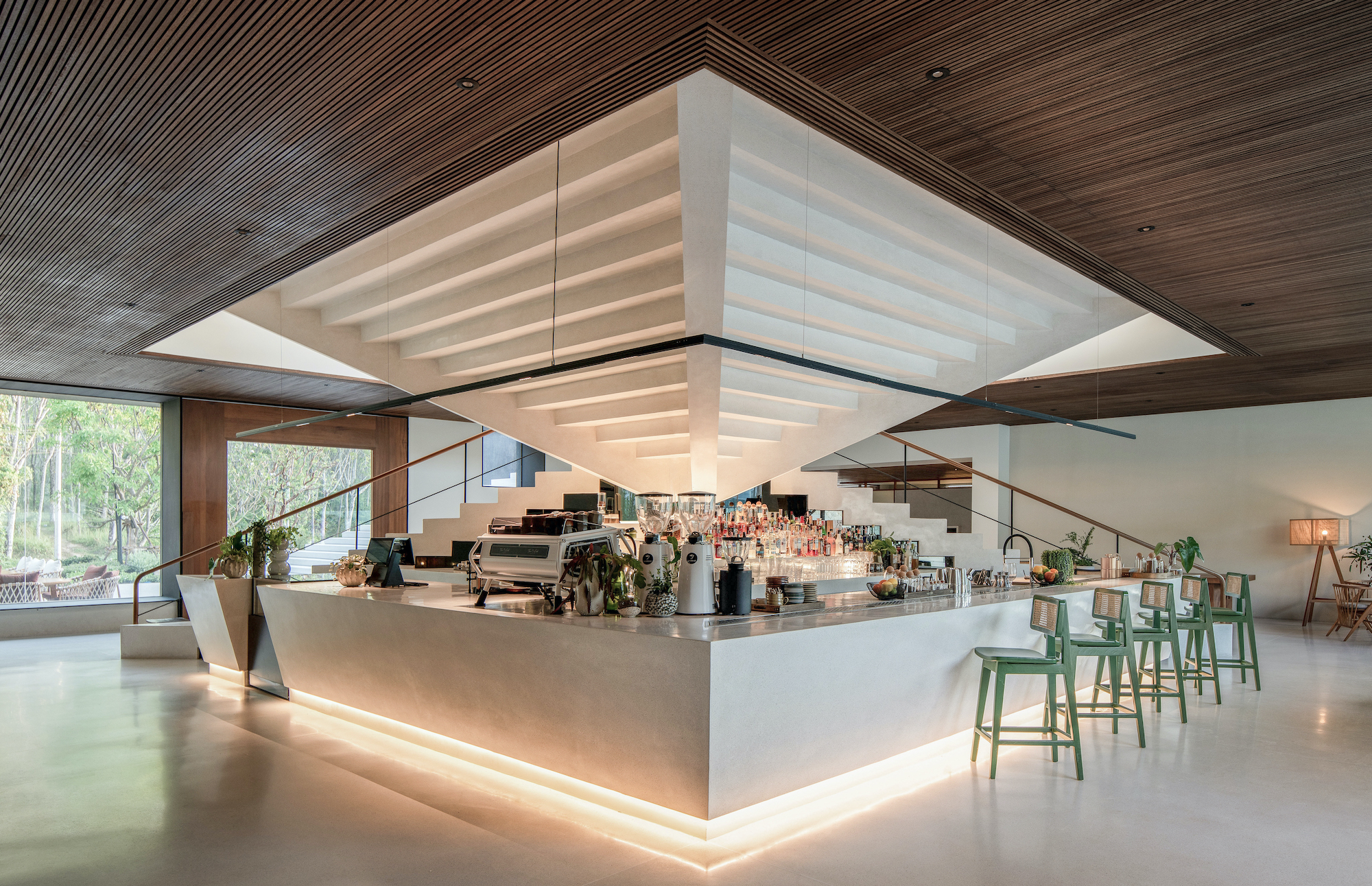
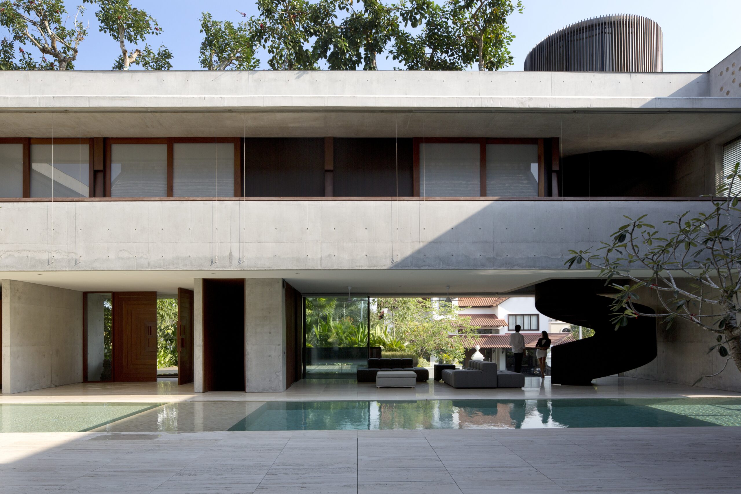
Tree O’clock — Villa Qabalah by Studio Locomotive, Phuket, Thailand | Photos by Beer Singnoi | Jury Winner and Popular Choice Winner, 12th Annual A+Awards, Mixed Use (S <25,000 sq ft)
As you’ve probably noticed, humans enjoy symmetry. It appeals to us on both a conscious and subconscious level, providing a sense of aesthetic pleasure and cognitive ease. It makes us think of health and stability and off—ers a sense of order. In interior design, symmetry shows up all the time. Think about in bedrooms with headboards, bedside tables and lamps. Or fireplaces with mantels centered on a lounge wall. As designers, we can introduce symmetry in subtle ways, for example, by framing areas with a set of curtains or choosing patterns that are symmetrical in design; even how we style shelving can bring symmetry into a design and instill harmony into a space.
Conversely, asymmetrical choices can also be highly effective. In this instance, designers use visual weight to capture a sense of balance as opposed to having an exact reflection. By grouping different elements of equal visual weight, we can achieve equilibrium while creating a more dynamic and intriguing composition. For instance, balancing a large piece of art with a cluster of smaller objet d’art items brings a lively yet cohesive feel. Similarly, a large armchair is flanked by nesting tables and a floor lamp — the varying heights and weights make the arrangements both engaging and balanced.
Building on the foundation of balance, composition and proportion are crucial to ensuring that each of the elements in a space relate well to each other. To achieve cohesion, many designers turn to established proportional strategies to guarantee pleasing relationships. “The Rule of Thirds” is often used to prevent monotony by introducing our old friend dynamic asymmetry, guiding the gaze through the space in an engaging manner. Adopting a well-understood idea like “The Golden Ratio” replicates the kind of organic balance we would typically experience in nature, making the composition of a space feel inherently satisfying in a primal way. Equally, designs that follow a grid system rely on proportions and the relative size of elements to ensure unity and balance.
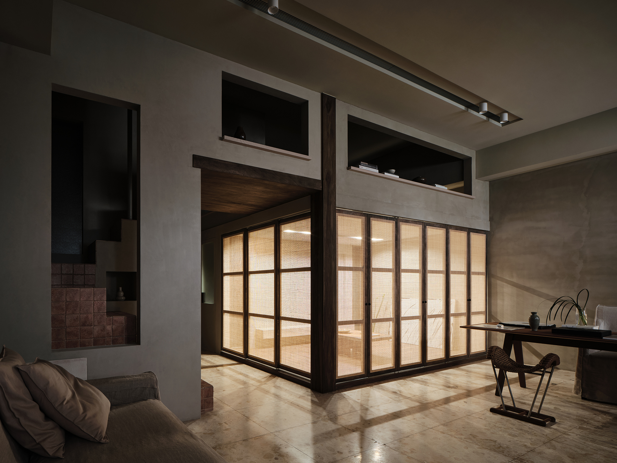
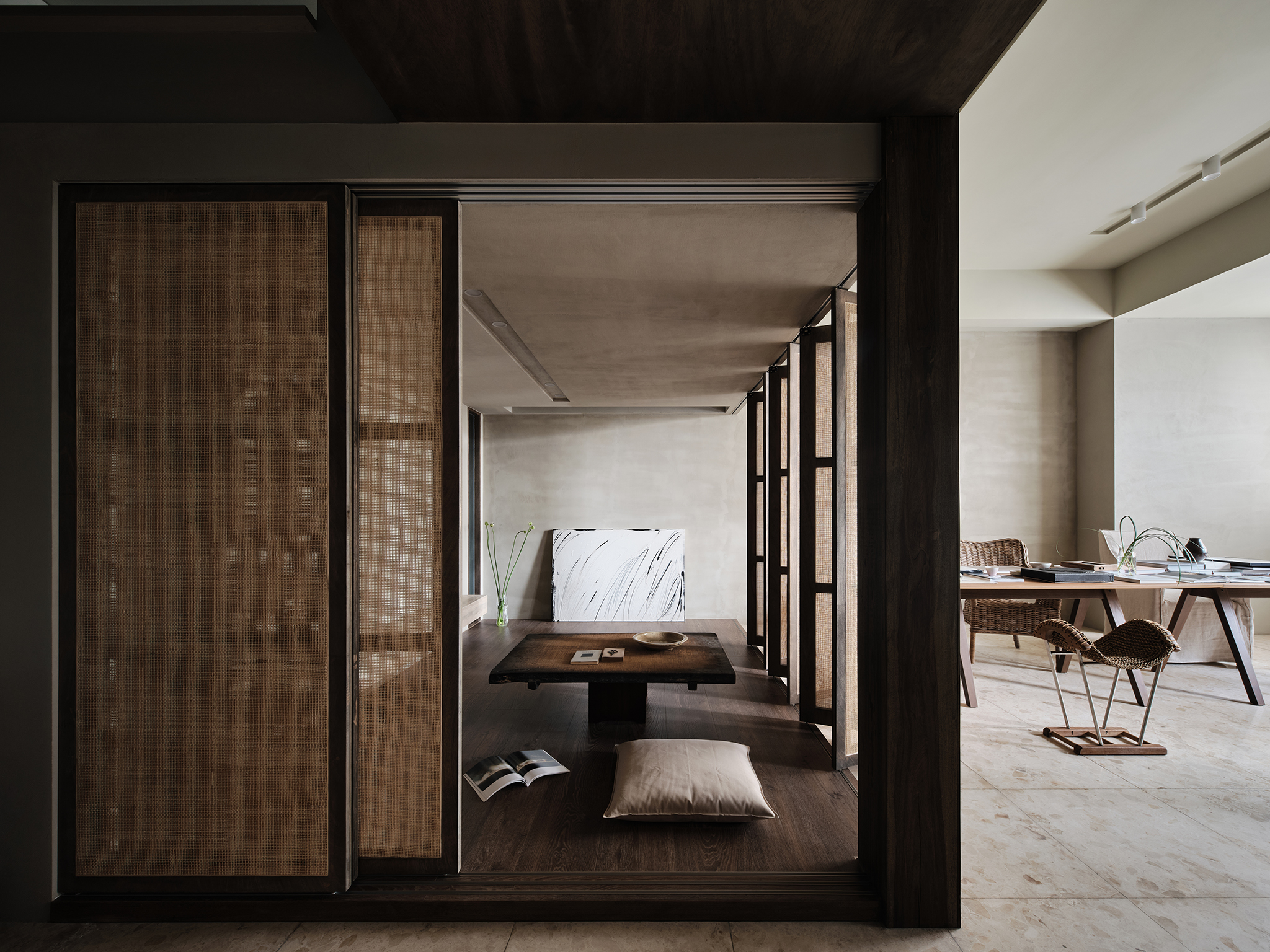
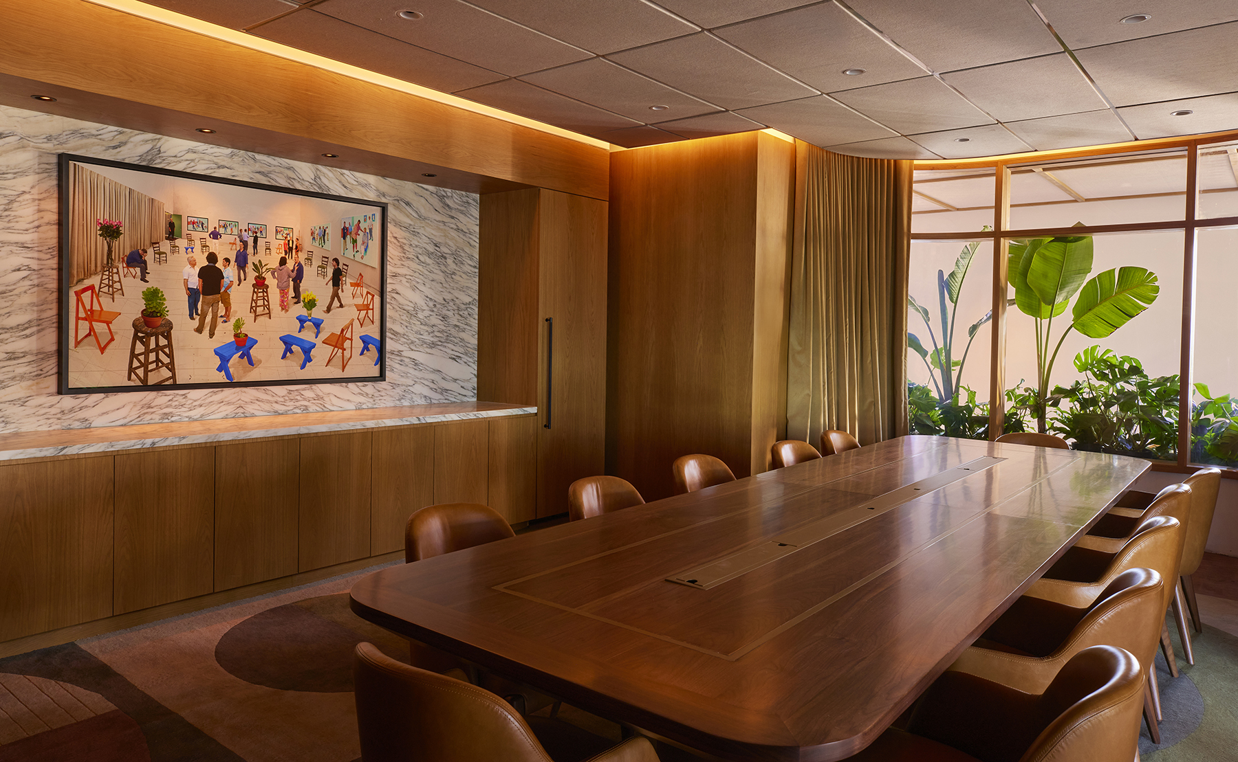
House FC by fws_work, Taipei, Taiwan | Photos by Suiyu | Jury Winner, 12th Annual A+Awards, Apartment
This idea of grid systems can be used to great effect when making visual vignettes. Rhythm and repetition are excellent at mimicking a sense of movement that has continuity. By deliberately repeating design elements, designers can establish a visual flow that appeals to users. There are many ways to do this and different types of rhythm to try and create. Regular rhythm involves consistent intervals, equal spacing and positioning. Think of a corridor of artwork, all the same size in the same frames or a pathway flanked by the same species of tree.
Alternating rhythm introduces variety, using two different repeating elements that alternate back and forth. This could be a checkered floor or striped wallpaper. Progressive rhythm uses gradual variations, color gradients, or light washes, which are common ways to introduce progressive rhythm into a design. Random rhythm scatters elements in a planned yet spontaneous manner. This can be used effectively when designing shelving units, making each opening unique while consistent material and color bring cohesion. Introducing rhythm into a design can make a space feel both unified and engaging, creating a visual journey that truly captivates and holds a visitor’s attention.
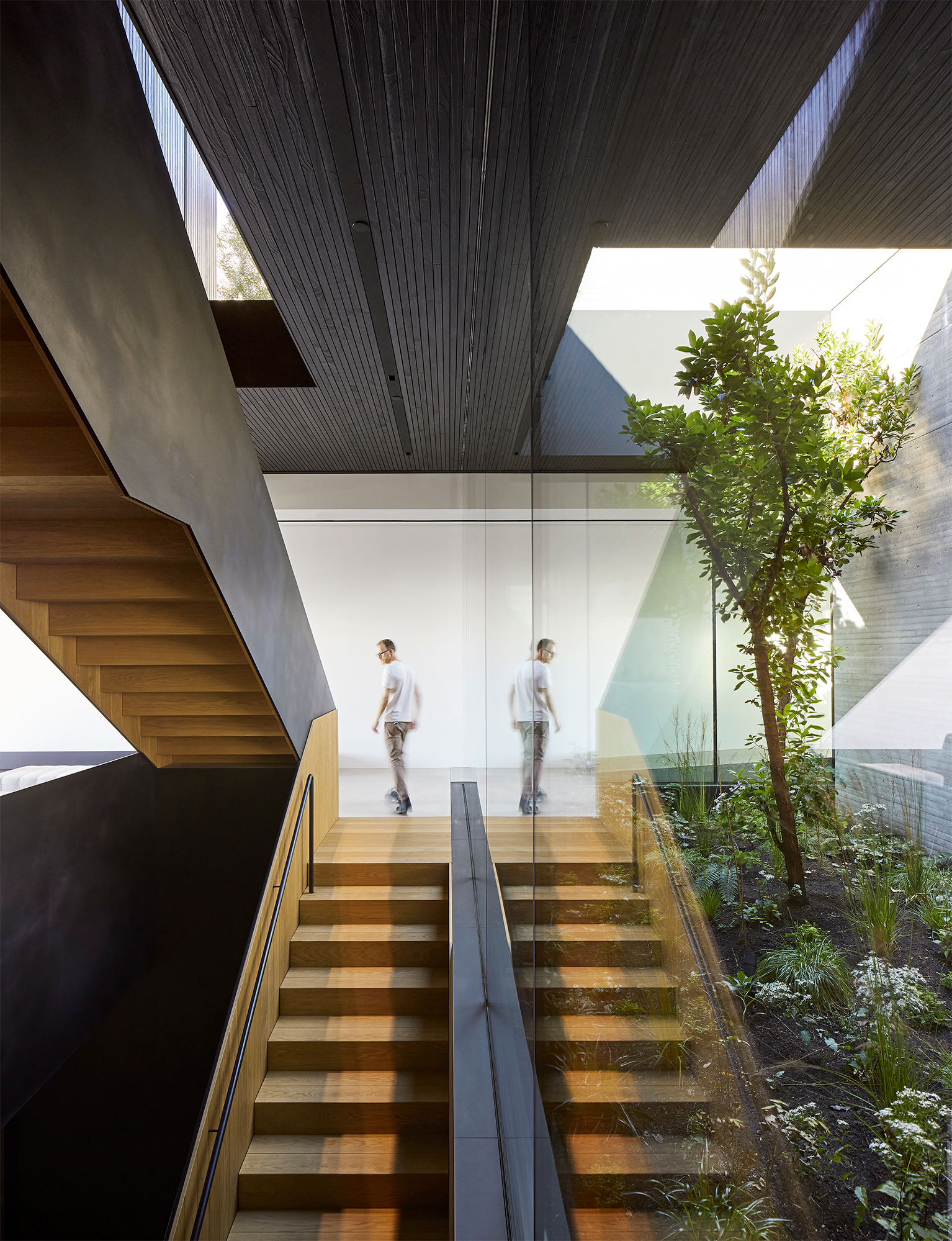
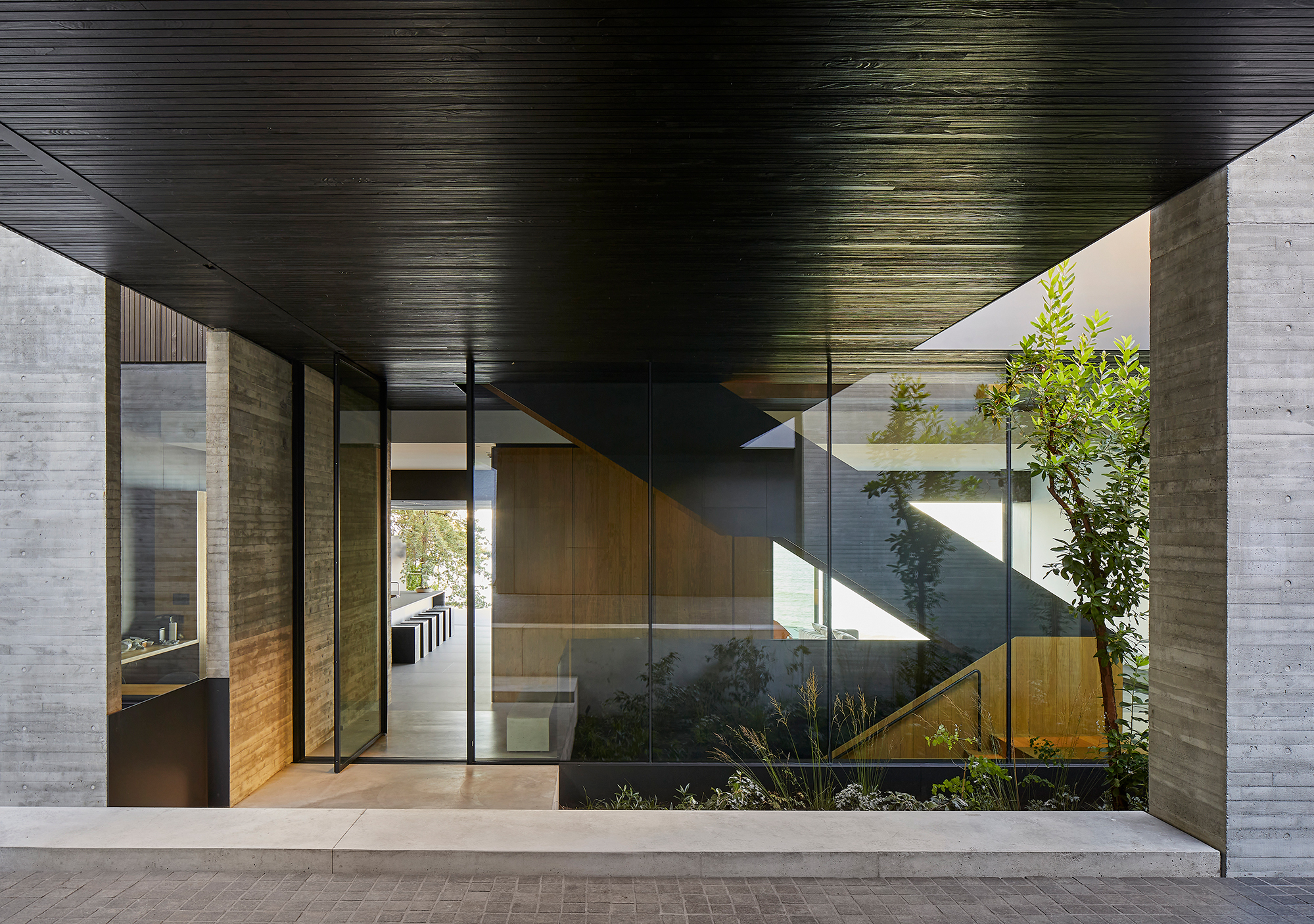
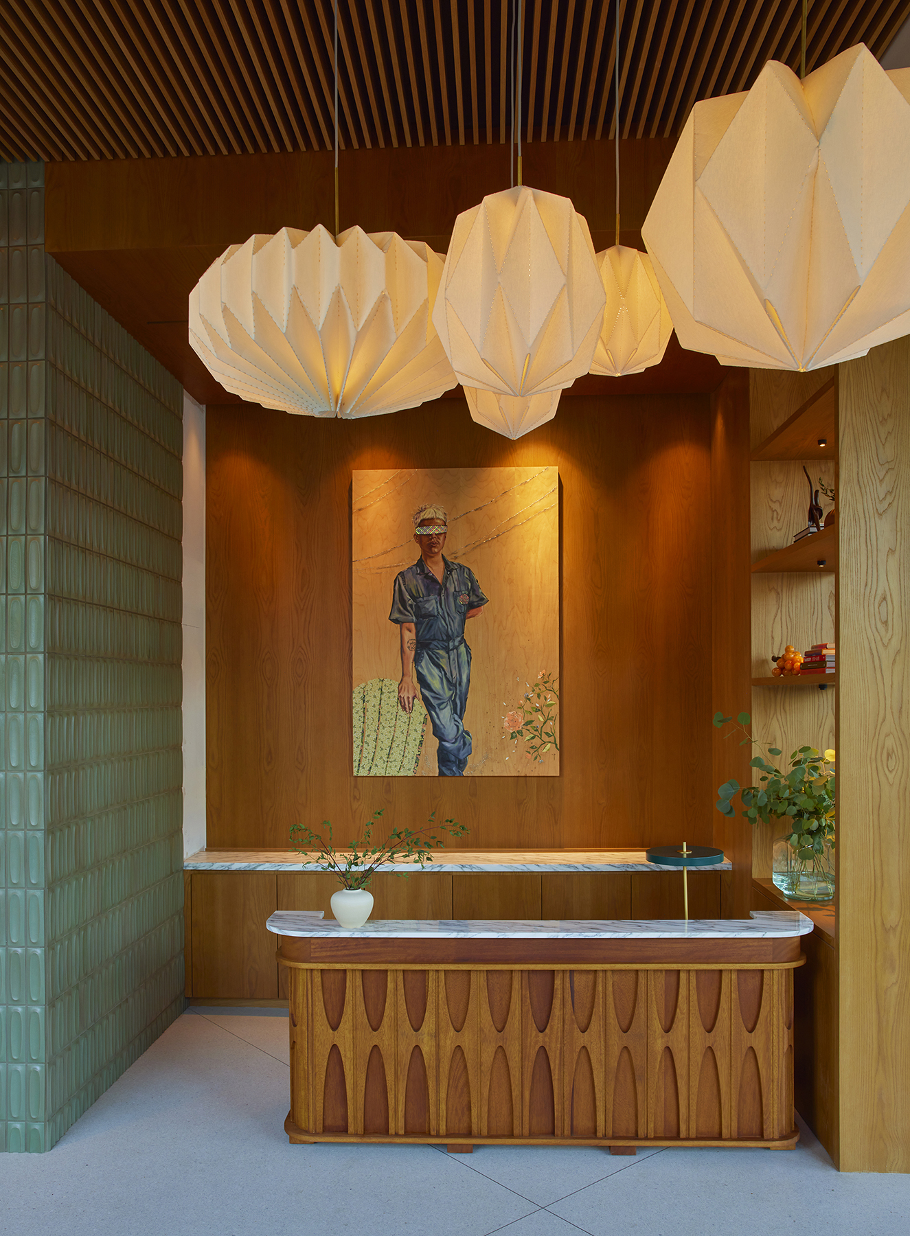
Liminal House by McLeod Bovell Modern Houses, West Vancouver, Canada | Photos by Hufton and Crow | Jury Winner and Popular Choice Winner, 12th Annual A+Awards, Residential Interiors (>3000 sq ft)
Finally, contrast is one of the simplest yet most powerful tools for creating a visual vignette. By juxtaposing different elements, such as texture, color, material and even something as basic as shadow and light, it is easy to create visual interest and highlight key features. Contrast, for example, using dark and light woods together or a high gloss finish paired with matte surfaces, allows elements to stand out from one another and adds further depth to a design. Effective use of contrast ensures that key elements capture attention, enhancing the overall visual appeal and dynamism of the composition.
Architects: Want to have your project featured? Showcase your work by uploading projects to Architizer and sign up for our inspirational newsletters.