Architects: Showcase your next project through Architizer and sign up for our inspirational newsletter.
When the Centre Georges Pompidou (also known as Beaubourg) was completed in 1977, its radical design and high-tech aesthetic delighted some and horrified many. The building landed in the city center like a massive steel and glass UFO, towering over Paris’s historic core. Drawing on Archigram and Cedric Price’s work, the design challenged the centuries-old perception that a building is a static entity. To contemporaries, it was more akin to a kinetic event than Architecture (with a capital A). Its massive skeletal profile was conceived for maximal adaptability; as a highly flexible container, it was equally aimed at shaking up museum typologies and the culture industry to make an affront to historically petrified cities.
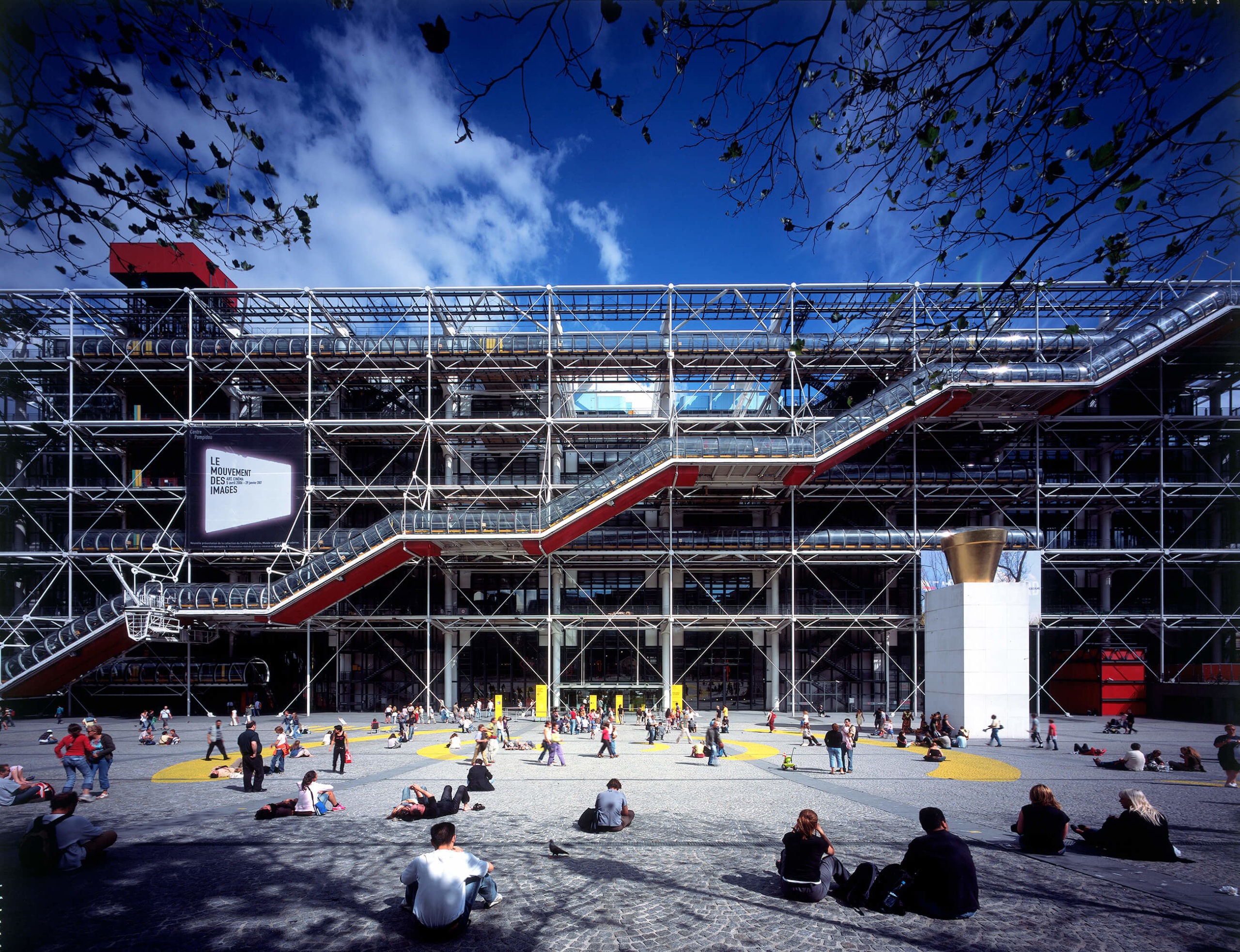
Centre Pompidou by Rogers + Piano, Paris, France. Image courtesy of Rogers Stirk Harbour +Partners.
Upon first glance at MVRDV’s WERK12, I couldn’t help but draw immediate formal comparisons to the famous Rogers + Piano building: from the dominant and transparent staircases snaking their ways up the modular grids of their glazed facades to the flexible interior layouts to engaging exterior displays. Sure, the 21st-century structure, located in Munich, might be an apple and the Pompidou an orange. Still, comparisons are not competitions but worthwhile exercises that shed new light on our understanding of the juxtaposed subjects, so I decided to follow through with this little thought exercise.
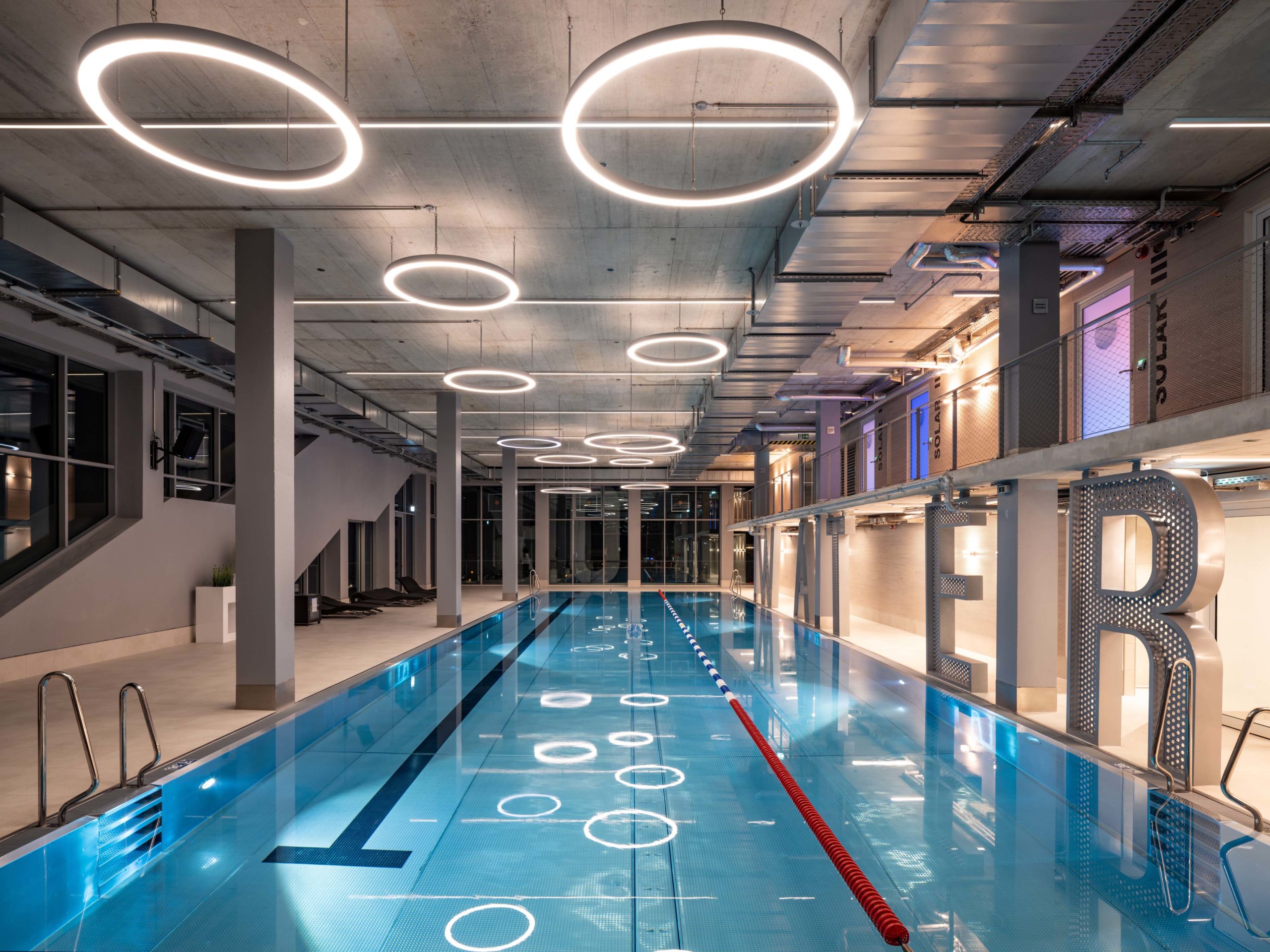
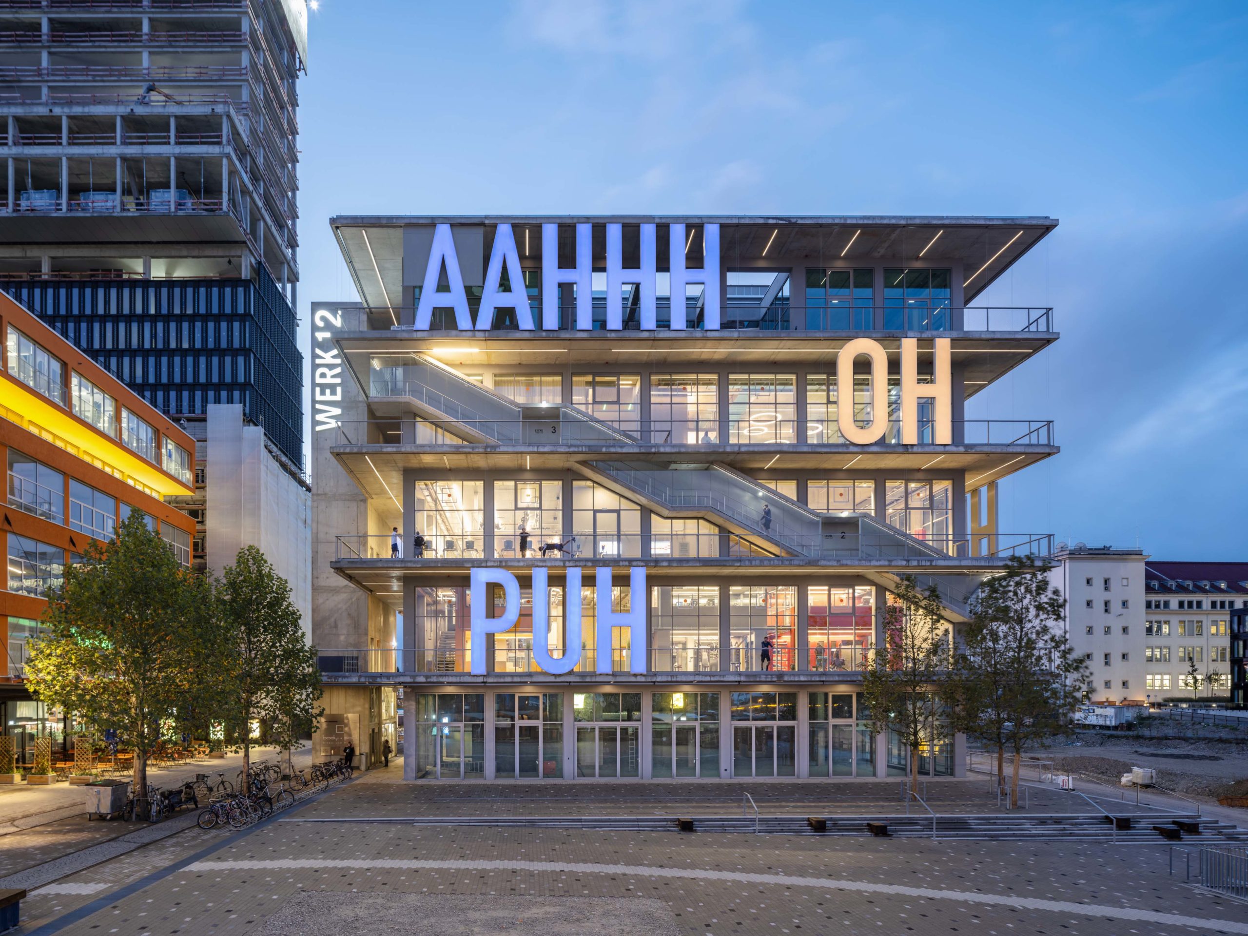
Let’s begin with context. MVRDV’s new mixed-use commercial building serves as the centerpiece for a former industrial site’s urban regeneration. The first five floors of the building play host to a smattering of restaurants and bars, while the offices of Audi Business Innovations call the top floor home; the three stories in between serve as gym facilities, complete with a massive swimming pool.
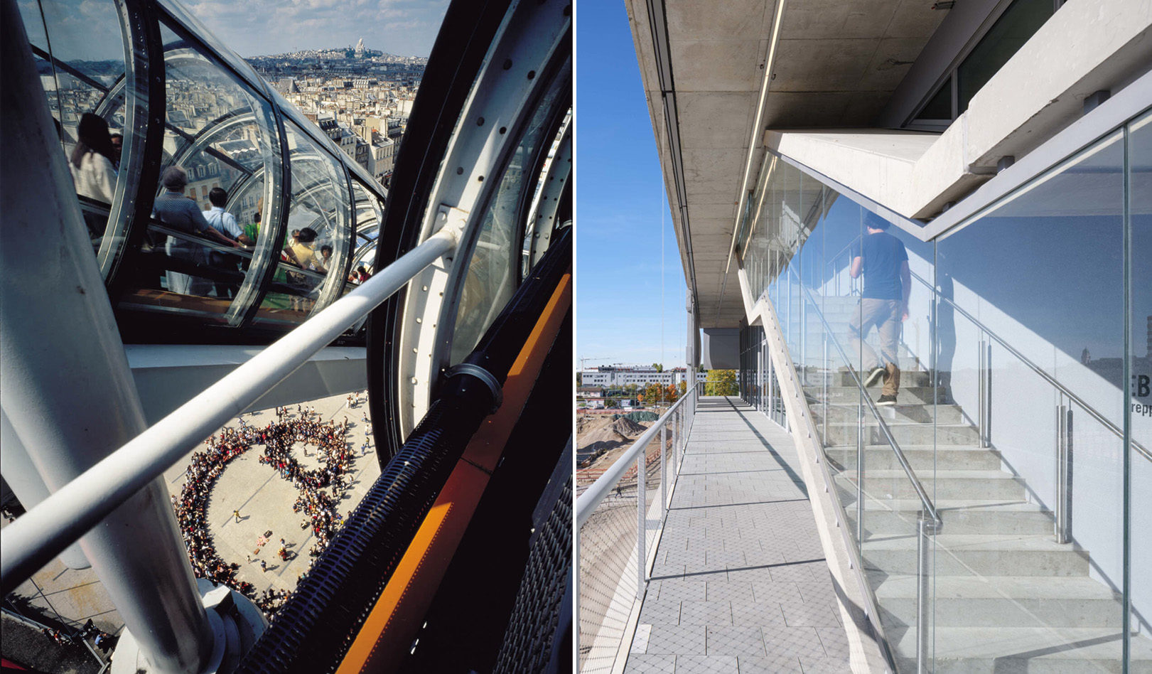
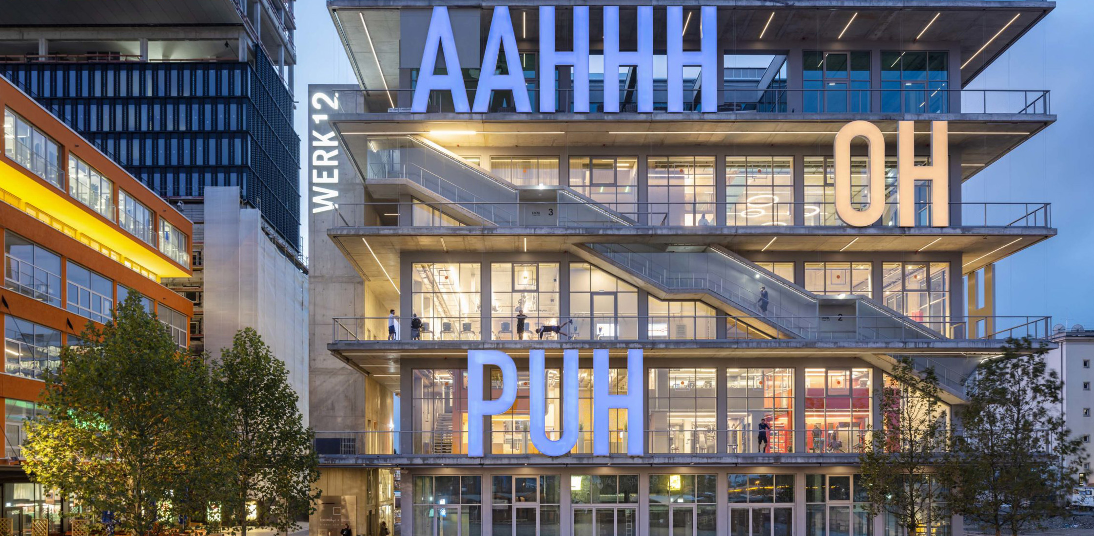
Right: Visitors on escalator of Centre Pompidou. Image courtesy of Rogers Stirk Harbour +Partners. Left: Glazed stairways, façade of WERK12.
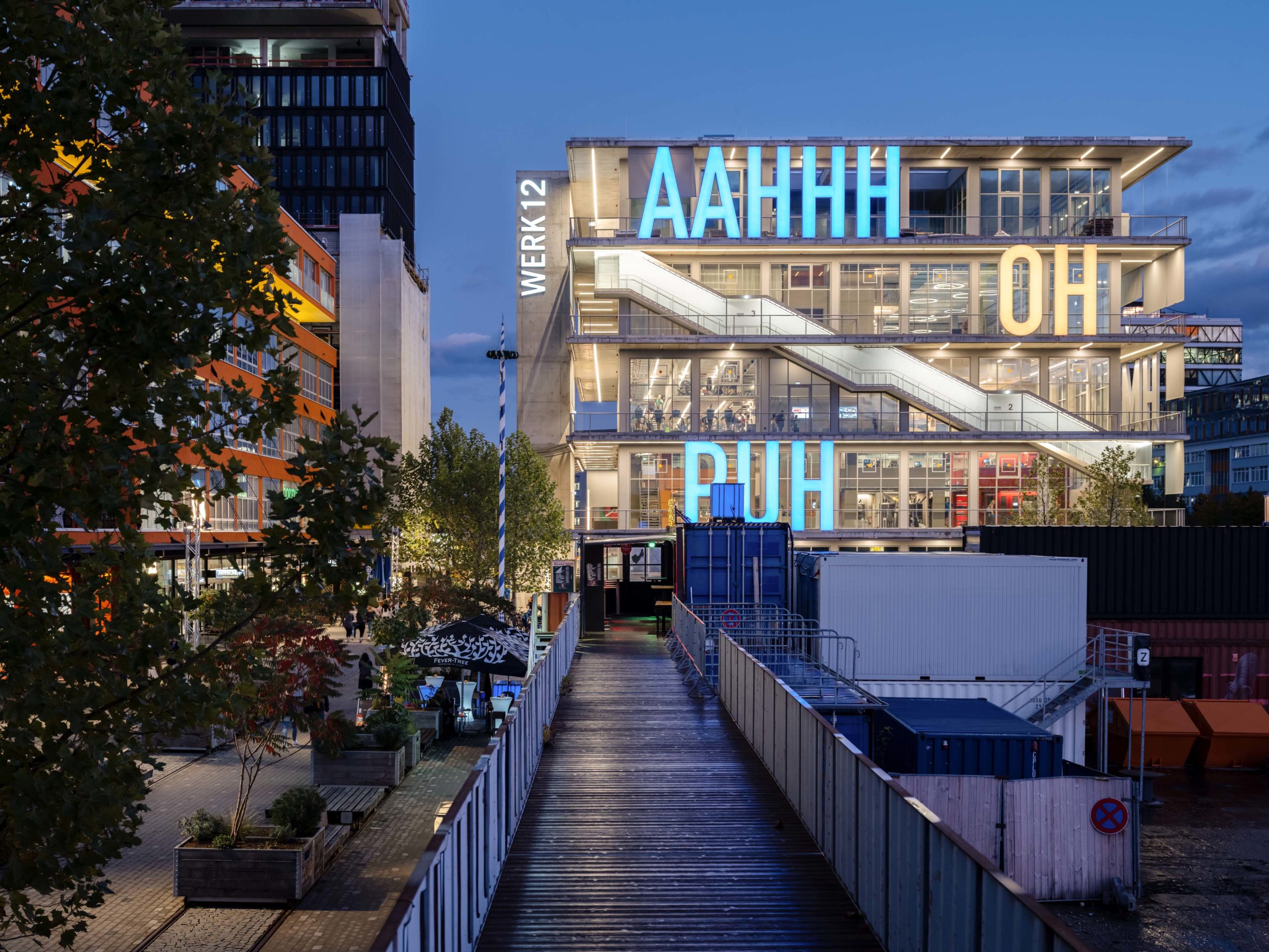
The external circulation — curving staircases that wrap around the building — is augmented by generous and breezy terraces, while floor-to-ceiling glass walls offer additional views across the city. These provisions are one of the main reasons that my mind drew the connection between the two buildings. At Pompidou (sometimes called Beaubourg), the circulation and service pipes are pushed outside the structure. Visitors are visible from to the crowds in the piazza outside as they move up the glass tube escalators (which I will discuss further later on). In both designs, the massive outdoor corridors boast sweeping views over their neighborhoods; in both, the aim is to maximize openness and flexibility once inside.
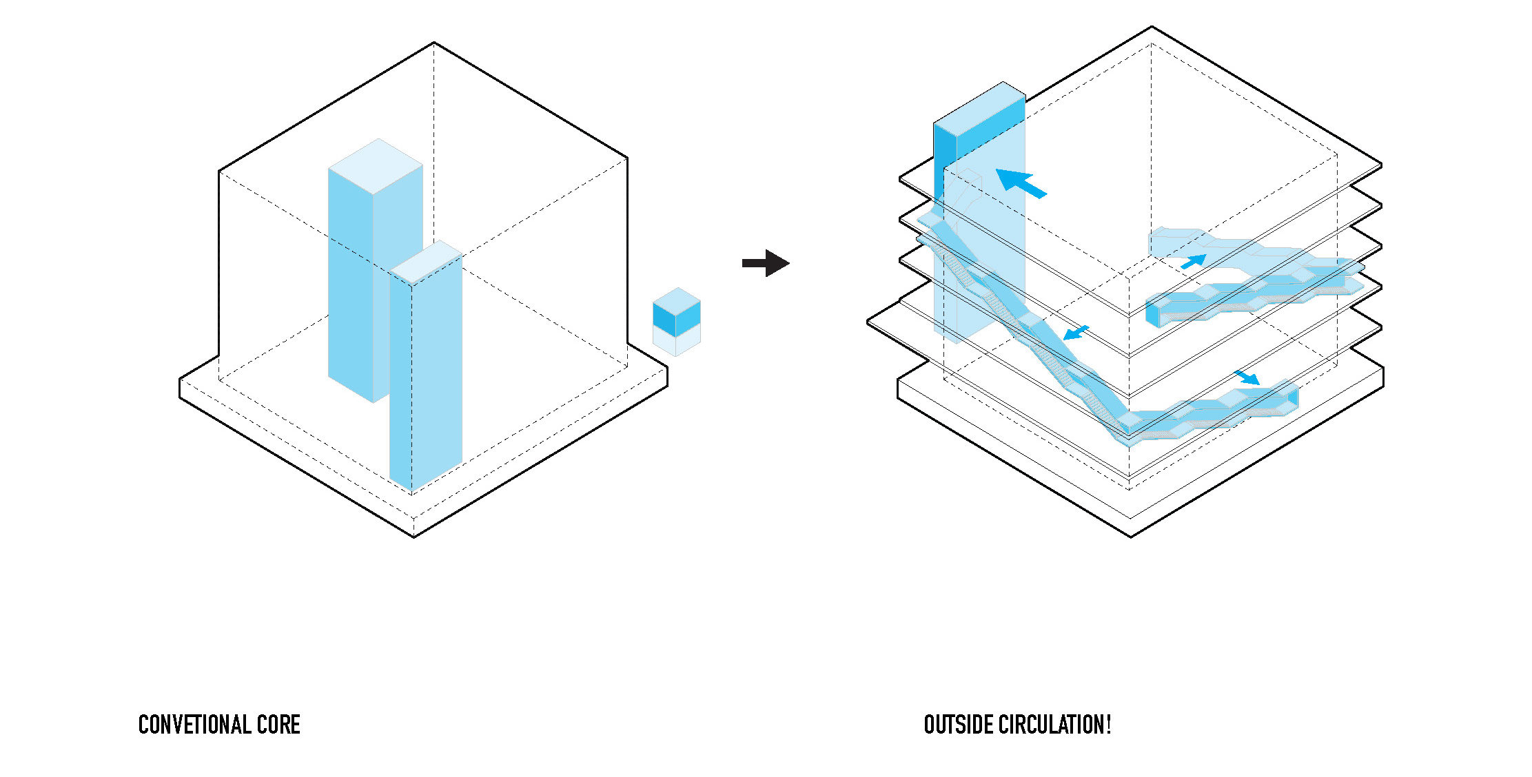
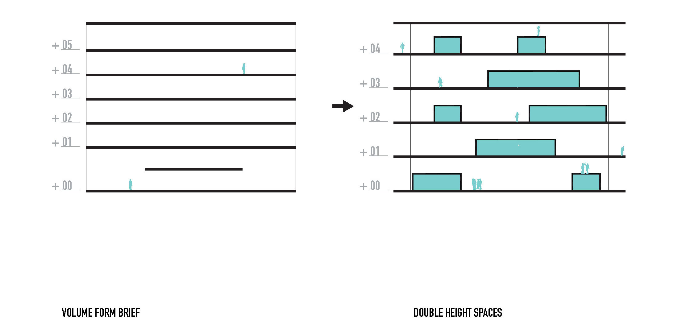
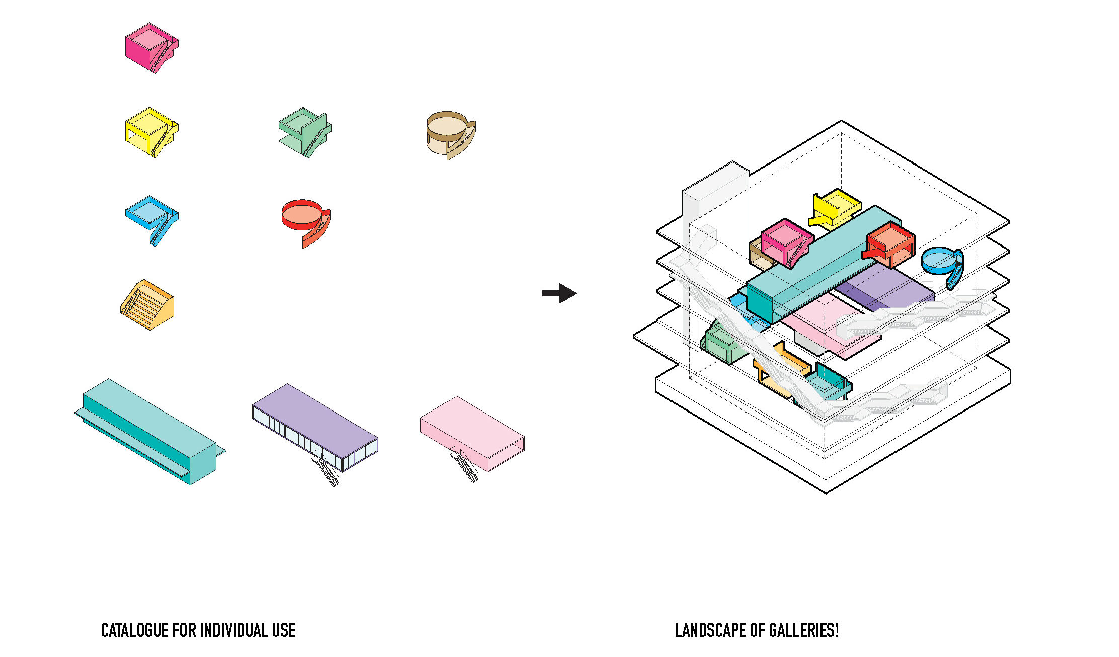
Spatial mapping for WERK12
In the Munich building, there are multiple ways of moving about the interior spaces. At the same time, extra-high 18-foot ceilings allow mezzanines or other level changes to be added by future users. Meanwhile, at the Beaubourg, the buildings’ parts were initially designed to be clipped and unclipped according to future needs (in practice, this is rarely the case); even its floors were intended to move up and down.
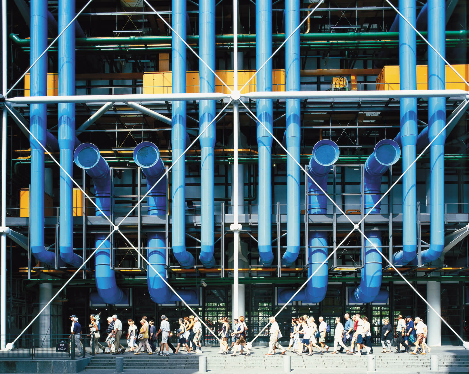
Entrance to the Centre Pompidou by Rogers + Piano, Paris, France. Image courtesy of Rogers Stirk Harbour +Partners.
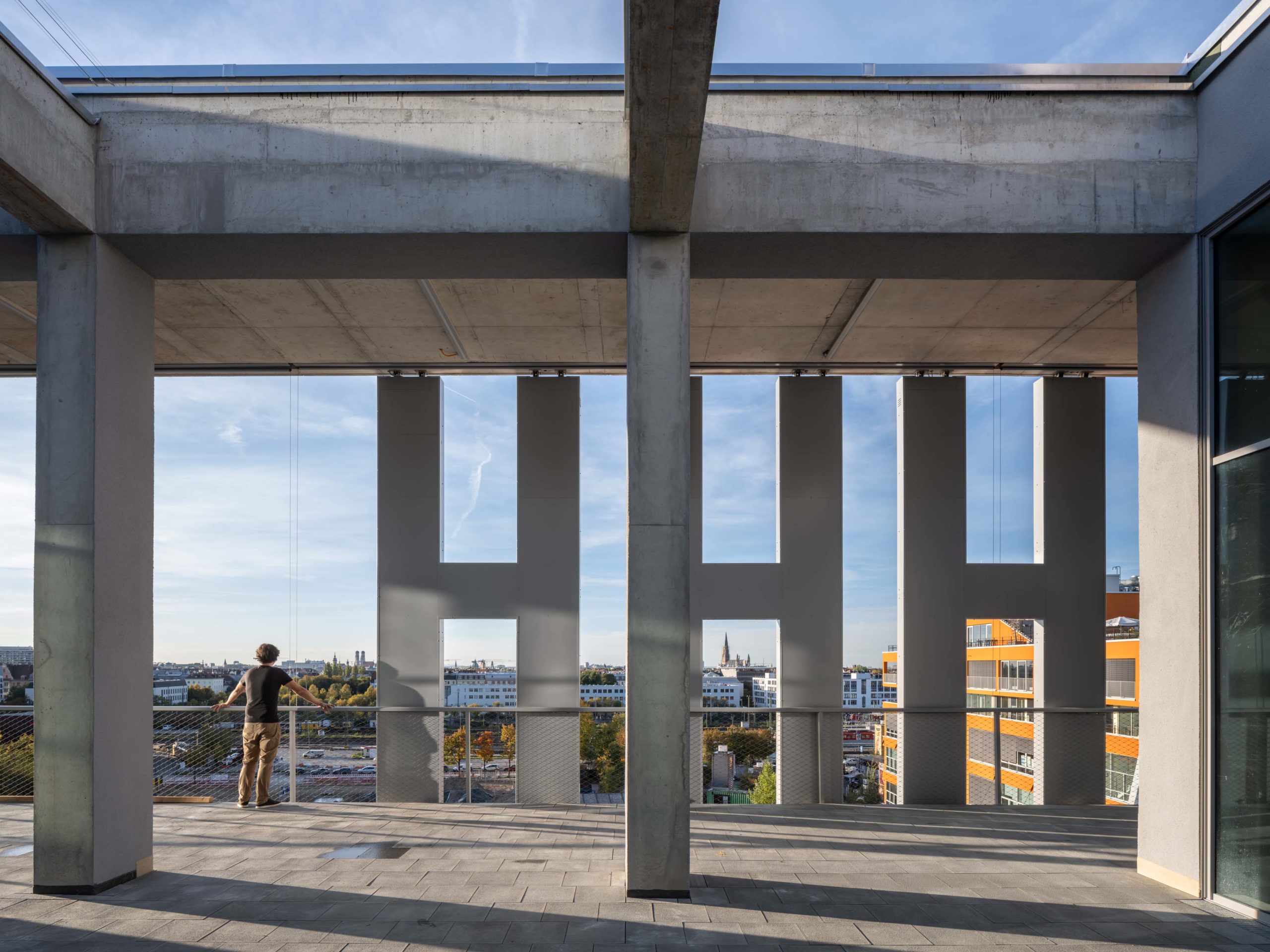
Yet, in the structural expression of the two buildings, there are contrasts. While at the Pompidou, the color-coated service pipes and muscular exoskeleton conspicuously advertise the technological and engineering considerations of design. By contrast, in Germany, WERK12’s technical feats are more subtly visible. Impressive prefabricated components, such as 10-tonne gerberettes, have been produced on a scale rarely seen in the construction industry. Flanking the buildings’ sides, these gerberettes join large trusses to the columns, making possible the large internal spans. Despite remarkable engineering, these materials do not take center stage.
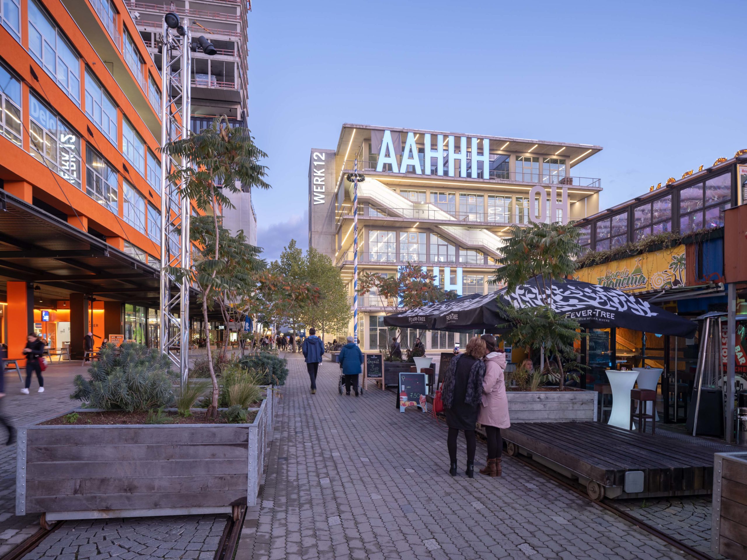
While visible in plain sight, their simple form and muted material expression allow them to serve as a backdrop for the five-meter-tall op-art-inspired lettering that dominates its façade. Local artists Christian Engelmann and Beate Engl developed the bold lettering of these verbal expressions, spelling out common phrases from the German version of Donald Duck comics. Rather than actual spell words, they display the building’s emotional qualities with ‘AAHHH,’ ‘OH,’ ‘WOW,’ ‘HI HI,’ and ‘PUH.’ At night, the building’s illumination transforms its appearance, animating simple geometries and natural materials with a mesmerizing light show.
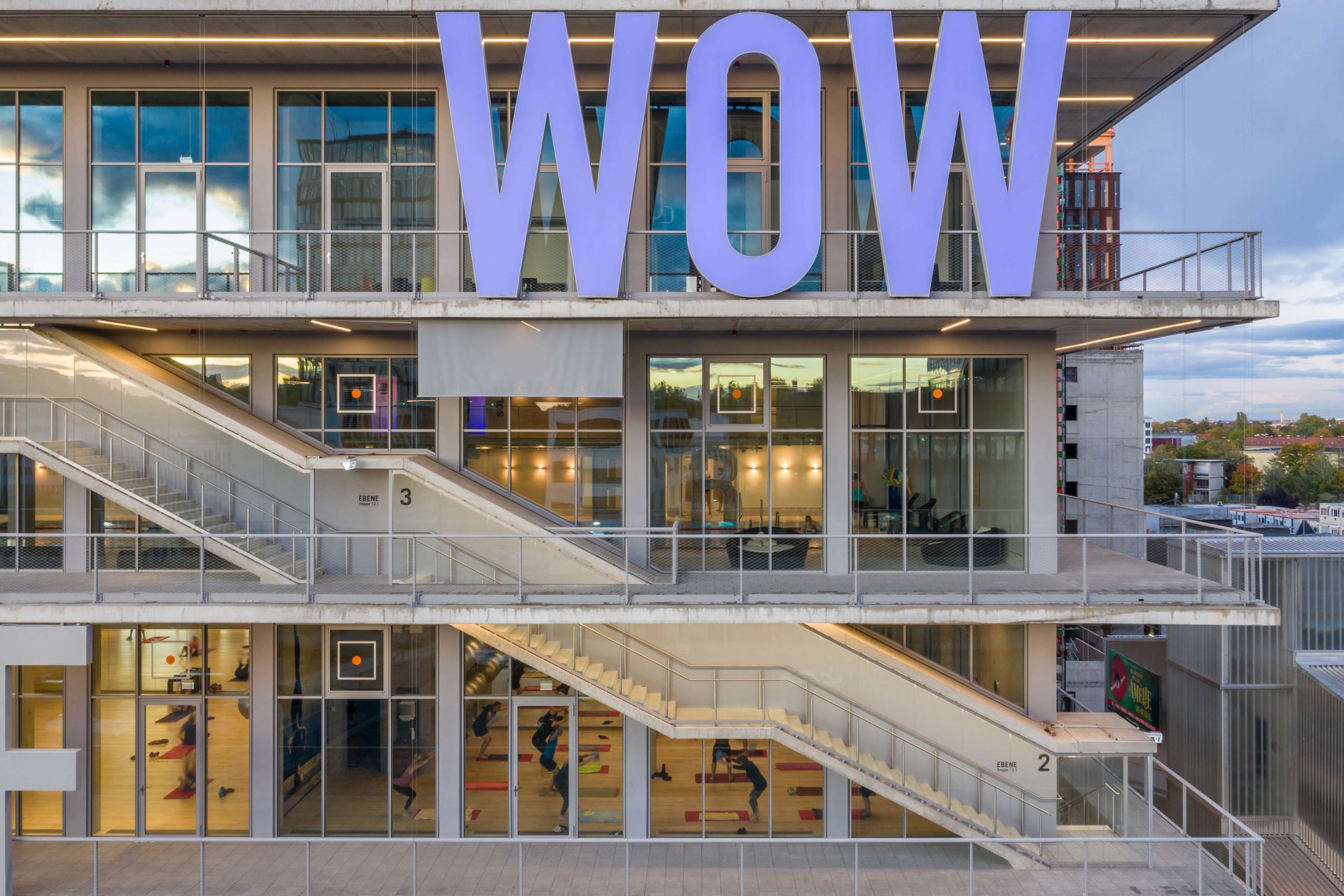
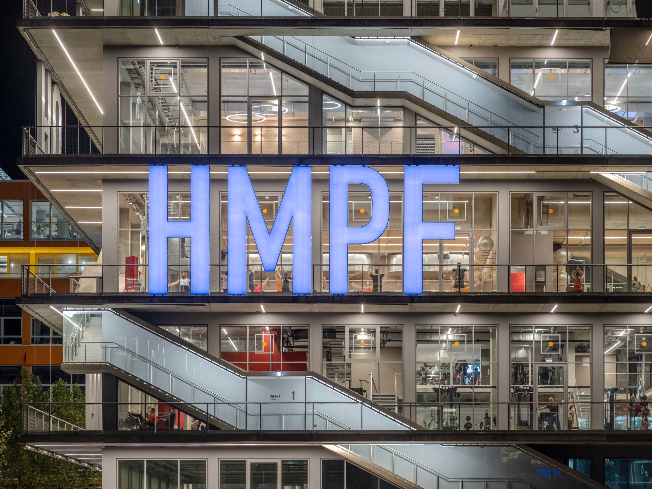
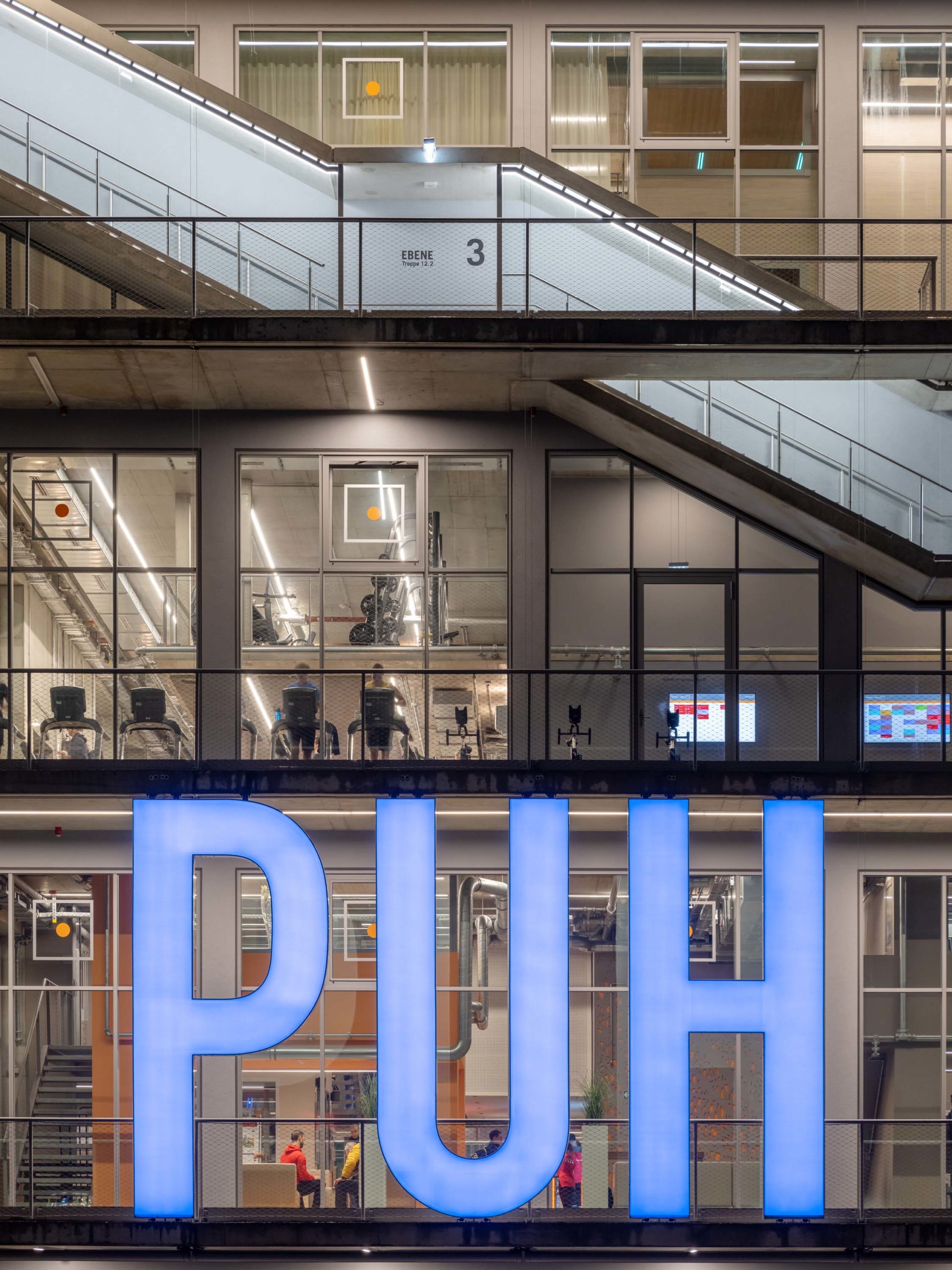
Perhaps superficially, it was these letters, in combination with the dominant outdoor circulation, that first inspired this comparison. Large capitalized fragments of text feature prominently on the façade of Rogers and Piano’s early maquettes. Messages such as “CAROLINE, GO TO KANSAS CITY IMMEDIATELY YOUR FRIEND LINDA HAS BEEN BUSTED;” or ‘COMPUTER TECHNIQUE FOR THE PRODUCTION OF ANIMATED MOVIES’ were originally intended to be displayed alongside other electronic screens and in tandem with the movement of the iconic escalators and broadcast to the large crowds in the piazza, alongside images of current events and other content taken from mass media. In this way, the building would have eternally asserted its contemporaneity. As a form of advertising to the broader public to the broader public, the façade aligned the monument itself and the cultural programming that contained with the many products advertised on billboards and television. The overall effect was not dissimilar from Andy Warhol’s pop-art (in particular, his Campbell’s soup cans).
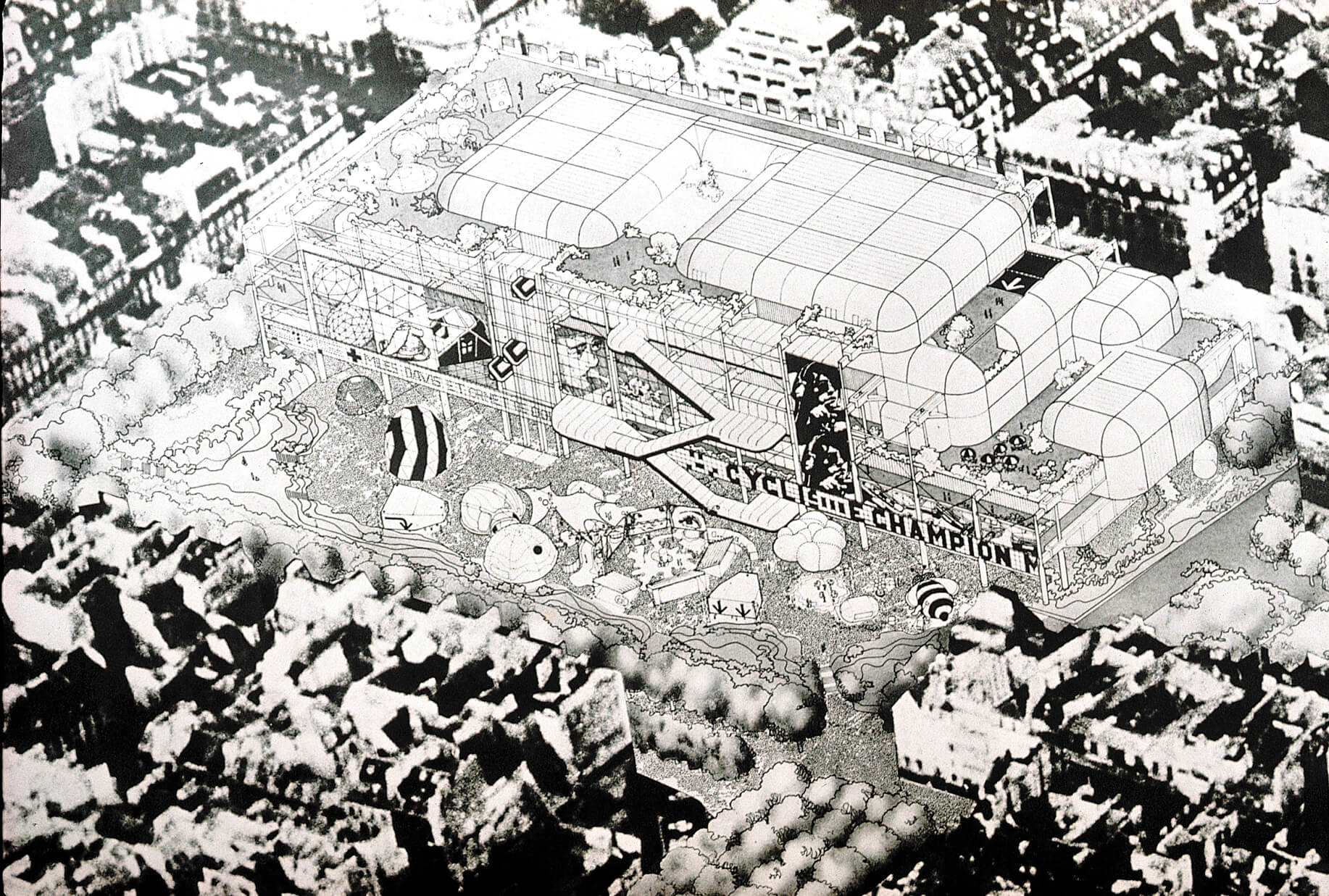
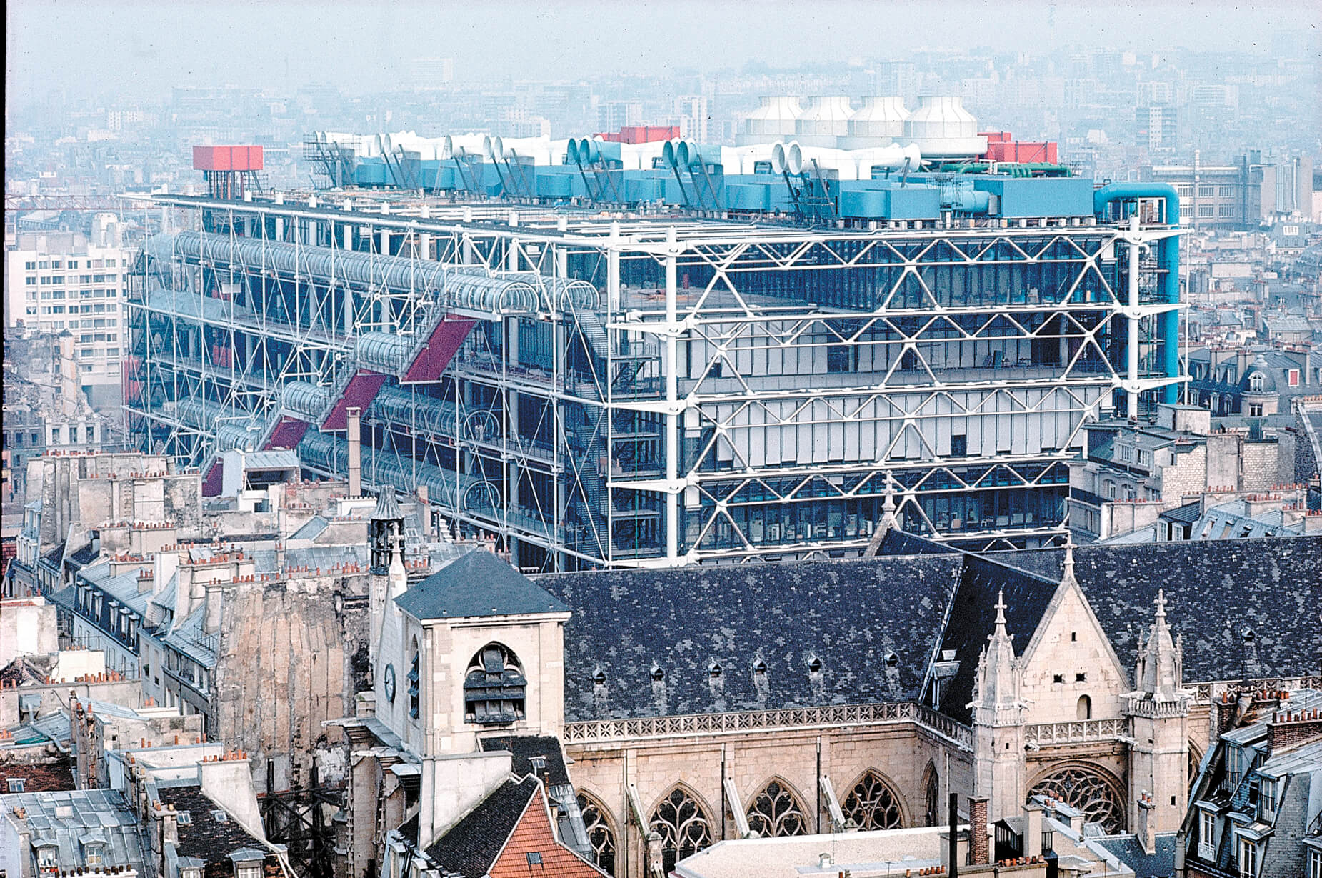
Centre Pompidou by Rogers + Piano, Paris, France. Images courtesy of Rogers Stirk Harbour +Partners.
The Pompidou was conceived in the wake of the 1968 protests that had shaken the French capital and much of Europe; the brief had called for a sophisticated contemporary art center and the design, it was assumed, would exude the high cultural values generally associated with such institutions. Instead of a neoclassical revival or a minimalist volume, the recently graduated British architect Richard Rogers and Italian architect Renzo Piano proposed a “Fun Palace” that drew on popular culture to create a cultural container and democratic space far from elitist archetypes.
In Paris, pop culture was mobilized in a critical and democratizing way. Fifty years later, the German project uses colloquial expressions and popular aesthetics in tribute to the graffiti culture and extensive use of signage found on the old site. If the Pompidou stands in brash high-tech contrast to its storied surroundings, WERK12 serves as a focal point for new development in a formerly industrial neighbourhood. Open in all directions, its façade aims to connect past to present; its expressive lettered glass seeks to create a dialogue with its site and district.
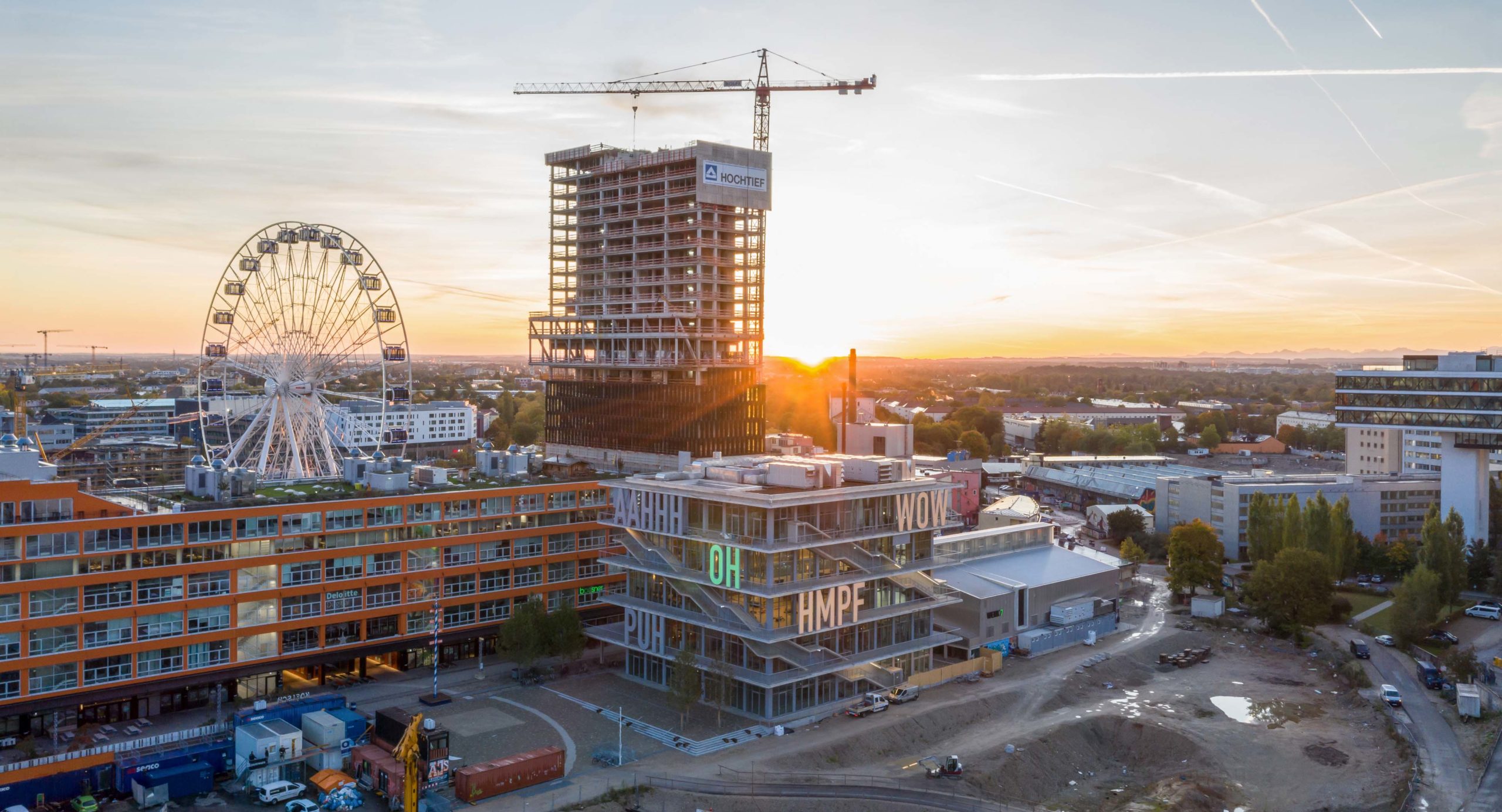
As a mixed-use commercial space, the design of WERK12 draws inspiration from an old informal and industrial heritage to create a new typology for Munich’s future. Similarities to Rogers + Piano’s building can be boiled down to circulation strategies and the provision of flexible and multi-layered spaces. Less high-tech and more nostalgic for the well-lit and airy industrial spaces of yesteryear, WERK12 is contemporary warehouse for sports, work, food and socializing. Drawing on some of the pop aspects as the original designs for the Pompidou, MVRDV’s building uncritically advertises itself and its neighborhood in a playful and fun-loving manner that leaves residents saying “WOW,” and the broader public in “AAHHH.”
Architects: Showcase your next project through Architizer and sign up for our inspirational newsletter.
 WERK12