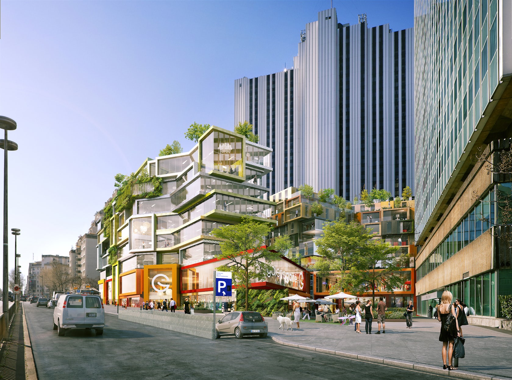
Shopping centers have long been a source of conflict and contradiction for architects. Successful malls are celebratory cathedrals of consumerism that, for all their vitality, can suck the lifeblood out of the surrounding cityscape and transform high streets into ghost towns. The functional motivation of malls is at once glamorous and gluttonous, often necessitating aesthetics that tread the fine line between class and kitsch; this was the challenge that MVRDV took on in their proposal to renovate the huge Vandamme Nord shopping center in Paris, which was approved last week.

© l’autre image
The regeneration of Vandamme Nord continues a trend in righting the wrongs of inner-city mall design, with the overhaul of many shopping centers constructed in the 1970s to reflect the contemporary preferences of developers and end users alike. Examples include La Part Dieu Centre Commercial in Lyon, which was built in 1975, sporting large amounts of artificial lighting and oppressive dark finishes. Building Design Partnership renovated the complex in 2001, cutting away a huge section of rooftop parking to allow natural light to flood in through huge new skylights.


Part Dieu Centre Commercial, Lyon. Via BDP
In the States, Water Tower Place — constructed in 1979 in Chicago — heralded a new era of vertical mixed-use shopping malls, but its monolithic marble walls and eight layers of repetitive floor plates around a well-like atrium failed to connect with consumers on a human scale. It was refurbished in 2001, with exterior glass walls and illuminated “fins” improving window displays for retailers, and a tiered fountain to create a more enticing lobby at ground level.

© Tony Soluri - Soluri Photography

© Tony Soluri - Soluri Photography
Water Tower Place. Via WATG
Come 2015 and MVRDV is rising to the challenge in Paris. The Dutch firm has already made waves in the realm of mixed-use design, with their Market Hall in Rotterdam echoing the flexible program and form of classic Victorian Arcades. The Market Hall is a triumph of design for a more flexible, informal type of retail — the condition at ground level is as active as one could hope for, and the arching form facilitates a positive dual aspect, with fenestration peppering the multi-colored internal skin and residential balconies covering the external façade.

Market Hall, Rotterdam.
In the case of their Paris renovation, no such solution was possible: This shopping center is another claustrophobic creature from the 1970s, a megalomaniacal development wedged between two monolithic tower blocks and lacking stylistic cohesion, save for some truly hideous red steelwork details.

The existing Vandamme shopping center. Via Google Street View

The proposed renovation. © l’autre image
To remedy this, MVRDV have attempted to “reintroduce the lost human scale and bring back a sense of place,” introducing an assorted stack of glazed blocks that jut out to differing degrees: this gives rise to covered terraces that break up the building envelope, and the firm have included obligatory sprinkles of luscious greenery for good measure. The external glazing transforms the skin into a contemporary display cabinet for retailers, framed by brightly colored sleeves that stand in stark contrast to the monochromatic towers that bookend the complex.

Proposed program diagram. © l’autre image
Programmatically, things have also been reconfigured to revitalize the building as a mixed-use public space. A crucial goal was to activate the heart of the building, and MVRDV have proposed a new facility that will attract the most active end users of all: A kindergarten is to be located at the building’s core, surrounding by new social housing units, commercial premises and offices. The Bibliothèque Vandamme, previously stuffed below the shopping center in dingy subterranean conditions, is to be move up to plinth level, with better lighting conditions and vastly improved accessibility.
Just how much of a difference will MVRDV’s revisions make? It seems likely that the increase in natural light, a unification of architectural language, and the intensification of public program will attract consumers much more than the present complex, but only post-occupancy analysis will reveal the definitive answer. Watch this space…
Yours rebooted,
The Angry Architect


